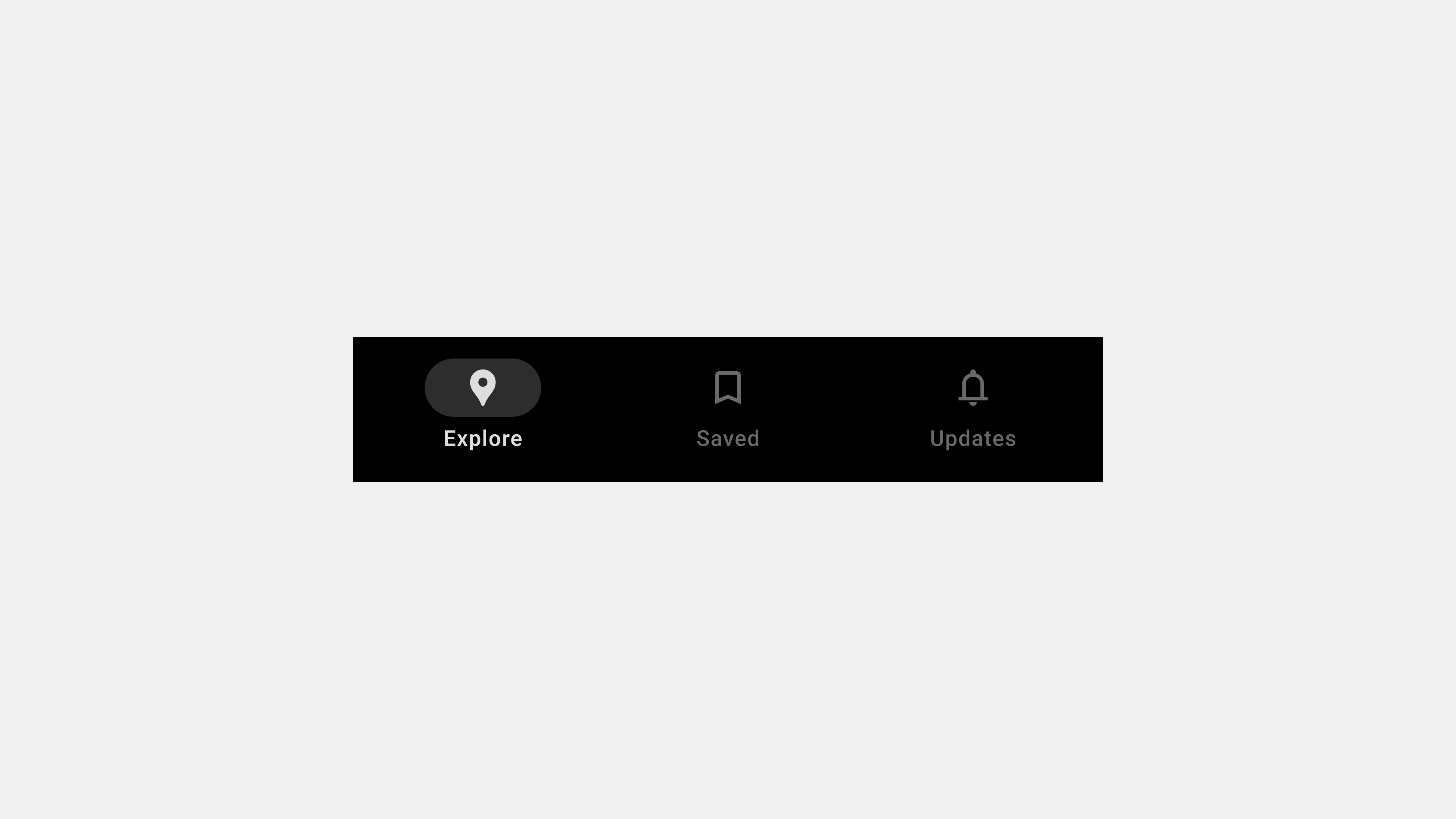
5 Key Considerations for User-Centric Bottom Navigation Bar Design
Bottom navigation bars are vital for seamless navigation in mobile apps. When designed with a user-centered approach, they enhance usability, improve user satisfaction, and ensure accessibility. This article outlines five critical aspects to focus on when designing bottom navigation bars from a UX/UI perspective, ensuring that they meet user expectations and align with best practices.
1. Simplify Navigation with Clarity and Focus
Why It Matters
Bottom navigation bars must simplify navigation by clearly organizing the app’s core features. Users expect to locate what they need without effort, and overloading the navigation bar with too many tabs can create confusion.
Key Principles
- Limit the Number of Tabs: Stick to 3-5 core tabs to prevent overcrowding.
- Use Clear Labels: Pair icons with concise, descriptive labels to enhance understanding.
- Prioritize Core Features: Include only the most important features and move secondary functions to an overflow menu.
Design Tips
- Conduct user research to identify the most accessed features.
- Use A/B testing to refine icon and label combinations.
- Ensure labels are concise and avoid ambiguity (e.g., use “Cart” instead of “Shop Bag”).
Example
In an e-commerce app, tabs like “Shop,” “Cart,” “Wishlist,” and “Profile” are clear and focused, ensuring ease of navigation.
2. Ensure Accessibility and Inclusivity
Why It Matters
A user-centered design must cater to everyone, including users with disabilities. Accessibility ensures compliance with legal standards and broadens your app’s reach to a diverse audience.
Key Principles
- Screen Reader Compatibility: Add ARIA labels and roles to make tabs readable by assistive technologies.
- Keyboard Navigation: Ensure users can navigate tabs using only a keyboard.
- Touch-Friendly Design: Design tap areas that are large enough for accurate selection.
Design Tips
- Use high-contrast colors to ensure text and icons are legible.
- Test designs with assistive technologies like VoiceOver or TalkBack.
- Include focus indicators for desktop and web applications.
Example
In a banking app, the “Accounts” tab announces its label and active state through a screen reader, ensuring visually impaired users can navigate effectively.
3. Optimize for Ergonomics and Thumb Reach
Why It Matters
Most users interact with mobile apps using their thumbs, especially on larger devices. Ergonomic design improves comfort and usability, particularly for one-handed operation.
Key Principles
- Placement: Position the navigation bar at the bottom of the screen.
- Thumb-Friendly Targets: Ensure tap areas are large and well-spaced to minimize misclicks.
- Responsive Design: Adapt the layout for different screen sizes and orientations.
Design Tips
- Use heatmaps to analyze user interaction patterns and optimize button placement.
- Maintain consistent spacing between tabs for easy navigation.
- Test usability across devices with varying screen sizes.
Example
A fitness app ensures that all tabs, such as “Dashboard,” “Workouts,” and “Progress,” are within thumb reach, enabling effortless interaction on large screens.
4. Provide Visual Feedback and Contextual Awareness
Why It Matters
Users rely on feedback to understand their current location within the app. Without clear indicators, users may feel lost, leading to frustration.
Key Principles
- Active Tab Highlighting: Use distinct visual indicators like color changes, bold text, or underlines to highlight the active tab.
- Feedback for Interactions: Include animations or transitions when switching tabs to enhance responsiveness.
- Context-Specific Feedback: Dynamically update the navigation bar based on the user’s location or action.
Design Tips
- Add subtle animations to make tab transitions feel natural.
- Use visual hierarchy to make the active tab stand out.
- Ensure that feedback is immediate and not delayed by performance issues.
Example
In a travel app, the “Bookings” tab highlights with a bold icon and color change when selected, providing clear feedback to the user.
5. Maintain Consistency and Scalability
Why It Matters
A consistent design ensures that users can predict how the navigation bar behaves, building familiarity and trust. Scalability allows the navigation bar to accommodate future app updates or expansions.
Key Principles
- Design Consistency: Maintain uniform styling, spacing, and functionality across all screens.
- Future-Proof Layouts: Design flexible navigation systems that can adapt to new features without overwhelming users.
- Cross-Platform Uniformity: Ensure the navigation bar works seamlessly across mobile, tablet, and web platforms.
Design Tips
- Use a design system to standardize elements and interactions.
- Plan for overflow menus or collapsible tabs to handle additional features.
- Test the navigation bar on multiple platforms to ensure consistent behavior.
Example
A project management app uses a consistent bottom navigation bar for “Tasks,” “Calendar,” and “Messages” across its mobile and web versions, providing a seamless user experience.
Conclusion
Designing user-centric bottom navigation bars requires a careful balance of simplicity, accessibility, ergonomics, feedback, and consistency. By focusing on these five key areas, designers can create navigation systems that meet user expectations and enhance the overall app experience. A well-designed navigation bar not only improves usability but also ensures long-term adaptability as the app evolves.

답글 남기기