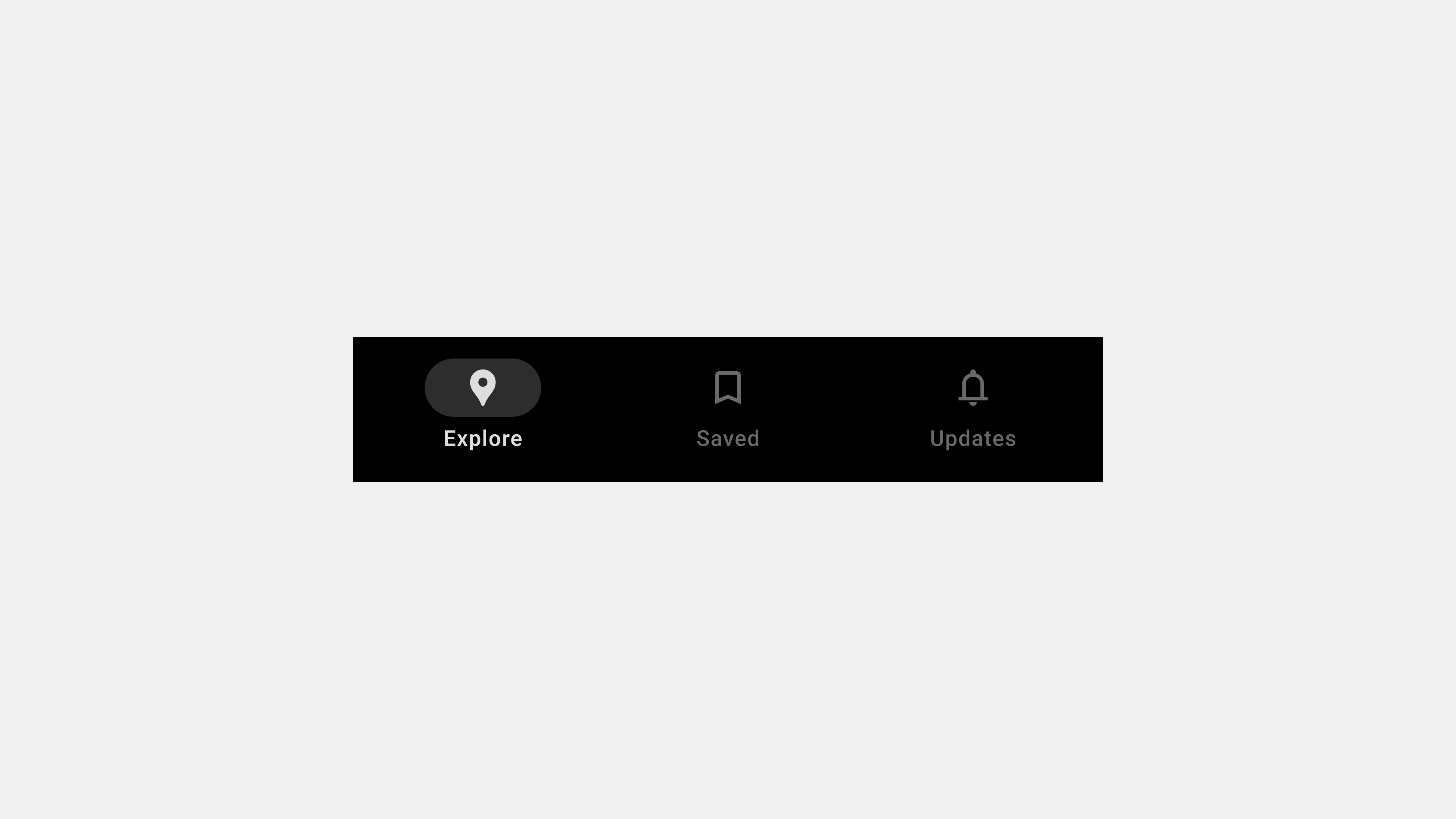
The Ultimate Guide to Bottom Navigation Bars: A Complete Wrap-Up
Bottom navigation bars are essential components of mobile app design, offering users a seamless way to navigate primary features. They serve as a cornerstone of usability, ensuring intuitive and efficient navigation. This wrap-up consolidates all aspects of bottom navigation bars—from their definition and roles to their design, development, and QA considerations. Whether you’re a designer, developer, or QA specialist, this guide provides actionable insights to create bottom navigation bars that enhance user experiences.
1. What Are Bottom Navigation Bars?
A bottom navigation bar is a fixed UI component at the bottom of an app screen. Its primary function is to provide quick access to the core sections of an application.
Key Characteristics
- Compact Layout: Saves screen space while maintaining accessibility.
- Icons and Labels: Combines intuitive visuals with descriptive text for clarity.
- Persistent Placement: Stays visible across screens to ensure consistent navigation.
Purpose
Bottom navigation bars simplify navigation by grouping an app’s primary features into easily accessible tabs.
2. The Role of Bottom Navigation Bars in User Experience
Bottom navigation bars are integral to creating a seamless and enjoyable user experience.
Key Functions
- Organizing Core Features: Groups primary app sections for quick access.
- Providing Contextual Awareness: Highlights active tabs to show users their current location.
- Supporting Multitasking: Allows users to switch tasks without losing progress.
Why It Matters
By reducing cognitive load and improving task efficiency, bottom navigation bars contribute to overall user satisfaction.
3. Key Types of Bottom Navigation Bars
Different apps have varying navigation needs, leading to diverse bottom navigation bar designs.
A. Standard Navigation Bars
- Features fixed tabs for primary sections.
- Ideal for apps with 3-5 core features.
B. Scrollable Navigation Bars
- Accommodates more tabs by enabling horizontal scrolling.
- Suitable for content-heavy apps like streaming platforms.
C. Floating Navigation Bars
- Positioned slightly above the screen edge with rounded corners.
- Adds a modern aesthetic and minimizes visual clutter.
D. Dynamic Navigation Bars
- Adjusts content based on user roles or app state.
- Offers a personalized navigation experience.
4. UX Writing for Bottom Navigation Bars
Effective UX writing ensures that tab labels are clear, concise, and aligned with user expectations.
Best Practices
- Use Descriptive Labels: Clearly convey the purpose of each tab (e.g., “Home” or “Search”).
- Combine Icons with Text: Pair icons with labels for better clarity.
- Keep Labels Short: Avoid truncation by limiting labels to 1-2 words.
- Align with User Mental Models: Use familiar terms that match user expectations.
Common Pitfalls
- Ambiguous labels like “More” or “Stuff.”
- Overly creative language that confuses users (e.g., “Vibes” for “Music”).
- Inconsistent terminology across the app.
5. Designing User-Centered Navigation Bars
Designing navigation bars with a user-first mindset ensures usability and accessibility.
Key Design Principles
- Simplicity: Limit tabs to 3-5 to prevent clutter.
- Accessibility: Use ARIA roles, high-contrast colors, and touch-friendly targets.
- Feedback and Indicators: Highlight active tabs and provide smooth transitions.
- Consistency: Maintain uniform styling and behavior across screens.
Examples
- In an e-commerce app, tabs like “Shop,” “Cart,” and “Profile” make navigation straightforward.
- A travel app highlights the “Bookings” tab with bold text and color changes when selected.
6. Publishing and Developing Navigation Bars
Developers play a critical role in implementing bottom navigation bars that are performant and consistent.
Key Considerations
- Performance Optimization: Use lazy loading and efficient animations to ensure responsiveness.
- Cross-Platform Compatibility: Test for consistent functionality across iOS, Android, and web.
- Dynamic Content Handling: Manage state changes and dynamic tabs efficiently.
Tools for Development
- React Native: For cross-platform development.
- Postman: To test dynamic content and API integrations.
7. QA Testing Bottom Navigation Bars
Rigorous QA ensures that bottom navigation bars function reliably across all scenarios.
Key Testing Areas
- Functional Testing: Validate that all tabs route users to the correct screens.
- Accessibility Testing: Use screen readers and keyboard navigation to ensure inclusivity.
- Performance Testing: Simulate heavy usage and offline scenarios to test resilience.
- Error Handling: Verify fallback options for failed content or broken links.
Tools for QA
- Axe Accessibility Checker: For identifying accessibility issues.
- BrowserStack: For cross-platform testing.
8. Future Trends in Bottom Navigation Bars
As mobile app design evolves, bottom navigation bars continue to adapt to new trends.
Emerging Trends
- Gesture-Based Navigation: Complementing or replacing traditional tabs with gestures.
- AI-Powered Personalization: Dynamic tabs that adjust based on user behavior.
- Augmented Reality (AR) Integration: Incorporating AR features within navigation systems.
Conclusion
Bottom navigation bars are more than just a navigation tool—they are a critical element of user experience design. By focusing on clarity, accessibility, performance, and testing, teams can create navigation bars that meet user expectations and enhance app usability. From design and development to QA, a holistic approach ensures that navigation bars remain intuitive, functional, and future-ready.

답글 남기기