Designing Tab Bars: Meeting User Expectations Through Service Planning
Tab bars are a core navigation component in applications, offering users a simple way to switch between primary features. For service planners, understanding user expectations and designing tab bars to meet those needs is essential. This article explores what users expect from tab bars and outlines actionable steps for service planners to create intuitive and effective designs.
1. User Expectations for Tab Bars
When users interact with tab bars, they bring specific expectations based on their previous experiences with similar interfaces.
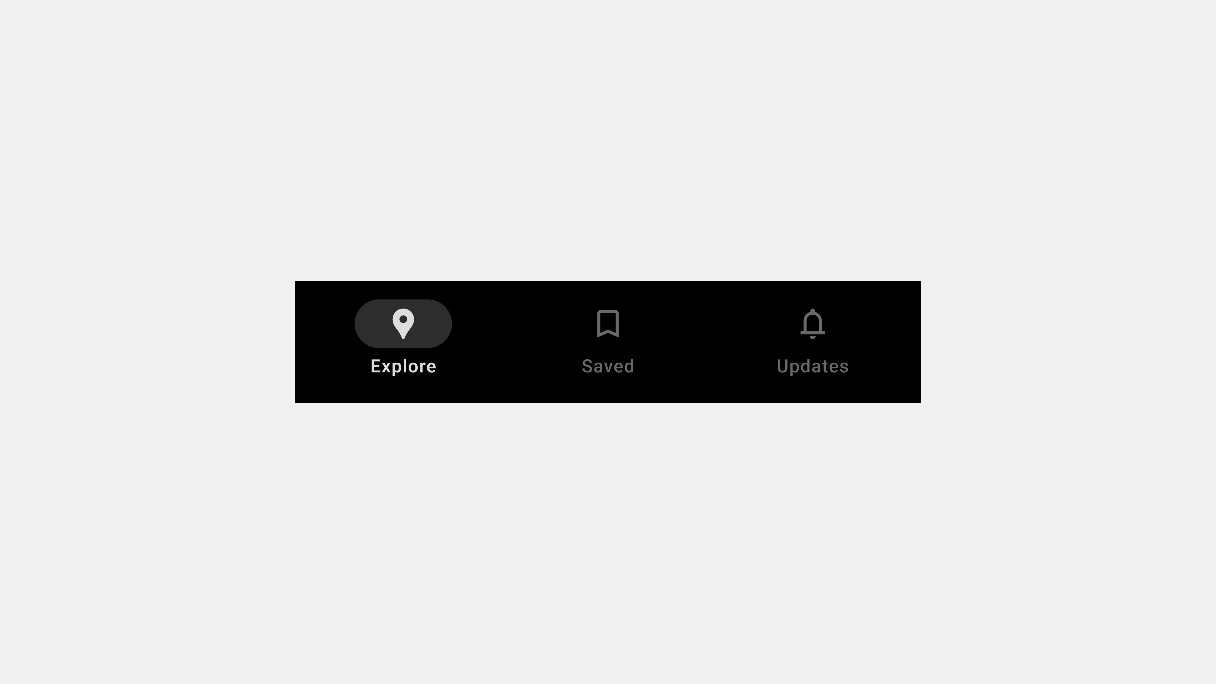
A. Simplicity and Clarity
- Expectation: Users want tabs to be straightforward and easy to understand.
- Details: Tabs should be clearly labeled with intuitive icons and text that describe their purpose.
- Why It Matters: Ambiguous or cluttered tabs can confuse users and hinder navigation.
B. Quick and Consistent Access
- Expectation: Users expect the tab bar to be always accessible and consistent across all screens.
- Details: The tab bar should remain visible and provide immediate access to primary features.
- Why It Matters: Hidden or inconsistent navigation disrupts user workflows.
C. Feedback and Contextual Awareness
- Expectation: Users rely on visual cues to understand their current location within the app.
- Details: Highlighting the active tab with color changes, bold text, or underlines reassures users.
- Why It Matters: Feedback reduces cognitive load and helps users navigate confidently.
D. Ergonomic and Accessible Design
- Expectation: Users want tab bars to be easy to reach and use, especially on mobile devices.
- Details: Tabs should be within thumb reach and include accessible features like screen reader support.
- Why It Matters: Poor ergonomics or lack of accessibility alienates users and diminishes usability.
2. Responsibilities of Service Planners
To meet these expectations, service planners must adopt a user-centric approach and focus on creating intuitive, accessible, and scalable tab bar designs.
A. Conduct User Research
- Why It Matters: Understanding user behavior and needs ensures the tab bar aligns with their expectations.
- Actions to Take:
- Observe how users navigate similar interfaces.
- Conduct surveys or interviews to identify pain points and preferences.
- Analyze heatmaps or navigation metrics to prioritize tabs.
B. Design for Clarity and Simplicity
- Why It Matters: Clear and concise tabs reduce cognitive load and improve discoverability.
- Actions to Take:
- Limit the number of tabs to 3-5 core features.
- Pair icons with descriptive labels.
- Group secondary features under an overflow menu if necessary.
C. Ensure Consistent and Persistent Navigation
- Why It Matters: Consistency builds trust and familiarity, enhancing user satisfaction.
- Actions to Take:
- Keep the tab bar visible across all screens.
- Use consistent icons, labels, and active states throughout the app.
- Test the tab bar on different devices to ensure responsive behavior.
D. Prioritize Accessibility and Ergonomics
- Why It Matters: Inclusive design ensures the app is usable by all users, including those with disabilities.
- Actions to Take:
- Optimize tab sizes for touch interactions and thumb reach.
- Add ARIA roles and labels for screen reader compatibility.
- Test color contrast to meet WCAG standards.
E. Iterate and Test Designs
- Why It Matters: Continuous testing and iteration ensure the tab bar remains effective as user needs evolve.
- Actions to Take:
- Use A/B testing to compare different tab designs.
- Gather user feedback to identify areas for improvement.
- Monitor analytics to evaluate the performance of individual tabs.
3. Examples of User-Centric Tab Bar Design
A. E-Commerce App
- Design: Tabs for “Shop,” “Categories,” “Cart,” “Orders,” and “Profile.”
- User Expectation Met: Quick access to shopping and order management.
B. Social Media App
- Design: Tabs for “Feed,” “Search,” “Reels,” “Notifications,” and “Profile.”
- User Expectation Met: Consistent access to key content creation and discovery features.
C. Fitness App
- Design: Tabs for “Dashboard,” “Workouts,” “Progress,” and “Profile.”
- User Expectation Met: Simplified navigation for tracking fitness goals.
4. Common Pitfalls and How to Avoid Them
A. Overcrowding Tabs
- Pitfall: Adding too many tabs overwhelms users and reduces clarity.
- Solution: Prioritize primary features and use an overflow menu for less critical options.
B. Ambiguous Labels or Icons
- Pitfall: Vague or unclear labels confuse users.
- Solution: Use descriptive text and universally recognized icons.
C. Inconsistent Behavior
- Pitfall: Tabs behave differently across screens, creating confusion.
- Solution: Maintain consistent functionality and visual design.
D. Ignoring Accessibility
- Pitfall: Failing to support screen readers or keyboard navigation excludes users.
- Solution: Follow accessibility guidelines and test with assistive technologies.
Conclusion
Designing tab bars from a user’s perspective requires a deep understanding of their needs and expectations. By prioritizing simplicity, accessibility, consistency, and feedback, service planners can create tab bars that enhance usability and improve overall user satisfaction. Incorporating user research and iterative testing ensures that the tab bar evolves to meet changing demands, making it an indispensable navigation tool.
답글 남기기