Comprehensive Guide to Menus in UI/UX Design
Menus are fundamental components of user interfaces, acting as a bridge between users and the features or content of a system. Whether in mobile apps, desktop applications, or websites, menus organize options in a structured and intuitive way, ensuring users can navigate and interact efficiently. This article explores the concept, types, design principles, and best practices of menus in UI/UX design.
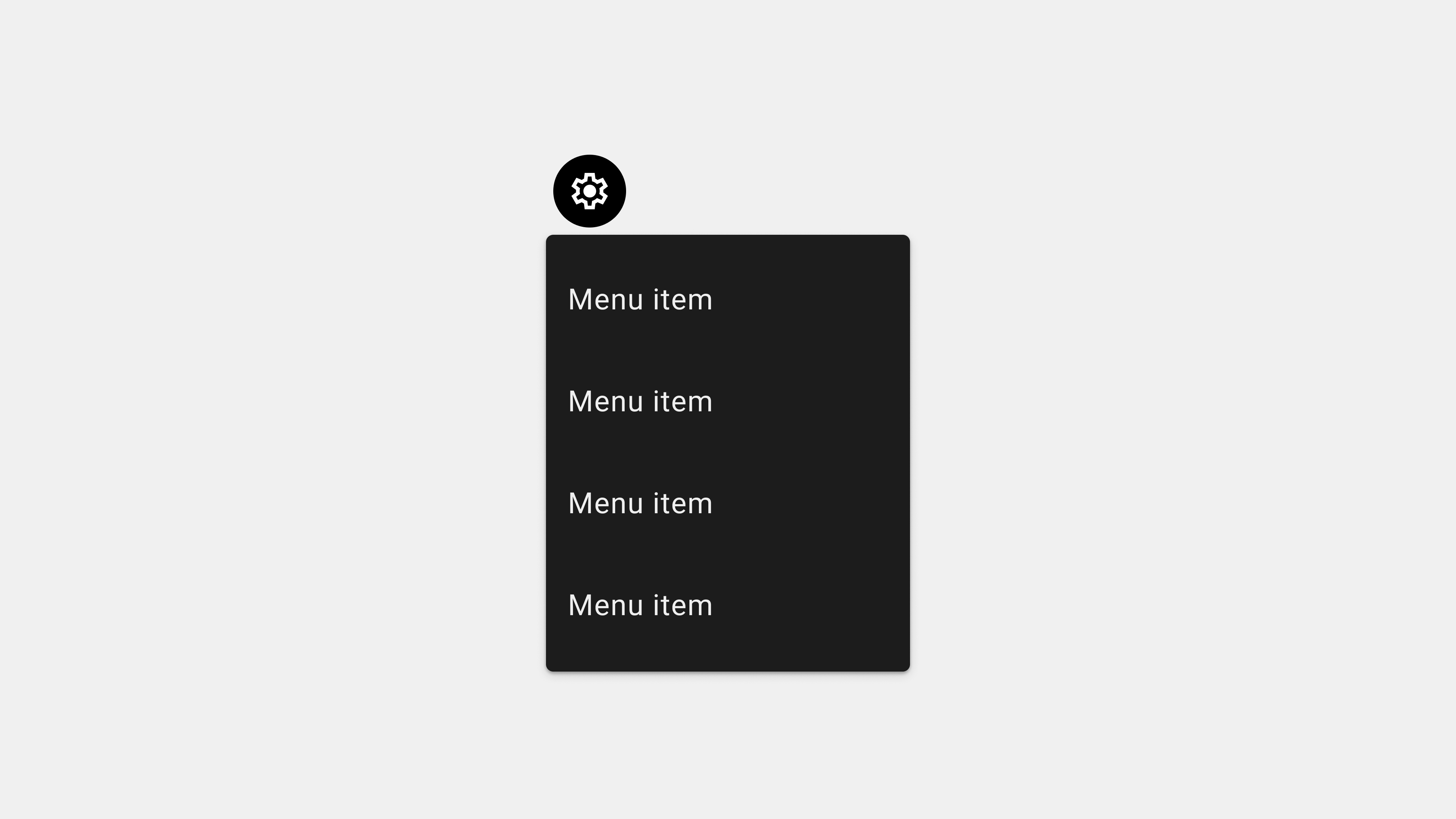
1. What Is a Menu in UI/UX Design?
A menu is a user interface element that presents a list of options or commands to the user. These options can include navigation links, actions, or settings that enable users to interact with the system.
Purpose of Menus
- Navigation: Help users move between different sections of an application or website.
- Task Execution: Provide quick access to actions such as saving, sharing, or deleting.
- Settings Management: Enable users to configure app or system preferences.
Key Characteristics
- Hierarchy: Menus often use a structured hierarchy to organize options logically.
- Visibility: Menus should be easily discoverable and accessible.
- Consistency: A consistent menu layout enhances usability and familiarity.
2. Types of Menus in UI Design
Menus come in various forms, each suited for specific use cases.
A. Navigation Menus
These menus provide links to primary sections of an app or website.
Examples
- Horizontal Menus: Found at the top of web pages for global navigation.
- Vertical Menus: Typically located on the side for categorized options.
- Hamburger Menus: Collapsible menus, common in mobile apps, accessed via a three-line icon.
Use Cases
- Websites with multiple sections like “Home,” “About,” and “Contact.”
- Mobile apps requiring compact navigation.
B. Contextual Menus
These menus appear based on user actions, offering relevant options.
Examples
- Right-click menus on desktop applications.
- Long-press menus on mobile devices.
Use Cases
- Providing quick access to file options like “Copy,” “Rename,” or “Delete.”
C. Dropdown Menus
Menus that expand vertically or horizontally when clicked or hovered over.
Examples
- Account settings menus accessed by clicking a profile icon.
- Submenus in navigation bars.
Use Cases
- Organizing hierarchical information or settings under a single label.
D. Mega Menus
Large menus that display multiple options and subcategories at once.
Examples
- E-commerce sites showing product categories like “Men,” “Women,” and “Kids.”
Use Cases
- Websites with extensive content or product catalogs.
E. Command Menus
Menus used in applications to execute specific actions.
Examples
- Text editor menus for actions like “Cut,” “Paste,” or “Undo.”
- Media player controls for “Play,” “Pause,” or “Skip.”
Use Cases
- Productivity tools requiring task-specific actions.
3. Best Practices for Designing Menus
Creating an effective menu involves balancing usability, accessibility, and aesthetics.
A. Prioritize Simplicity and Clarity
Menus should be intuitive, helping users find what they need quickly.
Tips
- Limit the number of menu items to avoid overwhelming users.
- Use clear, descriptive labels for each menu option.
B. Ensure Accessibility
Inclusive design ensures all users, including those with disabilities, can interact with the menu.
Tips
- Use ARIA roles and attributes for screen reader compatibility.
- Test color contrast and keyboard navigation to meet WCAG standards.
C. Maintain Consistency
Consistent menu design helps users develop a mental model, reducing the learning curve.
Tips
- Use the same menu layout and behavior across all screens or pages.
- Standardize iconography and terminology.
D. Optimize for Responsiveness
Menus should work seamlessly across devices and screen sizes.
Tips
- Implement collapsible menus or hamburger menus for mobile devices.
- Test layouts in portrait and landscape orientations.
E. Incorporate Feedback and Interaction States
Menus should provide visual cues and feedback to enhance user confidence.
Tips
- Highlight the active menu item to indicate the current page or section.
- Use hover effects, animations, or sound cues to confirm interactions.
4. Common Challenges in Menu Design
A. Overcrowded Menus
Menus with too many options can overwhelm users and reduce usability.
Solution
- Prioritize essential items and group secondary options under submenus.
B. Ambiguous Labels
Vague or unclear labels can confuse users about the purpose of a menu item.
Solution
- Use user-friendly, action-oriented language that aligns with user expectations.
C. Poor Accessibility
Menus that cannot be navigated with a keyboard or screen reader exclude users with disabilities.
Solution
- Test menus with assistive technologies and ensure compliance with accessibility standards.
5. Examples of Excellent Menu Design
A. Apple Website
- Type: Horizontal navigation bar with dropdowns.
- Why It Works: Clear organization of products, services, and support options.
B. Amazon Website
- Type: Vertical mega menu for product categories.
- Why It Works: Allows users to quickly find specific product categories.
C. Google Docs
- Type: Command menu with task-specific options.
- Why It Works: Streamlines productivity with intuitive labels and actions.
6. Tools for Menu Design and Development
A. Design Tools
- Figma: For wireframing and prototyping menu layouts.
- Sketch: For designing and testing menu interactions.
B. Development Tools
- React Menu: For implementing dynamic, responsive menus.
- Bootstrap: For prebuilt menu components and frameworks.
C. Testing Tools
- Axe Accessibility Checker: For accessibility audits.
- BrowserStack: For cross-browser compatibility testing.
Conclusion
Menus are indispensable elements of any user interface, serving as the gateway to content and functionality. By understanding the types of menus, adhering to best practices, and addressing common challenges, designers and developers can create menus that are intuitive, accessible, and user-friendly. Whether navigating a website, exploring a mobile app, or using a desktop application, a well-designed menu enhances the overall user experience.
답글 남기기