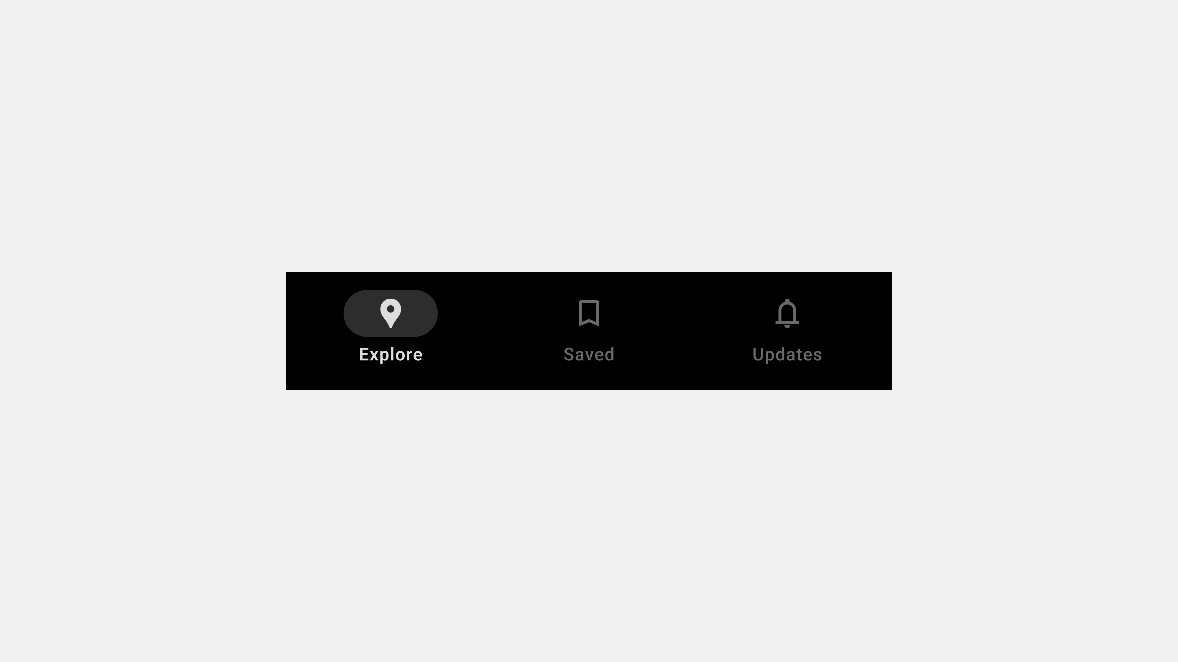
Tab bars are a fundamental component in user interface (UI) design, serving as a primary navigation tool in many modern applications. Particularly popular in mobile apps, tab bars provide users with an intuitive, accessible, and consistent way to switch between key sections. This article delves deeper into the definition and role of tab bars, exploring their importance in enhancing user experience and facilitating seamless navigation.
1. What Is a Tab Bar?
A tab bar is a navigation element typically located at the bottom (for mobile) or top (for web) of an application. It consists of a horizontal row of interactive tabs, each representing a major section or feature of the app.
Key Characteristics of Tab Bars
- Always Visible: Tab bars are persistently displayed across app screens, ensuring constant accessibility.
- Compact Design: They use minimal space while organizing primary navigation options effectively.
- Icons and Labels: Each tab combines an icon and a label to provide clarity about its purpose.
- Interactive Feedback: The active tab is visually distinguished to indicate the user’s current location.
Purpose of Tab Bars
Tab bars simplify navigation by providing direct access to core features. Their structured and familiar layout reduces cognitive load, enabling users to find what they need quickly.
2. The Role of Tab Bars in Navigation
Tab bars play a pivotal role in organizing and streamlining user journeys within an application.
A. Simplifying Navigation
Tab bars reduce the need for complex menus by presenting key sections upfront. Users can access different parts of the app with a single tap, minimizing the steps required to perform tasks.
B. Enhancing Discoverability
By prominently displaying primary features, tab bars improve discoverability. This makes it easier for users to explore and understand the app’s capabilities.
C. Providing Contextual Awareness
Tab bars maintain user orientation within the app by highlighting the active tab. This contextual awareness reassures users and reduces navigation errors.
D. Supporting Multitasking
For apps with multiple functions, tab bars enable seamless switching between tasks without disrupting workflows.
E. Promoting Consistency
Tab bars establish a consistent navigation framework, ensuring users can navigate the app predictably across different screens and sessions.
3. Benefits of Tab Bars
A. Efficiency
Tab bars enable faster navigation by providing direct access to key sections.
B. Space Optimization
Their compact design conserves screen space, making them ideal for mobile devices with limited display areas.
C. Intuitive Design
The combination of icons and labels ensures clarity, even for first-time users.
D. Accessibility
Positioned within thumb-reach zones, tab bars are ergonomically optimized for one-handed use.
E. Visual Consistency
They maintain a uniform layout across app screens, reinforcing brand identity and user familiarity.
4. The Anatomy of a Tab Bar
A well-designed tab bar consists of several key components that work together to create a seamless navigation experience.
A. Tabs
- Definition: Individual navigation points within the tab bar, each representing a unique section.
- Design: Tabs typically include an icon and a text label for clarity.
B. Active State Indicator
- Definition: A visual cue (e.g., color change, underline, or bold text) that highlights the active tab.
- Purpose: Provides users with contextual awareness of their current location.
C. Overflow Menu
- Definition: An additional menu for tabs that don’t fit within the visible space.
- Use Case: Common in apps with numerous sections or features.
5. Common Use Cases for Tab Bars
Tab bars are versatile and can be adapted to various types of applications.
A. Social Media Apps
- Example: Instagram’s tab bar includes “Home,” “Search,” “Reels,” “Shopping,” and “Profile.”
- Purpose: Organizes core social and content discovery features.
B. E-Commerce Platforms
- Example: Amazon’s tab bar includes “Home,” “Categories,” “Cart,” “Orders,” and “Account.”
- Purpose: Facilitates quick access to shopping-related tasks.
C. Productivity Tools
- Example: Google Drive’s tab bar includes “My Drive,” “Shared,” “Recent,” “Starred,” and “Trash.”
- Purpose: Streamlines navigation for document management.
D. Entertainment Apps
- Example: Netflix’s tab bar includes “Home,” “Search,” “Coming Soon,” “Downloads,” and “More.”
- Purpose: Enhances content discovery and user engagement.
6. Best Practices for Designing Tab Bars
To maximize the effectiveness of tab bars, designers must follow best practices that prioritize usability and accessibility.
A. Limit the Number of Tabs
- Recommendation: Use 3-5 tabs to avoid clutter and cognitive overload.
- Reason: Too many tabs can overwhelm users and make navigation difficult.
B. Use Descriptive Labels
- Recommendation: Pair icons with clear, concise text labels.
- Reason: Text labels provide context, ensuring users understand each tab’s function.
C. Highlight the Active Tab
- Recommendation: Use visual indicators like color changes or bold text to denote the active tab.
- Reason: Helps users maintain orientation within the app.
D. Ensure Accessibility
- Recommendation: Optimize for screen readers and include high-contrast designs for visibility.
- Reason: Accessibility enhances inclusivity and usability for all users.
E. Test for Ergonomics
- Recommendation: Place the tab bar within thumb-reach zones for comfortable interaction.
- Reason: Improves ease of use, especially on mobile devices.
7. Challenges and Solutions in Implementing Tab Bars
A. Overcrowding
Challenge: Adding too many tabs can make the interface feel cluttered.
Solution: Prioritize core features and use an overflow menu for secondary options.
B. Ambiguous Icons
Challenge: Icons without labels may confuse users.
Solution: Pair every icon with a descriptive text label.
C. Cross-Platform Consistency
Challenge: Ensuring the tab bar functions consistently across devices.
Solution: Design responsive layouts that adapt to different screen sizes and orientations.
Conclusion
Tab bars are an indispensable element of modern UI design, offering users a simple and efficient way to navigate applications. Their compact design, intuitive functionality, and consistent layout enhance usability, accessibility, and overall user satisfaction. By understanding the definition, role, and best practices for tab bars, designers and developers can create navigation systems that meet user needs and elevate the overall digital experience.

답글 남기기