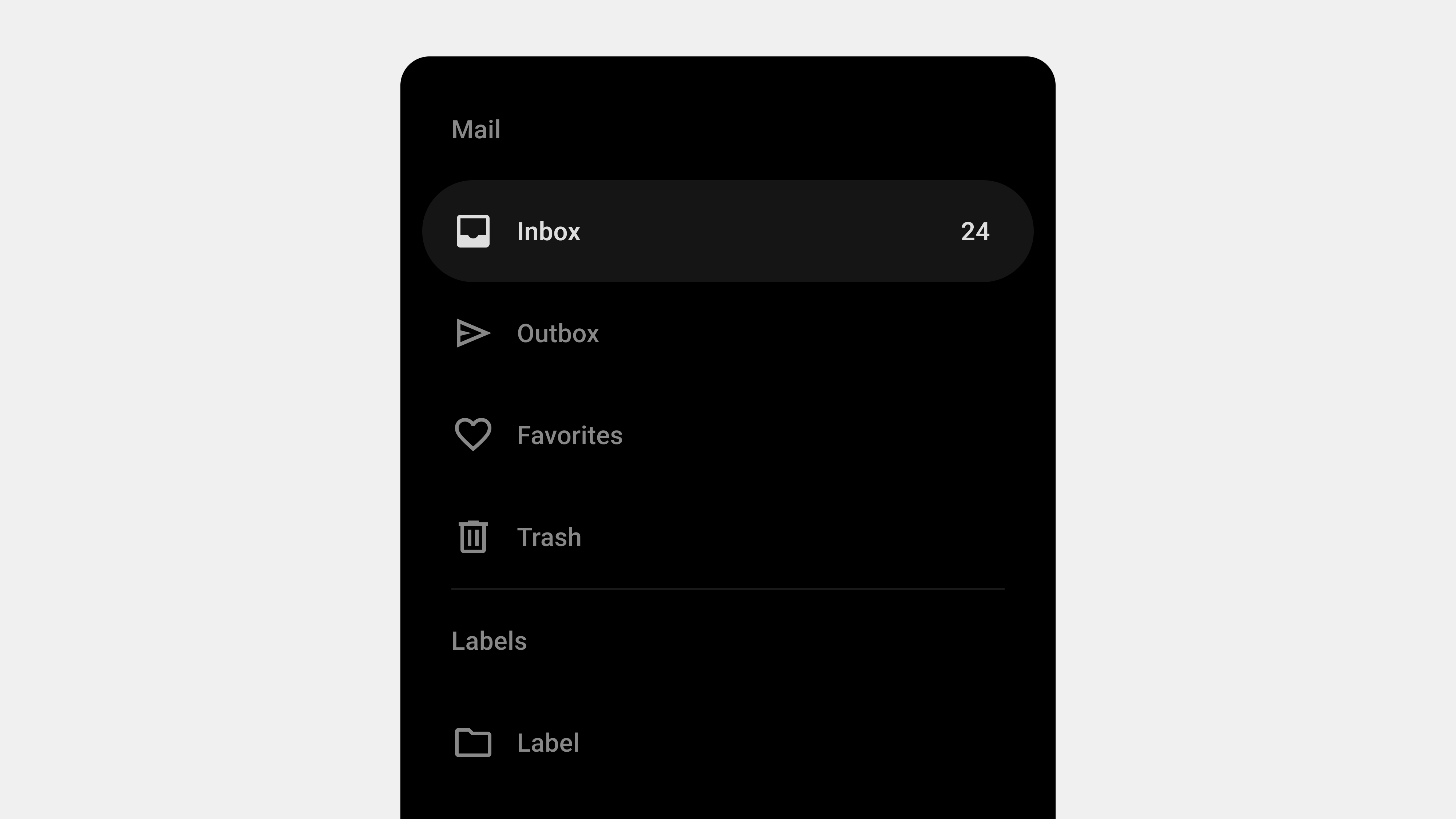
Designing Navigation Drawer Wireframes: 5 Key Considerations
Navigation drawers are critical for organizing and structuring digital platforms, particularly in mobile and web applications. When creating wireframes or storyboards for a navigation drawer, careful planning is essential to ensure usability, accessibility, and scalability. This article outlines the five most important factors to consider when designing navigation drawer wireframes, tailored for designers, publishers, developers, and QA professionals.
1. Information Architecture and Hierarchy
Why It Matters
A well-organized navigation drawer helps users quickly locate the features or content they need. Poor information architecture can confuse users, increasing cognitive load and navigation time.
Key Considerations
- Group Related Items: Organize menu items into logical categories.
- Prioritize Key Features: Place the most important or frequently used items at the top.
- Use Progressive Disclosure: Hide secondary or less critical items in collapsible submenus.
How to Implement in Wireframes
- Clearly label categories and subcategories.
- Use visual separators or headers to distinguish groups.
- Indicate expandable menus with icons or arrows.
Example
An e-commerce app’s drawer might have:
- Primary Items: “Home,” “Categories,” “Cart.”
- Secondary Items: “Order History,” “Help.”
- Collapsible Sections: “Clothing,” “Electronics” under “Categories.”
For the Team
- Designers: Focus on visual clarity for the hierarchy.
- Developers: Ensure nested menus function as intended.
- QA: Test usability for all menu levels.
2. Responsiveness and Adaptability
Why It Matters
Navigation drawers must adapt seamlessly to different devices, screen sizes, and orientations. A responsive design ensures consistent functionality and usability across platforms.
Key Considerations
- Mobile Optimization: Use full-screen drawers or bottom drawers for smaller screens.
- Desktop Adaptation: Opt for persistent or collapsible sidebars for larger screens.
- Orientation Changes: Ensure the layout adjusts smoothly between portrait and landscape modes.
How to Implement in Wireframes
- Create wireframes for multiple breakpoints (e.g., mobile, tablet, desktop).
- Indicate how the drawer opens (e.g., swipe, toggle button).
- Show different states: collapsed, expanded, and persistent.
Example
For a news app:
- Mobile: Temporary drawer with swipe-to-open functionality.
- Tablet: Persistent drawer showing icons and labels.
- Desktop: Full-width persistent sidebar with detailed categories.
For the Team
- Designers: Create responsive prototypes for usability testing.
- Publishers: Optimize styles for CSS breakpoints.
- QA: Test functionality across devices and orientations.
3. Accessibility Compliance
Why It Matters
Accessibility ensures that all users, including those with disabilities, can interact with the navigation drawer effectively. This is not only ethically essential but also legally required in many regions.
Key Considerations
- Keyboard Navigation: Ensure the drawer can be opened, closed, and navigated using a keyboard.
- Screen Reader Support: Use semantic HTML and ARIA roles to describe elements.
- Focus Indicators: Highlight interactive elements for visually impaired users.
How to Implement in Wireframes
- Annotate elements with accessibility labels and roles.
- Highlight focus states and keyboard shortcuts in the design.
- Include notes for developers on ARIA role implementation.
Example
In a financial app:
- The toggle button has an ARIA label like “Open Menu.”
- Focus automatically shifts to the first menu item when the drawer opens.
- A “Close Drawer” button is always accessible.
For the Team
- Designers: Use tools like Stark for contrast and readability checks.
- Developers: Implement and test ARIA roles.
- QA: Test screen reader and keyboard navigation compatibility.
4. Feedback and Interaction Design
Why It Matters
Users need clear visual and interactive cues to understand the state and functionality of the navigation drawer. Without proper feedback, users may struggle to interact effectively.
Key Considerations
- Opening and Closing Feedback: Use smooth animations to show transitions.
- Active State Indicators: Highlight the current menu item to orient users.
- Error States: Provide feedback for scenarios like broken links or failed dynamic loading.
How to Implement in Wireframes
- Indicate animation directions (e.g., slide-in, fade).
- Mark active and hover states for menu items.
- Include error messages or loading indicators for dynamic content.
Example
In a food delivery app:
- The drawer slides in from the left with a semi-transparent overlay.
- The active menu item (“Current Orders”) is highlighted with a bold underline.
- Dynamic sections show a loading spinner when fetching new content.
For the Team
- Designers: Annotate wireframes with animation details.
- Developers: Implement animations using CSS or JavaScript.
- QA: Test all interaction states, including error handling.
5. Scalability and Future Growth
Why It Matters
Navigation systems often grow as new features are added. Planning for scalability ensures that the navigation drawer remains functional and user-friendly over time.
Key Considerations
- Modular Design: Use a flexible structure that can accommodate additional items.
- Dynamic Content: Prepare for personalization or role-based menus.
- Fallback Options: Ensure the drawer remains usable if features are temporarily unavailable.
How to Implement in Wireframes
- Leave space for future menu items or categories.
- Use placeholders or notes for dynamic content.
- Show how the drawer adapts to different user roles or permissions.
Example
In an enterprise app:
- Admin users see options like “User Management” and “Reports.”
- Regular users only see “Dashboard” and “Profile.”
- Dynamic sections like “Recent Files” update based on user activity.
For the Team
- Designers: Plan for modular layouts and reusable components.
- Developers: Use scalable data structures for dynamic menus.
- QA: Test with different user roles and menu configurations.
Conclusion
Designing wireframes for navigation drawers is a collaborative process that requires input from designers, publishers, developers, and QA professionals. By focusing on information architecture, responsiveness, accessibility, interaction feedback, and scalability, teams can create navigation drawers that are intuitive, user-friendly, and adaptable to future needs. Proper planning and thorough testing ensure a seamless experience for all users, regardless of device or ability.

답글 남기기