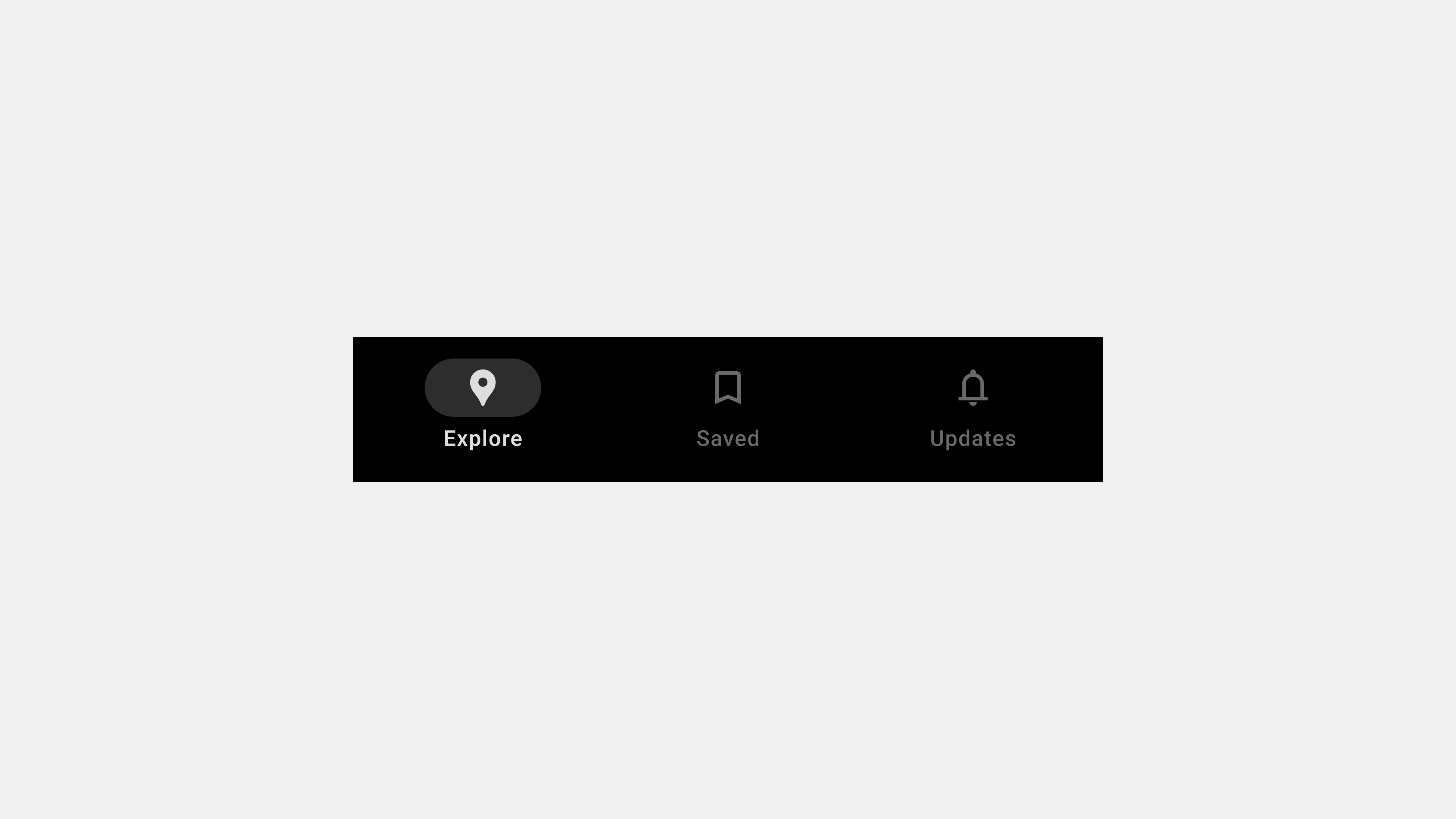
Key Considerations for Creating Bottom Navigation Bar Wireframes
Bottom navigation bars are a fundamental part of modern app interfaces, serving as a centralized navigation tool for accessing primary app features. Crafting effective wireframes for bottom navigation bars requires careful attention to usability, accessibility, and functionality. This article highlights five essential considerations for designing wireframes, providing actionable insights tailored for designers, publishers, developers, and QA teams.
1. Simplicity and Clarity in Design
Why It Matters
A simple and clear navigation bar ensures users can easily understand and navigate the app. Overcomplicating the design with too many tabs or unclear labels can confuse users and hinder usability.
Key Considerations
- Limit the Number of Tabs: Use 3-5 tabs to keep the design focused and user-friendly.
- Descriptive Labels: Pair icons with concise, descriptive labels to clarify functionality.
- Visual Hierarchy: Ensure the active tab is visually distinct using color, bold text, or underlines.
For Teams
- Designers: Create wireframes with clear spacing and alignment.
- Publishers: Ensure that text labels fit properly without truncation.
- Developers: Implement scalable designs to accommodate localization.
- QA: Verify that all labels and icons are intuitive and legible.
Example
A social media app may feature tabs like “Home,” “Search,” “Notifications,” and “Profile,” each paired with an intuitive icon for clarity.
2. Responsiveness and Adaptability
Why It Matters
Bottom navigation bars must adapt seamlessly to different screen sizes, resolutions, and device orientations. A responsive design ensures a consistent and accessible user experience across devices.
Key Considerations
- Dynamic Sizing: Design tabs that scale proportionally to fit various screen widths.
- Touch-Friendly Targets: Ensure tap areas are large enough for comfortable interaction, even on small screens.
- Orientation Changes: Test layouts in both portrait and landscape orientations to maintain usability.
For Teams
- Designers: Prototype wireframes for different devices and orientations.
- Publishers: Use flexible CSS styles for dynamic scaling.
- Developers: Implement breakpoints to adjust layouts responsively.
- QA: Test navigation bar behavior across devices and screen orientations.
Example
In a fitness app, the navigation bar remains accessible and functional whether the user is holding their phone in portrait or landscape mode.
3. Accessibility and Inclusive Design
Why It Matters
Inclusive design ensures that all users, including those with disabilities, can interact with the app effectively. Failing to address accessibility can exclude a significant portion of your user base.
Key Considerations
- Keyboard Navigation: Ensure users can navigate tabs using only a keyboard.
- Screen Reader Support: Use ARIA labels and roles to make tabs accessible to screen readers.
- Color Contrast: Ensure sufficient contrast between text/icons and the background for readability.
For Teams
- Designers: Annotate wireframes with accessibility guidelines, such as color contrast ratios and ARIA attributes.
- Publishers: Implement high-contrast themes and accessible font sizes.
- Developers: Use semantic HTML elements to support screen readers.
- QA: Test the navigation bar with assistive technologies like VoiceOver or NVDA.
Example
In an e-commerce app, each tab is clearly labeled and announced by screen readers as “Home tab, selected” or “Cart tab, not selected.”
4. Dynamic and Contextual Features
Why It Matters
Modern apps often require bottom navigation bars to handle dynamic content and adapt based on user behavior or app state. Wireframes should account for these scenarios to ensure smooth implementation.
Key Considerations
- Dynamic Tabs: Design placeholders for tabs that change based on user preferences or roles.
- Context Awareness: Plan for tabs that appear or disappear depending on the app state.
- Loading Indicators: Include feedback mechanisms for tabs that fetch dynamic content.
For Teams
- Designers: Use annotations in wireframes to indicate dynamic elements.
- Publishers: Ensure layouts accommodate changes in tab content or labels.
- Developers: Implement logic to handle dynamic tab visibility and content updates.
- QA: Test transitions and state changes to ensure smooth operation.
Example
In a streaming app, the “Downloads” tab only appears when offline content is available, dynamically adjusting based on the user’s activity.
5. Feedback and Visual Indicators
Why It Matters
Users rely on visual cues to understand the current state of the app and interact confidently with the navigation bar. Clear feedback improves usability and reduces errors.
Key Considerations
- Active State Indicators: Highlight the selected tab using distinct colors, bold text, or underlines.
- Hover and Focus States: Provide visual feedback for interactive elements, especially on desktop and web apps.
- Error and Loading States: Show clear messages or icons for tabs that fail to load content.
For Teams
- Designers: Create style guides for active, hover, and error states.
- Publishers: Implement consistent visual styles across all tabs.
- Developers: Use CSS animations for smooth transitions and feedback.
- QA: Test all interaction states, including hover, focus, and error scenarios.
Example
In a travel app, a loading spinner appears on the “Bookings” tab while fetching user data, providing clear feedback during delays.
Conclusion
Designing wireframes for bottom navigation bars involves balancing simplicity, responsiveness, accessibility, dynamic functionality, and feedback. By focusing on these five key areas, teams can create navigation systems that enhance usability and provide a seamless experience for users. Collaboration among designers, publishers, developers, and QA teams is crucial to ensuring the final product meets user needs and expectations.

답글 남기기