[카테고리:] BOTTOM NAVIGATION BAR

  • 바텀 내비게이션 바 – 7. 디자인

    바텀 내비게이션 바 – 7. 디자인

    바텀 내비게이션 바 디자인: 사용자 중심 UI/UX를 위한 주의사항 5가지

    바텀 내비게이션 바(Bottom Navigation Bar)는 모바일 애플리케이션에서 사용자 경험(UX)을 크게 좌우하는 핵심 UI 요소다. 사용자 중심의 설계를 통해 직관적인 탐색 경험과 높은 만족도를 제공하려면 디자인 단계에서 특별히 주의해야 할 요소들이 있다. 이번 글에서는 사용자 중심 UI/UX를 고려하여 바텀 내비게이션 바를 설계할 때 반드시 주의해야 할 다섯 가지를 상세히 설명한다.


    1. 정보 구조의 명확성: 사용자 기대를 충족하는 메뉴 구성

    왜 중요한가?

    바텀 내비게이션 바는 사용자가 주요 화면을 탐색하는 출발점이다. 메뉴 구성이 혼란스럽거나 불필요한 요소가 많다면 사용자 경험이 크게 저하될 수 있다.

    고려 사항

    1. 핵심 기능만 포함
      • 사용 빈도가 높은 3~5개의 메뉴만 포함.
      • 예: 홈, 검색, 알림, 프로필.
    2. 논리적 순서로 배치
      • 사용자의 예상 흐름에 따라 메뉴를 배열.
      • 예: 홈 → 검색 → 알림 → 설정.
    3. 명확한 메뉴 이름 사용
      • 간결하고 직관적인 용어로 라벨을 설정.
      • 예: “내 정보” 대신 “프로필”.

    주의해야 할 점

    • 너무 많은 메뉴를 포함하면 사용자 혼란이 가중될 수 있다.
    • 메뉴 이름이 직관적이지 않으면 사용자는 올바른 선택을 할 수 없다.

    개선 방안

    • 사용자 행동 데이터를 분석해 주요 기능을 파악.
    • 반복 테스트를 통해 메뉴 구성의 직관성을 검증.

    2. 디자인 일관성: 브랜드 정체성과 시각적 통일성 유지

    왜 중요한가?

    디자인의 일관성은 서비스 신뢰도와 사용성을 높이는 데 필수적이다. 바텀 내비게이션 바는 브랜드의 첫인상을 형성하는 주요 요소 중 하나다.

    고려 사항

    1. 브랜드 색상과 스타일 반영
      • 서비스의 주요 색상과 폰트를 내비게이션 바에 적용.
      • 예: 브랜드의 주요 색상을 활성화된 탭 강조 색으로 사용.
    2. 아이콘과 텍스트 스타일 통일
      • 모든 아이콘의 크기와 스타일, 텍스트의 폰트와 크기를 동일하게 설정.
    3. 전반적인 UI 디자인과의 조화
      • 앱의 다른 UI 요소와 통일된 톤앤매너를 유지.

    주의해야 할 점

    • 브랜드를 강조하려다 과도한 디자인 요소를 포함하지 않도록 주의.
    • 시각적 요소가 사용성을 저해하지 않도록 균형을 유지.

    개선 방안

    • 브랜드 가이드라인을 참고하여 디자인을 일관되게 적용.
    • 디자인 일관성 테스트를 통해 불일치를 발견하고 수정.

    3. 접근성 강화: 누구나 쉽게 사용할 수 있는 설계

    왜 중요한가?

    접근성은 모든 사용자가 서비스에 쉽게 접근할 수 있도록 보장하며, 포괄적인 사용자 경험을 제공한다.

    고려 사항

    1. 충분한 색상 대비 제공
      • 텍스트와 배경 간 색상 대비를 강화하여 시각적 인식력을 높인다.
    2. 터치 영역 확대
      • 각 버튼의 터치 영역은 최소 48px로 설정해 실수 클릭을 방지.
    3. 스크린 리더 지원
      • ARIA 속성을 추가해 스크린 리더가 각 메뉴를 명확히 설명할 수 있도록 한다.

    주의해야 할 점

    • 색상 대비가 낮아 시각 장애 사용자가 메뉴를 식별하기 어려운 경우가 발생할 수 있다.
    • 터치 영역이 작으면 사용성이 떨어지고 실수로 클릭할 가능성이 증가한다.

    개선 방안

    • WCAG(Web Content Accessibility Guidelines) 준수를 목표로 설계.
    • 실제 사용 사례를 기반으로 접근성 테스트를 반복.

    4. 피드백과 인터랙션: 사용자 행동에 즉각적으로 반응

    왜 중요한가?

    사용자는 자신의 행동이 즉각적으로 반영되는 피드백을 기대하며, 이를 통해 서비스에 대한 신뢰를 형성한다.

    고려 사항

    1. 활성화된 탭 강조
      • 선택된 탭은 색상, 밑줄, 아이콘 변화 등으로 시각적으로 구분.
    2. 애니메이션 효과 추가
      • 화면 전환 시 부드럽고 자연스러운 애니메이션을 제공.
    3. 즉각적인 반응 속도 보장
      • 클릭 또는 터치 후 지연 없이 반응.

    주의해야 할 점

    • 과도한 애니메이션은 성능 저하를 유발할 수 있다.
    • 피드백이 불명확하면 사용자가 혼란을 느낄 수 있다.

    개선 방안

    • GPU 기반 애니메이션으로 부드럽고 빠른 반응을 제공.
    • 활성화 상태와 비활성화 상태를 명확히 구분.

    5. 반응형 설계: 다양한 디바이스 환경에 최적화

    왜 중요한가?

    모바일 디바이스마다 화면 크기와 해상도가 다르므로, 바텀 내비게이션 바가 다양한 환경에서 일관된 경험을 제공해야 한다.

    고려 사항

    1. 디바이스 크기별 레이아웃 최적화
      • 화면 크기와 해상도에 따라 내비게이션 바 크기와 요소 간 간격을 조정.
    2. 가로모드 지원
      • 사용자가 가로모드로 전환해도 UI가 깨지지 않도록 설계.
    3. 터치 스크린 친화성 강화
      • 화면 크기가 작은 디바이스에서도 사용성을 유지.

    주의해야 할 점

    • 특정 디바이스에서 UI 요소가 겹치거나 잘리는 문제가 발생할 수 있다.
    • 터치 영역이 화면 크기에 따라 축소되면 사용성이 저하된다.

    개선 방안

    • CSS 미디어 쿼리를 사용해 다양한 화면 크기에 대응.
    • 실제 디바이스에서 반응형 테스트를 반복적으로 실행.

    결론

    바텀 내비게이션 바는 단순한 탐색 도구를 넘어 사용자 경험과 브랜드 이미지를 형성하는 중요한 UI 요소다. 정보 구조의 명확성, 디자인 일관성, 접근성 강화, 사용자 피드백 제공, 반응형 설계를 모두 충족해야 사용자 중심의 UI/UX를 구현할 수 있다. 이러한 요소를 철저히 고려하여 설계된 바텀 내비게이션 바는 사용자의 탐색 경험을 크게 개선하고 서비스의 가치를 높일 수 있다.


  • Bottom Navigation Bar – 6. Wireframes

    Bottom Navigation Bar – 6. Wireframes

    Key Considerations for Creating Bottom Navigation Bar Wireframes

    Bottom navigation bars are a fundamental part of modern app interfaces, serving as a centralized navigation tool for accessing primary app features. Crafting effective wireframes for bottom navigation bars requires careful attention to usability, accessibility, and functionality. This article highlights five essential considerations for designing wireframes, providing actionable insights tailored for designers, publishers, developers, and QA teams.


    1. Simplicity and Clarity in Design

    Why It Matters

    A simple and clear navigation bar ensures users can easily understand and navigate the app. Overcomplicating the design with too many tabs or unclear labels can confuse users and hinder usability.

    Key Considerations

    • Limit the Number of Tabs: Use 3-5 tabs to keep the design focused and user-friendly.
    • Descriptive Labels: Pair icons with concise, descriptive labels to clarify functionality.
    • Visual Hierarchy: Ensure the active tab is visually distinct using color, bold text, or underlines.

    For Teams

    • Designers: Create wireframes with clear spacing and alignment.
    • Publishers: Ensure that text labels fit properly without truncation.
    • Developers: Implement scalable designs to accommodate localization.
    • QA: Verify that all labels and icons are intuitive and legible.

    Example

    A social media app may feature tabs like “Home,” “Search,” “Notifications,” and “Profile,” each paired with an intuitive icon for clarity.


    2. Responsiveness and Adaptability

    Why It Matters

    Bottom navigation bars must adapt seamlessly to different screen sizes, resolutions, and device orientations. A responsive design ensures a consistent and accessible user experience across devices.

    Key Considerations

    • Dynamic Sizing: Design tabs that scale proportionally to fit various screen widths.
    • Touch-Friendly Targets: Ensure tap areas are large enough for comfortable interaction, even on small screens.
    • Orientation Changes: Test layouts in both portrait and landscape orientations to maintain usability.

    For Teams

    • Designers: Prototype wireframes for different devices and orientations.
    • Publishers: Use flexible CSS styles for dynamic scaling.
    • Developers: Implement breakpoints to adjust layouts responsively.
    • QA: Test navigation bar behavior across devices and screen orientations.

    Example

    In a fitness app, the navigation bar remains accessible and functional whether the user is holding their phone in portrait or landscape mode.


    3. Accessibility and Inclusive Design

    Why It Matters

    Inclusive design ensures that all users, including those with disabilities, can interact with the app effectively. Failing to address accessibility can exclude a significant portion of your user base.

    Key Considerations

    • Keyboard Navigation: Ensure users can navigate tabs using only a keyboard.
    • Screen Reader Support: Use ARIA labels and roles to make tabs accessible to screen readers.
    • Color Contrast: Ensure sufficient contrast between text/icons and the background for readability.

    For Teams

    • Designers: Annotate wireframes with accessibility guidelines, such as color contrast ratios and ARIA attributes.
    • Publishers: Implement high-contrast themes and accessible font sizes.
    • Developers: Use semantic HTML elements to support screen readers.
    • QA: Test the navigation bar with assistive technologies like VoiceOver or NVDA.

    Example

    In an e-commerce app, each tab is clearly labeled and announced by screen readers as “Home tab, selected” or “Cart tab, not selected.”


    4. Dynamic and Contextual Features

    Why It Matters

    Modern apps often require bottom navigation bars to handle dynamic content and adapt based on user behavior or app state. Wireframes should account for these scenarios to ensure smooth implementation.

    Key Considerations

    • Dynamic Tabs: Design placeholders for tabs that change based on user preferences or roles.
    • Context Awareness: Plan for tabs that appear or disappear depending on the app state.
    • Loading Indicators: Include feedback mechanisms for tabs that fetch dynamic content.

    For Teams

    • Designers: Use annotations in wireframes to indicate dynamic elements.
    • Publishers: Ensure layouts accommodate changes in tab content or labels.
    • Developers: Implement logic to handle dynamic tab visibility and content updates.
    • QA: Test transitions and state changes to ensure smooth operation.

    Example

    In a streaming app, the “Downloads” tab only appears when offline content is available, dynamically adjusting based on the user’s activity.


    5. Feedback and Visual Indicators

    Why It Matters

    Users rely on visual cues to understand the current state of the app and interact confidently with the navigation bar. Clear feedback improves usability and reduces errors.

    Key Considerations

    • Active State Indicators: Highlight the selected tab using distinct colors, bold text, or underlines.
    • Hover and Focus States: Provide visual feedback for interactive elements, especially on desktop and web apps.
    • Error and Loading States: Show clear messages or icons for tabs that fail to load content.

    For Teams

    • Designers: Create style guides for active, hover, and error states.
    • Publishers: Implement consistent visual styles across all tabs.
    • Developers: Use CSS animations for smooth transitions and feedback.
    • QA: Test all interaction states, including hover, focus, and error scenarios.

    Example

    In a travel app, a loading spinner appears on the “Bookings” tab while fetching user data, providing clear feedback during delays.


    Conclusion

    Designing wireframes for bottom navigation bars involves balancing simplicity, responsiveness, accessibility, dynamic functionality, and feedback. By focusing on these five key areas, teams can create navigation systems that enhance usability and provide a seamless experience for users. Collaboration among designers, publishers, developers, and QA teams is crucial to ensuring the final product meets user needs and expectations.


  • 바텀 내비게이션 바 – 6. 기획서

    바텀 내비게이션 바 – 6. 기획서

    바텀 내비게이션 바(Bottom Navigation Bar) 와이어프레임 작성 시 중요한 고려 사항

    바텀 내비게이션 바는 모바일 애플리케이션의 주요 UI 컴포넌트로, 탐색 효율성과 사용자 경험(UX)을 극대화하는 데 중요한 역할을 한다. 와이어프레임 단계에서는 디자이너, 퍼블리셔, 개발자, QA가 협력하여 기능과 디자인, 기술적 요구를 균형 있게 반영해야 한다. 이 글에서는 바텀 내비게이션 바 설계 시 와이어프레임 작성에서 반드시 고려해야 할 다섯 가지 핵심 요소를 다룬다.


    1. 정보 구조와 메뉴 구성

    왜 중요한가?

    바텀 내비게이션 바는 주요 화면 간의 탐색을 담당하므로, 정보 구조가 명확해야 사용자 혼란을 줄이고 탐색 효율성을 높일 수 있다.

    고려 사항

    1. 핵심 메뉴 선정
      • 사용 빈도가 높은 3~5개의 기능을 우선 배치.
      • 예: 홈, 검색, 알림, 프로필.
    2. 논리적 순서 배치
      • 사용자가 예상할 수 있는 직관적인 순서로 메뉴를 배치.
      • 예: 홈 → 검색 → 알림 → 설정.
    3. 메뉴 라벨링
      • 간결하면서도 명확한 텍스트를 사용.
      • 예: “설정 메뉴” 대신 “설정”.

    와이어프레임 작성 팁

    • 메뉴 이름과 아이콘의 배치를 시각적으로 명확히 표현.
    • 더보기 버튼(⋯)을 포함해 부가적인 기능을 제공.

    협업 포인트

    • 디자이너: 정보 구조를 시각화하고 사용자 흐름을 설계.
    • 퍼블리셔: HTML 구조와 CSS 스타일링 가능성을 반영.
    • 개발자: 데이터베이스 및 API와의 연결성을 고려.
    • QA: 탐색 시 혼란이 없도록 테스트.

    2. 레이아웃과 반응형 설계

    왜 중요한가?

    모바일 디바이스마다 화면 크기와 비율이 다르기 때문에, 일관된 사용자 경험을 보장하려면 반응형 설계가 필수적이다.

    고려 사항

    1. 디바이스별 최적화
      • 모바일 환경에서는 하단 고정형 바텀 내비게이션 설계.
      • 태블릿에서는 하단 또는 좌우측 레이아웃 선택 가능.
    2. 터치 영역 확보
      • 각 메뉴 항목은 최소 48px 이상으로 설정하여 사용성을 강화.
    3. 화면 회전에 따른 조정
      • 가로모드에서도 내비게이션 바가 적절히 표시되도록 설계.

    와이어프레임 작성 팁

    • 다양한 디바이스 크기에 대응하는 디자인을 포함.
    • 터치 영역이 넉넉한지 시뮬레이션.

    협업 포인트

    • 디자이너: 화면 회전 및 크기 변화 시 UI 요소 배치 확인.
    • 퍼블리셔: CSS 미디어 쿼리 활용 가능 여부 검토.
    • 개발자: 반응형 레이아웃과 동적 크기 조정 로직 구현.
    • QA: 모든 화면 크기와 비율에서 UI 테스트.

    3. 접근성과 사용자 피드백

    왜 중요한가?

    모든 사용자가 서비스에 접근할 수 있도록 설계하는 것은 법적, 윤리적 요구를 충족시킬 뿐만 아니라 사용자층을 확대하는 데도 도움이 된다.

    고려 사항

    1. 스크린 리더 호환성
      • 각 탭의 이름과 상태를 설명하는 ARIA 속성을 추가.
    2. 색상 대비 강화
      • 텍스트와 배경 간 충분한 색상 대비를 제공해 가독성을 높임.
    3. 피드백 제공
      • 활성화된 탭은 색상, 밑줄, 아이콘 변화 등으로 명확히 표시.
      • 클릭이나 터치 후 즉각적인 반응(예: 진동, 색상 변화) 제공.

    와이어프레임 작성 팁

    • 각 탭의 활성화 상태를 명확히 표현.
    • 피드백 요소를 추가하여 인터랙션을 시각화.

    협업 포인트

    • 디자이너: 접근성을 고려한 색상 및 디자인 요소 설계.
    • 퍼블리셔: CSS와 JavaScript로 접근성과 인터랙션 구현 가능성 검토.
    • 개발자: 스크린 리더와의 호환성 및 클릭 이벤트 처리.
    • QA: 실제 스크린 리더를 사용하여 접근성 테스트.

    4. 애니메이션과 전환 효과

    왜 중요한가?

    탭 전환 시 부드러운 애니메이션과 전환 효과는 사용자 경험을 향상시키고, 탐색 과정에서의 혼란을 줄여준다.

    고려 사항

    1. 탭 전환 애니메이션
      • 부드럽고 자연스러운 화면 전환 제공.
      • 예: 슬라이드 또는 페이드 애니메이션.
    2. 반응 속도 최적화
      • 애니메이션은 0.3~0.5초 이내로 설정해 반응성을 유지.
    3. 하드웨어 가속 활용
      • GPU 기반 애니메이션을 사용해 성능 저하를 방지.

    와이어프레임 작성 팁

    • 애니메이션 흐름을 와이어프레임에 포함.
    • 전환 속도를 시뮬레이션하여 사용자 반응 예상.

    협업 포인트

    • 디자이너: 애니메이션 스타일과 속도 정의.
    • 퍼블리셔: CSS 애니메이션 구현 가능성 검토.
    • 개발자: 하드웨어 가속 애니메이션 구현.
    • QA: 전환 속도와 부드러움을 다양한 디바이스에서 테스트.

    5. 브랜드 아이덴티티와 디자인 일관성

    왜 중요한가?

    바텀 내비게이션 바는 서비스의 전반적인 디자인 언어와 브랜드 정체성을 표현하는 데 중요한 역할을 한다.

    고려 사항

    1. 브랜드 색상 반영
      • 브랜드의 주요 색상을 텍스트, 아이콘, 배경 등에 적용.
    2. 일관된 스타일 유지
      • 서비스 전반에서 사용되는 아이콘 스타일, 폰트, 간격 등이 통일되어야 한다.
    3. 시각적 균형 유지
      • 디자인이 심미적이면서도 사용성을 저해하지 않도록 조화롭게 설계.

    와이어프레임 작성 팁

    • 브랜드 가이드라인을 참고하여 색상과 스타일 적용.
    • 디자인 요소의 가독성과 심미성을 동시에 검토.

    협업 포인트

    • 디자이너: 브랜드 일관성을 고려한 디자인 설계.
    • 퍼블리셔: CSS를 통해 브랜드 색상과 스타일 구현.
    • 개발자: 색상 및 디자인 변경이 기능에 영향을 미치지 않도록 최적화.
    • QA: 모든 화면에서 디자인의 일관성 유지 여부 확인.

    결론

    바텀 내비게이션 바는 단순한 탐색 도구를 넘어 사용자 경험과 브랜드 가치를 전달하는 핵심 UI 요소다. 정보 구조 설계, 반응형 레이아웃, 접근성과 피드백 강화, 애니메이션 최적화, 브랜드 일관성을 모두 고려한 와이어프레임은 성공적인 바텀 내비게이션 바 구현의 기초가 된다. 디자이너, 퍼블리셔, 개발자, QA가 협력하여 각 요소를 조화롭게 설계하고 테스트하면, 사용자와 서비스 모두 만족할 수 있는 결과를 얻을 수 있다.


  • Bottom Navigation Bars – Product Owner 1

    Bottom Navigation Bars – Product Owner 1

    Designing Bottom Navigation Bars: Meeting User Expectations

    Bottom navigation bars are a critical component of mobile app design, providing users with quick and intuitive access to an app’s key features. Users approach these navigation systems with certain expectations, and service planners must align design and functionality with these expectations to enhance user experience. This article explores what users expect from bottom navigation bars and outlines actionable steps service planners can take to meet these needs effectively.


    1. User Expectations for Bottom Navigation Bars

    Users interact with bottom navigation bars based on their prior experiences with similar apps, forming specific expectations about their functionality and design.

    A. Simplicity and Clarity

    • Expectation: Users expect bottom navigation bars to be straightforward and easy to understand.
    • Details: Tabs should have clear labels and intuitive icons that reflect their purpose.
    • Why It Matters: Overcomplicated or unclear navigation systems can frustrate users and reduce engagement.

    B. Quick Access to Core Features

    • Expectation: Users want to access an app’s primary features quickly and directly.
    • Details: Tabs should provide shortcuts to key sections without requiring additional steps.
    • Why It Matters: Reduces the time users spend navigating, improving overall satisfaction.

    C. Consistency Across Screens

    • Expectation: Users expect the navigation bar to remain consistent throughout their app experience.
    • Details: The bar should maintain the same design and functionality across all screens.
    • Why It Matters: Builds familiarity and trust, making navigation predictable.

    D. Feedback and Contextual Awareness

    • Expectation: Users rely on feedback to understand their current location within the app.
    • Details: Active tabs should be visually distinct, and transitions should be smooth.
    • Why It Matters: Helps users stay oriented and reduces cognitive load.

    E. Accessibility and Ease of Use

    • Expectation: Navigation should be accessible to all users, including those with disabilities.
    • Details: Tabs should be touch-friendly, screen reader-compatible, and visually clear.
    • Why It Matters: Inclusive design ensures that all users can navigate the app effectively.

    2. Responsibilities of Service Planners

    To meet user expectations, service planners must adopt a user-centric approach when designing bottom navigation bars.

    A. Conduct User Research

    • Why It Matters: Understanding user behavior and preferences ensures that the navigation design aligns with their needs.
    • Actions to Take:
      • Conduct surveys or interviews to gather insights into user navigation habits.
      • Analyze competitor apps to identify successful navigation patterns.
      • Use analytics tools to track user interactions with existing navigation systems.

    B. Focus on Simplicity and Prioritization

    • Why It Matters: A cluttered navigation bar can overwhelm users and reduce usability.
    • Actions to Take:
      • Limit the number of tabs to 3-5 to avoid overcrowding.
      • Prioritize core features that users interact with most frequently.
      • Group less important features into an overflow menu.

    C. Design for Accessibility

    • Why It Matters: Inclusive design ensures a positive experience for all users.
    • Actions to Take:
      • Add ARIA labels and roles for screen reader compatibility.
      • Test navigation bars with assistive technologies like VoiceOver or NVDA.
      • Ensure sufficient contrast between text/icons and the background.

    D. Provide Clear Feedback and Visual Cues

    • Why It Matters: Users need clear indicators to understand their current location and navigation progress.
    • Actions to Take:
      • Highlight active tabs using distinct colors, bold text, or underlines.
      • Use subtle animations to provide feedback during transitions.
      • Ensure hover and focus states are visually apparent for desktop and web apps.

    E. Iterate and Test Designs

    • Why It Matters: Iterative testing ensures that the navigation bar meets user needs and adapts to feedback.
    • Actions to Take:
      • Use A/B testing to compare different navigation designs.
      • Gather user feedback through usability testing sessions.
      • Continuously analyze navigation metrics to identify areas for improvement.

    3. Common Challenges and Solutions

    A. Overcrowding Tabs

    Challenge: Adding too many tabs makes navigation overwhelming and confusing.
    Solution: Prioritize the most critical features and use an overflow menu for secondary options.

    B. Misaligned Labels or Icons

    Challenge: Ambiguous labels or icons can confuse users about the purpose of a tab.
    Solution: Use familiar language and universally recognized icons to ensure clarity.

    C. Inconsistent Behavior Across Screens

    Challenge: Tabs behaving differently on different screens disrupts user flow.
    Solution: Maintain consistent functionality and design for the navigation bar throughout the app.


    4. Practical Examples of Effective Bottom Navigation Bars

    A. Social Media App

    • Tabs: Home, Search, Notifications, Profile.
    • Design Elements: Clear labels, consistent placement, and active state indicators.

    B. E-Commerce App

    • Tabs: Shop, Categories, Cart, Orders, Account.
    • Design Elements: Prominent icons, concise labels, and a touch-friendly layout.

    C. Productivity Tool

    • Tabs: Dashboard, Calendar, Tasks, Messages, Settings.
    • Design Elements: Adaptive tabs that highlight active states and offer quick feedback.

    Conclusion

    Designing bottom navigation bars from a user’s perspective requires a deep understanding of their expectations and behaviors. By focusing on simplicity, accessibility, consistency, and feedback, service planners can create navigation systems that meet user needs and enhance overall satisfaction. Regular testing and iteration ensure the design remains effective, adaptable, and user-friendly.


  • 바텀 내비게이션 바 – 5. 설계

    바텀 내비게이션 바 – 5. 설계

    바텀 내비게이션 바 설계: 사용자 기대와 서비스 기획자의 역할

    바텀 내비게이션 바(Bottom Navigation Bar)는 모바일 애플리케이션에서 사용자 탐색 경험을 향상시키는 중요한 UI 컴포넌트다. 사용자는 간단하고 직관적인 방식으로 주요 화면과 기능을 탐색하기를 기대하며, 이를 충족하기 위해 서비스 기획자는 사용자 중심의 사고를 바탕으로 설계를 진행해야 한다. 이번 글에서는 바텀 내비게이션 바 설계 시 사용자가 가지는 기대와, 그 기대에 적절히 대응하기 위해 서비스 기획자가 해야 할 일을 개괄적으로 살펴본다.


    1. 사용자가 바텀 내비게이션 바에서 기대하는 요소

    1) 직관적이고 간단한 탐색 경험

    • 사용자는 복잡한 탐색 없이 주요 메뉴를 쉽게 발견하고 선택하기를 기대한다.
    • 구체적 기대:
      • 탭의 아이콘과 텍스트가 명확하고 직관적일 것.
      • 최소한의 클릭으로 주요 화면에 도달할 수 있을 것.

    2) 현재 위치의 명확한 표시

    • 사용자는 현재 탐색 중인 화면이 어디인지 바로 이해할 수 있기를 기대한다.
    • 구체적 기대:
      • 활성화된 탭이 시각적으로 명확히 구분될 것.
      • 현재 위치 표시가 다른 화면에서도 일관되게 유지될 것.

    3) 빠르고 일관된 반응성

    • 사용자는 탭을 클릭하거나 터치했을 때 지연 없이 화면이 전환되기를 기대한다.
    • 구체적 기대:
      • 부드럽고 빠른 전환.
      • 모든 탭이 동일한 반응성을 제공.

    4) 서비스 브랜드와 조화로운 디자인

    • 사용자는 바텀 내비게이션 바를 통해 서비스의 정체성을 느끼기를 기대한다.
    • 구체적 기대:
      • 브랜드 색상과 스타일이 반영된 통일된 디자인.
      • 심미적이면서도 사용성을 해치지 않는 설계.

    5) 접근성과 포괄성

    • 장애를 가진 사용자나 다양한 디바이스 사용자도 바텀 내비게이션 바를 쉽게 사용할 수 있기를 기대한다.
    • 구체적 기대:
      • 키보드 탐색, 스크린 리더 호환 등 접근성 기능 제공.
      • 충분한 색상 대비로 가독성 확보.

    2. 서비스 기획자가 해야 할 일

    1) 사용자 리서치를 통한 기대 파악

    • 사용자가 바텀 내비게이션 바에 대해 가지는 기대와 요구를 명확히 이해하기 위해 다음 작업을 진행해야 한다.
      • 사용자 행동 데이터 분석: 자주 사용하는 기능과 화면을 파악.
      • 인터뷰와 설문조사: 사용자의 실제 요구를 수집.
      • 경쟁 서비스 벤치마킹: 유사 서비스의 바텀 내비게이션 바를 분석.

    2) 정보 구조 설계

    • 사용자 기대를 충족하기 위해 직관적이고 논리적인 정보 구조를 설계한다.
      • 우선순위 설정: 자주 사용하는 기능을 상위에 배치.
      • 탭 이름 선정: 간결하고 직관적인 텍스트 사용.
      • 탭 수 제한: 3~5개의 메뉴로 구성해 간결성을 유지.

    3) 사용성 테스트 반복

    • 초기 설계가 실제 사용자 기대에 부합하는지 확인하기 위해 테스트를 반복적으로 진행해야 한다.
      • 프로토타입 테스트: 간단한 시뮬레이션을 통해 사용자 반응 확인.
      • A/B 테스트: 탭 이름, 아이콘 스타일 등 다양한 옵션을 비교.
      • 클릭 데이터 분석: 사용 빈도가 낮은 탭을 수정하거나 삭제.

    4) 반응성과 성능 최적화

    • 탭 바의 반응성과 전환 속도를 최적화하기 위한 기술적 작업이 필요하다.
      • 지연 로딩 적용: 탭 클릭 시 필요한 데이터만 로드.
      • GPU 기반 애니메이션: 부드럽고 일관된 화면 전환 제공.

    5) 접근성과 디자인의 균형 유지

    • 사용자 경험을 보장하기 위해 디자인과 접근성 간의 균형을 맞춘다.
      • 색상 대비 강화: WCAG 가이드라인 준수.
      • 터치 영역 확대: 터치 스크린 사용성을 강화.
      • 스크린 리더 지원: 모든 메뉴가 명확히 설명될 수 있도록 설정.

    3. 설계 시 체크리스트

    1. 탐색 효율성: 사용자 기대를 충족할 수 있도록 주요 기능이 포함되었는가?
    2. 현재 위치 표시: 활성화된 탭이 명확히 구분되고 있는가?
    3. 디자인 일관성: 브랜드 정체성을 반영하면서도 심미성을 유지하고 있는가?
    4. 접근성 강화: 장애를 가진 사용자도 문제없이 사용할 수 있는가?
    5. 성능 최적화: 모든 디바이스에서 빠르고 일관된 반응성을 제공하고 있는가?

    결론

    바텀 내비게이션 바는 사용자의 기대를 충족시키기 위해 직관적인 탐색, 명확한 현재 위치 표시, 빠른 반응성, 브랜드와의 조화, 접근성을 모두 갖춰야 한다. 서비스 기획자는 사용자 중심의 사고를 기반으로 정보 구조를 설계하고, 테스트를 반복하며, 디자인과 기술적 요소를 균형 있게 구현해야 한다. 이러한 과정을 충실히 수행하면, 사용자와 서비스 모두가 만족할 수 있는 바텀 내비게이션 바를 성공적으로 설계할 수 있다.


  • Bottom Navigation Bars – 4. Functions

    Bottom Navigation Bars – 4. Functions

    A Detailed Guide to the Key Functions of Bottom Navigation Bars

    Bottom navigation bars are essential elements in mobile UI design, providing users with an intuitive way to navigate an application’s core features. Positioned for easy thumb reach, they enhance usability and simplify navigation. This article explores the key functions of bottom navigation bars, highlighting their role in creating seamless and efficient user experiences.


    1. Organizing Primary Navigation

    Purpose

    Bottom navigation bars are designed to structure an app’s main features, grouping them into easily accessible tabs.

    How It Works

    • Core Sections: Tabs represent major app sections like “Home,” “Search,” “Profile,” or “Cart.”
    • Visibility: The navigation bar remains visible across all app screens, ensuring constant access to key features.

    Why It Matters

    • Reduces user effort by making primary features easily accessible.
    • Simplifies navigation for apps with complex structures.

    Example

    In a banking app, a bottom navigation bar organizes features into “Accounts,” “Transfers,” “Payments,” and “Settings,” reducing the need for extensive menu exploration.


    2. Providing Contextual Awareness

    Purpose

    One of the primary functions of a bottom navigation bar is to help users understand their location within the app.

    How It Works

    • Active State Indicators: The active tab is visually highlighted using colors, bold text, or underlines.
    • Consistent Positioning: Tabs remain static, ensuring users can always see their current context.

    Why It Matters

    • Provides visual feedback, reducing cognitive load.
    • Helps users navigate confidently without feeling lost.

    Example

    In a fitness app, when users are on the “Workouts” screen, the “Workouts” tab in the bottom navigation bar is highlighted, ensuring clear contextual awareness.


    3. Enabling Quick Access to Features

    Purpose

    Bottom navigation bars streamline navigation by offering direct access to the app’s core features.

    How It Works

    • Shortcut to Main Features: Each tab serves as a shortcut to a specific section of the app.
    • Ergonomic Placement: Positioned at the bottom of the screen, it ensures easy thumb reach for one-handed use.

    Why It Matters

    • Reduces the time required to switch between sections.
    • Enhances the overall efficiency of user workflows.

    Example

    In an e-commerce app, users can quickly switch between “Shop,” “Cart,” and “Profile” tabs without navigating through a hierarchy of menus.


    4. Supporting Multitasking and Workflow Efficiency

    Purpose

    Bottom navigation bars allow users to switch between tasks without disrupting their progress.

    How It Works

    • State Retention: Tabs preserve the state of each section, enabling users to resume tasks seamlessly.
    • Task Switching: Users can toggle between tabs to perform multiple actions without restarting workflows.

    Why It Matters

    • Facilitates multitasking by enabling smooth transitions between sections.
    • Improves productivity by retaining progress across tabs.

    Example

    In a project management app, users can switch between “Tasks,” “Calendar,” and “Messages” tabs without losing their place in any section.


    5. Enhancing Visual Consistency

    Purpose

    Bottom navigation bars establish a visually consistent navigation framework, reinforcing app design and usability.

    How It Works

    • Uniform Layout: Tabs maintain the same design, style, and placement across all screens.
    • Predictable Behavior: Users learn the navigation structure quickly due to its uniformity.

    Why It Matters

    • Promotes a cohesive design that enhances brand recognition.
    • Reduces the learning curve for new users.

    Example

    A travel app uses consistent tabs for “Flights,” “Hotels,” and “Car Rentals,” ensuring a uniform experience across all features.


    6. Facilitating Accessibility

    Purpose

    Bottom navigation bars make navigation accessible to all users, including those with disabilities.

    How It Works

    • Screen Reader Support: Tabs are labeled and described for users relying on assistive technologies.
    • Keyboard Navigation: Users can navigate tabs using keyboard shortcuts.
    • Touch-Friendly Targets: Large tap areas make tabs easy to use for users with motor impairments.

    Why It Matters

    • Promotes inclusivity and ensures compliance with accessibility standards.
    • Improves usability for all users, regardless of their abilities.

    Example

    In a news app, each tab is labeled for screen readers with descriptions like “Home tab, selected” or “Topics tab, not selected.”


    7. Adapting to User Behavior

    Purpose

    Modern bottom navigation bars dynamically adapt to user preferences or context, offering a personalized experience.

    How It Works

    • Dynamic Updates: Tabs rearrange or display personalized content based on user behavior.
    • Role-Based Customization: Displays tabs relevant to specific user roles or permissions.

    Why It Matters

    • Enhances user engagement by tailoring the experience.
    • Reduces cognitive load by showing only relevant options.

    Example

    In a corporate app, an administrator may see tabs for “Reports” and “User Management,” while regular users see “Dashboard” and “Tasks.”


    8. Improving Multiplatform Usability

    Purpose

    Bottom navigation bars provide a consistent experience across devices and platforms.

    How It Works

    • Responsive Design: The navigation bar adapts to different screen sizes and orientations.
    • Platform Consistency: Tabs behave similarly across mobile, web, and tablet apps.

    Why It Matters

    • Reduces the learning curve for users switching devices.
    • Reinforces a cohesive app experience.

    Example

    In a streaming app, tabs like “Home,” “Search,” and “Downloads” function identically on mobile and desktop.


    Conclusion

    Bottom navigation bars are indispensable for creating intuitive and efficient user experiences. By organizing primary navigation, providing contextual awareness, enabling quick access to features, supporting multitasking, enhancing visual consistency, and facilitating accessibility, they serve as a cornerstone of modern mobile app design. Continuous testing and iteration ensure that bottom navigation bars remain effective and aligned with user expectations.


  • 바텀 내비게이션 바 – 4. 기능

    바텀 내비게이션 바 – 4. 기능

    바텀 내비게이션 바(Bottom Navigation Bar)의 주요 기능

    바텀 내비게이션 바(Bottom Navigation Bar)는 사용자 경험(UX)을 개선하고, 모바일 애플리케이션에서 핵심적인 역할을 수행하는 UI 컴포넌트다. 사용자가 주요 화면과 기능에 빠르게 접근할 수 있도록 돕는 동시에, 탐색을 단순화하여 서비스 이용 편의성을 극대화한다. 이번 글에서는 바텀 내비게이션 바의 주요 기능을 상세히 분석하고, 각 기능이 사용자 경험에 어떤 영향을 미치는지 알아본다.


    1. 주요 기능: 화면 간 빠른 전환

    정의

    바텀 내비게이션 바는 사용자가 여러 화면 간을 빠르고 쉽게 전환할 수 있도록 설계된 UI 요소다.

    구현 방법

    1. 탭 클릭
      • 사용자가 각 탭을 클릭하면, 해당 화면으로 즉시 전환된다.
    2. 활성화 상태 표시
      • 선택된 탭은 색상, 아이콘 변화 등으로 현재 활성화된 화면을 명확히 알 수 있도록 한다.
    3. 화면 상태 유지
      • 이전 화면의 데이터를 유지하여 전환 시 새로 로드하지 않고도 상태를 복원한다.

    효과

    • 탐색 시간 단축: 최소한의 클릭으로 원하는 화면에 도달.
    • 사용자 피로 감소: 복잡한 메뉴 탐색 없이 필요한 정보를 빠르게 확인 가능.

    2. 주요 기능: 현재 위치 표시

    정의

    바텀 내비게이션 바는 사용자가 탐색 중인 현재 위치를 시각적으로 강조하여, 탐색 흐름을 명확히 한다.

    구현 방법

    1. 색상 강조
      • 활성화된 탭은 다른 탭과 색상으로 차별화.
    2. 아이콘 채우기
      • 활성화된 탭의 아이콘은 채워진 상태로, 비활성화된 탭은 윤곽선으로 표시.
    3. 텍스트 강조
      • 활성화된 탭의 텍스트는 굵게 표시하거나 색상을 변경.

    효과

    • 탐색 혼란 방지: 사용자가 현재 화면을 쉽게 인지할 수 있도록 돕는다.
    • 사용자 신뢰 향상: 명확한 피드백으로 탐색 과정에서의 혼란을 줄인다.

    3. 주요 기능: 탐색 단순화

    정의

    바텀 내비게이션 바는 탐색 경로를 단순화하여 사용자가 최소한의 노력으로 필요한 정보를 얻을 수 있도록 한다.

    구현 방법

    1. 핵심 메뉴 구성
      • 사용 빈도가 높은 3~5개의 메뉴만 포함해 선택의 폭을 좁힌다.
    2. 일관된 탐색 경로 제공
      • 각 탭은 동일한 위치에 고정되어 언제든 접근 가능.
    3. 더보기 버튼 추가
      • 부가적인 메뉴는 더보기 버튼을 통해 제공.

    효과

    • 사용자 경험 향상: 복잡한 메뉴 구조 없이 직관적인 탐색 가능.
    • 서비스 이용률 증가: 주요 기능 접근성이 향상되어 사용자가 원하는 정보를 더 자주 탐색.

    4. 주요 기능: 멀티태스킹 지원

    정의

    바텀 내비게이션 바는 사용자가 여러 작업을 동시에 처리할 수 있도록 멀티태스킹을 지원한다.

    구현 방법

    1. 상태 유지 기능
      • 사용자가 다른 화면으로 전환해도 이전 화면의 상태를 그대로 유지.
    2. 빠른 전환 기능
      • 각 탭 간 전환이 지연 없이 즉시 이루어짐.
    3. 작업 흐름 보존
      • 사용자가 진행 중인 작업이 중단되지 않도록 설계.

    효과

    • 생산성 향상: 사용자는 원하는 작업을 중단하지 않고도 추가 작업을 수행 가능.
    • 사용자 만족도 증가: 부드럽고 일관된 탐색 흐름 제공.

    5. 주요 기능: 브랜드 아이덴티티 강화

    정의

    바텀 내비게이션 바는 서비스의 브랜드 정체성을 표현하고 사용자 경험을 통일하는 데 중요한 역할을 한다.

    구현 방법

    1. 브랜드 색상 적용
      • 탭 바의 색상과 강조 색상을 브랜드의 주요 색상으로 설정.
    2. 일관된 아이콘 디자인
      • 브랜드의 스타일 가이드에 따라 아이콘 모양과 크기를 통일.
    3. 애니메이션과 피드백 설계
      • 브랜드 톤앤매너를 반영한 애니메이션 효과를 추가.

    효과

    • 브랜드 신뢰도 향상: 디자인의 일관성을 유지하여 전문성을 전달.
    • 사용자 경험 강화: 심미적으로 만족스러운 UI 제공.

    6. 주요 기능: 접근성과 유연성 제공

    정의

    바텀 내비게이션 바는 모든 사용자가 쉽게 접근하고 사용할 수 있도록 설계되어야 한다.

    구현 방법

    1. 스크린 리더 호환성
      • ARIA 속성을 추가해 각 탭의 역할과 상태를 설명.
    2. 충분한 색상 대비 제공
      • 텍스트와 배경 간 색상 대비를 강화해 시각적 접근성 확보.
    3. 터치 영역 최적화
      • 터치 영역은 최소 48px 이상으로 설계해 실수 클릭을 방지.

    효과

    • 포괄적 사용자 경험 제공: 장애를 가진 사용자도 쉽게 탐색 가능.
    • 사용자층 확대: 접근성을 강화해 더 많은 사용자를 대상으로 서비스 제공.

    7. 주요 기능: 사용자 인터랙션 제공

    정의

    바텀 내비게이션 바는 사용자 행동에 반응하여 동적이고 직관적인 인터랙션을 제공한다.

    구현 방법

    1. 즉각적인 피드백
      • 클릭이나 터치 시 색상 변화 또는 진동 피드백 제공.
    2. 애니메이션 효과 추가
      • 부드러운 화면 전환 애니메이션으로 사용자 경험 향상.
    3. 동적 상태 전환
      • 활성화된 탭의 상태가 자연스럽게 전환되도록 설계.

    효과

    • 사용자 만족도 증가: 반응성이 높아져 사용자가 탐색에 자신감을 가질 수 있음.
    • 몰입도 향상: 인터랙션을 통해 탐색 과정에서의 재미 제공.

    결론

    바텀 내비게이션 바는 사용자 경험을 혁신적으로 향상시키는 다기능 UI 컴포넌트다. 화면 간 빠른 전환, 현재 위치 표시, 탐색 단순화, 멀티태스킹 지원, 브랜드 강화, 접근성과 사용자 인터랙션 제공은 바텀 내비게이션 바의 주요 기능으로, 모든 모바일 애플리케이션 설계에서 필수적이다. 성공적인 구현을 위해 각 기능을 철저히 분석하고, 사용자 중심의 설계를 반영해야 한다.


  • Bottom Navigation Bars – 3. Types

    Bottom Navigation Bars – 3. Types

    Comprehensive Guide to the Key Types of Bottom Navigation Bars

    Bottom navigation bars are a staple in modern mobile app design, providing users with a simple and intuitive way to access core features. Positioned at the bottom of the screen, these navigation bars are optimized for thumb reach, making them ideal for one-handed use. Depending on the app’s functionality and user needs, bottom navigation bars can be designed in various ways. This article explores the primary types of bottom navigation bars, detailing their features, use cases, and design considerations.


    1. Standard Bottom Navigation Bar

    Definition

    A standard bottom navigation bar features a fixed layout with 3-5 evenly spaced tabs, each representing a primary app section.

    Key Features

    • Static Placement: Remains fixed at the bottom of the screen.
    • Icons and Labels: Combines icons with text labels for clarity.
    • Active State Indicators: Highlights the selected tab using color changes, bold text, or underlines.

    Use Cases

    • Social Media Apps: For tabs like “Home,” “Search,” “Notifications,” and “Profile.”
    • E-Commerce Apps: For sections such as “Shop,” “Cart,” “Orders,” and “Account.”

    Advantages

    • Simple and intuitive design.
    • Ensures consistent navigation across screens.
    • Easy to implement for basic navigation needs.

    Best Practices

    • Limit the number of tabs to avoid overcrowding.
    • Use universally recognizable icons for better usability.
    • Ensure labels are short and descriptive.

    2. Floating Bottom Navigation Bar

    Definition

    A floating bottom navigation bar is slightly elevated from the screen’s bottom edge, giving it a distinct appearance with rounded edges and shadows.

    Key Features

    • Modern Aesthetic: Rounded corners and shadows create a “floating” effect.
    • Compact Design: Uses minimal screen space while remaining functional.
    • Interactive Feedback: Includes smooth animations for transitions and interactions.

    Use Cases

    • Fitness Apps: For navigating “Dashboard,” “Workouts,” and “Profile.”
    • Creative Tools: For sections like “Projects,” “Templates,” and “Settings.”

    Advantages

    • Offers a visually appealing and modern design.
    • Enhances focus by creating a clear separation from other UI elements.

    Best Practices

    • Pair with gesture-based navigation for a seamless experience.
    • Use drop shadows to enhance the floating effect.
    • Ensure the design does not obstruct important content.

    3. Scrollable Bottom Navigation Bar

    Definition

    A scrollable bottom navigation bar allows users to swipe horizontally to access additional tabs, accommodating apps with multiple sections.

    Key Features

    • Horizontal Scrolling: Enables access to more tabs than a standard layout can fit.
    • Dynamic Indicators: Highlights the active tab as users scroll through options.
    • Compact Layout: Maintains a clean design while supporting additional features.

    Use Cases

    • Streaming Platforms: For tabs like “Movies,” “TV Shows,” “Sports,” and “Kids.”
    • Content Management Apps: For navigating “Files,” “Shared,” “Recent,” and “Starred.”

    Advantages

    • Supports a large number of sections without cluttering the interface.
    • Ideal for apps with extensive content categories.

    Best Practices

    • Clearly indicate the current tab to prevent disorientation.
    • Include swipe gestures for effortless navigation.
    • Test the design on various screen sizes to ensure usability.

    4. Contextual Bottom Navigation Bar

    Definition

    A contextual bottom navigation bar adapts its content based on the user’s actions, role, or the current app screen.

    Key Features

    • Dynamic Tabs: Tabs change based on the user’s context or preferences.
    • Role-Based Navigation: Displays tabs relevant to the user’s role (e.g., admin vs. regular user).
    • Context Awareness: Adjusts navigation options based on the screen or user behavior.

    Use Cases

    • Enterprise Apps: For switching between “Dashboard,” “Reports,” and “Team Management.”
    • E-Learning Platforms: For accessing “Courses,” “Assignments,” and “Grades.”

    Advantages

    • Personalizes the navigation experience.
    • Reduces cognitive load by showing only relevant options.

    Best Practices

    • Clearly communicate changes in the navigation bar to avoid confusion.
    • Allow users to customize or reset tabs for greater flexibility.

    5. Minimalist Bottom Navigation Bar

    Definition

    A minimalist bottom navigation bar focuses on simplicity, often featuring icon-only tabs without text labels.

    Key Features

    • Icon-Only Design: Relies solely on icons for navigation.
    • Compact Layout: Takes up minimal screen space.
    • Modern Appearance: Prioritizes aesthetics and simplicity.

    Use Cases

    • Creative Apps: For toggling “Draw,” “Eraser,” and “Layers.”
    • Photography Tools: For navigating “Gallery,” “Camera,” and “Settings.”

    Advantages

    • Saves space, ideal for apps with limited navigation options.
    • Provides a sleek and modern interface.

    Best Practices

    • Use universally recognized icons to minimize confusion.
    • Pair with tooltips or onboarding guides to explain functions.
    • Ensure touch targets are large enough for usability.

    6. Hybrid Bottom Navigation Bar

    Definition

    A hybrid bottom navigation bar combines elements of multiple types to accommodate complex navigation needs.

    Key Features

    • Flexible Design: Integrates features like floating effects, dynamic tabs, or scrollable layouts.
    • Multi-Functionality: Supports diverse user tasks and contexts.
    • Scalable Architecture: Adapts to future app expansions.

    Use Cases

    • Project Management Apps: For navigating “Tasks,” “Calendar,” “Chat,” and “Reports.”
    • Health Apps: For accessing “Dashboard,” “Records,” “Appointments,” and “Settings.”

    Advantages

    • Balances usability and complexity.
    • Provides a customizable navigation experience.

    Best Practices

    • Test the navigation bar with real users to ensure intuitiveness.
    • Clearly differentiate primary tabs from secondary or dynamic ones.
    • Optimize performance for smooth interactions.

    Conclusion

    Bottom navigation bars are versatile tools that adapt to different app requirements and user preferences. From standard designs to dynamic and hybrid layouts, each type offers unique advantages tailored to specific use cases. Understanding these variations helps designers and developers create navigation systems that enhance usability, accessibility, and overall user satisfaction. By prioritizing clarity, responsiveness, and user context, bottom navigation bars remain a cornerstone of effective mobile app design.


  • 바텀 내비게이션 바 – 3. 주요 유형

    바텀 내비게이션 바 – 3. 주요 유형

    바텀 내비게이션 바(Bottom Navigation Bar)의 주요 유형

    바텀 내비게이션 바(Bottom Navigation Bar)는 모바일 애플리케이션 설계에서 중요한 UI 컴포넌트로, 사용자 탐색 경험을 최적화하기 위해 다양한 유형으로 구현될 수 있다. 이번 글에서는 바텀 내비게이션 바의 주요 유형을 상세히 분석하고, 각 유형의 특징과 사용 사례, 설계 및 구현 팁을 1500단어 이상으로 정리했다.


    1. 고정형 바텀 내비게이션 바 (Fixed Bottom Navigation Bar)

    정의

    고정형 바텀 내비게이션 바는 화면 하단에 항상 고정되어 사용자가 스크롤하거나 다른 작업을 수행해도 유지되는 유형이다.

    특징

    • 항상 표시: 탐색 메뉴가 언제든지 접근 가능.
    • 심플한 구성: 주요 메뉴(3~5개)만 포함.

    장점

    1. 높은 접근성: 사용자 흐름 중단 없이 주요 메뉴에 즉시 접근 가능.
    2. 일관성 제공: 모든 화면에서 동일한 위치에 유지되어 사용자가 쉽게 익숙해질 수 있음.

    단점

    1. 화면 공간 차지: 하단 공간을 계속 차지하므로 작은 화면에서는 콘텐츠 영역이 줄어들 수 있음.

    사용 사례

    • 인스타그램: 홈, 검색, 리일스, 알림, 프로필로 구성된 고정형 바텀 내비게이션 바 사용.
    • 페이스북: 홈, 친구, 알림 등 주요 기능에 접근 가능.

    2. 숨김형 바텀 내비게이션 바 (Hidden Bottom Navigation Bar)

    정의

    숨김형 바텀 내비게이션 바는 사용자가 콘텐츠를 스크롤할 때 사라지고, 상호작용 시 다시 나타나는 유형이다.

    특징

    • 화면 공간 절약: 콘텐츠를 소비할 때는 사라지고, 탐색이 필요할 때만 표시.
    • 사용자 행동에 따라 반응: 스크롤 방향이나 특정 액션에 따라 나타남.

    장점

    1. 화면 활용 극대화: 콘텐츠를 최대한 표시할 수 있어 읽기나 미디어 소비 경험을 개선.
    2. 동적 탐색 제공: 사용자 행동에 따라 동적으로 반응해 인터랙션을 강화.

    단점

    1. 학습 곡선 필요: 초보 사용자에게는 숨겨진 내비게이션을 발견하기 어려울 수 있음.
    2. 상태 혼란 가능성: 사라졌다 나타나는 동작이 사용자를 혼란스럽게 할 가능성 있음.

    사용 사례

    • 유튜브: 동영상을 시청할 때 하단 바가 사라지며, 탐색할 때 다시 나타남.
    • 브라우저 앱: 스크롤할 때 주소창과 바텀 내비게이션이 숨겨졌다가 나타남.

    3. 확장형 바텀 내비게이션 바 (Expandable Bottom Navigation Bar)

    정의

    확장형 바텀 내비게이션 바는 기본 상태에서는 최소한의 메뉴를 표시하고, 사용자의 클릭이나 제스처에 따라 확장되는 유형이다.

    특징

    • 기본 상태: 주요 메뉴만 표시.
    • 확장 상태: 부가적인 메뉴와 기능을 표시.

    장점

    1. 공간 효율성: 기본 상태에서는 최소 공간만 차지.
    2. 기능 확장 가능: 사용자가 필요할 때만 더 많은 메뉴와 기능을 탐색 가능.

    단점

    1. 복잡한 설계: 확장 상태에서 추가 메뉴와 레이아웃 간의 균형을 유지하기 어려움.
    2. 상태 관리: 확장 및 축소 동작을 정확히 구현해야 함.

    사용 사례

    • 구글 포토: 하단 바의 앨범, 검색 등을 기본으로 표시하며, 더보기 메뉴 확장 제공.
    • 음악 앱: 재생 중인 노래를 축소 상태에서 표시하고, 탭 시 확장.

    4. 스크롤형 바텀 내비게이션 바 (Scrollable Bottom Navigation Bar)

    정의

    스크롤형 바텀 내비게이션 바는 5개 이상의 메뉴를 포함하며, 사용자가 좌우로 스와이프하여 추가 항목을 탐색할 수 있는 유형이다.

    특징

    • 확장된 기능 제공: 많은 메뉴를 포함할 수 있어 복잡한 서비스에 적합.
    • 스크롤 탐색 지원: 좌우 스와이프 제스처로 항목 탐색.

    장점

    1. 확장성: 많은 기능을 포함할 수 있어 다양한 요구에 대응 가능.
    2. 사용자 선택 폭 증가: 더 많은 메뉴를 제공하여 사용자가 원하는 기능을 쉽게 찾을 수 있음.

    단점

    1. 가시성 제한: 처음 화면에서는 모든 메뉴를 한눈에 볼 수 없음.
    2. 탐색 복잡성 증가: 스와이프 방식이 익숙하지 않은 사용자에게는 어려울 수 있음.

    사용 사례

    • 넷플릭스: 영화 카테고리를 스크롤 형태로 제공.
    • 전자 상거래 앱: 다양한 상품군을 탐색할 때 사용.

    5. 동적 바텀 내비게이션 바 (Dynamic Bottom Navigation Bar)

    정의

    동적 바텀 내비게이션 바는 사용자 행동, 화면 상태 또는 사용자의 설정에 따라 메뉴 항목이 변하는 유형이다.

    특징

    • 상황에 따라 변화: 현재 사용자가 위치한 화면이나 작업에 따라 메뉴가 동적으로 변함.
    • 사용자 맞춤형 경험 제공: 개인화된 메뉴 제공.

    장점

    1. 개인화 경험 강화: 사용자가 필요한 항목만 표시해 효율적 탐색 제공.
    2. 다양한 상황 지원: 화면 상태에 따라 유동적으로 메뉴를 변경.

    단점

    1. 복잡한 개발: 동적 상태 전환을 구현하려면 복잡한 로직과 데이터 관리 필요.
    2. 일관성 부족 위험: 메뉴가 자주 변경되면 사용자가 혼란을 겪을 가능성 존재.

    사용 사례

    • 슬랙(Slack): 사용 중인 워크스페이스와 프로젝트에 따라 메뉴가 변경됨.
    • 트렐로(Trello): 작업 보드에 따라 동적으로 탭이 변경.

    6. 바텀 내비게이션 바 설계 체크리스트

    정보 구조

    • 각 메뉴가 서비스의 핵심 기능을 명확히 전달하는가?
    • 사용자가 탐색하기 쉽도록 논리적 순서로 배열되었는가?

    사용성 테스트

    • 각 유형이 다양한 사용자 그룹에서 직관적으로 이해되고 사용 가능한가?
    • 숨김형 및 동적 유형에서 사용자가 메뉴를 쉽게 발견할 수 있는가?

    접근성

    • 모든 유형이 WCAG 가이드라인을 준수하고 있는가?
    • 스크린 리더와 키보드 탐색이 가능한가?

    결론

    바텀 내비게이션 바는 고정형, 숨김형, 확장형, 스크롤형, 동적형 등 다양한 유형으로 구현될 수 있으며, 각 유형은 특정 서비스와 사용자 요구에 맞게 최적화된다. 성공적인 바텀 내비게이션 바 설계를 위해서는 정보 구조, 접근성, 반응성, 성능을 철저히 고려해야 한다.


  • Bottom Navigation Bars – 2. Definition

    Bottom Navigation Bars – 2. Definition

    Exploring the Definition and Role of Bottom Navigation Bars in UI/UX Design

    Bottom navigation bars are a cornerstone of mobile app design, providing users with intuitive and efficient access to an app’s key features. Positioned at the bottom of the screen, these navigation elements cater to ergonomic principles, making them ideal for one-handed use. This article delves deeper into the definition, purpose, and role of bottom navigation bars, examining their impact on usability and user experience.


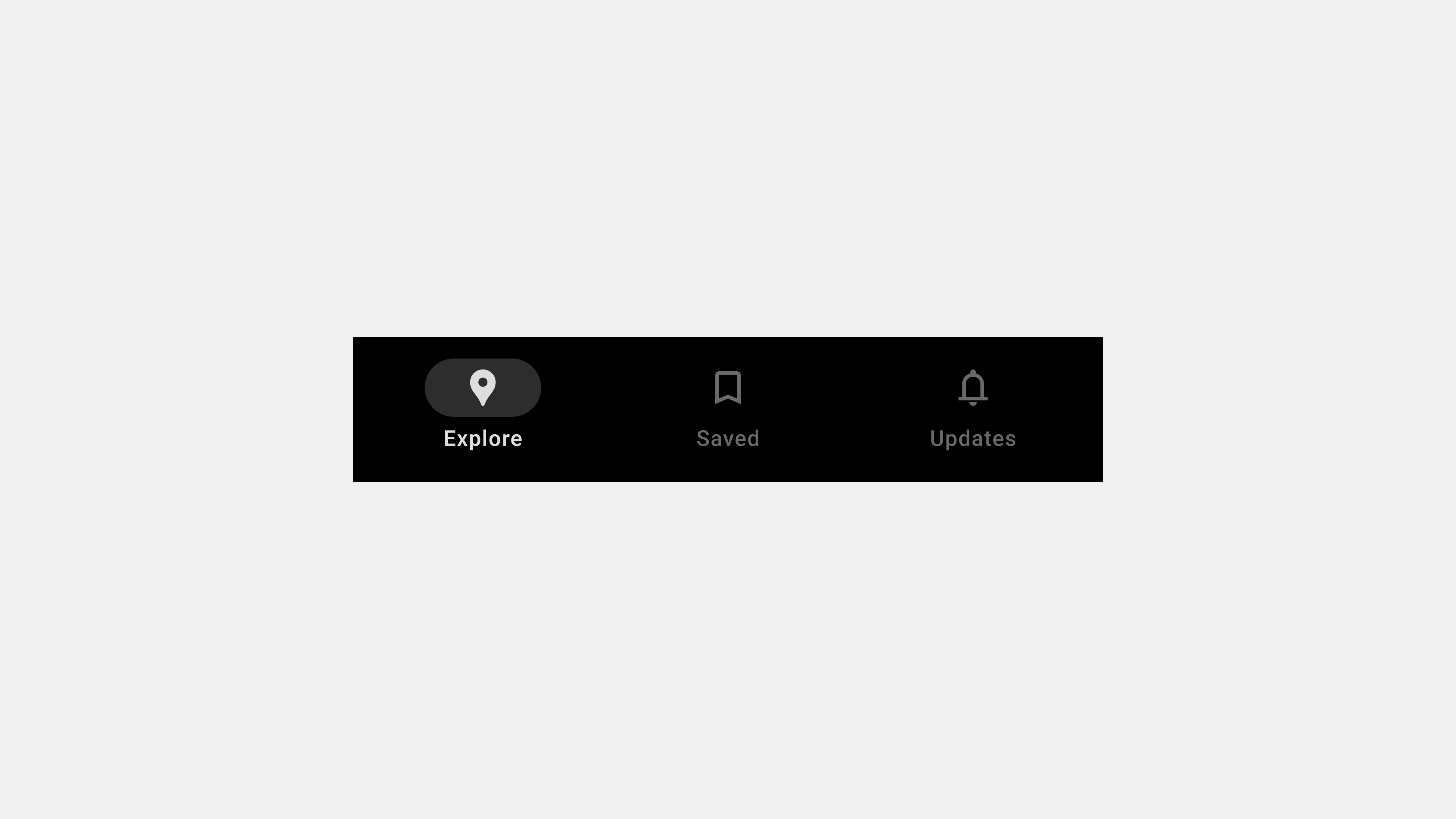
    1. What Are Bottom Navigation Bars?

    A bottom navigation bar is a fixed UI element located at the bottom of a mobile app screen, used to navigate between primary app sections or features.

    Key Features

    • Placement: Always positioned at the screen’s bottom for easy reach.
    • Tabs: Typically contains 3-5 options, each representing a primary app section.
    • Visual Feedback: Highlights the active tab using colors, icons, or animations.

    Purpose

    Bottom navigation bars are designed to simplify navigation, ensuring that users can access core features with minimal effort. They enhance user experience by providing a consistent and predictable navigation structure.


    2. The Role of Bottom Navigation Bars

    Bottom navigation bars are not just a navigation tool; they play a crucial role in shaping the overall user experience.

    A. Enhancing Usability

    Bottom navigation bars improve usability by grouping the most important app features into one easily accessible area.

    Why It Matters

    • Reduces the number of steps required to navigate between sections.
    • Simplifies app interaction, especially for new users.

    Example

    In an e-commerce app, tabs like “Home,” “Cart,” and “Profile” allow users to quickly switch between shopping and account management.


    B. Supporting Ergonomics

    Positioned for thumb-reach accessibility, bottom navigation bars cater to natural hand movements, making them particularly effective for one-handed use.

    Why It Matters

    • Enhances comfort and ease of use.
    • Reduces strain by placing key features within easy reach.

    Example

    Social media apps like Instagram use bottom navigation bars to ensure seamless interaction, even on larger screens.


    C. Facilitating Discoverability

    By prominently displaying core features, bottom navigation bars help users discover essential app sections without searching through menus.

    Why It Matters

    • Drives engagement with key app features.
    • Improves user retention by showcasing the app’s value.

    Example

    A streaming app with tabs like “Home,” “Search,” and “Library” ensures users can find content quickly.


    D. Providing Contextual Awareness

    Active state indicators in bottom navigation bars inform users of their current location within the app, reducing confusion.

    Why It Matters

    • Helps users stay oriented.
    • Enhances confidence in navigation.

    Example

    In a travel app, highlighting the “Bookings” tab when viewing reservations provides clear context.


    E. Encouraging Task Efficiency

    Bottom navigation bars enable multitasking by allowing users to switch between tasks without losing progress.

    Why It Matters

    • Streamlines workflows.
    • Reduces frustration by preserving state within tabs.

    Example

    In a project management app, users can toggle between “Tasks” and “Calendar” without losing data.


    3. Benefits of Bottom Navigation Bars

    A. Simplicity and Focus

    • Encourages minimalism by displaying only essential features.
    • Keeps the interface clean and user-friendly.

    B. Consistency

    • Provides a uniform navigation experience across screens.
    • Reinforces a cohesive app identity.

    C. Speed and Efficiency

    • Reduces the time required to find and access features.
    • Improves task completion rates.

    4. Best Practices for Designing Bottom Navigation Bars

    A. Prioritize Core Features

    Include only the most frequently used app sections.

    Example

    For a fitness app: “Dashboard,” “Workouts,” “Progress,” and “Settings.”


    B. Use Intuitive Icons and Labels

    Pair icons with short, descriptive labels to clarify their purpose.

    Example

    A music app can use a play icon labeled “Playlists” and a search icon labeled “Search.”


    C. Optimize for Accessibility

    Ensure navigation bars are inclusive and meet accessibility standards.

    Tips

    • Add ARIA roles for screen reader compatibility.
    • Use high-contrast colors for better visibility.

    D. Provide Visual Feedback

    Use animations or style changes to highlight active tabs and interactions.

    Example

    In a photo-sharing app, a color change for the “Upload” tab after tapping reinforces user action.


    E. Test Across Devices

    Ensure navigation bars function seamlessly across devices and orientations.

    Example

    A responsive design for a video app ensures usability on both phones and tablets.


    5. Challenges in Designing Bottom Navigation Bars

    A. Overcrowding

    Adding too many tabs can overwhelm users.
    Solution: Limit to 3-5 tabs and use overflow menus for secondary features.


    B. Ambiguous Labels or Icons

    Unclear or unfamiliar labels can confuse users.
    Solution: Use universally recognized icons and test labels with real users.


    C. Inconsistent Behavior

    Navigation bars that behave differently across screens disrupt the user experience.
    Solution: Maintain uniform functionality and style.


    6. Examples of Successful Bottom Navigation Bars

    A. Instagram

    • Tabs: Home, Search, Reels, Shop, Profile.
    • Why It Works: Combines minimalism with intuitive design.

    B. YouTube

    • Tabs: Home, Explore, Subscriptions, Library.
    • Why It Works: Clearly separates content discovery from user libraries.

    C. Spotify

    • Tabs: Home, Search, Library.
    • Why It Works: Prioritizes simplicity and quick access to core features.

    7. Future Trends for Bottom Navigation Bars

    A. Gesture-Based Navigation

    Replacing traditional taps with swipes for smoother transitions.


    B. AI-Powered Customization

    Dynamic tabs that adapt to user preferences and behavior.


    C. Integration with AR and VR

    Navigation systems tailored for immersive experiences.


    Conclusion

    Bottom navigation bars are more than just a navigation tool—they are a critical element in delivering a seamless and intuitive user experience. By understanding their definition, role, and best practices, designers and developers can create navigation systems that enhance usability and engagement. As mobile app design continues to evolve, bottom navigation bars will remain an indispensable part of the user experience landscape.