Navigation Drawer: A Comprehensive Guide
The navigation drawer is a UI component widely used in modern applications, especially mobile apps, to organize and access features efficiently. It provides a hidden menu that users can open by tapping a button or swiping from the side of the screen. This design pattern has become a go-to solution for developers and designers seeking to balance functionality with a clean interface. In this article, we’ll dive deep into the definition, use cases, design principles, best practices, and challenges of navigation drawers.
1. What Is a Navigation Drawer?
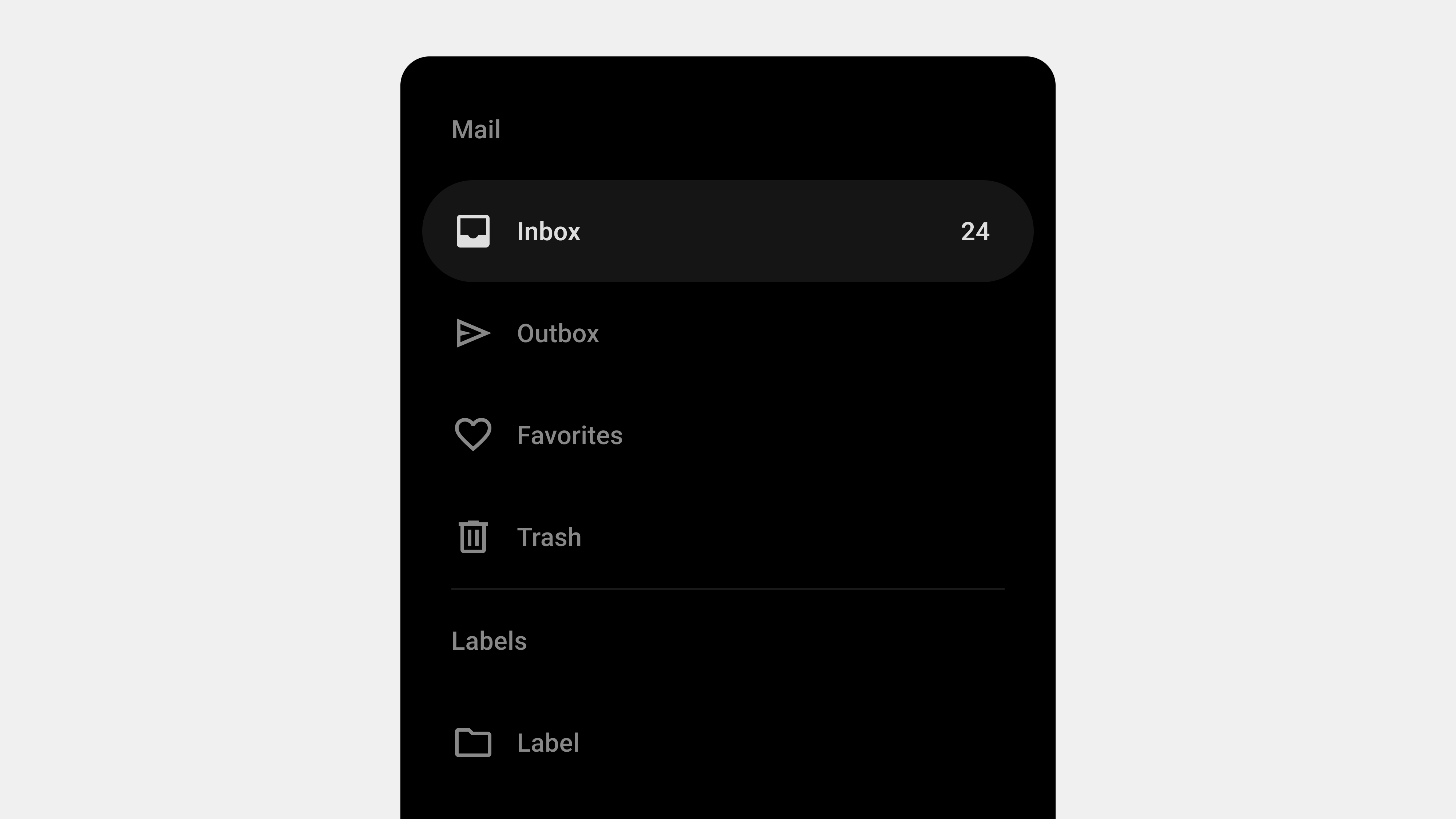
A navigation drawer, also known as a side drawer or hamburger menu, is a collapsible panel that slides in from the side of the screen. It houses secondary or less frequently used navigation items, allowing the primary interface to remain uncluttered.
Key Features
- Expandable and Collapsible: Opens and closes with a user gesture or interaction.
- Accessible from Any Screen: Typically available across all app pages for consistent navigation.
- Supports Hierarchical Navigation: Allows grouping of related menu items.
2. Benefits of Using a Navigation Drawer
A. Space Efficiency
By hiding the navigation menu, navigation drawers maximize screen space for primary content. This makes them particularly useful for smaller devices like smartphones.
B. Organizational Clarity
They allow grouping and categorizing menu items, helping users navigate complex apps or websites more easily.
C. Customization
Navigation drawers can be personalized to display user-specific content, such as profiles, shortcuts, or recommended actions.
D. Consistent Accessibility
The drawer remains available from any screen, ensuring users can always return to key sections without confusion.
3. Use Cases for Navigation Drawers
A. Mobile Applications
- Social Media: Facebook, Instagram, and Twitter use drawers for secondary features like settings and saved items.
- Productivity Apps: Google Drive and Evernote use drawers for folder navigation and account switching.
B. Complex Web Applications
Web platforms like project management tools or SaaS products use navigation drawers for multi-level menus and quick access to various modules.
C. Cross-Platform Apps
For apps designed to run on both mobile and desktop, navigation drawers provide a unified navigation experience.
4. Design Principles for Navigation Drawers
A. Prioritize Simplicity
- Display only essential items to avoid overwhelming the user.
- Use clear and concise labels for menu items.
B. Maintain Visual Hierarchy
- Use grouping and separators to organize related items.
- Place frequently accessed items at the top of the list.
C. Provide Visual Feedback
- Highlight the active or selected item.
- Use animations to show transitions between opened and closed states.
D. Support Gestures
- Allow users to swipe to open and close the drawer.
- Ensure gestures don’t interfere with other UI elements.
E. Ensure Accessibility
- Use semantic HTML and ARIA roles for screen reader compatibility.
- Include a keyboard-accessible toggle for opening and closing the drawer.
5. Best Practices for Navigation Drawers
A. Use a Clear Toggle Icon
- The hamburger icon (three horizontal lines) is a universal standard for toggling drawers.
- Ensure the icon is prominently placed, usually at the top left of the screen.
B. Keep It Minimal
- Avoid overcrowding the drawer with too many menu items.
- Use collapsible sections for submenus to maintain clarity.
C. Provide Contextual Information
- Display the user’s profile, notifications, or shortcuts at the top of the drawer.
- For example, Google apps often show the logged-in user’s name and avatar.
D. Test Responsiveness
- Adapt the drawer for different devices and screen sizes.
- On larger screens, consider using a persistent drawer that remains visible.
E. Ensure Smooth Animations
- Avoid abrupt transitions when opening and closing the drawer.
- Use subtle animations to enhance the user experience.
6. Challenges and Solutions in Navigation Drawer Design
A. Hidden Navigation Problem
Challenge: Users may overlook the drawer if it’s not obvious.
Solution: Use onboarding or visual hints (e.g., pulsing animations around the toggle icon) to guide new users.
B. Overloading with Items
Challenge: An overcrowded drawer can confuse users.
Solution: Prioritize key items and move less-used options to secondary menus.
C. Accessibility Issues
Challenge: Improper implementation can make drawers unusable for assistive technology users.
Solution: Follow WCAG guidelines, ensuring compatibility with screen readers and keyboard navigation.
D. Performance Concerns
Challenge: Animations and dynamic content in drawers can impact app performance.
Solution: Optimize assets and preload content to ensure smooth performance.
7. Examples of Excellent Navigation Drawer Implementation
A. Google Drive
- Features: Includes quick access to “My Drive,” “Shared with Me,” and “Recent.”
- Why It Works: Clear hierarchy and collapsible sections keep it clean and functional.
B. Facebook
- Features: Uses a navigation drawer for less critical features like saved posts and events.
- Why It Works: Prioritizes the feed while keeping secondary features accessible.
C. Slack (Mobile App)
- Features: The drawer organizes channels, DMs, and workspaces effectively.
- Why It Works: Displays essential content without overwhelming the user.
8. How to QA a Navigation Drawer
A. Functional Testing
- Verify that the drawer opens and closes with both gestures and the toggle button.
- Test all links and menu items for correct functionality.
B. Responsiveness Testing
- Check behavior on various devices and screen orientations.
- Ensure smooth animations across devices.
C. Accessibility Testing
- Use screen readers to ensure all elements are accessible.
- Test keyboard navigation for opening, closing, and interacting with the drawer.
D. Performance Testing
- Simulate high traffic to test how the drawer performs under load.
- Optimize assets and animations to reduce lag.
9. Future Trends in Navigation Drawers
A. Dynamic Personalization
Navigation drawers will increasingly leverage AI to show personalized content and shortcuts based on user behavior.
B. Voice-Activated Navigation
With the rise of voice assistants, drawers may integrate voice commands for opening and navigating menu items.
C. Gesture-First Design
Gesture-based interactions will continue to evolve, allowing users to interact with drawers more intuitively.
Conclusion
The navigation drawer is a versatile tool for organizing complex menus while maintaining a clean and user-friendly interface. By adhering to design principles, implementing best practices, and addressing challenges, you can create navigation drawers that enhance usability and accessibility. Whether you’re designing for mobile apps, web platforms, or cross-platform tools, navigation drawers remain an indispensable UI component for effective navigation.