현대의 앱과 웹사이트에서 메뉴(Menu)는 사용자 인터페이스(UI)의 핵심 요소 중 하나입니다. 잘 설계된 메뉴는 사용자가 원하는 기능을 쉽게 찾고 이동할 수 있도록 도와주며, 전체적인 사용자 경험(UX)을 좌우합니다. 이번 포스트에서는 메뉴의 기본 개념부터 구글 머터리얼 디자인, 애플 휴먼 인터페이스 가이드라인(HIG), 마이크로소프트 플루언트 디자인 등 주요 디자인 시스템의 메뉴 원칙을 살펴보고, 실제 서비스 사례와 최신 UI 트렌드, 그리고 메뉴 UI 설계 팁까지 폭넓게 다뤄보겠습니다.
1. 메뉴란 무엇인가?
메뉴의 정의: 메뉴란 컴퓨터 프로그램이나 웹사이트에서 사용자에게 제시되는 옵션들의 목록을 말합니다. 사용자는 이 목록에서 항목을 선택하여 정보를 찾거나 기능을 실행할 수 있습니다. 예를 들어 운영체제의 프로그램 메뉴, 웹 페이지의 내비게이션 바, 애플리케이션의 설정 아이콘을 누르면 나타나는 드롭다운 목록 등이 모두 메뉴에 해당합니다. 메뉴는 이러한 옵션들을 시각적으로 구조화하여 보여줌으로써, 사용자가 복잡한 명령어를 일일이 기억하지 않아도 필요한 작업을 수행할 수 있게 돕습니다.
메뉴가 필요한 이유: 메뉴를 사용하면 화면에 가능한 선택지를 한눈에 제시할 수 있기 때문에, 사용자 친화적인 인터페이스를 구현할 수 있습니다. 메뉴는 관련 기능들을 카테고리별로 묶어 체계적으로 보여주므로, 사용자들은 원하는 기능이나 콘텐츠를 빠르게 찾아갈 수 있습니다. 예를 들어, MS 워드와 같은 프로그램의 상단 메뉴 바에는 *File, Edit, View…*와 같이 기능별 메뉴가 구분되어 있어 사용자가 필요한 명령을 예측하기 쉽습니다. 이처럼 메뉴는 내비게이션(navigation)의 역할도 수행하여, 앱이나 사이트의 전반적인 구조와 제공 기능을 사용자에게 전달합니다. 메뉴가 없다면 사용자는 시스템의 모든 기능을 일일이 찾아다녀야 하므로 학습 부담이 커지고, 잘못된 경로로 이동하기 쉽습니다. 반면 메뉴 중심의 디자인은 처음 사용하는 사람도 비교적 쉽게 조작법을 익힐 수 있도록 해주죠. 요약하면, 메뉴는 “무엇을 할 수 있는지”를 한눈에 보여주는 친절한 안내판 역할을 합니다.
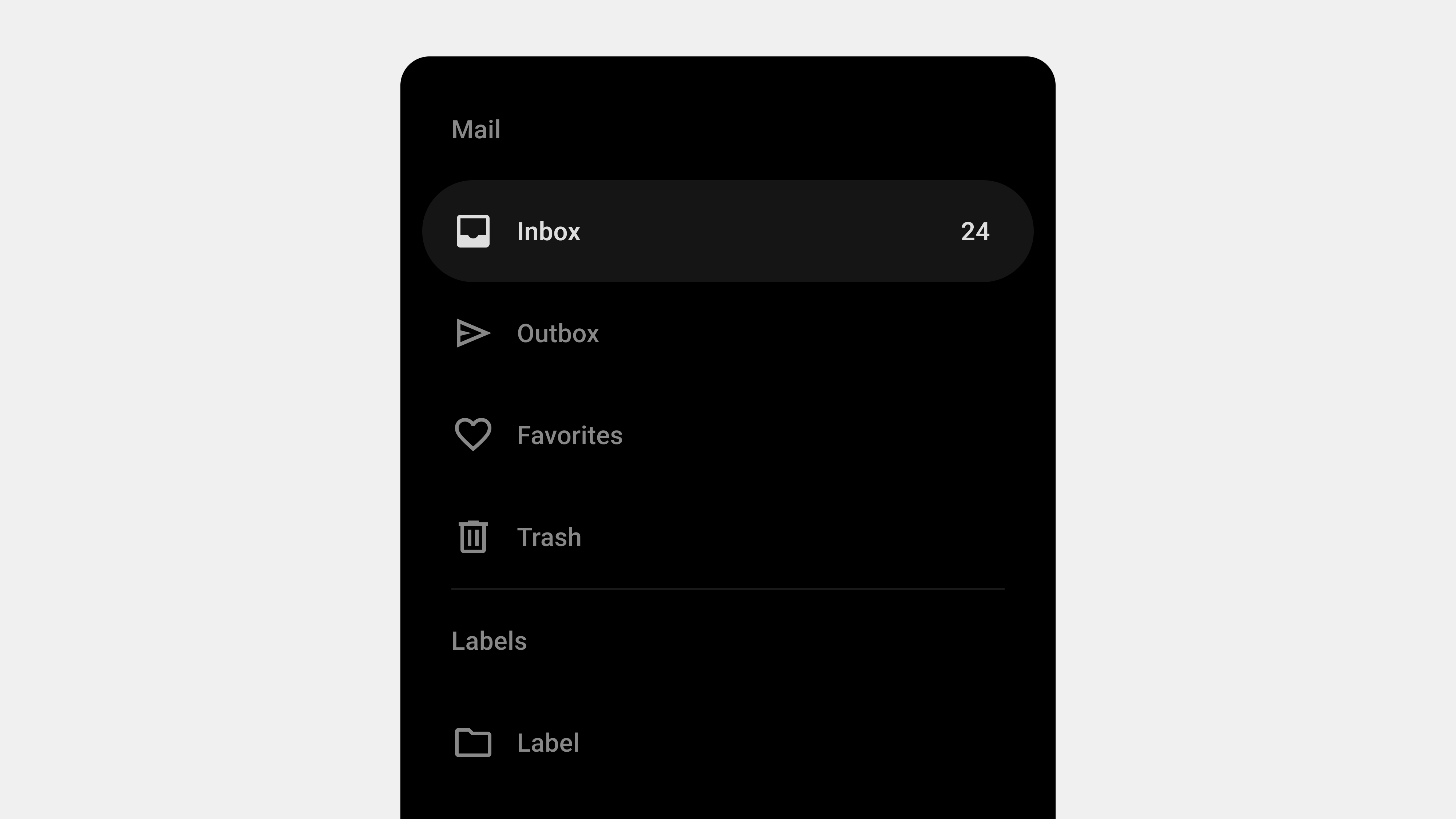
메뉴의 종류: UI에서 메뉴는 여러 형태로 나타날 수 있습니다. 대표적으로:
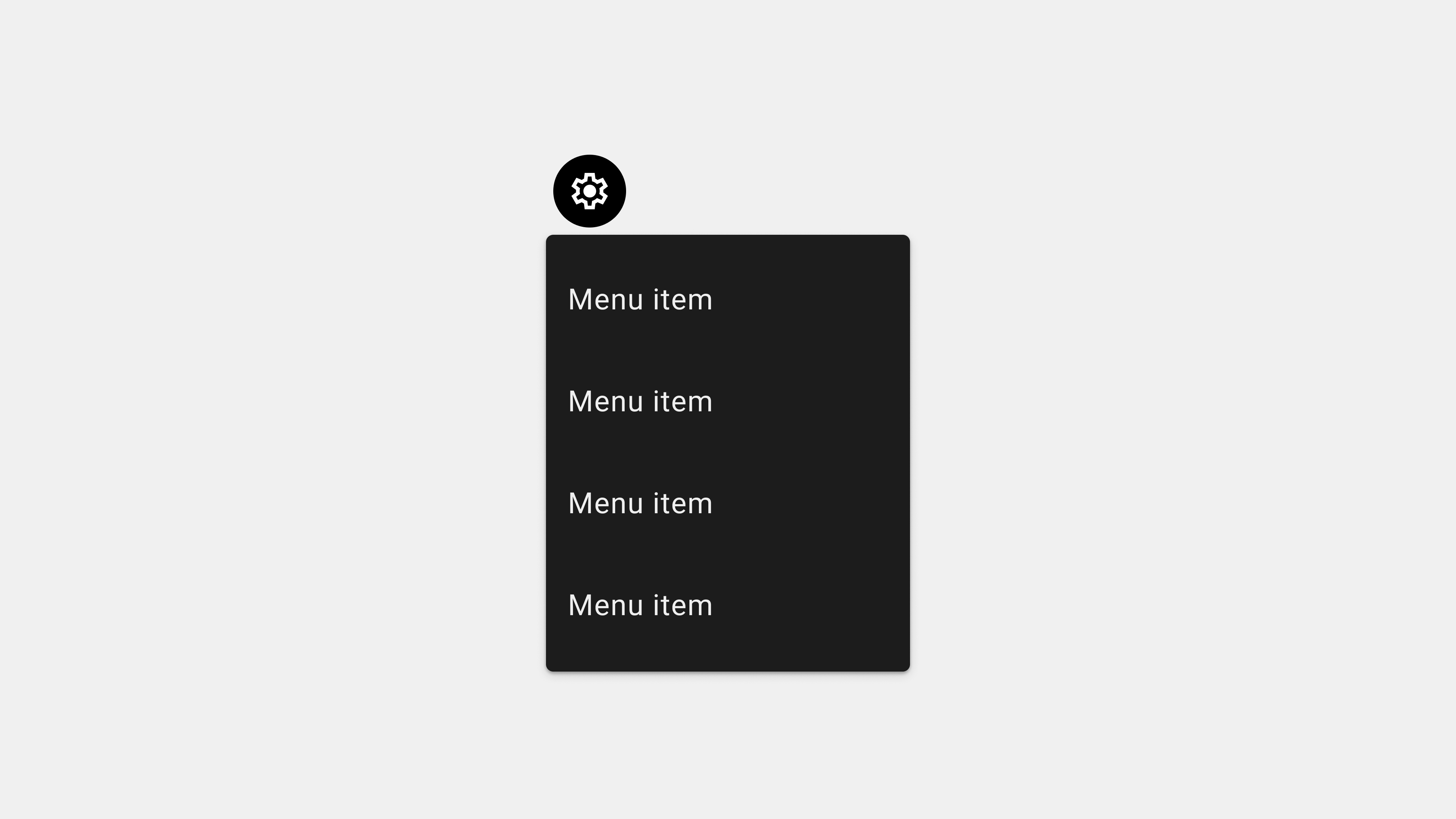
- 드롭다운 메뉴(drop-down): 버튼이나 탭을 클릭하면 아래로 펼쳐지는 메뉴입니다. 예를 들어 웹사이트 우측 상단의 프로필 아이콘을 클릭하면 계정 설정, 로그아웃 등이 나열된 메뉴가 나타나는 식입니다.
- 햄버거 메뉴(☰): 보통 세 줄 아이콘으로 표시되며, 클릭 시 사이드 패널이 슬라이드되어 열리는 형태입니다. 모바일 앱이나 반응형 웹에서 공간이 좁을 때 주로 사용되며, 내부에 여러 내비게이션 링크를 포함할 수 있습니다.
- 탭 메뉴/바텀 내비게이션: 화면 상단이나 하단에 여러 탭(tab)이나 아이콘으로 주요 섹션을 바로 이동할 수 있게 한 메뉴입니다. 모바일 앱 하단의 4~5개 아이콘 바가 그 예입니다. (예: 인스타그램 하단 메뉴바)
- 컨텍스트 메뉴: 항목을 길게 누르거나 오른쪽 클릭했을 때 나타나는 메뉴로, 선택한 항목과 문맥(context)에 관련된 옵션들을 제공합니다. (예: 파일을 우클릭했을 때 “복사, 이름 변경, 삭제” 등이 뜨는 메뉴)
- 메뉴 바(Menu Bar): 데스크톱 애플리케이션에서 창 상단에 항상 보이는 메뉴 모음으로, MacOS의 상단 메뉴 바나 Windows 프로그램의 상단 메뉴(파일, 편집 등)가 이에 해당합니다.
각각의 메뉴 유형은 쓰임새와 장단점이 있습니다. 예를 들어 드롭다운과 컨텍스트 메뉴는 일시적으로 나타났다 사라지는 특성이 있어 화면 공간을 효율적으로 쓰지만, 중요한 내비게이션을 모두 숨겨버리면 사용자가 메뉴를 눈치채지 못할 위험이 있습니다. 반대로 항상 보이는 메뉴 바나 탭 바는 한눈에 경로를 보여주지만 작은 화면에서는 공간을 많이 차지할 수 있죠. 따라서 어떤 메뉴 방식을 선택할지는 콘텐츠 분량, 화면 크기, 사용자 기대 등을 종합적으로 고려해야 합니다.
2. 주요 디자인 시스템의 메뉴 설계 원칙 (Material vs HIG vs Fluent)
각 플랫폼이나 디자인 시스템마다 권장하는 메뉴 디자인 패턴이 있습니다. 여기서는 구글 머터리얼 디자인(Material Design), 애플 휴먼 인터페이스 가이드라인(HIG), 마이크로소프트 플루언트 디자인(Fluent Design)에서 제시하는 메뉴 설계 원칙과 특징을 비교해보겠습니다.
2.1 구글 머터리얼 디자인의 메뉴 원칙
구글의 머터리얼 디자인은 안드로이드 앱과 웹 디자인 전반에 널리 적용되는 디자인 시스템입니다. 머터리얼 디자인에서는 메뉴를 일시적인 표면에 나타나는 선택 목록으로 정의합니다. 사용자가 버튼이나 아이콘을 터치하면, 다른 UI 요소 위에 얇은 종이 한 장이 떠오르듯 메뉴가 나타나고(List of choices on a transient sheet) 그 위에 한 줄에 하나씩 옵션들이 나열됩니다. 메뉴 항목은 현재 맥락에 따라 활성화되거나 비활성화될 수 있으며, 상황에 맞는 내용만 보여주는 컨텍스트 메뉴도 지원합니다.
머터리얼 디자인의 메뉴 원칙에서 주목할 점은 일관성(consistency)과 명확한 계층 구조입니다. 머터리얼 가이드라인에 따르면, 메뉴의 각 항목은 앱의 상태나 화면에 영향을 주는 독립적인 액션 또는 옵션이어야 합니다. 또한 메뉴는 최소 2개 이상의 항목으로 구성되어야 하며, 단일 항목만 있을 경우 메뉴 대신 다른 UI를 고려하도록 권장합니다. 예를 들어 점 세 개짜리 “더보기” 오버플로 아이콘( ⁝ )을 누르면 열리는 메뉴에는 적어도 두 개 이상의 액션(예: “설정”, “공유”, “피드백 보내기” 등)이 포함되어야 메뉴로서 의미가 있다는 것이죠.
흥미로운 것은, 머터리얼 디자인에서는 메뉴를 주 내비게이션 수단으로 남용하지 말라고 권고한다는 점입니다. 메뉴는 일시적인 액션 목록으로 사용하고, 앱의 주요 섹션 간 이동에는 탭 바나 내비게이션 서랍(Navigation Drawer) 같은 컴포넌트를 사용하라는 것입니다. 실제로 안드로이드 앱을 보면, 화면 상단/하단에 항상 표시되는 탭이나 네비게이션 바를 주요 이동 경로로 삼고, 개별 화면 내의 부가 기능들을 점 세 개 메뉴로 넣는 경우가 많습니다. 이것은 사용자로 하여금 중요한 경로는 늘 보이게 하고, 부수적인 옵션만 메뉴에 숨겨 UI를 깔끔하게 유지하려는 머터리얼 디자인 철학을 반영합니다.
머터리얼 디자인은 또한 일관된 시각적 스타일을 강조합니다. 메뉴는 카드 같은 판 형태로 떠오르며, 그림자와 레이어 개념을 사용해 메뉴가 다른 요소 위에 떠 있는 것을 표현합니다 (Elevation 원칙). 메뉴 항목 간 간격, 폰트, 아이콘 사용 등에 대한 상세한 규칙도 제시하여 개발자와 디자이너가 동일한 머터리얼 룩앤필을 구현하도록 돕습니다. 결과적으로 머터리얼 디자인의 메뉴는 어느 앱에서 보아도 익숙한 모습과 동작을 보여주어, 사용자 학습 비용을 줄여주는 효과가 있습니다.
모바일 vs 웹 적용: 머터리얼 디자인 원칙은 모바일 앱과 웹 모두에 적용되지만, 화면 크기에 따라 메뉴 형태가 달라질 수 있습니다. 작은 모바일 화면에서는 주 메뉴를 햄버거 아이콘 뒤에 숨기거나 하단 바(바텀 내비게이션)를 사용하고, 보조 메뉴만 팝업으로 띄우는 경우가 많습니다. 반면 PC 웹이나 태블릿처럼 화면이 큰 경우, 상단에 항상 보이는 메뉴 바나 좌측의 사이드바 내비게이션을 제공하여 사용자에게 모든 주요 경로를 직접 노출시키곤 합니다. 머터리얼 디자인 가이드에 따르면 화면 공간이 충분할 때에는 메뉴를 굳이 숨기지 말고 한눈에 보이도록 하여 “Out of sight, out of mind” 상황을 피하라고 권합니다. 이는 중요한 메뉴일수록 사용자에게 항상 보이는 것이 탐색을 수월하게 하고, 콘텐츠의 범위를 이해하는 데 도움이 되기 때문입니다.
2.2 애플 휴먼 인터페이스 가이드라인(HIG)의 메뉴 원칙
애플의 HIG는 iOS와 macOS 등 애플 생태계 앱 디자인의 지침으로, 심플함과 일관성, 그리고 콘텐츠 중심의 철학으로 유명합니다. 애플 HIG에서의 메뉴 디자인은 사용자가 예측 가능하고 익숙한 방식으로 옵션을 찾도록 하는 데 초점을 맞춥니다. 예를 들어 MacOS에서는 모든 앱이 상단 메뉴 바(예: ⌘ 메뉴)에 파일, 편집, 보기 등의 공통 메뉴 구조를 갖추도록 권장합니다. iOS 모바일 앱에서는 화면 하단에 탭 바(Tab Bar)를 두어 주요 기능(예: 음악 앱의 “듣기, 탐색, 라이브러리…”)을 항상 노출시키고, 추가 옵션은 설정 아이콘이나 스와이프 제스처 등을 통해 드러나게 설계합니다. 사용자 입장에서 중요한 기능은 숨겨놓지 않고 바로 접근 가능하게 하는 것이 애플 디자인의 핵심 원칙입니다.
메뉴 길이와 구성: 애플 HIG는 메뉴 항목의 길이에도 주의를 기울입니다. 한 메뉴에 너무 많은 항목이 나열되면 사용자가 훑어보는 데 시간이 걸려 원하는 명령을 놓칠 수 있기 때문입니다. 애플 가이드라인에 따르면 메뉴 길이가 너무 길다면 여러 개의 메뉴로 분할하는 것을 고려하라고 조언합니다. 필요에 따라 하위 메뉴(Submenu)를 사용하여 관련 항목을 중첩시킬 수도 있지만, 메뉴 깊이가 깊어지면 오히려 혼란을 주기 쉬우므로 적절한 균형을 잡아야 합니다. 예를 들어 데스크톱 앱에서도 “편집” 메뉴가 너무 길다면 “편집 > 고급” 같은 하위 메뉴로 일부 기능을 옮겨 메뉴 하나당 목록을 단순화하는 식입니다. iOS 앱에서는 아예 5개가 넘는 탭이 필요하면 하단 탭 바에 “More(더보기)” 메뉴를 두고, 나머지 덜 자주 쓰는 기능들을 그 안에 넣는 패턴을 권장합니다. 이렇게 하면 사용자에게 핵심 기능 4~5개는 바로 보이고, 부가 기능은 “더보기” 안에 숨어있지만 필요할 때만 꺼내볼 수 있게 됩니다.
상황별 메뉴 활용: 애플은 상황에 따른 메뉴 표시를 중요하게 생각합니다. iOS에서는 액션 시트(Action Sheet)나 컨텍스트 메뉴(UIContextMenu) 등을 활용하여, 사용자가 특정 항목을 길게 누르거나 (또는 iPhone에서 터치 앤 홀드) 했을 때 관련 옵션만 담긴 메뉴를 화면 하단 또는 항목 근처에 나타나게 합니다. 이러한 메뉴는 현재 상황에 꼭 맞는 기능(예: 사진을 길게 눌렀을 때 공유, 즐겨찾기 등)만 보여주므로, UI를 깔끔하게 유지하면서도 필요한 순간에는 빠른 액세스를 제공합니다.
일관성과 이해도: 애플 디자인은 언제나 심플함과 명확한 레이블을 강조합니다. 메뉴 글귀는 가능한 한 짧지만 뜻이 분명하게 작성해야 하며, 사용자가 의미를 혼동할 만한 은어나 내부 용어는 피해야 합니다. 또한 iOS의 탭 아이콘에는 짧은 라벨이 붙어 있고, macOS 메뉴 바에서는 메뉴 명령 옆에 해당 키보드 단축키가 표시되는 등 학습을 돕는 요소를 곳곳에 배치합니다. 전반적으로 애플 HIG의 메뉴 설계 원칙은 “사용자가 메뉴를 통해 현재 앱에서 무엇을 할 수 있는지 즉각 파악하게 하라”는 것으로 요약할 수 있습니다. 이를 위해 표준 아이콘과 용어를 사용하고, 중요한 건 숨기지 않기, 메뉴를 나누어서 복잡도 줄이기 등의 전략을 권장하는 것이죠.
2.3 마이크로소프트 MS 플루언트 디자인의 메뉴 원칙
마이크로소프트의 플루언트 디자인은 Windows 10 이후의 Windows UI와 Microsoft Office, UWP 앱 등에 적용된 현대적 디자인 시스템입니다. 플루언트 디자인에서의 메뉴는 이전 전통적인 Windows UI 요소를 현대적으로 재해석한 것이 많습니다. 기본적으로 “메뉴는 사용자가 트리거(Trigger)를 눌렀을 때 나타나는 숨겨진 옵션 목록”으로 정의됩니다. 이는 앞서 언급한 정의들과 유사하게, 메뉴는 평소에는 보이지 않다가 사용자가 아이콘, 버튼, 또는 우클릭 등의 동작을 취했을 때 나타나는 리스트라는 의미입니다. 플루언트 디자인의 메뉴는 가능한 한 운영체제의 기본 메뉴 동작과 통일되게 만들어 사용자에게 익숙함을 줍니다.
Fluent 디자인의 특징: 플루언트 디자인은 Light(빛), Depth(깊이), Motion(모션), Material(재질), Scale(확장성) 다섯 가지 요소를 원칙으로 삼습니다. 메뉴에도 이러한 원칙이 반영되어, 시각적인 깊이와 그림자를 사용해 메뉴가 떠 있는 효과(Acrylic 머티리얼 사용)를 주고, 메뉴가 나타날 때 부드러운 페이드나 모션이 적용됩니다. Windows 11을 사용해보셨다면, 우클릭 컨텍스트 메뉴나 시작 메뉴가 살짝 투명하고 블러 효과가 있는 것을 볼 수 있을 것입니다. 이것이 Fluent 디자인의 Acrylic 머티리얼 효과로, 메뉴 배경이 반투명하게 뒤 배경과 어우러져 보이게 합니다. 이러한 시각적 효과는 메뉴를 튀지 않으면서도 세련되게 보여주며, 시스템 전반에 일관된 느낌을 줍니다.
Windows의 메뉴 패턴: Windows 환경에서는 전통적으로 상단 메뉴 바(File, Edit 등)와 우클릭 컨텍스트 메뉴, 그리고 시작 메뉴가 대표적인 메뉴 인터페이스입니다. 플루언트 디자인을 도입하면서 Windows 10/11에서는 기본 앱들에 햄버거 메뉴 아이콘이나 왼쪽 내비게이션 패널을 많이 도입했습니다. 예를 들어, Windows 11의 설정(Settings) 앱을 열면 좌측에 주요 설정 카테고리가 아이콘과 함께 사이드 메뉴로 배치되어 있고, 우측에 상세 내용이 나옵니다. 이러한 사이드 메뉴는 반응형으로 작동하여 창 크기를 줄이면 아이콘만 남는 등 적응형 레이아웃을 보입니다. 또한 Microsoft의 UWP 앱이나 Office 365 웹 앱들은 좌측 상단에 ☰ 메뉴 아이콘을 눌러 패널을 여닫는 방식을 취하거나, 상단에 리본 메뉴를 간소화한 명령 모음(Command Bar)을 배치해 필요한 명령을 아이콘으로 제공하기도 합니다.
메뉴 구성 및 용어: MS의 메뉴 설계 원칙도 명확한 용어와 일관성을 강조합니다. 예를 들어 Windows에서는 대부분 “설정”, “옵션”, “도움말” 등 메뉴 항목 용어가 일관되게 쓰이며, Fluent UI 라이브러리를 사용하는 개발자들에게도 기본 메뉴 컴포넌트를 제공하여 네이티브와 유사한 모양으로 구현하도록 권장합니다. Office 제품군의 경우 메뉴 대신 리본(Ribbon) 인터페이스를 도입하여 탭마다 도구 버튼을 아이콘+텍스트로 배열했는데, 이것도 크게 보면 메뉴의 일종인 “탭으로 분류된 메뉴 모음”으로 볼 수 있습니다. 플루언트 디자인에서는 리본 또한 시대에 맞게 발전시켜, 최근 Office 365 웹이나 새로운 Office 앱들은 간소한 리본과 왼쪽 내비게이션 컬럼을 함께 활용하고 있습니다.
마이크로소프트 메뉴의 장점은 강력한 기능 노출입니다. 리본 메뉴를 통해 사용자에게 매우 많은 기능을 한 화면에 펼쳐 보이게 하거나, 시작 메뉴에 자주 쓰는 앱과 설정을 고정할 수 있게 하는 등, 사용자가 능동적으로 커스터마이즈하기도 쉽습니다. 하지만 단점으로는 처음 접하는 사람에게 다소 복잡해 보일 수 있다는 점이 있습니다. 너무 많은 메뉴 옵션이 한꺼번에 보이면 오히려 무엇을 해야 할지 막막해질 수 있기 때문입니다. 이를 완화하기 위해 Fluent 디자인에서는 아이콘, 간격, 그룹핑 등을 적절히 사용하고, 필요시 일부 메뉴는 기본적으로 감춰두는(… 더보기 메뉴 형태) 전략을 씁니다. 예를 들어 Windows 11 파일 탐색기의 상단 메뉴는 가장 자주 쓰는 아이콘만 보여주고 나머지는 드롭다운 ‘…’ 버튼 아래에 넣어 두었습니다. 이런 접근은 UI를 깔끔하게 하지만, 중급 사용자는 추가 기능을 찾기 위해 한 번 더 클릭해야 하는 트레이드오프가 있습니다.
요약하면, MS 플루언트 디자인의 메뉴는 전통 UI의 계승 + 현대적 시각효과 + 적응형 구성으로 특징지을 수 있습니다. 사용자가 익숙한 Windows/Office 메뉴 체계를 유지하면서도, 다양한 기기에서 통일성 있고 미려하게 보이도록 신경 쓴 것이죠.
3. 실제 서비스 사례 분석
그렇다면 이러한 디자인 원칙들이 실제 서비스에서는 어떻게 구현되고 있을까요? 이번에는 앞서 언급한 세 디자인 철학을 각각 잘 반영하고 있는 대표적인 서비스들의 메뉴 디자인을 살펴보겠습니다. 각 사례에서 해당 메뉴 설계의 장점과 한계도 함께 분석해보겠습니다.
3.1 머터리얼 디자인 사례: 유튜브(YouTube), 구글 드라이브
유튜브 (YouTube): 유튜브는 구글의 서비스인 만큼 머터리얼 디자인 가이드라인을 충실히 따르고 있습니다. 모바일 유튜브 앱을 열어보면 하단에 홈, 쇼츠(Shorts), 구독, 보관함 등의 아이콘 메뉴가 항상 표시되어 있어 사용자가 주요 섹션을 바로 이동할 수 있습니다. 과거 유튜브 앱 초기 버전에서는 왼쪽 상단의 햄버거 메뉴(≡)를 눌러 사이드바 메뉴에서 구독 채널이나 보관함에 접근해야 했지만, 2017년 대대적인 개편을 통해 이 햄버거 메뉴를 하단 탭 바로 변경했습니다. 이 변화로 화면 크기에 상관없이 핵심 경로를 즉시 볼 수 있게 되었고, 사용자의 탐색 편의가 향상되었습니다. 실제로 유튜브 팀은 A/B 테스트 결과 하단에 항상 보이는 메뉴 바가 사용자 참여도를 높이고, 이전에 메뉴를 못 찾아 헤매던 문제를 줄여준다고 밝혔습니다. 개편 후 유튜브 앱의 하단 바는 아이콘+텍스트로 구성되어 있어 직관적이며, 사용자가 한 탭에서 스크롤하다가 다른 탭을 갔다 돌아오면 이전 위치를 기억해주는 등 UX 세세한 부분도 개선되었습니다. 유튜브의 이러한 메뉴 디자인 장점은 자주 쓰는 기능의 가시성(visibility)이 높고, 탭 간 상태 유지가 되어 경험의 연속성이 좋다는 점입니다. 한계라면 탭 개수가 4~5개로 제한되다 보니, 그 외의 기능(예: 설정, 프로필 전환 등)은 여전히 우측 상단의 프로필 메뉴나 더보기 메뉴에 숨어 있다는 것입니다. 하지만 이러한 부가 기능은 매 순간 필요한 것이 아니기 때문에, 핵심 주제 위주로 메뉴를 노출하고 나머지는 필요할 때 찾게 하는 현재 설계는 대부분 사용자에게 호평을 받고 있습니다.
유튜브 웹 사이트의 경우도 살펴볼까요. 데스크톱 웹에서 유튜브를 켜면 좌측에 햄버거 버튼이 있고, 이를 클릭하면 왼쪽 사이드바 메뉴가 열리면서 홈, 탐색, 구독, 보관함 등이 나옵니다. 큰 화면에서는 이 사이드 메뉴를 펼쳐둔 상태로 사용할 수도 있고, 아이콘만 보이게 접을 수도 있습니다. 여기서 머터리얼 디자인 원칙이 보이는데요, 화면 크기에 따라 메뉴 표시 방식을 유연하게 바꾸는 것입니다. 큰 화면에서는 메뉴를 항상 보여주어 한눈에 내비게이션을 제공하고, 작은 화면에서는 아이콘으로 축약하거나 아예 숨겨두었다가 아이콘(햄버거 버튼)을 누를 때만 표시하는 반응형 접근이죠. 유튜브 웹 메뉴의 장점은 익숙한 패턴이라 누구나 쉽게 이해할 수 있고, 구독 채널 리스트처럼 사용자가 개인화한 콘텐츠를 메뉴에 바로 보여준다는 점입니다. 단점으로는 메뉴가 펼쳐졌을 때 콘텐츠 표시 영역이 줄어들어 영상 시청 공간이 좁아질 수 있다는 정도인데, 사용자 선택에 따라 닫을 수 있으므로 큰 문제는 아닙니다.
구글 드라이브 (Google Drive): 구글 드라이브의 메뉴 디자인도 머터리얼 디자인의 교과서적인 예시입니다. 모바일 앱을 보면 상단에 햄버거 메뉴 아이콘이 있어 터치하면 좌측에서 내비게이션 서랍이 밀려 나옵니다. 이 서랍에는 내 드라이브, 공유 문서함, 스타표시, 오프라인 파일 등 주요 섹션이 리스트로 나열되어 있죠. 한편 하단에는 “파일 추가” 동작을 위한 둥근 플로팅 액션 버튼(+)이 자리하고 있어, 머터리얼 디자인의 FAB 패턴도 활용하고 있습니다. 덕분에 드라이브 앱은 공간 절약과 빠른 액션 접근을 모두 잡았습니다. 웹 버전 구글 드라이브를 보면 좌측에 항상 보이는 사이드 메뉴가 있어서 내 드라이브/공유드라이브/내 컴퓨터 등의 섹션을 쉽게 전환할 수 있습니다. 머터리얼 디자인의 아이콘과 스타일이 적용된 이 사이드 메뉴는 직관적이지만, 화면 폭이 좁아지면 자동으로 접히면서 상단에 ☰ 아이콘으로 대체됩니다. 이는 유튜브와 유사하게 반응형 메뉴로 구현된 것으로, 동일한 코드베이스에서 화면 크기에 따라 메뉴 UI를 조절하는 좋은 사례입니다.
구글 드라이브 메뉴 설계의 장점은 파일 탐색에 최적화되었다는 점입니다. 트리 형태의 폴더 구조를 사이드 메뉴로 보여주어 사용자가 계층적으로 접근할 수 있고, 우클릭 시 파일별 컨텍스트 메뉴(열기, 다운로드, 공유 등)도 풍부하게 제공됩니다. 단점이라기보다 한계라면, 모바일에서는 작은 화면에 많은 메뉴를 담을 수 없으므로 일부 기능(예: 정렬 방식 변경 등)은 아이콘 없이 메뉴 안에 숨어 있다는 것입니다. 예컨대 드라이브 앱에서 특정 폴더의 옵션을 보려면 폴더명 옆 “⁝” 버튼을 눌러 메뉴를 열어야 하는데, 이런 부분은 처음엔 발견하기 어려울 수 있습니다. 하지만 전반적으로 구글 드라이브의 메뉴 UI는 머터리얼 디자인 철학대로 일관되고 예상 가능한 위치에 있어서, 사용자들은 금세 적응하고 효율적으로 활용하고 있습니다.
3.2 애플 HIG 사례: iOS 앱 (Apple Music, 설정 앱 등)
Apple Music (애플 뮤직): 애플 뮤직 앱은 iOS 플랫폼의 대표적인 미디어 앱으로, 애플의 HIG 가이드라인을 잘 따르고 있습니다. 앱을 열면 화면 하단에 5개의 탭 바가 보입니다. (iOS 16 기준으로 “듣기(For You)”, “둘러보기(Browse)”, “라디오(Radio)”, “라이브러리(Library)”, “검색(Search)”의 5탭) 이 탭 바는 앱 내 주요 콘텐츠 허브를 표시하며, 사용자는 한 번의 탭으로 섹션을 전환할 수 있습니다. 이러한 하단 탭 메뉴는 iOS 앱 디자인의 상징과도 같은데, 엄지손가락으로 누르기 쉽고, 각 섹션의 아이콘과 제목이 항상 보여지므로 현재 내가 어디에 있는지 명확하게 알려줍니다. 애플 뮤직의 경우, 사용자가 어떤 탭에 있든지 아래 메뉴를 보면 현재 섹션이 하이라이트(예: 굵은 아이콘이나 다른 색)되어 있어 현재 위치를 인지하기 쉽습니다. 이처럼 현재 위치 표시는 메뉴 디자인의 중요한 요소로, 사용자가 앱 내 내비게이션 구조에서 길을 잃지 않도록 돕습니다.
Apple Music 앱의 메뉴 설계 장점은 콘텐츠 중심으로 설계되었다는 점입니다. 예를 들어 “라이브러리” 탭 안에 들어가면 상단에 플레이리스트, 아티스트, 앨범 등 세부 범주가 또 세그먼트 컨트롤(토글 버튼들)로 제공되어, 사용자가 자신의 음악 컬렉션을 다양한 기준으로 볼 수 있습니다. 이러한 세분화 메뉴는 해당 탭 내부에서만 보이는 컨텍스트 메뉴의 일종으로, 복잡한 계층을 가지지 않고 평면적으로 분류를 제공하기 때문에 사용성이 높습니다. 또한 곡을 길게 누르면 나타나는 팝업 메뉴(예: “다음에 재생, 라이브러리에 추가, 공유…” 등)는 iOS의 표준 액션 시트를 활용하여 일관된 디자인으로 제공됩니다. 메뉴 항목에는 아이콘 대신 텍스트만 사용해 가독성을 높이고, 중요한 키워드는 굵게 표시하거나 컬러로 강조하는 등 세심한 디자인이 돋보입니다.
Apple Music 메뉴 설계의 한계는 화면 크기에 따른 정보량 조절에서 드러납니다. 모바일 화면에서는 탭 바를 5개까지만 배치할 수 있어 그 이상은 “더보기”에 넣어야 하는 제약이 있습니다. Apple Music의 경우 현재 5개 탭으로 충분히 커버되지만, 만약 섹션이 추가된다면 UI 수정이 필요할 것입니다. 또 하나, 사용자 맞춤형 커스터마이즈가 제한된다는 점입니다. 안드로이드에서는 종종 사용자가 메뉴를 재배열하거나 숨길 수 있는 기능이 있지만, iOS HIG에서는 디자이너가 정한 중요도 순서를 따르는 경향이 강합니다. 따라서 어떤 사용자는 자주 쓰지 않는 “라디오” 탭이 항상 보이는 대신 다른 기능을 넣고 싶어도 변경할 수 없습니다. 그러나 이러한 고정된 메뉴 구조는 오히려 앱 간 일관성을 높여주기 때문에, 처음 보는 iOS 앱도 하단 탭 구성을 보면 “대략 어떻게 사용”하는지 감을 잡게 되는 장점이 있습니다.
iOS 설정 앱: 애플의 시스템 설정(Settings) 앱도 메뉴 UX의 모범 사례입니다. 설정 앱을 열면 아이폰에서 제공하는 모든 설정 카테고리가 한 화면에 리스트로 쭉 나열됩니다. 화면을 스크롤해서 Wi-Fi, 블루투스, 알림, 일반, 개인정보 보호 등 수십 가지 메뉴를 볼 수 있는데, 이는 사실상 긴 메뉴 목록의 예입니다. 애플은 이 메뉴를 효율적으로 탐색하기 위해 상단 검색 바를 제공하여 사용자가 키워드로 원하는 설정을 바로 찾을 수 있게 했습니다. 또한 각 메뉴 항목은 화살표(>) 표시로 클릭 시 다음 화면으로 깊이 들어감을 나타내고, 계층적 구조를 갖습니다. 예를 들어 “일반>소프트웨어 업데이트”처럼 단계가 깊어지면, 상단에 이전 단계로 돌아갈 수 있는 백 버튼이 나타나 사용자가 계층 내에서 앞으로/뒤로 이동하기 쉽도록 했습니다. 이러한 탐색 패턴은 iOS뿐 아니라 macOS의 시스템 환경설정에서도 유사하게 구현되어 있습니다.
설정 앱 메뉴의 장점은 일관성과 포괄성입니다. 모든 옵션을 한 곳에 모아두어 “설정에 없는 것은 없다”는 신뢰를 주며, 알파벳 순서나 논리적 범주로 정렬해 사용자가 예상 가능한 위치에서 찾도록 했습니다. 단점은 메뉴 항목이 매우 많아 처음엔 압도될 수 있다는 점인데, 아까 언급한 검색 기능이나 아이콘을 통한 시각적 구분 등으로 이를 보완했습니다. 애플은 이처럼 방대한 메뉴도 잘 찾아갈 수 있도록 UI 요소(검색, 백버튼, 섹션 구분 등)를 배치하여 사용자 길찾기(wayfinding)를 돕고 있습니다.
3.3 MS 플루언트 디자인 사례: Windows 11 UI, Microsoft Office
Windows 11의 시작 메뉴: Windows를 사용하는 분들께 가장 친숙한 메뉴는 아마 “시작 메뉴”일 것입니다. 시작 메뉴는 Windows 95 이래 계속 발전해온 OS 메인 메뉴로, Windows 11에서는 플루언트 디자인을 입고 새로운 모습을 선보였습니다. 우선 시작 버튼을 클릭하면 화면 중앙에 반투명한 직사각형 패널이 뜨며, 상단에는 고정된 앱 아이콘들이 격자형으로 배열되어 있고 하단에는 추천 항목과 전원 버튼 등이 있습니다. Windows 10까지 있던 타일 형식이 사라지고 깔끔한 아이콘 목록으로 변화한 것이 특징인데, 이는 단순하고 집중된 경험을 주기 위한 설계입니다. 시작 메뉴 상단의 검색창을 통해 바로 앱이나 파일을 검색할 수도 있어서, 사실상 메뉴+검색 하이브리드 형태로 볼 수 있습니다. 플루언트 디자인의 재질 효과 덕분에 시작 메뉴 배경이 살짝 흐려져 보이며, 시스템 라이트/다크 모드에 따라 메뉴 색상도 자동으로 맞춰져 일관성을 유지합니다.
Windows 11 시작 메뉴의 장점은 시각적 간결함입니다. 중요한 앱은 핀으로 고정해두고 한 눈에 찾을 수 있으며, 이전보다 메뉴 크기가 작아져 화면을 많이 가리지 않습니다. 또한 키보드로 Windows 키 누르고 바로 타이핑하면 검색으로 연결되기 때문에, 숙련자에게는 메뉴 항목을 일일이 찾을 필요 없이 빠른 실행이 가능합니다. 단점으로 지적되는 부분은, Windows 10의 시작 메뉴에 비해 사용자 커스터마이즈 폭이 줄었다는 것입니다. 예전에는 라이브 타일 크기를 조정하거나 그룹 제목을 붙이는 등 자유도가 높았는데, Win11에서는 정해진 크기로만 배치되므로 사용자의 개인화 공간 느낌이 감소했다는 의견이 있습니다. 또한 모든 앱 목록을 보기 위해서는 “모든 앱” 버튼을 눌러 별도 스크롤 리스트를 봐야 해서, 자주 안 쓰는 앱을 찾으려면 두 단계 조작이 필요합니다. 이 부분은 자주 쓰는 것 중심으로 메뉴를 단순화한 대신, 전체 목록은 한 번 더 들어가게 만든 설계로 이해할 수 있습니다. 즉, 대부분의 사용 시나리오에서는 고정 앱이나 추천 항목으로 해결되고, 가끔 전체 앱이 필요할 때만 추가 탐색을 요구하는 구조입니다. 이는 한 화면에 너무 많은 항목을 나열해서 겪는 복잡성을 줄이고 주요 기능에 포커스하게 하는 현대 UI 흐름에 부합하지만, 모든 것을 한 눈에 보고 싶어하는 일부 사용자에겐 아쉬운 변화일 수 있습니다.
Microsoft Office (예: Word, Excel 등): MS Office의 UI는 수차례 변혁을 거듭해왔는데, 2007년 등장한 리본 메뉴(Ribbon)는 메뉴 디자인의 한 혁신으로 불립니다. 리본은 전통적인 드롭다운 메뉴들을 대체하여, 탭(Tab)과 툴바 아이콘 조합으로 방대한 명령들을 시각적으로 펼쳐 보인 것이 특징입니다. 예를 들어 Word를 열면 상단에 “홈, 삽입, 레이아웃, 참조…” 등의 탭이 있고, 각 탭마다 하위 그룹으로 나뉜 여러 아이콘 버튼들이 리본 형태로 나타납니다. 이는 사실상 중첩된 메뉴를 한 화면에 모두 펼친 것으로 볼 수 있는데, 사용자는 탭을 전환함으로써 해당 카테고리의 모든 명령(아이콘과 텍스트 라벨이 함께)을 즉시 볼 수 있습니다. 리본 메뉴의 장점은 기능 발견 가능성(discoverability)이 매우 높다는 점입니다. 숨겨진 메뉴를 일일이 뒤질 필요 없이 화면에 버튼들이 드러나 있으니 어떤 기능이 존재하는지 눈에 잘 띕니다. 또한 아이콘 덕분에 시각적으로도 빠르게 구분할 수 있고, 리본 아래에 퀵 액세스 도구모음 등을 배치해 사용자 지정 단축 메뉴도 제공합니다.
하지만 리본의 단점은 초보자에게 방대한 정보량으로 다가올 수 있다는 것입니다. 수많은 아이콘과 옵션이 한꺼번에 보이면 어디를 봐야 할지 막막할 수 있죠. 이를 보완하기 위해 Office는 검색 기능(Tell me, 이제는 “내게 알려주세요”)이나 간소화 리본 모드 등을 도입했습니다. 간소화 리본을 쓰면 자주 쓰는 아이콘만 한 줄로 보이고 나머지는 드롭다운으로 숨겨집니다. 이는 앞서 언급한 “필요할 때만 추가 메뉴 노출” 전략과 일맥상통합니다. 최근 Office 365 웹 버전은 좌측에 햄버거 메뉴로 파일 목록을 보이고, 상단에는 최소한의 편집 도구 아이콘을 두는 등, 웹 앱에 맞춘 더 단순한 메뉴 UI를採用了. 이처럼 Microsoft는 같은 제품군이라도 플랫폼과 화면 크기에 따라 메뉴 UI를 조정하며, 궁극적으로 사용자가 작업에 몰입할 수 있도록 불필요한 UI 요소를 줄이는 방향으로 진화시키고 있습니다.
Office의 메뉴 사례에서 얻을 수 있는 교훈은, 기능이 많은 전문 앱일수록 사용자 수준과 맥락에 맞게 메뉴 표현을 다르게 할 필요가 있다는 것입니다. 초보자에게는 단순 모드(필수 메뉴만), 전문가에게는 고급 모드(모든 메뉴 노출)를 제공하면 좋지만, 두 가지를 모두 설계하는 것은 쉽지 않은 도전입니다. Microsoft는 리본 도입으로 많은 호평을 받았지만, 일부 사용자는 옛날 메뉴를 그리워하기도 했습니다. 그래서 현재는 리본과 기존 메뉴 방식을 절충하여 파일 메뉴는 여전히 텍스트 리스트(백스테이지 화면) 형태로 두되, 편집 명령은 리본으로 보여주는 등 혼합 형태로 발전시켰습니다. 이 사례는 메뉴 디자인이 한 번 정답이 있고 끝나는 작업이 아니라, 시대와 사용자 요구에 맞춰 계속 조율해야 하는 과제임을 보여줍니다.
4. 최신 UI 트렌드와 메뉴 디자인의 변화
메뉴 디자인도 시대에 따라 트렌드와 베스트 프랙티스가 변화합니다. 최근 몇 년간의 서비스들을 살펴보면, 과거와 다른 새로운 메뉴 패턴들이 부상하고 있음을 알 수 있습니다. 어떤 변화들이 일어나고 있을지 주요 트렌드를 정리해보겠습니다.
- 햄버거 메뉴에서 하단 내비게이션으로: 모바일 앱 디자인에서 가장 눈에 띄는 변화는 햄버거 메뉴(숨겨진 사이드 메뉴)의 사용 감소입니다. 이전에는 화면 왼쪽 상단의 햄버거 아이콘을 통해 모든 내비게이션을 담는 패턴이 흔했지만, 사용자 탐색성(Discoverability) 문제로 점점 지양되는 추세입니다. Nielsen Norman Group의 UX 연구에 따르면, 주요 메뉴를 숨겨버리면 사용자가 그것을 찾지 못하거나 더 늦게 찾아 작업 효율이 떨어진다고 합니다. 이에 따라 페이스북(iOS 버전)이나 유튜브, 인스타그램 등 많은 인기 앱들이 항상 보이는 하단 탭 바로 주요 메뉴를 변경했습니다. 하단 내비게이션 바는 엄지 손가락으로 누르기 쉽고, 아이콘+레이블 형태로 직관적이며, 현재 어느 섹션에 있는지 바로 표시해주는 장점이 있습니다. 반면 화면이 아주 작거나 메뉴 항목이 많은 경우에는 모든 항목을 다 노출하기 어려워 5개 내외의 핵심 메뉴만 배치하는 게 일반적입니다. 그래서 핵심 사용 기능 위주로 메뉴를 재편하고, 부가 기능은 다른 곳(설정 or 프로필 메뉴 등)에 넣는 사례가 많습니다. 웹 서비스도 반응형 디자인에서 모바일 뷰일 때는 햄버거 메뉴지만, 태블릿 이상 화면에서는 풀 사이즈 메뉴로 자동 전환하여 가능한 한 메뉴를 드러내는 방향으로 가고 있습니다.
- 다크 모드 및 시각적 스타일: 2019년경부터 OS 차원에서 다크 모드 지원이 시작되면서, 메뉴 디자인도 밝은 테마와 어두운 테마를 모두 고려하게 되었습니다. 다크 모드에서는 배경이 어둡고 글자색이 밝은 반전된 팔레트를 쓰는데, 이때 메뉴의 가독성과 대비가 유지되도록 디자인해야 합니다. 예를 들어 다크 모드에서는 분리선이나 아이콘 색상이 어둠 속에서도 식별 가능하게 약간 더 밝게 조정되거나, 투명도 효과(Acrylic 등)가 줄어들 수도 있습니다. 최근 서비스들은 대부분 라이트/다크 모드에 맞춰 메뉴 색상, 그림자, 하이라이트 색까지 세심하게 튜닝합니다. 이는 접근성 측면에서도 중요한데, 충분한 대비가 확보되지 않으면 시력이 약한 사용자가 메뉴를 읽기 어렵기 때문입니다. 최신 디자인 시스템 (Material You, Fluent 등)은 아예 자동 컬러 조정 알고리즘을 제공하여 한 번 디자인한 메뉴를 밝은/어두운 테마에 자동 적용하도록 돕기도 합니다.
- 제스처와 메뉴의 결합: 스마트폰 UI에서 제스처 기반 내비게이션이 늘면서 메뉴 호출 방식도 다양해졌습니다. 예를 들어 일부 앱에서는 화면 모서리에서 스와이프(swipe) 하면 사이드 메뉴가 열리거나, 하단에서 위로 쓸어올리면 “바텀시트(bottom sheet)” 형태로 메뉴가 등장하기도 합니다. 바텀시트는 화면 아래서 반쯤 올라오는 패널로, 안드로이드에서 많이 쓰이는 패턴입니다. 이 패널에 메뉴 항목이나 옵션을 넣으면, 전체 화면을 덮지 않으면서도 사용 가능한 옵션을 보여줄 수 있어 인기가 높습니다. iOS 역시 iOS 13 이후로 컨텍스트 메뉴를 롱프레스 + 제스처로 터치하여 미리보기와 함께 메뉴를 노출하는 방식을 도입했습니다. 이러한 변화들은 메뉴가 단순히 버튼을 누르면 뜨는 정적 요소가 아니라, 제스처와 애니메이션을 통한 부드러운 UX의 일부로 진화하고 있음을 보여줍니다. 다만 제스처 호출은 숨겨진 방식이기에 사용자에게 힌트나 튜토리얼을 제공해 학습을 도와야 하며, 잘못하면 우발적 실행(실수로 메뉴가 열리는)의 가능성도 있으므로 신중한 설계가 필요합니다.
- 접근성과 메뉴: 최근 모든 UI 디자인에서 강조되는 접근성(Accessibility) 원칙은 메뉴 디자인에서도 예외가 아닙니다. 시각장애인, 모터 장애인 등도 메뉴를 이용하는 데 불편이 없도록 고려해야 합니다. 이를 위해 키보드로 메뉴 탐색이 가능해야 하며(웹의 경우 Tab 키와 Enter로 메뉴 조작 등), 스크린 리더가 메뉴 항목을 읽어줄 수 있도록 대체 텍스트(ARIA 레이블)가 제대로 설정되어야 합니다. 또한 앞서 언급한 색 대비 외에도, 포커스가 갔을 때 뚜렷한 강조 표시를 해주는 것이 중요합니다. 예를 들어 Windows나 웹에서 메뉴 항목에 포커스가 가면 파란 하이라이트가 나타나는데, 이는 키보드 또는 보조기구로 조작 중인 사용자가 현재 어느 항목을 가리키고 있는지 알게 해줍니다. 모바일에서는 사용자 터치에 즉각 피드백 효과(예: 살짝 회색 배경 하이라이트)를 주어 터치가 인식되었음을 알려줍니다. 최근 트렌드는 이러한 마이크로 인터랙션과 접근성 피드백을 메뉴에 부여하는 것이 일반화되었다는 것입니다.
- 메가 메뉴와 멀티컬럼 메뉴: 웹사이트, 특히 전자상거래나 포털 사이트에서는 메가 메뉴(Mega menu)라 불리는 대형 메뉴 패널이 흔합니다. 예를 들어 쇼핑몰 상단의 “상품 카테고리”에 마우스를 올리면 수십 개의 세부 카테고리를 여러 열(column)에 걸쳐 한꺼번에 보여주는 식입니다. 이는 사용자에게 사이트의 넓은 정보 구조를 한눈에 볼 수 있게 하지만, 너무 많은 정보를 쏟아낼 경우 과부하를 줄 수 있습니다. 최신 경향은 적당한 수준에서 2단계 정도까지만 메가 메뉴로 노출하고, 그 이상 깊은 링크는 클릭 시 별도의 페이지(일명 랜드инг 페이지)에서 목록을 보이게 하는 것입니다. 이렇게 하면 초기 메뉴는 깔끔하게 유지하면서, 더 탐색이 필요하면 구조화된 페이지로 안내하여 인지 부하를 줄일 수 있습니다. Nielsen Norman Group 역시 2단계를 넘어가는 다단 메뉴는 사용성 문제가 발생하므로 가급적 피하고, 메가 메뉴나 다른 대안을 사용하라고 권고합니다.
- 개인화되고 학습하는 메뉴: AI와 사용자 데이터 활용이 늘면서, 메뉴도 사용자별로 개인화되는 사례가 생기고 있습니다. 예컨대 어떤 음악 앱은 메뉴 순서를 사용자의 이용 빈도에 맞춰 재배치하거나, “최근 사용한 기능”을 메뉴 상단에 따로 보여주기도 합니다. 또 사용자가 자주 안 쓰는 메뉴는 과감히 감춰서 UI를 단순화하는 적응형 인터페이스 연구도 진행 중입니다. 다만 지나친 개인화는 일관성을 해칠 수 있고, 사용자가 예측하기 어렵게 만들 수 있으므로 신중해야 합니다. 현재로서는 완전 동적인 메뉴보다는, 일부 섹션(예: 최근 항목, 즐겨찾는 메뉴)을 추가하는 선에서 개인화를 활용하는 경우가 많습니다.
정리하면, 최신 메뉴 디자인 트렌드는 “최대한 보이고, 최대한 단순하게”로 요약할 수 있습니다. 사용자에게 중요한 내비게이션은 숨기지 말고 보여주되, 동시에 화면을 어수선하게 만들지 않도록 정보 디자인에 공을 들이고 있습니다. 다크 모드, 제스처, 접근성 강화 등은 모두 사용자 편의를 극대화하기 위한 방향으로 메뉴를 발전시키고 있습니다.
5. 메뉴 UI 설계 시 주의할 점과 실무 적용 팁
마지막으로, 실제로 메뉴를 디자인하거나 구현할 때 유의해야 할 사항들을 정리해보겠습니다. 좋은 메뉴 디자인을 위해 기억해야 할 UX 원칙과 실무 팁, 그리고 피해야 할 실수들을 짚어봅니다.
1) 사용자 관점에서 정보 구조 잡기: 메뉴를 설계할 때 가장 먼저 할 일은 어떤 항목들을 어떤 그룹으로 묶을지 정보 구조(IA)를 정의하는 것입니다. 이때 사용자 관점의 분류가 중요합니다. 내부 팀 조직이나 기술적 분류가 아니라, 사용자들이 익숙하고 직관적으로 생각하는 범주대로 메뉴를 구성해야 합니다. 예를 들어 “Stuff(잡동사니)”처럼 포괄적이지만 모호한 라벨은 피하고, “파일”, “설정”처럼 누구나 예상할 수 있는 용어를 써야 합니다. 메뉴 항목 이름은 짧지만 명확하게 짓고, 가능하다면 일반적으로 통용되는 단어를 사용하세요 (예: “정보” 대신 “About”, “문의” 대신 “Contact” 등). 사용자 조사나 카드 소팅(card sorting) 기법을 통해 사람들이 정보들을 어떻게 묶는지 알아보고 메뉴 구조에 반영하는 것도 좋습니다.
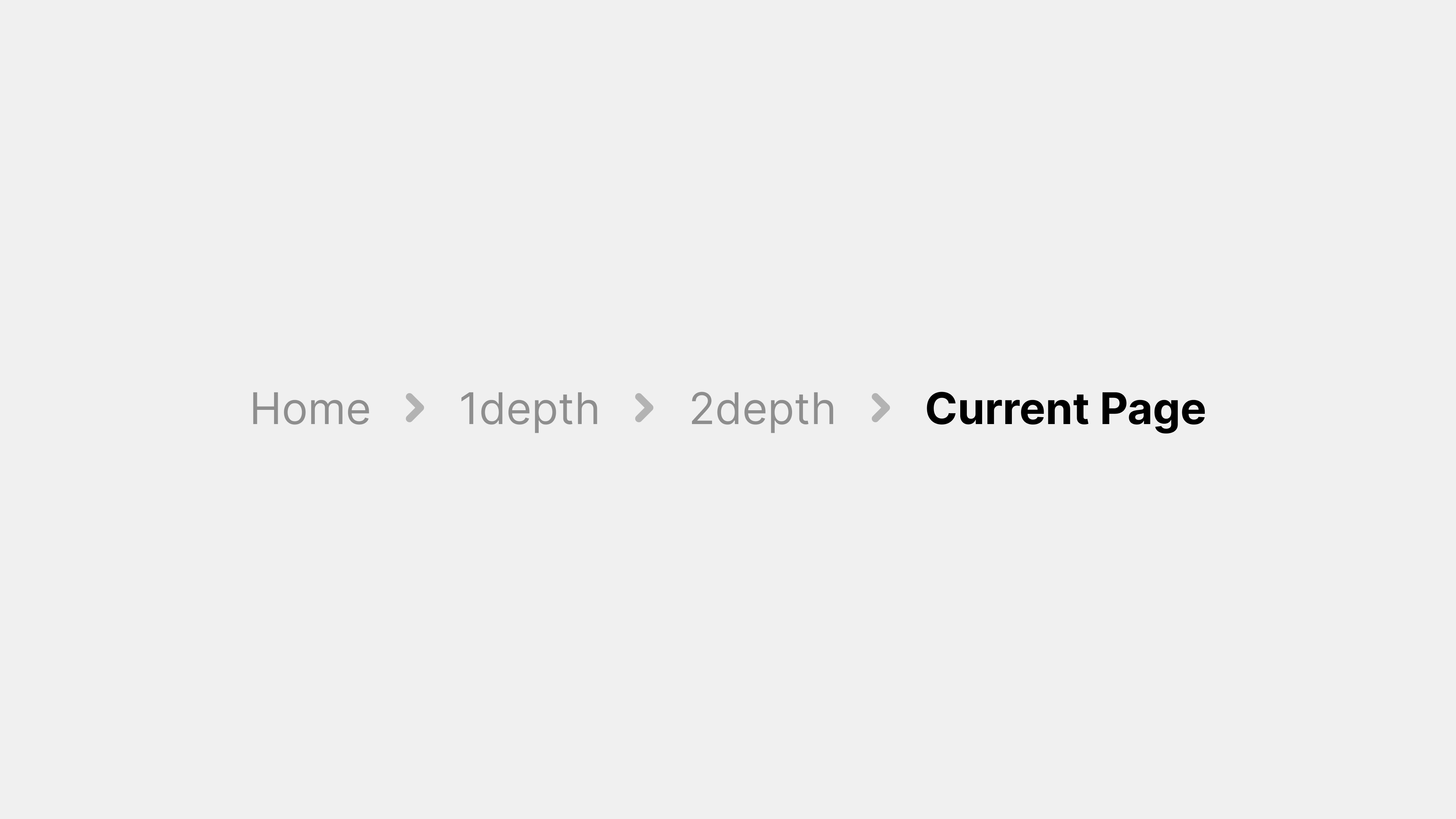
2) 메뉴는 한눈에 현재 위치와 선택지를 보여줘야: 사용자는 메뉴를 통해 현재 자신이 앱/사이트 내 어디에 있는지 알고 싶어 합니다. 따라서 메뉴에는 현재 페이지나 섹션이 강조 표시되어 있어야 합니다 (활성 상태 하이라이트 또는 다른 색 표시 등). 또한 상위 구조를 파악할 수 있도록, 가능하다면 브레드크럼(breadcrumb)이나 헤더로 경로 표시를 병행하면 좋습니다. 잘못된 메뉴 설계로 현재 위치 표시를 빼먹으면, 사용자는 메뉴를 보고도 “내가 어디에 있지?”를 답하기 어려워 혼란을 겪습니다. 그리고 메뉴를 열었을 때 어떤 옵션들이 있는지 전체 그림이 보여야 합니다. 스크롤을 너무 많이 해야 하거나 여러 단계 깊숙이 들어가야만 다른 옵션을 알 수 있다면, 메뉴의 역할을 충분히 못하는 것입니다. 특히 1단계 메뉴에서 범주 전체를 파악할 수 있게 하고, 2단계 메뉴 이상 깊어질 경우 상위 카테고리를 명시하여 사용자가 길을 잃지 않게 해야 합니다.
3) 조작하기 쉽게 만들기 (터치/클릭 고려): 메뉴 항목은 누르기 쉬운 크기와 간격으로 배치해야 합니다. 모바일에서는 손가락으로 잘못 누르지 않도록 각 항목의 높이와 여백을 충분히 주고, PC에서도 너무 촘촘하게 붙어있지 않게 해야 합니다. Nielsen Norman Group의 권장사항에 따르면, 모바일 터치 타겟은 최소 7mm (45~48px) 정도 높이를 가져야 오류를 줄일 수 있다고 합니다. 메뉴 간 간격이 너무 좁으면 한 항목을 누르려다 인접 항목을 누르는 실수를 유발하니 반드시 피하세요. 또한 하버(Hover) 기반 메뉴(마우스를 올리면 자동 열리는 메뉴)는 모바일이나 터치스크린에서는 동작하지 않으므로, 클릭/터치로 확실히 열리도록 설계해야 합니다. 최근 추세는 호버 대신 클릭으로 메뉴 열기를 선호합니다. 이렇게 하면 의도치 않은 메뉴 열림을 방지하고, 터치환경과 일관된 UX를 제공할 수 있습니다.
4) 계층은 최대 2단계, 깊어질 경우 다른 대안 고려: 드롭다운이나 플라이아웃 메뉴의 중첩 수준은 1단계, 많아도 2단계가 적당합니다. 3단계 이상으로 여러 겹 중첩된 다단 메뉴는 사용자가 메뉴를 따라 들어가다가 쉽게 길을 잃거나, 메뉴가 닫혀버리는 오류를 겪기 쉽습니다. 만약 메뉴 구조가 너무 깊어진다면, 메가 메뉴(한 번에 다 펼쳐 보여주는)나 별도 페이지 이동을 고려하세요. 예를 들어, 쇼핑몰 사이트에서 “제품 > 남성 > 의류 > 상의 > 티셔츠”처럼 4단계가 넘는다면, “상의” 단계까지만 메뉴로 보여주고 “티셔츠” 목록은 클릭 시 새로운 페이지에서 필터링된 리스트로 보여주는 식입니다. 또는 처음부터 검색 기능에 의존하도록 UX를 설계할 수도 있습니다. 중요한 것은 메뉴의 계층을 늘릴 때마다 사용자의 인지부하가 기하급수적으로 늘어난다는 점입니다. 따라서 메뉴는 얕고 넓게 설계하는 것이 대체로 바람직합니다.
5) 중요도에 따라 메뉴 노출 우선순위 정하기: 모든 것을 한 메뉴에 욱여넣기보다는, 자주 쓰는 기능과 가끔 쓰는 기능을 구분하여 메뉴 체계에 반영해야 합니다. 앞서 사례에서도 보았듯, 핵심 섹션은 항상 보이게 하고 덜 중요한 것은 드롭다운이나 “더보기” 아래 둡니다. 이를 위해 어떤 기능이 얼마나 자주 사용되는지 데이터가 있다면 참고하고, 없다면 주요 사용자 시나리오를 그림으로 그려보세요. 예를 들어 음식 주문 앱이라면 “메뉴 보기→장바구니→결제”가 핵심 시나리오이므로 이 경로는 메뉴에 한 번에 드러나게 하고, “환경설정 변경” 같은 드문 작업은 설정 메뉴 아래 넣어두어도 됩니다. 또한 UI 설계 시 Fitts의 법칙을 고려하여, 자주 쓰는 메뉴일수록 클릭/터치 거리가 짧게 (예: 화면 모서리나 손이 닿기 쉬운 하단 등에 배치) 배치합니다. 사용 빈도가 높다면 화면 한가운데 뜨는 플로팅 버튼도 검토할 수 있습니다.
6) 피드백과 상태 표시: 사용자가 메뉴를 조작할 때 즉각적인 피드백을 주는 것이 중요합니다. 메뉴 버튼을 누르면 메뉴 패널이 나타나는 애니메이션을 주어 인지하게 하고, 메뉴가 활성화된 동안은 바깥 영역을 클릭하면 닫히도록 하여 메뉴 모달리티를 명확히 합니다. 메뉴 항목을 선택하면 그 항목이 하이라이트되거나 체크 표시를 해주어 선택되었음을 표시하는 것도 좋은 패턴입니다. 예컨대 드롭다운 메뉴에서 현재 선택된 옵션은 ✔ 표시해두면 사용자가 현재 설정 상태를 알 수 있습니다. 또한 토글형 메뉴 항목(켜고 끄는 기능)은 체크박스나 토글 스위치 모양으로 표시해 상태를 시각적으로 보여주세요. 만약 어떤 메뉴 항목이 일시적으로 비활성화돼 있다면 (지금은 적용 안 되는 옵션 등) 회색으로 표시하여 클릭 불가임을 나타내되, 숨기지는 않는 것이 원칙입니다. 그래야 사용자가 “이 기능이 존재하는구나”를 인지할 수 있기 때문입니다. 단, 항목이 너무 많아 혼란을 준다면 조건에 따라 일부 메뉴를 아예 제거할 수도 있지만, 일반적으로는 비활성화(disable) > 제거(remove) 순으로 고려합니다.
7) 접근성 & 다국어 고려: 다국어 지원 앱이라면 메뉴 글자가 길어졌을 때 UI가 깨지지 않도록 미리 여유 공간을 두고 디자인합니다. 또한 폰트 크기 확대 모드나 화면 낭독에도 대비해야 합니다. 예를 들어 iOS 다이내믹 타입으로 글자가 커지면 메뉴 높이도 자동 증가하게 하거나, Android 접근성 옵션에서 “글자 크기 크게”를 해도 아이콘이 잘리지 않게 레이아웃을 조정합니다. 시각 장애인을 위해 포커스 순서를 논리적으로 배치하고(Tab 키 순서 등), 각 메뉴 버튼에 적절한 레이블(aria-label)을 넣어 스크린리더가 읽어주도록 해야 합니다. 키보드 접근은 웹의 경우 ul > li 메뉴 리스트 구조에 :focus 스타일을 주어 어디에 포커스 있는지 보이게 하고, Enter키로 메뉴 열기/선택이 가능하게 JavaScript를 설정합니다. 네이티브 앱은 기본 컴포넌트를 사용하면 대부분 지원되지만, 커스텀 메뉴를 만들 경우 비슷한 노력을 기울여야 합니다. 컬러 사용에서도 색맹 사용자를 배려해 단순 색 변화만으로 상태를 표시하지 말고, 아이콘 모양 변화나 강조 테두리 등 추가 시각적 힌트를 제공하면 좋습니다.
8) 잘못된 메뉴 설계 사례 피하기: 마지막으로 흔히 저지르는 메뉴 설계 실수를 몇 가지 짚어봅시다. 첫째, 너무 과한 창의성은 금물입니다. 메뉴는 사용자가 가장 기본적으로 조작하는 요소이므로, 표준적인 모양과 동작이 오히려 좋습니다. 지나치게 특이한 애니메이션이나 실험적인 UI (예: 화면 여기저기 흩어진 미로 같은 메뉴)는 멋져 보일 수 있으나 실제 사용성을 해칠 위험이 큽니다. 둘째, 아이콘만 있는 메뉴도 주의가 필요합니다. 아이콘은 공간을 절약하지만, 의미가 모호할 수 있습니다. 모두가 아는 햄버거(메뉴) 아이콘, 집 모양(홈) 정도가 아니면 가능하면 짧은 텍스트 라벨을 함께 표시하세요. 셋째, 일관성 부족입니다. 예를 들어 어떤 화면에서는 메뉴가 오른쪽 위에 있는데 비슷한 역할의 메뉴가 다른 화면에서는 왼쪽에 있다면 사용자는 혼란을 겪습니다. 앱 전체적으로 메뉴 배치와 스타일 가이드를 통일하고, 웹사이트에서도 페이지마다 다른 메뉴 구조를 쓰지 않도록 해야 합니다. 넷째, 반응형 메뉴 미흡입니다. 데스크톱 디자인을 모바일로 단순 축소해서는 안 됩니다. 모바일에서는 터치와 작은 화면에 맞게 메뉴를 재구성하고, 필요하면 항목을 축소/재배치하거나 완전히 다른 컴포넌트(예: 탭바 ↔ 사이드바)를 사용해야 합니다. 끝으로, 메뉴와 콘텐츠의 구분이 모호한 것도 문제입니다. 메뉴 영역은 명확히 식별 가능하게 배경이나 구분선으로 나누고, 사용자 스크롤 시 따라다니는 고정 메뉴(sticky menu)라면 가려지는 콘텐츠가 없도록 높이를 최소화하거나, 스크롤할 때 자동 숨김 처리하는 것도 고려합니다.
실무 적용 팁: 메뉴 디자인은 여러모로 신경 쓸 것이 많지만, 다행히도 플랫폼별 UI 가이드라인과 컴포넌트가 잘 마련되어 있습니다. 가능하면 iOS는 UIKit이나 SwiftUI의 UITabBar, UIMenu 등을 활용하고, 안드로이드는 Material Components의 NavigationView, PopupMenu 등을 활용하는 것이 좋습니다. 웹에서는 부트스트랩(Bootstrap)이나 머터리얼 웹 컴포넌트의 내비게이션 바, 드롭다운을 쓰면 접근성 기능도 거의 기본 장착돼 있습니다. 기존 컴포넌트의 활용은 개발 시간도 단축시키고 일관성도 높여주니 1석2조입니다. 그리고 디자인 단계에서는 프로토타입 툴을 통해 메뉴 동작을 반드시 테스트해보세요. Figma나 Adobe XD 등으로 메뉴를 클릭했을 때 화면 전환, 하이라이트 변화 등을 미리 체험해보면 의외의 UX 문제가 드러날 수 있습니다. 최종적으로 사용자 테스트를 통해 메뉴 용어가 이해되지 않거나 찾기 어렵다는 피드백이 나오면, 과감하게 수정하기를 권장합니다. 메뉴는 사용자의 내비게이션 허브이기 때문에, 초기 설계 의도보다 사용자 피드백이 우선되어야 합니다.
6. 정리 및 마무리
메뉴 UI 디자인은 단순히 보기 좋게 만드는 작업이 아니라, 정보 구조 설계, 사용자 심리 이해, 기술적 구현이 모두 어우러진 종합 예술입니다. 이번 글에서는 메뉴의 개념과 필요성을 시작으로, 구글 머터리얼 디자인・애플 HIG・MS 플루언트 디자인의 원칙과 실제 사례, 그리고 최신 트렌드와 실무 팁까지 폭넓게 살펴보았습니다.
핵심 개념 요약:
- 메뉴는 사용자에게 가능한 작업과 정보의 구조를 제공하는 UI 요소로, 사용자 경험의 길잡이 역할을 한다. 잘 만든 메뉴는 사용자가 앱/사이트 내에서 어디로 가야 할지 직관적으로 알 수 있게 돕는다.
- 디자인 시스템마다 메뉴에 대한 접근은 조금씩 다르지만 공통적으로 일관성, 명확성, 접근성을 중시한다. 머터리얼 디자인은 일시적이며 컨텍스트에 맞는 메뉴를, 애플 HIG는 심플하고 예측 가능한 메뉴를, MS 플루언트는 전통과 현대감각이 조화된 메뉴를 추구한다.
- 최신 트렌드는 중요 내비게이션은 가시성 높게, 메뉴는 단순하게이다. 숨겨진 햄버거 메뉴 대신 하단 탭이나 노출형 메뉴가 늘고, 다크 모드와 제스처 지원, 접근성 개선 등이 메뉴 설계에 큰 영향을 미치고 있다.
메뉴 디자인의 가장 중요한 요소: 결국 사용자가 원하는 바를 쉽고 빠르게 찾게 해주는 것입니다. 이를 위해 메뉴는 정보를 구조화하고, 현재 위치와 이동 경로를 제시하며, 오조작 없이 편리하게 눌러야 합니다. 아무리 멋진 시각 효과도 이 요소들을 해쳐서는 안 됩니다. 콘텐츠가 왕이라면, 메뉴는 그 왕으로 가는 길잡이입니다. 길을 잘못 안내하는 화려한 표지판보다는, 투박해도 정확한 이정표가 사용자에게는 더 가치있습니다.
마지막으로 실무에서 메뉴를 설계할 때는 항상 사용자 입장에서 생각하기를 권합니다. 우리가 만든 메뉴를 전혀 처음 쓰는 사람이라면 이해할까? 이 메뉴 구조가 과연 제품 목표와 사용자 목표를 모두 만족시키는 최적의 타협점일까? 정기적으로 자문하며, 필요하면 동료나 잠재 사용자에게 테스트해 보는 것이 좋습니다.
다양한 기기와 환경에서 메뉴가 일관되게 작동하는지도 확인하세요. 특히 모바일 vs PC, 라이트 vs 다크 모드, 언어 변화 등 상황에서 깨지거나 혼란스럽진 않은지 꼼꼼히 살피는 것이 중요합니다.
이상으로 UI 디자인에서 메뉴의 개념과 설계 원칙에 대해 살펴보았습니다. 메뉴 디자인은 한 번 배우면 끝나는 주제가 아니라, 새로운 기술과 트렌드에 맞춰 계속 업데이트해야 하는 분야입니다. 하지만 변하지 않는 원칙은 하나 있습니다: “사용자가 느끼기에 편해야 한다.” 이 원칙만큼은 늘 염두에 두고, 멋보다는 쓰임새에 집중하는 메뉴 설계자가 되시길 바랍니다. 여러분의 앱/웹이 뛰어난 메뉴 디자인으로 사용자들에게 쾌적한 탐색 경험을 제공하길 기대합니다!
#UI디자인 #메뉴UI #구글머터리얼 #애플HIG #MS플루언트 #UX디자인 #인터페이스디자인 #모바일UI #웹UI #메뉴사례 #UI가이드라인