[카테고리:] UI COMPONENTS

  • Menu – 4. Functions

    Menu – 4. Functions

    Exploring the Key Functions of Menus in UI/UX Design

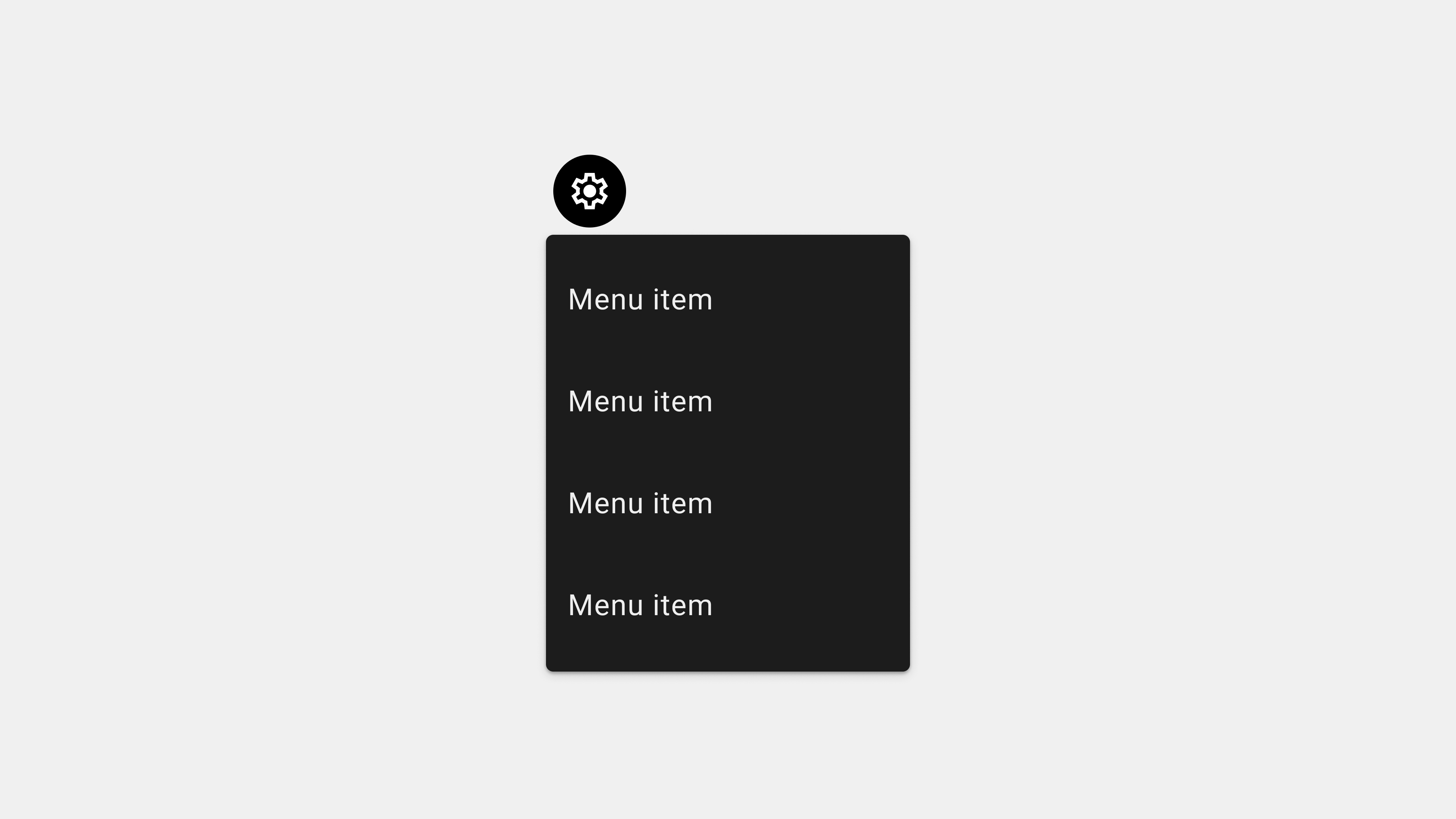
    Menus are an essential component of user interfaces, serving as the primary method for users to interact with applications or websites. By organizing and presenting content, actions, and navigation paths, menus play a critical role in delivering an intuitive and seamless user experience. This article explores the major functions of menus, their impact on usability, and best practices for implementation.


    1. Organizing Content and Features

    Menus structure and organize content, ensuring users can easily find what they need.

    How It Works

    • Categorization: Menus group related items into categories, creating a logical hierarchy.
    • Prioritization: Important features are placed prominently in the menu for easy access.
    • Navigation Structure: Menus establish a clear flow between different sections or features.

    Examples

    • E-commerce Sites: Categories like “Electronics,” “Clothing,” and “Home Goods” in mega menus simplify shopping.
    • Mobile Apps: Tabs in navigation menus like “Home,” “Search,” and “Profile” provide quick access to core features.

    Benefits

    • Reduces cognitive load by breaking down complex information.
    • Speeds up task completion by presenting options logically.

    2. Facilitating Navigation

    Menus act as a guide, helping users move between different sections or pages.

    How It Works

    • Primary Navigation: Horizontal or vertical menus provide access to main sections.
    • Secondary Navigation: Dropdown or contextual menus lead to subcategories or additional options.
    • Persistent Navigation: Fixed menus remain visible as users scroll, ensuring consistent access.

    Examples

    • Websites: Top navigation bars link to pages like “About Us,” “Products,” and “Contact.”
    • Desktop Applications: Side menus in productivity tools like Slack or Microsoft Teams provide quick navigation to chats, tasks, or settings.

    Benefits

    • Eliminates confusion by creating predictable navigation paths.
    • Encourages exploration by exposing users to additional features or content.

    3. Enabling Task Execution

    Menus provide users with tools and options to complete specific tasks or actions.

    How It Works

    • Command Menus: Contain actions like “Save,” “Edit,” or “Delete” relevant to the user’s context.
    • Inline Menus: Allow users to make selections or execute tasks within a workflow.
    • Floating Menus: Provide quick access to frequently used actions, such as “Add” or “Share.”

    Examples

    • Text Editors: Menus with options like “Undo,” “Redo,” or “Format” streamline content creation.
    • Project Management Tools: Dropdown menus for assigning tasks, setting deadlines, or adding collaborators.

    Benefits

    • Increases productivity by reducing the number of steps required to perform actions.
    • Ensures users can quickly complete tasks without navigating away from their current context.

    4. Enhancing Discoverability

    Menus expose users to features or content they might not be aware of, driving engagement and retention.

    How It Works

    • Expandable Menus: Dropdowns and mega menus reveal additional options upon interaction.
    • Dynamic Menus: Adjust content based on user behavior or preferences.
    • Searchable Menus: Allow users to find specific items or features using keywords.

    Examples

    • Streaming Platforms: Mega menus with categories like “Movies,” “TV Shows,” and “Documentaries.”
    • Mobile Apps: Hamburger menus revealing options like “Settings,” “Help,” or “Feedback.”

    Benefits

    • Encourages users to explore all aspects of the app or website.
    • Improves user satisfaction by helping them discover new features or content.

    5. Supporting Personalization and Customization

    Menus allow users to tailor their experience by configuring settings or preferences.

    How It Works

    • Settings Menus: Provide options to adjust account details, notifications, or display preferences.
    • Role-Based Menus: Adjust the menu content based on user roles, such as admin or regular user.
    • Dynamic Menus: Update content dynamically to reflect user preferences or activity history.

    Examples

    • Fitness Apps: Menus offering customization of workout plans or tracking goals.
    • Corporate Apps: Role-specific menus for admins to access “User Management” and employees to access “Tasks.”

    Benefits

    • Enhances engagement by aligning the interface with individual needs.
    • Supports inclusivity by providing accessibility options.

    6. Providing Contextual Awareness

    Menus help users understand their current location within the app or website.

    How It Works

    • Active State Indicators: Highlight the current menu item or tab.
    • Breadcrumb Menus: Display the user’s navigation path for better orientation.
    • Contextual Menus: Offer relevant actions based on the selected item or area.

    Examples

    • E-Learning Platforms: Breadcrumbs showing the path from “Dashboard > Courses > Module 3.”
    • File Management Apps: Contextual menus for individual files with options like “Rename” or “Move.”

    Benefits

    • Reduces confusion by showing users where they are in the system.
    • Builds confidence in navigation and task execution.

    7. Supporting Multitasking

    Menus facilitate multitasking by allowing users to switch between tasks or manage multiple workflows.

    How It Works

    • Tab Menus: Enable switching between different sections without losing progress.
    • Side Menus: Provide persistent access to options while users interact with the main interface.
    • Overlay Menus: Temporarily display additional tools or settings without leaving the current screen.

    Examples

    • Web Browsers: Tab menus for multiple open pages.
    • Messaging Apps: Side menus for navigating between chats, calls, or groups.

    Benefits

    • Saves time by eliminating the need to repeatedly navigate back and forth.
    • Improves user productivity by keeping workflows uninterrupted.

    8. Improving Accessibility

    Menus ensure that all users, including those with disabilities, can navigate and interact with the interface effectively.

    How It Works

    • Keyboard Navigation: Enables users to navigate menus using only a keyboard.
    • Screen Reader Support: Menus are designed with ARIA roles and labels for screen reader compatibility.
    • Touch-Friendly Menus: Designed with large touch targets for users with motor impairments.

    Examples

    • E-Commerce Sites: Menus with keyboard shortcuts for browsing product categories.
    • Corporate Apps: Accessible menus for visually impaired employees using assistive technologies.

    Benefits

    • Promotes inclusivity by accommodating diverse user needs.
    • Enhances usability for all users, regardless of their abilities.

    9. Tools for Implementing Menus

    Design Tools

    • Figma: For prototyping and designing interactive menus.
    • Adobe XD: For creating animations and testing menu transitions.

    Development Tools

    • React Menu: For building dynamic and responsive menus.
    • Bootstrap: For prebuilt menu components.

    Testing Tools

    • Axe Accessibility Checker: To ensure compliance with accessibility standards.
    • BrowserStack: For cross-browser and cross-platform menu testing.

    Conclusion

    Menus are indispensable in UI/UX design, providing users with the tools and pathways they need to navigate, execute tasks, and personalize their experience. By focusing on the key functions—such as organizing content, facilitating navigation, and enhancing discoverability—designers and developers can create menus that deliver seamless and intuitive user experiences. Incorporating best practices and leveraging modern tools ensures that menus remain functional, accessible, and user-friendly.


  • 메뉴 – 4. 기능

    메뉴 – 4. 기능

    메뉴(Menu)의 주요 기능: 상세 분석

    메뉴(Menu)는 사용자가 디지털 서비스와 애플리케이션 내에서 원하는 정보를 탐색하거나 특정 작업을 수행할 수 있도록 설계된 UI 구성 요소다. 단순히 항목을 나열하는 것을 넘어 서비스의 정보 구조를 체계화하고, 사용자 경험(UX)을 향상시키는 중요한 역할을 한다. 이번 글에서는 메뉴의 주요 기능을 심도 있게 분석하고, 성공적인 메뉴 설계를 위한 가이드를 제공한다.


    1. 정보 탐색과 구조 제공

    1) 주요 정보 접근성 강화

    메뉴의 가장 기본적인 기능은 사용자에게 중요한 정보를 효율적으로 노출하는 것이다.

    • 핵심 정보의 배치: 사용 빈도가 높은 기능을 상위 메뉴에 배치.
      • 예: “홈”, “검색”, “내 계정”.
    • 계층적 구조 제공: 상위 항목과 하위 항목을 체계적으로 구성하여 사용자가 원하는 정보를 쉽게 찾을 수 있도록 설계.
      • 예: “상품” → “의류” → “남성복”.

    2) 전체 서비스 맥락 제공

    • 서비스의 전체 구조 이해: 메뉴는 서비스가 제공하는 기능과 정보를 한눈에 볼 수 있도록 한다.
    • 빠른 탐색 경로 제공: 사용자가 탐색 흐름을 빠르게 이해하고 원하는 항목으로 이동할 수 있도록 돕는다.

    3) 사용자 여정 지원

    • 현재 위치 표시: 활성화된 메뉴 항목을 시각적으로 강조해 사용자가 현재 위치를 명확히 인지할 수 있도록 한다.
      • 예: 활성화된 탭의 색상 변화, 밑줄 강조.
    • 직관적인 네비게이션 제공: 메뉴를 통해 사용자가 서비스 내에서의 여정을 논리적으로 설계.

    2. 사용자 작업 수행 지원

    1) 작업 실행 경로 제공

    메뉴는 사용자가 특정 작업을 쉽게 수행할 수 있도록 한다.

    • CTA(Call To Action) 포함: “구매하기”, “문의하기”와 같은 버튼을 메뉴에 포함해 사용자의 행동을 유도.
    • 작업 단축: 자주 사용하는 기능에 빠르게 접근할 수 있는 경로 제공.
      • 예: “최근 본 상품”, “장바구니”.

    2) 반복 작업의 효율성 증대

    • 즐겨찾기 기능 통합: 사용자가 자주 방문하는 페이지나 기능을 저장해 빠르게 접근할 수 있도록 한다.
      • 예: “내 목록”, “즐겨찾기”.
    • 탭 전환으로 작업 전환 지원: 작업 간 빠른 전환을 가능하게 해 생산성을 높임.

    3) 검색 기능 통합

    • 통합 검색 메뉴: 복잡한 정보 구조를 가진 서비스는 검색 메뉴를 통해 필요한 정보를 빠르게 찾을 수 있게 한다.
      • 예: 상단 메뉴에 검색 창 배치.

    3. 사용자 경험 향상

    1) 사용자 기대 충족

    메뉴는 사용자가 직관적으로 이해할 수 있는 방식으로 설계되어야 한다.

    • 명확한 텍스트 사용: 메뉴 항목 이름이 기능과 역할을 명확히 반영.
      • 예: “내 정보” 대신 “프로필”.
    • 시각적 힌트 제공: 아이콘과 텍스트를 함께 사용해 탐색 효율성을 강화.

    2) 탐색 스트레스 감소

    • 간결한 디자인: 한 화면에 너무 많은 메뉴 항목이 나열되지 않도록 조정.
    • 피드백 제공: 사용자의 선택에 대한 즉각적인 시각적 또는 애니메이션 피드백 제공.

    4. 서비스 브랜드 표현

    1) 브랜드 이미지 강화

    메뉴는 단순한 탐색 도구를 넘어 서비스의 정체성을 표현한다.

    • 브랜드 색상 반영: 메뉴의 디자인에 브랜드의 주요 색상을 적용해 서비스의 일관성을 유지.
    • 로고와 슬로건 노출: 메뉴 상단에 브랜드 로고와 슬로건을 포함해 신뢰감을 전달.

    2) 서비스 특성 강조

    • 특정 기능 강조: 브랜드의 주요 가치를 반영하는 메뉴 항목을 눈에 띄게 디자인.
      • 예: “로켓 배송” (쿠팡), “프라임 비디오” (아마존).

    5. 사용자 행동 데이터 수집

    1) 클릭 패턴 분석

    메뉴를 통해 사용자가 자주 탐색하는 항목과 경로를 파악할 수 있다.

    • 사용자 선호도 파악: 클릭 데이터를 기반으로 자주 사용하는 메뉴 항목 분석.
    • 메뉴 최적화: 데이터를 바탕으로 사용자 흐름을 개선하고 불필요한 메뉴 제거.

    2) 개인화된 메뉴 제공

    • 사용자 행동 기반 추천: 사용자의 탐색 이력을 바탕으로 맞춤형 메뉴 항목 제공.
      • 예: 넷플릭스의 추천 카테고리.

    6. 접근성과 사용성 강화

    1) 모든 사용자에게 접근 가능한 설계

    • 스크린 리더 지원: ARIA 속성을 추가해 메뉴 항목이 스크린 리더와 호환되도록 설계.
    • 키보드 내비게이션 지원: 키보드만으로 메뉴를 탐색할 수 있도록 구현.

    2) 다양한 디바이스 환경 대응

    • 반응형 설계: 모바일, 태블릿, 데스크탑 등 다양한 디바이스 환경에서 메뉴가 일관되게 작동.
    • 터치 친화적 설계: 터치 스크린 디바이스에서 적절한 터치 영역과 제스처를 지원.

    7. 성능 최적화

    1) 빠른 로딩 시간 제공

    • 지연 로딩(Lazy Loading): 필요한 데이터만 로드해 초기 로딩 시간을 단축.
    • 캐싱 활용: 반복적으로 사용되는 메뉴 데이터를 캐싱해 빠르게 불러옴.

    2) 부드러운 인터랙션 제공

    • 애니메이션 최적화: 드롭다운 메뉴나 슬라이드 애니메이션이 끊기지 않도록 GPU 기반 애니메이션 활용.
    • 즉각적인 피드백: 클릭, 터치 등의 입력에 빠르고 정확하게 반응.

    8. 테스트와 QA를 통한 신뢰성 확보

    1) 기능 테스트

    • 메뉴 항목이 올바른 화면으로 연결되는지 확인.
    • 서브 메뉴가 열리고 닫히는 동작 검증.

    2) 접근성 테스트

    • 스크린 리더와 키보드 탐색 테스트를 통해 모든 사용자가 접근 가능하도록 설계.

    3) 성능 테스트

    • 메뉴 로딩 속도와 애니메이션 부드러움을 점검.
    • 네트워크 상태가 불안정한 환경에서도 메뉴가 정상적으로 작동하는지 확인.

    결론

    메뉴는 단순한 UI 요소를 넘어 정보 탐색, 사용자 작업 지원, 브랜드 표현, 데이터 수집 등 다양한 기능을 수행한다. 사용자 중심의 설계와 성능 최적화를 통해 메뉴의 효율성을 극대화하면, 서비스 품질을 높이고 사용자 만족도를 강화할 수 있다.


  • Menu – 3. Types

    Menu – 3. Types

    Comprehensive Guide to the Major Types of Menus in UI/UX Design

    Menus are essential components of any user interface, serving as navigation hubs that guide users through applications or websites. With various types of menus tailored to different use cases and user needs, understanding their features and applications is critical for effective UI/UX design. This article provides an in-depth look at the major types of menus, their roles, advantages, and best practices.


    1. Navigation Menus

    Definition

    Navigation menus are used to help users move between the primary sections of a website or application.

    Key Types

    A. Horizontal Navigation Menus

    • Description: Typically placed at the top of the page, these menus display links in a single row.
    • Use Cases: Ideal for websites or apps with a small number of primary sections.
    • Examples: “Home,” “About Us,” “Services,” “Contact.”

    B. Vertical Navigation Menus

    • Description: Displayed in a column on the left or right side of the screen.
    • Use Cases: Suitable for apps or websites with a lot of content, such as dashboards.
    • Examples: Admin panels with categories like “Users,” “Settings,” “Reports.”

    C. Hamburger Menus

    • Description: Collapsible menus accessed via a three-line icon.
    • Use Cases: Frequently used in mobile apps to save space.
    • Examples: Social media apps like Instagram.

    2. Dropdown Menus

    Definition

    Dropdown menus expand vertically or horizontally to reveal additional options when clicked or hovered over.

    Types and Use Cases

    A. Standard Dropdown Menus

    • Description: Simple lists that expand upon interaction.
    • Use Cases: Great for organizing options like account settings.
    • Examples: “Profile” dropdown with options like “Edit Profile,” “Logout.”

    B. Cascading Dropdown Menus

    • Description: Submenus appear next to the main dropdown options.
    • Use Cases: Useful for hierarchical data.
    • Examples: E-commerce sites with categories like “Men > Shoes > Sneakers.”

    3. Contextual Menus

    Definition

    Contextual menus appear dynamically based on the user’s actions, offering relevant options.

    Key Features

    • Triggered By: Right-clicking on desktops or long-pressing on mobile devices.
    • Dynamic Options: Adjusted based on the item or location clicked.

    Use Cases

    • File management apps like Google Drive, where right-clicking offers “Download,” “Rename,” or “Delete” options.

    Advantages

    • Reduces clutter by only showing relevant actions.
    • Increases efficiency by offering shortcuts.

    4. Mega Menus

    Definition

    Mega menus are large, multi-column menus that display multiple options and subcategories simultaneously.

    Use Cases

    • E-commerce sites with extensive product categories.
    • Educational websites with diverse resources like “Courses,” “Departments,” “Events.”

    Advantages

    • Provides a comprehensive view of options.
    • Reduces the need for deep navigation hierarchies.

    Challenges

    • Requires careful organization to avoid overwhelming users.

    5. Command Menus

    Definition

    Command menus are used in applications to execute specific actions.

    Examples

    • Text editors with options like “Cut,” “Copy,” “Paste.”
    • Media players with controls like “Play,” “Pause,” “Skip.”

    Advantages

    • Focuses on task-specific actions.
    • Enhances productivity for professional tools.

    6. Side Menus

    Definition

    Side menus slide in from the left or right side of the screen, often triggered by gestures or icons.

    Use Cases

    • Mobile apps for secondary navigation like “Settings,” “Help,” “Feedback.”
    • Social media apps for account options.

    Advantages

    • Saves space by hiding secondary options.
    • Offers a clean and minimalist design.

    7. Floating Menus

    Definition

    Floating menus are overlay menus that appear above other content.

    Use Cases

    • Quick access to frequently used tools in creative apps.
    • Mobile apps with floating action buttons (FABs).

    Advantages

    • Provides quick access without disrupting the user’s current context.
    • Enhances multitasking.

    8. Tab Menus

    Definition

    Tab menus use tabs to divide content into multiple views, with each tab representing a section.

    Use Cases

    • Mobile apps like Instagram, with tabs for “Home,” “Search,” “Reels,” and “Profile.”
    • Desktop apps like browsers with tabs for multiple webpages.

    Advantages

    • Keeps navigation consistent across sections.
    • Allows easy switching between tasks.

    9. Footer Menus

    Definition

    Footer menus are located at the bottom of a webpage or app, providing access to supplementary content.

    Use Cases

    • Websites for links to “Privacy Policy,” “Terms of Service,” “Contact.”
    • Mobile apps for persistent navigation options.

    Advantages

    • Offers non-intrusive access to secondary content.
    • Ensures visibility without cluttering the main interface.

    10. Inline Menus

    Definition

    Inline menus are embedded within the content, allowing users to select options directly.

    Use Cases

    • Survey forms with dropdowns for selecting responses.
    • Rich text editors with inline formatting options.

    Advantages

    • Keeps users focused on the task by minimizing navigation.
    • Simplifies workflows for inline tasks.

    Best Practices for Choosing the Right Menu Type

    A. Understand User Needs

    • Identify the user’s primary tasks and navigation goals.
    • Choose a menu type that aligns with their workflow.

    B. Test Menu Usability

    • Conduct A/B testing to determine the most effective menu type.
    • Gather feedback from real users to refine the design.

    C. Ensure Accessibility

    • Design menus that are keyboard-navigable and screen reader-compatible.
    • Use sufficient contrast and clear labels for all menu options.

    Conclusion

    Menus are the backbone of navigation in UI/UX design, with each type serving distinct purposes and use cases. From simple dropdowns to expansive mega menus, understanding the strengths and challenges of each type helps create interfaces that enhance usability and user satisfaction. By choosing the right menu type for your application and adhering to best practices, you can ensure a seamless and intuitive user experience.


  • 메뉴 – 3 주요 유형

    메뉴 – 3 주요 유형

    메뉴(Menu)의 주요 유형: 심층 분석

    메뉴(Menu)는 디지털 서비스와 애플리케이션에서 사용자 경험(UX)을 설계하는 데 가장 중요한 요소 중 하나다. 다양한 유형의 메뉴는 각기 다른 사용자 요구와 서비스의 특성에 맞춰 설계된다. 이번 글에서는 메뉴의 주요 유형을 상세히 분석하고, 각 유형의 특징, 장단점, 사용 사례를 깊이 있게 다룬다.


    1. 상단 메뉴 (Top Navigation Bar)

    정의

    상단 메뉴는 화면의 상단에 고정되어 주요 탐색 항목을 제공하는 형태다.

    특징

    • 위치: 화면의 최상단에 위치하며, 주요 카테고리를 노출.
    • 항목: “홈”, “서비스”, “연락처”와 같은 상위 카테고리 포함.
    • 일관성: 모든 페이지에서 동일하게 유지되는 경우가 많음.

    장점

    1. 직관적 탐색: 사용자에게 익숙한 레이아웃으로 탐색이 용이하다.
    2. 항목 간 가시성: 모든 메뉴 항목이 항상 화면에 노출되어 있다.
    3. 브랜드 표현 강화: 상단 바에 로고, 브랜드 색상을 포함해 신뢰감 전달.

    단점

    1. 공간 제약: 메뉴 항목이 많을 경우 화면 공간 부족.
    2. 모바일에서 비효율적: 작은 화면에서는 상단 메뉴가 차지하는 공간이 큼.

    사용 사례

    • 웹사이트: 대부분의 기업 웹사이트에서 사용.
    • 전자 상거래: 아마존, 쿠팡 등 주요 상품 카테고리를 상단 메뉴에 배치.

    2. 사이드 메뉴 (Sidebar Navigation)

    정의

    사이드 메뉴는 화면의 왼쪽 또는 오른쪽에 위치하며, 주요 탐색 항목을 나열하거나 숨겨진 상태로 시작되는 형태다.

    특징

    • 위치: 좌측 사이드바(일반적), 우측 사이드바(보조 기능).
    • 상태: 고정형 또는 햄버거 메뉴로 숨겨져 있다가 열리는 형태.

    장점

    1. 공간 활용도 높음: 좌우측 여백을 활용하여 화면 공간을 절약.
    2. 확장성: 많은 메뉴 항목과 서브 메뉴를 포함할 수 있음.
    3. 사용자 흐름 지원: 계층적 정보 구조 제공.

    단점

    1. 시각적 부각 부족: 초기 상태에서 메뉴가 숨겨져 있으면 사용자가 탐색하기 어려움.
    2. 초기 학습 필요: 숨겨진 메뉴 사용에 익숙하지 않은 사용자에게는 혼란 가능.

    사용 사례

    • 대시보드: Google Analytics, Notion과 같은 복잡한 정보 구조를 가진 서비스.
    • 모바일 앱: 설정 또는 부가 기능을 포함하는 보조 탐색 메뉴로 활용.

    3. 바텀 메뉴 (Bottom Navigation Bar)

    정의

    바텀 메뉴는 모바일 화면 하단에 고정되어 주요 탐색 기능을 제공하는 형태다.

    특징

    • 위치: 화면 하단에 고정.
    • 탭 구성: 최대 3~5개의 주요 항목.

    장점

    1. 손쉬운 접근성: 사용자의 엄지손가락 범위 내에서 주요 기능 제공.
    2. 간결한 레이아웃: 핵심 기능만 포함해 간단하고 직관적.
    3. 일관성 유지: 모든 화면에서 동일하게 표시.

    단점

    1. 공간 제한: 표시할 수 있는 항목 수가 제한적.
    2. 복잡한 서비스에 부적합: 많은 정보를 제공해야 하는 서비스에는 적합하지 않음.

    사용 사례

    • 모바일 앱: 인스타그램, 페이스북, 유튜브.
    • 간단한 탐색 구조: 탭을 통한 빠른 화면 전환.

    4. 드롭다운 메뉴 (Dropdown Menu)

    정의

    드롭다운 메뉴는 클릭 또는 호버 시 하위 항목이 열리는 방식으로 구성된 메뉴다.

    특징

    • 상태: 기본 상태에서는 숨겨져 있으며, 사용자 동작으로 표시됨.
    • 구성 요소: 상위 항목과 다수의 하위 항목 포함.

    장점

    1. 공간 절약: 초기 상태에서 숨겨진 항목으로 화면을 깔끔하게 유지.
    2. 다양한 선택지 제공: 여러 옵션을 한 번에 표시.

    단점

    1. 탐색 복잡성: 하위 메뉴의 가독성이 낮을 수 있음.
    2. 모바일 비적합: 작은 화면에서는 사용하기 어려움.

    사용 사례

    • 웹 애플리케이션: 사용자 설정, 계정 관리.
    • 전자 상거래: 제품 카테고리 필터링.

    5. 햄버거 메뉴 (Hamburger Menu)

    정의

    햄버거 메뉴는 세 줄 모양의 아이콘을 클릭하면 메뉴가 확장되는 형태다.

    특징

    • 상태: 숨겨진 상태에서 시작하며, 클릭 시 탐색 메뉴를 표시.
    • 구성 요소: 상위 및 하위 메뉴를 포함한 계층적 구조.

    장점

    1. 공간 절약: 화면 공간을 최소한으로 차지.
    2. 모든 디바이스에서 사용 가능: 반응형 디자인에 적합.

    단점

    1. 탐색 가시성 부족: 초기 상태에서 메뉴가 숨겨져 있어 사용자가 쉽게 찾지 못할 수 있음.
    2. 추가 클릭 필요: 메뉴를 열기 위해 추가 동작이 필요.

    사용 사례

    • 모바일 웹사이트: 주요 탐색 메뉴가 숨겨져야 할 때 사용.
    • 복잡한 서비스: 메뉴 항목이 많을 때 유용.

    6. 플라이아웃 메뉴 (Flyout Menu)

    정의

    플라이아웃 메뉴는 사용자가 특정 항목 위에 마우스를 올리면 하위 메뉴가 옆으로 확장되는 방식이다.

    특징

    • 위치: 사이드바나 드롭다운 형태에서 확장.
    • 상태: 서브 메뉴가 계층적으로 표시됨.

    장점

    1. 계층적 탐색 제공: 많은 정보를 단계적으로 탐색 가능.
    2. 빠른 접근성: 마우스 이동만으로 하위 메뉴 탐색.

    단점

    1. 초보자에게 어려움: 사용자가 서브 메뉴를 탐색하는 데 익숙하지 않을 수 있음.
    2. 공간 소모: 서브 메뉴가 확장될 때 화면 공간을 많이 차지.

    사용 사례

    • 대시보드: 관리자 페이지, 복잡한 데이터 구조.
    • 전자 상거래: 카테고리별 상품 탐색.

    7. 탭 메뉴 (Tab Navigation)

    정의

    탭 메뉴는 여러 항목을 탭 형태로 나열하여 사용자가 선택한 탭에 따라 화면 내용이 변경되는 메뉴다.

    특징

    • 위치: 상단, 중앙, 하단.
    • 구성: 한 번에 여러 항목을 표시하며, 선택된 탭이 활성화 상태로 표시.

    장점

    1. 직관적 탐색: 사용자가 현재 위치를 쉽게 인지.
    2. 빠른 전환: 클릭 또는 터치만으로 다른 화면으로 전환 가능.

    단점

    1. 공간 제한: 항목 수가 많아질수록 가독성이 떨어짐.
    2. 복잡한 기능 제공 어려움: 간단한 구조에 적합.

    사용 사례

    • 모바일 앱: 인스타그램(피드, 탐색, 프로필).
    • 웹사이트: 뉴스, 쇼핑몰 카테고리.

    결론

    메뉴는 사용자가 서비스의 정보와 기능을 탐색하는 데 중요한 역할을 한다. 다양한 메뉴 유형은 서비스의 특성과 사용자 요구에 맞게 설계되며, 상단 메뉴, 사이드 메뉴, 바텀 메뉴, 드롭다운 메뉴, 햄버거 메뉴, 플라이아웃 메뉴, 탭 메뉴 등 각 유형은 고유의 장점과 단점을 가지고 있다. 성공적인 메뉴 설계를 위해서는 각 유형의 특징과 사용자 환경에 따른 최적화를 고려해야 한다.


  • Menu – 2. Definition

    Menu – 2. Definition

    Exploring the Definition and Role of Menus in UI/UX Design

    Menus are one of the most essential elements in user interface design. They act as the backbone of navigation, enabling users to access content, features, and functionality efficiently. A well-designed menu not only improves usability but also serves as a critical component in delivering a seamless user experience. This article delves deeper into the definition and role of menus, providing insights into their importance and best practices for their design.


    1. What Are Menus in UI/UX Design?

    A menu in the context of UI/UX design is a structured list of options, commands, or features that allow users to interact with a system. Menus act as the primary means of navigation, guiding users through the interface and helping them perform desired tasks.

    Key Characteristics of Menus

    • Hierarchy: Menus often follow a hierarchical structure to organize information.
    • Visibility: They are designed to be easily discoverable and accessible.
    • Functionality: Menus facilitate navigation, settings configuration, and task execution.

    Purpose of Menus

    • To provide users with clear pathways to navigate between different sections of an app or website.
    • To offer shortcuts for executing commands or accessing frequently used features.
    • To reduce cognitive load by organizing options in an intuitive layout.

    2. The Role of Menus in UI/UX Design

    Menus are more than just lists of options; they play a multifaceted role in shaping the user experience.

    A. Organizing Information

    Menus act as a framework for categorizing and presenting content in a logical manner.

    Why It Matters

    • Helps users quickly find what they are looking for.
    • Prevents information overload by grouping related options.

    Example

    E-commerce websites like Amazon use mega menus to categorize products into “Electronics,” “Fashion,” and “Home Essentials,” allowing users to navigate vast inventories easily.


    B. Facilitating Navigation

    Menus guide users to different sections or features of a system.

    Why It Matters

    • Simplifies complex interfaces by providing clear pathways.
    • Reduces the time and effort required to navigate.

    Example

    In a mobile app, a bottom navigation bar menu provides quick access to primary features like “Home,” “Search,” “Notifications,” and “Profile.”


    C. Enhancing Discoverability

    Menus help users uncover features or content they may not have known existed.

    Why It Matters

    • Drives engagement by exposing users to new or less obvious features.
    • Encourages exploration and retention.

    Example

    A hamburger menu in a mobile app might include secondary features like “Help,” “Settings,” or “About Us” that are not immediately visible.


    D. Supporting Task Execution

    Command menus allow users to perform specific actions such as editing, saving, or sharing content.

    Why It Matters

    • Increases efficiency by enabling quick access to tools and functions.
    • Improves user satisfaction by reducing the steps required to complete tasks.

    Example

    In a document editing tool like Google Docs, the “File” menu offers commands like “Save,” “Download,” and “Print,” streamlining productivity.


    E. Enabling Customization and Configuration

    Settings menus allow users to personalize their experience by configuring preferences.

    Why It Matters

    • Enhances user satisfaction by giving them control over the interface.
    • Supports diverse user needs and accessibility requirements.

    Example

    A settings menu in a streaming app allows users to adjust playback quality, manage subscriptions, and configure parental controls.


    3. Key Components of Menus

    A. Menu Items

    Each option within a menu is a menu item, representing an action, link, or feature.

    B. Icons and Labels

    Icons visually represent menu items, while labels provide textual descriptions.

    C. Dividers and Grouping

    Menus often use dividers or visual grouping to organize related items, making them easier to scan.

    D. Hierarchical Structure

    Submenus or dropdowns create a nested structure for categorizing complex menus.


    4. Best Practices for Designing Effective Menus

    Creating an effective menu involves balancing usability, functionality, and aesthetics.

    A. Keep It Simple

    • Avoid cluttering menus with too many options.
    • Prioritize the most important features or sections.

    B. Use Clear and Descriptive Labels

    • Ensure that menu labels accurately describe their purpose.
    • Avoid using jargon or ambiguous terms.

    C. Ensure Accessibility

    • Implement ARIA roles for screen reader compatibility.
    • Design menus to be navigable via keyboard.

    D. Optimize for Different Devices

    • Use responsive design to ensure menus work seamlessly on mobile, tablet, and desktop.
    • Implement touch-friendly elements for mobile users.

    E. Provide Feedback and Indicators

    • Highlight the active menu item to show users their current location.
    • Use hover effects, animations, or sound cues to confirm interactions.

    5. Common Types of Menus

    A. Navigation Menus

    Used for moving between sections of an app or website.

    B. Dropdown Menus

    Expand to reveal options when clicked or hovered over.

    C. Contextual Menus

    Appear based on user actions, offering relevant commands.

    D. Mega Menus

    Display multiple categories and subcategories in a large panel.


    6. Challenges in Menu Design

    A. Overcrowding

    Menus with too many options can overwhelm users.
    Solution: Prioritize and group options into submenus.

    B. Ambiguity

    Unclear labels or icons can confuse users.
    Solution: Use familiar language and universally recognized icons.

    C. Accessibility Issues

    Menus that are not screen reader-friendly exclude users with disabilities.
    Solution: Test menus with assistive technologies.


    7. Tools for Designing and Developing Menus

    A. Design Tools

    • Figma: For creating wireframes and prototypes.
    • Adobe XD: For interactive menu designs.

    B. Development Tools

    • React Menu: For implementing dynamic, responsive menus.
    • Bootstrap: For prebuilt components and templates.

    C. Testing Tools

    • Axe Accessibility Checker: For identifying accessibility issues.
    • BrowserStack: For cross-browser testing.

    Conclusion

    Menus are more than just navigation tools; they are pivotal in shaping the overall user experience. By organizing content, facilitating navigation, and supporting task execution, menus empower users to interact with a system effortlessly. Designers and developers must prioritize clarity, accessibility, and responsiveness to create menus that enhance usability and satisfaction.


  • 메뉴 – 2. 정의

    메뉴 – 2. 정의

    메뉴(Menu): 정의와 역할에 대한 심층 분석

    메뉴(Menu)는 웹사이트와 애플리케이션에서 가장 기본적이면서도 필수적인 UI 요소로, 사용자가 원하는 정보를 탐색하거나 특정 작업을 수행할 수 있도록 돕는 도구다. 서비스의 첫인상을 결정하고 사용자 경험(UX)을 좌우하는 핵심적인 역할을 한다. 이번 글에서는 메뉴의 정의와 역할을 심층적으로 탐구하고, 성공적인 메뉴 설계를 위한 주요 요소를 분석한다.


    1. 메뉴란 무엇인가?

    1) 메뉴의 정의

    메뉴는 디지털 서비스의 탐색 및 작업 수행을 지원하는 UI 구성 요소다.

    • 탐색 도구: 사용자가 서비스 내 주요 화면과 기능으로 쉽게 이동하도록 돕는다.
    • 정보 구조화: 서비스 내의 복잡한 정보를 체계적으로 정리해 제공한다.
    • 작업 실행: 사용자에게 필요한 기능(예: 설정, 검색)을 빠르게 실행할 수 있는 접근점을 제공한다.

    2) 메뉴의 주요 구성 요소

    • 메뉴 항목: 주요 기능 또는 정보를 나타내는 개별 항목.
    • 서브 메뉴: 세부적인 탐색을 위해 메인 메뉴의 하위에 위치한 항목들.
    • 탐색 피드백: 활성화 상태 표시(색상 변화, 밑줄) 등을 통해 현재 위치를 사용자에게 알림.
    • 인터랙션 요소: 드롭다운, 클릭, 슬라이드 등 메뉴 열림 및 닫힘 동작.

    3) 메뉴의 진화

    • 초기 메뉴: 단순한 리스트 형태로 정보만 나열.
    • 현대적 메뉴: 드롭다운, 햄버거 메뉴, 플라이아웃 등 인터랙티브 요소가 추가된 디자인.
    • 미래 메뉴: 개인화된 메뉴, AI 기반 추천 항목 포함.

    2. 메뉴의 역할

    1) 탐색의 중심

    메뉴는 사용자가 원하는 정보를 탐색하고 기능을 실행할 수 있는 출발점이다.

    • 전체 맥락 제공: 사용자가 서비스의 전체적인 구조를 쉽게 이해할 수 있도록 돕는다.
    • 빠른 접근성: 주요 기능이나 정보를 쉽게 찾을 수 있는 탐색 경로 제공.
      • 예: 상단 메뉴에 “홈”, “검색”, “내 계정” 등 배치.

    2) 사용자 경험 향상

    • 직관적 인터페이스: 사용자 친화적인 설계는 서비스의 사용성을 높인다.
    • 스트레스 감소: 명확하고 간결한 메뉴는 사용자의 탐색 피로를 줄인다.
    • 일관성 유지: 모든 화면에서 동일한 메뉴 구조를 제공하여 사용자가 혼란을 느끼지 않도록 한다.

    3) 브랜드 정체성 강화

    메뉴는 단순히 정보를 나열하는 도구를 넘어 브랜드의 정체성을 전달한다.

    • 디자인 요소: 색상, 폰트, 애니메이션 등을 통해 브랜드 이미지를 강화.
    • 메뉴 배치: 주요 기능과 정보의 우선순위를 설정해 서비스의 핵심 가치를 드러냄.

    4) 사용자 행동 유도

    메뉴는 사용자의 행동을 유도하는 데 중요한 역할을 한다.

    • CTA(Call To Action): “구매하기”, “가입하기”와 같은 버튼을 통해 행동 유도.
    • 추천 탐색 제공: 사용자가 다음에 할 수 있는 행동을 자연스럽게 안내.

    3. 메뉴 설계의 주요 고려사항

    1) 정보 구조화

    • 계층적 설계: 상위 메뉴와 하위 메뉴를 논리적으로 배치해 사용자가 쉽게 탐색할 수 있도록 설계.
      • 예: “제품” → “전자기기” → “스마트폰”.
    • 사용자 기대 반영: 사용자가 직관적으로 이해할 수 있는 카테고리 구조 제공.

    2) 명확하고 간결한 표현

    • 텍스트 간소화: “내 정보 보기” 대신 “프로필”처럼 간결하게 작성.
    • 아이콘 활용: 시각적 힌트를 제공해 텍스트를 보완.

    3) 디자인 일관성

    • 브랜드 아이덴티티 반영: 메뉴의 색상, 아이콘, 폰트는 전체 서비스와 일치해야 한다.
    • 탐색 피드백 제공: 선택된 메뉴를 강조해 현재 위치를 명확히 표시.

    4) 접근성과 반응형 설계

    • 접근성 강화: ARIA 속성을 통해 스크린 리더 호환성을 제공.
    • 반응형 디자인: 모바일, 태블릿, 데스크탑 등 다양한 디바이스 환경에서 적절히 작동하도록 설계.

    4. 성공적인 메뉴 설계를 위한 팁

    1) 사용자 중심 설계

    • 사용자 연구: 사용자 행동 데이터를 기반으로 메뉴 항목을 설계.
    • 테스트와 개선: 반복적인 사용자 테스트를 통해 문제점을 개선.

    2) 탐색 효율성 최적화

    • 핵심 항목 노출: 가장 자주 사용하는 기능을 메뉴의 상단에 배치.
    • 필터링 및 검색 기능 통합: 많은 정보가 있는 경우 검색 기능 제공.

    3) 인터랙션 요소 활용

    • 애니메이션 추가: 드롭다운 메뉴가 부드럽게 열리고 닫히는 애니메이션 제공.
    • 피드백 제공: 클릭, 터치, 스와이프 동작에 즉각적인 피드백 제공.

    5. 메뉴 설계 성공 사례

    1) 애플(Apple)

    • 심플한 상단 메뉴: 직관적인 텍스트와 최소한의 항목으로 구성.
    • 브랜드 강화: 심미적이고 정교한 디자인으로 브랜드 가치를 반영.

    2) 구글(Google)

    • 탐색 중심의 설계: 상단 메뉴와 드롭다운 메뉴를 통해 효율적인 정보 접근 가능.
    • 반응형 지원: 모바일과 데스크탑에서 동일한 사용자 경험 제공.

    3) 넷플릭스(Netflix)

    • 개인화된 메뉴 제공: 사용자의 관심사와 과거 행동에 따라 추천 항목을 포함한 메뉴 구성.
    • 간결한 인터페이스: 사용자가 쉽게 탐색할 수 있는 단순한 메뉴 구조.

    6. 메뉴 테스트와 QA

    1) 기능 검증

    • 메뉴 항목이 올바른 페이지로 연결되는지 확인.
    • 서브 메뉴가 정상적으로 열리고 닫히는지 테스트.

    2) 반응형 테스트

    • 모바일, 태블릿, 데스크탑에서 메뉴가 올바르게 작동하는지 확인.

    3) 접근성 테스트

    • 스크린 리더로 메뉴 탐색 가능 여부 점검.
    • 키보드 내비게이션으로 모든 메뉴 항목을 접근 가능하게 구현.

    4) 성능 테스트

    • 메뉴 로딩 속도 점검.
    • 애니메이션이 부드럽게 작동하는지 확인.

    결론

    메뉴는 사용자와 서비스 간의 상호작용을 연결하는 중요한 역할을 한다. 정보 구조화, 사용자 중심 설계, 접근성 강화, 디자인 일관성을 충족시킨 메뉴는 서비스 품질을 높이고 사용자 만족도를 극대화할 수 있다. 메뉴 설계는 단순히 항목을 나열하는 것이 아니라, 사용자 경험을 향상시키기 위한 전략적 작업임을 잊지 말아야 한다.


  • Menu – 1. Overview

    Menu – 1. Overview

    Comprehensive Guide to Menus in UI/UX Design

    Menus are fundamental components of user interfaces, acting as a bridge between users and the features or content of a system. Whether in mobile apps, desktop applications, or websites, menus organize options in a structured and intuitive way, ensuring users can navigate and interact efficiently. This article explores the concept, types, design principles, and best practices of menus in UI/UX design.


    1. What Is a Menu in UI/UX Design?

    A menu is a user interface element that presents a list of options or commands to the user. These options can include navigation links, actions, or settings that enable users to interact with the system.

    Purpose of Menus

    • Navigation: Help users move between different sections of an application or website.
    • Task Execution: Provide quick access to actions such as saving, sharing, or deleting.
    • Settings Management: Enable users to configure app or system preferences.

    Key Characteristics

    • Hierarchy: Menus often use a structured hierarchy to organize options logically.
    • Visibility: Menus should be easily discoverable and accessible.
    • Consistency: A consistent menu layout enhances usability and familiarity.

    2. Types of Menus in UI Design

    Menus come in various forms, each suited for specific use cases.

    A. Navigation Menus

    These menus provide links to primary sections of an app or website.

    Examples

    • Horizontal Menus: Found at the top of web pages for global navigation.
    • Vertical Menus: Typically located on the side for categorized options.
    • Hamburger Menus: Collapsible menus, common in mobile apps, accessed via a three-line icon.

    Use Cases

    • Websites with multiple sections like “Home,” “About,” and “Contact.”
    • Mobile apps requiring compact navigation.

    B. Contextual Menus

    These menus appear based on user actions, offering relevant options.

    Examples

    • Right-click menus on desktop applications.
    • Long-press menus on mobile devices.

    Use Cases

    • Providing quick access to file options like “Copy,” “Rename,” or “Delete.”

    C. Dropdown Menus

    Menus that expand vertically or horizontally when clicked or hovered over.

    Examples

    • Account settings menus accessed by clicking a profile icon.
    • Submenus in navigation bars.

    Use Cases

    • Organizing hierarchical information or settings under a single label.

    D. Mega Menus

    Large menus that display multiple options and subcategories at once.

    Examples

    • E-commerce sites showing product categories like “Men,” “Women,” and “Kids.”

    Use Cases

    • Websites with extensive content or product catalogs.

    E. Command Menus

    Menus used in applications to execute specific actions.

    Examples

    • Text editor menus for actions like “Cut,” “Paste,” or “Undo.”
    • Media player controls for “Play,” “Pause,” or “Skip.”

    Use Cases

    • Productivity tools requiring task-specific actions.

    3. Best Practices for Designing Menus

    Creating an effective menu involves balancing usability, accessibility, and aesthetics.

    A. Prioritize Simplicity and Clarity

    Menus should be intuitive, helping users find what they need quickly.

    Tips

    • Limit the number of menu items to avoid overwhelming users.
    • Use clear, descriptive labels for each menu option.

    B. Ensure Accessibility

    Inclusive design ensures all users, including those with disabilities, can interact with the menu.

    Tips

    • Use ARIA roles and attributes for screen reader compatibility.
    • Test color contrast and keyboard navigation to meet WCAG standards.

    C. Maintain Consistency

    Consistent menu design helps users develop a mental model, reducing the learning curve.

    Tips

    • Use the same menu layout and behavior across all screens or pages.
    • Standardize iconography and terminology.

    D. Optimize for Responsiveness

    Menus should work seamlessly across devices and screen sizes.

    Tips

    • Implement collapsible menus or hamburger menus for mobile devices.
    • Test layouts in portrait and landscape orientations.

    E. Incorporate Feedback and Interaction States

    Menus should provide visual cues and feedback to enhance user confidence.

    Tips

    • Highlight the active menu item to indicate the current page or section.
    • Use hover effects, animations, or sound cues to confirm interactions.

    4. Common Challenges in Menu Design

    A. Overcrowded Menus

    Menus with too many options can overwhelm users and reduce usability.

    Solution

    • Prioritize essential items and group secondary options under submenus.

    B. Ambiguous Labels

    Vague or unclear labels can confuse users about the purpose of a menu item.

    Solution

    • Use user-friendly, action-oriented language that aligns with user expectations.

    C. Poor Accessibility

    Menus that cannot be navigated with a keyboard or screen reader exclude users with disabilities.

    Solution

    • Test menus with assistive technologies and ensure compliance with accessibility standards.

    5. Examples of Excellent Menu Design

    A. Apple Website

    • Type: Horizontal navigation bar with dropdowns.
    • Why It Works: Clear organization of products, services, and support options.

    B. Amazon Website

    • Type: Vertical mega menu for product categories.
    • Why It Works: Allows users to quickly find specific product categories.

    C. Google Docs

    • Type: Command menu with task-specific options.
    • Why It Works: Streamlines productivity with intuitive labels and actions.

    6. Tools for Menu Design and Development

    A. Design Tools

    • Figma: For wireframing and prototyping menu layouts.
    • Sketch: For designing and testing menu interactions.

    B. Development Tools

    • React Menu: For implementing dynamic, responsive menus.
    • Bootstrap: For prebuilt menu components and frameworks.

    C. Testing Tools

    • Axe Accessibility Checker: For accessibility audits.
    • BrowserStack: For cross-browser compatibility testing.

    Conclusion

    Menus are indispensable elements of any user interface, serving as the gateway to content and functionality. By understanding the types of menus, adhering to best practices, and addressing common challenges, designers and developers can create menus that are intuitive, accessible, and user-friendly. Whether navigating a website, exploring a mobile app, or using a desktop application, a well-designed menu enhances the overall user experience.


  • 메뉴 – 1. 개요

    메뉴 – 1. 개요

    메뉴(Menu): UI/UX의 핵심, 탐색의 시작

    메뉴(Menu)는 디지털 서비스와 애플리케이션의 핵심 UI 요소로, 사용자가 원하는 정보나 기능에 접근할 수 있도록 돕는 도구다. 사용자가 화면에서 수행할 작업과 서비스를 탐색하는 출발점으로 작용하며, UI/UX 설계에서 중요한 위치를 차지한다. 이번 글에서는 메뉴의 정의, 역할, 주요 유형, 설계 원칙, 그리고 성공적인 메뉴 설계를 위한 핵심 요소를 1500단어 이상으로 상세히 살펴본다.


    1. 메뉴란 무엇인가?

    정의

    메뉴는 사용자가 디지털 서비스나 애플리케이션 내에서 주요 기능과 화면을 탐색할 수 있도록 도와주는 인터페이스 요소다.

    • 위치: 화면 상단, 하단, 혹은 사이드바에 배치.
    • 구성 요소: 텍스트 라벨, 아이콘, 서브 메뉴 등.
    • 목적: 사용자가 필요한 작업을 최소한의 노력으로 수행할 수 있도록 함.

    역할

    1. 정보 구조 제공
      • 서비스의 전체 맥락과 주요 기능을 한눈에 파악하도록 돕는다.
    2. 사용자 흐름 지원
      • 사용자가 원하는 작업을 단계적으로 수행할 수 있는 길잡이 역할을 한다.
    3. 서비스 이해도 향상
      • 메뉴를 통해 사용자는 서비스의 전체 구조와 가능성을 이해할 수 있다.

    2. 메뉴의 주요 유형

    1) 상단 메뉴 (Top Navigation Bar)

    • 특징: 화면 상단에 위치하며, 주요 카테고리를 포함.
    • 장점: 익숙하고 직관적이며, 모든 화면에서 접근 가능.
    • 사용 사례: 웹사이트의 헤더 메뉴, 데스크탑 애플리케이션.

    2) 사이드 메뉴 (Sidebar Navigation)

    • 특징: 화면의 왼쪽 또는 오른쪽에 위치하며, 숨겨진 상태로 시작되기도 함.
    • 장점: 공간 절약, 확장 가능한 서브 메뉴 제공.
    • 사용 사례: 파일 관리자, 대시보드.

    3) 바텀 메뉴 (Bottom Navigation Bar)

    • 특징: 모바일 화면 하단에 고정된 탐색 메뉴.
    • 장점: 손가락으로 쉽게 접근 가능, 주요 기능에 빠른 접근.
    • 사용 사례: 모바일 애플리케이션.

    4) 드롭다운 메뉴 (Dropdown Menu)

    • 특징: 클릭이나 터치로 열리는 형태의 메뉴.
    • 장점: 여러 옵션을 한 번에 보여주며 공간 절약.
    • 사용 사례: 설정 메뉴, 사용자 프로필.

    5) 햄버거 메뉴 (Hamburger Menu)

    • 특징: 세 줄 모양의 아이콘으로 표시되며, 클릭 시 확장.
    • 장점: 간결한 디자인, 숨겨진 탐색 옵션 제공.
    • 사용 사례: 모바일 웹사이트, 앱.

    3. 메뉴 설계 원칙

    1) 사용성 중심 설계

    • 간결성: 메뉴는 간단해야 하며, 사용자가 필요한 정보를 쉽게 찾을 수 있어야 한다.
    • 직관성: 메뉴 항목의 이름은 기능과 역할을 명확히 반영해야 한다.
      • 예: “파일” → “새로 만들기”, “저장”.

    2) 계층적 구조

    • 정보 구조화: 상위 메뉴와 하위 메뉴를 체계적으로 정리해 사용자가 쉽게 탐색할 수 있도록 한다.
      • 예: “제품” → “노트북”, “스마트폰”.
    • 탐색 흐름 유지: 사용자가 메뉴를 통해 특정 경로를 따라 이동할 수 있도록 설계.

    3) 디자인과 가독성

    • 일관성 있는 스타일: 아이콘, 텍스트, 색상 등을 통일해 가독성을 높인다.
    • 강조와 구분: 활성화된 메뉴 항목은 색상 변화나 밑줄로 강조한다.

    4) 반응형 설계

    • 다양한 디바이스 지원: 모바일, 태블릿, 데스크탑 등에서 적합하게 작동해야 한다.
    • 제스처와 터치 지원: 모바일 디바이스에서 직관적인 탐색 경험 제공.

    4. 성공적인 메뉴 설계를 위한 핵심 요소

    1) 정보 구조와 메뉴 구성

    • 핵심 기능 노출: 사용자가 가장 자주 사용하는 기능을 메뉴 상단에 배치.
    • 우선순위 지정: 자주 사용하지 않는 항목은 숨김 처리하거나 서브 메뉴로 이동.

    2) 사용자 테스트와 피드백 반영

    • 프로토타입 테스트: 메뉴 탐색 과정에서의 사용자 행동을 분석.
    • 반복적인 개선: 사용자의 피드백을 바탕으로 구조와 표현을 지속적으로 개선.

    3) UX 라이팅의 적용

    • 명확한 텍스트 사용: “내 정보 보기” 대신 “프로필”처럼 짧고 명료한 텍스트 사용.
    • 결과 예측 가능성: 메뉴 항목만 보고도 어떤 작업이 가능한지 쉽게 이해.

    4) 접근성 강화

    • 색상 대비와 터치 영역: 텍스트와 배경 간 색상 대비를 강화하고 터치 영역을 충분히 확보.
    • 스크린 리더 호환성: ARIA 속성을 활용해 스크린 리더에서 메뉴를 탐색할 수 있도록 설계.

    5) 성능 최적화

    • 빠른 로딩: 메뉴 항목을 동적으로 로드하거나 캐싱해 로딩 시간을 단축.
    • 애니메이션 최적화: 메뉴 열림과 닫힘 애니메이션이 부드럽고 지연 없이 작동.

    5. 메뉴 테스트와 QA 과정

    1) 기능 테스트

    • 각 메뉴가 올바른 화면으로 연결되는지 확인.
    • 서브 메뉴가 올바르게 열리고 닫히는지 점검.

    2) 반응형 테스트

    • 모바일, 태블릿, 데스크탑 등 다양한 디바이스에서 메뉴가 정상적으로 표시되는지 확인.
    • 제스처(스와이프, 터치)가 올바르게 작동하는지 점검.

    3) 접근성 테스트

    • 키보드 탐색이 가능한지, 스크린 리더가 메뉴를 읽을 수 있는지 확인.
    • 색상 대비와 터치 영역이 충분한지 검증.

    4) 성능 테스트

    • 메뉴 열림과 닫힘 시 애니메이션이 부드럽게 작동하는지 확인.
    • 네트워크 연결 상태에 따라 메뉴 로딩 속도를 점검.

    결론

    메뉴는 단순한 UI 요소를 넘어 사용자가 서비스의 전체 구조와 기능을 탐색하는 길잡이 역할을 한다. 성공적인 메뉴 설계를 위해 정보 구조화, 사용자 테스트, 접근성 강화, 성능 최적화를 철저히 고려해야 한다. 이러한 과정을 거쳐 설계된 메뉴는 사용자 만족도를 높이고 서비스의 가치를 극대화할 수 있다.


  • Tab bar – 11. Final

    Tab bar – 11. Final

    Comprehensive Guide to Tab Bars: A Complete Wrap-Up

    Tab bars are indispensable navigation components in modern applications, especially in mobile UI design. They offer users intuitive and consistent access to key features, playing a vital role in enhancing usability and navigation efficiency. This comprehensive guide summarizes the essential aspects of tab bars, covering their definition, roles, types, design principles, development considerations, and QA testing insights.


    1. What Is a Tab Bar?

    A tab bar is a horizontal navigation tool typically placed at the bottom of a mobile screen or the top of a desktop interface. It enables users to switch between primary sections or features of an application seamlessly.

    Key Features

    • Always Visible: Ensures consistent navigation across screens.
    • Compact Design: Saves screen space while providing quick access to essential functions.
    • Icons and Labels: Combines visuals and text for clear communication.

    Purpose

    Tab bars organize content and functions efficiently, simplifying user navigation by grouping core features in an easily accessible layout.


    2. The Role of Tab Bars in User Experience

    Tab bars significantly influence the overall user experience, acting as a central hub for navigation.

    A. Simplifying Navigation

    By grouping key features into one accessible location, tab bars minimize the steps users need to take to find essential functions.

    B. Enhancing Discoverability

    Prominent placement ensures that primary features are easy to locate, reducing frustration.

    C. Providing Contextual Awareness

    Active state indicators highlight the user’s current location within the app, offering clear feedback and reducing cognitive load.

    D. Supporting Multitasking

    Tab bars facilitate smooth transitions between tasks without disrupting workflows, improving productivity.


    3. Types of Tab Bars

    Different applications require varying tab bar designs based on their functionality and user needs.

    A. Standard Tab Bar

    • Features fixed tabs for core sections.
    • Ideal for apps with a limited number of features (e.g., 3-5 tabs).

    B. Scrollable Tab Bar

    • Allows users to scroll horizontally for additional tabs.
    • Suitable for content-heavy applications like streaming platforms.

    C. Persistent Tab Bar

    • Remains visible during scrolling or page transitions.
    • Ensures constant access to navigation options.

    D. Dynamic Tab Bar

    • Adapts to user roles, preferences, or contexts.
    • Provides personalized navigation experiences.

    E. Floating Tab Bar

    • Positioned slightly above the screen bottom with a minimalist design.
    • Popular in modern, aesthetically focused applications.

    4. Best Practices for Designing Tab Bars

    Creating user-centered tab bars requires adherence to specific design principles.

    A. Simplicity and Clarity

    • Limit tabs to 3-5 key sections.
    • Use clear and descriptive labels paired with intuitive icons.

    B. Accessibility and Inclusivity

    • Add ARIA roles and labels for screen readers.
    • Ensure keyboard navigation and focus indicators.

    C. Ergonomic Design

    • Position the tab bar at the bottom for thumb-reach accessibility.
    • Provide large tap targets to prevent misclicks.

    D. Visual Feedback

    • Highlight active tabs using bold text, color changes, or underlines.
    • Use animations for smooth transitions between tabs.

    E. Scalability and Consistency

    • Plan for future features with overflow menus or collapsible tabs.
    • Maintain consistent design and behavior across all platforms.

    5. Development and Publishing Considerations

    A. Performance Optimization

    • Use lazy loading to reduce initial load times.
    • Minimize dependencies to enhance responsiveness.

    B. Cross-Platform Compatibility

    • Test tab bars on various devices, including mobile, tablet, and desktop.
    • Ensure consistent performance across iOS, Android, and web browsers.

    C. Dynamic Content Management

    • Load dynamic content on-demand to improve performance.
    • Use error messages or fallback options for failed content loads.

    D. Responsive Design

    • Adapt layouts to different screen sizes and orientations.
    • Implement media queries for scalable and responsive designs.

    6. QA Testing Insights for Tab Bars

    Quality assurance is critical to ensure tab bars function reliably across all scenarios.

    A. Functional Testing

    • Verify that all tabs navigate to the correct sections.
    • Test nested menus and dropdowns for proper operation.

    B. Accessibility Compliance

    • Test compatibility with screen readers and keyboard navigation.
    • Validate contrast ratios and focus indicators.

    C. Performance Testing

    • Measure response times for interactions.
    • Simulate high-traffic scenarios to ensure scalability.

    D. Error Handling

    • Test how tabs respond to network failures or broken links.
    • Provide user-friendly error messages for unresolved issues.

    7. The Importance of UX Writing in Tab Bars

    Clear and concise labels are fundamental to effective tab bars.

    Best Practices for UX Writing

    • Use action-oriented labels like “Track Order” or “View Cart.”
    • Maintain consistency in terminology across the app.
    • Avoid jargon or overly creative terms that might confuse users.

    Examples of Excellent Labels

    • E-Commerce App: Home, Shop, Cart, Profile.
    • Social Media App: Feed, Search, Notifications, Profile.

    Conclusion

    Tab bars are vital for efficient navigation and usability, offering users a simple way to access an app’s core features. By understanding their role, designing user-centered layouts, ensuring proper development, and conducting thorough QA testing, teams can create tab bars that enhance user satisfaction and engagement. Combining clear UX writing, accessibility, and responsive design ensures that tab bars remain a cornerstone of effective UI/UX design.


  • 탭 바 – 11. 최종

    탭 바 – 11. 최종

    탭 바(Tab Bar): 설계, 퍼블리싱, QA까지 모든 것을 아우르는 완벽 가이드

    탭 바(Tab Bar)는 현대 디지털 서비스의 핵심 UI 컴포넌트로, 사용자가 주요 기능과 화면에 빠르게 접근할 수 있도록 돕는다. 모바일, 태블릿, 데스크탑 등 다양한 디바이스에서 널리 사용되며, 직관적이고 사용자 친화적인 디자인이 요구된다. 이번 글에서는 탭 바 설계, 퍼블리싱, QA 과정을 종합적으로 정리하며, 사용자 중심의 UI/UX를 구현하기 위한 실질적인 가이드를 제공한다.


    1. 탭 바의 정의와 역할

    탭 바란 무엇인가?

    탭 바는 화면 하단(모바일) 또는 상단(데스크탑)에 고정되어 사용자가 주요 기능에 접근할 수 있도록 돕는 UI 구성 요소다.

    • 주요 특징: 간결함, 직관성, 일관성.
    • 주요 구성 요소: 아이콘, 텍스트 라벨, 활성화 상태 표시.

    탭 바의 역할

    1. 탐색 효율성 향상: 사용자가 최소한의 클릭으로 주요 메뉴에 접근 가능.
    2. 공간 절약: 제한된 화면 공간을 효과적으로 사용.
    3. 현재 위치 표시: 사용자가 탐색 중인 화면을 명확히 알 수 있도록 시각적 피드백 제공.
    4. 브랜드 강화: 서비스의 브랜드 정체성을 표현하는 데 기여.

    2. 탭 바 설계 시 고려 사항

    사용자 중심 설계 원칙

    1. 정보 구조의 명확성
    • 사용자 행동 데이터를 기반으로 주요 메뉴를 선정하고, 순서를 논리적으로 배치한다.
    • 메뉴는 3~5개로 제한해 가독성을 유지한다.
    1. 직관적이고 간결한 디자인
    • 아이콘과 텍스트 라벨은 의미가 명확해야 하며, 불필요한 장식은 배제한다.
    1. 반응형 설계
    • 모바일, 태블릿, 데스크탑 등 모든 화면 크기에서 일관된 경험 제공.
    • 터치 영역은 최소 48px 이상으로 설정해 사용성을 보장한다.
    1. 접근성과 사용성 강화
    • WCAG 기준을 준수하여 색상 대비와 텍스트 가독성을 확보한다.
    • 스크린 리더 및 키보드 탐색 지원 기능을 추가한다.

    3. 탭 바 퍼블리싱과 개발

    퍼블리싱/개발 시 유의점

    1. 코드의 유지보수성과 재사용성
    • 컴포넌트 기반 설계(React, Vue 등)를 통해 코드를 모듈화하고 유지보수성을 강화한다.
    • CSS BEM(Block Element Modifier) 방법론을 사용해 클래스 이름을 명확히 한다.
    1. 성능 최적화
    • CSS 애니메이션은 GPU를 활용해 렌더링 성능을 높인다.
    • 지연 로딩을 적용해 초기 로딩 시간을 단축한다.
    1. 반응형 레이아웃 구현
    • CSS 미디어 쿼리를 사용해 다양한 화면 크기에 대응하는 스타일을 작성한다.
    • 모바일과 데스크탑 환경에서 다른 레이아웃을 제공한다.

    4. UX 라이팅: 명확하고 직관적인 텍스트 작성

    UX 라이팅의 중요성

    • 사용자에게 각 탭의 목적을 한눈에 전달하기 위해 간결하고 직관적인 텍스트가 필요하다.

    작성 원칙

    1. 사용자 친화적 언어 사용
    • 기술 용어 대신 사용자가 쉽게 이해할 수 있는 표현 사용.
    • 예: ‘데이터 관리’ 대신 ‘파일 관리’.
    1. 간결한 텍스트
    • 텍스트는 2~3글자 정도로 간결하게 작성.
    • 예: ‘설정 메뉴’ → ‘설정’.
    1. 행동 유도
    • 동사를 활용해 사용자 행동을 유도.
    • 예: ‘문의’ → ‘문의하기’.

    5. QA 진행 시 점검 항목

    1) 기능 테스트

    • 각 탭이 올바른 화면으로 연결되는지, 클릭 시 중복 요청이 발생하지 않는지 확인한다.

    2) 반응형 테스트

    • 다양한 디바이스와 화면 크기에서 탭 바가 올바르게 렌더링되는지 점검한다.

    3) 접근성 테스트

    • 스크린 리더 및 키보드 탐색 기능이 정상적으로 작동하는지 확인한다.

    4) 성능 테스트

    • 탭 전환 속도와 애니메이션 성능을 점검하며, 리소스 사용량을 분석한다.

    5) 오류 처리

    • 잘못된 URL, 네트워크 오류 등 예외 상황에서도 탭 바가 정상적으로 작동하는지 확인한다.

    6. 성공적인 탭 바 구현을 위한 체크리스트

    1. 탐색 효율성: 사용자가 가장 자주 사용하는 기능이 포함되었는가?
    2. 디자인 일관성: 브랜드 정체성과 서비스 전반의 디자인 언어가 일치하는가?
    3. 접근성 강화: 장애를 가진 사용자도 쉽게 사용할 수 있는가?
    4. 성능 최적화: 모든 디바이스에서 빠르고 안정적으로 작동하는가?
    5. 테스트 완료: 다양한 시나리오에서 모든 기능이 정상적으로 작동하는가?

    결론

    탭 바는 사용자 경험의 중심에 있는 UI 컴포넌트로, 설계, 퍼블리싱, QA 단계에서 모든 요소를 철저히 검토해야 한다. 정보 구조의 명확성, 접근성과 성능 최적화, 명확한 UX 라이팅은 성공적인 탭 바 구현을 위한 필수 조건이다. 이러한 요소를 충실히 반영하면, 사용자에게 직관적이고 효율적인 탐색 경험을 제공할 수 있다.