[카테고리:] UI COMPONENTS

  • Buttons for professinals

    Buttons for professinals

    Buttons are one of the most essential components in user interface design. They serve as the primary tools for user interaction, bridging the gap between user intentions and product functionality. In this comprehensive guide, we’ll dive deeper into the definition and role of buttons, their anatomy, types, and design best practices to enhance usability and elevate user experience.

    What Is a Button?

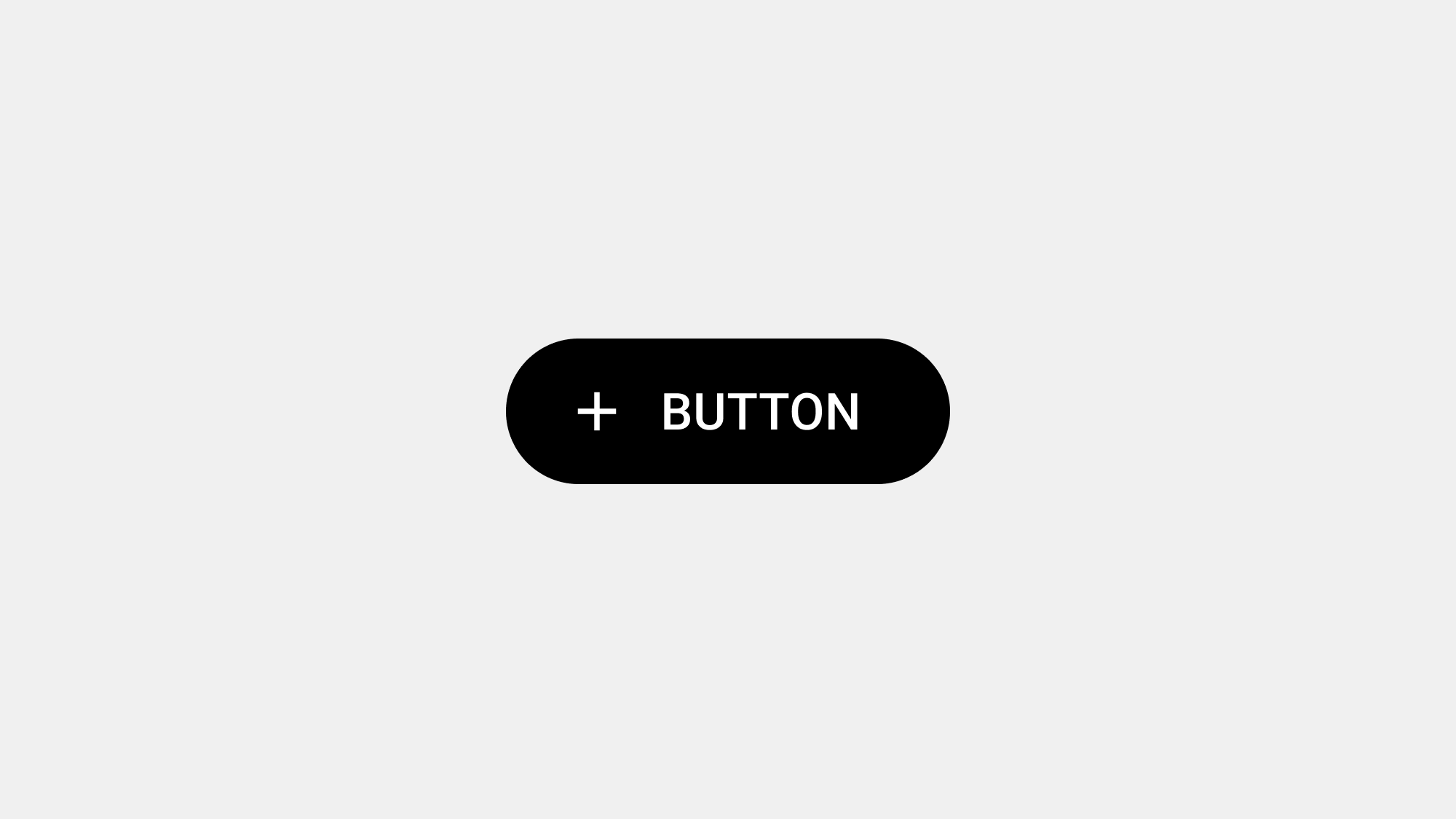
    A button is a graphical control element designed to prompt an action when clicked or tapped. It typically includes a combination of a label (text or icon) and a visual container that distinguishes it as interactive. While they may seem simple, buttons are critical to any interface’s functionality and design.

    Defining Characteristics of Buttons:

    • Interactive Nature: Buttons provide users with direct interaction by triggering specific actions.
    • Visual Feedback: They communicate state changes through visual or tactile feedback, such as highlighting, color changes, or vibrations.
    • Action-Oriented: Each button has a defined purpose, guiding users through tasks or workflows.

    Buttons act as the connective tissue of an interface, enabling users to navigate, make decisions, and achieve their goals. A well-designed button can reduce cognitive load, improve accessibility, and ensure seamless interaction.

    The Role of Buttons in User Interfaces

    Buttons are not just functional elements; they are central to user experience. Their design, placement, and behavior directly impact how users perceive and interact with a product.

    1. Facilitating Actions

    The primary role of a button is to allow users to take action. Whether it’s submitting a form, adding an item to a cart, or navigating to another page, buttons translate user intent into system responses.

    • Examples of Core Actions:
      • Submitting data (e.g., “Submit”)
      • Initiating processes (e.g., “Download”)
      • Navigating to other areas (e.g., “Next”)

    2. Guiding User Journeys

    Buttons serve as signposts in the user journey, helping users move through tasks and workflows with clarity. Strategic button placement and design ensure users know what to do next.

    • Example: In an e-commerce app, a primary button like “Checkout” guides users toward completing a purchase, while secondary buttons like “Continue Shopping” offer alternative paths.

    3. Enhancing Accessibility

    Buttons play a vital role in making digital interfaces accessible:

    • They provide clear visual cues for interactive elements.
    • With proper coding, buttons are readable by screen readers, making them usable for visually impaired users.
    • Buttons with sufficient size and spacing ensure touch-friendly interfaces, especially on mobile devices.

    4. Communicating Hierarchy and Importance

    Through their visual design, buttons communicate the relative importance of actions. Primary buttons stand out to emphasize critical actions, while secondary or tertiary buttons support less prominent tasks.

    • Example: A “Confirm” button may be bold and colorful to draw attention, while a “Cancel” button might appear muted to show it’s a secondary option.

    5. Providing Feedback and Assurance

    Buttons offer instant feedback when clicked, helping users understand the system’s response to their input. For example:

    • A button changing color upon clicking reassures the user their action has been registered.
    • Loading spinners or animations in a button can indicate a process is ongoing.

    6. Maintaining Consistency Across Systems

    Buttons act as a unifying design element. Consistent button styles, behaviors, and placements across an interface create a predictable and intuitive user experience.

    • Example: If all primary actions use a specific color, users quickly learn to associate that color with essential tasks.

    7. Building Brand Identity

    Buttons contribute to the overall aesthetic of a product. Their style—rounded corners, colors, animations—can reflect the brand’s personality, reinforcing brand identity.

    Why Buttons Are Indispensable

    Without buttons, digital interfaces would lack clarity and usability. They are the touchpoints of interaction, ensuring users can execute tasks efficiently. A poorly designed button not only frustrates users but can also lead to task abandonment, affecting business outcomes.

    Psychological Impact of Buttons

    Buttons also play a psychological role in user interactions:

    • Confidence Boosters: Well-designed buttons encourage users to proceed with tasks, creating a sense of accomplishment.
    • Trust Builders: Buttons that provide clear feedback (e.g., changing states) foster trust in the interface.

    For example, a “Buy Now” button that responds with immediate confirmation reassures users their purchase is being processed correctly.

    The Evolution of Buttons

    Buttons have evolved significantly since the early days of digital design:

    • Early Interfaces: Buttons were simple, rectangular elements with minimal styling.
    • Mobile and Touch Interfaces: With the rise of smartphones, button design adapted to touch interactions, focusing on size and spacing.
    • Modern Design Systems: Today’s buttons are integral to design systems like Material Design, Fluent, and Human Interface Guidelines, ensuring consistency and scalability across devices.

    Conclusion

    Buttons are the backbone of user interface design, shaping how users interact with digital products. Their design and functionality significantly influence user satisfaction, task completion rates, and overall product success. By understanding their role and designing them with care, you can create interfaces that are both visually appealing and highly functional.


  • 버튼 – 심화

    버튼 – 심화

    버튼이란 무엇인가?

    버튼(Button)은 디지털 인터페이스에서 사용자와 시스템 간 상호작용을 연결하는 가장 기본적이면서도 중요한 요소입니다. 단순히 클릭 가능한 요소 이상의 의미를 가지며, 사용자의 의도와 시스템의 반응을 매끄럽게 이어주는 디지털 경험의 핵심입니다.


    버튼의 본질적 정의

    1. 상호작용의 단위

    버튼은 사용자의 특정 동작(클릭, 터치 등)을 통해 시스템이 명령을 수행하도록 하는 상호작용의 단위입니다. 이는 사용자의 요구를 시스템이 이해하고 처리할 수 있도록 돕는 디지털 언어라 할 수 있습니다.

    2. 시각적 신호

    버튼은 명확한 시각적 단서를 통해 사용자에게 작업 가능성을 전달합니다. 크기, 색상, 텍스트, 아이콘 등의 요소를 통해 사용자가 즉각적으로 ‘여기를 클릭하면 된다’는 인지를 할 수 있도록 설계됩니다.

    3. 의사소통 도구

    텍스트와 디자인 요소를 통해 버튼은 시스템과 사용자가 의사소통할 수 있는 수단이 됩니다. 예를 들어, “로그인” 버튼은 사용자가 시스템에 인증 절차를 시작하겠다는 의사를 전달하는 역할을 합니다.


    버튼의 주요 역할

    버튼은 단순한 시각적 요소를 넘어 사용자의 여정을 안내하고 작업을 가능하게 하는 중요한 역할을 합니다.


    1. 사용자 목표 달성의 촉매제

    버튼은 사용자가 목표를 달성하는 데 있어 핵심적인 기능을 수행합니다. 예를 들어, “결제하기” 버튼은 온라인 쇼핑몰에서 구매 과정을 완료하도록 돕습니다. 이는 사용자 여정의 최종 단계를 지원하거나 주요 작업을 시작하는 촉매제 역할을 합니다.


    2. 작업의 시작과 완료

    작업 시작

    버튼은 작업을 시작하는 신호를 보냅니다. 예를 들어, “검색” 버튼은 사용자가 원하는 정보를 검색하는 프로세스를 시작합니다.

    작업 완료

    “확인” 또는 “제출” 버튼과 같이 작업을 최종적으로 마무리하는 역할도 합니다. 이때 버튼은 사용자가 작업을 완료했다는 심리적 안정감을 제공합니다.


    3. 명확한 피드백 전달

    버튼은 사용자가 인터페이스와 상호작용한 후 즉각적인 피드백을 제공합니다. 예를 들어:

    • 시각적 피드백: 버튼 클릭 시 색상이 변하거나 음영 효과가 나타나는 방식으로 사용자 행동을 인정합니다.
    • 청각적 피드백: 클릭 소리나 알림음으로 동작이 실행되었음을 알립니다.
    • 진동 피드백: 모바일 기기에서는 버튼을 터치했을 때 짧은 진동으로 피드백을 제공합니다.

    이 피드백은 사용자가 작업이 정상적으로 수행되었음을 이해하고 다음 단계를 진행할 수 있도록 합니다.


    4. 의도와 정보 전달

    버튼은 사용자와 시스템 간 의도와 정보를 전달하는 중요한 매개체입니다.

    예시 1: 텍스트 버튼

    “등록하기” 버튼은 사용자가 등록 프로세스를 시작하겠다는 의도를 전달합니다.

    예시 2: 아이콘 버튼

    쓰레기통 아이콘의 버튼은 사용자가 항목을 삭제하겠다는 의사를 전달합니다.

    이처럼 버튼은 작업의 방향성을 명확히 함으로써 불필요한 혼란을 줄입니다.


    5. 행동 유도 및 사용자 경험 향상

    행동 유도(CTA: Call to Action):

    “지금 가입하세요” 또는 “다운로드” 버튼과 같이 행동을 유도하는 문구를 통해 사용자에게 적극적인 참여를 독려합니다.

    사용자 여정 최적화:

    버튼은 사용자가 서비스의 목적을 더 쉽게 달성할 수 있도록 사용자 여정을 간소화합니다. 이를 통해 긍정적인 사용자 경험을 제공하며, 이는 서비스의 성공에 직접적으로 기여합니다.


    결론

    버튼은 디지털 환경에서 사용자와 시스템을 연결하는 가장 직관적이고 강력한 인터페이스 요소입니다. 버튼은 단순한 클릭 가능 영역을 넘어 사용자와 시스템 간 상호작용을 설계하고 강화하는 중요한 역할을 합니다. 잘 설계된 버튼은 사용자 목표 달성을 도울 뿐만 아니라 긍정적이고 직관적인 사용자 경험을 제공합니다.


  • Buttons – Overview

    Buttons – Overview

    Buttons are one of the most fundamental components in user interface design. They act as gateways to interaction, serving as the medium between users and your product’s core functionalities. In this post, we’ll explore the anatomy, types, usage, and best practices for designing buttons that enhance usability and aesthetics.

    What Is a Button?

    Buttons are clickable elements that enable users to perform actions or navigate within an interface. They are crucial for facilitating user tasks and guiding workflows.

    Key Characteristics of Buttons:

    • Clickable Area: Defined and large enough for ease of interaction.
    • Label or Icon: Text or imagery to indicate its function clearly.
    • State Feedback: Visual or auditory feedback to show interactivity (e.g., hover, active, disabled states).

    Buttons are versatile, appearing in nearly every type of digital interface: websites, mobile apps, desktop software, and even smart devices.

    Button Anatomy

    1. Container

    The button’s visible shape (rectangle, circle, pill-shaped) defines its clickable area and determines its alignment with the overall design language.

    2. Label

    Text or icons communicate the action. Labels should be concise and action-driven (e.g., “Submit,” “Buy Now”).

    3. States

    Effective buttons visually communicate their state:

    • Default: Resting state.
    • Hover: Visual feedback upon mouseover.
    • Active: Indicates the button has been clicked.
    • Disabled: Non-functional state, often grayed out.
    • Focus: Indicates keyboard navigation or selection.

    4. Shadow and Elevation

    Shadowing creates depth, particularly in Material Design, where buttons can have raised or flat appearances depending on their purpose.

    Types of Buttons

    1. Primary Buttons

    • Purpose: Highlight the most critical actions.
    • Styling: Bold, vibrant colors to stand out.
    • Example: “Sign Up,” “Purchase.”

    2. Secondary Buttons

    • Purpose: Complementary actions to the primary button.
    • Styling: Muted colors, often outlined.
    • Example: “Learn More,” “Preview.”

    3. Tertiary Buttons

    • Purpose: Lesser-priority actions.
    • Styling: Text-only or minimal styling.
    • Example: “Cancel,” “More Options.”

    4. Icon Buttons

    • Purpose: Represent actions with minimal screen space.
    • Styling: Contain only icons, no text.
    • Example: Trash can for delete, magnifying glass for search.

    5. Floating Action Buttons (FABs)

    • Purpose: Promote a single, standout action.
    • Styling: Circular with a prominent icon.
    • Example: “Add” in Google Drive.

    Best Practices for Designing Buttons

    1. Clarity in Labeling

    • Use actionable words (e.g., “Start Free Trial” instead of “Click Here”).
    • Avoid jargon or ambiguous terms.

    2. Consistent Styling

    • Maintain consistent colors, shapes, and typography across your product to reduce cognitive load.

    3. Feedback and States

    • Always provide feedback (e.g., color changes, animations) to confirm actions.
    • Include a disabled state for unavailable options.

    4. Accessibility

    • Ensure buttons are usable by all:
      • Keyboard Navigation: Include focus states.
      • Screen Readers: Add descriptive ARIA labels.
      • Contrast Ratios: Meet WCAG standards for text and background contrast.

    5. Touch Target Size

    • For mobile, ensure buttons meet the minimum 48x48dp size for usability.

    Common Mistakes to Avoid

    1. Overloading Interfaces

    Too many buttons in a single view can confuse users. Prioritize actions and hide less relevant ones under menus or modals.

    2. Poor Placement

    Place buttons in expected locations (e.g., bottom of forms, near the primary action).

    3. Ambiguous Labels

    Avoid generic terms like “Submit” without context. Provide meaningful guidance.

    Industry Standards and Inspirations

    Apple Human Interface Guidelines:

    • Focus on simplicity and clarity. Buttons in Apple interfaces are designed to feel intuitive and effortless.

    Google Material Design:

    • Emphasizes shadowing and elevation for buttons, with clear guidelines on size, spacing, and interaction states.

    Microsoft Fluent Design:

    • Buttons have a polished, dynamic feel, incorporating subtle animations and smooth transitions.

    Conclusion

    Buttons are small yet mighty components that shape the way users interact with your product. Thoughtful button design ensures seamless navigation, boosts usability, and creates a more enjoyable user experience. By understanding their anatomy, types, and best practices, you can elevate your designs and meet user needs effectively.


  • 버튼 – 개괄

    버튼 – 개괄

    버튼이란 무엇인가?

    버튼은 디지털 인터페이스의 핵심적인 상호작용 컴포넌트로, 사용자와 시스템 간의 커뮤니케이션을 매개합니다. 버튼은 단순한 클릭 가능 영역이 아니라, 명확한 기능 전달과 직관적인 상호작용을 통해 사용자의 목표 달성을 돕는 중요한 요소입니다.


    버튼의 주요 역할

    1. 상호작용의 시작점

    버튼은 사용자가 특정 작업을 시작하거나 명령을 실행하도록 돕는 핵심 도구입니다. 클릭이나 터치와 같은 단순 동작을 통해 복잡한 프로세스를 실행할 수 있도록 합니다.

    2. 명확한 피드백 제공

    사용자가 버튼을 클릭했을 때 시스템은 즉각적인 시각적, 청각적, 또는 진동 피드백을 제공해야 합니다. 이를 통해 사용자는 자신의 동작이 성공적으로 인식되었음을 확인할 수 있습니다.

    3. 정보 전달

    버튼은 단순한 아이콘부터 명확한 텍스트가 포함된 디자인까지, 사용자에게 다음 단계나 작업에 대한 정보를 명확히 전달해야 합니다.


    버튼 디자인의 핵심 원칙

    1. 명확성

    사용자는 버튼의 기능을 직관적으로 이해할 수 있어야 합니다. “다음”이나 “제출”과 같이 명확하고 간결한 레이블을 사용하세요.

    2. 일관성

    서비스 전반에서 버튼 스타일(색상, 크기, 텍스트 스타일)을 일관되게 유지하여 사용자가 혼란스럽지 않도록 설계하세요.

    3. 접근성

    모든 사용자가 버튼을 쉽게 사용할 수 있도록 접근성을 고려하세요. 예를 들어, 충분한 색상 대비와 클릭 가능한 크기를 제공해야 합니다.

    4. 가시성

    중요한 버튼은 시각적으로 강조되어야 합니다. 주요 작업 버튼은 더 크고 눈에 띄는 색상으로 디자인하는 것이 좋습니다.


    버튼 유형과 사용 사례

    1. 기본 버튼 (Primary Button)

    주요 작업을 강조합니다. 예: 결제 버튼, “시작하기”.

    2. 보조 버튼 (Secondary Button)

    부가적인 작업을 지원하며, 기본 버튼에 비해 시각적으로 덜 강조됩니다. 예: “취소” 또는 “더 보기”.

    3. 아이콘 버튼 (Icon Button)

    공간을 절약하고 직관성을 높이기 위해 아이콘으로 표현된 버튼입니다. 예: 공유, 좋아요.

    4. 텍스트 버튼 (Text Button)

    시각적 부담을 줄이고 간단한 작업에 사용됩니다. 예: “자세히 보기”.


    버튼 설계 시 주의할 점

    1. 너무 많은 버튼

    화면에 버튼이 지나치게 많으면 사용자가 혼란을 겪을 수 있습니다. 주요 작업에 초점을 맞춘 최소한의 버튼을 배치하세요.

    2. 비슷한 스타일의 버튼

    기본 버튼과 보조 버튼의 스타일이 지나치게 유사하다면 사용자는 우선순위를 파악하기 어렵습니다.

    3. 반응 시간

    버튼 클릭 시 시스템 응답 시간이 지연되면 사용자 경험이 크게 저하됩니다. 빠르고 명확한 피드백을 제공하세요.


    버튼 설계의 사례 분석

    Apple Human Interface Guidelines

    Apple은 버튼에 대해 간결하고 직관적인 레이블을 추천합니다. 또한, 사용자가 버튼을 실수로 누르지 않도록 충분한 여백을 확보하도록 권장합니다.

    Google Material Design

    Material Design에서는 버튼의 그림자, 색상, 애니메이션을 활용하여 버튼의 깊이와 상호작용성을 강조합니다. 특히, 클릭 시 변화를 시각적으로 표시하는 데 중점을 둡니다.


    버튼 테스트 방법

    1. 사용자 테스트

    버튼의 크기, 위치, 기능이 사용자의 기대에 부합하는지 확인합니다.

    2. A/B 테스트

    두 가지 이상의 버튼 디자인을 비교하여 사용자가 더 많이 클릭하는 디자인을 선택합니다.

    3. 접근성 검사

    스크린 리더, 키보드 네비게이션 등을 통해 모든 사용자가 버튼을 문제없이 사용할 수 있는지 확인합니다.


    결론

    버튼은 디지털 환경에서 사용자와 시스템 간의 상호작용을 연결하는 가장 기본적이고 중요한 요소입니다. 효과적인 버튼 설계를 위해서는 명확성, 일관성, 접근성, 가시성 등 다양한 원칙을 고려해야 합니다. 성공적인 UX/UI를 위해 버튼은 단순한 클릭 영역이 아니라, 사용자 경험을 결정짓는 중요한 요소임을 잊지 마세요.