스마트폰 앱을 열었을 때, 우리는 원하는 기능을 찾고 다양한 콘텐츠를 탐색하기 위해 끊임없이 화면을 이동합니다. 이 복잡한 여정을 쉽고 직관적으로 만들어주는 핵심 요소가 바로 ‘내비게이션’ 시스템이며, 그중에서도 탭 바(Tab Bar)는 특히 모바일 앱 환경에서 사용자의 길잡이 역할을 하는 가장 중요하고 기본적인 UI 패턴 중 하나입니다. 화면 하단이나 상단에 위치하여 앱의 주요 섹션 간 이동을 돕거나, 특정 화면 내의 관련 콘텐츠를 전환하는 기능을 제공하는 탭 바는 사용자가 앱의 구조를 이해하고 원하는 목적지에 빠르게 도달할 수 있도록 지원합니다. 이 글에서는 탭 바의 개념과 중요성, 특히 모바일 앱에서 중추적인 역할을 하는 하단 탭 바와 화면 내 콘텐츠 구성을 돕는 상단 탭의 특징과 디자인 원칙, 그리고 접근성 고려사항까지 심층적으로 분석하여, 사용자 여정의 믿음직한 나침반이 되는 탭 바 UI 디자인에 대해 완벽하게 이해하는 것을 목표로 합니다. (현재 시점: 2025년 4월 12일)
탭 바(Tab Bar)란 무엇인가?
핵심 개념: 주요 섹션 간의 빠른 전환 경로
탭 바(Tab Bar)는 사용자 인터페이스에서 관련된 콘텐츠 그룹이나 앱의 주요 기능 섹션 사이를 전환할 수 있도록 하는 내비게이션 컴포넌트입니다. 크게 두 가지 형태로 구분할 수 있습니다.
- 하단 탭 바(Bottom Tab Bar): 주로 모바일 앱 화면 하단에 고정되어 나타나며, 3개에서 5개 정도의 아이콘과 레이블로 구성됩니다. 앱의 최상위 레벨의 주요 섹션(예: 홈, 검색, 프로필) 간의 이동을 담당하며, 사용자가 앱의 어느 위치에 있든 항상 접근 가능합니다. iOS의 Human Interface Guidelines (HIG)나 구글의 Material Design 가이드라인에서 핵심적인 내비게이션 패턴으로 다루어집니다. 이 글에서 주로 다룰 대상입니다.
- 상단 탭(Top Tabs): 주로 화면 상단, 헤더(App Bar) 바로 아래에 위치하며, 현재 화면이나 섹션 내에서 관련된 하위 뷰(View)나 필터링된 콘텐츠(예: 채팅 목록, 통화 기록, 상태 / 또는 전체, 미확인, 멘션) 사이를 전환하는 데 사용됩니다. 하단 탭 바보다 더 많은 항목을 포함할 수 있으며, 스크롤 가능한 형태로 구현되기도 합니다.
이 두 형태는 위치와 주된 역할에서 차이가 있지만, 사용자에게 명확한 탐색 경로를 제공하고 콘텐츠를 구조화한다는 공통적인 목표를 가집니다.
왜 중요할까? 앱 탐색의 효율성과 명확성
탭 바, 특히 하단 탭 바가 모바일 앱 디자인에서 중요한 이유는 명확합니다. 첫째, 지속적인 접근성(Persistence)을 제공합니다. 화면 하단에 항상 고정되어 있기 때문에 사용자는 앱의 어느 깊이에 들어가 있더라도 단 한 번의 탭으로 주요 섹션으로 즉시 이동할 수 있습니다. 이는 복잡한 탐색 과정을 거치지 않고도 핵심 기능 간의 빠른 전환을 가능하게 하여 사용 편의성을 크게 높입니다.
둘째, 높은 발견 가능성(Discoverability)을 보장합니다. 앱의 가장 중요하고 자주 사용될 가능성이 높은 기능들이 항상 눈에 보이는 곳에 노출되므로, 사용자는 앱이 제공하는 핵심 가치를 쉽게 인지하고 접근할 수 있습니다. 숨겨진 메뉴(예: 햄버거 메뉴)에 비해 사용자가 기능을 발견하기 훨씬 용이합니다. 셋째, 모바일 환경에서의 인체공학(Ergonomics)을 고려한 디자인입니다. 화면 하단은 스마트폰을 한 손으로 사용할 때 엄지손가락이 비교적 쉽게 닿는 영역이므로 조작이 편리합니다. 마지막으로, 앱의 정보 구조(Information Architecture, IA)를 명확하게 정의하고 사용자에게 전달하는 역할을 합니다. 하단 탭 바의 항목들은 곧 그 앱의 최상위 정보 구조를 반영하며, 사용자가 앱의 전체적인 구성을 이해하는 데 도움을 줍니다. 또한, iOS와 안드로이드 양대 플랫폼에서 널리 사용되는 익숙한 패턴이므로 사용자의 학습 부담이 적습니다.
바닥의 내비게이터: 하단 탭 바 (Navigator at the Bottom: Bottom Tab Bar)
하단 탭 바는 현대 모바일 앱 디자인에서 가장 보편적이고 효과적인 내비게이션 패턴 중 하나로 자리 잡았습니다. 그 역할과 디자인 원칙을 더 자세히 살펴보겠습니다.
모바일 앱 네비게이션의 중심
하단 탭 바는 앱의 1차 네비게이션(Primary Navigation) 역할을 수행합니다. 즉, 앱을 구성하는 가장 크고 중요한 섹션들로 사용자를 안내하는 출입구와 같습니다. 인스타그램의 피드, 탐색, 릴스, 쇼핑, 프로필 탭이나, 카카오톡의 친구, 채팅, 뷰, 쇼핑, 더보기 탭처럼, 각 탭은 앱의 핵심적인 기능 영역이나 콘텐츠 그룹을 대표합니다. 사용자는 이 탭들을 통해 앱의 주요 기능들을 오가며 원하는 작업을 수행하게 됩니다. 따라서 하단 탭 바의 구성은 앱의 전체적인 정보 구조와 사용성을 결정짓는 매우 중요한 디자인 결정입니다.
언제 사용해야 할까?
하단 탭 바는 다음과 같은 경우에 사용하는 것이 가장 효과적입니다.
- 앱에 2개에서 5개 사이의 명확하게 구분되는 주요 기능 또는 콘텐츠 섹션이 있을 때.
- 사용자가 이러한 주요 섹션들을 앱 사용 중에 빈번하게 오갈 필요가 있을 때.
- 각 섹션이 서로 독립적이며, 사용자가 어느 섹션에 있든 다른 주요 섹션으로 바로 이동할 수 있어야 할 때.
소셜 미디어, 음악 스트리밍, 뉴스, 이커머스, 금융 앱 등 다양한 종류의 앱에서 이러한 요구사항을 충족하기 위해 하단 탭 바를 성공적으로 활용하고 있습니다. 반면, 앱의 주요 섹션이 5개를 초과하거나, 단일 작업을 순차적으로 수행하는 앱(예: 계산기, 특정 유틸리티), 또는 계층 구조가 매우 깊고 복잡하여 다른 네비게이션 패턴(예: 사이드 드로어)이 더 적합한 경우에는 하단 탭 바가 최선의 선택이 아닐 수 있습니다.
디자인 핵심 원칙: 명확성, 간결성, 일관성
효과적인 하단 탭 바 디자인을 위한 핵심 원칙은 다음과 같습니다.
- 탭 개수 제한: 일반적으로 3개에서 5개 사이를 유지합니다. 2개는 너무 적어 탭 바의 필요성이 낮고, 6개 이상은 각 탭의 터치 영역이 너무 작아지고 시각적으로 복잡해져 사용성을 해칩니다.
- 아이콘과 레이블: 각 탭은 명확하고 이해하기 쉬운 아이콘과 간결한 텍스트 레이블을 함께 사용해야 합니다. 아이콘만으로는 의미 전달이 모호할 수 있으므로, 레이블은 사용자 이해를 돕는 데 필수적입니다. (2025년 현재, 주요 플랫폼 가이드라인 모두 아이콘과 레이블 병기를 권장합니다.)
- 명확한 활성 상태: 현재 사용자가 어떤 탭(섹션)에 있는지 명확하게 시각적으로 표시해야 합니다. 아이콘과 레이블의 색상 변경, 아이콘 형태 변화, 배경 하이라이트, 상단 인디케이터 등 다양한 방식을 사용할 수 있으며, 비활성 탭과 확실히 구분되어야 합니다.
- 고정된 위치와 일관성: 하단 탭 바는 화면 하단에 고정되어 스크롤 시에도 사라지지 않아야 합니다. 또한, 앱의 주요 섹션을 이동하더라도 탭 바의 구성과 순서는 일관되게 유지되어야 사용자가 혼란을 겪지 않습니다.
플랫폼 가이드라인 준수
iOS와 안드로이드(Material Design)는 하단 탭 바(iOS에서는 Tab Bar, Material Design에서는 Bottom Navigation)에 대한 자체적인 디자인 가이드라인을 제공합니다. 예를 들어, 배경의 투명도, 아이콘 스타일, 텍스트 레이블 표시 방식, 활성 상태 표시 방법, 탭 전환 시 애니메이션 등에 대한 권장 사항이 있습니다. 각 플랫폼의 사용자는 해당 플랫폼의 표준적인 디자인과 동작 방식에 익숙하므로, 가이드라인을 존중하고 따르는 것이 사용자에게 자연스럽고 편안한 경험을 제공하는 데 중요합니다. 물론, 브랜드 아이덴티티를 반영하는 범위 내에서의 커스터마이징은 가능합니다.
콘텐츠 영역의 길잡이: 상단 탭 (Guide within Content Areas: Top Tabs)
하단 탭 바가 앱 전체의 구조를 잡는 역할을 한다면, 상단 탭은 특정 화면이나 섹션 내에서 콘텐츠를 효과적으로 구성하고 탐색하는 데 사용됩니다.
화면 내 콘텐츠 구성 및 필터링
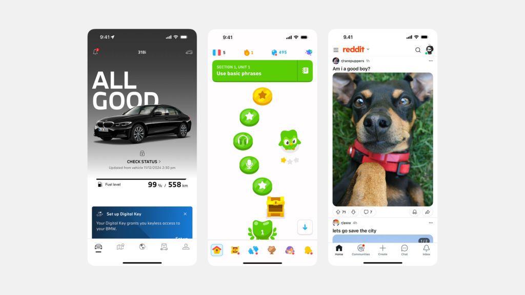
상단 탭은 주로 현재 화면의 콘텐츠를 여러 하위 그룹으로 나누어 보여주거나, 사용자가 특정 기준에 따라 콘텐츠를 필터링하여 볼 수 있도록 하는 데 사용됩니다. 예를 들어, 메신저 앱에서 ‘채팅’, ‘통화 기록’, ‘연락처’를 상단 탭으로 구분하거나, 뉴스 앱에서 ‘정치’, ‘경제’, ‘사회’, ‘IT’ 등의 카테고리를 탭으로 제공하는 경우입니다. 사용자는 탭을 전환함으로써 동일한 맥락 내에서 다른 관점의 정보를 탐색할 수 있습니다.
활용 사례: 관련 정보 묶어 보여주기
상단 탭은 서로 관련성이 높은 정보들을 논리적으로 묶어 보여주는 데 효과적입니다. 예를 들어, 사용자 프로필 화면에서 ‘게시물’, ‘저장됨’, ‘태그됨’ 등의 정보를 상단 탭으로 구분하여 보여주거나, 설정 화면 내에서 ‘일반 설정’, ‘알림 설정’, ‘계정 설정’ 등을 탭으로 나누어 복잡함을 줄일 수 있습니다. 이커머스 상품 상세 페이지에서 ‘상품 정보’, ‘리뷰’, ‘문의’ 등을 탭으로 제공하는 것도 흔한 사례입니다.
디자인 고려사항: 유연성과 명확한 상태
상단 탭은 하단 탭 바보다 일반적으로 더 많은 탭 항목을 수용할 수 있습니다. 탭 항목 수가 많아 화면 너비를 초과할 경우, 좌우로 스크롤 가능한 스크롤링 탭(Scrolling Tabs) 형태로 구현할 수 있습니다. 상단 탭에서는 아이콘보다는 텍스트 레이블이 주로 사용되며, 레이블 자체가 탭의 내용을 명확하게 설명해야 합니다. 활성 상태 표시는 주로 탭 아래에 밑줄(Underline indicator)을 긋거나, 탭의 배경색 또는 텍스트 색상을 변경하는 방식으로 이루어집니다. 상단 탭 역시 현재 어떤 탭이 활성화되어 있는지 명확하게 보여주는 것이 중요합니다.
효과적인 탭 바 디자인을 위한 심층 가이드
하단 탭 바이든 상단 탭이든, 사용자가 쉽고 편리하게 사용할 수 있도록 만들기 위한 몇 가지 공통적인 디자인 고려사항들이 있습니다.
아이콘과 레이블: 의미 전달의 조화
특히 하단 탭 바에서는 아이콘과 레이블을 함께 사용하는 것이 매우 중요합니다. 아이콘은 시각적인 식별을 돕고 공간을 절약하는 효과가 있지만, 모든 아이콘이 사용자에게 보편적으로 동일한 의미로 해석되지는 않습니다. 따라서 간결하고 명확한 텍스트 레이블을 함께 제공하여 아이콘의 의미를 보강하고 모호성을 제거해야 합니다. 레이블은 사용자가 탭의 기능을 정확히 이해하는 데 결정적인 역할을 합니다. 아이콘은 각 플랫폼의 표준 아이콘을 사용하거나, 일관된 스타일 가이드에 따라 명확하게 디자인되어야 합니다.
활성 상태와 비활성 상태의 명확한 구분
사용자가 현재 어떤 탭을 선택했는지 즉시 알 수 있도록 활성 상태와 비활성 상태의 시각적 구분이 명확해야 합니다. 단순히 색상만 변경하는 것 외에도 아이콘의 채움/선 스타일 변경(Filled/Outline), 텍스트 굵기(Bold) 변경, 아이콘과 레이블의 크기 조절 등 다양한 시각적 단서를 조합하여 활성 상태를 강조할 수 있습니다. 중요한 것은 비활성 탭과 확실히 차이가 나도록 디자인하여 사용자의 혼동을 최소화하는 것입니다.
터치 영역과 간격: 편안한 상호작용
각 탭은 사용자가 실수 없이 쉽게 탭할 수 있도록 충분한 터치 영역(Tap Target Size)을 확보해야 합니다. 모바일 플랫폼 가이드라인에서는 일반적으로 최소 44x44pt(iOS) 또는 48x48dp(Android) 정도의 터치 영역을 권장합니다. 탭과 탭 사이에도 적절한 간격을 두어 사용자가 의도하지 않은 탭을 누르는 실수를 방지해야 합니다. 특히 하단 탭 바는 손가락으로 조작하는 주요 영역이므로 터치 편의성이 매우 중요합니다.
일관된 동작과 예측 가능성
탭 바의 동작은 사용자가 예측 가능해야 합니다. 예를 들어, 하단 탭 바의 특정 탭을 누르면 해당 섹션의 최상위 화면으로 이동하는 것이 일반적입니다. 이미 해당 섹션에 있는 상태에서 같은 탭을 다시 누르면, 화면의 가장 상단으로 스크롤되거나(Scroll to top), 현재 화면을 새로고침(Refresh)하거나, 또는 아무 동작도 하지 않는 등 일관된 규칙을 정하고 따르는 것이 좋습니다. 사용자가 탭의 동작 방식을 학습하면 앱을 더욱 효율적으로 사용할 수 있습니다.
접근성 고려: 모두를 위한 탭 바
모든 사용자가 탭 바를 불편 없이 이용할 수 있도록 웹 접근성 지침(WCAG 등)을 준수하는 것이 중요합니다.
스크린 리더 사용자 지원
시각 장애가 있는 사용자는 스크린 리더를 통해 앱을 탐색합니다. 따라서 탭 바와 각 탭 항목에 적절한 시맨틱 역할(Semantic Role)과 속성을 부여해야 합니다. 예를 들어, 웹 환경에서는 탭 바 컨테이너에 role="tablist"를, 각 탭 항목에 role="tab"을, 현재 선택된 탭에는 aria-selected="true" 속성을 지정하여 스크린 리더가 탭 구조와 현재 상태를 인식하고 사용자에게 음성으로 안내할 수 있도록 해야 합니다. 각 탭에는 아이콘만 있더라도 스크린 리더가 읽을 수 있는 명확한 텍스트 설명(예: aria-label)이 제공되어야 합니다.
충분한 터치 영역과 대비
앞서 언급했듯이, 모든 사용자가 정확하게 탭을 누를 수 있도록 충분한 터치 영역을 확보하는 것은 접근성의 기본입니다. 또한, 저시력 사용자나 색각 이상 사용자를 위해 아이콘, 텍스트 레이블, 활성 상태 표시 등이 배경색과 충분한 명암 대비(Contrast Ratio)를 가져야 합니다. WCAG에서는 일반 텍스트의 경우 4.5:1, 큰 텍스트나 그래픽 요소의 경우 3:1 이상의 명암 대비를 권장합니다.
키보드 네비게이션
웹 환경이나 키보드 사용이 가능한 환경에서는 키보드(예: Tab 키, 방향키)만으로도 탭 간 이동 및 선택이 가능해야 합니다. 현재 포커스를 받은 탭이 시각적으로 명확하게 표시되어야 하며(Focus Indicator), Enter 키나 Space 키를 눌러 탭을 활성화할 수 있어야 합니다.
탭 바 UI의 실제 사례와 대안
탭 바는 수많은 성공적인 앱에서 그 효과를 입증하고 있습니다.
성공적인 앱들의 탭 바 활용
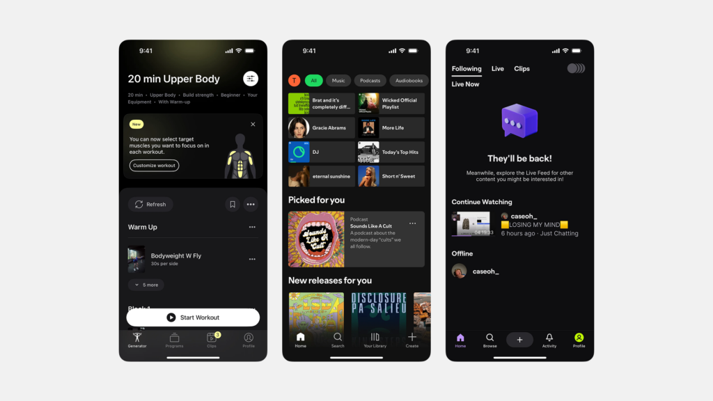
- 인스타그램(Instagram): 홈(피드), 탐색, 릴스, 쇼핑, 프로필의 5개 탭으로 구성된 하단 탭 바는 앱의 핵심 기능을 명확하게 나누고 사용자의 콘텐츠 소비와 탐색을 효과적으로 지원합니다. 활성 상태는 아이콘의 채움 스타일 변경으로 명확히 구분합니다.
- 유튜브(YouTube) 모바일: 홈, Shorts, 구독, 보관함의 4개 탭(로그인 상태에 따라 다를 수 있음)으로 구성되어 동영상 콘텐츠 탐색 및 관리를 위한 주요 경로를 제공합니다.
- 스포티파이(Spotify): 홈, 검색, 내 라이브러리의 3개 핵심 탭으로 음악 탐색 및 청취 경험을 단순화했습니다. (탭 구성은 업데이트에 따라 변경될 수 있음)
- 카카오톡(KakaoTalk): 친구, 채팅, 뷰, 쇼핑, 더보기의 5개 탭은 단순한 메신저를 넘어 다양한 서비스를 제공하는 카카오톡의 복합적인 기능을 효과적으로 구조화하여 보여줍니다.
이러한 앱들은 각자의 서비스 특성에 맞게 탭 바를 구성하고 디자인함으로써 사용자에게 직관적인 네비게이션 경험을 제공하고 있습니다.
탭 바가 적합하지 않은 경우
앞서 언급했듯이, 모든 앱에 탭 바가 적합한 것은 아닙니다. 예를 들어, 계산기 앱처럼 단일 목적을 가진 앱이나, 사용자가 특정 작업을 시작하면 완료할 때까지 선형적인 흐름을 따르는 앱(예: 회원가입, 복잡한 설정 마법사)에는 지속적인 섹션 전환을 위한 탭 바가 불필요하거나 오히려 방해가 될 수 있습니다. 또한, 앱의 주요 섹션이 너무 많아 5개를 초과하는 경우에는 하단 탭 바 대신 다른 네비게이션 패턴을 고려해야 합니다.
탭 바의 대안 패턴들
하단 탭 바가 적합하지 않거나 더 많은 네비게이션 항목이 필요한 경우, 다음과 같은 대안 패턴들을 고려할 수 있습니다.
- 햄버거 메뉴 / 사이드 드로어(Hamburger Menu / Side Drawer): 화면 가장자리에 숨겨진 메뉴 아이콘(햄버거 모양)을 탭하면 측면에서 메뉴가 나타나는 방식입니다. 많은 수의 네비게이션 항목을 담을 수 있지만, 메뉴가 숨겨져 있어 발견 가능성이 낮다는 단점이 있습니다.
- 내비게이션 허브(Navigation Hub): 앱의 시작 화면이나 특정 지점에서 주요 섹션으로 이동할 수 있는 링크들을 모아 놓은 화면(예: 대시보드 형태)을 제공하는 방식입니다.
- 제스처 기반 네비게이션(Gesture-based Navigation): 화면을 스와이프하는 등의 제스처를 통해 섹션 간을 전환하는 방식입니다. 직관적일 수 있지만, 사용자가 제스처를 학습해야 하고 발견 가능성이 낮을 수 있습니다.
각 패턴은 장단점을 가지므로, 앱의 정보 구조, 콘텐츠 특성, 타겟 사용자 등을 종합적으로 고려하여 최적의 네비게이션 전략을 수립해야 합니다.
결론: 사용자 여정의 믿음직한 나침반
탭 바, 특히 모바일 앱 환경에서의 하단 탭 바는 사용자가 앱의 광활한 정보 속에서 길을 잃지 않도록 안내하는 가장 기본적이면서도 강력한 나침반입니다. 앱의 핵심 기능을 명확하게 드러내고, 사용자가 원하는 목적지 사이를 쉽고 빠르게 이동할 수 있도록 지원함으로써 직관적인 사용자 경험의 토대를 마련합니다.
효과적인 탭 바를 디자인하기 위해서는 명확성(아이콘과 레이블, 활성 상태), 간결성(탭 개수 제한), 일관성(위치와 동작)이라는 핵심 원칙을 지켜야 합니다. 또한, 각 모바일 플랫폼의 디자인 가이드라인을 존중하고, 모든 사용자가 불편 없이 이용할 수 있도록 접근성을 철저히 고려하는 것이 필수적입니다. 앱의 특성과 사용자의 요구를 깊이 이해하고 신중하게 설계된 탭 바는 사용자의 앱 탐색 여정을 즐겁고 효율적으로 만들어주는 믿음직한 동반자가 될 것입니다.
#탭바 #하단탭바 #상단탭 #UI디자인 #UX디자인 #모바일앱디자인 #앱네비게이션 #정보구조 #인터페이스디자인 #iOS디자인 #안드로이드디자인 #MaterialDesign #사용성 #접근성
