A Detailed Look at the Key Functions of Tab Bars
Tab bars are one of the most effective navigation tools in modern UI design. They simplify navigation, enhance usability, and provide users with immediate access to primary sections of an application. Understanding the key functions of tab bars is essential for designing intuitive interfaces that meet user needs. This article explores the core functions of tab bars in detail, highlighting their role in creating seamless and efficient user experiences.
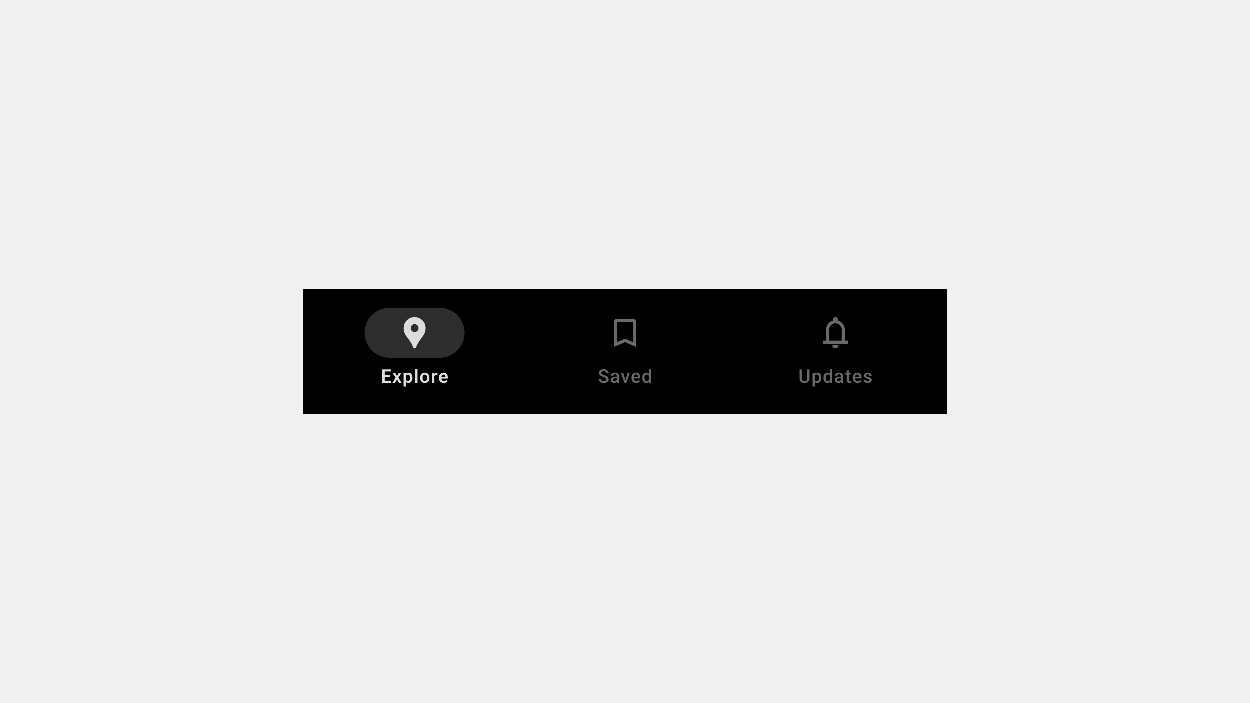
1. Organizing Primary Navigation
Purpose
Tab bars serve as a central hub for organizing an application’s main sections. By grouping primary features in a compact layout, they simplify navigation and reduce the cognitive load on users.
How It Works
- Categorization: Tabs are used to separate distinct sections, such as “Home,” “Search,” and “Profile.”
- Icon and Label Pairing: Each tab includes an icon and a label to clarify its function.
- Consistent Structure: The tab bar remains visible across all screens, ensuring seamless navigation.
Example
In a banking app, tabs like “Accounts,” “Payments,” and “Investments” organize core functions for quick access.
Benefits
- Simplifies navigation.
- Enhances discoverability of key features.
- Reduces the need for complex menus.
2. Providing Contextual Awareness
Purpose
Tab bars help users understand their current location within an application. This contextual awareness is essential for creating a sense of orientation and reducing user frustration.
How It Works
- Active State Indicators: The active tab is visually distinguished with color changes, bold text, or underlines.
- Persistent Positioning: The tab bar remains static, ensuring users can always see which section they are in.
Example
In a social media app, the “Feed” tab is highlighted when users are viewing their main content feed.
Benefits
- Provides clear navigation cues.
- Prevents users from feeling lost.
- Improves overall usability.
3. Enabling Quick Access to Features
Purpose
Tab bars ensure users can quickly switch between an app’s primary sections with minimal effort.
How It Works
- Direct Navigation: Each tab acts as a shortcut to a specific feature or section.
- Ergonomic Placement: Positioned at the bottom of the screen, tabs are within easy reach for one-handed use on mobile devices.
Example
In an e-commerce app, users can quickly switch between “Shop,” “Cart,” and “Profile” tabs without navigating through multiple layers.
Benefits
- Reduces the time needed to access features.
- Streamlines workflows.
- Enhances user satisfaction.
4. Supporting Multitasking and Workflow Efficiency
Purpose
Tab bars enable users to switch between tasks or sections without losing progress, supporting multitasking and improving workflow efficiency.
How It Works
- State Retention: Tabs preserve the state of each section, allowing users to resume tasks seamlessly.
- Task Switching: Users can move between tabs without navigating back to a home screen.
Example
In a project management app, users can move between “Tasks,” “Calendar,” and “Messages” tabs without losing data or progress.
Benefits
- Facilitates multitasking.
- Improves productivity.
- Reduces navigation complexity.
5. Enhancing Visual Consistency
Purpose
Tab bars create a visually consistent navigation framework that enhances the overall design of an application.
How It Works
- Uniform Design: All tabs share the same style, ensuring a cohesive look.
- Predictable Layout: The tab bar’s fixed position and consistent structure make navigation predictable.
Example
In a fitness app, tabs like “Dashboard,” “Workouts,” and “Profile” maintain a uniform design, reinforcing the app’s branding.
Benefits
- Strengthens brand identity.
- Reduces user confusion.
- Promotes a professional and polished appearance.
6. Facilitating Accessibility
Purpose
Tab bars make navigation more accessible for users, including those with disabilities.
How It Works
- Screen Reader Support: Each tab is labeled and described for screen readers.
- Keyboard Navigation: Users can navigate tabs using keyboard shortcuts.
- Touch-Friendly Design: Large tap targets ensure ease of use on mobile devices.
Example
In a news app, tabs like “Top Stories,” “Sports,” and “Entertainment” are accessible to screen reader users, with descriptive labels like “Top Stories tab, selected.”
Benefits
- Promotes inclusivity.
- Meets accessibility standards like WCAG.
- Enhances usability for all users.
7. Adapting to User Behavior
Purpose
Modern tab bars adapt dynamically to user preferences or context, providing a personalized experience.
How It Works
- Dynamic Updates: Tabs rearrange or display personalized content based on user activity.
- Role-Based Customization: Different users see different tabs based on their roles or permissions.
Example
In a corporate app, an administrator might see tabs like “Reports” and “User Management,” while regular users see “Dashboard” and “Tasks.”
Benefits
- Enhances user engagement.
- Personalizes the navigation experience.
- Aligns with user goals.
8. Improving Multiplatform Usability
Purpose
Tab bars provide a consistent navigation experience across multiple devices and platforms.
How It Works
- Responsive Design: The tab bar adapts to different screen sizes and orientations.
- Platform Consistency: Tabs behave similarly across mobile, web, and desktop versions of an app.
Example
In a streaming platform like Netflix, tabs like “Home,” “Search,” and “Downloads” function identically on mobile and desktop.
Benefits
- Reduces the learning curve for users switching devices.
- Reinforces a cohesive app experience.
- Simplifies cross-platform development.
Conclusion
Tab bars are more than just navigation tools—they are integral to creating efficient, accessible, and visually consistent user experiences. By organizing primary navigation, providing contextual awareness, enabling quick access to features, and supporting multitasking, tab bars enhance usability and satisfaction across applications. Their adaptability to user behavior and multiplatform compatibility ensures they remain a cornerstone of modern UI design.