Tab Bar: A Comprehensive Guide
Tab bars are a cornerstone of modern UI design, providing a compact and efficient way to navigate between key sections of an application. They are especially popular in mobile applications due to their accessibility and ease of use. This article explores the purpose, key features, design principles, best practices, and development considerations for tab bars, offering a complete guide to understanding and implementing this vital UI component.
1. What Is a Tab Bar?
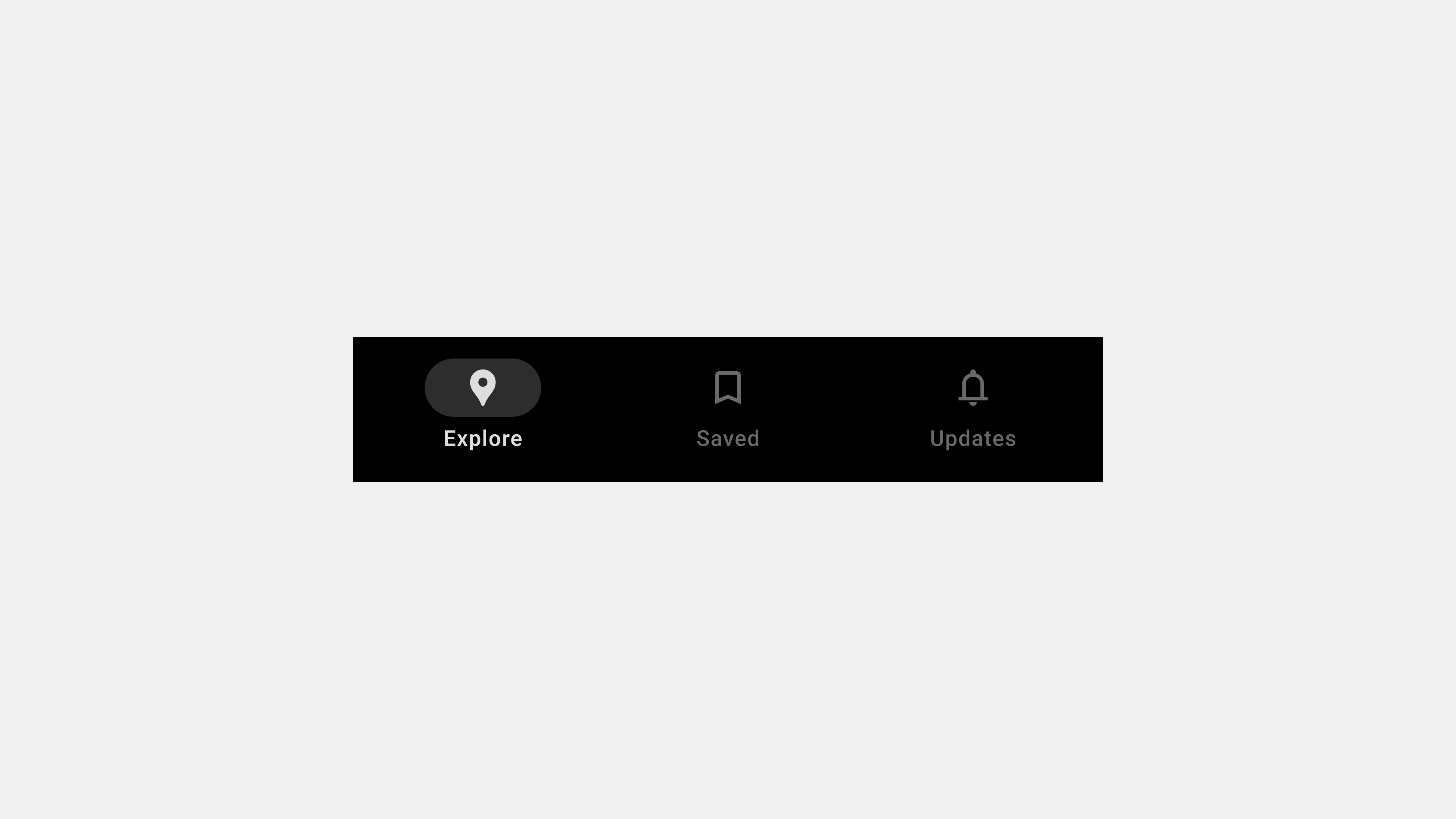
A tab bar is a horizontal navigation element typically located at the bottom of a mobile app or the top of a web application. It allows users to switch between different sections or features of an application with a single tap.
Key Features
- Visibility: Always visible for consistent navigation.
- Compact Design: Saves space while providing quick access to major sections.
- Interactive Feedback: Highlights the active tab to indicate the current location.
- Icon and Label Combination: Uses a combination of icons and text labels for clarity.
Primary Purpose
The tab bar simplifies navigation by grouping primary features into an easily accessible interface, enhancing usability and user satisfaction.
2. Why Are Tab Bars Important?
Tab bars play a critical role in organizing content and ensuring efficient navigation.
Benefits of Tab Bars
- Ease of Use: Enables users to switch between sections with minimal effort.
- Improved Discoverability: Ensures primary features are easy to find.
- Space Efficiency: Offers navigation without taking up significant screen real estate.
- Consistency: Provides a uniform navigation structure across app screens.
Examples
- In a social media app, a tab bar might include “Home,” “Search,” “Reels,” “Notifications,” and “Profile.”
- In an e-commerce app, it could feature “Shop,” “Categories,” “Cart,” “Wishlist,” and “Account.”
3. Key Design Principles for Tab Bars
Designing an effective tab bar requires a balance between functionality and aesthetics.
A. Prioritize Core Features
Limit the number of tabs to 3-5 to avoid overwhelming users. Focus on the app’s primary functions.
B. Use Intuitive Icons and Labels
- Icons: Choose universally recognizable icons that convey meaning.
- Labels: Add text labels to clarify the purpose of each tab.
C. Maintain Consistency
- Keep the tab bar design consistent across all screens.
- Use uniform styles for icons, labels, and active states.
D. Provide Visual Feedback
- Highlight the active tab with color changes, underlines, or bold text.
- Include subtle animations for smoother transitions.
E. Optimize for Ergonomics
- Place the tab bar at the bottom for mobile apps to enhance accessibility.
- Ensure tap targets are large enough for comfortable interaction.
4. Types of Tab Bars
Tab bars can be adapted to different use cases and design contexts.
A. Standard Tab Bar
- Definition: A fixed tab bar with equal-width tabs for navigation.
- Use Case: Ideal for apps with a small number of primary sections.
B. Scrollable Tab Bar
- Definition: A horizontally scrollable tab bar for handling a large number of sections.
- Use Case: Suitable for content-heavy apps like news or streaming platforms.
C. Floating Tab Bar
- Definition: A tab bar that floats slightly above the bottom edge of the screen.
- Use Case: Popular in apps prioritizing modern aesthetics and minimalism.
D. Persistent Tab Bar
- Definition: A tab bar that remains visible while users scroll through content.
- Use Case: Ensures navigation consistency, especially for lengthy pages.
5. Best Practices for Implementing Tab Bars
A. Limit the Number of Tabs
Stick to 3-5 tabs to prevent cognitive overload and ensure quick decision-making.
B. Use Clear Active States
Indicate the active tab with distinct visual elements like color changes or highlights.
C. Test Icon and Label Combinations
Ensure that the combination of icons and labels is intuitive and easily understood.
D. Ensure Accessibility
- Include ARIA roles and labels for screen readers.
- Optimize color contrast for better visibility.
E. Focus on Responsiveness
Design the tab bar to adapt seamlessly to different screen sizes and orientations.
6. Development Considerations for Tab Bars
Developers play a vital role in bringing tab bar designs to life while ensuring functionality and performance.
Key Areas to Focus On
- Responsive Design: Use CSS or frameworks like Flutter to ensure compatibility across devices.
- Dynamic Content: Handle dynamic updates in tab content without disrupting navigation.
- Performance Optimization: Minimize the impact of animations and transitions on performance.
- Accessibility Compliance: Test with screen readers and keyboard navigation.
Example Code Snippet
Here’s a simple implementation using HTML and CSS:
<div class="tab-bar">
  <div class="tab active">
    <span class="icon">🏠</span>
    <span class="label">Home</span>
  </div>
  <div class="tab">
    <span class="icon">🔍</span>
    <span class="label">Search</span>
  </div>
  <div class="tab">
    <span class="icon">🛒</span>
    <span class="label">Cart</span>
  </div>
</div>
.tab-bar {
  display: flex;
  justify-content: space-around;
  background-color: #fff;
  border-top: 1px solid #ccc;
}
.tab {
  text-align: center;
  padding: 10px;
}
.tab.active .icon,
.tab.active .label {
  color: #007bff;
  font-weight: bold;
}
7. Testing and QA for Tab Bars
Testing ensures that the tab bar functions correctly across different devices, screen sizes, and scenarios.
Functional Testing
- Verify that all tabs navigate to the correct sections.
- Test dynamic updates in tab content.
Responsive Testing
- Check the tab bar’s behavior on various devices and orientations.
- Test tap targets for usability on small screens.
Accessibility Testing
- Test screen reader support for tab navigation.
- Verify focus indicators for keyboard navigation.
Conclusion
Tab bars are a fundamental part of modern UI design, offering a simple and efficient way to navigate applications. By following best practices in design, development, and testing, you can create tab bars that are user-friendly, accessible, and visually appealing. Whether you’re building a social media app, an e-commerce platform, or a content hub, a well-designed tab bar enhances usability and ensures a seamless navigation experience.
: