[태그:] accessibility

  • Navigation Drawers – Product Owner 1

    Navigation Drawers – Product Owner 1

    Designing Navigation Drawers: User Expectations and Service Planner’s Responsibilities

    Navigation drawers have become a staple in modern UI/UX design, offering a compact and efficient way for users to navigate applications. However, creating an effective navigation drawer requires understanding user expectations and aligning design and functionality to meet those needs. This article explores user expectations for navigation drawers and outlines the key responsibilities of service planners to ensure these expectations are met.


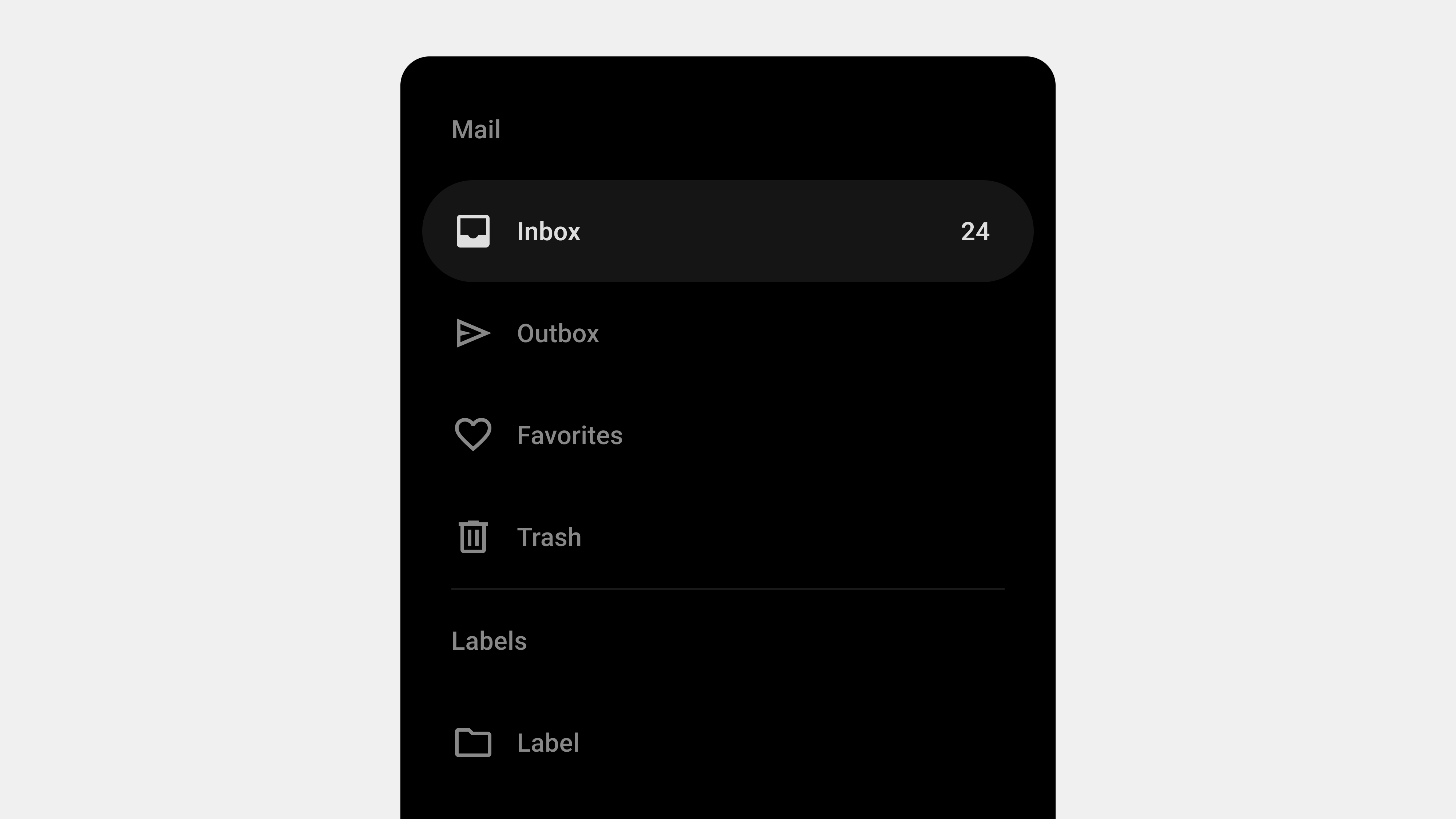
    1. User Expectations for Navigation Drawers

    Users approach navigation drawers with specific expectations about functionality, usability, and accessibility. Meeting these expectations is crucial for creating a positive user experience.

    A. Simplicity and Clarity

    Users expect navigation drawers to provide clear, concise, and well-organized options.

    • What Users Want:
      • Clear labels for menu items.
      • Logical grouping of related items.
      • A clutter-free interface.
    • Why It Matters:
      Overly complex or ambiguous menus confuse users, leading to frustration and disengagement.

    B. Quick Access to Important Features

    Users rely on navigation drawers to quickly locate and access key features.

    • What Users Want:
      • Frequently used items at the top of the menu.
      • Shortcuts to essential actions.
      • Search functionality for deep navigation.
    • Why It Matters:
      Efficiency is a key factor in retaining user attention, especially in task-oriented applications.

    C. Consistency Across Screens and Platforms

    Navigation drawers should behave predictably and maintain a consistent layout throughout the app.

    • What Users Want:
      • Familiar placement of the toggle button (e.g., top left).
      • Consistent menu structure across devices.
      • Seamless transitions between pages.
    • Why It Matters:
      Consistency reduces cognitive load and helps users build familiarity with the interface.

    D. Accessibility and Usability

    Users expect navigation drawers to be accessible and easy to use, regardless of their abilities or devices.

    • What Users Want:
      • Keyboard and screen reader support.
      • Touch-friendly design for mobile users.
      • High contrast and readable text.
    • Why It Matters:
      Accessibility ensures inclusivity and compliance with global usability standards.

    E. Personalization and Context Awareness

    Modern users value navigation systems that adapt to their needs and preferences.

    • What Users Want:
      • Personalized content or shortcuts based on usage history.
      • Context-aware options tailored to the current screen or task.
      • Clear feedback and visual cues.
    • Why It Matters:
      Personalization enhances user satisfaction and encourages deeper engagement.

    2. Responsibilities of Service Planners

    Service planners play a critical role in bridging user expectations with functional design. By prioritizing user needs and aligning them with business goals, planners can ensure the navigation drawer enhances the overall experience.

    A. Conduct User Research

    Understanding the target audience’s preferences, behaviors, and pain points is essential for designing effective navigation drawers.

    • Actions to Take:
      • Conduct surveys and interviews to identify user priorities.
      • Analyze user flows to determine frequently accessed features.
      • Use heatmaps to observe navigation patterns.
    • Outcome:
      A data-driven understanding of what users need from the navigation drawer.

    B. Create a Logical Information Hierarchy

    Organizing menu items in a logical and intuitive structure is key to meeting user expectations.

    • Actions to Take:
      • Categorize features into primary, secondary, and tertiary levels.
      • Use card sorting techniques to group related items.
      • Prioritize essential actions based on user goals.
    • Outcome:
      A navigation drawer that aligns with user mental models and reduces cognitive load.

    C. Prioritize Accessibility and Inclusivity

    Ensuring that the navigation drawer is accessible to all users is both an ethical and practical responsibility.

    • Actions to Take:
      • Implement ARIA roles and semantic HTML for screen readers.
      • Test keyboard navigation for ease of use.
      • Provide visual focus indicators for better accessibility.
    • Outcome:
      A navigation drawer that is inclusive and compliant with global accessibility standards.

    D. Optimize for Cross-Platform Consistency

    Service planners must ensure that the navigation drawer provides a consistent experience across devices and screen sizes.

    • Actions to Take:
      • Use responsive design principles to adapt the layout for mobile, tablet, and desktop.
      • Maintain consistent menu structures and interactions across platforms.
      • Test performance on different devices to ensure smooth functionality.
    • Outcome:
      A navigation drawer that feels intuitive and reliable, regardless of the device used.

    E. Incorporate Feedback and Iteration

    Continuous improvement is critical for maintaining the effectiveness of navigation drawers over time.

    • Actions to Take:
      • Gather user feedback through surveys and usability testing.
      • Analyze metrics like time to navigate and menu engagement rates.
      • Iterate on the design based on insights and evolving user needs.
    • Outcome:
      A navigation drawer that evolves to meet changing user expectations and business goals.

    Conclusion

    Designing a navigation drawer that meets user expectations requires a deep understanding of their needs and a commitment to delivering intuitive, accessible, and efficient solutions. Service planners must take a user-centered approach, focusing on clarity, consistency, and personalization while ensuring inclusivity and responsiveness. By aligning these principles with actionable strategies, navigation drawers can become a powerful tool for enhancing the user experience.


  • Navigation Drawers – Functions

    Navigation Drawers – Functions

    Key Functions of Navigation Drawers: A Detailed Exploration

    Navigation drawers are a fundamental component of modern user interfaces, designed to streamline navigation and enhance usability. Their hidden, expandable structure makes them ideal for organizing a large number of features without overwhelming the user. This article explores the primary functions of navigation drawers, emphasizing their role in creating intuitive and efficient digital experiences.


    1. Organizing and Categorizing Content

    One of the core functions of a navigation drawer is to organize and categorize content, providing users with a clear structure to explore features and resources.

    How It Works

    • Grouping Items: Related features are grouped together under headers or sections for better discoverability.
    • Hierarchical Navigation: Supports multi-level menus, enabling users to drill down into subcategories.

    Benefits

    • Reduces clutter on the main interface.
    • Makes complex systems easier to navigate.

    Example

    In an e-commerce app:

    • Categories like “Men,” “Women,” and “Kids” are top-level items.
    • Subcategories like “Clothing” and “Accessories” are nested under them.

    2. Providing Quick Access to Key Features

    Navigation drawers enable users to access essential features or frequently used sections with minimal effort.

    How It Works

    • Shortcut Links: Direct links to critical actions like “Home,” “Search,” or “Profile.”
    • Pinned Features: Important items are pinned at the top of the drawer for easy access.

    Benefits

    • Saves time by reducing the number of clicks or taps needed.
    • Improves overall efficiency for power users.

    Example

    In a productivity app like Trello, quick links to “Boards,” “Notifications,” and “Settings” allow users to switch contexts effortlessly.


    3. Enhancing Personalization

    Navigation drawers can dynamically adapt to user preferences and behavior, offering a personalized experience.

    How It Works

    • Dynamic Menus: Display content based on user activity, such as recently visited sections or saved items.
    • Profile Integration: Includes user-specific details like profile pictures, account names, and shortcuts.

    Benefits

    • Increases engagement by prioritizing relevant content.
    • Provides a sense of ownership and customization.

    Example

    Streaming platforms like Netflix use the drawer to show personalized recommendations and quick links to the user’s watchlist.


    4. Supporting Seamless Cross-Platform Navigation

    Navigation drawers maintain consistency across devices, making them a versatile tool for multi-platform applications.

    How It Works

    • Responsive Design: Adapts the layout to suit different screen sizes and orientations.
    • Consistent Structure: Retains the same menu organization across mobile, tablet, and desktop versions.

    Benefits

    • Reduces the learning curve for users switching between devices.
    • Enhances brand identity through uniform design.

    Example

    Slack’s navigation drawer provides the same structure for channels and direct messages across all devices, ensuring familiarity.


    5. Improving Focus with Contextual Navigation

    Navigation drawers can adjust their content based on the user’s current context, offering options relevant to the task at hand.

    How It Works

    • Context-Aware Menus: Display actions related to the active screen or task.
    • Dynamic Updates: Change the menu items as the user navigates through the application.

    Benefits

    • Reduces cognitive load by limiting options to relevant ones.
    • Enhances task efficiency by aligning navigation with user goals.

    Example

    In a design app like Figma, the drawer might show “Layers” and “Components” when editing a file, but display “Account Settings” when on the home screen.


    6. Enhancing Accessibility and Usability

    Navigation drawers contribute to a more inclusive experience by supporting accessibility features.

    How It Works

    • Screen Reader Compatibility: Uses ARIA roles and semantic HTML for better interaction with assistive technologies.
    • Keyboard Navigation: Allows users to open, close, and navigate through the drawer using only a keyboard.
    • Focus Indicators: Highlights interactive elements to improve visibility for users with visual impairments.

    Benefits

    • Ensures usability for a broader range of users.
    • Complies with accessibility standards like WCAG.

    Example

    A government website with a navigation drawer ensures that all links are screen-reader friendly and accessible via keyboard shortcuts.


    7. Enabling Multi-Level Navigation

    For applications with extensive hierarchies, navigation drawers simplify multi-level navigation without overwhelming the user.

    How It Works

    • Expandable Menus: Submenus appear dynamically when users interact with a parent item.
    • Breadcrumb Integration: Shows the user’s current location within the hierarchy.

    Benefits

    • Keeps the interface clean while offering depth when needed.
    • Reduces the steps required to navigate to specific sections.

    Example

    A content management system (CMS) might use a drawer to navigate between “Pages,” “Posts,” and nested categories like “Drafts” and “Published.”


    8. Supporting Offline Functionality

    Navigation drawers can enhance offline usability by providing cached or locally stored content.

    How It Works

    • Preloaded Content: Displays options that are available offline, like downloaded files or recent activity.
    • Error Messaging: Communicates connectivity issues while guiding users to accessible features.

    Benefits

    • Ensures the app remains functional even without an internet connection.
    • Improves user trust by handling errors gracefully.

    Example

    A cloud storage app like Google Drive shows offline files prominently in the navigation drawer when the user is disconnected.


    9. Facilitating Error Handling and Recovery

    Navigation drawers can help users recover from errors by providing fallback options and clear pathways.

    How It Works

    • Visible Home Links: Always display a “Home” or “Dashboard” link for easy recovery.
    • Error Notifications: Highlight errors (e.g., failed loading) directly in the drawer.

    Benefits

    • Reduces frustration by offering clear recovery options.
    • Maintains user confidence in the application’s reliability.

    Example

    In an online learning platform, the drawer may show a persistent “Help” link to guide users facing technical issues.


    10. Encouraging Exploration and Engagement

    Navigation drawers can encourage users to explore additional features or content by showcasing secondary options.

    How It Works

    • Highlight New Features: Use badges or highlights to draw attention to updates or new functionality.
    • Recommended Actions: Suggest content or actions based on user behavior.

    Benefits

    • Increases user engagement by introducing less obvious features.
    • Drives deeper exploration of the platform’s capabilities.

    Example

    An e-commerce app might use the drawer to promote seasonal sales or highlight unused features like “Wishlist.”


    Conclusion

    The navigation drawer is more than just a space-saving tool—it’s a powerhouse for organizing content, improving accessibility, supporting personalization, and enhancing usability. By leveraging its key functions, designers and developers can create navigation systems that are intuitive, efficient, and user-friendly. Whether you’re building a mobile app, web application, or desktop software, understanding these functionalities ensures your navigation drawer meets both user and business goals effectively.


  • Navigation Drawers – 2. Definition

    Navigation Drawers – 2. Definition

    Understanding Navigation Drawers: Definition and Role

    Navigation drawers, also known as side menus or hamburger menus, are one of the most widely used UI patterns in digital design. They provide a streamlined and efficient way to organize navigation, especially for applications with numerous features or complex hierarchies. While they are often seen as secondary to the primary navigation, their design and functionality can significantly impact the overall user experience. This article delves into the definition and role of navigation drawers, providing a comprehensive understanding of their importance in modern UI/UX design.


    1. What Is a Navigation Drawer?

    A navigation drawer is a collapsible side panel that allows users to access secondary or supplementary navigation elements. It typically remains hidden by default and can be opened via a toggle button, swipe gesture, or similar interaction.

    Key Characteristics

    • Hidden by Default: It stays out of sight, providing a clean interface until needed.
    • Expandable: Opens with a smooth transition to reveal navigation options.
    • Hierarchical Navigation: Supports multiple levels of navigation in a compact form.
    • Context-Aware: Can be personalized or contextualized based on user behavior.

    Common Use Cases

    • Mobile apps where screen space is limited.
    • Web applications with complex functionality.
    • Multi-platform tools that require consistent navigation patterns.

    2. The Role of Navigation Drawers in UX/UI Design

    Navigation drawers play a crucial role in enhancing usability, accessibility, and design efficiency. Let’s explore their key functions.

    A. Organizing Content and Features

    One of the primary roles of a navigation drawer is to organize content and features into a structured, easily navigable format.

    Benefits

    • Reduces clutter on the main screen by hiding secondary items.
    • Groups related features, making them easier to find.
    • Enables quick access to key sections without overwhelming the user.

    Example

    An e-commerce app might use a navigation drawer to house sections like “Shop by Category,” “Order History,” and “Account Settings,” while keeping the main interface focused on product discovery.


    B. Improving Space Efficiency

    Navigation drawers are particularly valuable in mobile and responsive designs, where screen space is at a premium.

    Benefits

    • Maximizes space for primary content by hiding the navigation panel.
    • Ensures users can focus on tasks without distraction.
    • Adapts seamlessly to different screen sizes and orientations.

    Example

    In a productivity app like Google Drive, the drawer stays hidden until the user needs to switch folders or access settings.


    C. Supporting Hierarchical Navigation

    For applications with multiple layers of content, navigation drawers simplify hierarchical navigation.

    Benefits

    • Allows users to drill down into submenus without losing context.
    • Keeps the navigation structure clear and logical.
    • Accommodates large datasets or extensive features.

    Example

    A learning platform like Coursera might use a drawer to navigate between courses, modules, and lessons.


    D. Enhancing Personalization

    Navigation drawers can be tailored to individual users, offering shortcuts or content based on their preferences and behavior.

    Benefits

    • Boosts engagement by showing personalized options.
    • Speeds up navigation for frequently accessed features.
    • Encourages user retention through customized experiences.

    Example

    A streaming app like Netflix uses the drawer to highlight the user’s profile, watchlist, and recommendations.


    E. Ensuring Consistency Across Platforms

    Navigation drawers provide a consistent navigation experience across mobile, web, and desktop applications.

    Benefits

    • Reduces learning curves for users switching between platforms.
    • Standardizes the UI design for better brand consistency.
    • Simplifies maintenance and updates for development teams.

    Example

    Slack’s navigation drawer maintains a consistent structure whether accessed on mobile or desktop, ensuring familiarity for users.


    3. Advantages of Navigation Drawers

    A. Scalability

    Navigation drawers can handle a wide range of content without becoming cluttered.

    B. Flexibility

    They adapt to different contexts, user needs, and platform constraints.

    C. Minimal Disruption

    The hidden design minimizes disruption to the main content, allowing users to focus on their tasks.

    D. Improved Aesthetics

    By hiding secondary navigation elements, drawers contribute to a cleaner, more modern interface.


    4. Challenges in Implementing Navigation Drawers

    While navigation drawers offer many benefits, they also present certain challenges.

    A. Discoverability

    Since drawers are hidden by default, some users may overlook their presence.

    Solution

    • Use onboarding or visual hints to introduce the drawer.
    • Make the toggle icon prominent and universally recognizable (e.g., the hamburger icon).

    B. Overcrowding

    Adding too many items to the drawer can overwhelm users and reduce usability.

    Solution

    • Prioritize key items and move less important ones to submenus.
    • Regularly audit and streamline the navigation structure.

    C. Accessibility Issues

    Improper implementation can exclude users with disabilities.

    Solution

    • Follow accessibility standards like WCAG.
    • Use ARIA roles and keyboard navigation support.

    5. Best Practices for Navigation Drawers

    A. Keep It Simple

    • Limit the number of menu items to avoid clutter.
    • Use clear and concise labels for navigation links.

    B. Highlight Key Features

    • Place frequently used features at the top of the drawer.
    • Use separators or headings to group related items.

    C. Optimize for Gestures

    • Enable swipe gestures for opening and closing the drawer on mobile devices.
    • Ensure gestures don’t interfere with other interactions.

    D. Test Responsiveness

    • Adapt the drawer design for various screen sizes.
    • Use persistent drawers for larger screens where appropriate.

    6. Examples of Effective Navigation Drawer Designs

    A. Gmail

    • Features: Displays user account info, primary folders, and additional labels.
    • Why It Works: Combines personalization with hierarchical navigation.

    B. Spotify

    • Features: Provides quick access to playlists, search, and user library.
    • Why It Works: Keeps the focus on music discovery while organizing secondary features.

    C. Trello

    • Features: Allows users to switch between boards and manage account settings.
    • Why It Works: Maintains a clean interface by hiding less frequently used options.

    7. Future Trends in Navigation Drawers

    A. AI-Powered Personalization

    Future drawers will use AI to dynamically adjust content based on user behavior and preferences.

    B. Voice Integration

    As voice interfaces grow, navigation drawers may incorporate voice commands for opening and navigating menus.

    C. Gesture-Based Interactions

    Gestures will become more intuitive and integrated with other touch interactions.


    Conclusion

    Navigation drawers are more than just a design trend—they are a functional, space-efficient solution for organizing complex menus and enhancing user experiences. By understanding their definition and role, designers and developers can harness their potential to create intuitive, user-friendly interfaces. While challenges like discoverability and accessibility require careful attention, the benefits of navigation drawers make them an indispensable tool in modern UI/UX design.


  • Navigation Drawer – 1. Overview

    Navigation Drawer – 1. Overview

    Navigation Drawer: A Comprehensive Guide

    The navigation drawer is a UI component widely used in modern applications, especially mobile apps, to organize and access features efficiently. It provides a hidden menu that users can open by tapping a button or swiping from the side of the screen. This design pattern has become a go-to solution for developers and designers seeking to balance functionality with a clean interface. In this article, we’ll dive deep into the definition, use cases, design principles, best practices, and challenges of navigation drawers.


    1. What Is a Navigation Drawer?

    A navigation drawer, also known as a side drawer or hamburger menu, is a collapsible panel that slides in from the side of the screen. It houses secondary or less frequently used navigation items, allowing the primary interface to remain uncluttered.

    Key Features

    • Expandable and Collapsible: Opens and closes with a user gesture or interaction.
    • Accessible from Any Screen: Typically available across all app pages for consistent navigation.
    • Supports Hierarchical Navigation: Allows grouping of related menu items.

    2. Benefits of Using a Navigation Drawer

    A. Space Efficiency

    By hiding the navigation menu, navigation drawers maximize screen space for primary content. This makes them particularly useful for smaller devices like smartphones.

    B. Organizational Clarity

    They allow grouping and categorizing menu items, helping users navigate complex apps or websites more easily.

    C. Customization

    Navigation drawers can be personalized to display user-specific content, such as profiles, shortcuts, or recommended actions.

    D. Consistent Accessibility

    The drawer remains available from any screen, ensuring users can always return to key sections without confusion.


    3. Use Cases for Navigation Drawers

    A. Mobile Applications

    • Social Media: Facebook, Instagram, and Twitter use drawers for secondary features like settings and saved items.
    • Productivity Apps: Google Drive and Evernote use drawers for folder navigation and account switching.

    B. Complex Web Applications

    Web platforms like project management tools or SaaS products use navigation drawers for multi-level menus and quick access to various modules.

    C. Cross-Platform Apps

    For apps designed to run on both mobile and desktop, navigation drawers provide a unified navigation experience.


    4. Design Principles for Navigation Drawers

    A. Prioritize Simplicity

    • Display only essential items to avoid overwhelming the user.
    • Use clear and concise labels for menu items.

    B. Maintain Visual Hierarchy

    • Use grouping and separators to organize related items.
    • Place frequently accessed items at the top of the list.

    C. Provide Visual Feedback

    • Highlight the active or selected item.
    • Use animations to show transitions between opened and closed states.

    D. Support Gestures

    • Allow users to swipe to open and close the drawer.
    • Ensure gestures don’t interfere with other UI elements.

    E. Ensure Accessibility

    • Use semantic HTML and ARIA roles for screen reader compatibility.
    • Include a keyboard-accessible toggle for opening and closing the drawer.

    5. Best Practices for Navigation Drawers

    A. Use a Clear Toggle Icon

    • The hamburger icon (three horizontal lines) is a universal standard for toggling drawers.
    • Ensure the icon is prominently placed, usually at the top left of the screen.

    B. Keep It Minimal

    • Avoid overcrowding the drawer with too many menu items.
    • Use collapsible sections for submenus to maintain clarity.

    C. Provide Contextual Information

    • Display the user’s profile, notifications, or shortcuts at the top of the drawer.
    • For example, Google apps often show the logged-in user’s name and avatar.

    D. Test Responsiveness

    • Adapt the drawer for different devices and screen sizes.
    • On larger screens, consider using a persistent drawer that remains visible.

    E. Ensure Smooth Animations

    • Avoid abrupt transitions when opening and closing the drawer.
    • Use subtle animations to enhance the user experience.

    6. Challenges and Solutions in Navigation Drawer Design

    A. Hidden Navigation Problem

    Challenge: Users may overlook the drawer if it’s not obvious.
    Solution: Use onboarding or visual hints (e.g., pulsing animations around the toggle icon) to guide new users.

    B. Overloading with Items

    Challenge: An overcrowded drawer can confuse users.
    Solution: Prioritize key items and move less-used options to secondary menus.

    C. Accessibility Issues

    Challenge: Improper implementation can make drawers unusable for assistive technology users.
    Solution: Follow WCAG guidelines, ensuring compatibility with screen readers and keyboard navigation.

    D. Performance Concerns

    Challenge: Animations and dynamic content in drawers can impact app performance.
    Solution: Optimize assets and preload content to ensure smooth performance.


    7. Examples of Excellent Navigation Drawer Implementation

    A. Google Drive

    • Features: Includes quick access to “My Drive,” “Shared with Me,” and “Recent.”
    • Why It Works: Clear hierarchy and collapsible sections keep it clean and functional.

    B. Facebook

    • Features: Uses a navigation drawer for less critical features like saved posts and events.
    • Why It Works: Prioritizes the feed while keeping secondary features accessible.

    C. Slack (Mobile App)

    • Features: The drawer organizes channels, DMs, and workspaces effectively.
    • Why It Works: Displays essential content without overwhelming the user.

    8. How to QA a Navigation Drawer

    A. Functional Testing

    • Verify that the drawer opens and closes with both gestures and the toggle button.
    • Test all links and menu items for correct functionality.

    B. Responsiveness Testing

    • Check behavior on various devices and screen orientations.
    • Ensure smooth animations across devices.

    C. Accessibility Testing

    • Use screen readers to ensure all elements are accessible.
    • Test keyboard navigation for opening, closing, and interacting with the drawer.

    D. Performance Testing

    • Simulate high traffic to test how the drawer performs under load.
    • Optimize assets and animations to reduce lag.

    9. Future Trends in Navigation Drawers

    A. Dynamic Personalization

    Navigation drawers will increasingly leverage AI to show personalized content and shortcuts based on user behavior.

    B. Voice-Activated Navigation

    With the rise of voice assistants, drawers may integrate voice commands for opening and navigating menu items.

    C. Gesture-First Design

    Gesture-based interactions will continue to evolve, allowing users to interact with drawers more intuitively.


    Conclusion

    The navigation drawer is a versatile tool for organizing complex menus while maintaining a clean and user-friendly interface. By adhering to design principles, implementing best practices, and addressing challenges, you can create navigation drawers that enhance usability and accessibility. Whether you’re designing for mobile apps, web platforms, or cross-platform tools, navigation drawers remain an indispensable UI component for effective navigation.


  • Navigation Bars – Final

    Navigation Bars – Final

    The Ultimate Guide to Navigation Bars: A Comprehensive Wrap-Up

    Navigation bars are the backbone of user interaction in digital platforms, serving as the gateway to content and functionality. From their design principles to their development, testing, and user experience writing, every aspect contributes to creating a seamless, intuitive, and accessible user journey. This comprehensive guide wraps up key insights about navigation bars, summarizing critical considerations for designers, developers, publishers, and QA teams.


    1. Understanding Navigation Bars: Definition and Role

    A navigation bar is a user interface component that provides structured access to various sections of a website or application. Its primary purpose is to enable users to locate and interact with features efficiently.

    Key Takeaways

    • Definition: A visual roadmap connecting users to content and functionality.
    • Role: Guides users, enhances usability, and improves content discoverability.

    Practical Example

    For an e-commerce platform, a navigation bar might include:

    • Core functions: “Home,” “Shop,” “Categories,” “Cart.”
    • Secondary actions: “Login,” “Help,” “Settings.”

    The role of the navigation bar extends beyond functionality—it establishes brand identity and builds user trust.


    2. Designing User-Centric Navigation Bars

    Designing navigation bars with users in mind ensures better usability and engagement. A well-designed navigation bar is simple, accessible, and consistent across devices and platforms.

    Key Considerations

    1. Clarity and Simplicity: Use familiar terms and organize content logically.
    2. Accessibility: Include ARIA roles, keyboard navigation, and focus indicators.
    3. Responsive Design: Adapt layouts to different screen sizes and devices.
    4. Feedback and Visual Cues: Highlight active states, provide hover effects, and ensure smooth transitions.
    5. Scalability: Prepare for future growth with expandable and flexible designs.

    3. UX Writing for Navigation Bars

    Clear and concise UX writing is essential for navigation bars, as it helps users understand and interact with the platform effortlessly.

    Key Principles

    • Use Familiar Language: Avoid jargon and use terms that resonate with users (e.g., “Cart” instead of “Shopping Basket”).
    • Behavior-Driven Labels: Use action-oriented phrases like “Start Now” or “Learn More.”
    • Consistency: Maintain uniform terminology across pages and components.
    • Global Context: Consider cultural and linguistic differences in international platforms.

    Practical Application

    For a banking app:

    • Use “Accounts” instead of “My Account” to reflect multiple options.
    • Highlight primary tasks like “Send Money” or “View Transactions.”

    4. Development and Publishing Considerations

    Developing and publishing navigation bars requires technical precision to ensure performance, compatibility, and responsiveness.

    Key Areas to Focus On

    1. Performance Optimization: Minimize load times with efficient code and lazy loading.
    2. Cross-Browser Compatibility: Test across major browsers like Chrome, Firefox, and Safari.
    3. Responsive Design: Use CSS media queries for adaptive layouts.
    4. Dynamic Content Handling: Load dropdowns and menus dynamically for better scalability.
    5. Accessibility Compliance: Ensure ARIA roles, keyboard navigation, and screen reader support are in place.

    Practical Example

    /* Responsive Navigation Bar */
    @media (max-width: 768px) {
      nav ul {
        display: none;
      }
      nav .hamburger {
        display: block;
      }
    }
    

    Tools like BrowserStack and Lighthouse can streamline cross-browser testing and performance optimization.


    5. QA Testing for Navigation Bars

    Quality assurance is critical for ensuring navigation bars function as intended across devices and user scenarios.

    Key Testing Areas

    1. Functional Testing: Validate all links, dropdowns, and interactive elements.
    2. Cross-Platform Testing: Ensure compatibility across devices and operating systems.
    3. Accessibility Testing: Verify keyboard navigation, screen reader compatibility, and focus indicators.
    4. Performance and Load Testing: Ensure smooth operation under high traffic and dynamic loading.
    5. Error Handling: Test edge cases like 404 errors, broken links, or failed dynamic content.

    QA Checklist

    • Simulate high traffic with tools like Apache JMeter.
    • Test usability in offline mode and under slow network conditions.
    • Use tools like Axe for accessibility audits.

    6. Holistic Approach to Navigation Bars

    Bringing together design, UX writing, development, and QA ensures a comprehensive approach to navigation bar creation.

    Unified Best Practices

    • Collaborate Across Teams: Designers, developers, writers, and QA must align on user goals and technical requirements.
    • Conduct User Testing: Validate navigation designs with real users to gather actionable feedback.
    • Iterate Continuously: Monitor performance post-launch and update as user needs evolve.

    Final Thoughts

    A navigation bar is not just a functional component—it’s a strategic tool that defines the overall user experience. By focusing on clarity, accessibility, responsiveness, and usability, teams can create navigation systems that meet user needs and drive engagement.


  • Navigation Bars – QA

    Navigation Bars – QA

    5 Key Considerations for QA Testing Navigation Bars

    Quality assurance (QA) plays a critical role in ensuring that a navigation bar functions correctly, provides a seamless user experience, and maintains platform stability. As the navigation bar is one of the most visible and frequently used components of a digital product, meticulous testing is essential. This article highlights the five most important areas to focus on when conducting QA for navigation bars, ensuring they are user-friendly, functional, and error-free.


    1. Functional Testing: Ensuring Core Functionality

    Why It Matters

    The primary purpose of a navigation bar is to help users move through the platform seamlessly. Any broken links, incorrect redirections, or missing elements can disrupt the user experience.

    Key Guidelines

    • Link Validation: Test all navigation links to ensure they point to the correct destinations.
    • Dropdown and Submenu Functionality: Verify that dropdown menus and submenus expand, collapse, and link correctly.
    • Button Clickability: Ensure all buttons in the navigation bar are clickable and trigger the intended actions.

    Checklist for QA

    • Test all links across pages and devices.
    • Verify that hover states, clicks, and taps work as expected.
    • Ensure secondary navigation items (e.g., dropdowns) function correctly.

    Tools

    • Browser DevTools for link inspection.
    • Automated testing tools like Selenium or Cypress for repeated functional tests.

    2. Cross-Browser and Cross-Platform Compatibility

    Why It Matters

    Users access websites and applications on a variety of devices and browsers. Ensuring compatibility prevents issues like misaligned elements, broken functionality, or inconsistent behavior.

    Key Guidelines

    • Test Across Major Browsers: Chrome, Firefox, Safari, Edge, and their mobile counterparts.
    • Device Testing: Check functionality on desktops, tablets, and mobile devices.
    • OS Compatibility: Verify behavior across Windows, macOS, iOS, and Android.

    Checklist for QA

    • Test how the navigation bar adapts to different screen sizes.
    • Ensure consistent appearance and functionality in both light and dark modes (if supported).
    • Confirm responsive behavior (e.g., hamburger menus on mobile).

    Tools

    • BrowserStack or Sauce Labs for multi-browser and multi-device testing.
    • Real-device testing for accurate results.

    3. Accessibility Testing: Inclusive Usability for All Users

    Why It Matters

    An accessible navigation bar ensures that users with disabilities can interact with your platform effectively. Accessibility issues can alienate users and may even lead to legal consequences.

    Key Guidelines

    • Screen Reader Compatibility: Ensure ARIA roles, labels, and semantic HTML elements are properly implemented.
    • Keyboard Navigation: Test navigation using only a keyboard (e.g., tab and arrow keys).
    • Focus Indicators: Verify that focus states are visible and intuitive.
    • Color Contrast: Ensure adequate contrast for text and interactive elements.

    Checklist for QA

    • Test with screen readers like NVDA or VoiceOver.
    • Verify the tab order of navigation links.
    • Use contrast-checking tools to ensure WCAG compliance.

    Tools

    • Lighthouse for accessibility audits.
    • Axe Accessibility Checker for in-depth reports.

    4. Performance and Load Testing

    Why It Matters

    The navigation bar is a core component of every page, so its performance affects the overall user experience. Slow load times or unresponsive interactions can frustrate users.

    Key Guidelines

    • Load Speed: Ensure the navigation bar loads quickly on all devices.
    • Dynamic Content: Test how dynamically loaded menus (e.g., dropdowns) perform under various conditions.
    • Heavy Traffic: Simulate high traffic to ensure stability during peak usage.

    Checklist for QA

    • Measure page load times with the navigation bar active.
    • Test dynamic elements like dropdowns under slow network conditions.
    • Simulate multiple users accessing the navigation bar simultaneously.

    Tools

    • Lighthouse or GTmetrix for load speed analysis.
    • Apache JMeter for load and stress testing.

    5. Edge Cases and Error Handling

    Why It Matters

    Navigation bars must handle unexpected inputs, errors, or unusual user behaviors gracefully. Poor error handling can lead to crashes or broken navigation, which can negatively impact the user experience.

    Key Guidelines

    • 404 Errors: Verify how the navigation bar behaves when a linked page is missing or unavailable.
    • Dynamic Menu Failures: Test what happens if dynamically loaded content fails to load.
    • Broken Links: Simulate incorrect or outdated links to ensure error messages are helpful.

    Checklist for QA

    • Ensure fallback behavior for missing or unavailable content.
    • Verify error messages are displayed clearly and guide users on what to do next.
    • Test navigation elements in offline mode or with intermittent network connectivity.

    Tools

    • Postman for API testing in dynamic menus.
    • Chrome DevTools for offline simulation.

    Conclusion

    Quality assurance for navigation bars involves testing for functionality, compatibility, accessibility, performance, and error handling. By focusing on these five areas, QA teams can ensure that navigation systems meet user expectations, perform reliably, and provide an inclusive experience across all platforms. A well-tested navigation bar not only enhances usability but also strengthens the overall credibility of the product.


  • Navigation Bars – Publising and Developing

    Navigation Bars – Publising and Developing

    5 Key Considerations for Publishing and Developing Navigation Bars

    Developing and publishing a navigation bar requires meticulous planning and execution, as it serves as the backbone of user interaction within a digital platform. Mistakes in this component can lead to a poor user experience, inefficient functionality, and accessibility issues. This article highlights the five most critical aspects to consider when publishing or developing navigation bars, ensuring usability, performance, and compatibility across platforms.


    1. Accessibility Compliance

    Why It Matters

    Accessibility is crucial for making navigation usable by everyone, including individuals with disabilities. Ignoring accessibility can alienate users and even lead to legal implications in some regions.

    Key Guidelines

    • Keyboard Navigation: Ensure all menu items are accessible via keyboard controls (e.g., tabbing through links).
    • Screen Reader Support: Use semantic HTML and ARIA roles to make navigation clear for screen readers.
    • Color Contrast: Maintain sufficient contrast between text and background for users with visual impairments.
    • Focus Indicators: Include visible focus states for links and buttons.

    Implementation Example

    <nav aria-label="Main Navigation">
      <ul>
        <li><a href="/home" aria-current="page">Home</a></li>
        <li><a href="/about">About</a></li>
        <li><a href="/services">Services</a></li>
        <li><a href="/contact">Contact</a></li>
      </ul>
    </nav>
    

    Testing Tools

    • Lighthouse Accessibility Audit.
    • Axe Accessibility Checker.
    • Manual screen reader testing with tools like NVDA or VoiceOver.

    2. Responsiveness and Mobile Optimization

    Why It Matters

    With a majority of users accessing websites and apps through mobile devices, navigation bars must be responsive and mobile-friendly. A poorly optimized nav bar can disrupt the user experience and increase bounce rates.

    Key Guidelines

    • Responsive Breakpoints: Define CSS breakpoints for various screen sizes (mobile, tablet, desktop).
    • Mobile-Specific Navigation: Implement hamburger menus or bottom navigation for better usability on smaller screens.
    • Touch-Friendly Elements: Ensure buttons and links are large enough for touch interaction.

    Implementation Example

    /* Desktop Navigation */
    nav ul {
      display: flex;
      justify-content: space-around;
    }
    
    /* Mobile Navigation */
    @media (max-width: 768px) {
      nav ul {
        display: none;
      }
      nav .hamburger {
        display: block;
      }
    }
    

    Testing Tools

    • Browser DevTools to simulate different screen sizes.
    • Responsive design tools like BrowserStack.

    3. Performance Optimization

    Why It Matters

    Navigation bars are a core element loaded on every page. Inefficient code can slow down page load times and negatively affect SEO rankings and user experience.

    Key Guidelines

    • Minimize JavaScript: Avoid unnecessary JavaScript dependencies for basic navigation functionality.
    • Lazy Loading: Load secondary or hidden menu items only when required.
    • CSS Optimization: Use efficient CSS selectors and avoid redundant styles.
    • Reduce HTTP Requests: Combine assets like icons and fonts to minimize HTTP requests.

    Implementation Example

    • Use a sprite for menu icons:
    .icon-home {
      background: url('icons-sprite.png') no-repeat -10px -10px;
    }
    
    • Load dropdown content dynamically:
    document.querySelector('.dropdown').addEventListener('click', () => {
      fetch('/menu-items').then(response => response.json()).then(data => {
        // Render dropdown content
      });
    });
    

    Testing Tools

    • Lighthouse Performance Audit.
    • WebPageTest for detailed performance metrics.

    4. Cross-Browser and Cross-Platform Compatibility

    Why It Matters

    Users access websites and applications using various browsers and devices, each with its quirks. Ensuring compatibility prevents broken functionality or inconsistent design across platforms.

    Key Guidelines

    • Test in Major Browsers: Chrome, Firefox, Safari, Edge, and mobile browsers.
    • Use Progressive Enhancement: Ensure basic functionality works even without JavaScript or CSS.
    • Standardized Code: Use modern HTML5, CSS3, and JavaScript standards.

    Implementation Example

    • CSS Reset to normalize styles:
    * {
      margin: 0;
      padding: 0;
      box-sizing: border-box;
    }
    
    • Polyfill for older browser support:
    if (!('fetch' in window)) {
      // Load fetch polyfill
      const script = document.createElement('script');
      script.src = 'https://cdn.polyfill.io/v2/polyfill.min.js';
      document.head.appendChild(script);
    }
    

    Testing Tools

    • BrowserStack or Sauce Labs for multi-browser testing.
    • Virtual Machines for testing older versions of browsers.

    5. Robust QA and Error Handling

    Why It Matters

    Navigation bars are one of the most visible and used components of a website. Errors in this area can lead to user frustration and navigation failure. Thorough QA ensures functionality, usability, and reliability.

    Key Guidelines

    • Link Testing: Verify that all links work correctly and lead to the intended destinations.
    • Error States: Handle edge cases gracefully, such as unavailable pages or network errors.
    • Interaction Testing: Test hover, click, and focus interactions across devices.
    • Load Testing: Ensure the navigation bar performs well under high traffic.

    Implementation Example

    • Graceful error handling:
    document.querySelector('.nav-link').addEventListener('click', (e) => {
      e.preventDefault();
      fetch('/page').catch(() => {
        alert('Page is currently unavailable. Please try again later.');
      });
    });
    

    Testing Tools

    • Selenium for automated interaction testing.
    • Load testing tools like Apache JMeter.

    Conclusion

    Publishing and developing navigation bars require a balance of accessibility, responsiveness, performance, compatibility, and quality assurance. By focusing on these five key areas, developers and publishers can ensure that navigation systems meet user expectations, perform efficiently, and remain accessible across devices and platforms. Thoughtful implementation not only enhances usability but also reinforces the credibility of the entire digital platform.


  • Navigation Bars – UX Writing

    Navigation Bars – UX Writing

    UX Writing for Navigation Bars: Crafting Clear and Intuitive Labels

    Navigation bars are the backbone of user navigation on digital platforms, and their effectiveness largely depends on the clarity and intuitiveness of the labels used. From the UX writing perspective, selecting the right words ensures users can quickly and accurately understand and interact with the platform. This article dives deep into crafting clear, user-centric terms for navigation bars in English, covering principles, best practices, and actionable examples.


    1. The Role of UX Writing in Navigation Bars

    UX writing transforms the navigation bar from a simple interface element into a powerful guide that aligns with user intent.

    Key Responsibilities of UX Writing

    • Enhancing Clarity: Ensuring labels are concise and self-explanatory.
    • Reducing Cognitive Load: Simplifying decision-making with intuitive terms.
    • Promoting Consistency: Using standardized terminology across the platform.

    Example

    Instead of “Product Options” or “Select Items,” a simpler term like “Shop” immediately communicates the function without ambiguity.


    2. Principles of Effective UX Writing for Navigation Bars

    To craft effective navigation bar labels, UX writers must adhere to the following principles:

    A. Keep It Short and Actionable

    Labels should be as concise as possible while remaining descriptive. Users prefer terms that quickly communicate the purpose.

    Good Examples:

    • “Home” instead of “Back to Homepage.”
    • “Cart” instead of “Your Shopping Cart.”

    Why It Works:

    Short labels are easier to scan, particularly on mobile devices.


    B. Use Familiar Language

    Avoid jargon or technical terms that may confuse users. Stick to terms that are universally understood or align with user expectations.

    Good Examples:

    • “Login” instead of “User Authentication.”
    • “Contact” instead of “Reach Out to Us.”

    Why It Works:

    Familiar terms reduce hesitation and increase trust.


    C. Prioritize User Intent

    Align labels with the actions users are likely to take. Focus on purpose rather than formality.

    Good Examples:

    • “Browse Products” instead of “Catalog.”
    • “Track Order” instead of “Order History.”

    Why It Works:

    Action-oriented labels guide users effectively.


    D. Maintain Consistency

    Ensure uniformity in language and style across the navigation bar and the platform.

    Good Examples:

    • Use “My Profile” consistently instead of alternating between “Account” and “Profile.”

    Why It Works:

    Consistency reinforces user confidence and reduces confusion.


    E. Localize Thoughtfully

    If your platform caters to an international audience, ensure the labels are easily translatable without losing their meaning.

    Good Examples:

    • Avoid idiomatic expressions like “Get Started” that may not translate well.

    Why It Works:

    Localization ensures clarity across cultures.


    3. Common Categories and Their Optimal Labels

    A. Home and General Navigation

    • Optimal Labels: Home, Dashboard, Explore.
    • Examples:
      • “Home” for general audiences.
      • “Dashboard” for professional or account-specific platforms.

    B. User Actions

    • Optimal Labels: Login, Sign Up, Contact.
    • Examples:
      • “Sign Up” for new users.
      • “Contact” for customer service.

    C. E-commerce Platforms

    • Optimal Labels: Shop, Cart, Wishlist, Checkout.
    • Examples:
      • “Shop” to browse items.
      • “Checkout” to finalize purchases.

    D. Social Media Platforms

    • Optimal Labels: Feed, Profile, Messages, Notifications.
    • Examples:
      • “Feed” for content streams.
      • “Messages” for private conversations.

    E. Support and Information

    • Optimal Labels: Help, FAQ, Support.
    • Examples:
      • “Help” for immediate assistance.
      • “FAQ” for commonly asked questions.

    4. Testing and Refining Navigation Bar Labels

    UX writing is an iterative process. Testing ensures that navigation bar labels resonate with users.

    A. Conduct Usability Testing

    • Use A/B testing to compare different labels.
    • Gather feedback on comprehension and ease of use.

    B. Analyze User Behavior

    • Use heatmaps and click-tracking tools to measure engagement.
    • Identify underused navigation items for potential refinement.

    C. Iterate Based on Insights

    • Adjust labels that cause confusion or low engagement.
    • Ensure changes are communicated across teams for consistency.

    5. Real-World Examples of Excellent UX Writing for Navigation Bars

    A. Airbnb

    • Labels: “Explore,” “Wishlists,” “Trips,” “Log In.”
    • Why It Works: Action-oriented and user-focused.

    B. Amazon

    • Labels: “Home,” “Shop by Category,” “Orders,” “Cart.”
    • Why It Works: Clear and hierarchical structure aligns with user needs.

    C. LinkedIn

    • Labels: “Home,” “My Network,” “Jobs,” “Messages.”
    • Why It Works: Contextual labels for professional networking.

    6. Avoiding Common Pitfalls

    A. Overloading with Options

    • Issue: Too many options overwhelm users.
    • Solution: Group items into dropdowns or secondary menus.

    B. Using Ambiguous Terms

    • Issue: Labels like “Stuff” or “Options” confuse users.
    • Solution: Use precise terms like “Documents” or “Settings.”

    C. Ignoring Accessibility

    • Issue: Non-descriptive labels hinder screen reader users.
    • Solution: Include ARIA labels and use semantic HTML.

    Conclusion

    Crafting clear and intuitive navigation bar labels requires a deep understanding of user needs and a commitment to simplicity and consistency. By adhering to UX writing best practices, you can create navigation systems that enhance usability, drive engagement, and improve overall user satisfaction. Effective labels not only guide users but also reflect the platform’s brand and purpose.


  • Navigation Bar – Designer

    Navigation Bar – Designer

    Top 5 Considerations for User-Centric Navigation Bar Design

    A navigation bar is a crucial component of any digital interface, guiding users to essential information and features. Designing a navigation bar with a user-centered approach is vital for enhancing usability, engagement, and satisfaction. This article outlines the five most important considerations for creating a navigation bar that prioritizes user experience and ensures seamless interaction.


    1. Prioritize Simplicity and Clarity

    Why It Matters

    Simplicity and clarity are the foundation of effective navigation bar design. Users should immediately understand the purpose of each menu item and how to use the navigation bar. A cluttered or overly complex navigation system can frustrate users and lead to abandonment.

    Key Guidelines

    • Use Familiar Labels: Stick to terms that users commonly understand (e.g., “Home,” “Contact”).
    • Limit Options: Focus on the most essential menu items to avoid overwhelming users.
    • Logical Grouping: Organize related items into categories for better discoverability.

    Example

    An e-commerce site might use labels like “Shop,” “Categories,” “Cart,” and “Profile” while grouping less critical features (e.g., “Help” or “FAQ”) into dropdowns or secondary menus.

    Design Tip

    Conduct user research to understand common terminology and structure menu items accordingly.


    2. Ensure Accessibility for All Users

    Why It Matters

    Inclusive design is a key principle of user-centered UI/UX. A navigation bar should be accessible to everyone, including users with disabilities. Overlooking accessibility can alienate a significant portion of your audience and impact usability.

    Key Guidelines

    • Keyboard Navigation: Ensure all menu items are accessible via the keyboard.
    • Screen Reader Compatibility: Provide clear ARIA labels and roles for assistive technologies.
    • Color Contrast: Use high-contrast colors to improve readability for users with visual impairments.

    Example

    A government website might include features like tab-based navigation, clear focus indicators, and descriptive alt text for menu icons.

    Design Tip

    Test the navigation bar using accessibility tools to identify and fix potential barriers.


    3. Optimize for Responsiveness and Cross-Device Compatibility

    Why It Matters

    With users accessing digital platforms on a wide range of devices, responsive design is non-negotiable. Navigation bars must adapt seamlessly to different screen sizes and input methods while maintaining usability.

    Key Guidelines

    • Mobile-Friendly Design: Use bottom navigation or hamburger menus for small screens.
    • Touch Targets: Ensure buttons and links are large enough for touch interaction.
    • Consistent Experience: Align navigation design across desktop, tablet, and mobile devices.

    Example

    A mobile banking app might feature a bottom navigation bar with primary actions like “Accounts,” “Transactions,” and “Settings,” ensuring easy thumb reach.

    Design Tip

    Create prototypes for multiple screen sizes and test usability across devices.


    4. Provide Feedback and Visual Cues

    Why It Matters

    Users need immediate feedback to understand their actions and current location within the interface. Visual cues improve navigation intuitiveness and reduce cognitive load.

    Key Guidelines

    • Active States: Highlight the current page or section in the navigation bar.
    • Hover Effects: Use animations or color changes to indicate clickable items.
    • Error Feedback: Guide users when navigation fails (e.g., broken links or unavailable pages).

    Example

    An educational platform might use bold text or an underline for active sections like “Courses” or “Dashboard” to help users identify their current location.

    Design Tip

    Incorporate subtle animations and consistent styles to enhance interaction cues without overwhelming users.


    5. Design for Scalability and Future Growth

    Why It Matters

    As digital platforms grow, navigation systems often need to accommodate additional features and content. Designing for scalability ensures the navigation bar remains functional and user-friendly over time.

    Key Guidelines

    • Expandable Menus: Include dropdowns or collapsible sections for secondary items.
    • Dynamic Content: Leverage personalization to highlight relevant options based on user behavior.
    • Avoid Overloading: Maintain a clean layout by balancing core and secondary options.

    Example

    A SaaS product might feature a top-level navigation bar for core features like “Dashboard,” “Projects,” and “Reports,” with dropdowns for advanced settings or admin tools.

    Design Tip

    Regularly audit the navigation bar to remove outdated items and incorporate new features without compromising usability.


    Conclusion

    Designing a user-centered navigation bar requires a balance of simplicity, accessibility, responsiveness, feedback, and scalability. By prioritizing these considerations, designers can create navigation systems that cater to diverse user needs and enhance the overall user experience. A well-designed navigation bar is not just functional—it’s a strategic tool for improving engagement and satisfaction.


  • Navigation Bars – Product Owner 2

    Navigation Bars – Product Owner 2

    Top 5 Considerations When Creating Wireframes for Navigation Bars

    Navigation bars are the backbone of any digital interface, and their wireframes serve as the blueprint for successful implementation. A well-thought-out wireframe ensures seamless collaboration among designers, publishers, developers, and QA teams, laying the foundation for an intuitive and user-friendly navigation system. This article explores the five most critical considerations to focus on when drafting wireframes or storyboards for navigation bars.


    1. Define Clear User Flows

    Why It Matters

    User flow is the backbone of any navigation system. A clear and logical user journey ensures that users can easily access the information or features they seek without unnecessary confusion or friction.

    Key Points for Wireframing

    • Understand User Intent: Map out the primary and secondary user goals.
    • Logical Hierarchy: Arrange items based on user priority and frequency of access.
    • Entry and Exit Points: Clearly define how users enter and leave specific sections.

    Example

    For an e-commerce site:

    • Primary Flows: “Browse Categories,” “Search Products,” “View Cart.”
    • Secondary Flows: “Track Orders,” “Manage Account,” “Customer Support.”

    Collaboration Tips

    • Designers: Focus on creating intuitive paths with minimal cognitive load.
    • Developers: Highlight key navigation triggers and interactions.
    • QA: Test whether the navigation flow matches the wireframe logic.

    2. Prioritize Responsive Design

    Why It Matters

    Navigation bars must adapt seamlessly to different devices and screen sizes. A wireframe that accounts for responsiveness ensures a consistent user experience across platforms.

    Key Points for Wireframing

    • Device-Specific Layouts: Design separate layouts for desktop, tablet, and mobile.
    • Touch-Friendly Interactions: Ensure buttons and links are large enough for touch screens.
    • Responsive Breakpoints: Define how the navigation will adapt at various screen sizes.

    Example

    • Desktop: Horizontal top navigation with dropdowns.
    • Mobile: Bottom navigation with a collapsible hamburger menu.
    • Tablet: A hybrid approach with expanded or hidden menus depending on screen orientation.

    Collaboration Tips

    • Designers: Create separate wireframes for each breakpoint.
    • Publishers: Ensure proper CSS implementation for responsiveness.
    • Developers: Test adaptive behavior in real-time.
    • QA: Verify usability across all devices and resolutions.

    3. Ensure Accessibility Compliance

    Why It Matters

    Accessibility is not just a legal requirement; it’s an ethical responsibility. Navigation bars should cater to all users, including those with disabilities. Wireframes should explicitly include accessibility considerations to ensure they are not overlooked during development.

    Key Points for Wireframing

    • Keyboard Navigation: Indicate tab orders and keyboard shortcuts.
    • Screen Reader Compatibility: Add labels and ARIA roles to key elements.
    • Contrast Ratios: Ensure sufficient contrast between text and background colors.

    Example

    For a navigation bar:

    • Tab Order: “Home > About Us > Services > Contact.”
    • Visual Focus Indicators: Highlight menu items as users tab through options.

    Collaboration Tips

    • Designers: Use accessibility tools to simulate low-vision or colorblind experiences.
    • Developers: Implement semantic HTML with ARIA roles.
    • QA: Test with screen readers and keyboard-only navigation.

    4. Define Visual and Interaction Cues

    Why It Matters

    Visual and interaction cues provide feedback to users, making navigation intuitive and engaging. A wireframe that includes these details reduces guesswork for designers and developers during the implementation phase.

    Key Points for Wireframing

    • Active States: Show how the navigation bar will indicate the current page or section.
    • Hover and Focus Effects: Define visual changes for interactive elements.
    • Transitions and Animations: Illustrate dynamic behaviors like dropdown menus or sliding panels.

    Example

    • Active State: Bold text or underlined style for the active menu item.
    • Hover Effect: Change in background color or icon animation.
    • Dropdown Transition: Smooth sliding effect when expanding menus.

    Collaboration Tips

    • Designers: Use annotations in the wireframe to describe interaction effects.
    • Developers: Implement CSS animations and transitions as specified.
    • QA: Verify that visual and interaction cues behave as expected.

    5. Balance Scalability and Simplicity

    Why It Matters

    Navigation systems often evolve as platforms grow. Wireframes must accommodate future scalability without overloading the initial design. Balancing simplicity and scalability ensures both current usability and long-term flexibility.

    Key Points for Wireframing

    • Expandable Menus: Include dropdowns or side panels for additional options.
    • Content Prioritization: Highlight the most critical items while hiding secondary ones.
    • Dynamic Updates: Account for features like personalized or contextual menus.

    Example

    • Primary Navigation: “Home,” “Shop,” “Categories,” “Cart.”
    • Secondary Navigation: Nested dropdown for “Categories” (e.g., “Clothing,” “Accessories”).

    Collaboration Tips

    • Designers: Plan for modular components that are easy to update.
    • Developers: Build scalable systems with reusable code.
    • QA: Test navigation performance under different use cases and scenarios.

    Conclusion

    Creating wireframes for navigation bars is a collaborative effort that requires careful planning and attention to user needs. By focusing on clear user flows, responsiveness, accessibility, interaction cues, and scalability, teams can design navigation systems that deliver exceptional user experiences. Wireframes are not just static documents—they are living blueprints that guide the entire development process, from design to deployment.