UX Writing for Navigation Drawers: Crafting Clear and User-Friendly Labels
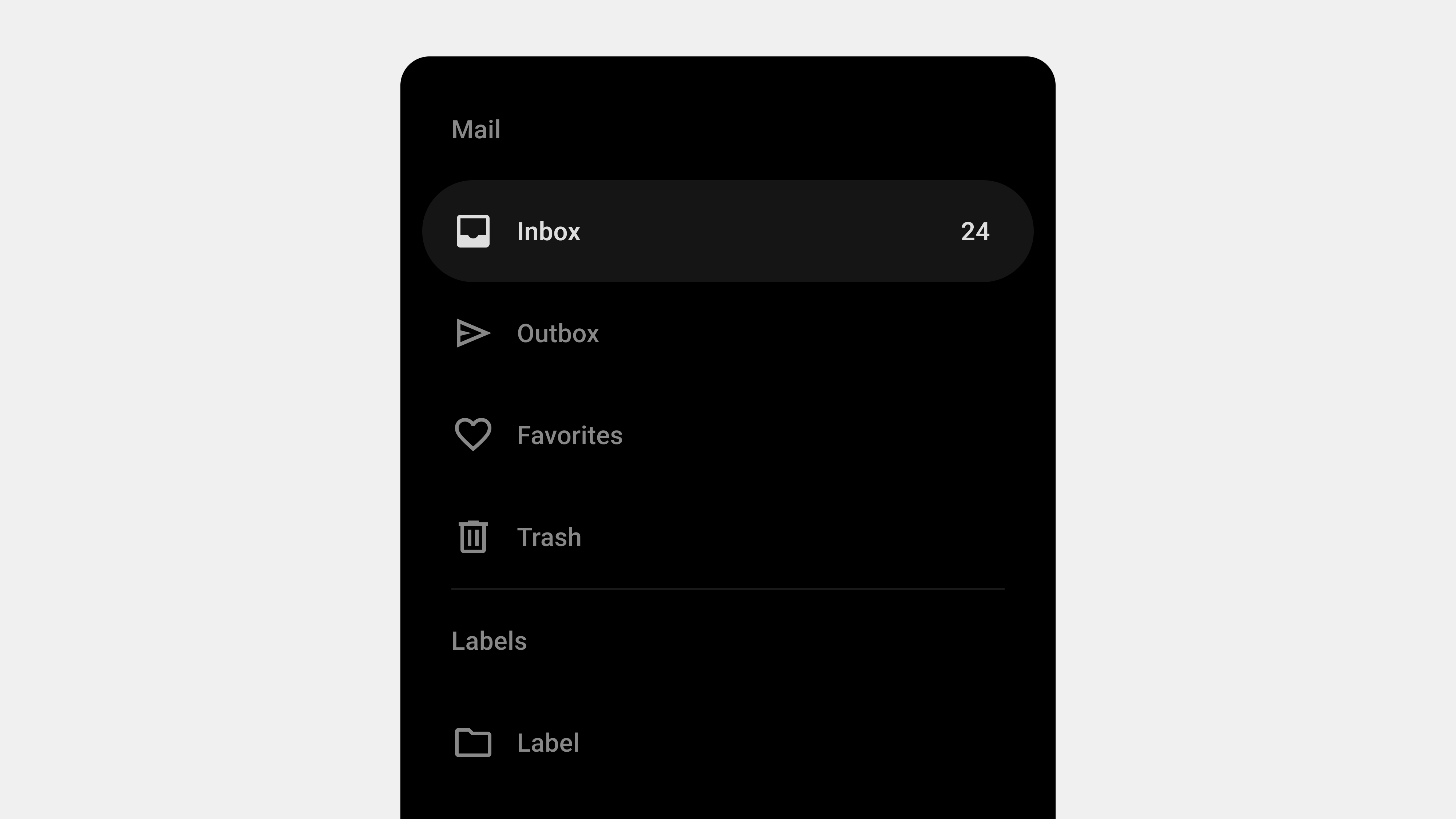
Navigation drawers are a versatile tool in modern UI design, offering a clean way to organize complex menus while optimizing space. However, the success of a navigation drawer depends not only on its structure but also on the clarity and intuitiveness of its labels. UX writing plays a crucial role in ensuring users can easily understand and navigate the drawer’s options. This article focuses on how to craft clear, concise, and user-centric labels for navigation drawers, providing practical examples and best practices.
1. The Role of UX Writing in Navigation Drawers
UX writing is about creating text that guides users through an interface effortlessly. For navigation drawers, it ensures that users can quickly locate features and understand their purpose without confusion or guesswork.
Why It Matters
- Efficiency: Clear labels reduce the time users spend searching for features.
- Usability: Intuitive text enhances the overall experience.
- Consistency: Uniform language builds trust and familiarity.
Example
Instead of using vague terms like “Options” or “Things to Do,” opt for descriptive labels like “Settings” or “Task Manager.”
2. Principles of Effective UX Writing for Navigation Drawers
A. Clarity Over Creativity
Users value clarity more than creative or quirky language. Avoid jargon, idioms, or ambiguous terms that could confuse users.
Good Examples:
- Use “Profile” instead of “My Corner.”
- Use “Cart” instead of “Bag of Goods.”
Why It Works:
Clear, familiar terms help users understand options at a glance.
B. Use Action-Oriented Labels
Action-oriented labels help users understand what they can do within a section.
Good Examples:
- Use “Start Order” instead of “Ordering.”
- Use “Track Shipment” instead of “Shipping Info.”
Why It Works:
Action-oriented labels align with user intent, guiding them toward their goals.
C. Prioritize the User’s Mental Model
Align labels with how users think about tasks and features. Conduct user research to understand their expectations and terminology.
Good Examples:
- “Watchlist” for saved media in a streaming app.
- “Favorites” for saved items in an e-commerce app.
Why It Works:
Matching users’ mental models makes navigation intuitive.
D. Keep It Short and Scannable
Navigation drawer labels should be concise and scannable. Long phrases increase cognitive load and make navigation slower.
Good Examples:
- “Home” instead of “Return to Home Page.”
- “Orders” instead of “Order History and Details.”
Why It Works:
Short labels are easier to read, especially on mobile devices.
E. Consistency Across the Interface
Use consistent terminology throughout the app or platform to avoid confusion.
Good Examples:
- If the main navigation says “Cart,” don’t call it “Basket” elsewhere.
- If you use “Notifications” in one place, avoid “Alerts” or “Updates” elsewhere.
Why It Works:
Consistency reinforces user understanding and trust.
3. Common Navigation Drawer Categories and Their Optimal Labels
A. Home and General Navigation
- Optimal Labels: Home, Dashboard, Explore.
- Why It Works: These terms are widely recognized and intuitive.
B. User Actions and Profiles
- Optimal Labels: Profile, Settings, Log Out.
- Why It Works: They clearly indicate user-specific functions.
C. E-Commerce
- Optimal Labels: Shop, Cart, Wishlist, Orders.
- Why It Works: These terms directly reflect typical e-commerce actions.
D. Content Platforms
- Optimal Labels: Library, Favorites, Categories, Recommendations.
- Why It Works: These terms align with how users organize and discover content.
4. Testing and Refining Navigation Drawer Labels
UX writing is an iterative process. Testing ensures that your labels resonate with users and align with their expectations.
A. Conduct Usability Testing
- Use A/B testing to evaluate different label options.
- Ask users to locate specific features and observe their behavior.
B. Analyze Metrics
- Monitor click-through rates and time spent navigating.
- Identify labels that cause confusion or low engagement.
C. Gather Feedback
- Collect user feedback through surveys or interviews.
- Incorporate their suggestions into your next iteration.
5. Examples of Excellent UX Writing for Navigation Drawers
A. Google Drive
- Labels: My Drive, Shared with Me, Recent, Trash.
- Why It Works: Combines simplicity with functionality, using terms users easily understand.
B. Netflix
- Labels: Home, New & Popular, My List, Settings.
- Why It Works: Prioritizes commonly used actions and personalized options.
C. Shopify
- Labels: Dashboard, Orders, Products, Marketing, Analytics.
- Why It Works: Uses direct, action-oriented language suited for business owners.
6. Common Pitfalls to Avoid
A. Ambiguous Labels
- Issue: Users can’t predict what the label means.
- Fix: Use descriptive terms, e.g., replace “Stuff” with “Documents.”
B. Overloading with Options
- Issue: Too many items overwhelm users.
- Fix: Group items into categories or collapsible menus.
C. Ignoring Localization
- Issue: Terms don’t translate well for international users.
- Fix: Use universally understood terms or localize effectively.
Conclusion
Crafting clear and user-friendly labels for navigation drawers is a critical part of UX writing. By focusing on clarity, action-oriented language, and user mental models, you can create a navigation system that enhances usability and meets user expectations. Consistent testing and iteration ensure that your labels remain relevant and effective over time. A well-written navigation drawer not only improves navigation but also strengthens the overall user experience.
