[태그:] bottom navigation

  • Navigation Drawers – Types

    Navigation Drawers – Types

    Exploring Key Types of Navigation Drawers: A Detailed Guide

    Navigation drawers are a versatile tool for organizing content and functionality within digital interfaces. Their adaptability makes them a popular choice for applications across mobile, desktop, and web platforms. However, not all navigation drawers are the same. They come in various types, each catering to specific user needs and contexts. In this article, we’ll delve into the primary types of navigation drawers, their features, best use cases, and design considerations to help you choose the right one for your project.


    1. Standard (Temporary) Navigation Drawer

    Definition

    The standard or temporary navigation drawer is hidden by default and appears only when a user interacts with a toggle button or performs a swipe gesture. It overlays the main content and closes automatically when the user interacts with another part of the interface.

    Features

    • Overlay Design: Covers the main content when opened.
    • Compact: Hides completely when not in use.
    • Single Focus: Forces users to focus on navigation before returning to the main content.

    Best Use Cases

    • Mobile Apps: Ideal for small screens where space is limited.
    • Simple Navigation: Best for applications with a small number of menu items.

    Design Tips

    • Ensure the toggle button is easily accessible.
    • Use smooth transitions to enhance the user experience.
    • Provide clear feedback when the drawer opens or closes.

    2. Persistent Navigation Drawer

    Definition

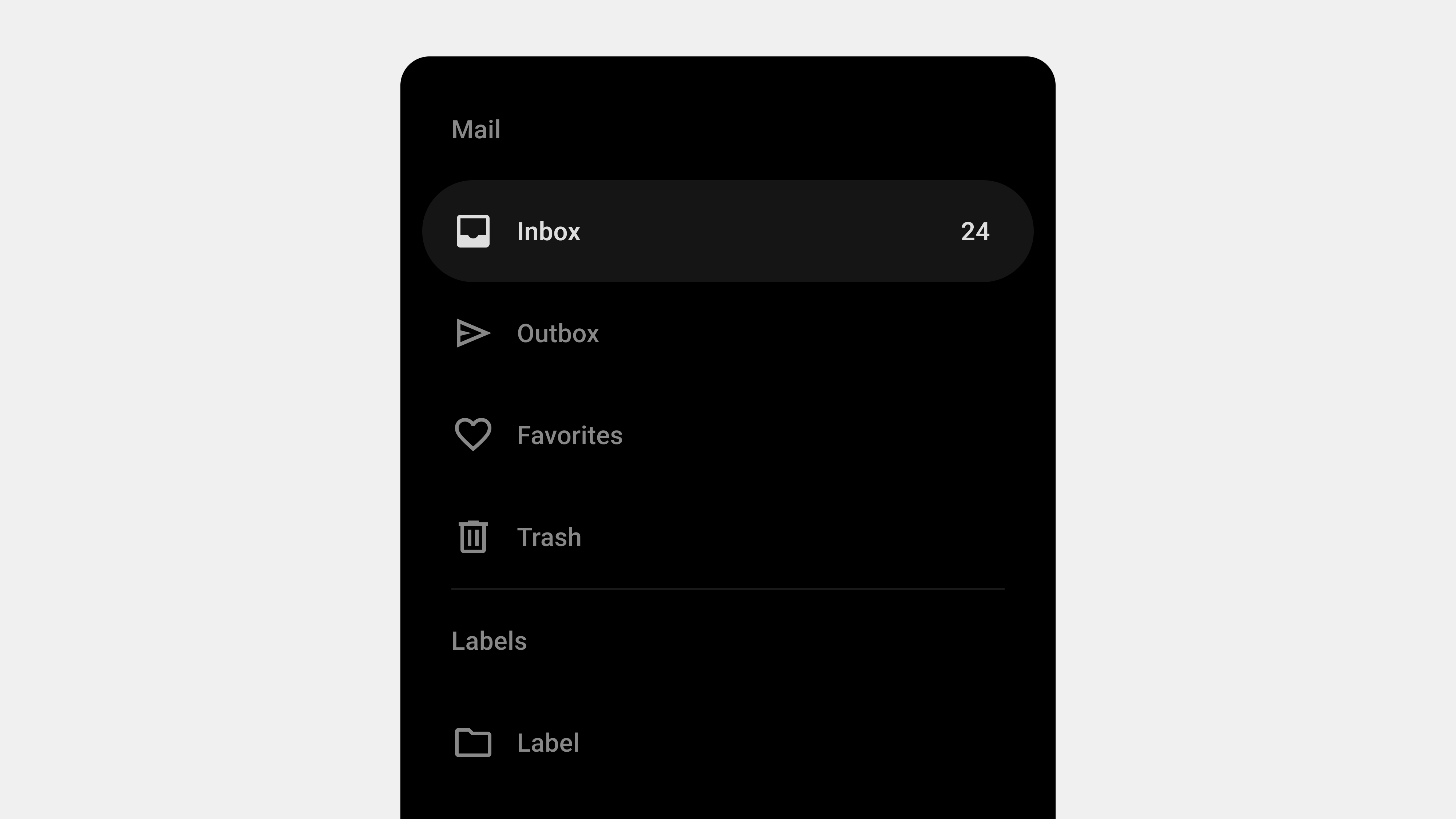
    The persistent navigation drawer remains visible alongside the main content. It does not overlay the content but occupies a fixed portion of the screen.

    Features

    • Fixed Position: Always visible, making navigation seamless.
    • Wider Menu Options: Accommodates more items due to its larger size.
    • Multi-Level Navigation: Supports nested menus or hierarchical structures.

    Best Use Cases

    • Desktop Applications: Works well on larger screens with ample space.
    • Complex Systems: Suitable for tools or platforms with extensive features, such as project management software.

    Design Tips

    • Use collapsible sections to manage space efficiently.
    • Highlight the current selection for better context.
    • Test responsiveness to ensure usability on smaller screens.

    3. Mini Variant Navigation Drawer

    Definition

    A mini navigation drawer is a hybrid between temporary and persistent drawers. It shows only icons when collapsed and expands to reveal full menu labels when the user interacts with it.

    Features

    • Compact Design: Saves space while keeping essential options visible.
    • Expandable: Allows users to expand it for more details.
    • Icon-Based: Relies heavily on recognizable icons for navigation.

    Best Use Cases

    • Web Platforms: Useful for web applications where both space and accessibility are critical.
    • Task-Oriented Interfaces: Ideal for tools with repetitive tasks, such as design or editing software.

    Design Tips

    • Ensure icons are intuitive and universally understood.
    • Use animations to signal the transition between collapsed and expanded states.
    • Provide hover tooltips for additional clarity.

    4. Modal Navigation Drawer

    Definition

    The modal navigation drawer is similar to the temporary drawer but adds a semi-transparent overlay on the rest of the screen when opened. This design choice emphasizes the navigation drawer by blocking interaction with the main content until it is closed.

    Features

    • Enhanced Focus: Directs the user’s attention solely to the navigation.
    • Interactive Lock: Prevents accidental interactions with background elements.
    • Dimmed Background: Highlights the drawer’s content.

    Best Use Cases

    • Content-Heavy Apps: Applications where navigation requires full attention, such as e-commerce platforms.
    • Guided Workflows: Situations where users need clear direction or focus.

    Design Tips

    • Keep the drawer content minimal to avoid overwhelming users.
    • Use a close button that is easily accessible.
    • Ensure the overlay color contrasts well with the drawer for visibility.

    5. Bottom Navigation Drawer

    Definition

    The bottom navigation drawer slides up from the bottom of the screen and is commonly used for mobile devices. It is particularly effective for thumb-reach interactions.

    Features

    • Mobile-Friendly: Optimized for one-handed use on smartphones.
    • Flexible Display: Can show more content when expanded.
    • Contextual Content: Often displays context-specific navigation options.

    Best Use Cases

    • Mobile Apps: Especially those prioritizing ergonomic design.
    • Action-Centric Apps: Applications like ride-sharing or food delivery apps.

    Design Tips

    • Use clear gestures for opening and closing the drawer.
    • Ensure the drawer does not obstruct critical UI elements.
    • Design the drawer to be easily dismissible with a downward swipe.

    6. Multi-Pane Navigation Drawer

    Definition

    A multi-pane navigation drawer provides multiple columns or panes to display different levels of navigation simultaneously.

    Features

    • Multi-Level View: Displays parent and child menu items side by side.
    • Efficient Exploration: Reduces the steps required to navigate between levels.
    • Space-Intensive: Requires significant screen space.

    Best Use Cases

    • Desktop Applications: Platforms with complex structures, such as analytics tools or enterprise software.
    • Knowledge-Based Platforms: Suitable for applications like Wikipedia or documentation hubs.

    Design Tips

    • Ensure each pane is clearly distinguished with visual separators.
    • Use responsive design to collapse panes on smaller screens.
    • Highlight the active pane to guide users effectively.

    7. Adaptive Navigation Drawer

    Definition

    An adaptive navigation drawer adjusts its appearance and functionality based on the user’s device or behavior. For instance, it might act as a persistent drawer on a desktop but as a temporary drawer on mobile.

    Features

    • Dynamic Layout: Adapts to screen size and orientation.
    • Behavioral Adjustments: Changes based on user activity or preferences.
    • Flexible Design: Offers a consistent experience across platforms.

    Best Use Cases

    • Cross-Platform Apps: Applications targeting both mobile and desktop users.
    • Responsive Websites: Platforms that cater to a wide range of devices.

    Design Tips

    • Test the drawer extensively on various devices.
    • Use media queries to define clear breakpoints for transitions.
    • Maintain consistency in content and structure across different modes.

    Conclusion

    Navigation drawers are a versatile tool for organizing and simplifying navigation within digital platforms. By understanding the various types of navigation drawers—temporary, persistent, mini variant, modal, bottom, multi-pane, and adaptive—you can choose the right one to suit your application’s needs. Each type has its unique strengths and challenges, and the choice should align with the platform’s goals, user needs, and context of use. With thoughtful design and implementation, navigation drawers can greatly enhance the user experience by making complex systems intuitive and accessible.


  • Navigation Bars – Types

    Navigation Bars – Types

    Detailed Guide to Key Types of Navigation Bars

    Navigation bars are an essential UI component, acting as the central hub for users to interact with and explore digital platforms. Depending on the platform, user needs, and design goals, navigation bars take on different forms and styles. In this article, we will explore the major types of navigation bars, their features, use cases, and best practices to help you design effective navigation systems that cater to diverse users.


    1. Top Navigation Bars

    Definition

    Top navigation bars are horizontal menus located at the top of a webpage or application. They are the most traditional form of navigation and are widely used across desktop platforms.

    Key Features

    • Visibility: Always prominent, making it easy for users to locate and access options.
    • Space Allocation: Ideal for platforms with sufficient horizontal space, such as desktops.
    • Dropdown Menus: Often include dropdowns to organize secondary and tertiary options.

    Best Use Cases

    • Corporate websites: For primary pages like “About,” “Services,” “Contact.”
    • E-commerce: Categories such as “Home,” “Shop,” “Deals.”
    • Blogs: Sections like “Home,” “Articles,” “Resources,” “Contact.”

    Design Tips

    • Ensure that dropdowns are easy to interact with.
    • Use fixed positioning to keep the nav bar visible while scrolling.
    • Highlight the current page or section for better orientation.

    2. Side Navigation Bars (Drawer Navigation)

    Definition

    Side navigation bars, also called “drawer navigation,” are vertical menus located on the left or right side of a screen. They are often hidden behind a toggle (hamburger menu) and slide into view when needed.

    Key Features

    • Space Efficiency: Maximizes screen space by remaining hidden until activated.
    • Scalability: Suitable for systems with multiple menu items or nested categories.
    • Customizable: Can include collapsible submenus for better organization.

    Best Use Cases

    • Mobile applications: Where screen space is limited.
    • Enterprise tools: For complex systems requiring deep hierarchies.
    • Dashboards: Where functionality and content are segmented into modules.

    Design Tips

    • Ensure the toggle button is easily discoverable.
    • Provide visual feedback (e.g., animation) when the menu opens or closes.
    • Maintain consistency in placement across screens or pages.

    3. Bottom Navigation Bars

    Definition

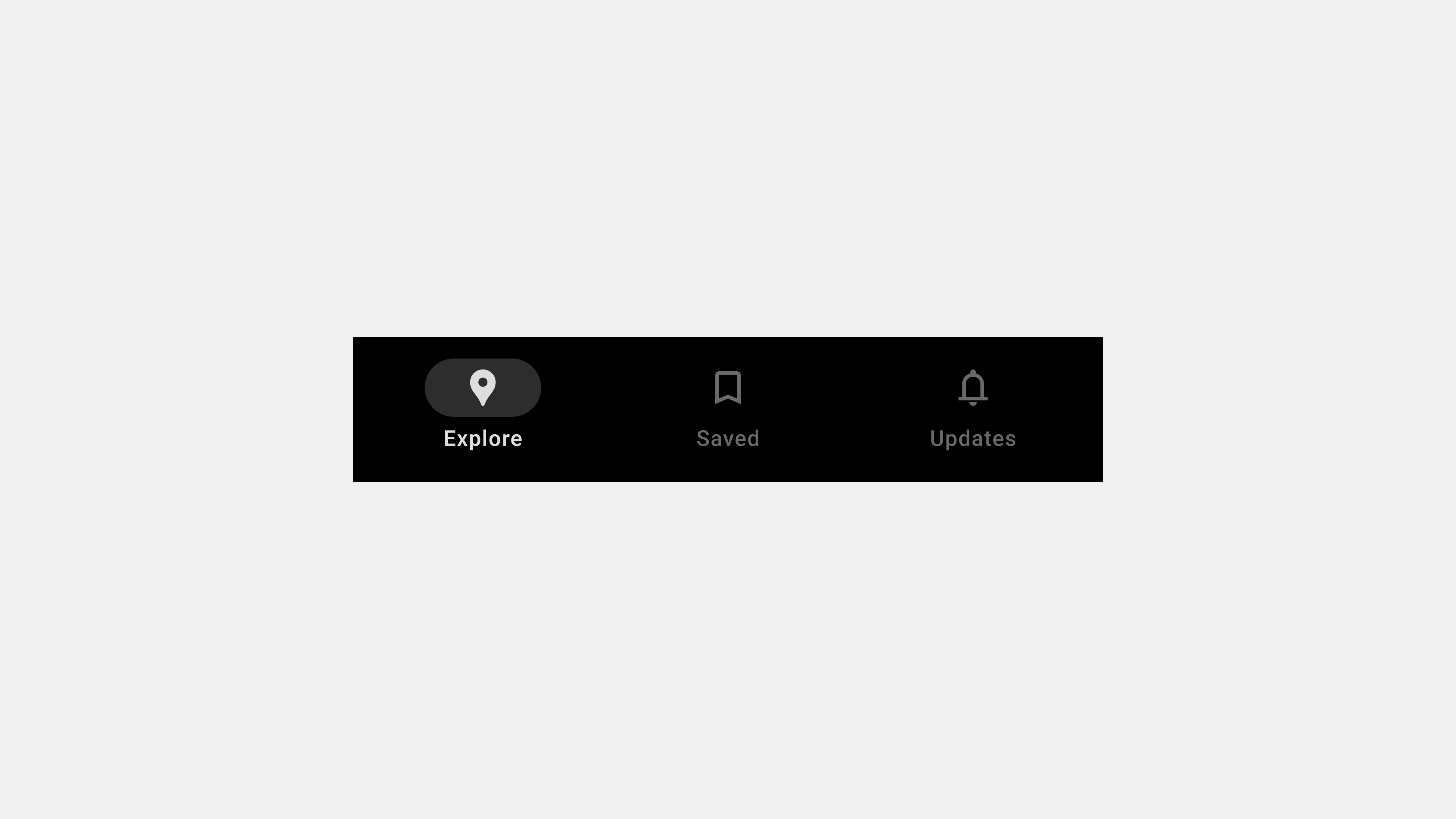
    Bottom navigation bars are horizontal menus positioned at the bottom of the screen. They are widely used in mobile apps to provide easy access to core actions.

    Key Features

    • Thumb Reach: Optimized for one-handed use on mobile devices.
    • Icon-Based: Often uses icons with labels for clarity.
    • Limited Options: Best for up to 5 primary destinations.

    Best Use Cases

    • Social media apps: Sections like “Home,” “Search,” “Post,” “Profile.”
    • Music apps: Options like “Home,” “Search,” “Library,” “Settings.”
    • Finance apps: Tabs for “Dashboard,” “Transactions,” “Accounts.”

    Design Tips

    • Prioritize clarity in icon design and labeling.
    • Avoid overcrowding; limit the number of menu items.
    • Use feedback like highlighting the active tab.

    4. Tab Navigation

    Definition

    Tab navigation divides content into discrete sections, with tabs often displayed horizontally or vertically. It is best suited for categorizing related information.

    Key Features

    • Ease of Use: Tabs are intuitive and easy to navigate.
    • Space Efficiency: Group multiple sections in a compact layout.
    • Immediate Access: Switches content without reloading the page.

    Best Use Cases

    • Product pages: Showing “Description,” “Reviews,” “Specifications.”
    • Settings pages: Tabs for “General,” “Security,” “Notifications.”
    • Content-heavy platforms: Grouping categories like “Trending,” “Popular,” “New.”

    Design Tips

    • Use consistent styling across tabs.
    • Indicate the active tab with a clear visual cue.
    • Avoid deep hierarchies; tabs should remain simple and straightforward.

    5. Fixed Navigation Bars (Sticky Navigation)

    Definition

    Fixed navigation bars, also called “sticky navigation,” remain visible as users scroll through a webpage or application.

    Key Features

    • Persistent Accessibility: Ensures key actions are always available.
    • Streamlined Experience: Reduces the need to scroll back to the top.
    • Enhanced Usability: Keeps users oriented, especially on long pages.

    Best Use Cases

    • Content-heavy websites: News portals or blogs with lengthy articles.
    • E-commerce: Providing quick access to the cart or categories.
    • SaaS tools: For actions like “Save,” “Edit,” “Dashboard.”

    Design Tips

    • Avoid taking up too much vertical space.
    • Test the bar’s visibility and interactions across devices.
    • Use smooth transitions to minimize distraction.

    6. Dynamic and Contextual Navigation Bars

    Definition

    Dynamic navigation bars adapt to the user’s current context or behavior, displaying options relevant to their actions.

    Key Features

    • Personalization: Offers tailored options based on user activity.
    • Dynamic Content: Adjusts menu items depending on the page or task.
    • Reduced Clutter: Simplifies the interface by hiding irrelevant options.

    Best Use Cases

    • E-learning platforms: Showing “Next Lesson” or “Quiz” based on progress.
    • Design tools: Displaying tools specific to the selected object (e.g., text, image).
    • Productivity apps: Adapting menus for “Editing” vs. “Viewing” modes.

    Design Tips

    • Provide clear cues when the navigation changes.
    • Ensure users can still access less-frequent options easily.
    • Avoid over-customization that might confuse users.

    7. Mega Menus

    Definition

    Mega menus are expansive dropdown menus that display multiple levels of navigation at once.

    Key Features

    • Content-Rich: Showcases a wide range of options in a single view.
    • Categorical Clarity: Groups related items for better discoverability.
    • Visual Enhancements: Often includes icons, images, or descriptions.

    Best Use Cases

    • E-commerce platforms: For categories like “Electronics,” “Clothing,” “Home & Kitchen.”
    • Educational sites: Offering sections like “Courses,” “Resources,” “Community.”
    • Travel websites: Featuring “Flights,” “Hotels,” “Car Rentals.”

    Design Tips

    • Use logical grouping for categories.
    • Optimize for responsiveness; mega menus must work on mobile devices.
    • Avoid overwhelming users with excessive information.

    8. Hidden or Collapsible Navigation

    Definition

    Hidden or collapsible navigation bars remain concealed until activated by a user action, such as clicking a button or hovering over an area.

    Key Features

    • Minimalist Design: Keeps the interface clean and distraction-free.
    • Action-Based Access: Requires explicit user interaction to reveal.
    • Flexibility: Works well for secondary or less-critical options.

    Best Use Cases

    • Creative portfolios: Allowing users to focus on visual content.
    • Landing pages: For a focused call-to-action without distractions.
    • Apps with limited screen real estate.

    Design Tips

    • Clearly indicate how to open the navigation.
    • Ensure accessibility for users with disabilities.
    • Test interactions to avoid usability issues.

    Conclusion

    Understanding the types of navigation bars and their unique roles helps UX/UI designers create systems that cater to specific user needs and platform constraints. From traditional top navigation to dynamic and contextual bars, each type has its advantages and challenges. By tailoring navigation design to the intended audience and use case, you can create intuitive, accessible, and engaging digital experiences.


    Summary:

    Tags: