Key Considerations for QA Testing Menus
Menus are a critical component of user interfaces, enabling navigation and task execution. QA testing ensures that menus function as intended, provide a seamless experience, and meet user expectations. This article explores the five most important aspects to focus on during menu QA testing, offering actionable insights for quality assurance specialists.
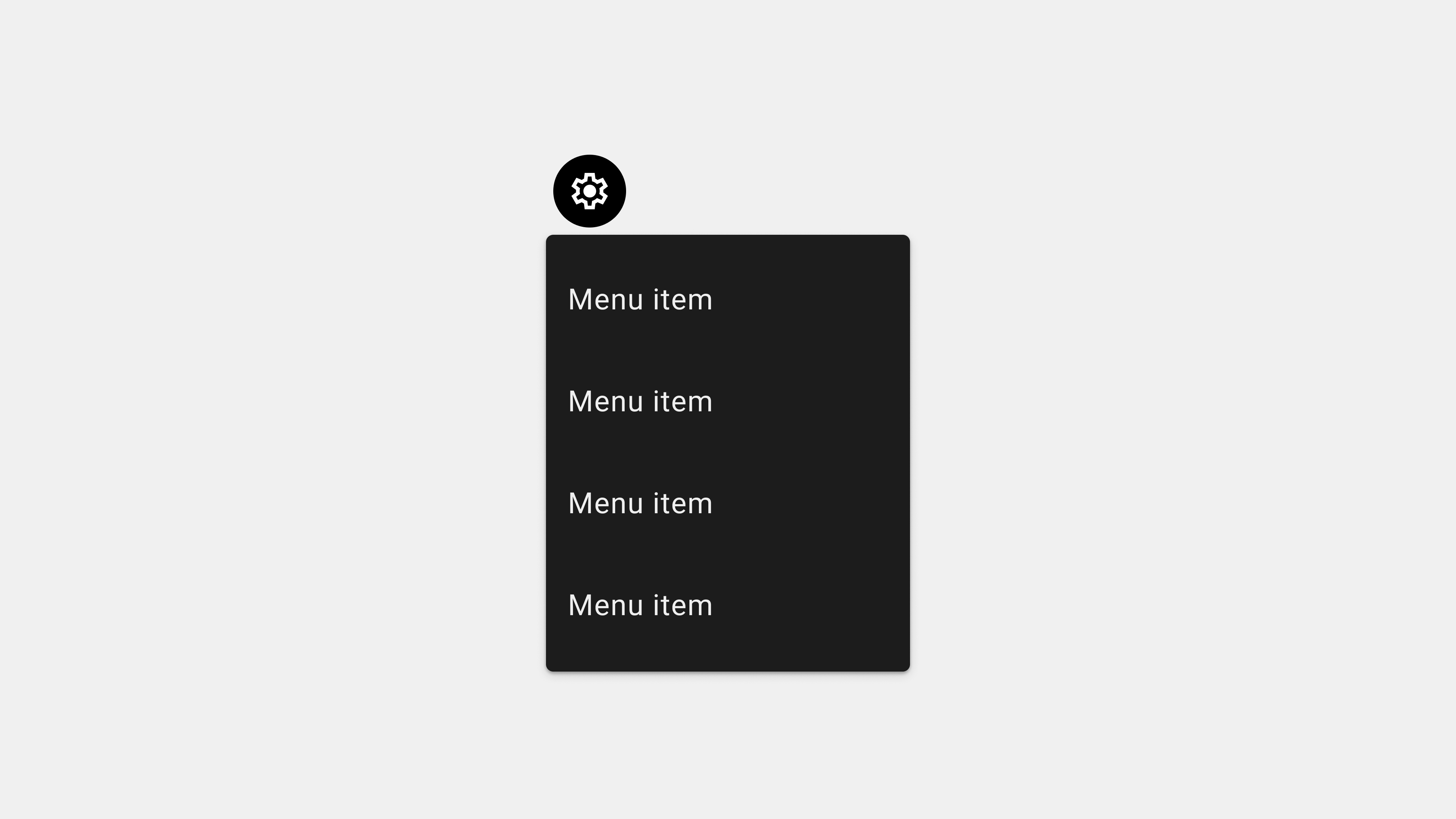
1. Functional Testing
Why It Matters
Menus must perform their basic functions reliably. Broken links, unresponsive items, or incorrect navigation paths can frustrate users and harm the user experience.
Key Testing Areas
- Link Verification: Ensure all menu items route to the correct destination.
- Dropdown Menus: Test expand/collapse behavior under various conditions.
- Submenus: Validate that submenus open correctly and are accessible.
Test Scenarios
- Clicking each menu item and verifying its destination.
- Rapidly switching between dropdown menus to ensure they function without errors.
- Testing submenus with multiple nested layers for proper functionality.
Tools and Tips
- Use automated tools like Selenium or Cypress to validate menu links.
- Conduct manual testing to ensure responsiveness and reliability.
- Test on various devices and browsers to identify inconsistencies.
2. Cross-Browser and Cross-Platform Testing
Why It Matters
Users access menus on diverse devices and browsers, making it essential to ensure consistent functionality and appearance.
Key Testing Areas
- Browser Compatibility: Verify menus function correctly on Chrome, Safari, Firefox, Edge, and more.
- Device Compatibility: Test menus on desktops, tablets, and smartphones.
- Operating System Variations: Check for differences across iOS, Android, Windows, and macOS.
Test Scenarios
- Verifying the display and behavior of menus on different screen sizes and resolutions.
- Testing touch interactions (e.g., tap and swipe) on mobile devices.
- Simulating mouse hover and click interactions on desktop browsers.
Tools and Tips
- Use BrowserStack or Sauce Labs for cross-browser and cross-platform testing.
- Manually test menus on physical devices to identify real-world issues.
3. Accessibility Testing
Why It Matters
Accessible menus ensure inclusivity, enabling users with disabilities to navigate and interact with the interface effectively.
Key Testing Areas
- Screen Reader Compatibility: Verify that menu items are correctly announced.
- Keyboard Navigation: Ensure users can navigate menus using only a keyboard.
- Focus Management: Test visible focus indicators for interactive elements.
Test Scenarios
- Navigating through the menu with a screen reader like NVDA or VoiceOver.
- Using the Tab and Shift+Tab keys to move forward and backward through menu items.
- Testing color contrast and font sizes to ensure readability for users with visual impairments.
Tools and Tips
- Use Axe Accessibility Checker for automated audits.
- Test with real users who rely on assistive technologies to uncover practical issues.
4. Performance Testing
Why It Matters
Menus should load quickly and function smoothly, even under high traffic or resource-constrained environments.
Key Testing Areas
- Loading Speed: Test how quickly menus appear and respond to interactions.
- Animation Smoothness: Validate that dropdowns and transitions are fluid.
- High-Traffic Scenarios: Simulate heavy usage to test resilience.
Test Scenarios
- Clicking rapidly between menu items to check for delays or stuttering.
- Simulating poor network conditions to observe menu behavior during slow loads.
- Testing on low-performance devices to identify potential bottlenecks.
Tools and Tips
- Use Lighthouse to measure menu performance metrics.
- Conduct load testing with Apache JMeter or similar tools.
5. Edge Case and Error Handling Testing
Why It Matters
Menus must handle unexpected scenarios gracefully to ensure a seamless user experience.
Key Testing Areas
- Offline Mode: Test how menus behave when the device is disconnected from the internet.
- Dynamic Content: Validate menus that fetch data dynamically or adapt based on user roles.
- Error Messages: Ensure fallback mechanisms are in place for broken links or failed content loads.
Test Scenarios
- Testing menus with dynamically generated items (e.g., user-specific settings).
- Simulating network interruptions to check for appropriate error handling.
- Interacting with unavailable or restricted menu items to verify error messages.
Tools and Tips
- Use Postman to simulate API failures for dynamic menus.
- Test with different user roles to ensure menus display correctly for each scenario.
Conclusion
QA testing for menus is crucial for delivering a functional, accessible, and seamless user experience. By focusing on functional testing, cross-platform compatibility, accessibility, performance, and edge case handling, QA teams can ensure menus meet technical and user expectations. Regular testing and collaboration with designers and developers are essential for refining menus and addressing potential issues proactively.