[태그:] cross-platform compatibility

  • Tab bar – 11. Final

    Tab bar – 11. Final

    Comprehensive Guide to Tab Bars: A Complete Wrap-Up

    Tab bars are indispensable navigation components in modern applications, especially in mobile UI design. They offer users intuitive and consistent access to key features, playing a vital role in enhancing usability and navigation efficiency. This comprehensive guide summarizes the essential aspects of tab bars, covering their definition, roles, types, design principles, development considerations, and QA testing insights.


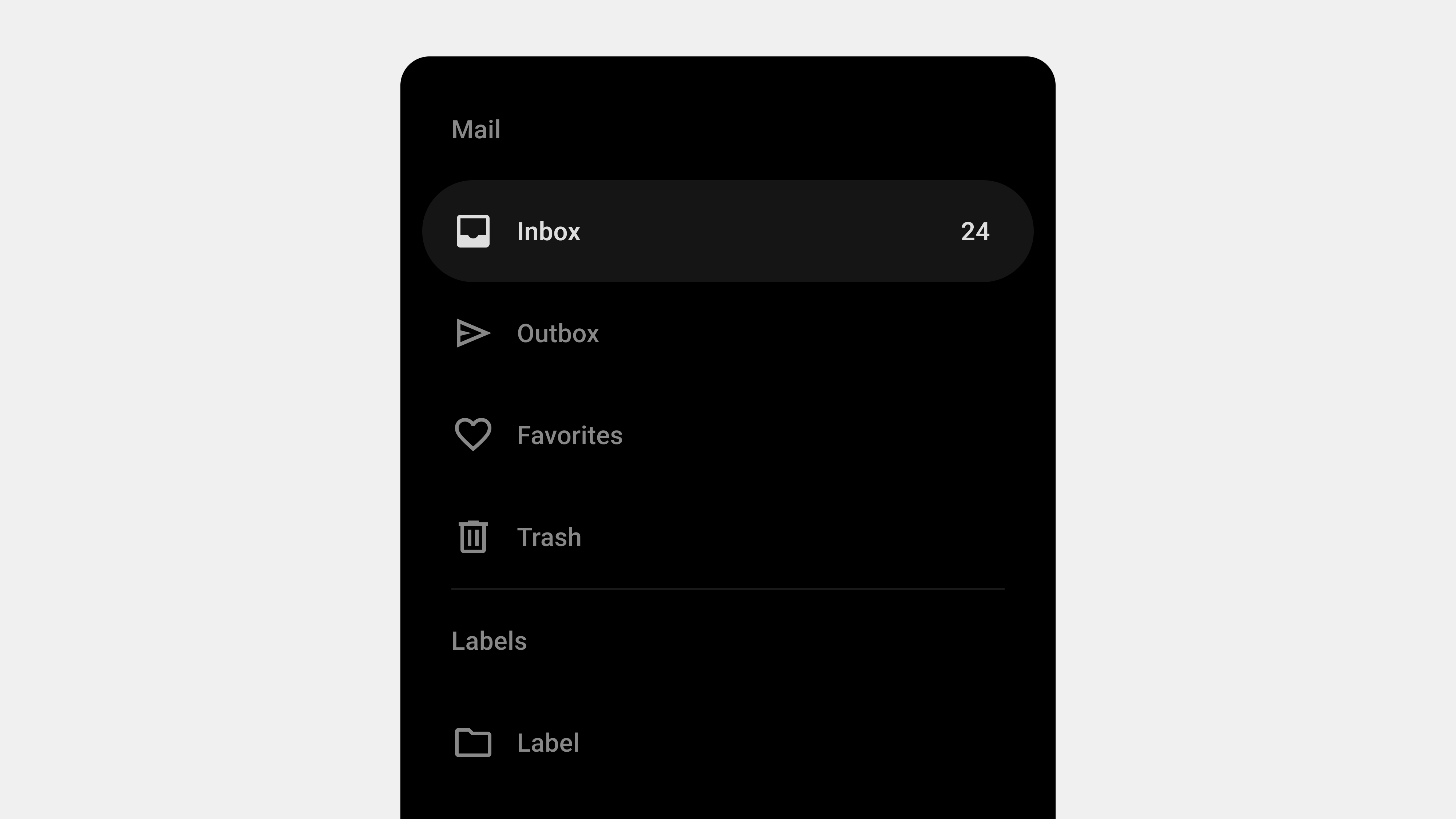
    1. What Is a Tab Bar?

    A tab bar is a horizontal navigation tool typically placed at the bottom of a mobile screen or the top of a desktop interface. It enables users to switch between primary sections or features of an application seamlessly.

    Key Features

    • Always Visible: Ensures consistent navigation across screens.
    • Compact Design: Saves screen space while providing quick access to essential functions.
    • Icons and Labels: Combines visuals and text for clear communication.

    Purpose

    Tab bars organize content and functions efficiently, simplifying user navigation by grouping core features in an easily accessible layout.


    2. The Role of Tab Bars in User Experience

    Tab bars significantly influence the overall user experience, acting as a central hub for navigation.

    A. Simplifying Navigation

    By grouping key features into one accessible location, tab bars minimize the steps users need to take to find essential functions.

    B. Enhancing Discoverability

    Prominent placement ensures that primary features are easy to locate, reducing frustration.

    C. Providing Contextual Awareness

    Active state indicators highlight the user’s current location within the app, offering clear feedback and reducing cognitive load.

    D. Supporting Multitasking

    Tab bars facilitate smooth transitions between tasks without disrupting workflows, improving productivity.


    3. Types of Tab Bars

    Different applications require varying tab bar designs based on their functionality and user needs.

    A. Standard Tab Bar

    • Features fixed tabs for core sections.
    • Ideal for apps with a limited number of features (e.g., 3-5 tabs).

    B. Scrollable Tab Bar

    • Allows users to scroll horizontally for additional tabs.
    • Suitable for content-heavy applications like streaming platforms.

    C. Persistent Tab Bar

    • Remains visible during scrolling or page transitions.
    • Ensures constant access to navigation options.

    D. Dynamic Tab Bar

    • Adapts to user roles, preferences, or contexts.
    • Provides personalized navigation experiences.

    E. Floating Tab Bar

    • Positioned slightly above the screen bottom with a minimalist design.
    • Popular in modern, aesthetically focused applications.

    4. Best Practices for Designing Tab Bars

    Creating user-centered tab bars requires adherence to specific design principles.

    A. Simplicity and Clarity

    • Limit tabs to 3-5 key sections.
    • Use clear and descriptive labels paired with intuitive icons.

    B. Accessibility and Inclusivity

    • Add ARIA roles and labels for screen readers.
    • Ensure keyboard navigation and focus indicators.

    C. Ergonomic Design

    • Position the tab bar at the bottom for thumb-reach accessibility.
    • Provide large tap targets to prevent misclicks.

    D. Visual Feedback

    • Highlight active tabs using bold text, color changes, or underlines.
    • Use animations for smooth transitions between tabs.

    E. Scalability and Consistency

    • Plan for future features with overflow menus or collapsible tabs.
    • Maintain consistent design and behavior across all platforms.

    5. Development and Publishing Considerations

    A. Performance Optimization

    • Use lazy loading to reduce initial load times.
    • Minimize dependencies to enhance responsiveness.

    B. Cross-Platform Compatibility

    • Test tab bars on various devices, including mobile, tablet, and desktop.
    • Ensure consistent performance across iOS, Android, and web browsers.

    C. Dynamic Content Management

    • Load dynamic content on-demand to improve performance.
    • Use error messages or fallback options for failed content loads.

    D. Responsive Design

    • Adapt layouts to different screen sizes and orientations.
    • Implement media queries for scalable and responsive designs.

    6. QA Testing Insights for Tab Bars

    Quality assurance is critical to ensure tab bars function reliably across all scenarios.

    A. Functional Testing

    • Verify that all tabs navigate to the correct sections.
    • Test nested menus and dropdowns for proper operation.

    B. Accessibility Compliance

    • Test compatibility with screen readers and keyboard navigation.
    • Validate contrast ratios and focus indicators.

    C. Performance Testing

    • Measure response times for interactions.
    • Simulate high-traffic scenarios to ensure scalability.

    D. Error Handling

    • Test how tabs respond to network failures or broken links.
    • Provide user-friendly error messages for unresolved issues.

    7. The Importance of UX Writing in Tab Bars

    Clear and concise labels are fundamental to effective tab bars.

    Best Practices for UX Writing

    • Use action-oriented labels like “Track Order” or “View Cart.”
    • Maintain consistency in terminology across the app.
    • Avoid jargon or overly creative terms that might confuse users.

    Examples of Excellent Labels

    • E-Commerce App: Home, Shop, Cart, Profile.
    • Social Media App: Feed, Search, Notifications, Profile.

    Conclusion

    Tab bars are vital for efficient navigation and usability, offering users a simple way to access an app’s core features. By understanding their role, designing user-centered layouts, ensuring proper development, and conducting thorough QA testing, teams can create tab bars that enhance user satisfaction and engagement. Combining clear UX writing, accessibility, and responsive design ensures that tab bars remain a cornerstone of effective UI/UX design.


  • Navigation Drawers – 11. Final

    Navigation Drawers – 11. Final

    The Complete Guide to Navigation Drawers: Wrap-Up

    Navigation drawers are a critical component of modern digital interfaces, offering a clean and efficient way to organize menus and navigation elements. Over the course of our exploration, we have delved into various aspects of navigation drawers, including their definition, roles, key types, UX writing best practices, design considerations, development essentials, and QA testing. This comprehensive guide summarizes all the important points to create a cohesive understanding of navigation drawers, their design, implementation, and testing.


    1. What Is a Navigation Drawer?

    Navigation drawers are collapsible side panels used in digital interfaces to organize and provide access to navigation elements. They are particularly popular in mobile and web applications due to their ability to save space while maintaining functionality.

    Key Features

    • Expandable and Collapsible: Hidden by default and activated via gestures or buttons.
    • Space Efficient: Keeps the interface clean by storing secondary options.
    • Scalable: Handles large or hierarchical navigation structures effectively.

    Primary Role

    Navigation drawers serve as a tool for organizing content, enabling users to navigate complex interfaces with ease.


    2. Designing Navigation Drawers: User-Centered Best Practices

    Creating an effective navigation drawer begins with a focus on the user. The design must prioritize simplicity, accessibility, and responsiveness.

    Key Considerations

    1. Clarity and Simplicity: Use clear, concise labels and group related items logically.
    2. Accessibility: Ensure compatibility with screen readers, keyboard navigation, and focus management.
    3. Responsive Design: Adapt layouts for mobile, tablet, and desktop devices.
    4. Feedback and Cues: Highlight active states, provide visual feedback, and use smooth animations.
    5. Scalability: Design for future growth, accommodating new features seamlessly.

    UX Writing for Navigation Drawers

    Labels play a vital role in user experience. Clear and action-oriented labels such as “Profile” or “Track Order” align with user expectations, improving navigation efficiency.


    3. Types of Navigation Drawers

    Navigation drawers come in various forms, each tailored to specific use cases.

    Primary Types

    1. Standard (Temporary): Hidden by default and overlays the main content. Ideal for mobile apps.
    2. Persistent: Always visible alongside the content, suitable for larger screens.
    3. Mini Variant: Collapsible design showing only icons when closed.
    4. Bottom Drawer: Slides up from the bottom, optimized for mobile ergonomics.
    5. Modal Drawer: Focused interaction with a dimmed background for emphasis.

    Each type addresses different user needs, balancing space efficiency and usability.


    4. Developing and Publishing Navigation Drawers

    Key Development Considerations

    1. Performance Optimization: Use lazy loading, CSS transitions, and minimize JavaScript dependencies.
    2. Dynamic Content Handling: Fetch content dynamically and handle errors gracefully.
    3. Responsiveness: Implement layouts that adapt seamlessly to various screen sizes and devices.
    4. Cross-Platform Compatibility: Test the drawer on all major browsers and devices to ensure consistent performance.
    5. Accessibility Compliance: Incorporate ARIA roles, focus management, and keyboard navigation.

    Tips for Developers

    • Use semantic HTML for better screen reader support.
    • Test gestures and interactions on both mobile and desktop devices.

    5. QA Testing for Navigation Drawers

    Quality assurance ensures that navigation drawers function reliably across all scenarios.

    Focus Areas

    1. Functional Testing: Validate all links, buttons, and dropdowns.
    2. Performance Testing: Measure response times for opening, closing, and loading dynamic content.
    3. Accessibility Testing: Ensure compatibility with assistive technologies like screen readers.
    4. Error Handling: Test fallback behaviors for broken links or failed API requests.
    5. Cross-Browser and Device Testing: Verify consistency across devices, orientations, and browsers.

    Tools for QA

    • Lighthouse: For performance and accessibility audits.
    • BrowserStack: For cross-browser and device testing.
    • Axe Accessibility Checker: For in-depth accessibility testing.

    6. Combining Design, Development, and QA

    The success of a navigation drawer relies on the collaboration between designers, developers, and QA teams. Each role contributes to the process:

    • Designers focus on creating intuitive layouts and labels.
    • Developers implement responsive, scalable, and accessible code.
    • QA Teams ensure functionality, usability, and reliability through rigorous testing.

    By aligning efforts across these teams, you can create navigation drawers that not only meet user expectations but also drive engagement and satisfaction.


    Conclusion

    Navigation drawers are more than just a functional component—they are a strategic tool for organizing content and enhancing user experiences. From their design and development to rigorous QA testing, each step in the process requires attention to detail and user-centric thinking. By following the principles and best practices outlined in this guide, you can create navigation drawers that are intuitive, accessible, and scalable, ensuring long-term success for your applications.


  • Navigation Drawers – 9. Dev

    Navigation Drawers – 9. Dev

    5 Key Considerations for Publishing and Developing Navigation Drawers

    Navigation drawers are an essential part of modern UI design, providing a compact and efficient way to organize menus and navigation elements. While their design plays a vital role, successful implementation through publishing and development is equally critical. Poor execution can lead to usability issues, performance lags, or even accessibility barriers. This article outlines the top five considerations for publishing and developing navigation drawers, offering practical insights for developers and publishers to ensure optimal functionality and user experience.


    1. Performance Optimization

    Why It Matters

    Navigation drawers are used across multiple screens in an app or website. Poorly optimized drawers can slow down load times, negatively impacting the overall user experience.

    Key Considerations

    • Lazy Loading: Load secondary or less-used content only when the drawer is opened.
    • Minimize JavaScript: Avoid unnecessary JavaScript dependencies for animations or dynamic content.
    • Efficient CSS: Use clean and efficient CSS for styling to reduce rendering time.

    Implementation Tips

    • Use CSS transitions for animations instead of JavaScript for better performance.
    • Preload critical assets for smooth interaction.
    • Combine multiple API calls for dynamic content into a single request.

    Tools

    • Lighthouse for performance auditing.
    • Webpack or Rollup to bundle and minify assets.

    2. Responsiveness and Device Compatibility

    Why It Matters

    Navigation drawers must work seamlessly across a wide range of devices, from small-screen smartphones to large desktop monitors. Ensuring responsiveness is critical to maintaining a consistent user experience.

    Key Considerations

    • Responsive Breakpoints: Use media queries to define specific layouts for different screen sizes.
    • Mobile Optimization: Ensure touch targets are large enough for mobile interactions.
    • Cross-Browser Compatibility: Test the drawer’s functionality on all major browsers, including Chrome, Safari, Firefox, and Edge.

    Implementation Tips

    • Use a mobile-first approach when defining breakpoints.
    • Implement swipe gestures for mobile drawers while maintaining click/tap functionality.
    • Design persistent drawers for desktop applications where appropriate.

    Tools

    • BrowserStack for testing across devices and browsers.
    • Chrome DevTools for simulating various screen sizes.

    3. Accessibility Compliance

    Why It Matters

    Accessibility ensures that navigation drawers are usable for all users, including those with disabilities. Ignoring accessibility can alienate users and lead to legal consequences.

    Key Considerations

    • Keyboard Navigation: Users should be able to navigate the drawer using only a keyboard.
    • Screen Reader Support: Implement ARIA roles and labels to make the drawer content accessible via screen readers.
    • Focus Management: Automatically move focus to the drawer when it opens and return it to the toggle button when it closes.

    Implementation Tips

    • Use semantic HTML for the drawer’s structure (e.g., <nav> tags).
    • Highlight focusable elements and ensure focus indicators are visible.
    • Test the drawer with assistive technologies like NVDA or VoiceOver.

    Tools

    • Axe Accessibility Checker.
    • Lighthouse Accessibility Audit.

    4. Dynamic Content Handling

    Why It Matters

    Many modern applications rely on navigation drawers to display dynamic or personalized content. If not handled correctly, this can lead to performance issues or broken functionality.

    Key Considerations

    • Dynamic Loading: Fetch content only when required, rather than preloading everything.
    • Error Handling: Provide fallback options or error messages if dynamic content fails to load.
    • Caching: Cache frequently accessed content to improve load times.

    Implementation Tips

    • Use loading indicators for sections that fetch content dynamically.
    • Implement retry mechanisms for failed network requests.
    • Test how the drawer behaves in offline or low-connectivity scenarios.

    Example

    For a messaging app, load recent chats dynamically when the drawer opens, but show a placeholder if the content fails to load.


    5. Testing and Quality Assurance (QA)

    Why It Matters

    Even a well-designed navigation drawer can fail to meet user expectations without rigorous testing. QA ensures the drawer performs consistently across devices, browsers, and scenarios.

    Key Considerations

    • Functional Testing: Verify that all links, buttons, and dynamic content work correctly.
    • Performance Testing: Test the drawer’s performance under high traffic or slow network conditions.
    • Stress Testing: Ensure the drawer can handle large amounts of content without breaking.

    Implementation Tips

    • Create automated tests for common user actions, such as opening, closing, and navigating through the drawer.
    • Simulate various user behaviors, such as rapid opening/closing or switching devices mid-session.
    • Test accessibility features with real users or accessibility experts.

    Tools

    • Selenium or Cypress for automated testing.
    • Apache JMeter for load and stress testing.

    Conclusion

    Publishing and developing navigation drawers require a balance of performance optimization, responsiveness, accessibility, dynamic content handling, and rigorous testing. By addressing these five areas, developers and publishers can create navigation systems that meet user expectations and perform reliably across devices and scenarios. Proper implementation ensures not only a smoother user experience but also long-term scalability and maintainability.