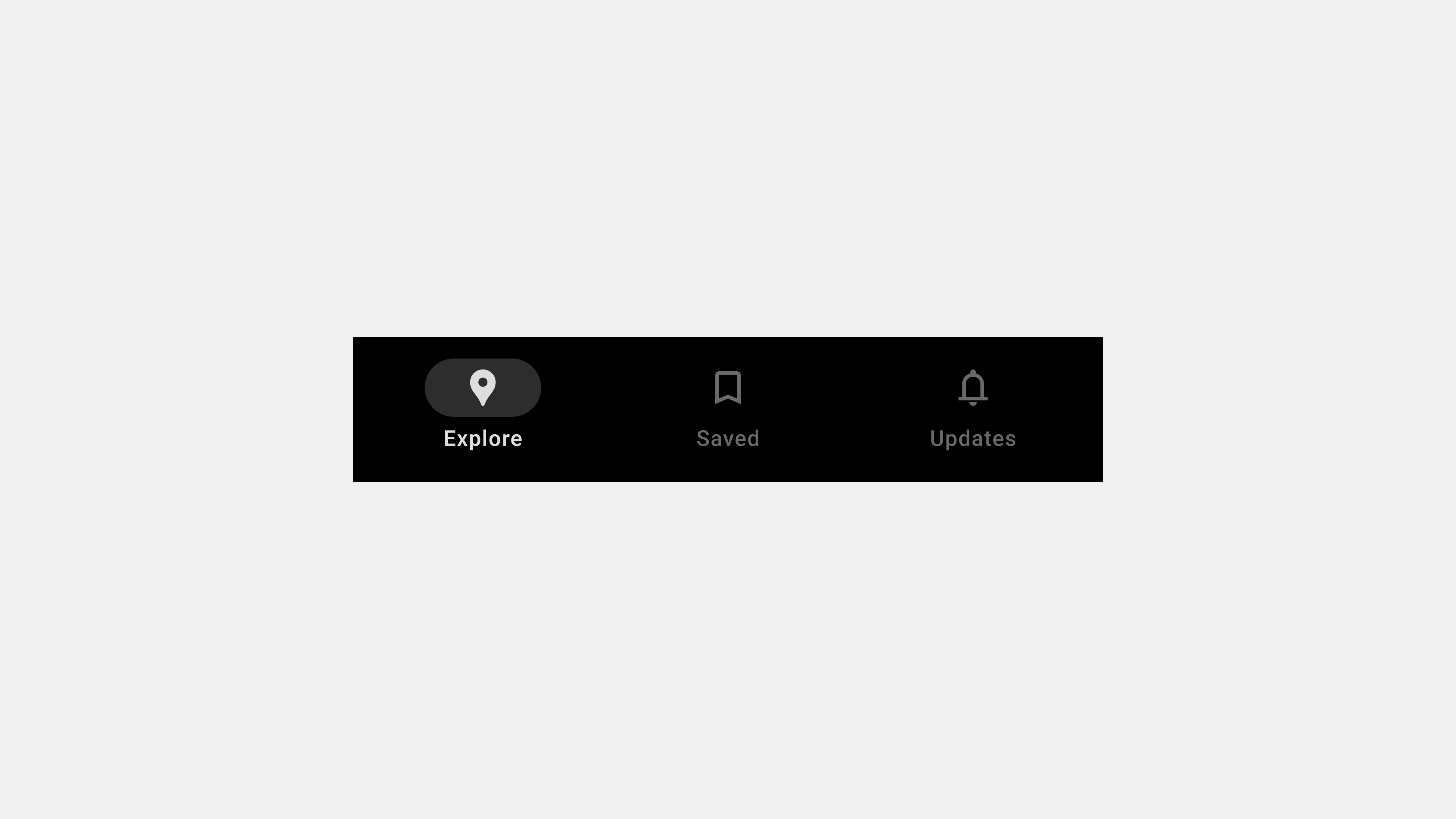
Comprehensive Guide to the Key Types of Bottom Navigation Bars
Bottom navigation bars are a staple in modern mobile app design, providing users with a simple and intuitive way to access core features. Positioned at the bottom of the screen, these navigation bars are optimized for thumb reach, making them ideal for one-handed use. Depending on the app’s functionality and user needs, bottom navigation bars can be designed in various ways. This article explores the primary types of bottom navigation bars, detailing their features, use cases, and design considerations.
1. Standard Bottom Navigation Bar
Definition
A standard bottom navigation bar features a fixed layout with 3-5 evenly spaced tabs, each representing a primary app section.
Key Features
- Static Placement: Remains fixed at the bottom of the screen.
- Icons and Labels: Combines icons with text labels for clarity.
- Active State Indicators: Highlights the selected tab using color changes, bold text, or underlines.
Use Cases
- Social Media Apps: For tabs like “Home,” “Search,” “Notifications,” and “Profile.”
- E-Commerce Apps: For sections such as “Shop,” “Cart,” “Orders,” and “Account.”
Advantages
- Simple and intuitive design.
- Ensures consistent navigation across screens.
- Easy to implement for basic navigation needs.
Best Practices
- Limit the number of tabs to avoid overcrowding.
- Use universally recognizable icons for better usability.
- Ensure labels are short and descriptive.
2. Floating Bottom Navigation Bar
Definition
A floating bottom navigation bar is slightly elevated from the screen’s bottom edge, giving it a distinct appearance with rounded edges and shadows.
Key Features
- Modern Aesthetic: Rounded corners and shadows create a “floating” effect.
- Compact Design: Uses minimal screen space while remaining functional.
- Interactive Feedback: Includes smooth animations for transitions and interactions.
Use Cases
- Fitness Apps: For navigating “Dashboard,” “Workouts,” and “Profile.”
- Creative Tools: For sections like “Projects,” “Templates,” and “Settings.”
Advantages
- Offers a visually appealing and modern design.
- Enhances focus by creating a clear separation from other UI elements.
Best Practices
- Pair with gesture-based navigation for a seamless experience.
- Use drop shadows to enhance the floating effect.
- Ensure the design does not obstruct important content.
3. Scrollable Bottom Navigation Bar
Definition
A scrollable bottom navigation bar allows users to swipe horizontally to access additional tabs, accommodating apps with multiple sections.
Key Features
- Horizontal Scrolling: Enables access to more tabs than a standard layout can fit.
- Dynamic Indicators: Highlights the active tab as users scroll through options.
- Compact Layout: Maintains a clean design while supporting additional features.
Use Cases
- Streaming Platforms: For tabs like “Movies,” “TV Shows,” “Sports,” and “Kids.”
- Content Management Apps: For navigating “Files,” “Shared,” “Recent,” and “Starred.”
Advantages
- Supports a large number of sections without cluttering the interface.
- Ideal for apps with extensive content categories.
Best Practices
- Clearly indicate the current tab to prevent disorientation.
- Include swipe gestures for effortless navigation.
- Test the design on various screen sizes to ensure usability.
4. Contextual Bottom Navigation Bar
Definition
A contextual bottom navigation bar adapts its content based on the user’s actions, role, or the current app screen.
Key Features
- Dynamic Tabs: Tabs change based on the user’s context or preferences.
- Role-Based Navigation: Displays tabs relevant to the user’s role (e.g., admin vs. regular user).
- Context Awareness: Adjusts navigation options based on the screen or user behavior.
Use Cases
- Enterprise Apps: For switching between “Dashboard,” “Reports,” and “Team Management.”
- E-Learning Platforms: For accessing “Courses,” “Assignments,” and “Grades.”
Advantages
- Personalizes the navigation experience.
- Reduces cognitive load by showing only relevant options.
Best Practices
- Clearly communicate changes in the navigation bar to avoid confusion.
- Allow users to customize or reset tabs for greater flexibility.
5. Minimalist Bottom Navigation Bar
Definition
A minimalist bottom navigation bar focuses on simplicity, often featuring icon-only tabs without text labels.
Key Features
- Icon-Only Design: Relies solely on icons for navigation.
- Compact Layout: Takes up minimal screen space.
- Modern Appearance: Prioritizes aesthetics and simplicity.
Use Cases
- Creative Apps: For toggling “Draw,” “Eraser,” and “Layers.”
- Photography Tools: For navigating “Gallery,” “Camera,” and “Settings.”
Advantages
- Saves space, ideal for apps with limited navigation options.
- Provides a sleek and modern interface.
Best Practices
- Use universally recognized icons to minimize confusion.
- Pair with tooltips or onboarding guides to explain functions.
- Ensure touch targets are large enough for usability.
6. Hybrid Bottom Navigation Bar
Definition
A hybrid bottom navigation bar combines elements of multiple types to accommodate complex navigation needs.
Key Features
- Flexible Design: Integrates features like floating effects, dynamic tabs, or scrollable layouts.
- Multi-Functionality: Supports diverse user tasks and contexts.
- Scalable Architecture: Adapts to future app expansions.
Use Cases
- Project Management Apps: For navigating “Tasks,” “Calendar,” “Chat,” and “Reports.”
- Health Apps: For accessing “Dashboard,” “Records,” “Appointments,” and “Settings.”
Advantages
- Balances usability and complexity.
- Provides a customizable navigation experience.
Best Practices
- Test the navigation bar with real users to ensure intuitiveness.
- Clearly differentiate primary tabs from secondary or dynamic ones.
- Optimize performance for smooth interactions.
Conclusion
Bottom navigation bars are versatile tools that adapt to different app requirements and user preferences. From standard designs to dynamic and hybrid layouts, each type offers unique advantages tailored to specific use cases. Understanding these variations helps designers and developers create navigation systems that enhance usability, accessibility, and overall user satisfaction. By prioritizing clarity, responsiveness, and user context, bottom navigation bars remain a cornerstone of effective mobile app design.
