[태그:] interaction design

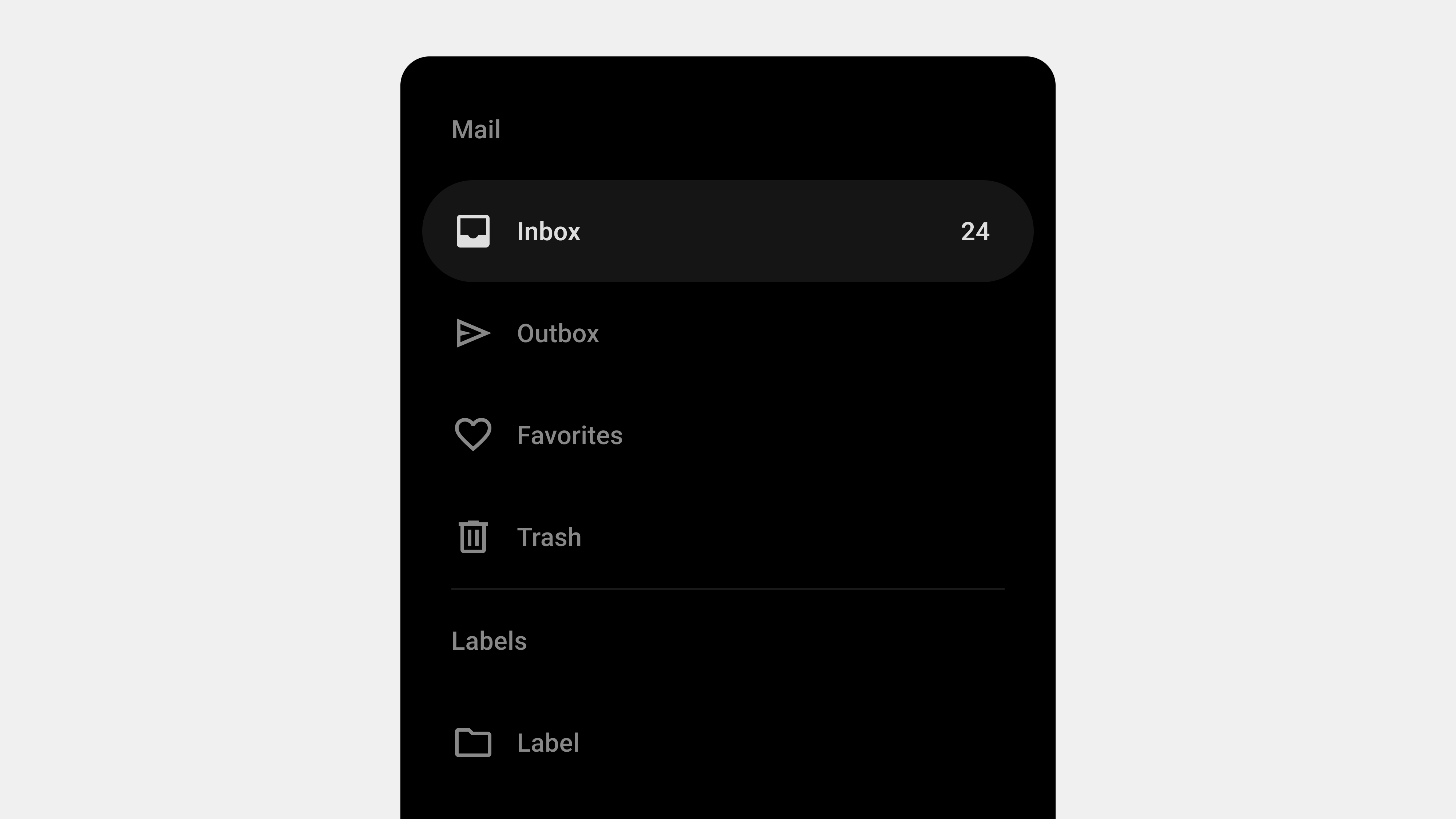
  • Navigation Drawer – 7. Design

    Navigation Drawer – 7. Design

    5 Key Considerations for User-Centric Navigation Drawer Design

    Navigation drawers are integral to modern UI/UX design, providing users with an intuitive way to navigate complex applications. To create an effective navigation drawer, designers must adopt a user-centered approach, prioritizing usability, accessibility, and responsiveness. This article highlights the five most critical factors to consider when designing navigation drawers to ensure a seamless and satisfying user experience.


    1. Simplicity and Clarity in Navigation

    Why It Matters

    Users interact with navigation drawers to find specific features or content quickly. A cluttered or overly complicated design can confuse users and increase navigation time.

    Key Strategies

    • Prioritize Core Features: Display the most important items prominently, placing them at the top of the menu.
    • Logical Grouping: Organize related items into clear categories or sections.
    • Use Clear Labels: Avoid ambiguous or technical terms—use language that aligns with user expectations.

    Best Practices

    • Limit the number of menu items to avoid overwhelming users.
    • Use dividers or headings to visually separate sections.
    • Ensure labels are concise and self-explanatory.

    Example

    In a productivity app:

    • Top items: “Tasks,” “Calendar,” “Notifications.”
    • Group secondary items under categories like “Settings” or “Help.”

    2. Accessibility for All Users

    Why It Matters

    Inclusive design ensures that all users, including those with disabilities, can access and interact with the navigation drawer. Accessibility is not just a legal requirement but also a critical aspect of user-centered design.

    Key Strategies

    • Keyboard Navigation: Ensure the drawer can be opened, closed, and navigated using only a keyboard.
    • Screen Reader Support: Use ARIA roles and semantic HTML to describe drawer elements.
    • High Contrast: Ensure text and background colors meet WCAG contrast guidelines.

    Best Practices

    • Highlight focus states for interactive elements.
    • Provide clear visual cues for actions, such as opening or closing the drawer.
    • Test the design with assistive technologies like screen readers.

    Example

    A banking app’s drawer should:

    • Allow users to tab through menu items.
    • Announce each item with its description (e.g., “Accounts, link”).

    3. Responsiveness and Adaptability

    Why It Matters

    With users accessing applications on various devices, a navigation drawer must adapt seamlessly to different screen sizes and input methods. A responsive design ensures consistency and usability across platforms.

    Key Strategies

    • Design for Multiple Breakpoints: Create layouts for mobile, tablet, and desktop devices.
    • Optimize for Touch Devices: Ensure buttons and menu items are large enough for touch interactions.
    • Use Gestures Effectively: Allow swipe gestures to open or close the drawer on mobile devices.

    Best Practices

    • Create a persistent sidebar for desktop interfaces and a temporary drawer for mobile.
    • Test interactions like swiping and tapping for responsiveness.
    • Ensure the drawer does not block critical content on smaller screens.

    Example

    A social media app might:

    • Use a hamburger menu on mobile to open a full-screen drawer.
    • Display a persistent sidebar on desktop for quick access to “Feed” and “Messages.”

    4. Feedback and Visual Cues

    Why It Matters

    Users rely on visual and interactive feedback to understand the state and functionality of the navigation drawer. Without proper feedback, interactions can feel unresponsive or unclear.

    Key Strategies

    • Highlight Active States: Indicate the current page or section with a visual cue (e.g., bold text, a highlighted background).
    • Provide Clear Feedback: Use animations or transitions when the drawer opens or closes.
    • Error Handling: Display appropriate messages for scenarios like missing content or connectivity issues.

    Best Practices

    • Use smooth, non-disruptive animations for transitions.
    • Ensure hover effects or focus indicators are consistent.
    • Provide fallback options for dynamic content (e.g., a retry button for failed loads).

    Example

    An e-commerce app could:

    • Highlight “Cart” when the user is reviewing their items.
    • Show a spinner or error message if categories fail to load.

    5. Scalability and Future-Proofing

    Why It Matters

    Applications often grow over time, adding new features or content. A navigation drawer must be designed to accommodate such changes without becoming cluttered or confusing.

    Key Strategies

    • Modular Structure: Use a flexible design that can expand or adapt as new items are added.
    • Dynamic Content Loading: Include placeholders or expandable sections for future features.
    • Role-Based Customization: Tailor the drawer’s content based on user roles or permissions.

    Best Practices

    • Design for scalability with collapsible menus and submenus.
    • Regularly audit the drawer to remove outdated or unused items.
    • Use analytics to monitor how users interact with the navigation and adjust accordingly.

    Example

    In an enterprise tool:

    • Admin users see options like “User Management” and “Reports.”
    • Regular users see streamlined menus with “Dashboard” and “Profile.”

    Conclusion

    Designing a navigation drawer that prioritizes user experience requires balancing simplicity, accessibility, responsiveness, and scalability. By focusing on these five key areas, designers can create drawers that not only meet user expectations but also adapt to evolving needs and technologies. A user-centered navigation drawer is more than a functional element—it’s a critical component of a seamless digital experience.

  • Navigation Drawer – 6. Wireframes

    Navigation Drawer – 6. Wireframes

    Designing Navigation Drawer Wireframes: 5 Key Considerations

    Navigation drawers are critical for organizing and structuring digital platforms, particularly in mobile and web applications. When creating wireframes or storyboards for a navigation drawer, careful planning is essential to ensure usability, accessibility, and scalability. This article outlines the five most important factors to consider when designing navigation drawer wireframes, tailored for designers, publishers, developers, and QA professionals.


    1. Information Architecture and Hierarchy

    Why It Matters

    A well-organized navigation drawer helps users quickly locate the features or content they need. Poor information architecture can confuse users, increasing cognitive load and navigation time.

    Key Considerations

    • Group Related Items: Organize menu items into logical categories.
    • Prioritize Key Features: Place the most important or frequently used items at the top.
    • Use Progressive Disclosure: Hide secondary or less critical items in collapsible submenus.

    How to Implement in Wireframes

    • Clearly label categories and subcategories.
    • Use visual separators or headers to distinguish groups.
    • Indicate expandable menus with icons or arrows.

    Example

    An e-commerce app’s drawer might have:

    • Primary Items: “Home,” “Categories,” “Cart.”
    • Secondary Items: “Order History,” “Help.”
    • Collapsible Sections: “Clothing,” “Electronics” under “Categories.”

    For the Team

    • Designers: Focus on visual clarity for the hierarchy.
    • Developers: Ensure nested menus function as intended.
    • QA: Test usability for all menu levels.

    2. Responsiveness and Adaptability

    Why It Matters

    Navigation drawers must adapt seamlessly to different devices, screen sizes, and orientations. A responsive design ensures consistent functionality and usability across platforms.

    Key Considerations

    • Mobile Optimization: Use full-screen drawers or bottom drawers for smaller screens.
    • Desktop Adaptation: Opt for persistent or collapsible sidebars for larger screens.
    • Orientation Changes: Ensure the layout adjusts smoothly between portrait and landscape modes.

    How to Implement in Wireframes

    • Create wireframes for multiple breakpoints (e.g., mobile, tablet, desktop).
    • Indicate how the drawer opens (e.g., swipe, toggle button).
    • Show different states: collapsed, expanded, and persistent.

    Example

    For a news app:

    • Mobile: Temporary drawer with swipe-to-open functionality.
    • Tablet: Persistent drawer showing icons and labels.
    • Desktop: Full-width persistent sidebar with detailed categories.

    For the Team

    • Designers: Create responsive prototypes for usability testing.
    • Publishers: Optimize styles for CSS breakpoints.
    • QA: Test functionality across devices and orientations.

    3. Accessibility Compliance

    Why It Matters

    Accessibility ensures that all users, including those with disabilities, can interact with the navigation drawer effectively. This is not only ethically essential but also legally required in many regions.

    Key Considerations

    • Keyboard Navigation: Ensure the drawer can be opened, closed, and navigated using a keyboard.
    • Screen Reader Support: Use semantic HTML and ARIA roles to describe elements.
    • Focus Indicators: Highlight interactive elements for visually impaired users.

    How to Implement in Wireframes

    • Annotate elements with accessibility labels and roles.
    • Highlight focus states and keyboard shortcuts in the design.
    • Include notes for developers on ARIA role implementation.

    Example

    In a financial app:

    • The toggle button has an ARIA label like “Open Menu.”
    • Focus automatically shifts to the first menu item when the drawer opens.
    • A “Close Drawer” button is always accessible.

    For the Team

    • Designers: Use tools like Stark for contrast and readability checks.
    • Developers: Implement and test ARIA roles.
    • QA: Test screen reader and keyboard navigation compatibility.

    4. Feedback and Interaction Design

    Why It Matters

    Users need clear visual and interactive cues to understand the state and functionality of the navigation drawer. Without proper feedback, users may struggle to interact effectively.

    Key Considerations

    • Opening and Closing Feedback: Use smooth animations to show transitions.
    • Active State Indicators: Highlight the current menu item to orient users.
    • Error States: Provide feedback for scenarios like broken links or failed dynamic loading.

    How to Implement in Wireframes

    • Indicate animation directions (e.g., slide-in, fade).
    • Mark active and hover states for menu items.
    • Include error messages or loading indicators for dynamic content.

    Example

    In a food delivery app:

    • The drawer slides in from the left with a semi-transparent overlay.
    • The active menu item (“Current Orders”) is highlighted with a bold underline.
    • Dynamic sections show a loading spinner when fetching new content.

    For the Team

    • Designers: Annotate wireframes with animation details.
    • Developers: Implement animations using CSS or JavaScript.
    • QA: Test all interaction states, including error handling.

    5. Scalability and Future Growth

    Why It Matters

    Navigation systems often grow as new features are added. Planning for scalability ensures that the navigation drawer remains functional and user-friendly over time.

    Key Considerations

    • Modular Design: Use a flexible structure that can accommodate additional items.
    • Dynamic Content: Prepare for personalization or role-based menus.
    • Fallback Options: Ensure the drawer remains usable if features are temporarily unavailable.

    How to Implement in Wireframes

    • Leave space for future menu items or categories.
    • Use placeholders or notes for dynamic content.
    • Show how the drawer adapts to different user roles or permissions.

    Example

    In an enterprise app:

    • Admin users see options like “User Management” and “Reports.”
    • Regular users only see “Dashboard” and “Profile.”
    • Dynamic sections like “Recent Files” update based on user activity.

    For the Team

    • Designers: Plan for modular layouts and reusable components.
    • Developers: Use scalable data structures for dynamic menus.
    • QA: Test with different user roles and menu configurations.

    Conclusion

    Designing wireframes for navigation drawers is a collaborative process that requires input from designers, publishers, developers, and QA professionals. By focusing on information architecture, responsiveness, accessibility, interaction feedback, and scalability, teams can create navigation drawers that are intuitive, user-friendly, and adaptable to future needs. Proper planning and thorough testing ensure a seamless experience for all users, regardless of device or ability.


  • Navigation Bars – Product Owner 2

    Navigation Bars – Product Owner 2

    Top 5 Considerations When Creating Wireframes for Navigation Bars

    Navigation bars are the backbone of any digital interface, and their wireframes serve as the blueprint for successful implementation. A well-thought-out wireframe ensures seamless collaboration among designers, publishers, developers, and QA teams, laying the foundation for an intuitive and user-friendly navigation system. This article explores the five most critical considerations to focus on when drafting wireframes or storyboards for navigation bars.


    1. Define Clear User Flows

    Why It Matters

    User flow is the backbone of any navigation system. A clear and logical user journey ensures that users can easily access the information or features they seek without unnecessary confusion or friction.

    Key Points for Wireframing

    • Understand User Intent: Map out the primary and secondary user goals.
    • Logical Hierarchy: Arrange items based on user priority and frequency of access.
    • Entry and Exit Points: Clearly define how users enter and leave specific sections.

    Example

    For an e-commerce site:

    • Primary Flows: “Browse Categories,” “Search Products,” “View Cart.”
    • Secondary Flows: “Track Orders,” “Manage Account,” “Customer Support.”

    Collaboration Tips

    • Designers: Focus on creating intuitive paths with minimal cognitive load.
    • Developers: Highlight key navigation triggers and interactions.
    • QA: Test whether the navigation flow matches the wireframe logic.

    2. Prioritize Responsive Design

    Why It Matters

    Navigation bars must adapt seamlessly to different devices and screen sizes. A wireframe that accounts for responsiveness ensures a consistent user experience across platforms.

    Key Points for Wireframing

    • Device-Specific Layouts: Design separate layouts for desktop, tablet, and mobile.
    • Touch-Friendly Interactions: Ensure buttons and links are large enough for touch screens.
    • Responsive Breakpoints: Define how the navigation will adapt at various screen sizes.

    Example

    • Desktop: Horizontal top navigation with dropdowns.
    • Mobile: Bottom navigation with a collapsible hamburger menu.
    • Tablet: A hybrid approach with expanded or hidden menus depending on screen orientation.

    Collaboration Tips

    • Designers: Create separate wireframes for each breakpoint.
    • Publishers: Ensure proper CSS implementation for responsiveness.
    • Developers: Test adaptive behavior in real-time.
    • QA: Verify usability across all devices and resolutions.

    3. Ensure Accessibility Compliance

    Why It Matters

    Accessibility is not just a legal requirement; it’s an ethical responsibility. Navigation bars should cater to all users, including those with disabilities. Wireframes should explicitly include accessibility considerations to ensure they are not overlooked during development.

    Key Points for Wireframing

    • Keyboard Navigation: Indicate tab orders and keyboard shortcuts.
    • Screen Reader Compatibility: Add labels and ARIA roles to key elements.
    • Contrast Ratios: Ensure sufficient contrast between text and background colors.

    Example

    For a navigation bar:

    • Tab Order: “Home > About Us > Services > Contact.”
    • Visual Focus Indicators: Highlight menu items as users tab through options.

    Collaboration Tips

    • Designers: Use accessibility tools to simulate low-vision or colorblind experiences.
    • Developers: Implement semantic HTML with ARIA roles.
    • QA: Test with screen readers and keyboard-only navigation.

    4. Define Visual and Interaction Cues

    Why It Matters

    Visual and interaction cues provide feedback to users, making navigation intuitive and engaging. A wireframe that includes these details reduces guesswork for designers and developers during the implementation phase.

    Key Points for Wireframing

    • Active States: Show how the navigation bar will indicate the current page or section.
    • Hover and Focus Effects: Define visual changes for interactive elements.
    • Transitions and Animations: Illustrate dynamic behaviors like dropdown menus or sliding panels.

    Example

    • Active State: Bold text or underlined style for the active menu item.
    • Hover Effect: Change in background color or icon animation.
    • Dropdown Transition: Smooth sliding effect when expanding menus.

    Collaboration Tips

    • Designers: Use annotations in the wireframe to describe interaction effects.
    • Developers: Implement CSS animations and transitions as specified.
    • QA: Verify that visual and interaction cues behave as expected.

    5. Balance Scalability and Simplicity

    Why It Matters

    Navigation systems often evolve as platforms grow. Wireframes must accommodate future scalability without overloading the initial design. Balancing simplicity and scalability ensures both current usability and long-term flexibility.

    Key Points for Wireframing

    • Expandable Menus: Include dropdowns or side panels for additional options.
    • Content Prioritization: Highlight the most critical items while hiding secondary ones.
    • Dynamic Updates: Account for features like personalized or contextual menus.

    Example

    • Primary Navigation: “Home,” “Shop,” “Categories,” “Cart.”
    • Secondary Navigation: Nested dropdown for “Categories” (e.g., “Clothing,” “Accessories”).

    Collaboration Tips

    • Designers: Plan for modular components that are easy to update.
    • Developers: Build scalable systems with reusable code.
    • QA: Test navigation performance under different use cases and scenarios.

    Conclusion

    Creating wireframes for navigation bars is a collaborative effort that requires careful planning and attention to user needs. By focusing on clear user flows, responsiveness, accessibility, interaction cues, and scalability, teams can design navigation systems that deliver exceptional user experiences. Wireframes are not just static documents—they are living blueprints that guide the entire development process, from design to deployment.


  • Navigation Bars – Pro

    Navigation Bars – Pro

    Understanding the Definition and Role of Navigation Bars in UX/UI

    Navigation bars are the fundamental building blocks of digital interfaces, guiding users through applications and websites. Despite their simplicity in appearance, their design and implementation carry a profound impact on usability, accessibility, and overall user experience. This article dives deep into the definition and role of navigation bars, offering insights into their significance in modern UI/UX design.

    What Is a Navigation Bar?

    A navigation bar, often abbreviated as a “nav bar,” is a UI component that organizes and presents the main options or destinations within a digital product. It serves as a roadmap, enabling users to traverse an application or website efficiently.

    From the simplest website with a few links to a complex enterprise system with multiple layers of content, the navigation bar is the interface’s backbone. Its structure directly affects how users interact with the platform and how intuitively they can accomplish their tasks.

    Characteristics of a Navigation Bar

    • Hierarchy Representation: Organizes content into logical categories.
    • Persistent Accessibility: Ensures users can always find their way back to key sections.
    • Visual Indicator: Communicates the current location within the system.
    • Consistency: Provides a unified experience across different pages or screens.

    The Role of Navigation Bars in Digital Design

    1. Structuring Content

    The primary role of a navigation bar is to structure content into a digestible and logical format. This structure enables users to find what they need without confusion, minimizing cognitive load. For instance, e-commerce websites use categories like “Home,” “Shop,” “Cart,” and “Profile” to segment user tasks effectively.

    2. Enhancing Usability

    Usability is a core tenet of UX design, and navigation bars play a pivotal role in achieving it. By following established conventions such as placing a top nav on desktop websites or a bottom nav on mobile apps, designers ensure a predictable and seamless user journey.

    3. Increasing Accessibility

    Navigation bars serve as an entry point for all users, including those with disabilities. Accessible nav bars, when designed correctly, enable everyone to interact with content. Screen readers, focusable elements, and keyboard navigation are essential considerations for achieving inclusivity.

    4. Encouraging User Engagement

    Navigation bars can guide users toward desired actions or content, influencing behavior. For example, a streaming platform’s nav bar may prioritize “Trending” or “Recommendations” to drive content discovery and engagement.

    5. Establishing Brand Identity

    The navigation bar is often the first touchpoint for users. Its design, typography, color scheme, and interaction style can communicate the brand’s identity. A sleek, minimalist nav bar aligns with a high-tech brand, while a playful, colorful one may suit a children’s product.

    Layers of Complexity in Navigation Bars

    While the concept of a navigation bar is simple, its implementation can be highly complex, especially in multi-layered systems like enterprise software or global e-commerce platforms.

    1. Single-Level Navigation

    Used for websites or apps with limited content, single-level navigation includes direct links to all primary sections.

    2. Multi-Level Navigation

    Larger platforms often require subcategories and nested menus. This complexity requires careful attention to hierarchy and discoverability. Dropdown menus, mega menus, and side panels are common solutions.

    3. Contextual Navigation

    Some applications use dynamic or contextual nav bars that adapt based on user actions. For instance, design software may display different options when editing text versus an image.

    4. Adaptive Navigation

    Adaptive nav bars respond to user behavior, such as frequently accessed sections or personalized recommendations. They leverage data and machine learning to create tailored experiences.

    Psychological and Cognitive Impact

    Navigation bars significantly affect how users perceive and interact with digital interfaces.

    1. Reducing Cognitive Load

    A well-structured nav bar reduces the mental effort required to locate information. By grouping related items and using clear labels, users can quickly understand the interface without unnecessary thought.

    2. Fostering Confidence

    Knowing that a navigation bar is consistently available reassures users. This sense of control is essential for user retention and satisfaction.

    3. Building Trust

    A clear and transparent navigation bar builds trust, as users feel the interface is reliable and easy to use. Misleading or poorly structured nav bars can frustrate users, leading to abandonment.

    4. Encouraging Exploration

    Nav bars designed with enticing visuals or intuitive flows encourage users to explore more sections of the app or website, increasing engagement and time spent on the platform.

    Practical Applications Across Platforms

    1. Mobile Navigation

    Mobile devices have limited screen space, so navigation bars need to prioritize essential functions. Common practices include bottom nav bars and hamburger menus for secondary options.

    2. Desktop Navigation

    With more screen real estate, desktop nav bars often feature horizontal layouts, dropdowns, and mega menus for greater content visibility.

    3. Wearables and IoT Devices

    On smaller screens, like smartwatches, navigation relies heavily on gestures or voice commands. The navigation bar is often minimal or context-specific.

    4. TV Interfaces

    For smart TVs, remote controls dictate navigation design. Horizontal scrolling or carousel-style navigation is common.

    Challenges in Navigation Design

    Designing an effective navigation bar requires addressing several challenges:

    • Overcrowding: Including too many options can overwhelm users.
    • Ambiguous Labels: Poorly chosen menu labels confuse users.
    • Inconsistency: Variations in navigation design across platforms create friction.
    • Accessibility: Ignoring accessibility features limits usability for diverse users.

    Future Trends in Navigation Bars

    1. Gesture-Based Navigation

    With the rise of touch interfaces, gestures are becoming a natural way to navigate.

    2. Voice Navigation

    As voice assistants grow in popularity, voice-based navigation will supplement traditional nav bars.

    3. AI-Driven Personalization

    Artificial intelligence can dynamically tailor nav bar options based on user behavior and preferences.

    4. Minimalist and Invisible Navigation

    Simplified designs that fade into the background, such as context-sensitive menus, are gaining traction.

    Conclusion

    Navigation bars are more than just functional elements—they are a cornerstone of user experience and brand interaction. By understanding their definition, role, and impact, designers can create intuitive, accessible, and engaging navigation systems that meet the needs of diverse users. As technology evolves, so will navigation design, making it an ever-exciting field for UX/UI professionals.


  • Buttons for professinals

    Buttons for professinals

    Buttons are one of the most essential components in user interface design. They serve as the primary tools for user interaction, bridging the gap between user intentions and product functionality. In this comprehensive guide, we’ll dive deeper into the definition and role of buttons, their anatomy, types, and design best practices to enhance usability and elevate user experience.

    What Is a Button?

    A button is a graphical control element designed to prompt an action when clicked or tapped. It typically includes a combination of a label (text or icon) and a visual container that distinguishes it as interactive. While they may seem simple, buttons are critical to any interface’s functionality and design.

    Defining Characteristics of Buttons:

    • Interactive Nature: Buttons provide users with direct interaction by triggering specific actions.
    • Visual Feedback: They communicate state changes through visual or tactile feedback, such as highlighting, color changes, or vibrations.
    • Action-Oriented: Each button has a defined purpose, guiding users through tasks or workflows.

    Buttons act as the connective tissue of an interface, enabling users to navigate, make decisions, and achieve their goals. A well-designed button can reduce cognitive load, improve accessibility, and ensure seamless interaction.

    The Role of Buttons in User Interfaces

    Buttons are not just functional elements; they are central to user experience. Their design, placement, and behavior directly impact how users perceive and interact with a product.

    1. Facilitating Actions

    The primary role of a button is to allow users to take action. Whether it’s submitting a form, adding an item to a cart, or navigating to another page, buttons translate user intent into system responses.

    • Examples of Core Actions:
      • Submitting data (e.g., “Submit”)
      • Initiating processes (e.g., “Download”)
      • Navigating to other areas (e.g., “Next”)

    2. Guiding User Journeys

    Buttons serve as signposts in the user journey, helping users move through tasks and workflows with clarity. Strategic button placement and design ensure users know what to do next.

    • Example: In an e-commerce app, a primary button like “Checkout” guides users toward completing a purchase, while secondary buttons like “Continue Shopping” offer alternative paths.

    3. Enhancing Accessibility

    Buttons play a vital role in making digital interfaces accessible:

    • They provide clear visual cues for interactive elements.
    • With proper coding, buttons are readable by screen readers, making them usable for visually impaired users.
    • Buttons with sufficient size and spacing ensure touch-friendly interfaces, especially on mobile devices.

    4. Communicating Hierarchy and Importance

    Through their visual design, buttons communicate the relative importance of actions. Primary buttons stand out to emphasize critical actions, while secondary or tertiary buttons support less prominent tasks.

    • Example: A “Confirm” button may be bold and colorful to draw attention, while a “Cancel” button might appear muted to show it’s a secondary option.

    5. Providing Feedback and Assurance

    Buttons offer instant feedback when clicked, helping users understand the system’s response to their input. For example:

    • A button changing color upon clicking reassures the user their action has been registered.
    • Loading spinners or animations in a button can indicate a process is ongoing.

    6. Maintaining Consistency Across Systems

    Buttons act as a unifying design element. Consistent button styles, behaviors, and placements across an interface create a predictable and intuitive user experience.

    • Example: If all primary actions use a specific color, users quickly learn to associate that color with essential tasks.

    7. Building Brand Identity

    Buttons contribute to the overall aesthetic of a product. Their style—rounded corners, colors, animations—can reflect the brand’s personality, reinforcing brand identity.

    Why Buttons Are Indispensable

    Without buttons, digital interfaces would lack clarity and usability. They are the touchpoints of interaction, ensuring users can execute tasks efficiently. A poorly designed button not only frustrates users but can also lead to task abandonment, affecting business outcomes.

    Psychological Impact of Buttons

    Buttons also play a psychological role in user interactions:

    • Confidence Boosters: Well-designed buttons encourage users to proceed with tasks, creating a sense of accomplishment.
    • Trust Builders: Buttons that provide clear feedback (e.g., changing states) foster trust in the interface.

    For example, a “Buy Now” button that responds with immediate confirmation reassures users their purchase is being processed correctly.

    The Evolution of Buttons

    Buttons have evolved significantly since the early days of digital design:

    • Early Interfaces: Buttons were simple, rectangular elements with minimal styling.
    • Mobile and Touch Interfaces: With the rise of smartphones, button design adapted to touch interactions, focusing on size and spacing.
    • Modern Design Systems: Today’s buttons are integral to design systems like Material Design, Fluent, and Human Interface Guidelines, ensuring consistency and scalability across devices.

    Conclusion

    Buttons are the backbone of user interface design, shaping how users interact with digital products. Their design and functionality significantly influence user satisfaction, task completion rates, and overall product success. By understanding their role and designing them with care, you can create interfaces that are both visually appealing and highly functional.