[태그:] intuitive navigation

  • Bottom Navigation Bars – UX Writing

    Bottom Navigation Bars – UX Writing

    UX Writing for Bottom Navigation Bars: Crafting Clear and User-Friendly Labels

    Bottom navigation bars are integral to user experience, providing quick access to core features. While the design of the navigation bar is important, its usability heavily relies on the clarity of the labels used. UX writing plays a pivotal role in ensuring that users understand the purpose of each tab at a glance. This article explores how to craft intuitive and effective labels for bottom navigation bars, focusing on best practices, common pitfalls, and real-world examples.


    1. Why UX Writing Matters in Bottom Navigation Bars

    The words used in a bottom navigation bar significantly impact user comprehension and navigation efficiency. Poorly written labels can confuse users, leading to frustration and task abandonment.

    Key Principles of Effective UX Writing

    • Clarity: Use clear and straightforward terms that convey the tab’s function.
    • Conciseness: Labels should be short enough to avoid truncation and fit comfortably within the tab.
    • Consistency: Maintain consistent terminology across the app to avoid confusion.
    • Familiarity: Use terms that align with user expectations and mental models.

    2. Best Practices for Writing Tab Labels

    A. Use Descriptive Labels

    Labels should clearly describe the tab’s purpose, leaving no room for ambiguity.

    Examples:

    • Use “Home” instead of “Main” to represent the starting page.
    • Use “Search” instead of “Discover” if the feature is focused on finding specific items.

    Why It Works

    Descriptive labels help users quickly understand the function of each tab, reducing cognitive load.


    B. Combine Icons with Text

    While icons are visually appealing, they should always be accompanied by text to provide context.

    Examples:

    • A magnifying glass icon with the label “Search” makes its purpose unmistakable.
    • A shopping cart icon with “Cart” is more intuitive than the icon alone.

    Why It Works

    Text clarifies the icon’s meaning, especially for users unfamiliar with certain visual metaphors.


    C. Align Labels with User Mental Models

    Labels should match the language and expectations of your target audience.

    Examples:

    • In a social media app, use “Notifications” rather than “Alerts” to align with common terminology.
    • In an e-commerce app, use “Orders” instead of “Transactions.”

    Why It Works

    Using familiar terms improves usability by matching user expectations, reducing the learning curve.


    D. Keep Labels Short and Scannable

    Users should be able to read and understand tab labels at a glance.

    Examples:

    • “Profile” instead of “My Personal Profile.”
    • “Messages” instead of “Your Inbox Messages.”

    Why It Works

    Short labels are easier to scan, especially on small screens, and prevent truncation.


    E. Prioritize Action-Oriented Terms

    Labels should indicate what users can do within a section, focusing on actionable language.

    Examples:

    • Use “Track Order” instead of “Orders” to highlight the feature’s primary function.
    • Use “Start Workout” instead of “Fitness” to make the tab’s purpose more engaging.

    Why It Works

    Action-oriented terms provide clarity and align with user goals, enhancing engagement.


    3. Common Pitfalls in UX Writing for Navigation Bars

    A. Ambiguous Labels

    Using vague terms like “More” or “Stuff” can confuse users about the tab’s purpose.

    How to Fix It

    • Replace “More” with a specific label like “Settings” or “Menu.”
    • Clearly define the contents of overflow tabs to avoid ambiguity.

    B. Overly Creative or Jargon-Filled Language

    Overly creative labels may look unique but often confuse users.

    Examples of What to Avoid:

    • “Vibes” instead of “Music.”
    • “Hub” instead of “Dashboard.”

    Why It Fails

    Users prefer familiar language over clever or abstract terms, as it helps them navigate with confidence.


    C. Inconsistent Terminology

    Using different terms for the same feature across an app creates confusion.

    How to Fix It

    • Standardize terms across all app elements.
    • Conduct a terminology audit to ensure consistency.

    4. Real-World Examples of Excellent UX Writing for Bottom Navigation Bars

    A. Instagram

    • Tabs: Home, Search, Reels, Shop, Profile.
    • Why It Works: Labels are short, descriptive, and align with user expectations.

    B. Netflix

    • Tabs: Home, Search, Coming Soon, Downloads, More.
    • Why It Works: Action-oriented labels like “Downloads” clearly indicate functionality.

    C. Slack (Mobile App)

    • Tabs: Home, Mentions, DMs, You.
    • Why It Works: Combines concise language with a user-focused tone.

    5. Testing and Iteration for UX Writing

    A. Conduct User Testing

    Test different label options with real users to identify the most intuitive terms.

    Example:

    Compare “Search” vs. “Explore” to see which label resonates more with users.


    B. Use A/B Testing

    Deploy multiple versions of tab labels and track user interactions to determine which set performs better.

    Example:

    Test “Orders” vs. “Track Order” to assess engagement differences.


    C. Analyze Navigation Metrics

    Monitor which tabs users interact with most and identify potential confusion points.

    Example:

    If the “More” tab has high traffic, consider breaking its contents into dedicated tabs for clarity.


    6. Future-Proofing Tab Labels

    As apps evolve, the functions within tabs may expand. Plan labels that can accommodate additional features without losing clarity.

    How to Do It

    • Use broad yet descriptive labels (e.g., “Settings” instead of “Account Settings”).
    • Ensure overflow menus are clearly labeled and intuitive.

    Conclusion

    UX writing for bottom navigation bars is about crafting labels that are clear, concise, and aligned with user expectations. By focusing on familiar language, action-oriented terms, and consistency, designers can create navigation systems that enhance usability and satisfaction. Continuous testing and iteration ensure that labels remain effective as the app evolves, helping users achieve their goals effortlessly.
  • Bottom Navigation Bars – 1. Overview

    Bottom Navigation Bars – 1. Overview

    Comprehensive Guide to Bottom Navigation Bars

    Bottom navigation bars are integral components of modern app design, providing a simple and intuitive way for users to navigate between key features. Commonly seen in mobile apps, they are positioned at the bottom of the screen for easy thumb access. This guide explores the purpose, design principles, benefits, and best practices of bottom navigation bars, helping you create effective and user-friendly interfaces.


    1. What Is a Bottom Navigation Bar?

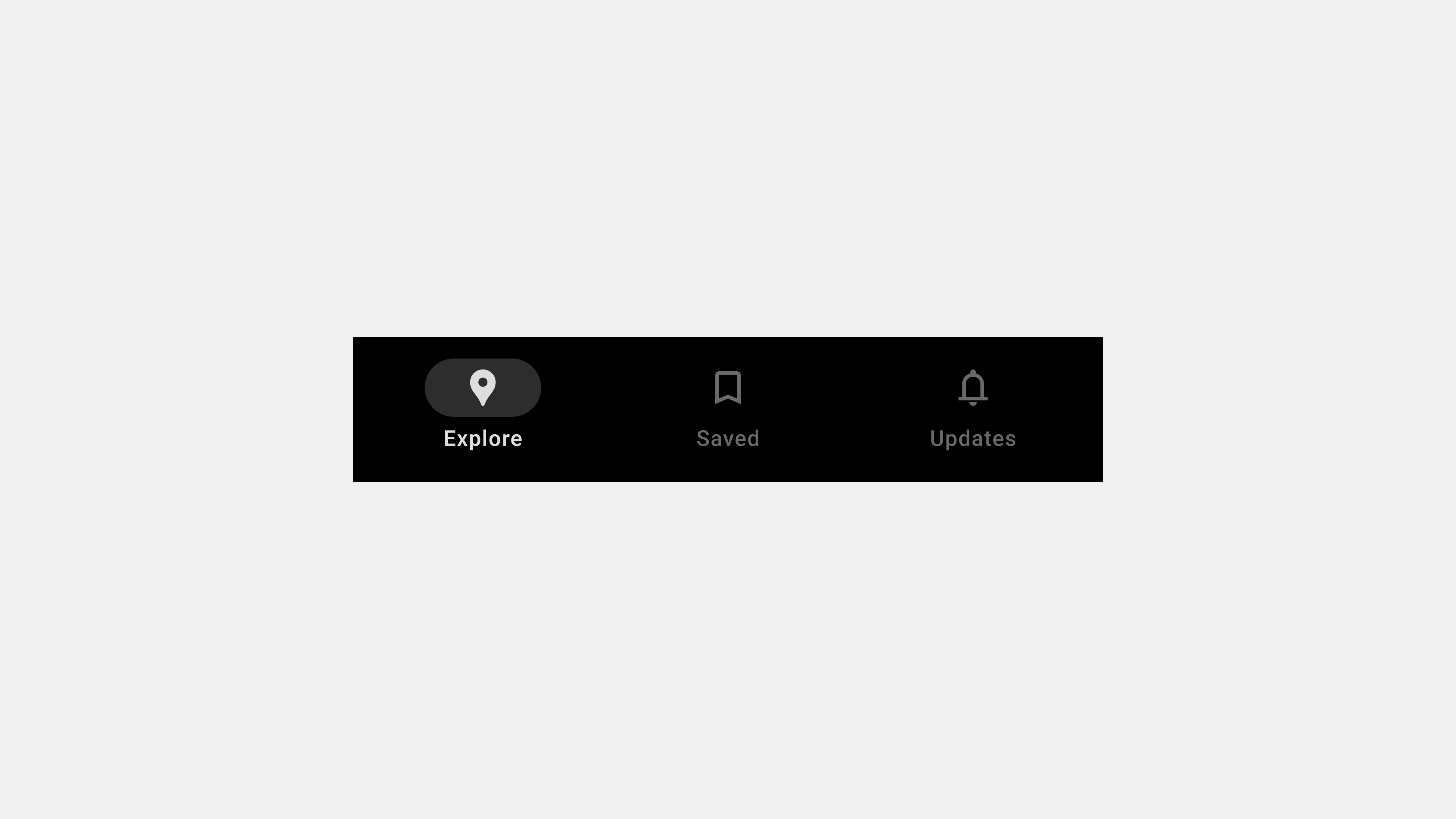
    A bottom navigation bar is a fixed UI element that sits at the bottom of the screen and provides quick access to an app’s core sections. It typically contains three to five items, each representing a primary app feature.

    Key Characteristics

    • Placement: Always visible at the bottom of the screen.
    • Icons and Labels: Combines visual icons with descriptive text for clarity.
    • Active State Indicators: Highlights the currently selected tab with color or style changes.

    Purpose

    • Simplifies navigation by offering direct access to primary features.
    • Enhances usability by keeping navigation within easy reach.
    • Reduces cognitive load by providing a consistent and predictable interface.

    2. Why Use Bottom Navigation Bars?

    Bottom navigation bars are especially effective for mobile apps because they align with natural thumb movement and ergonomic principles.

    Benefits

    • Accessibility: Positioned within thumb reach for one-handed use.
    • Consistency: Offers a uniform navigation structure across screens.
    • Discoverability: Ensures critical features are easy to find.
    • Task Switching: Allows users to switch between tasks without losing context.

    3. Key Components of a Bottom Navigation Bar

    A. Icons

    Icons visually represent each feature or section.

    • Use universally recognized symbols for clarity (e.g., a home icon for the homepage).
    • Ensure icons are visually distinct to avoid confusion.

    B. Labels

    Labels provide textual context for icons.

    • Keep labels concise, ideally one to two words.
    • Use familiar terms aligned with user expectations.

    C. Active State Indicators

    • Highlight the selected tab with bold text, color changes, or underlines.
    • Provide subtle animations for transitions between tabs.

    4. Best Practices for Designing Bottom Navigation Bars

    A. Keep It Simple

    • Limit tabs to three to five items.
    • Avoid overcrowding the navigation bar with too many options.

    B. Prioritize Core Features

    • Include only the most important app sections.
    • Move secondary features to an overflow menu if necessary.

    C. Use Intuitive Icons and Labels

    • Pair icons with descriptive labels for better clarity.
    • Test labels with users to ensure they align with expectations.

    D. Optimize for Accessibility

    • Use ARIA roles and labels for screen reader compatibility.
    • Ensure sufficient contrast between text/icons and the background.

    E. Provide Visual Feedback

    • Highlight the active tab to indicate the user’s current location.
    • Use animations to create smooth transitions between tabs.

    5. Common Types of Bottom Navigation Bars

    A. Standard Bottom Navigation Bar

    • Features fixed tabs for primary app sections.
    • Ideal for apps with up to five core features.

    B. Scrollable Bottom Navigation Bar

    • Allows users to scroll horizontally to access additional tabs.
    • Useful for apps with multiple content categories.

    C. Dynamic Bottom Navigation Bar

    • Adjusts its content based on user roles, preferences, or app states.
    • Enhances personalization and context awareness.

    D. Floating Bottom Navigation Bar

    • Positioned slightly above the bottom edge with rounded corners.
    • Adds a modern aesthetic and reduces visual clutter.

    6. Examples of Effective Bottom Navigation Bars

    A. Instagram

    • Tabs: Home, Search, Reels, Shop, Profile.
    • Why It Works: Combines clear icons, concise labels, and a visually appealing design.

    B. YouTube

    • Tabs: Home, Explore, Subscriptions, Library.
    • Why It Works: Organizes features effectively with clear active state indicators.

    C. Spotify

    • Tabs: Home, Search, Library.
    • Why It Works: Keeps navigation minimal and focused on core features.

    7. Challenges in Designing Bottom Navigation Bars

    A. Overcrowding

    • Including too many tabs can overwhelm users.
    • Solution: Prioritize essential features and group secondary ones into an overflow menu.

    B. Ambiguous Icons or Labels

    • Poorly designed icons or unclear labels can confuse users.
    • Solution: Use familiar icons and test labels with real users.

    C. Poor Accessibility

    • Lack of accessibility features excludes users with disabilities.
    • Solution: Follow WCAG guidelines and test with assistive technologies.

    8. Tools for Designing and Developing Bottom Navigation Bars

    Design Tools

    • Figma: For prototyping and designing interactive navigation bars.
    • Adobe XD: For creating and testing animations and transitions.

    Development Tools

    • React Native: For cross-platform implementation.
    • Flutter: For creating dynamic, responsive navigation bars.

    Testing Tools

    • BrowserStack: For cross-device and cross-browser compatibility testing.
    • Axe Accessibility Checker: For accessibility audits.

    Conclusion

    Bottom navigation bars are essential for creating intuitive and efficient navigation in mobile apps. By focusing on simplicity, accessibility, and user-centered design, you can ensure your navigation bar enhances usability and meets user expectations. Whether it’s a standard navigation bar or a dynamic, personalized one, a well-designed bottom navigation bar is a cornerstone of successful app design.


  • Navigation Drawers – 8. UX Writing

    Navigation Drawers – 8. UX Writing

    UX Writing for Navigation Drawers: Crafting Clear and User-Friendly Labels

    Navigation drawers are a versatile tool in modern UI design, offering a clean way to organize complex menus while optimizing space. However, the success of a navigation drawer depends not only on its structure but also on the clarity and intuitiveness of its labels. UX writing plays a crucial role in ensuring users can easily understand and navigate the drawer’s options. This article focuses on how to craft clear, concise, and user-centric labels for navigation drawers, providing practical examples and best practices.


    1. The Role of UX Writing in Navigation Drawers

    UX writing is about creating text that guides users through an interface effortlessly. For navigation drawers, it ensures that users can quickly locate features and understand their purpose without confusion or guesswork.

    Why It Matters

    • Efficiency: Clear labels reduce the time users spend searching for features.
    • Usability: Intuitive text enhances the overall experience.
    • Consistency: Uniform language builds trust and familiarity.

    Example

    Instead of using vague terms like “Options” or “Things to Do,” opt for descriptive labels like “Settings” or “Task Manager.”


    2. Principles of Effective UX Writing for Navigation Drawers

    A. Clarity Over Creativity

    Users value clarity more than creative or quirky language. Avoid jargon, idioms, or ambiguous terms that could confuse users.

    Good Examples:

    • Use “Profile” instead of “My Corner.”
    • Use “Cart” instead of “Bag of Goods.”

    Why It Works:

    Clear, familiar terms help users understand options at a glance.


    B. Use Action-Oriented Labels

    Action-oriented labels help users understand what they can do within a section.

    Good Examples:

    • Use “Start Order” instead of “Ordering.”
    • Use “Track Shipment” instead of “Shipping Info.”

    Why It Works:

    Action-oriented labels align with user intent, guiding them toward their goals.


    C. Prioritize the User’s Mental Model

    Align labels with how users think about tasks and features. Conduct user research to understand their expectations and terminology.

    Good Examples:

    • “Watchlist” for saved media in a streaming app.
    • “Favorites” for saved items in an e-commerce app.

    Why It Works:

    Matching users’ mental models makes navigation intuitive.


    D. Keep It Short and Scannable

    Navigation drawer labels should be concise and scannable. Long phrases increase cognitive load and make navigation slower.

    Good Examples:

    • “Home” instead of “Return to Home Page.”
    • “Orders” instead of “Order History and Details.”

    Why It Works:

    Short labels are easier to read, especially on mobile devices.


    E. Consistency Across the Interface

    Use consistent terminology throughout the app or platform to avoid confusion.

    Good Examples:

    • If the main navigation says “Cart,” don’t call it “Basket” elsewhere.
    • If you use “Notifications” in one place, avoid “Alerts” or “Updates” elsewhere.

    Why It Works:

    Consistency reinforces user understanding and trust.


    3. Common Navigation Drawer Categories and Their Optimal Labels

    A. Home and General Navigation

    • Optimal Labels: Home, Dashboard, Explore.
    • Why It Works: These terms are widely recognized and intuitive.

    B. User Actions and Profiles

    • Optimal Labels: Profile, Settings, Log Out.
    • Why It Works: They clearly indicate user-specific functions.

    C. E-Commerce

    • Optimal Labels: Shop, Cart, Wishlist, Orders.
    • Why It Works: These terms directly reflect typical e-commerce actions.

    D. Content Platforms

    • Optimal Labels: Library, Favorites, Categories, Recommendations.
    • Why It Works: These terms align with how users organize and discover content.

    4. Testing and Refining Navigation Drawer Labels

    UX writing is an iterative process. Testing ensures that your labels resonate with users and align with their expectations.

    A. Conduct Usability Testing

    • Use A/B testing to evaluate different label options.
    • Ask users to locate specific features and observe their behavior.

    B. Analyze Metrics

    • Monitor click-through rates and time spent navigating.
    • Identify labels that cause confusion or low engagement.

    C. Gather Feedback

    • Collect user feedback through surveys or interviews.
    • Incorporate their suggestions into your next iteration.

    5. Examples of Excellent UX Writing for Navigation Drawers

    A. Google Drive

    • Labels: My Drive, Shared with Me, Recent, Trash.
    • Why It Works: Combines simplicity with functionality, using terms users easily understand.

    B. Netflix

    • Labels: Home, New & Popular, My List, Settings.
    • Why It Works: Prioritizes commonly used actions and personalized options.

    C. Shopify

    • Labels: Dashboard, Orders, Products, Marketing, Analytics.
    • Why It Works: Uses direct, action-oriented language suited for business owners.

    6. Common Pitfalls to Avoid

    A. Ambiguous Labels

    • Issue: Users can’t predict what the label means.
    • Fix: Use descriptive terms, e.g., replace “Stuff” with “Documents.”

    B. Overloading with Options

    • Issue: Too many items overwhelm users.
    • Fix: Group items into categories or collapsible menus.

    C. Ignoring Localization

    • Issue: Terms don’t translate well for international users.
    • Fix: Use universally understood terms or localize effectively.

    Conclusion

    Crafting clear and user-friendly labels for navigation drawers is a critical part of UX writing. By focusing on clarity, action-oriented language, and user mental models, you can create a navigation system that enhances usability and meets user expectations. Consistent testing and iteration ensure that your labels remain relevant and effective over time. A well-written navigation drawer not only improves navigation but also strengthens the overall user experience.


  • Navigation Bars – UX Writing

    Navigation Bars – UX Writing

    UX Writing for Navigation Bars: Crafting Clear and Intuitive Labels

    Navigation bars are the backbone of user navigation on digital platforms, and their effectiveness largely depends on the clarity and intuitiveness of the labels used. From the UX writing perspective, selecting the right words ensures users can quickly and accurately understand and interact with the platform. This article dives deep into crafting clear, user-centric terms for navigation bars in English, covering principles, best practices, and actionable examples.


    1. The Role of UX Writing in Navigation Bars

    UX writing transforms the navigation bar from a simple interface element into a powerful guide that aligns with user intent.

    Key Responsibilities of UX Writing

    • Enhancing Clarity: Ensuring labels are concise and self-explanatory.
    • Reducing Cognitive Load: Simplifying decision-making with intuitive terms.
    • Promoting Consistency: Using standardized terminology across the platform.

    Example

    Instead of “Product Options” or “Select Items,” a simpler term like “Shop” immediately communicates the function without ambiguity.


    2. Principles of Effective UX Writing for Navigation Bars

    To craft effective navigation bar labels, UX writers must adhere to the following principles:

    A. Keep It Short and Actionable

    Labels should be as concise as possible while remaining descriptive. Users prefer terms that quickly communicate the purpose.

    Good Examples:

    • “Home” instead of “Back to Homepage.”
    • “Cart” instead of “Your Shopping Cart.”

    Why It Works:

    Short labels are easier to scan, particularly on mobile devices.


    B. Use Familiar Language

    Avoid jargon or technical terms that may confuse users. Stick to terms that are universally understood or align with user expectations.

    Good Examples:

    • “Login” instead of “User Authentication.”
    • “Contact” instead of “Reach Out to Us.”

    Why It Works:

    Familiar terms reduce hesitation and increase trust.


    C. Prioritize User Intent

    Align labels with the actions users are likely to take. Focus on purpose rather than formality.

    Good Examples:

    • “Browse Products” instead of “Catalog.”
    • “Track Order” instead of “Order History.”

    Why It Works:

    Action-oriented labels guide users effectively.


    D. Maintain Consistency

    Ensure uniformity in language and style across the navigation bar and the platform.

    Good Examples:

    • Use “My Profile” consistently instead of alternating between “Account” and “Profile.”

    Why It Works:

    Consistency reinforces user confidence and reduces confusion.


    E. Localize Thoughtfully

    If your platform caters to an international audience, ensure the labels are easily translatable without losing their meaning.

    Good Examples:

    • Avoid idiomatic expressions like “Get Started” that may not translate well.

    Why It Works:

    Localization ensures clarity across cultures.


    3. Common Categories and Their Optimal Labels

    A. Home and General Navigation

    • Optimal Labels: Home, Dashboard, Explore.
    • Examples:
      • “Home” for general audiences.
      • “Dashboard” for professional or account-specific platforms.

    B. User Actions

    • Optimal Labels: Login, Sign Up, Contact.
    • Examples:
      • “Sign Up” for new users.
      • “Contact” for customer service.

    C. E-commerce Platforms

    • Optimal Labels: Shop, Cart, Wishlist, Checkout.
    • Examples:
      • “Shop” to browse items.
      • “Checkout” to finalize purchases.

    D. Social Media Platforms

    • Optimal Labels: Feed, Profile, Messages, Notifications.
    • Examples:
      • “Feed” for content streams.
      • “Messages” for private conversations.

    E. Support and Information

    • Optimal Labels: Help, FAQ, Support.
    • Examples:
      • “Help” for immediate assistance.
      • “FAQ” for commonly asked questions.

    4. Testing and Refining Navigation Bar Labels

    UX writing is an iterative process. Testing ensures that navigation bar labels resonate with users.

    A. Conduct Usability Testing

    • Use A/B testing to compare different labels.
    • Gather feedback on comprehension and ease of use.

    B. Analyze User Behavior

    • Use heatmaps and click-tracking tools to measure engagement.
    • Identify underused navigation items for potential refinement.

    C. Iterate Based on Insights

    • Adjust labels that cause confusion or low engagement.
    • Ensure changes are communicated across teams for consistency.

    5. Real-World Examples of Excellent UX Writing for Navigation Bars

    A. Airbnb

    • Labels: “Explore,” “Wishlists,” “Trips,” “Log In.”
    • Why It Works: Action-oriented and user-focused.

    B. Amazon

    • Labels: “Home,” “Shop by Category,” “Orders,” “Cart.”
    • Why It Works: Clear and hierarchical structure aligns with user needs.

    C. LinkedIn

    • Labels: “Home,” “My Network,” “Jobs,” “Messages.”
    • Why It Works: Contextual labels for professional networking.

    6. Avoiding Common Pitfalls

    A. Overloading with Options

    • Issue: Too many options overwhelm users.
    • Solution: Group items into dropdowns or secondary menus.

    B. Using Ambiguous Terms

    • Issue: Labels like “Stuff” or “Options” confuse users.
    • Solution: Use precise terms like “Documents” or “Settings.”

    C. Ignoring Accessibility

    • Issue: Non-descriptive labels hinder screen reader users.
    • Solution: Include ARIA labels and use semantic HTML.

    Conclusion

    Crafting clear and intuitive navigation bar labels requires a deep understanding of user needs and a commitment to simplicity and consistency. By adhering to UX writing best practices, you can create navigation systems that enhance usability, drive engagement, and improve overall user satisfaction. Effective labels not only guide users but also reflect the platform’s brand and purpose.