5 Key Considerations for QA Testing Bottom Navigation Bars
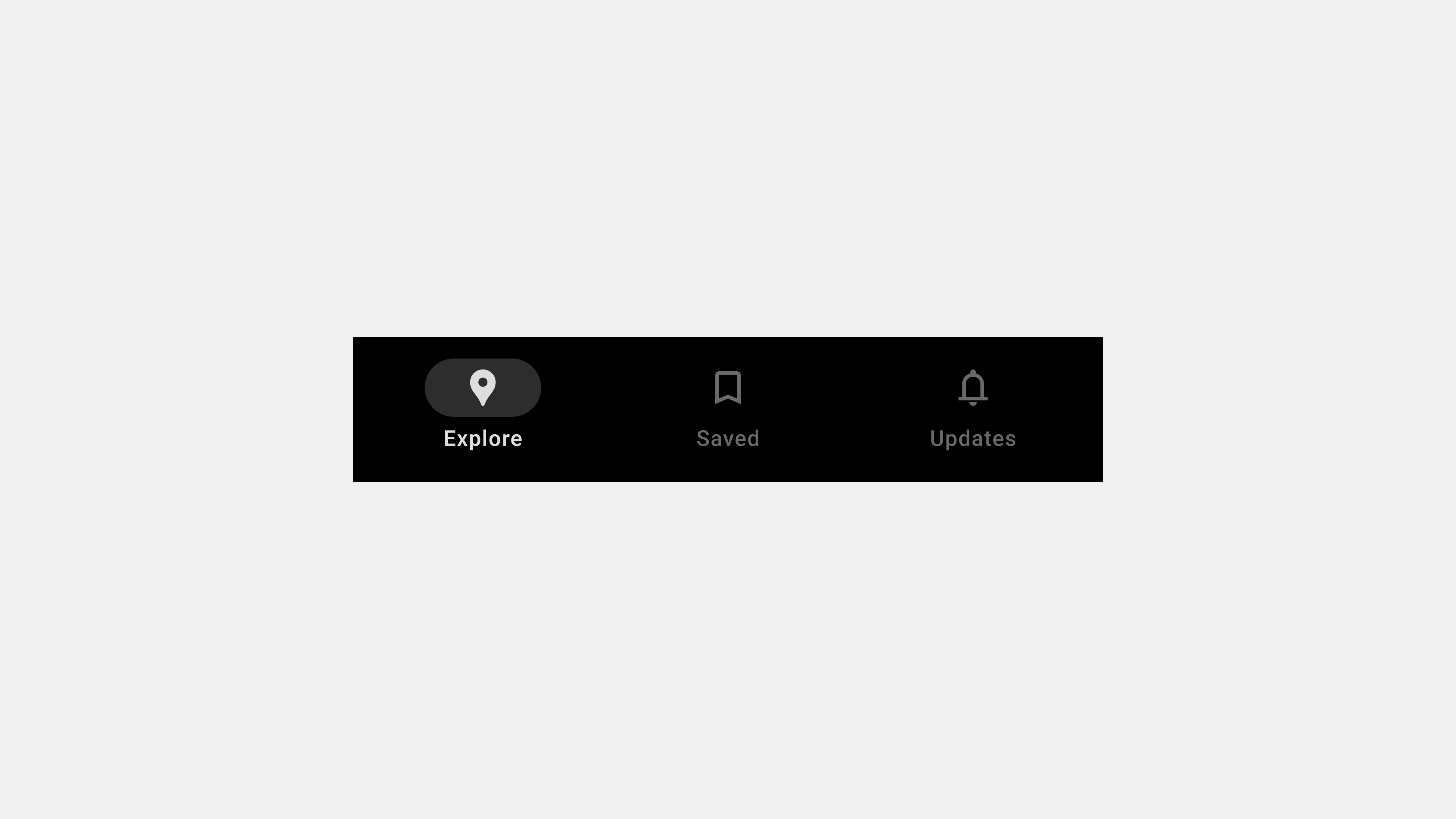
Bottom navigation bars are critical for providing seamless navigation within applications. QA (Quality Assurance) plays a pivotal role in ensuring these navigation components function correctly, deliver a consistent experience, and meet accessibility standards. This article outlines five key areas to focus on during QA testing of bottom navigation bars, ensuring optimal usability and reliability.
1. Functional Testing
Why It Matters
The core purpose of a bottom navigation bar is to enable smooth navigation between key sections of the app. Ensuring that each tab functions as intended is fundamental to the user experience.
Key Testing Areas
- Tab Navigation: Verify that each tab redirects users to the correct screen or section.
- Interactivity: Ensure that all icons and labels are clickable and responsive.
- Overflow Menus: Test any additional options provided within dropdowns or overflow menus.
Test Scenarios
- Switch between tabs in quick succession to ensure no lag or misrouting occurs.
- Test tab functionality under edge cases, such as multiple rapid taps or simultaneous user interactions.
- Validate tab interactions on both touch and non-touch devices.
Tools
- Selenium or Cypress for automated functional testing.
- Manual testing for edge cases and real-world scenarios.
2. Cross-Platform and Device Compatibility
Why It Matters
Apps are accessed across a variety of devices and platforms, including iOS, Android, and web browsers. Ensuring that the bottom navigation bar works consistently across all platforms is crucial for a unified user experience.
Key Testing Areas
- Device Responsiveness: Test navigation bar behavior on different screen sizes, from small phones to large tablets.
- Browser Compatibility: Validate functionality on major browsers, including Chrome, Safari, Firefox, and Edge.
- Platform-Specific Features: Test platform-specific interactions, such as gestures on mobile devices.
Test Scenarios
- Check how the navigation bar adapts to various resolutions and orientations (portrait vs. landscape).
- Validate the tab behavior in responsive layouts on web platforms.
- Simulate user interactions on real and emulated devices.
Tools
- BrowserStack or Sauce Labs for cross-platform and cross-browser testing.
- Real device testing for mobile and tablet apps.
3. Accessibility Testing
Why It Matters
An accessible bottom navigation bar ensures inclusivity for users with disabilities, enhancing usability and meeting legal requirements.
Key Testing Areas
- Screen Reader Support: Verify that all tabs are labeled and announced correctly by screen readers.
- Keyboard Navigation: Ensure users can navigate and select tabs using only a keyboard.
- Focus Management: Test visible focus indicators for interactive elements.
Test Scenarios
- Navigate tabs using screen readers like VoiceOver or NVDA and check for proper announcements.
- Use the Tab key to navigate between tabs and validate focus indicators.
- Check contrast ratios between text, icons, and backgrounds for compliance with WCAG standards.
Tools
- Axe Accessibility Checker for automated audits.
- Lighthouse Accessibility Audit for scoring accessibility performance.
4. Performance and Load Testing
Why It Matters
A navigation bar that lags or fails under heavy usage can frustrate users and degrade the overall app experience. Performance testing ensures responsiveness and reliability.
Key Testing Areas
- Loading Speed: Validate that the navigation bar loads instantly and functions without delays.
- Animation Smoothness: Check for stutter-free transitions between tabs.
- High-Traffic Scenarios: Simulate heavy usage or poor network conditions to test resilience.
Test Scenarios
- Simulate multiple users accessing the app simultaneously to test performance under load.
- Evaluate navigation bar behavior in offline or low-bandwidth scenarios.
- Check the impact of animations on low-end devices.
Tools
- Apache JMeter for load testing.
- Chrome DevTools for analyzing performance metrics.
5. Error Handling and Edge Case Validation
Why It Matters
Applications must handle errors gracefully to ensure a seamless user experience. Testing the navigation bar’s response to unexpected scenarios is vital for robust functionality.
Key Testing Areas
- Broken Links: Verify that all tabs redirect users to valid destinations.
- Dynamic Content Failures: Test tabs that load user-specific or real-time data for proper fallback behavior.
- Offline Scenarios: Ensure the navigation bar remains functional in offline or limited connectivity conditions.
Test Scenarios
- Simulate broken links or API failures to ensure appropriate error messages are displayed.
- Test tab interactions in offline mode, ensuring basic navigation still functions.
- Validate how the navigation bar behaves when users rapidly switch tabs during a failed content load.
Tools
- Postman for API error simulation.
- Real device testing for simulating offline and edge-case scenarios.
Conclusion
Rigorous QA testing ensures that bottom navigation bars function reliably and enhance the user experience. By focusing on functionality, compatibility, accessibility, performance, and error handling, QA teams can identify and resolve potential issues before they impact users. A well-tested navigation bar not only meets user expectations but also strengthens the app’s overall usability and engagement.

