[태그:] QA testing

  • Navigation Drawers – 9. Dev

    Navigation Drawers – 9. Dev

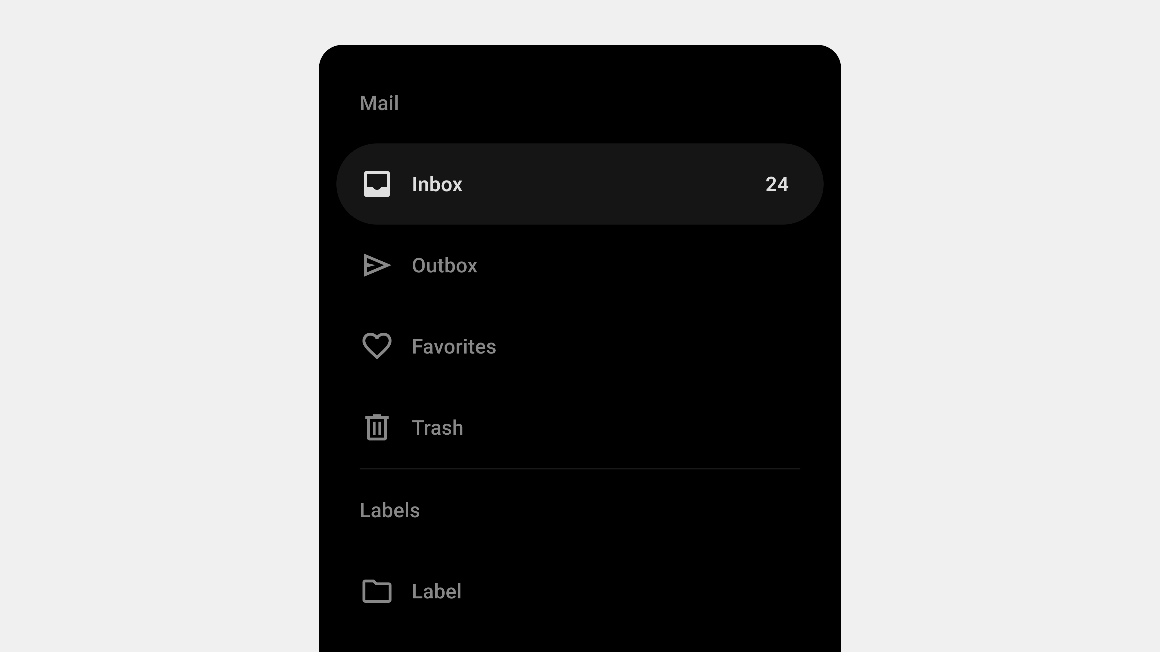
    5 Key Considerations for Publishing and Developing Navigation Drawers

    Navigation drawers are an essential part of modern UI design, providing a compact and efficient way to organize menus and navigation elements. While their design plays a vital role, successful implementation through publishing and development is equally critical. Poor execution can lead to usability issues, performance lags, or even accessibility barriers. This article outlines the top five considerations for publishing and developing navigation drawers, offering practical insights for developers and publishers to ensure optimal functionality and user experience.


    1. Performance Optimization

    Why It Matters

    Navigation drawers are used across multiple screens in an app or website. Poorly optimized drawers can slow down load times, negatively impacting the overall user experience.

    Key Considerations

    • Lazy Loading: Load secondary or less-used content only when the drawer is opened.
    • Minimize JavaScript: Avoid unnecessary JavaScript dependencies for animations or dynamic content.
    • Efficient CSS: Use clean and efficient CSS for styling to reduce rendering time.

    Implementation Tips

    • Use CSS transitions for animations instead of JavaScript for better performance.
    • Preload critical assets for smooth interaction.
    • Combine multiple API calls for dynamic content into a single request.

    Tools

    • Lighthouse for performance auditing.
    • Webpack or Rollup to bundle and minify assets.

    2. Responsiveness and Device Compatibility

    Why It Matters

    Navigation drawers must work seamlessly across a wide range of devices, from small-screen smartphones to large desktop monitors. Ensuring responsiveness is critical to maintaining a consistent user experience.

    Key Considerations

    • Responsive Breakpoints: Use media queries to define specific layouts for different screen sizes.
    • Mobile Optimization: Ensure touch targets are large enough for mobile interactions.
    • Cross-Browser Compatibility: Test the drawer’s functionality on all major browsers, including Chrome, Safari, Firefox, and Edge.

    Implementation Tips

    • Use a mobile-first approach when defining breakpoints.
    • Implement swipe gestures for mobile drawers while maintaining click/tap functionality.
    • Design persistent drawers for desktop applications where appropriate.

    Tools

    • BrowserStack for testing across devices and browsers.
    • Chrome DevTools for simulating various screen sizes.

    3. Accessibility Compliance

    Why It Matters

    Accessibility ensures that navigation drawers are usable for all users, including those with disabilities. Ignoring accessibility can alienate users and lead to legal consequences.

    Key Considerations

    • Keyboard Navigation: Users should be able to navigate the drawer using only a keyboard.
    • Screen Reader Support: Implement ARIA roles and labels to make the drawer content accessible via screen readers.
    • Focus Management: Automatically move focus to the drawer when it opens and return it to the toggle button when it closes.

    Implementation Tips

    • Use semantic HTML for the drawer’s structure (e.g., <nav> tags).
    • Highlight focusable elements and ensure focus indicators are visible.
    • Test the drawer with assistive technologies like NVDA or VoiceOver.

    Tools

    • Axe Accessibility Checker.
    • Lighthouse Accessibility Audit.

    4. Dynamic Content Handling

    Why It Matters

    Many modern applications rely on navigation drawers to display dynamic or personalized content. If not handled correctly, this can lead to performance issues or broken functionality.

    Key Considerations

    • Dynamic Loading: Fetch content only when required, rather than preloading everything.
    • Error Handling: Provide fallback options or error messages if dynamic content fails to load.
    • Caching: Cache frequently accessed content to improve load times.

    Implementation Tips

    • Use loading indicators for sections that fetch content dynamically.
    • Implement retry mechanisms for failed network requests.
    • Test how the drawer behaves in offline or low-connectivity scenarios.

    Example

    For a messaging app, load recent chats dynamically when the drawer opens, but show a placeholder if the content fails to load.


    5. Testing and Quality Assurance (QA)

    Why It Matters

    Even a well-designed navigation drawer can fail to meet user expectations without rigorous testing. QA ensures the drawer performs consistently across devices, browsers, and scenarios.

    Key Considerations

    • Functional Testing: Verify that all links, buttons, and dynamic content work correctly.
    • Performance Testing: Test the drawer’s performance under high traffic or slow network conditions.
    • Stress Testing: Ensure the drawer can handle large amounts of content without breaking.

    Implementation Tips

    • Create automated tests for common user actions, such as opening, closing, and navigating through the drawer.
    • Simulate various user behaviors, such as rapid opening/closing or switching devices mid-session.
    • Test accessibility features with real users or accessibility experts.

    Tools

    • Selenium or Cypress for automated testing.
    • Apache JMeter for load and stress testing.

    Conclusion

    Publishing and developing navigation drawers require a balance of performance optimization, responsiveness, accessibility, dynamic content handling, and rigorous testing. By addressing these five areas, developers and publishers can create navigation systems that meet user expectations and perform reliably across devices and scenarios. Proper implementation ensures not only a smoother user experience but also long-term scalability and maintainability.


  • Navigation Bars – Final

    Navigation Bars – Final

    The Ultimate Guide to Navigation Bars: A Comprehensive Wrap-Up

    Navigation bars are the backbone of user interaction in digital platforms, serving as the gateway to content and functionality. From their design principles to their development, testing, and user experience writing, every aspect contributes to creating a seamless, intuitive, and accessible user journey. This comprehensive guide wraps up key insights about navigation bars, summarizing critical considerations for designers, developers, publishers, and QA teams.


    1. Understanding Navigation Bars: Definition and Role

    A navigation bar is a user interface component that provides structured access to various sections of a website or application. Its primary purpose is to enable users to locate and interact with features efficiently.

    Key Takeaways

    • Definition: A visual roadmap connecting users to content and functionality.
    • Role: Guides users, enhances usability, and improves content discoverability.

    Practical Example

    For an e-commerce platform, a navigation bar might include:

    • Core functions: “Home,” “Shop,” “Categories,” “Cart.”
    • Secondary actions: “Login,” “Help,” “Settings.”

    The role of the navigation bar extends beyond functionality—it establishes brand identity and builds user trust.


    2. Designing User-Centric Navigation Bars

    Designing navigation bars with users in mind ensures better usability and engagement. A well-designed navigation bar is simple, accessible, and consistent across devices and platforms.

    Key Considerations

    1. Clarity and Simplicity: Use familiar terms and organize content logically.
    2. Accessibility: Include ARIA roles, keyboard navigation, and focus indicators.
    3. Responsive Design: Adapt layouts to different screen sizes and devices.
    4. Feedback and Visual Cues: Highlight active states, provide hover effects, and ensure smooth transitions.
    5. Scalability: Prepare for future growth with expandable and flexible designs.

    3. UX Writing for Navigation Bars

    Clear and concise UX writing is essential for navigation bars, as it helps users understand and interact with the platform effortlessly.

    Key Principles

    • Use Familiar Language: Avoid jargon and use terms that resonate with users (e.g., “Cart” instead of “Shopping Basket”).
    • Behavior-Driven Labels: Use action-oriented phrases like “Start Now” or “Learn More.”
    • Consistency: Maintain uniform terminology across pages and components.
    • Global Context: Consider cultural and linguistic differences in international platforms.

    Practical Application

    For a banking app:

    • Use “Accounts” instead of “My Account” to reflect multiple options.
    • Highlight primary tasks like “Send Money” or “View Transactions.”

    4. Development and Publishing Considerations

    Developing and publishing navigation bars requires technical precision to ensure performance, compatibility, and responsiveness.

    Key Areas to Focus On

    1. Performance Optimization: Minimize load times with efficient code and lazy loading.
    2. Cross-Browser Compatibility: Test across major browsers like Chrome, Firefox, and Safari.
    3. Responsive Design: Use CSS media queries for adaptive layouts.
    4. Dynamic Content Handling: Load dropdowns and menus dynamically for better scalability.
    5. Accessibility Compliance: Ensure ARIA roles, keyboard navigation, and screen reader support are in place.

    Practical Example

    /* Responsive Navigation Bar */
    @media (max-width: 768px) {
      nav ul {
        display: none;
      }
      nav .hamburger {
        display: block;
      }
    }
    

    Tools like BrowserStack and Lighthouse can streamline cross-browser testing and performance optimization.


    5. QA Testing for Navigation Bars

    Quality assurance is critical for ensuring navigation bars function as intended across devices and user scenarios.

    Key Testing Areas

    1. Functional Testing: Validate all links, dropdowns, and interactive elements.
    2. Cross-Platform Testing: Ensure compatibility across devices and operating systems.
    3. Accessibility Testing: Verify keyboard navigation, screen reader compatibility, and focus indicators.
    4. Performance and Load Testing: Ensure smooth operation under high traffic and dynamic loading.
    5. Error Handling: Test edge cases like 404 errors, broken links, or failed dynamic content.

    QA Checklist

    • Simulate high traffic with tools like Apache JMeter.
    • Test usability in offline mode and under slow network conditions.
    • Use tools like Axe for accessibility audits.

    6. Holistic Approach to Navigation Bars

    Bringing together design, UX writing, development, and QA ensures a comprehensive approach to navigation bar creation.

    Unified Best Practices

    • Collaborate Across Teams: Designers, developers, writers, and QA must align on user goals and technical requirements.
    • Conduct User Testing: Validate navigation designs with real users to gather actionable feedback.
    • Iterate Continuously: Monitor performance post-launch and update as user needs evolve.

    Final Thoughts

    A navigation bar is not just a functional component—it’s a strategic tool that defines the overall user experience. By focusing on clarity, accessibility, responsiveness, and usability, teams can create navigation systems that meet user needs and drive engagement.


  • Navigation Bars – QA

    Navigation Bars – QA

    5 Key Considerations for QA Testing Navigation Bars

    Quality assurance (QA) plays a critical role in ensuring that a navigation bar functions correctly, provides a seamless user experience, and maintains platform stability. As the navigation bar is one of the most visible and frequently used components of a digital product, meticulous testing is essential. This article highlights the five most important areas to focus on when conducting QA for navigation bars, ensuring they are user-friendly, functional, and error-free.


    1. Functional Testing: Ensuring Core Functionality

    Why It Matters

    The primary purpose of a navigation bar is to help users move through the platform seamlessly. Any broken links, incorrect redirections, or missing elements can disrupt the user experience.

    Key Guidelines

    • Link Validation: Test all navigation links to ensure they point to the correct destinations.
    • Dropdown and Submenu Functionality: Verify that dropdown menus and submenus expand, collapse, and link correctly.
    • Button Clickability: Ensure all buttons in the navigation bar are clickable and trigger the intended actions.

    Checklist for QA

    • Test all links across pages and devices.
    • Verify that hover states, clicks, and taps work as expected.
    • Ensure secondary navigation items (e.g., dropdowns) function correctly.

    Tools

    • Browser DevTools for link inspection.
    • Automated testing tools like Selenium or Cypress for repeated functional tests.

    2. Cross-Browser and Cross-Platform Compatibility

    Why It Matters

    Users access websites and applications on a variety of devices and browsers. Ensuring compatibility prevents issues like misaligned elements, broken functionality, or inconsistent behavior.

    Key Guidelines

    • Test Across Major Browsers: Chrome, Firefox, Safari, Edge, and their mobile counterparts.
    • Device Testing: Check functionality on desktops, tablets, and mobile devices.
    • OS Compatibility: Verify behavior across Windows, macOS, iOS, and Android.

    Checklist for QA

    • Test how the navigation bar adapts to different screen sizes.
    • Ensure consistent appearance and functionality in both light and dark modes (if supported).
    • Confirm responsive behavior (e.g., hamburger menus on mobile).

    Tools

    • BrowserStack or Sauce Labs for multi-browser and multi-device testing.
    • Real-device testing for accurate results.

    3. Accessibility Testing: Inclusive Usability for All Users

    Why It Matters

    An accessible navigation bar ensures that users with disabilities can interact with your platform effectively. Accessibility issues can alienate users and may even lead to legal consequences.

    Key Guidelines

    • Screen Reader Compatibility: Ensure ARIA roles, labels, and semantic HTML elements are properly implemented.
    • Keyboard Navigation: Test navigation using only a keyboard (e.g., tab and arrow keys).
    • Focus Indicators: Verify that focus states are visible and intuitive.
    • Color Contrast: Ensure adequate contrast for text and interactive elements.

    Checklist for QA

    • Test with screen readers like NVDA or VoiceOver.
    • Verify the tab order of navigation links.
    • Use contrast-checking tools to ensure WCAG compliance.

    Tools

    • Lighthouse for accessibility audits.
    • Axe Accessibility Checker for in-depth reports.

    4. Performance and Load Testing

    Why It Matters

    The navigation bar is a core component of every page, so its performance affects the overall user experience. Slow load times or unresponsive interactions can frustrate users.

    Key Guidelines

    • Load Speed: Ensure the navigation bar loads quickly on all devices.
    • Dynamic Content: Test how dynamically loaded menus (e.g., dropdowns) perform under various conditions.
    • Heavy Traffic: Simulate high traffic to ensure stability during peak usage.

    Checklist for QA

    • Measure page load times with the navigation bar active.
    • Test dynamic elements like dropdowns under slow network conditions.
    • Simulate multiple users accessing the navigation bar simultaneously.

    Tools

    • Lighthouse or GTmetrix for load speed analysis.
    • Apache JMeter for load and stress testing.

    5. Edge Cases and Error Handling

    Why It Matters

    Navigation bars must handle unexpected inputs, errors, or unusual user behaviors gracefully. Poor error handling can lead to crashes or broken navigation, which can negatively impact the user experience.

    Key Guidelines

    • 404 Errors: Verify how the navigation bar behaves when a linked page is missing or unavailable.
    • Dynamic Menu Failures: Test what happens if dynamically loaded content fails to load.
    • Broken Links: Simulate incorrect or outdated links to ensure error messages are helpful.

    Checklist for QA

    • Ensure fallback behavior for missing or unavailable content.
    • Verify error messages are displayed clearly and guide users on what to do next.
    • Test navigation elements in offline mode or with intermittent network connectivity.

    Tools

    • Postman for API testing in dynamic menus.
    • Chrome DevTools for offline simulation.

    Conclusion

    Quality assurance for navigation bars involves testing for functionality, compatibility, accessibility, performance, and error handling. By focusing on these five areas, QA teams can ensure that navigation systems meet user expectations, perform reliably, and provide an inclusive experience across all platforms. A well-tested navigation bar not only enhances usability but also strengthens the overall credibility of the product.


  • Buttons – Final

    Buttons – Final

    The Complete Guide to Buttons in Digital Interfaces: Design, Development, and QA Insights

    Buttons are the cornerstone of user interaction in any digital interface. From guiding users through tasks to triggering crucial system functions, buttons play a pivotal role in the usability and success of a product. Designing, developing, and testing buttons may seem straightforward, but achieving excellence in their implementation requires attention to detail, collaboration across teams, and adherence to best practices.

    This article wraps up key insights about buttons, summarizing design considerations, development strategies, and QA best practices to ensure your buttons are intuitive, accessible, and high-performing.


    Why Buttons Matter in Digital Products

    Buttons are more than just clickable elements—they are the primary tools for driving user actions. Their importance lies in their ability to:

    • Guide users toward completing tasks (e.g., submitting forms, purchasing products).
    • Improve user workflows by providing clarity and visual cues.
    • Build trust and confidence through consistent design and behavior.

    The effectiveness of a button depends on its ability to meet user expectations, perform reliably, and align with the overall user experience.


    Designing Buttons: Key Takeaways

    The design phase of buttons lays the foundation for usability and aesthetics. Here are the critical aspects of button design:

    1. Clarity of Purpose

    Every button should have a clear and specific purpose, communicated effectively through its label and design. Action-oriented language, such as “Sign Up” or “Download Report,” guides users better than generic terms like “Submit.”

    Best Practices:

    • Use concise, actionable labels.
    • Maintain visual hierarchy by differentiating primary, secondary, and tertiary buttons.
    • Test labels with users to ensure clarity.

    2. Consistency in Style

    Buttons should adhere to a unified design language to create familiarity and reduce cognitive load. Consistent use of color, size, and typography helps users predict button behavior.

    Best Practices:

    • Establish a design system with predefined button styles.
    • Use distinct visual cues (e.g., hover effects) for interactive elements.
    • Ensure uniformity across all screens and devices.

    3. Accessibility

    Inclusive design is critical for buttons. Accessible buttons ensure that all users, including those with disabilities, can interact with your product.

    Best Practices:

    • Provide clear focus states for keyboard users.
    • Ensure contrast ratios meet WCAG standards.
    • Add ARIA labels for screen readers to describe button functionality.

    4. Feedback and States

    Buttons must communicate their state (default, hover, active, disabled) to help users understand their functionality and system responses.

    Best Practices:

    • Use visual feedback, such as color changes or animations, to indicate button states.
    • Include loading indicators for actions that take time to process.
    • Test buttons under different scenarios to ensure state transitions are smooth.

    5. Placement and Layout

    Strategic button placement enhances usability and helps users complete tasks efficiently. Buttons should align with user expectations and be positioned intuitively within the interface.

    Best Practices:

    • Place primary buttons in prominent locations (e.g., bottom-right of forms).
    • Maintain adequate spacing between buttons to prevent accidental clicks.
    • Follow platform-specific guidelines for button placement on mobile and desktop.

    Developing Buttons: Key Takeaways

    Once the design is finalized, development ensures that buttons are functional, responsive, and scalable across different platforms.

    1. Responsive and Touch-Friendly Design

    Buttons must adapt seamlessly to various screen sizes and input methods. Mobile users, in particular, need buttons that are large enough to tap and positioned within easy reach.

    Best Practices:

    • Use a minimum touch target size of 48x48dp.
    • Optimize button layouts for different screen resolutions using CSS media queries.
    • Provide touch feedback (e.g., haptic vibrations) for mobile interactions.

    2. State Management

    Managing button states programmatically is essential to prevent errors and ensure smooth interactions.

    Best Practices:

    • Disable buttons when actions are unavailable or in progress.
    • Display loading states for actions requiring backend responses.
    • Test transitions between states to avoid unexpected behavior.

    3. Performance Optimization

    Efficiently developed buttons contribute to the overall performance of the product. Poorly optimized buttons can slow down interactions and frustrate users.

    Best Practices:

    • Minimize dependencies and avoid inline styles.
    • Use lightweight SVG icons instead of raster images.
    • Test button performance under various network conditions and device types.

    4. Scalability with Design Systems

    Using design systems allows teams to create reusable button components, ensuring consistency and scalability across products.

    Best Practices:

    • Develop modular button components with customizable properties.
    • Use frameworks like React or Vue for dynamic button behavior.
    • Collaborate with designers to ensure the design system aligns with the product vision.

    QA Testing Buttons: Key Takeaways

    The final step in creating effective buttons is thorough QA testing. Testing ensures buttons function as expected, provide a seamless user experience, and handle edge cases gracefully.

    1. Functional Testing

    Verify that all buttons perform their intended actions and handle both valid and invalid inputs correctly.

    Best Practices:

    • Test buttons across different scenarios, including clicks, taps, and hover interactions.
    • Validate dynamic behavior, such as enabling/disabling based on input conditions.
    • Simulate backend responses to ensure buttons handle errors effectively.

    2. Accessibility Testing

    Ensure buttons are usable by all users, including those relying on assistive technologies.

    Best Practices:

    • Test buttons with screen readers to verify clear labels and roles.
    • Check focus states during keyboard navigation.
    • Use tools like axe or Lighthouse to audit accessibility compliance.

    3. Cross-Browser and Cross-Device Testing

    Buttons must work consistently across various browsers, operating systems, and devices.

    Best Practices:

    • Test buttons on popular browsers like Chrome, Safari, Firefox, and Edge.
    • Verify button layout and responsiveness on mobile, tablet, and desktop devices.
    • Check hover effects and touch interactions to ensure compatibility.

    4. Performance and Load Testing

    Assess how buttons behave under different performance conditions, such as slow network speeds or heavy user loads.

    Best Practices:

    • Measure response times for button interactions.
    • Simulate rapid clicks to prevent duplicate submissions.
    • Test under varying network conditions to validate loading states.

    5. Error Handling

    Test how buttons respond to edge cases, such as invalid inputs, API failures, or timeouts.

    Best Practices:

    • Simulate server errors to ensure appropriate error messages are displayed.
    • Validate disabled states for buttons relying on incomplete user inputs.
    • Test retry mechanisms for buttons triggering transient errors.

    Wrap-Up: The Button Lifecycle

    Creating effective buttons requires a collaborative effort across design, development, and QA teams. Each phase contributes to a seamless user experience, from crafting intuitive designs to ensuring robust functionality and performance.

    Summary of Key Steps:

    1. Design: Focus on clarity, consistency, accessibility, and strategic placement.
    2. Development: Prioritize responsiveness, scalability, and performance.
    3. QA Testing: Verify functionality, accessibility, cross-environment compatibility, and error handling.

    By following these guidelines, you can deliver buttons that not only look great but also perform reliably across all user interactions.