[태그:] responsive design

  • Menu – 10 QA

    Menu – 10 QA

    Key Considerations for QA Testing Menus

    Menus are a critical component of user interfaces, enabling navigation and task execution. QA testing ensures that menus function as intended, provide a seamless experience, and meet user expectations. This article explores the five most important aspects to focus on during menu QA testing, offering actionable insights for quality assurance specialists.


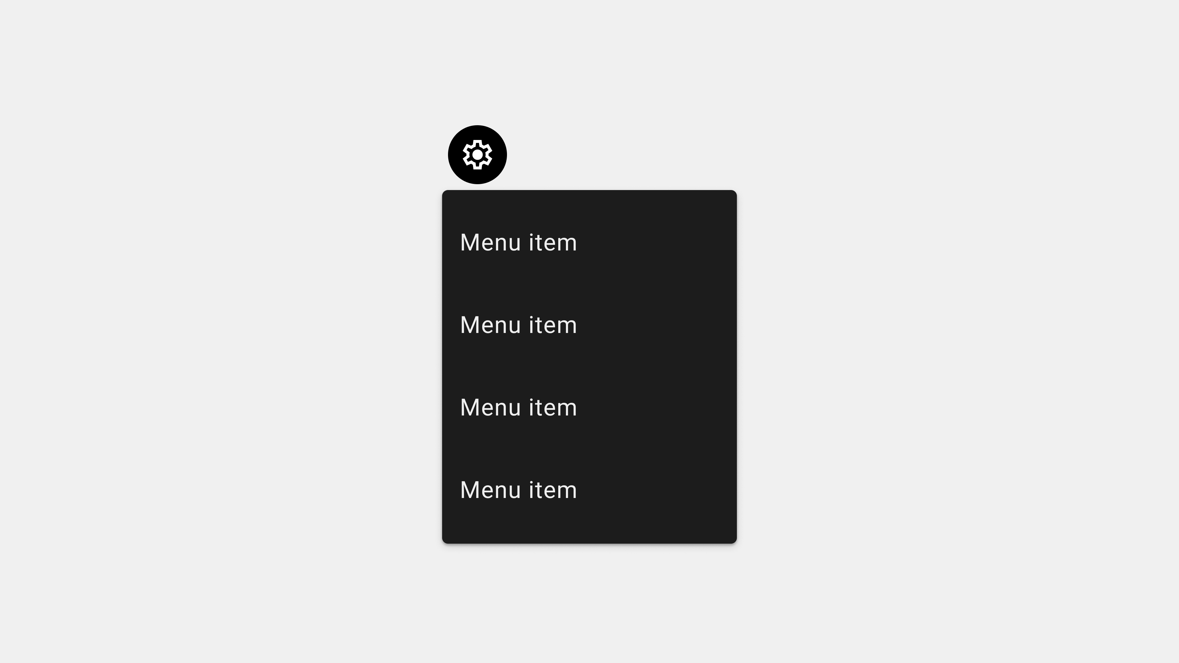
    1. Functional Testing

    Why It Matters

    Menus must perform their basic functions reliably. Broken links, unresponsive items, or incorrect navigation paths can frustrate users and harm the user experience.

    Key Testing Areas

    • Link Verification: Ensure all menu items route to the correct destination.
    • Dropdown Menus: Test expand/collapse behavior under various conditions.
    • Submenus: Validate that submenus open correctly and are accessible.

    Test Scenarios

    • Clicking each menu item and verifying its destination.
    • Rapidly switching between dropdown menus to ensure they function without errors.
    • Testing submenus with multiple nested layers for proper functionality.

    Tools and Tips

    • Use automated tools like Selenium or Cypress to validate menu links.
    • Conduct manual testing to ensure responsiveness and reliability.
    • Test on various devices and browsers to identify inconsistencies.

    2. Cross-Browser and Cross-Platform Testing

    Why It Matters

    Users access menus on diverse devices and browsers, making it essential to ensure consistent functionality and appearance.

    Key Testing Areas

    • Browser Compatibility: Verify menus function correctly on Chrome, Safari, Firefox, Edge, and more.
    • Device Compatibility: Test menus on desktops, tablets, and smartphones.
    • Operating System Variations: Check for differences across iOS, Android, Windows, and macOS.

    Test Scenarios

    • Verifying the display and behavior of menus on different screen sizes and resolutions.
    • Testing touch interactions (e.g., tap and swipe) on mobile devices.
    • Simulating mouse hover and click interactions on desktop browsers.

    Tools and Tips

    • Use BrowserStack or Sauce Labs for cross-browser and cross-platform testing.
    • Manually test menus on physical devices to identify real-world issues.

    3. Accessibility Testing

    Why It Matters

    Accessible menus ensure inclusivity, enabling users with disabilities to navigate and interact with the interface effectively.

    Key Testing Areas

    • Screen Reader Compatibility: Verify that menu items are correctly announced.
    • Keyboard Navigation: Ensure users can navigate menus using only a keyboard.
    • Focus Management: Test visible focus indicators for interactive elements.

    Test Scenarios

    • Navigating through the menu with a screen reader like NVDA or VoiceOver.
    • Using the Tab and Shift+Tab keys to move forward and backward through menu items.
    • Testing color contrast and font sizes to ensure readability for users with visual impairments.

    Tools and Tips

    • Use Axe Accessibility Checker for automated audits.
    • Test with real users who rely on assistive technologies to uncover practical issues.

    4. Performance Testing

    Why It Matters

    Menus should load quickly and function smoothly, even under high traffic or resource-constrained environments.

    Key Testing Areas

    • Loading Speed: Test how quickly menus appear and respond to interactions.
    • Animation Smoothness: Validate that dropdowns and transitions are fluid.
    • High-Traffic Scenarios: Simulate heavy usage to test resilience.

    Test Scenarios

    • Clicking rapidly between menu items to check for delays or stuttering.
    • Simulating poor network conditions to observe menu behavior during slow loads.
    • Testing on low-performance devices to identify potential bottlenecks.

    Tools and Tips

    • Use Lighthouse to measure menu performance metrics.
    • Conduct load testing with Apache JMeter or similar tools.

    5. Edge Case and Error Handling Testing

    Why It Matters

    Menus must handle unexpected scenarios gracefully to ensure a seamless user experience.

    Key Testing Areas

    • Offline Mode: Test how menus behave when the device is disconnected from the internet.
    • Dynamic Content: Validate menus that fetch data dynamically or adapt based on user roles.
    • Error Messages: Ensure fallback mechanisms are in place for broken links or failed content loads.

    Test Scenarios

    • Testing menus with dynamically generated items (e.g., user-specific settings).
    • Simulating network interruptions to check for appropriate error handling.
    • Interacting with unavailable or restricted menu items to verify error messages.

    Tools and Tips

    • Use Postman to simulate API failures for dynamic menus.
    • Test with different user roles to ensure menus display correctly for each scenario.

    Conclusion

    QA testing for menus is crucial for delivering a functional, accessible, and seamless user experience. By focusing on functional testing, cross-platform compatibility, accessibility, performance, and edge case handling, QA teams can ensure menus meet technical and user expectations. Regular testing and collaboration with designers and developers are essential for refining menus and addressing potential issues proactively.


  • Menu – 9. Dev.

    Menu – 9. Dev.

    Key Considerations for Publishing and Developing Menus

    Menus are fundamental components of user interfaces, facilitating navigation and task execution. When publishing or developing menus, it’s essential to ensure they are functional, responsive, and accessible. This article highlights the five most critical factors to consider during the publishing and development phases, offering actionable insights for developers, designers, and QA teams.


    1. Ensure Cross-Browser and Cross-Platform Compatibility

    Why It Matters

    Menus must work seamlessly across various devices, screen sizes, and browsers to ensure a consistent user experience.

    Key Steps

    • Test Across Browsers: Ensure compatibility with major browsers such as Chrome, Safari, Firefox, and Edge.
    • Adapt for Devices: Design menus that scale and function properly on desktops, tablets, and mobile devices.
    • Handle Touch and Click Events: Implement event handling for both touch and mouse interactions.

    Implementation Tips

    • Use CSS media queries to adapt menus for different screen sizes.
    • Leverage feature detection libraries like Modernizr to ensure browser compatibility.
    • Test on physical devices to account for real-world interaction differences.

    Common Issues to Address

    • Menus that appear misaligned or broken on specific browsers.
    • Dropdown menus that fail to expand on touch devices.

    2. Optimize for Performance and Speed

    Why It Matters

    Slow or laggy menus can frustrate users and lead to poor user experiences. Performance optimization ensures menus load and respond quickly.

    Key Steps

    • Minimize Dependencies: Use lightweight frameworks or vanilla JavaScript for menu interactions.
    • Lazy Load Content: Load menu items dynamically only when needed to reduce initial load times.
    • Optimize Animations: Use hardware-accelerated CSS transitions for smooth effects.

    Implementation Tips

    • Compress images or icons used within menus to reduce file size.
    • Debounce or throttle menu event listeners to avoid performance bottlenecks.
    • Use tools like Lighthouse or PageSpeed Insights to measure and improve performance.

    Common Issues to Address

    • Jittery dropdown animations on low-end devices.
    • Menus that delay in opening or responding to user input.

    3. Prioritize Accessibility Compliance

    Why It Matters

    Accessible menus ensure inclusivity, allowing users with disabilities to navigate and interact effectively. Compliance with accessibility standards is also a legal requirement in many regions.

    Key Steps

    • Use Semantic HTML: Implement <nav> elements, <ul> lists, and <li> items for menus.
    • Add ARIA Attributes: Use ARIA roles and labels for screen reader compatibility.
    • Keyboard Navigation: Ensure users can navigate menus using only the keyboard.

    Implementation Tips

    • Highlight focused items using CSS for visible keyboard navigation.
    • Use descriptive ARIA labels to convey menu context (e.g., aria-label="Main Menu").
    • Test menus with screen readers like VoiceOver and NVDA.

    Common Issues to Address

    • Menus that cannot be accessed or navigated without a mouse.
    • Insufficient contrast between menu text and background colors.

    4. Implement Scalable and Modular Code

    Why It Matters

    Menus often need to accommodate updates, such as adding new items or changing layouts. Writing scalable and modular code ensures flexibility and maintainability.

    Key Steps

    • Use Reusable Components: Build menus as modular components that can be reused across different pages.
    • Handle Dynamic Content: Plan for menus that adjust based on user roles, preferences, or activity.
    • Ensure Scalability: Design menus to support future expansions without requiring a complete overhaul.

    Implementation Tips

    • Use component-based libraries like React or Vue for dynamic menus.
    • Store menu data in JSON or similar formats to simplify updates.
    • Write clean, documented code to facilitate collaboration and maintenance.

    Common Issues to Address

    • Hardcoded menu items that require manual updates for every change.
    • Menus that break when additional items or categories are added.

    5. Test Thoroughly Across Scenarios

    Why It Matters

    Thorough testing ensures that menus function as intended under various conditions, reducing the risk of user frustration or errors.

    Key Steps

    • Functional Testing: Verify that all menu items link to the correct destinations.
    • Stress Testing: Simulate heavy user traffic to test menu performance under load.
    • Edge Case Testing: Check for issues in offline mode or with slow network connections.

    Implementation Tips

    • Use automated tools like Selenium or Cypress for regression testing.
    • Test menus with real users to identify usability issues.
    • Simulate low-bandwidth environments to ensure graceful degradation.

    Common Issues to Address

    • Dropdowns that fail to close properly when clicking outside the menu.
    • Menu items that do not respond correctly during rapid navigation.

    Conclusion

    Publishing and developing menus require careful attention to cross-platform compatibility, performance, accessibility, scalability, and testing. By focusing on these five key areas, developers can ensure menus provide a seamless and reliable experience for all users. Collaborating with designers, QA teams, and stakeholders further ensures that menus meet both technical and user expectations.


  • Menu – 7. Design

    Menu – 7. Design

    Designing User-Centric Menus: 5 Critical Considerations

    Menus are a fundamental aspect of user interface design, guiding users through an app or website and helping them accomplish their goals. Designing menus with a user-centered approach ensures they are intuitive, accessible, and aligned with user needs. This article explores the five most important considerations for creating user-centric menus and offers actionable insights for designers and developers.


    1. Simplicity and Clarity

    Why It Matters

    A simple and clear menu allows users to find what they need quickly and without confusion. Overly complex menus can overwhelm users and hinder navigation.

    Key Strategies

    • Limit Menu Options: Include only essential items to avoid clutter.
    • Use Descriptive Labels: Ensure menu labels are concise and clearly indicate their function.
    • Organize Logically: Group related items and arrange them in a logical order.

    Practical Example

    In an e-commerce app, primary categories like “Home,” “Shop,” “Cart,” and “Profile” should be clearly labeled and easy to access. Subcategories, such as “Electronics” or “Clothing,” can be placed in dropdown menus.

    Tips for Designers

    • Use bold or distinct typography to emphasize key menu items.
    • Avoid abbreviations or jargon that may confuse users.
    • Test menu layouts with users to identify potential confusion points.

    2. Accessibility

    Why It Matters

    Accessible menus ensure that all users, including those with disabilities, can navigate the app or website effectively. This not only improves usability but also complies with legal accessibility standards.

    Key Strategies

    • Keyboard Navigation: Design menus that can be navigated using only a keyboard.
    • Screen Reader Support: Add ARIA roles and labels to make menus compatible with assistive technologies.
    • High-Contrast Design: Use colors that provide sufficient contrast for readability.

    Practical Example

    In a productivity app, ensure that keyboard users can tab through all menu items and that screen readers announce each option accurately, such as “File menu, 3 items, Save, Open, Close.”

    Tips for Designers

    • Test menus with screen readers like VoiceOver or NVDA.
    • Use WCAG (Web Content Accessibility Guidelines) as a standard for design.
    • Include visible focus indicators to show where the user is navigating.

    3. Responsiveness and Device Compatibility

    Why It Matters

    With users accessing apps and websites on various devices, menus must adapt seamlessly to different screen sizes and input methods.

    Key Strategies

    • Mobile-First Design: Prioritize designs for smaller screens and scale up for larger devices.
    • Responsive Layouts: Use collapsible menus (e.g., hamburger menus) for mobile devices.
    • Touch-Friendly Targets: Ensure menu items are large enough to tap easily on mobile screens.

    Practical Example

    A news website can use a horizontal menu for desktop users and collapse it into a hamburger menu for mobile users, ensuring a consistent experience across devices.

    Tips for Designers

    • Use breakpoints in design to define how menus adjust at various screen sizes.
    • Avoid placing critical menu items too close to screen edges, where accidental taps are common.
    • Test menus on a range of devices and orientations (portrait and landscape).

    4. Visual Feedback and Interactivity

    Why It Matters

    Users rely on visual cues and interactive feedback to understand menu functionality and confirm their actions. A lack of feedback can cause confusion and frustration.

    Key Strategies

    • Hover and Focus States: Highlight menu items when hovered over or focused.
    • Active State Indicators: Show the user’s current location with a distinct style for active items.
    • Smooth Transitions: Use animations for expanding or collapsing dropdown menus.

    Practical Example

    A travel app can use a color change or underline effect to indicate the currently selected tab, such as “Bookings.” Dropdown menus can expand smoothly when clicked, giving users a sense of fluidity.

    Tips for Designers

    • Avoid excessive animations that slow down interactions.
    • Use consistent feedback mechanisms across all menu items.
    • Highlight errors, such as unavailable menu options, with clear visual cues.

    5. Customization and Personalization

    Why It Matters

    Users value the ability to tailor menus to their preferences, especially in apps with diverse user needs or complex functionalities.

    Key Strategies

    • User Preferences: Allow users to rearrange or hide menu items based on their needs.
    • Dynamic Content: Adjust menus based on user roles or usage history.
    • Role-Based Menus: Display different menu options for admin and regular users.

    Practical Example

    In a project management app, regular users might see tabs like “Tasks” and “Messages,” while admins also have access to “User Management” and “Settings.”

    Tips for Designers

    • Include a settings option for menu customization.
    • Use analytics to identify frequently used menu items and prioritize them.
    • Test personalized menus with diverse user groups to ensure relevance.

    Conclusion

    Designing user-centric menus requires a focus on simplicity, accessibility, responsiveness, interactivity, and personalization. By addressing these five critical areas, designers can create menus that are intuitive, functional, and aligned with user expectations. Regular testing and feedback loops ensure that menus evolve alongside user needs, providing an enhanced and satisfying experience.


  • Menu – 6. Wireframe

    Menu – 6. Wireframe

    Key Considerations for Creating Menu Wireframes: A Comprehensive Guide

    When designing menus for applications or websites, wireframes serve as the blueprint that guides the entire development process. A well-constructed wireframe ensures that menus meet user expectations, adhere to design principles, and function seamlessly across platforms. This guide explores the five most important considerations when creating menu wireframes, tailored for designers, publishers, developers, and QA specialists.


    1. Prioritizing Simplicity and Clarity

    Why It Matters

    Menus are essential for navigation, and overly complex designs can overwhelm users. Simple and clear menus enhance usability and reduce cognitive load.

    Key Steps

    • Limit Options: Include only the most essential items in the main menu. Secondary options can go into submenus.
    • Use Familiar Labels: Avoid jargon and ensure labels are intuitive and descriptive.
    • Organize Logically: Group related items together using categories or sections.

    Wireframe Considerations

    • Highlight the main menu items in bold or prominent colors.
    • Use visual dividers to separate groups for better readability.
    • Annotate wireframes with explanations for grouping and prioritization.

    Tips for Stakeholders

    • Designers: Use consistent typography and spacing to improve readability.
    • Publishers: Ensure text labels are concise and do not truncate on smaller screens.
    • Developers: Implement scalable layouts that adapt to different devices.
    • QA: Test navigation flows to ensure users can easily find items.

    2. Ensuring Responsive Design

    Why It Matters

    Menus must function seamlessly across devices, from mobile phones to large desktop screens. A responsive menu design guarantees accessibility for all users.

    Key Steps

    • Mobile-First Design: Design menus for smaller screens first and scale up for larger devices.
    • Adaptive Layouts: Use collapsible menus (e.g., hamburger menus) for mobile devices.
    • Flexible Grids: Arrange menu items dynamically to accommodate varying screen sizes.

    Wireframe Considerations

    • Include variations for mobile, tablet, and desktop views.
    • Use placeholder text to simulate real content and identify layout issues.
    • Annotate breakpoints for screen size transitions.

    Tips for Stakeholders

    • Designers: Use touch-friendly targets for mobile wireframes.
    • Publishers: Verify that text remains legible at all sizes.
    • Developers: Implement CSS media queries to ensure layouts adapt responsively.
    • QA: Test menus on devices with different screen resolutions and orientations.

    3. Supporting Accessibility

    Why It Matters

    Accessible menus ensure inclusivity and compliance with legal standards. They make navigation possible for users with disabilities.

    Key Steps

    • Keyboard Navigation: Ensure menus can be navigated using only a keyboard.
    • Screen Reader Support: Add ARIA roles and attributes for screen readers.
    • Contrast and Font Size: Use high-contrast colors and readable font sizes for menu items.

    Wireframe Considerations

    • Highlight focus states and active states in the wireframe for keyboard navigation.
    • Annotate the wireframe with ARIA roles and accessibility guidelines.
    • Specify contrast ratios to meet WCAG standards.

    Tips for Stakeholders

    • Designers: Ensure wireframes include clear focus indicators.
    • Publishers: Test contrast levels to ensure text is readable.
    • Developers: Use semantic HTML and ARIA attributes for better accessibility.
    • QA: Test menus with assistive technologies like screen readers.

    4. Providing Visual Feedback and Interactivity

    Why It Matters

    Menus should offer visual and interactive feedback to guide users and confirm their actions. This improves navigation confidence and reduces errors.

    Key Steps

    • Hover Effects: Use visual cues like highlights or underlines to indicate clickable items.
    • Active State Indicators: Show the user’s current location within the menu.
    • Transitions and Animations: Use subtle animations for dropdowns and submenus.

    Wireframe Considerations

    • Include visual examples of hover, active, and disabled states.
    • Annotate interactions, such as how dropdown menus expand and collapse.
    • Define animation durations and easing for smooth transitions.

    Tips for Stakeholders

    • Designers: Use wireframes to visualize how feedback mechanisms work.
    • Publishers: Ensure animations and transitions are not too distracting.
    • Developers: Implement CSS animations for smooth and lightweight interactions.
    • QA: Test all interactive states, including hover, focus, and active.

    5. Supporting Scalability and Future Updates

    Why It Matters

    Menus often evolve as applications grow. Designing scalable menus ensures they can accommodate new features without redesigning the entire system.

    Key Steps

    • Flexible Hierarchies: Design menus with expandable categories or submenus.
    • Dynamic Content: Plan for menus that adjust based on user roles or preferences.
    • Overflow Menus: Use “More” or similar options for additional items.

    Wireframe Considerations

    • Highlight placeholders for future items or categories.
    • Annotate scenarios for dynamic content or role-based menus.
    • Include fallback options for overflow menus in the wireframe.

    Tips for Stakeholders

    • Designers: Use modular components in wireframes for easier updates.
    • Publishers: Plan content placement for additional menu items.
    • Developers: Use flexible code structures to accommodate future changes.
    • QA: Test how menus behave when new items are added dynamically.

    Conclusion

    Designing effective menu wireframes requires attention to simplicity, responsiveness, accessibility, interactivity, and scalability. By focusing on these five key areas, designers, publishers, developers, and QA specialists can create menus that enhance usability and meet user needs. Wireframes serve as a collaborative tool, ensuring that every stakeholder understands the design’s intent and works together to deliver a seamless user experience.


  • Menu – 5. Product owner

    Menu – 5. Product owner

    Designing Menus: Meeting User Expectations Through Effective Service Planning

    Menus are central to user interface design, serving as the gateway to content, features, and actions within a system. Users approach menus with specific expectations, and addressing these effectively is crucial for creating seamless and satisfying user experiences. This article explores user expectations for menus and outlines actionable steps service planners can take to meet those expectations.


    1. Understanding User Expectations for Menus

    Users expect menus to be intuitive, efficient, and accessible, allowing them to achieve their goals with minimal effort.

    A. Simplicity and Clarity

    • Expectation: Menus should present options in a clear and organized manner.
    • Details: Users prefer concise labels and logical groupings that eliminate guesswork.

    B. Quick Access to Key Features

    • Expectation: Menus should prioritize essential features for immediate access.
    • Details: Core functionality should be highlighted, while secondary options are nested.

    C. Consistent Navigation

    • Expectation: Menus should behave consistently across all screens and devices.
    • Details: Predictable interactions reduce the learning curve for users.

    D. Accessibility and Inclusivity

    • Expectation: Menus should cater to all users, including those with disabilities.
    • Details: Accessible design ensures usability for diverse user groups.

    E. Visual Feedback and Contextual Awareness

    • Expectation: Menus should provide feedback on user actions and indicate their current location.
    • Details: Highlighting active items and smooth transitions enhance navigation clarity.

    2. Actions Service Planners Should Take

    To align menu design with user expectations, service planners must adopt a user-centered approach.

    A. Conduct User Research

    Understanding user needs and behaviors is foundational to designing effective menus.

    Steps to Take

    • Surveys and Interviews: Gather insights on user preferences and pain points.
    • Analytics Tools: Analyze navigation patterns to identify frequently used features.
    • Competitor Analysis: Study successful menu designs in similar systems.

    Outcome

    A prioritized list of features and menu items that align with user expectations.


    B. Prioritize Simplicity and Usability

    A cluttered menu confuses users and reduces efficiency.

    Steps to Take

    • Limit Options: Focus on 5-7 primary menu items to avoid overwhelming users.
    • Logical Grouping: Organize related items into categories or submenus.
    • Descriptive Labels: Use clear, action-oriented language that users understand.

    Outcome

    A menu that is easy to navigate and helps users achieve their goals quickly.


    C. Design for Accessibility

    Menus must be inclusive and usable by all users, including those with disabilities.

    Steps to Take

    • Screen Reader Support: Add ARIA labels and roles for accessibility tools.
    • Keyboard Navigation: Ensure menus can be navigated without a mouse.
    • High-Contrast Design: Use colors and text that meet WCAG guidelines.

    Outcome

    A menu that complies with accessibility standards and enhances usability for all users.


    D. Provide Visual Feedback and Context

    Users need feedback to understand their current location and the results of their actions.

    Steps to Take

    • Active State Indicators: Highlight the current menu item with color or bold text.
    • Smooth Transitions: Use animations to indicate changes in the menu state.
    • Breadcrumb Navigation: Show users their navigation path for better orientation.

    Outcome

    A menu that builds user confidence and reduces navigation errors.


    E. Test and Iterate

    Continuous testing ensures that the menu meets user needs and adapts to feedback.

    Steps to Take

    • Usability Testing: Observe users interacting with the menu to identify pain points.
    • A/B Testing: Compare different menu designs to determine the most effective layout.
    • Feedback Mechanisms: Encourage users to report issues or suggest improvements.

    Outcome

    A refined menu design that evolves with user expectations and behaviors.


    3. Addressing Common Challenges in Menu Design

    A. Overcrowded Menus

    Problem: Too many options can overwhelm users.
    Solution: Prioritize essential features and group secondary options into submenus.

    B. Ambiguous Labels

    Problem: Vague or unclear labels confuse users.
    Solution: Use descriptive, familiar language aligned with user expectations.

    C. Poor Accessibility

    Problem: Menus that are not accessible exclude users with disabilities.
    Solution: Test menus with assistive technologies and ensure compliance with accessibility standards.


    4. Examples of User-Centric Menus

    A. Amazon (E-Commerce)

    • Why It Works: Uses a mega menu to organize extensive product categories, ensuring quick navigation.
    • Features: Clear labels, logical groupings, and predictive search.

    B. Google Drive (Productivity App)

    • Why It Works: Contextual menus provide task-specific options like “Share” or “Rename,” reducing clutter.

    C. Spotify (Streaming App)

    • Why It Works: A bottom navigation bar highlights core features like “Home,” “Search,” and “Library.”

    Conclusion

    Menus are a critical element of UI/UX design, and meeting user expectations requires careful planning, research, and iteration. By focusing on simplicity, accessibility, and usability, service planners can create menus that enhance navigation and overall user satisfaction. Regular testing and feedback loops ensure that menus remain aligned with evolving user needs.


  • Menu – 3. Types

    Menu – 3. Types

    Comprehensive Guide to the Major Types of Menus in UI/UX Design

    Menus are essential components of any user interface, serving as navigation hubs that guide users through applications or websites. With various types of menus tailored to different use cases and user needs, understanding their features and applications is critical for effective UI/UX design. This article provides an in-depth look at the major types of menus, their roles, advantages, and best practices.


    1. Navigation Menus

    Definition

    Navigation menus are used to help users move between the primary sections of a website or application.

    Key Types

    A. Horizontal Navigation Menus

    • Description: Typically placed at the top of the page, these menus display links in a single row.
    • Use Cases: Ideal for websites or apps with a small number of primary sections.
    • Examples: “Home,” “About Us,” “Services,” “Contact.”

    B. Vertical Navigation Menus

    • Description: Displayed in a column on the left or right side of the screen.
    • Use Cases: Suitable for apps or websites with a lot of content, such as dashboards.
    • Examples: Admin panels with categories like “Users,” “Settings,” “Reports.”

    C. Hamburger Menus

    • Description: Collapsible menus accessed via a three-line icon.
    • Use Cases: Frequently used in mobile apps to save space.
    • Examples: Social media apps like Instagram.

    2. Dropdown Menus

    Definition

    Dropdown menus expand vertically or horizontally to reveal additional options when clicked or hovered over.

    Types and Use Cases

    A. Standard Dropdown Menus

    • Description: Simple lists that expand upon interaction.
    • Use Cases: Great for organizing options like account settings.
    • Examples: “Profile” dropdown with options like “Edit Profile,” “Logout.”

    B. Cascading Dropdown Menus

    • Description: Submenus appear next to the main dropdown options.
    • Use Cases: Useful for hierarchical data.
    • Examples: E-commerce sites with categories like “Men > Shoes > Sneakers.”

    3. Contextual Menus

    Definition

    Contextual menus appear dynamically based on the user’s actions, offering relevant options.

    Key Features

    • Triggered By: Right-clicking on desktops or long-pressing on mobile devices.
    • Dynamic Options: Adjusted based on the item or location clicked.

    Use Cases

    • File management apps like Google Drive, where right-clicking offers “Download,” “Rename,” or “Delete” options.

    Advantages

    • Reduces clutter by only showing relevant actions.
    • Increases efficiency by offering shortcuts.

    4. Mega Menus

    Definition

    Mega menus are large, multi-column menus that display multiple options and subcategories simultaneously.

    Use Cases

    • E-commerce sites with extensive product categories.
    • Educational websites with diverse resources like “Courses,” “Departments,” “Events.”

    Advantages

    • Provides a comprehensive view of options.
    • Reduces the need for deep navigation hierarchies.

    Challenges

    • Requires careful organization to avoid overwhelming users.

    5. Command Menus

    Definition

    Command menus are used in applications to execute specific actions.

    Examples

    • Text editors with options like “Cut,” “Copy,” “Paste.”
    • Media players with controls like “Play,” “Pause,” “Skip.”

    Advantages

    • Focuses on task-specific actions.
    • Enhances productivity for professional tools.

    6. Side Menus

    Definition

    Side menus slide in from the left or right side of the screen, often triggered by gestures or icons.

    Use Cases

    • Mobile apps for secondary navigation like “Settings,” “Help,” “Feedback.”
    • Social media apps for account options.

    Advantages

    • Saves space by hiding secondary options.
    • Offers a clean and minimalist design.

    7. Floating Menus

    Definition

    Floating menus are overlay menus that appear above other content.

    Use Cases

    • Quick access to frequently used tools in creative apps.
    • Mobile apps with floating action buttons (FABs).

    Advantages

    • Provides quick access without disrupting the user’s current context.
    • Enhances multitasking.

    8. Tab Menus

    Definition

    Tab menus use tabs to divide content into multiple views, with each tab representing a section.

    Use Cases

    • Mobile apps like Instagram, with tabs for “Home,” “Search,” “Reels,” and “Profile.”
    • Desktop apps like browsers with tabs for multiple webpages.

    Advantages

    • Keeps navigation consistent across sections.
    • Allows easy switching between tasks.

    9. Footer Menus

    Definition

    Footer menus are located at the bottom of a webpage or app, providing access to supplementary content.

    Use Cases

    • Websites for links to “Privacy Policy,” “Terms of Service,” “Contact.”
    • Mobile apps for persistent navigation options.

    Advantages

    • Offers non-intrusive access to secondary content.
    • Ensures visibility without cluttering the main interface.

    10. Inline Menus

    Definition

    Inline menus are embedded within the content, allowing users to select options directly.

    Use Cases

    • Survey forms with dropdowns for selecting responses.
    • Rich text editors with inline formatting options.

    Advantages

    • Keeps users focused on the task by minimizing navigation.
    • Simplifies workflows for inline tasks.

    Best Practices for Choosing the Right Menu Type

    A. Understand User Needs

    • Identify the user’s primary tasks and navigation goals.
    • Choose a menu type that aligns with their workflow.

    B. Test Menu Usability

    • Conduct A/B testing to determine the most effective menu type.
    • Gather feedback from real users to refine the design.

    C. Ensure Accessibility

    • Design menus that are keyboard-navigable and screen reader-compatible.
    • Use sufficient contrast and clear labels for all menu options.

    Conclusion

    Menus are the backbone of navigation in UI/UX design, with each type serving distinct purposes and use cases. From simple dropdowns to expansive mega menus, understanding the strengths and challenges of each type helps create interfaces that enhance usability and user satisfaction. By choosing the right menu type for your application and adhering to best practices, you can ensure a seamless and intuitive user experience.


  • Menu – 2. Definition

    Menu – 2. Definition

    Exploring the Definition and Role of Menus in UI/UX Design

    Menus are one of the most essential elements in user interface design. They act as the backbone of navigation, enabling users to access content, features, and functionality efficiently. A well-designed menu not only improves usability but also serves as a critical component in delivering a seamless user experience. This article delves deeper into the definition and role of menus, providing insights into their importance and best practices for their design.


    1. What Are Menus in UI/UX Design?

    A menu in the context of UI/UX design is a structured list of options, commands, or features that allow users to interact with a system. Menus act as the primary means of navigation, guiding users through the interface and helping them perform desired tasks.

    Key Characteristics of Menus

    • Hierarchy: Menus often follow a hierarchical structure to organize information.
    • Visibility: They are designed to be easily discoverable and accessible.
    • Functionality: Menus facilitate navigation, settings configuration, and task execution.

    Purpose of Menus

    • To provide users with clear pathways to navigate between different sections of an app or website.
    • To offer shortcuts for executing commands or accessing frequently used features.
    • To reduce cognitive load by organizing options in an intuitive layout.

    2. The Role of Menus in UI/UX Design

    Menus are more than just lists of options; they play a multifaceted role in shaping the user experience.

    A. Organizing Information

    Menus act as a framework for categorizing and presenting content in a logical manner.

    Why It Matters

    • Helps users quickly find what they are looking for.
    • Prevents information overload by grouping related options.

    Example

    E-commerce websites like Amazon use mega menus to categorize products into “Electronics,” “Fashion,” and “Home Essentials,” allowing users to navigate vast inventories easily.


    B. Facilitating Navigation

    Menus guide users to different sections or features of a system.

    Why It Matters

    • Simplifies complex interfaces by providing clear pathways.
    • Reduces the time and effort required to navigate.

    Example

    In a mobile app, a bottom navigation bar menu provides quick access to primary features like “Home,” “Search,” “Notifications,” and “Profile.”


    C. Enhancing Discoverability

    Menus help users uncover features or content they may not have known existed.

    Why It Matters

    • Drives engagement by exposing users to new or less obvious features.
    • Encourages exploration and retention.

    Example

    A hamburger menu in a mobile app might include secondary features like “Help,” “Settings,” or “About Us” that are not immediately visible.


    D. Supporting Task Execution

    Command menus allow users to perform specific actions such as editing, saving, or sharing content.

    Why It Matters

    • Increases efficiency by enabling quick access to tools and functions.
    • Improves user satisfaction by reducing the steps required to complete tasks.

    Example

    In a document editing tool like Google Docs, the “File” menu offers commands like “Save,” “Download,” and “Print,” streamlining productivity.


    E. Enabling Customization and Configuration

    Settings menus allow users to personalize their experience by configuring preferences.

    Why It Matters

    • Enhances user satisfaction by giving them control over the interface.
    • Supports diverse user needs and accessibility requirements.

    Example

    A settings menu in a streaming app allows users to adjust playback quality, manage subscriptions, and configure parental controls.


    3. Key Components of Menus

    A. Menu Items

    Each option within a menu is a menu item, representing an action, link, or feature.

    B. Icons and Labels

    Icons visually represent menu items, while labels provide textual descriptions.

    C. Dividers and Grouping

    Menus often use dividers or visual grouping to organize related items, making them easier to scan.

    D. Hierarchical Structure

    Submenus or dropdowns create a nested structure for categorizing complex menus.


    4. Best Practices for Designing Effective Menus

    Creating an effective menu involves balancing usability, functionality, and aesthetics.

    A. Keep It Simple

    • Avoid cluttering menus with too many options.
    • Prioritize the most important features or sections.

    B. Use Clear and Descriptive Labels

    • Ensure that menu labels accurately describe their purpose.
    • Avoid using jargon or ambiguous terms.

    C. Ensure Accessibility

    • Implement ARIA roles for screen reader compatibility.
    • Design menus to be navigable via keyboard.

    D. Optimize for Different Devices

    • Use responsive design to ensure menus work seamlessly on mobile, tablet, and desktop.
    • Implement touch-friendly elements for mobile users.

    E. Provide Feedback and Indicators

    • Highlight the active menu item to show users their current location.
    • Use hover effects, animations, or sound cues to confirm interactions.

    5. Common Types of Menus

    A. Navigation Menus

    Used for moving between sections of an app or website.

    B. Dropdown Menus

    Expand to reveal options when clicked or hovered over.

    C. Contextual Menus

    Appear based on user actions, offering relevant commands.

    D. Mega Menus

    Display multiple categories and subcategories in a large panel.


    6. Challenges in Menu Design

    A. Overcrowding

    Menus with too many options can overwhelm users.
    Solution: Prioritize and group options into submenus.

    B. Ambiguity

    Unclear labels or icons can confuse users.
    Solution: Use familiar language and universally recognized icons.

    C. Accessibility Issues

    Menus that are not screen reader-friendly exclude users with disabilities.
    Solution: Test menus with assistive technologies.


    7. Tools for Designing and Developing Menus

    A. Design Tools

    • Figma: For creating wireframes and prototypes.
    • Adobe XD: For interactive menu designs.

    B. Development Tools

    • React Menu: For implementing dynamic, responsive menus.
    • Bootstrap: For prebuilt components and templates.

    C. Testing Tools

    • Axe Accessibility Checker: For identifying accessibility issues.
    • BrowserStack: For cross-browser testing.

    Conclusion

    Menus are more than just navigation tools; they are pivotal in shaping the overall user experience. By organizing content, facilitating navigation, and supporting task execution, menus empower users to interact with a system effortlessly. Designers and developers must prioritize clarity, accessibility, and responsiveness to create menus that enhance usability and satisfaction.


  • Menu – 1. Overview

    Menu – 1. Overview

    Comprehensive Guide to Menus in UI/UX Design

    Menus are fundamental components of user interfaces, acting as a bridge between users and the features or content of a system. Whether in mobile apps, desktop applications, or websites, menus organize options in a structured and intuitive way, ensuring users can navigate and interact efficiently. This article explores the concept, types, design principles, and best practices of menus in UI/UX design.


    1. What Is a Menu in UI/UX Design?

    A menu is a user interface element that presents a list of options or commands to the user. These options can include navigation links, actions, or settings that enable users to interact with the system.

    Purpose of Menus

    • Navigation: Help users move between different sections of an application or website.
    • Task Execution: Provide quick access to actions such as saving, sharing, or deleting.
    • Settings Management: Enable users to configure app or system preferences.

    Key Characteristics

    • Hierarchy: Menus often use a structured hierarchy to organize options logically.
    • Visibility: Menus should be easily discoverable and accessible.
    • Consistency: A consistent menu layout enhances usability and familiarity.

    2. Types of Menus in UI Design

    Menus come in various forms, each suited for specific use cases.

    A. Navigation Menus

    These menus provide links to primary sections of an app or website.

    Examples

    • Horizontal Menus: Found at the top of web pages for global navigation.
    • Vertical Menus: Typically located on the side for categorized options.
    • Hamburger Menus: Collapsible menus, common in mobile apps, accessed via a three-line icon.

    Use Cases

    • Websites with multiple sections like “Home,” “About,” and “Contact.”
    • Mobile apps requiring compact navigation.

    B. Contextual Menus

    These menus appear based on user actions, offering relevant options.

    Examples

    • Right-click menus on desktop applications.
    • Long-press menus on mobile devices.

    Use Cases

    • Providing quick access to file options like “Copy,” “Rename,” or “Delete.”

    C. Dropdown Menus

    Menus that expand vertically or horizontally when clicked or hovered over.

    Examples

    • Account settings menus accessed by clicking a profile icon.
    • Submenus in navigation bars.

    Use Cases

    • Organizing hierarchical information or settings under a single label.

    D. Mega Menus

    Large menus that display multiple options and subcategories at once.

    Examples

    • E-commerce sites showing product categories like “Men,” “Women,” and “Kids.”

    Use Cases

    • Websites with extensive content or product catalogs.

    E. Command Menus

    Menus used in applications to execute specific actions.

    Examples

    • Text editor menus for actions like “Cut,” “Paste,” or “Undo.”
    • Media player controls for “Play,” “Pause,” or “Skip.”

    Use Cases

    • Productivity tools requiring task-specific actions.

    3. Best Practices for Designing Menus

    Creating an effective menu involves balancing usability, accessibility, and aesthetics.

    A. Prioritize Simplicity and Clarity

    Menus should be intuitive, helping users find what they need quickly.

    Tips

    • Limit the number of menu items to avoid overwhelming users.
    • Use clear, descriptive labels for each menu option.

    B. Ensure Accessibility

    Inclusive design ensures all users, including those with disabilities, can interact with the menu.

    Tips

    • Use ARIA roles and attributes for screen reader compatibility.
    • Test color contrast and keyboard navigation to meet WCAG standards.

    C. Maintain Consistency

    Consistent menu design helps users develop a mental model, reducing the learning curve.

    Tips

    • Use the same menu layout and behavior across all screens or pages.
    • Standardize iconography and terminology.

    D. Optimize for Responsiveness

    Menus should work seamlessly across devices and screen sizes.

    Tips

    • Implement collapsible menus or hamburger menus for mobile devices.
    • Test layouts in portrait and landscape orientations.

    E. Incorporate Feedback and Interaction States

    Menus should provide visual cues and feedback to enhance user confidence.

    Tips

    • Highlight the active menu item to indicate the current page or section.
    • Use hover effects, animations, or sound cues to confirm interactions.

    4. Common Challenges in Menu Design

    A. Overcrowded Menus

    Menus with too many options can overwhelm users and reduce usability.

    Solution

    • Prioritize essential items and group secondary options under submenus.

    B. Ambiguous Labels

    Vague or unclear labels can confuse users about the purpose of a menu item.

    Solution

    • Use user-friendly, action-oriented language that aligns with user expectations.

    C. Poor Accessibility

    Menus that cannot be navigated with a keyboard or screen reader exclude users with disabilities.

    Solution

    • Test menus with assistive technologies and ensure compliance with accessibility standards.

    5. Examples of Excellent Menu Design

    A. Apple Website

    • Type: Horizontal navigation bar with dropdowns.
    • Why It Works: Clear organization of products, services, and support options.

    B. Amazon Website

    • Type: Vertical mega menu for product categories.
    • Why It Works: Allows users to quickly find specific product categories.

    C. Google Docs

    • Type: Command menu with task-specific options.
    • Why It Works: Streamlines productivity with intuitive labels and actions.

    6. Tools for Menu Design and Development

    A. Design Tools

    • Figma: For wireframing and prototyping menu layouts.
    • Sketch: For designing and testing menu interactions.

    B. Development Tools

    • React Menu: For implementing dynamic, responsive menus.
    • Bootstrap: For prebuilt menu components and frameworks.

    C. Testing Tools

    • Axe Accessibility Checker: For accessibility audits.
    • BrowserStack: For cross-browser compatibility testing.

    Conclusion

    Menus are indispensable elements of any user interface, serving as the gateway to content and functionality. By understanding the types of menus, adhering to best practices, and addressing common challenges, designers and developers can create menus that are intuitive, accessible, and user-friendly. Whether navigating a website, exploring a mobile app, or using a desktop application, a well-designed menu enhances the overall user experience.


  • Tab bar – 11. Final

    Tab bar – 11. Final

    Comprehensive Guide to Tab Bars: A Complete Wrap-Up

    Tab bars are indispensable navigation components in modern applications, especially in mobile UI design. They offer users intuitive and consistent access to key features, playing a vital role in enhancing usability and navigation efficiency. This comprehensive guide summarizes the essential aspects of tab bars, covering their definition, roles, types, design principles, development considerations, and QA testing insights.


    1. What Is a Tab Bar?

    A tab bar is a horizontal navigation tool typically placed at the bottom of a mobile screen or the top of a desktop interface. It enables users to switch between primary sections or features of an application seamlessly.

    Key Features

    • Always Visible: Ensures consistent navigation across screens.
    • Compact Design: Saves screen space while providing quick access to essential functions.
    • Icons and Labels: Combines visuals and text for clear communication.

    Purpose

    Tab bars organize content and functions efficiently, simplifying user navigation by grouping core features in an easily accessible layout.


    2. The Role of Tab Bars in User Experience

    Tab bars significantly influence the overall user experience, acting as a central hub for navigation.

    A. Simplifying Navigation

    By grouping key features into one accessible location, tab bars minimize the steps users need to take to find essential functions.

    B. Enhancing Discoverability

    Prominent placement ensures that primary features are easy to locate, reducing frustration.

    C. Providing Contextual Awareness

    Active state indicators highlight the user’s current location within the app, offering clear feedback and reducing cognitive load.

    D. Supporting Multitasking

    Tab bars facilitate smooth transitions between tasks without disrupting workflows, improving productivity.


    3. Types of Tab Bars

    Different applications require varying tab bar designs based on their functionality and user needs.

    A. Standard Tab Bar

    • Features fixed tabs for core sections.
    • Ideal for apps with a limited number of features (e.g., 3-5 tabs).

    B. Scrollable Tab Bar

    • Allows users to scroll horizontally for additional tabs.
    • Suitable for content-heavy applications like streaming platforms.

    C. Persistent Tab Bar

    • Remains visible during scrolling or page transitions.
    • Ensures constant access to navigation options.

    D. Dynamic Tab Bar

    • Adapts to user roles, preferences, or contexts.
    • Provides personalized navigation experiences.

    E. Floating Tab Bar

    • Positioned slightly above the screen bottom with a minimalist design.
    • Popular in modern, aesthetically focused applications.

    4. Best Practices for Designing Tab Bars

    Creating user-centered tab bars requires adherence to specific design principles.

    A. Simplicity and Clarity

    • Limit tabs to 3-5 key sections.
    • Use clear and descriptive labels paired with intuitive icons.

    B. Accessibility and Inclusivity

    • Add ARIA roles and labels for screen readers.
    • Ensure keyboard navigation and focus indicators.

    C. Ergonomic Design

    • Position the tab bar at the bottom for thumb-reach accessibility.
    • Provide large tap targets to prevent misclicks.

    D. Visual Feedback

    • Highlight active tabs using bold text, color changes, or underlines.
    • Use animations for smooth transitions between tabs.

    E. Scalability and Consistency

    • Plan for future features with overflow menus or collapsible tabs.
    • Maintain consistent design and behavior across all platforms.

    5. Development and Publishing Considerations

    A. Performance Optimization

    • Use lazy loading to reduce initial load times.
    • Minimize dependencies to enhance responsiveness.

    B. Cross-Platform Compatibility

    • Test tab bars on various devices, including mobile, tablet, and desktop.
    • Ensure consistent performance across iOS, Android, and web browsers.

    C. Dynamic Content Management

    • Load dynamic content on-demand to improve performance.
    • Use error messages or fallback options for failed content loads.

    D. Responsive Design

    • Adapt layouts to different screen sizes and orientations.
    • Implement media queries for scalable and responsive designs.

    6. QA Testing Insights for Tab Bars

    Quality assurance is critical to ensure tab bars function reliably across all scenarios.

    A. Functional Testing

    • Verify that all tabs navigate to the correct sections.
    • Test nested menus and dropdowns for proper operation.

    B. Accessibility Compliance

    • Test compatibility with screen readers and keyboard navigation.
    • Validate contrast ratios and focus indicators.

    C. Performance Testing

    • Measure response times for interactions.
    • Simulate high-traffic scenarios to ensure scalability.

    D. Error Handling

    • Test how tabs respond to network failures or broken links.
    • Provide user-friendly error messages for unresolved issues.

    7. The Importance of UX Writing in Tab Bars

    Clear and concise labels are fundamental to effective tab bars.

    Best Practices for UX Writing

    • Use action-oriented labels like “Track Order” or “View Cart.”
    • Maintain consistency in terminology across the app.
    • Avoid jargon or overly creative terms that might confuse users.

    Examples of Excellent Labels

    • E-Commerce App: Home, Shop, Cart, Profile.
    • Social Media App: Feed, Search, Notifications, Profile.

    Conclusion

    Tab bars are vital for efficient navigation and usability, offering users a simple way to access an app’s core features. By understanding their role, designing user-centered layouts, ensuring proper development, and conducting thorough QA testing, teams can create tab bars that enhance user satisfaction and engagement. Combining clear UX writing, accessibility, and responsive design ensures that tab bars remain a cornerstone of effective UI/UX design.


  • Tab bar – 9. Dev.

    Tab bar – 9. Dev.

    5 Key Considerations for Publishing and Developing Tab Bars

    Tab bars are essential navigation tools that enhance user experience by offering intuitive access to an app’s primary features. However, successful implementation during publishing and development requires careful attention to usability, performance, and cross-platform functionality. This article explores five critical factors to consider when developing and publishing tab bars, offering actionable insights for developers and publishers.


    1. Performance Optimization

    Why It Matters

    Tab bars are frequently used across an app’s interface, making performance a crucial factor. Slow or unresponsive tab bars can frustrate users and lead to a poor overall experience.

    Key Considerations

    • Efficient Animations: Use lightweight CSS animations or hardware-accelerated transitions to ensure smooth interactions.
    • Lazy Loading: Load content for inactive tabs only when they are accessed to reduce initial load times.
    • Minimize Dependencies: Avoid unnecessary JavaScript or CSS libraries that may bloat the codebase.

    Implementation Tips

    • Use requestAnimationFrame for optimized animations.
    • Preload critical assets for frequently accessed tabs.
    • Optimize API calls to reduce delays in dynamic content loading.

    Tools

    • Lighthouse for performance auditing.
    • Webpack or Rollup for bundling and minifying assets.

    2. Responsive and Adaptive Design

    Why It Matters

    Tab bars must function seamlessly across various devices, screen sizes, and orientations. Responsive design ensures a consistent and user-friendly experience.

    Key Considerations

    • Dynamic Sizing: Ensure tab bar elements scale appropriately on different screen sizes.
    • Touch-Friendly Targets: Design tap areas large enough for comfortable interaction on mobile devices.
    • Orientation Adaptability: Maintain usability when the device orientation changes between portrait and landscape.

    Implementation Tips

    • Use media queries to adapt tab bar layouts for different screen widths.
    • Implement dynamic layouts that adjust element spacing and font sizes.
    • Test the tab bar on various devices and simulators to ensure responsiveness.

    Tools

    • Chrome DevTools for responsive design testing.
    • BrowserStack for cross-device compatibility checks.

    3. Accessibility Compliance

    Why It Matters

    Accessible tab bars ensure inclusivity, allowing users with disabilities to navigate the app effectively. This not only enhances usability but also complies with legal standards.

    Key Considerations

    • Keyboard Navigation: Ensure users can navigate tabs using only a keyboard.
    • Screen Reader Compatibility: Use ARIA roles and labels to make tabs accessible to visually impaired users.
    • Focus Indicators: Provide visible focus states for interactive elements.

    Implementation Tips

    • Use semantic HTML elements like <nav> and <button> for tab structures.
    • Add ARIA attributes such as aria-selected to indicate the active tab.
    • Ensure sufficient color contrast for text and icons against the background.

    Tools

    • Axe Accessibility Checker.
    • Lighthouse Accessibility Audit.

    4. Dynamic Content and State Management

    Why It Matters

    Many modern applications require tab bars to handle dynamic content and preserve states across user interactions. Proper state management ensures a seamless experience.

    Key Considerations

    • State Preservation: Retain user progress or data within a tab when switching between tabs.
    • Dynamic Content Loading: Fetch content for inactive tabs only when needed.
    • Error Handling: Provide fallback options or error messages for failed content loads.

    Implementation Tips

    • Use libraries like Redux or Context API for efficient state management.
    • Display loading indicators for tabs with dynamic content.
    • Test how the tab bar handles scenarios like poor network connectivity or server errors.

    Tools

    • Postman for testing API integrations.
    • React or Vue for managing dynamic content efficiently.

    5. Cross-Platform Consistency

    Why It Matters

    Users expect consistent functionality and design across devices and platforms. Ensuring cross-platform compatibility builds trust and enhances usability.

    Key Considerations

    • Uniform Behavior: Tabs should function similarly on iOS, Android, and web platforms.
    • Design Consistency: Maintain uniform icon styles, labels, and animations across platforms.
    • Performance Parity: Optimize performance for both mobile and desktop environments.

    Implementation Tips

    • Use a design system to maintain consistency across platforms.
    • Test tab bars in native and hybrid environments to identify discrepancies.
    • Implement platform-specific adaptations only when necessary for usability.

    Tools

    • Flutter or React Native for cross-platform development.
    • Detox or Appium for automated cross-platform testing.

    Conclusion

    Developing and publishing tab bars involves balancing performance, responsiveness, accessibility, and consistency. By focusing on these five critical areas, developers and publishers can ensure their tab bars provide a seamless, inclusive, and engaging user experience. Proper implementation not only meets user expectations but also enhances the overall quality and functionality of the application.