The Complete Guide to Navigation Drawers: Wrap-Up
Navigation drawers are a critical component of modern digital interfaces, offering a clean and efficient way to organize menus and navigation elements. Over the course of our exploration, we have delved into various aspects of navigation drawers, including their definition, roles, key types, UX writing best practices, design considerations, development essentials, and QA testing. This comprehensive guide summarizes all the important points to create a cohesive understanding of navigation drawers, their design, implementation, and testing.
1. What Is a Navigation Drawer?
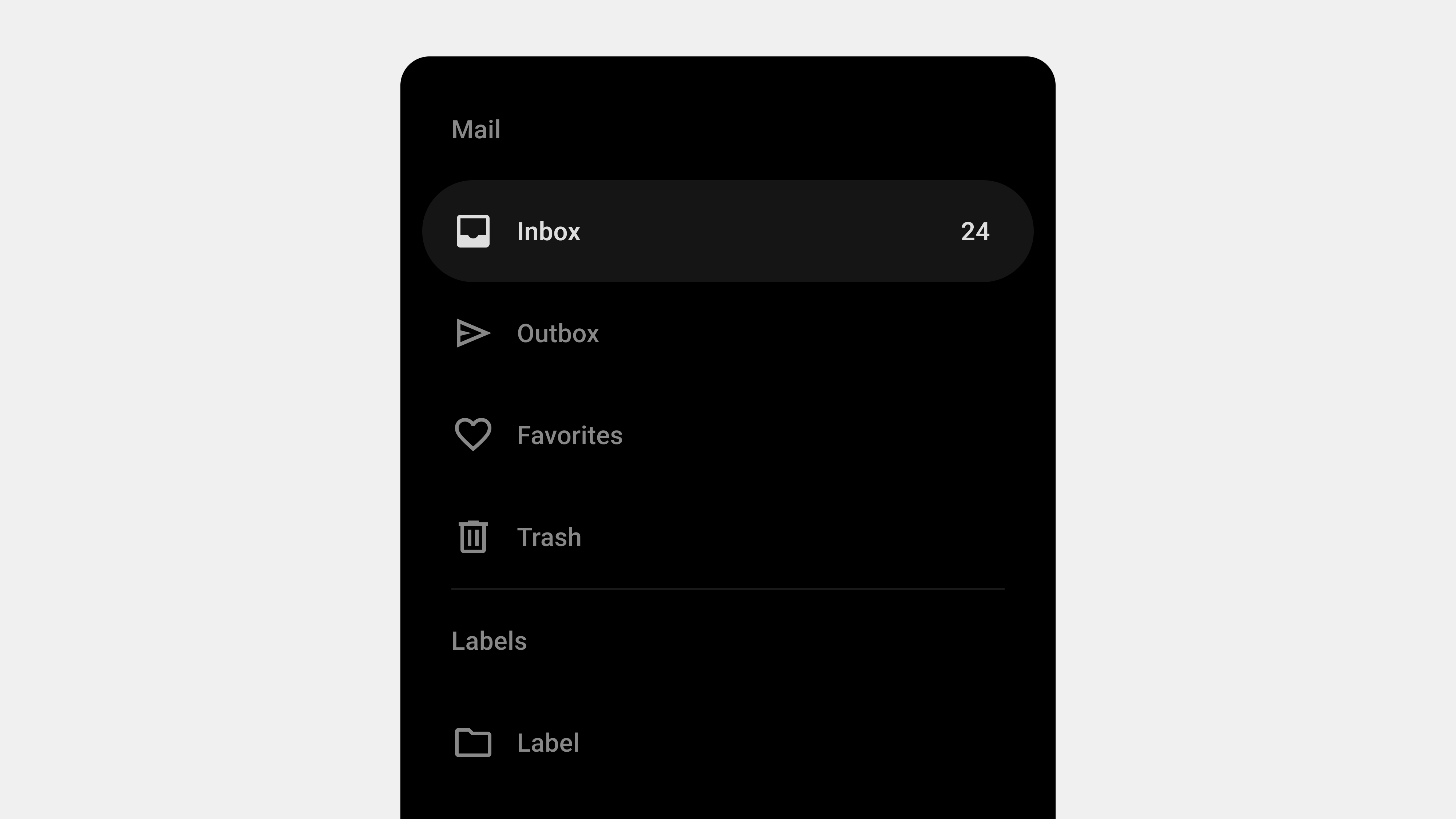
Navigation drawers are collapsible side panels used in digital interfaces to organize and provide access to navigation elements. They are particularly popular in mobile and web applications due to their ability to save space while maintaining functionality.
Key Features
- Expandable and Collapsible: Hidden by default and activated via gestures or buttons.
- Space Efficient: Keeps the interface clean by storing secondary options.
- Scalable: Handles large or hierarchical navigation structures effectively.
Primary Role
Navigation drawers serve as a tool for organizing content, enabling users to navigate complex interfaces with ease.
2. Designing Navigation Drawers: User-Centered Best Practices
Creating an effective navigation drawer begins with a focus on the user. The design must prioritize simplicity, accessibility, and responsiveness.
Key Considerations
- Clarity and Simplicity: Use clear, concise labels and group related items logically.
- Accessibility: Ensure compatibility with screen readers, keyboard navigation, and focus management.
- Responsive Design: Adapt layouts for mobile, tablet, and desktop devices.
- Feedback and Cues: Highlight active states, provide visual feedback, and use smooth animations.
- Scalability: Design for future growth, accommodating new features seamlessly.
UX Writing for Navigation Drawers
Labels play a vital role in user experience. Clear and action-oriented labels such as “Profile” or “Track Order” align with user expectations, improving navigation efficiency.
3. Types of Navigation Drawers
Navigation drawers come in various forms, each tailored to specific use cases.
Primary Types
- Standard (Temporary): Hidden by default and overlays the main content. Ideal for mobile apps.
- Persistent: Always visible alongside the content, suitable for larger screens.
- Mini Variant: Collapsible design showing only icons when closed.
- Bottom Drawer: Slides up from the bottom, optimized for mobile ergonomics.
- Modal Drawer: Focused interaction with a dimmed background for emphasis.
Each type addresses different user needs, balancing space efficiency and usability.
4. Developing and Publishing Navigation Drawers
Key Development Considerations
- Performance Optimization: Use lazy loading, CSS transitions, and minimize JavaScript dependencies.
- Dynamic Content Handling: Fetch content dynamically and handle errors gracefully.
- Responsiveness: Implement layouts that adapt seamlessly to various screen sizes and devices.
- Cross-Platform Compatibility: Test the drawer on all major browsers and devices to ensure consistent performance.
- Accessibility Compliance: Incorporate ARIA roles, focus management, and keyboard navigation.
Tips for Developers
- Use semantic HTML for better screen reader support.
- Test gestures and interactions on both mobile and desktop devices.
5. QA Testing for Navigation Drawers
Quality assurance ensures that navigation drawers function reliably across all scenarios.
Focus Areas
- Functional Testing: Validate all links, buttons, and dropdowns.
- Performance Testing: Measure response times for opening, closing, and loading dynamic content.
- Accessibility Testing: Ensure compatibility with assistive technologies like screen readers.
- Error Handling: Test fallback behaviors for broken links or failed API requests.
- Cross-Browser and Device Testing: Verify consistency across devices, orientations, and browsers.
Tools for QA
- Lighthouse: For performance and accessibility audits.
- BrowserStack: For cross-browser and device testing.
- Axe Accessibility Checker: For in-depth accessibility testing.
6. Combining Design, Development, and QA
The success of a navigation drawer relies on the collaboration between designers, developers, and QA teams. Each role contributes to the process:
- Designers focus on creating intuitive layouts and labels.
- Developers implement responsive, scalable, and accessible code.
- QA Teams ensure functionality, usability, and reliability through rigorous testing.
By aligning efforts across these teams, you can create navigation drawers that not only meet user expectations but also drive engagement and satisfaction.
Conclusion
Navigation drawers are more than just a functional component—they are a strategic tool for organizing content and enhancing user experiences. From their design and development to rigorous QA testing, each step in the process requires attention to detail and user-centric thinking. By following the principles and best practices outlined in this guide, you can create navigation drawers that are intuitive, accessible, and scalable, ensuring long-term success for your applications.
