[태그:] service planning

  • Menu – 6. Wireframe

    Menu – 6. Wireframe

    Key Considerations for Creating Menu Wireframes: A Comprehensive Guide

    When designing menus for applications or websites, wireframes serve as the blueprint that guides the entire development process. A well-constructed wireframe ensures that menus meet user expectations, adhere to design principles, and function seamlessly across platforms. This guide explores the five most important considerations when creating menu wireframes, tailored for designers, publishers, developers, and QA specialists.


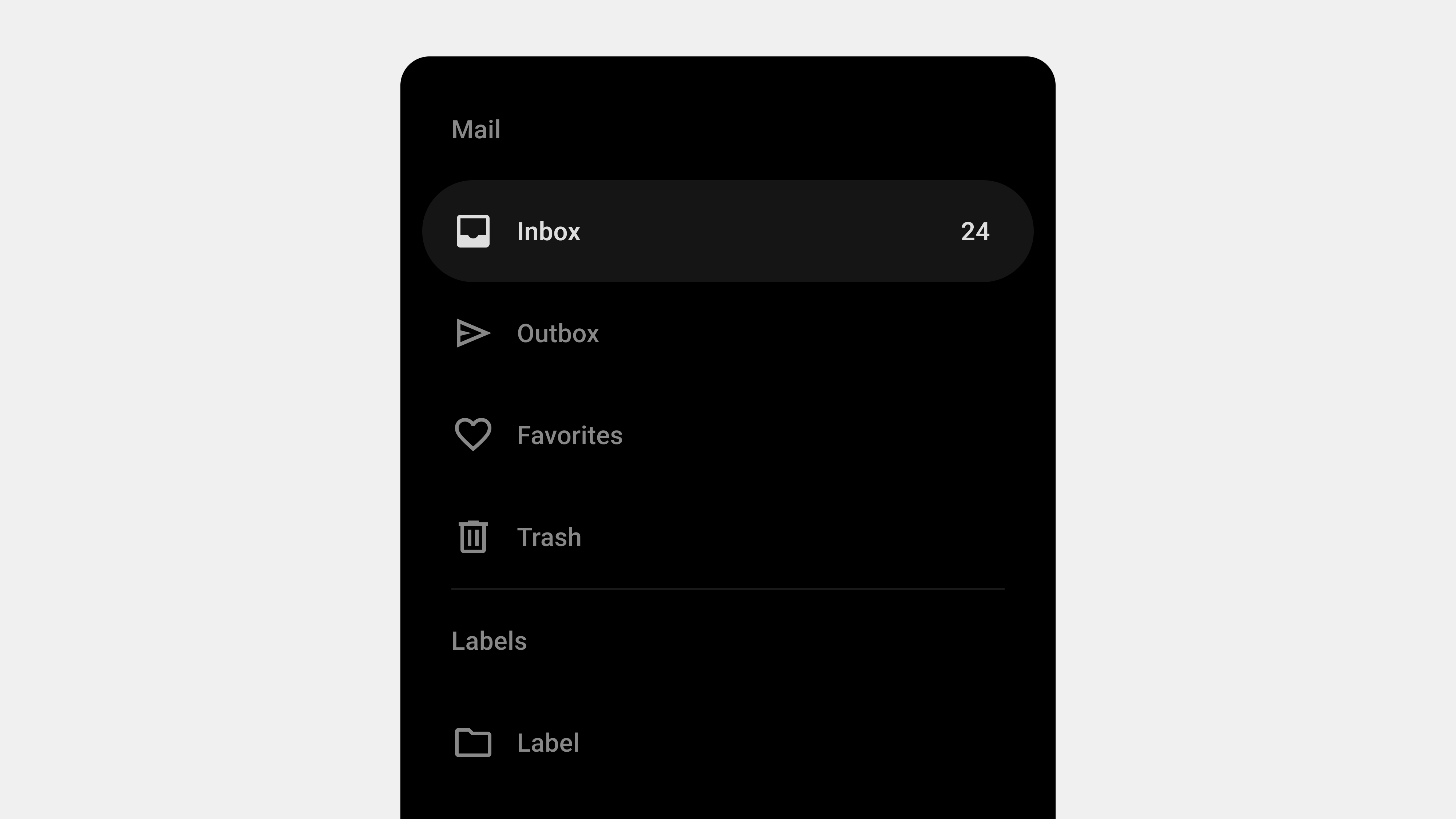
    1. Prioritizing Simplicity and Clarity

    Why It Matters

    Menus are essential for navigation, and overly complex designs can overwhelm users. Simple and clear menus enhance usability and reduce cognitive load.

    Key Steps

    • Limit Options: Include only the most essential items in the main menu. Secondary options can go into submenus.
    • Use Familiar Labels: Avoid jargon and ensure labels are intuitive and descriptive.
    • Organize Logically: Group related items together using categories or sections.

    Wireframe Considerations

    • Highlight the main menu items in bold or prominent colors.
    • Use visual dividers to separate groups for better readability.
    • Annotate wireframes with explanations for grouping and prioritization.

    Tips for Stakeholders

    • Designers: Use consistent typography and spacing to improve readability.
    • Publishers: Ensure text labels are concise and do not truncate on smaller screens.
    • Developers: Implement scalable layouts that adapt to different devices.
    • QA: Test navigation flows to ensure users can easily find items.

    2. Ensuring Responsive Design

    Why It Matters

    Menus must function seamlessly across devices, from mobile phones to large desktop screens. A responsive menu design guarantees accessibility for all users.

    Key Steps

    • Mobile-First Design: Design menus for smaller screens first and scale up for larger devices.
    • Adaptive Layouts: Use collapsible menus (e.g., hamburger menus) for mobile devices.
    • Flexible Grids: Arrange menu items dynamically to accommodate varying screen sizes.

    Wireframe Considerations

    • Include variations for mobile, tablet, and desktop views.
    • Use placeholder text to simulate real content and identify layout issues.
    • Annotate breakpoints for screen size transitions.

    Tips for Stakeholders

    • Designers: Use touch-friendly targets for mobile wireframes.
    • Publishers: Verify that text remains legible at all sizes.
    • Developers: Implement CSS media queries to ensure layouts adapt responsively.
    • QA: Test menus on devices with different screen resolutions and orientations.

    3. Supporting Accessibility

    Why It Matters

    Accessible menus ensure inclusivity and compliance with legal standards. They make navigation possible for users with disabilities.

    Key Steps

    • Keyboard Navigation: Ensure menus can be navigated using only a keyboard.
    • Screen Reader Support: Add ARIA roles and attributes for screen readers.
    • Contrast and Font Size: Use high-contrast colors and readable font sizes for menu items.

    Wireframe Considerations

    • Highlight focus states and active states in the wireframe for keyboard navigation.
    • Annotate the wireframe with ARIA roles and accessibility guidelines.
    • Specify contrast ratios to meet WCAG standards.

    Tips for Stakeholders

    • Designers: Ensure wireframes include clear focus indicators.
    • Publishers: Test contrast levels to ensure text is readable.
    • Developers: Use semantic HTML and ARIA attributes for better accessibility.
    • QA: Test menus with assistive technologies like screen readers.

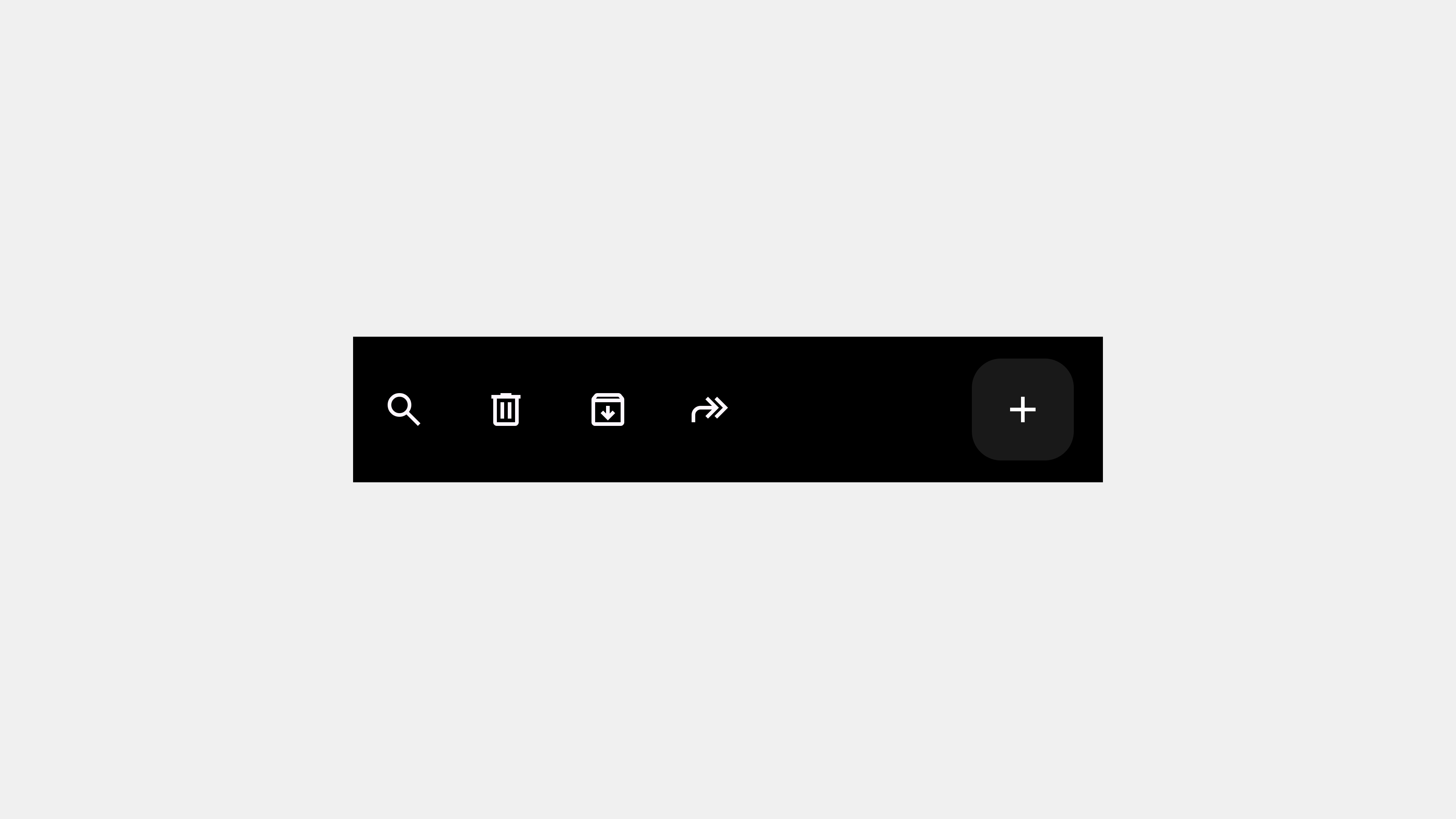
    4. Providing Visual Feedback and Interactivity

    Why It Matters

    Menus should offer visual and interactive feedback to guide users and confirm their actions. This improves navigation confidence and reduces errors.

    Key Steps

    • Hover Effects: Use visual cues like highlights or underlines to indicate clickable items.
    • Active State Indicators: Show the user’s current location within the menu.
    • Transitions and Animations: Use subtle animations for dropdowns and submenus.

    Wireframe Considerations

    • Include visual examples of hover, active, and disabled states.
    • Annotate interactions, such as how dropdown menus expand and collapse.
    • Define animation durations and easing for smooth transitions.

    Tips for Stakeholders

    • Designers: Use wireframes to visualize how feedback mechanisms work.
    • Publishers: Ensure animations and transitions are not too distracting.
    • Developers: Implement CSS animations for smooth and lightweight interactions.
    • QA: Test all interactive states, including hover, focus, and active.

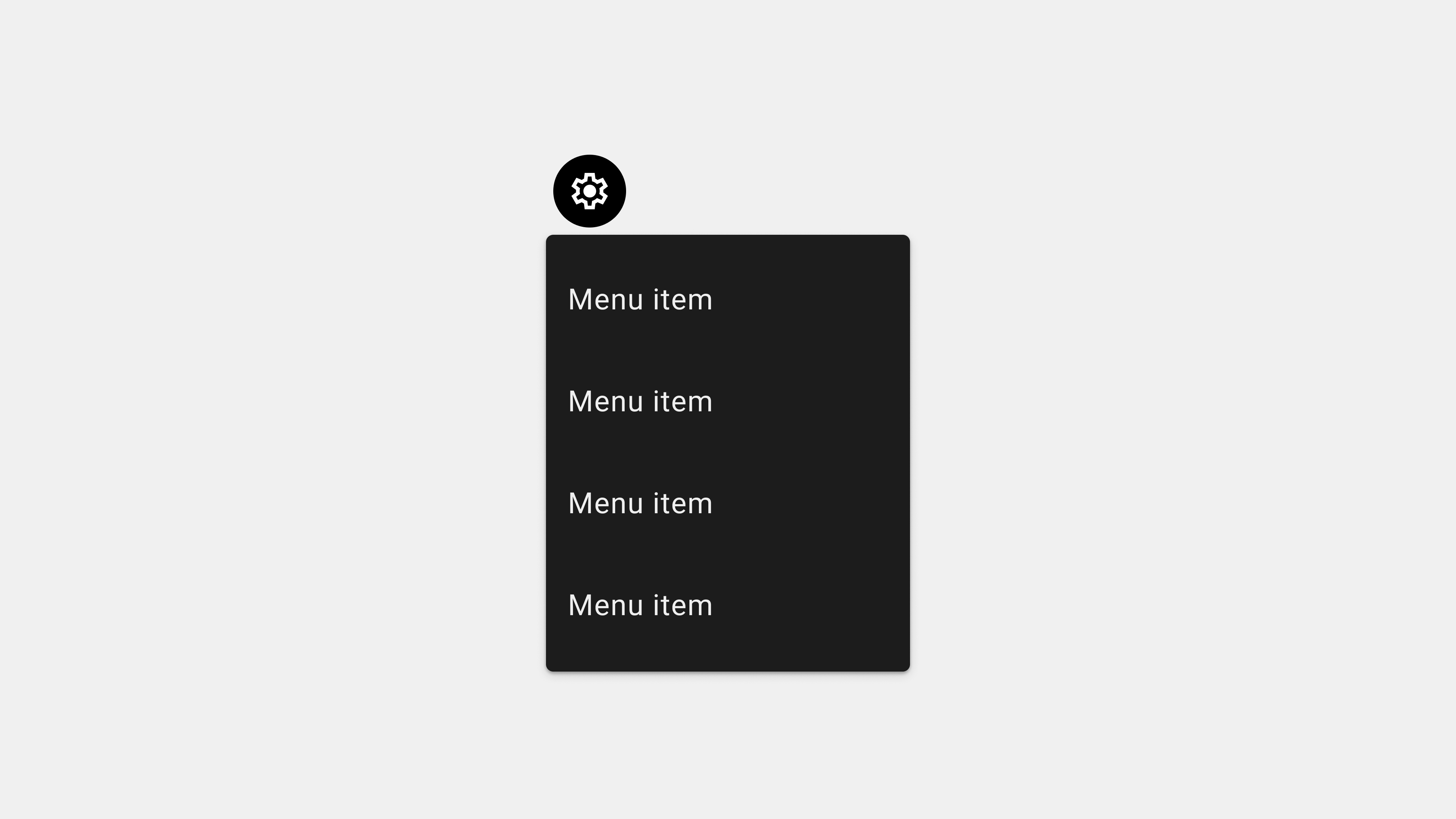
    5. Supporting Scalability and Future Updates

    Why It Matters

    Menus often evolve as applications grow. Designing scalable menus ensures they can accommodate new features without redesigning the entire system.

    Key Steps

    • Flexible Hierarchies: Design menus with expandable categories or submenus.
    • Dynamic Content: Plan for menus that adjust based on user roles or preferences.
    • Overflow Menus: Use “More” or similar options for additional items.

    Wireframe Considerations

    • Highlight placeholders for future items or categories.
    • Annotate scenarios for dynamic content or role-based menus.
    • Include fallback options for overflow menus in the wireframe.

    Tips for Stakeholders

    • Designers: Use modular components in wireframes for easier updates.
    • Publishers: Plan content placement for additional menu items.
    • Developers: Use flexible code structures to accommodate future changes.
    • QA: Test how menus behave when new items are added dynamically.

    Conclusion

    Designing effective menu wireframes requires attention to simplicity, responsiveness, accessibility, interactivity, and scalability. By focusing on these five key areas, designers, publishers, developers, and QA specialists can create menus that enhance usability and meet user needs. Wireframes serve as a collaborative tool, ensuring that every stakeholder understands the design’s intent and works together to deliver a seamless user experience.


  • Menu – 5. Product owner

    Menu – 5. Product owner

    Designing Menus: Meeting User Expectations Through Effective Service Planning

    Menus are central to user interface design, serving as the gateway to content, features, and actions within a system. Users approach menus with specific expectations, and addressing these effectively is crucial for creating seamless and satisfying user experiences. This article explores user expectations for menus and outlines actionable steps service planners can take to meet those expectations.


    1. Understanding User Expectations for Menus

    Users expect menus to be intuitive, efficient, and accessible, allowing them to achieve their goals with minimal effort.

    A. Simplicity and Clarity

    • Expectation: Menus should present options in a clear and organized manner.
    • Details: Users prefer concise labels and logical groupings that eliminate guesswork.

    B. Quick Access to Key Features

    • Expectation: Menus should prioritize essential features for immediate access.
    • Details: Core functionality should be highlighted, while secondary options are nested.

    C. Consistent Navigation

    • Expectation: Menus should behave consistently across all screens and devices.
    • Details: Predictable interactions reduce the learning curve for users.

    D. Accessibility and Inclusivity

    • Expectation: Menus should cater to all users, including those with disabilities.
    • Details: Accessible design ensures usability for diverse user groups.

    E. Visual Feedback and Contextual Awareness

    • Expectation: Menus should provide feedback on user actions and indicate their current location.
    • Details: Highlighting active items and smooth transitions enhance navigation clarity.

    2. Actions Service Planners Should Take

    To align menu design with user expectations, service planners must adopt a user-centered approach.

    A. Conduct User Research

    Understanding user needs and behaviors is foundational to designing effective menus.

    Steps to Take

    • Surveys and Interviews: Gather insights on user preferences and pain points.
    • Analytics Tools: Analyze navigation patterns to identify frequently used features.
    • Competitor Analysis: Study successful menu designs in similar systems.

    Outcome

    A prioritized list of features and menu items that align with user expectations.


    B. Prioritize Simplicity and Usability

    A cluttered menu confuses users and reduces efficiency.

    Steps to Take

    • Limit Options: Focus on 5-7 primary menu items to avoid overwhelming users.
    • Logical Grouping: Organize related items into categories or submenus.
    • Descriptive Labels: Use clear, action-oriented language that users understand.

    Outcome

    A menu that is easy to navigate and helps users achieve their goals quickly.


    C. Design for Accessibility

    Menus must be inclusive and usable by all users, including those with disabilities.

    Steps to Take

    • Screen Reader Support: Add ARIA labels and roles for accessibility tools.
    • Keyboard Navigation: Ensure menus can be navigated without a mouse.
    • High-Contrast Design: Use colors and text that meet WCAG guidelines.

    Outcome

    A menu that complies with accessibility standards and enhances usability for all users.


    D. Provide Visual Feedback and Context

    Users need feedback to understand their current location and the results of their actions.

    Steps to Take

    • Active State Indicators: Highlight the current menu item with color or bold text.
    • Smooth Transitions: Use animations to indicate changes in the menu state.
    • Breadcrumb Navigation: Show users their navigation path for better orientation.

    Outcome

    A menu that builds user confidence and reduces navigation errors.


    E. Test and Iterate

    Continuous testing ensures that the menu meets user needs and adapts to feedback.

    Steps to Take

    • Usability Testing: Observe users interacting with the menu to identify pain points.
    • A/B Testing: Compare different menu designs to determine the most effective layout.
    • Feedback Mechanisms: Encourage users to report issues or suggest improvements.

    Outcome

    A refined menu design that evolves with user expectations and behaviors.


    3. Addressing Common Challenges in Menu Design

    A. Overcrowded Menus

    Problem: Too many options can overwhelm users.
    Solution: Prioritize essential features and group secondary options into submenus.

    B. Ambiguous Labels

    Problem: Vague or unclear labels confuse users.
    Solution: Use descriptive, familiar language aligned with user expectations.

    C. Poor Accessibility

    Problem: Menus that are not accessible exclude users with disabilities.
    Solution: Test menus with assistive technologies and ensure compliance with accessibility standards.


    4. Examples of User-Centric Menus

    A. Amazon (E-Commerce)

    • Why It Works: Uses a mega menu to organize extensive product categories, ensuring quick navigation.
    • Features: Clear labels, logical groupings, and predictive search.

    B. Google Drive (Productivity App)

    • Why It Works: Contextual menus provide task-specific options like “Share” or “Rename,” reducing clutter.

    C. Spotify (Streaming App)

    • Why It Works: A bottom navigation bar highlights core features like “Home,” “Search,” and “Library.”

    Conclusion

    Menus are a critical element of UI/UX design, and meeting user expectations requires careful planning, research, and iteration. By focusing on simplicity, accessibility, and usability, service planners can create menus that enhance navigation and overall user satisfaction. Regular testing and feedback loops ensure that menus remain aligned with evolving user needs.


  • Tab bar – 5. Product Owner

    Tab bar – 5. Product Owner

    Designing Tab Bars: Meeting User Expectations Through Service Planning

    Tab bars are a core navigation component in applications, offering users a simple way to switch between primary features. For service planners, understanding user expectations and designing tab bars to meet those needs is essential. This article explores what users expect from tab bars and outlines actionable steps for service planners to create intuitive and effective designs.


    1. User Expectations for Tab Bars

    When users interact with tab bars, they bring specific expectations based on their previous experiences with similar interfaces.

    A. Simplicity and Clarity

    • Expectation: Users want tabs to be straightforward and easy to understand.
    • Details: Tabs should be clearly labeled with intuitive icons and text that describe their purpose.
    • Why It Matters: Ambiguous or cluttered tabs can confuse users and hinder navigation.

    B. Quick and Consistent Access

    • Expectation: Users expect the tab bar to be always accessible and consistent across all screens.
    • Details: The tab bar should remain visible and provide immediate access to primary features.
    • Why It Matters: Hidden or inconsistent navigation disrupts user workflows.

    C. Feedback and Contextual Awareness

    • Expectation: Users rely on visual cues to understand their current location within the app.
    • Details: Highlighting the active tab with color changes, bold text, or underlines reassures users.
    • Why It Matters: Feedback reduces cognitive load and helps users navigate confidently.

    D. Ergonomic and Accessible Design

    • Expectation: Users want tab bars to be easy to reach and use, especially on mobile devices.
    • Details: Tabs should be within thumb reach and include accessible features like screen reader support.
    • Why It Matters: Poor ergonomics or lack of accessibility alienates users and diminishes usability.

    2. Responsibilities of Service Planners

    To meet these expectations, service planners must adopt a user-centric approach and focus on creating intuitive, accessible, and scalable tab bar designs.

    A. Conduct User Research

    • Why It Matters: Understanding user behavior and needs ensures the tab bar aligns with their expectations.
    • Actions to Take:
      • Observe how users navigate similar interfaces.
      • Conduct surveys or interviews to identify pain points and preferences.
      • Analyze heatmaps or navigation metrics to prioritize tabs.

    B. Design for Clarity and Simplicity

    • Why It Matters: Clear and concise tabs reduce cognitive load and improve discoverability.
    • Actions to Take:
      • Limit the number of tabs to 3-5 core features.
      • Pair icons with descriptive labels.
      • Group secondary features under an overflow menu if necessary.

    C. Ensure Consistent and Persistent Navigation

    • Why It Matters: Consistency builds trust and familiarity, enhancing user satisfaction.
    • Actions to Take:
      • Keep the tab bar visible across all screens.
      • Use consistent icons, labels, and active states throughout the app.
      • Test the tab bar on different devices to ensure responsive behavior.

    D. Prioritize Accessibility and Ergonomics

    • Why It Matters: Inclusive design ensures the app is usable by all users, including those with disabilities.
    • Actions to Take:
      • Optimize tab sizes for touch interactions and thumb reach.
      • Add ARIA roles and labels for screen reader compatibility.
      • Test color contrast to meet WCAG standards.

    E. Iterate and Test Designs

    • Why It Matters: Continuous testing and iteration ensure the tab bar remains effective as user needs evolve.
    • Actions to Take:
      • Use A/B testing to compare different tab designs.
      • Gather user feedback to identify areas for improvement.
      • Monitor analytics to evaluate the performance of individual tabs.

    3. Examples of User-Centric Tab Bar Design

    A. E-Commerce App

    • Design: Tabs for “Shop,” “Categories,” “Cart,” “Orders,” and “Profile.”
    • User Expectation Met: Quick access to shopping and order management.

    B. Social Media App

    • Design: Tabs for “Feed,” “Search,” “Reels,” “Notifications,” and “Profile.”
    • User Expectation Met: Consistent access to key content creation and discovery features.

    C. Fitness App

    • Design: Tabs for “Dashboard,” “Workouts,” “Progress,” and “Profile.”
    • User Expectation Met: Simplified navigation for tracking fitness goals.

    4. Common Pitfalls and How to Avoid Them

    A. Overcrowding Tabs

    • Pitfall: Adding too many tabs overwhelms users and reduces clarity.
    • Solution: Prioritize primary features and use an overflow menu for less critical options.

    B. Ambiguous Labels or Icons

    • Pitfall: Vague or unclear labels confuse users.
    • Solution: Use descriptive text and universally recognized icons.

    C. Inconsistent Behavior

    • Pitfall: Tabs behave differently across screens, creating confusion.
    • Solution: Maintain consistent functionality and visual design.

    D. Ignoring Accessibility

    • Pitfall: Failing to support screen readers or keyboard navigation excludes users.
    • Solution: Follow accessibility guidelines and test with assistive technologies.

    Conclusion

    Designing tab bars from a user’s perspective requires a deep understanding of their needs and expectations. By prioritizing simplicity, accessibility, consistency, and feedback, service planners can create tab bars that enhance usability and improve overall user satisfaction. Incorporating user research and iterative testing ensures that the tab bar evolves to meet changing demands, making it an indispensable navigation tool.


  • Bottom Navigation Bars – Product Owner 1

    Bottom Navigation Bars – Product Owner 1

    Designing Bottom Navigation Bars: Meeting User Expectations

    Bottom navigation bars are a critical component of mobile app design, providing users with quick and intuitive access to an app’s key features. Users approach these navigation systems with certain expectations, and service planners must align design and functionality with these expectations to enhance user experience. This article explores what users expect from bottom navigation bars and outlines actionable steps service planners can take to meet these needs effectively.


    1. User Expectations for Bottom Navigation Bars

    Users interact with bottom navigation bars based on their prior experiences with similar apps, forming specific expectations about their functionality and design.

    A. Simplicity and Clarity

    • Expectation: Users expect bottom navigation bars to be straightforward and easy to understand.
    • Details: Tabs should have clear labels and intuitive icons that reflect their purpose.
    • Why It Matters: Overcomplicated or unclear navigation systems can frustrate users and reduce engagement.

    B. Quick Access to Core Features

    • Expectation: Users want to access an app’s primary features quickly and directly.
    • Details: Tabs should provide shortcuts to key sections without requiring additional steps.
    • Why It Matters: Reduces the time users spend navigating, improving overall satisfaction.

    C. Consistency Across Screens

    • Expectation: Users expect the navigation bar to remain consistent throughout their app experience.
    • Details: The bar should maintain the same design and functionality across all screens.
    • Why It Matters: Builds familiarity and trust, making navigation predictable.

    D. Feedback and Contextual Awareness

    • Expectation: Users rely on feedback to understand their current location within the app.
    • Details: Active tabs should be visually distinct, and transitions should be smooth.
    • Why It Matters: Helps users stay oriented and reduces cognitive load.

    E. Accessibility and Ease of Use

    • Expectation: Navigation should be accessible to all users, including those with disabilities.
    • Details: Tabs should be touch-friendly, screen reader-compatible, and visually clear.
    • Why It Matters: Inclusive design ensures that all users can navigate the app effectively.

    2. Responsibilities of Service Planners

    To meet user expectations, service planners must adopt a user-centric approach when designing bottom navigation bars.

    A. Conduct User Research

    • Why It Matters: Understanding user behavior and preferences ensures that the navigation design aligns with their needs.
    • Actions to Take:
      • Conduct surveys or interviews to gather insights into user navigation habits.
      • Analyze competitor apps to identify successful navigation patterns.
      • Use analytics tools to track user interactions with existing navigation systems.

    B. Focus on Simplicity and Prioritization

    • Why It Matters: A cluttered navigation bar can overwhelm users and reduce usability.
    • Actions to Take:
      • Limit the number of tabs to 3-5 to avoid overcrowding.
      • Prioritize core features that users interact with most frequently.
      • Group less important features into an overflow menu.

    C. Design for Accessibility

    • Why It Matters: Inclusive design ensures a positive experience for all users.
    • Actions to Take:
      • Add ARIA labels and roles for screen reader compatibility.
      • Test navigation bars with assistive technologies like VoiceOver or NVDA.
      • Ensure sufficient contrast between text/icons and the background.

    D. Provide Clear Feedback and Visual Cues

    • Why It Matters: Users need clear indicators to understand their current location and navigation progress.
    • Actions to Take:
      • Highlight active tabs using distinct colors, bold text, or underlines.
      • Use subtle animations to provide feedback during transitions.
      • Ensure hover and focus states are visually apparent for desktop and web apps.

    E. Iterate and Test Designs

    • Why It Matters: Iterative testing ensures that the navigation bar meets user needs and adapts to feedback.
    • Actions to Take:
      • Use A/B testing to compare different navigation designs.
      • Gather user feedback through usability testing sessions.
      • Continuously analyze navigation metrics to identify areas for improvement.

    3. Common Challenges and Solutions

    A. Overcrowding Tabs

    Challenge: Adding too many tabs makes navigation overwhelming and confusing.
    Solution: Prioritize the most critical features and use an overflow menu for secondary options.

    B. Misaligned Labels or Icons

    Challenge: Ambiguous labels or icons can confuse users about the purpose of a tab.
    Solution: Use familiar language and universally recognized icons to ensure clarity.

    C. Inconsistent Behavior Across Screens

    Challenge: Tabs behaving differently on different screens disrupts user flow.
    Solution: Maintain consistent functionality and design for the navigation bar throughout the app.


    4. Practical Examples of Effective Bottom Navigation Bars

    A. Social Media App

    • Tabs: Home, Search, Notifications, Profile.
    • Design Elements: Clear labels, consistent placement, and active state indicators.

    B. E-Commerce App

    • Tabs: Shop, Categories, Cart, Orders, Account.
    • Design Elements: Prominent icons, concise labels, and a touch-friendly layout.

    C. Productivity Tool

    • Tabs: Dashboard, Calendar, Tasks, Messages, Settings.
    • Design Elements: Adaptive tabs that highlight active states and offer quick feedback.

    Conclusion

    Designing bottom navigation bars from a user’s perspective requires a deep understanding of their expectations and behaviors. By focusing on simplicity, accessibility, consistency, and feedback, service planners can create navigation systems that meet user needs and enhance overall satisfaction. Regular testing and iteration ensure the design remains effective, adaptable, and user-friendly.


  • Navigation Drawers – Product Owner 1

    Navigation Drawers – Product Owner 1

    Designing Navigation Drawers: User Expectations and Service Planner’s Responsibilities

    Navigation drawers have become a staple in modern UI/UX design, offering a compact and efficient way for users to navigate applications. However, creating an effective navigation drawer requires understanding user expectations and aligning design and functionality to meet those needs. This article explores user expectations for navigation drawers and outlines the key responsibilities of service planners to ensure these expectations are met.


    1. User Expectations for Navigation Drawers

    Users approach navigation drawers with specific expectations about functionality, usability, and accessibility. Meeting these expectations is crucial for creating a positive user experience.

    A. Simplicity and Clarity

    Users expect navigation drawers to provide clear, concise, and well-organized options.

    • What Users Want:
      • Clear labels for menu items.
      • Logical grouping of related items.
      • A clutter-free interface.
    • Why It Matters:
      Overly complex or ambiguous menus confuse users, leading to frustration and disengagement.

    B. Quick Access to Important Features

    Users rely on navigation drawers to quickly locate and access key features.

    • What Users Want:
      • Frequently used items at the top of the menu.
      • Shortcuts to essential actions.
      • Search functionality for deep navigation.
    • Why It Matters:
      Efficiency is a key factor in retaining user attention, especially in task-oriented applications.

    C. Consistency Across Screens and Platforms

    Navigation drawers should behave predictably and maintain a consistent layout throughout the app.

    • What Users Want:
      • Familiar placement of the toggle button (e.g., top left).
      • Consistent menu structure across devices.
      • Seamless transitions between pages.
    • Why It Matters:
      Consistency reduces cognitive load and helps users build familiarity with the interface.

    D. Accessibility and Usability

    Users expect navigation drawers to be accessible and easy to use, regardless of their abilities or devices.

    • What Users Want:
      • Keyboard and screen reader support.
      • Touch-friendly design for mobile users.
      • High contrast and readable text.
    • Why It Matters:
      Accessibility ensures inclusivity and compliance with global usability standards.

    E. Personalization and Context Awareness

    Modern users value navigation systems that adapt to their needs and preferences.

    • What Users Want:
      • Personalized content or shortcuts based on usage history.
      • Context-aware options tailored to the current screen or task.
      • Clear feedback and visual cues.
    • Why It Matters:
      Personalization enhances user satisfaction and encourages deeper engagement.

    2. Responsibilities of Service Planners

    Service planners play a critical role in bridging user expectations with functional design. By prioritizing user needs and aligning them with business goals, planners can ensure the navigation drawer enhances the overall experience.

    A. Conduct User Research

    Understanding the target audience’s preferences, behaviors, and pain points is essential for designing effective navigation drawers.

    • Actions to Take:
      • Conduct surveys and interviews to identify user priorities.
      • Analyze user flows to determine frequently accessed features.
      • Use heatmaps to observe navigation patterns.
    • Outcome:
      A data-driven understanding of what users need from the navigation drawer.

    B. Create a Logical Information Hierarchy

    Organizing menu items in a logical and intuitive structure is key to meeting user expectations.

    • Actions to Take:
      • Categorize features into primary, secondary, and tertiary levels.
      • Use card sorting techniques to group related items.
      • Prioritize essential actions based on user goals.
    • Outcome:
      A navigation drawer that aligns with user mental models and reduces cognitive load.

    C. Prioritize Accessibility and Inclusivity

    Ensuring that the navigation drawer is accessible to all users is both an ethical and practical responsibility.

    • Actions to Take:
      • Implement ARIA roles and semantic HTML for screen readers.
      • Test keyboard navigation for ease of use.
      • Provide visual focus indicators for better accessibility.
    • Outcome:
      A navigation drawer that is inclusive and compliant with global accessibility standards.

    D. Optimize for Cross-Platform Consistency

    Service planners must ensure that the navigation drawer provides a consistent experience across devices and screen sizes.

    • Actions to Take:
      • Use responsive design principles to adapt the layout for mobile, tablet, and desktop.
      • Maintain consistent menu structures and interactions across platforms.
      • Test performance on different devices to ensure smooth functionality.
    • Outcome:
      A navigation drawer that feels intuitive and reliable, regardless of the device used.

    E. Incorporate Feedback and Iteration

    Continuous improvement is critical for maintaining the effectiveness of navigation drawers over time.

    • Actions to Take:
      • Gather user feedback through surveys and usability testing.
      • Analyze metrics like time to navigate and menu engagement rates.
      • Iterate on the design based on insights and evolving user needs.
    • Outcome:
      A navigation drawer that evolves to meet changing user expectations and business goals.

    Conclusion

    Designing a navigation drawer that meets user expectations requires a deep understanding of their needs and a commitment to delivering intuitive, accessible, and efficient solutions. Service planners must take a user-centered approach, focusing on clarity, consistency, and personalization while ensuring inclusivity and responsiveness. By aligning these principles with actionable strategies, navigation drawers can become a powerful tool for enhancing the user experience.


  • Navigation Bars – Product Owner 1

    Navigation Bars – Product Owner 1

    Designing Navigation Bars: Meeting User Expectations with Strategic Planning

    A navigation bar is often the first interaction point for users when exploring a digital platform. Its design must align with user expectations to ensure a seamless and intuitive experience. From clarity and accessibility to responsiveness and engagement, service planners play a crucial role in creating navigation systems that cater to user needs. This article outlines the key expectations users have when interacting with navigation bars and the essential tasks service planners must address to meet these expectations effectively.


    User Expectations for Navigation Bars

    1. Clarity and Simplicity

    Users expect a navigation bar to be clear and straightforward. They want to understand where each menu item leads without confusion or excessive effort.

    What Users Expect:

    • Intuitive labels with unambiguous meanings.
    • Minimalist design that avoids clutter.
    • Logical grouping of related items.

    Planner’s Action Points:

    • Conduct user research to identify common terminology.
    • Use card sorting techniques to organize menu items effectively.
    • Prioritize key options while minimizing secondary distractions.

    2. Quick Access to Key Features

    Users expect to find critical features or content immediately. They don’t want to hunt through multiple layers of menus to accomplish tasks.

    What Users Expect:

    • Prominent placement of high-priority actions.
    • Easy access to frequently used sections.
    • A search bar for locating specific content.

    Planner’s Action Points:

    • Define primary user goals and prioritize these in the navigation hierarchy.
    • Analyze user behavior data to determine frequently accessed features.
    • Integrate a robust search function for precise results.

    3. Consistency Across Pages and Devices

    Consistency is crucial for building user trust and reducing cognitive load. Users expect the navigation system to behave the same way across all pages and devices.

    What Users Expect:

    • A uniform layout and style throughout the platform.
    • Seamless transitions between devices (responsive design).
    • Familiar patterns that follow industry standards.

    Planner’s Action Points:

    • Develop a design system with reusable components.
    • Ensure responsive design principles are applied across devices.
    • Conduct cross-platform usability testing to maintain uniformity.

    4. Feedback and Visual Cues

    Users expect clear feedback to confirm their actions. Whether they click a menu item or hover over a link, the navigation bar should respond visually or interactively.

    What Users Expect:

    • Highlighted states for active or selected items.
    • Hover and focus indicators for interactive elements.
    • Immediate response to clicks or taps.

    Planner’s Action Points:

    • Incorporate active state indicators for the current page or section.
    • Use animations or transitions to provide visual feedback.
    • Test responsiveness to ensure real-time interactions.

    5. Accessibility for All Users

    Accessibility is not optional—it’s essential. Users expect navigation bars to be inclusive, catering to all abilities and needs.

    What Users Expect:

    • Compatibility with screen readers and assistive technologies.
    • Keyboard-friendly navigation.
    • Proper contrast ratios for text and elements.

    Planner’s Action Points:

    • Follow WCAG (Web Content Accessibility Guidelines) standards.
    • Use ARIA roles and attributes to enhance accessibility.
    • Regularly test the navigation bar with accessibility tools.

    6. Personalization and Context Awareness

    Modern users appreciate navigation systems that adapt to their preferences or current context. Personalized navigation can improve efficiency and engagement.

    What Users Expect:

    • Dynamic content tailored to their preferences or history.
    • Context-aware options that align with current tasks.
    • Recommendations or shortcuts for frequently used sections.

    Planner’s Action Points:

    • Leverage user data to personalize navigation dynamically.
    • Design contextual menus that adapt based on user behavior.
    • Avoid over-complicating personalization—keep it subtle and helpful.

    7. Error Prevention and Recovery

    Users expect navigation systems to be forgiving, allowing them to recover easily from errors.

    What Users Expect:

    • Clear pathways to return to the homepage or previous sections.
    • Prevention of dead-end pages or broken links.
    • Easy undo or redo actions.

    Planner’s Action Points:

    • Include a visible “Home” or “Back” button in the navigation bar.
    • Regularly audit the platform for broken links or errors.
    • Provide clear error messages with actionable solutions.

    Key Responsibilities of a Service Planner

    1. Understand User Needs

    Conduct user interviews, surveys, and usability tests to gain deep insights into what users expect from the navigation bar.

    2. Create User-Centric Navigation Hierarchies

    Design the menu structure based on user goals, ensuring intuitive and logical grouping of content.

    3. Leverage Analytics

    Use behavioral data to identify high-priority actions and optimize the navigation system accordingly.

    4. Prototype and Test

    Develop prototypes to test different navigation designs with real users. Gather feedback to refine the system.

    5. Monitor and Iterate

    Post-launch, monitor user behavior and performance metrics. Regularly update the navigation system to reflect changing user needs and technology trends.


    Conclusion

    Designing navigation bars that align with user expectations requires a balance of empathy, data-driven decision-making, and iterative design. By focusing on clarity, accessibility, and user-centricity, service planners can create navigation systems that enhance usability, foster engagement, and support user goals effectively.