Comprehensive Guide to the Major Types of Menus in UI/UX Design
Menus are essential components of any user interface, serving as navigation hubs that guide users through applications or websites. With various types of menus tailored to different use cases and user needs, understanding their features and applications is critical for effective UI/UX design. This article provides an in-depth look at the major types of menus, their roles, advantages, and best practices.
1. Navigation Menus
Definition
Navigation menus are used to help users move between the primary sections of a website or application.
Key Types
A. Horizontal Navigation Menus
- Description: Typically placed at the top of the page, these menus display links in a single row.
- Use Cases: Ideal for websites or apps with a small number of primary sections.
- Examples: “Home,” “About Us,” “Services,” “Contact.”
B. Vertical Navigation Menus
- Description: Displayed in a column on the left or right side of the screen.
- Use Cases: Suitable for apps or websites with a lot of content, such as dashboards.
- Examples: Admin panels with categories like “Users,” “Settings,” “Reports.”
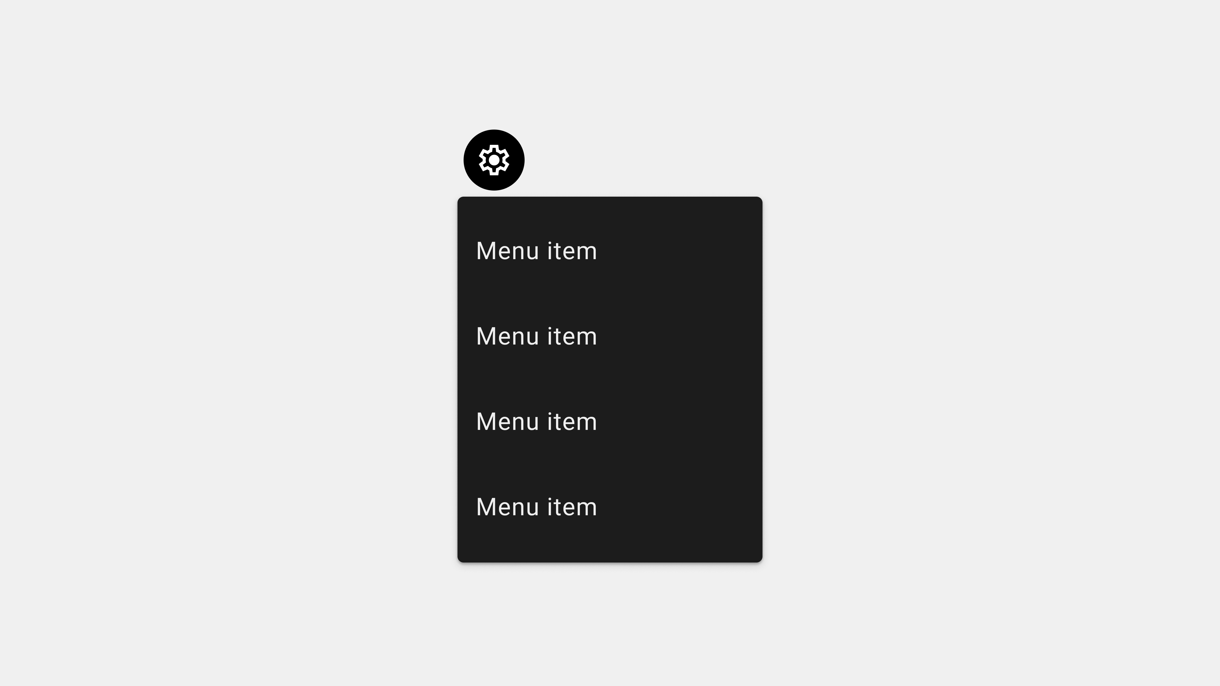
C. Hamburger Menus
- Description: Collapsible menus accessed via a three-line icon.
- Use Cases: Frequently used in mobile apps to save space.
- Examples: Social media apps like Instagram.
2. Dropdown Menus
Definition
Dropdown menus expand vertically or horizontally to reveal additional options when clicked or hovered over.
Types and Use Cases
A. Standard Dropdown Menus
- Description: Simple lists that expand upon interaction.
- Use Cases: Great for organizing options like account settings.
- Examples: “Profile” dropdown with options like “Edit Profile,” “Logout.”
B. Cascading Dropdown Menus
- Description: Submenus appear next to the main dropdown options.
- Use Cases: Useful for hierarchical data.
- Examples: E-commerce sites with categories like “Men > Shoes > Sneakers.”
3. Contextual Menus
Definition
Contextual menus appear dynamically based on the user’s actions, offering relevant options.
Key Features
- Triggered By: Right-clicking on desktops or long-pressing on mobile devices.
- Dynamic Options: Adjusted based on the item or location clicked.
Use Cases
- File management apps like Google Drive, where right-clicking offers “Download,” “Rename,” or “Delete” options.
Advantages
- Reduces clutter by only showing relevant actions.
- Increases efficiency by offering shortcuts.
4. Mega Menus
Definition
Mega menus are large, multi-column menus that display multiple options and subcategories simultaneously.
Use Cases
- E-commerce sites with extensive product categories.
- Educational websites with diverse resources like “Courses,” “Departments,” “Events.”
Advantages
- Provides a comprehensive view of options.
- Reduces the need for deep navigation hierarchies.
Challenges
- Requires careful organization to avoid overwhelming users.
5. Command Menus
Definition
Command menus are used in applications to execute specific actions.
Examples
- Text editors with options like “Cut,” “Copy,” “Paste.”
- Media players with controls like “Play,” “Pause,” “Skip.”
Advantages
- Focuses on task-specific actions.
- Enhances productivity for professional tools.
6. Side Menus
Definition
Side menus slide in from the left or right side of the screen, often triggered by gestures or icons.
Use Cases
- Mobile apps for secondary navigation like “Settings,” “Help,” “Feedback.”
- Social media apps for account options.
Advantages
- Saves space by hiding secondary options.
- Offers a clean and minimalist design.
7. Floating Menus
Definition
Floating menus are overlay menus that appear above other content.
Use Cases
- Quick access to frequently used tools in creative apps.
- Mobile apps with floating action buttons (FABs).
Advantages
- Provides quick access without disrupting the user’s current context.
- Enhances multitasking.
8. Tab Menus
Definition
Tab menus use tabs to divide content into multiple views, with each tab representing a section.
Use Cases
- Mobile apps like Instagram, with tabs for “Home,” “Search,” “Reels,” and “Profile.”
- Desktop apps like browsers with tabs for multiple webpages.
Advantages
- Keeps navigation consistent across sections.
- Allows easy switching between tasks.
9. Footer Menus
Definition
Footer menus are located at the bottom of a webpage or app, providing access to supplementary content.
Use Cases
- Websites for links to “Privacy Policy,” “Terms of Service,” “Contact.”
- Mobile apps for persistent navigation options.
Advantages
- Offers non-intrusive access to secondary content.
- Ensures visibility without cluttering the main interface.
10. Inline Menus
Definition
Inline menus are embedded within the content, allowing users to select options directly.
Use Cases
- Survey forms with dropdowns for selecting responses.
- Rich text editors with inline formatting options.
Advantages
- Keeps users focused on the task by minimizing navigation.
- Simplifies workflows for inline tasks.
Best Practices for Choosing the Right Menu Type
A. Understand User Needs
- Identify the user’s primary tasks and navigation goals.
- Choose a menu type that aligns with their workflow.
B. Test Menu Usability
- Conduct A/B testing to determine the most effective menu type.
- Gather feedback from real users to refine the design.
C. Ensure Accessibility
- Design menus that are keyboard-navigable and screen reader-compatible.
- Use sufficient contrast and clear labels for all menu options.
Conclusion
Menus are the backbone of navigation in UI/UX design, with each type serving distinct purposes and use cases. From simple dropdowns to expansive mega menus, understanding the strengths and challenges of each type helps create interfaces that enhance usability and user satisfaction. By choosing the right menu type for your application and adhering to best practices, you can ensure a seamless and intuitive user experience.