Designing User-Centric Menus: 5 Critical Considerations
Menus are a fundamental aspect of user interface design, guiding users through an app or website and helping them accomplish their goals. Designing menus with a user-centered approach ensures they are intuitive, accessible, and aligned with user needs. This article explores the five most important considerations for creating user-centric menus and offers actionable insights for designers and developers.
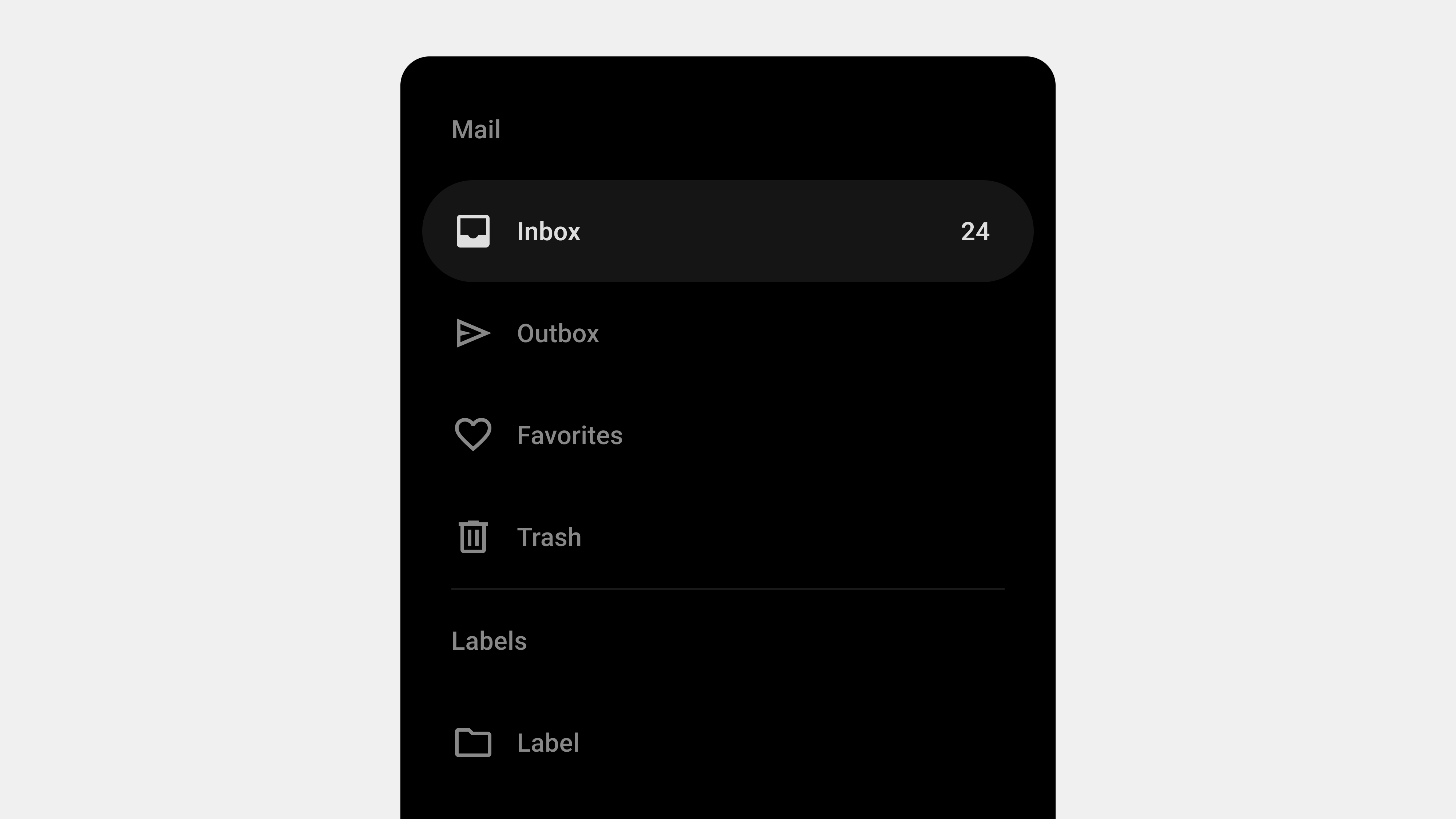
1. Simplicity and Clarity
Why It Matters
A simple and clear menu allows users to find what they need quickly and without confusion. Overly complex menus can overwhelm users and hinder navigation.
Key Strategies
- Limit Menu Options: Include only essential items to avoid clutter.
- Use Descriptive Labels: Ensure menu labels are concise and clearly indicate their function.
- Organize Logically: Group related items and arrange them in a logical order.
Practical Example
In an e-commerce app, primary categories like “Home,” “Shop,” “Cart,” and “Profile” should be clearly labeled and easy to access. Subcategories, such as “Electronics” or “Clothing,” can be placed in dropdown menus.
Tips for Designers
- Use bold or distinct typography to emphasize key menu items.
- Avoid abbreviations or jargon that may confuse users.
- Test menu layouts with users to identify potential confusion points.
2. Accessibility
Why It Matters
Accessible menus ensure that all users, including those with disabilities, can navigate the app or website effectively. This not only improves usability but also complies with legal accessibility standards.
Key Strategies
- Keyboard Navigation: Design menus that can be navigated using only a keyboard.
- Screen Reader Support: Add ARIA roles and labels to make menus compatible with assistive technologies.
- High-Contrast Design: Use colors that provide sufficient contrast for readability.
Practical Example
In a productivity app, ensure that keyboard users can tab through all menu items and that screen readers announce each option accurately, such as “File menu, 3 items, Save, Open, Close.”
Tips for Designers
- Test menus with screen readers like VoiceOver or NVDA.
- Use WCAG (Web Content Accessibility Guidelines) as a standard for design.
- Include visible focus indicators to show where the user is navigating.
3. Responsiveness and Device Compatibility
Why It Matters
With users accessing apps and websites on various devices, menus must adapt seamlessly to different screen sizes and input methods.
Key Strategies
- Mobile-First Design: Prioritize designs for smaller screens and scale up for larger devices.
- Responsive Layouts: Use collapsible menus (e.g., hamburger menus) for mobile devices.
- Touch-Friendly Targets: Ensure menu items are large enough to tap easily on mobile screens.
Practical Example
A news website can use a horizontal menu for desktop users and collapse it into a hamburger menu for mobile users, ensuring a consistent experience across devices.
Tips for Designers
- Use breakpoints in design to define how menus adjust at various screen sizes.
- Avoid placing critical menu items too close to screen edges, where accidental taps are common.
- Test menus on a range of devices and orientations (portrait and landscape).
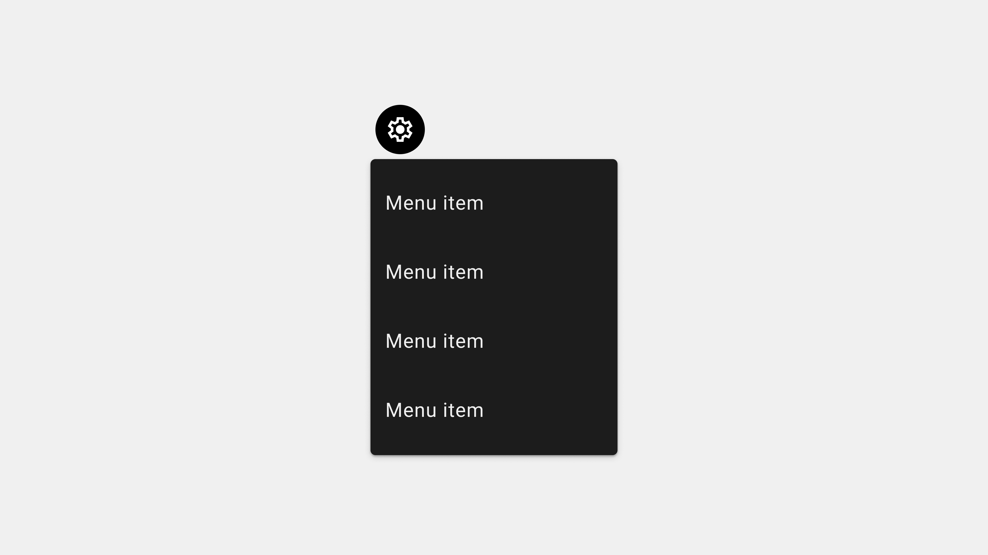
4. Visual Feedback and Interactivity
Why It Matters
Users rely on visual cues and interactive feedback to understand menu functionality and confirm their actions. A lack of feedback can cause confusion and frustration.
Key Strategies
- Hover and Focus States: Highlight menu items when hovered over or focused.
- Active State Indicators: Show the user’s current location with a distinct style for active items.
- Smooth Transitions: Use animations for expanding or collapsing dropdown menus.
Practical Example
A travel app can use a color change or underline effect to indicate the currently selected tab, such as “Bookings.” Dropdown menus can expand smoothly when clicked, giving users a sense of fluidity.
Tips for Designers
- Avoid excessive animations that slow down interactions.
- Use consistent feedback mechanisms across all menu items.
- Highlight errors, such as unavailable menu options, with clear visual cues.
5. Customization and Personalization
Why It Matters
Users value the ability to tailor menus to their preferences, especially in apps with diverse user needs or complex functionalities.
Key Strategies
- User Preferences: Allow users to rearrange or hide menu items based on their needs.
- Dynamic Content: Adjust menus based on user roles or usage history.
- Role-Based Menus: Display different menu options for admin and regular users.
Practical Example
In a project management app, regular users might see tabs like “Tasks” and “Messages,” while admins also have access to “User Management” and “Settings.”
Tips for Designers
- Include a settings option for menu customization.
- Use analytics to identify frequently used menu items and prioritize them.
- Test personalized menus with diverse user groups to ensure relevance.
Conclusion
Designing user-centric menus requires a focus on simplicity, accessibility, responsiveness, interactivity, and personalization. By addressing these five critical areas, designers can create menus that are intuitive, functional, and aligned with user expectations. Regular testing and feedback loops ensure that menus evolve alongside user needs, providing an enhanced and satisfying experience.