[태그:] user experience

  • Menu – 2. Definition

    Menu – 2. Definition

    Exploring the Definition and Role of Menus in UI/UX Design

    Menus are one of the most essential elements in user interface design. They act as the backbone of navigation, enabling users to access content, features, and functionality efficiently. A well-designed menu not only improves usability but also serves as a critical component in delivering a seamless user experience. This article delves deeper into the definition and role of menus, providing insights into their importance and best practices for their design.


    1. What Are Menus in UI/UX Design?

    A menu in the context of UI/UX design is a structured list of options, commands, or features that allow users to interact with a system. Menus act as the primary means of navigation, guiding users through the interface and helping them perform desired tasks.

    Key Characteristics of Menus

    • Hierarchy: Menus often follow a hierarchical structure to organize information.
    • Visibility: They are designed to be easily discoverable and accessible.
    • Functionality: Menus facilitate navigation, settings configuration, and task execution.

    Purpose of Menus

    • To provide users with clear pathways to navigate between different sections of an app or website.
    • To offer shortcuts for executing commands or accessing frequently used features.
    • To reduce cognitive load by organizing options in an intuitive layout.

    2. The Role of Menus in UI/UX Design

    Menus are more than just lists of options; they play a multifaceted role in shaping the user experience.

    A. Organizing Information

    Menus act as a framework for categorizing and presenting content in a logical manner.

    Why It Matters

    • Helps users quickly find what they are looking for.
    • Prevents information overload by grouping related options.

    Example

    E-commerce websites like Amazon use mega menus to categorize products into “Electronics,” “Fashion,” and “Home Essentials,” allowing users to navigate vast inventories easily.


    B. Facilitating Navigation

    Menus guide users to different sections or features of a system.

    Why It Matters

    • Simplifies complex interfaces by providing clear pathways.
    • Reduces the time and effort required to navigate.

    Example

    In a mobile app, a bottom navigation bar menu provides quick access to primary features like “Home,” “Search,” “Notifications,” and “Profile.”


    C. Enhancing Discoverability

    Menus help users uncover features or content they may not have known existed.

    Why It Matters

    • Drives engagement by exposing users to new or less obvious features.
    • Encourages exploration and retention.

    Example

    A hamburger menu in a mobile app might include secondary features like “Help,” “Settings,” or “About Us” that are not immediately visible.


    D. Supporting Task Execution

    Command menus allow users to perform specific actions such as editing, saving, or sharing content.

    Why It Matters

    • Increases efficiency by enabling quick access to tools and functions.
    • Improves user satisfaction by reducing the steps required to complete tasks.

    Example

    In a document editing tool like Google Docs, the “File” menu offers commands like “Save,” “Download,” and “Print,” streamlining productivity.


    E. Enabling Customization and Configuration

    Settings menus allow users to personalize their experience by configuring preferences.

    Why It Matters

    • Enhances user satisfaction by giving them control over the interface.
    • Supports diverse user needs and accessibility requirements.

    Example

    A settings menu in a streaming app allows users to adjust playback quality, manage subscriptions, and configure parental controls.


    3. Key Components of Menus
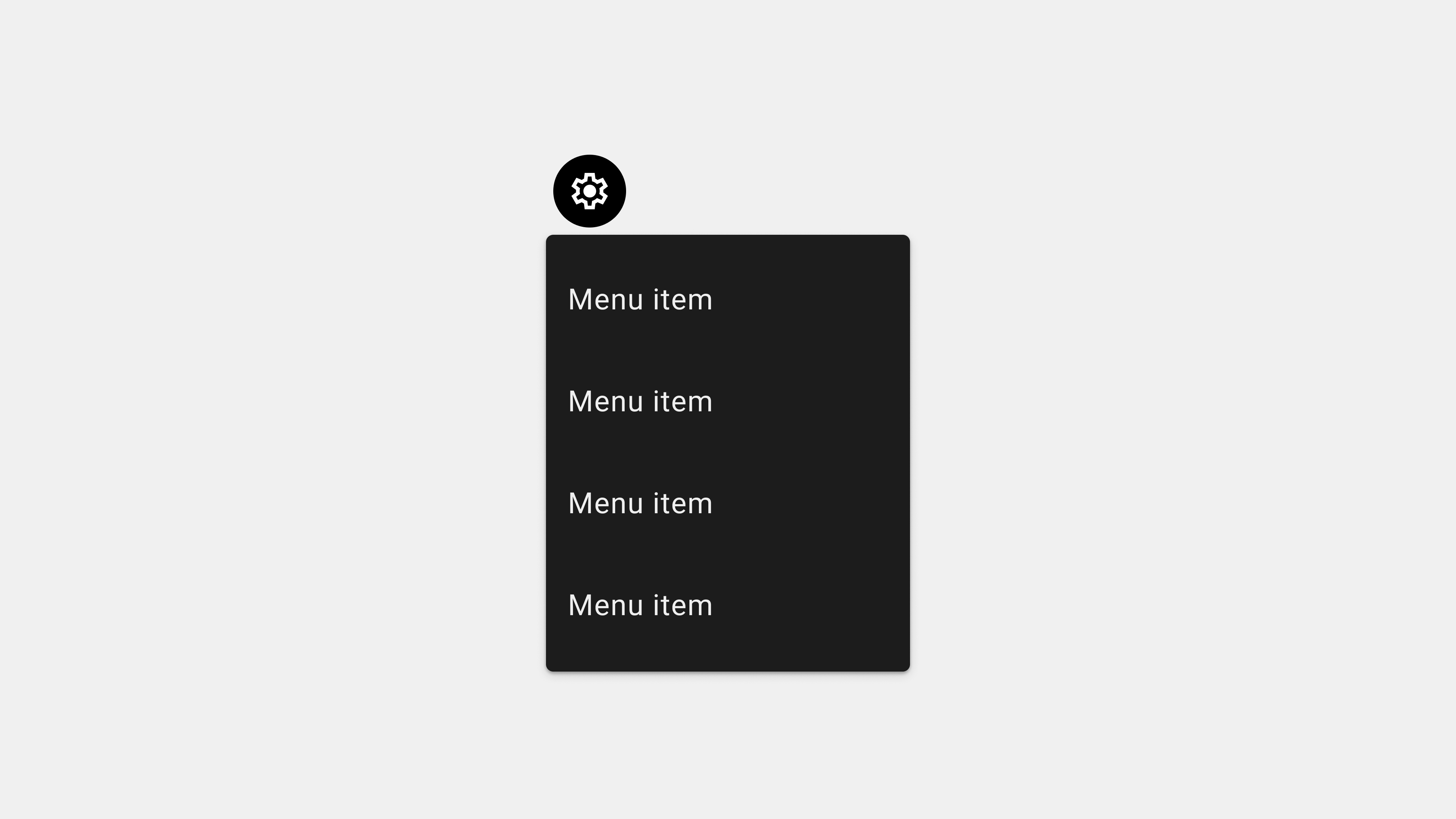
    A. Menu Items

    Each option within a menu is a menu item, representing an action, link, or feature.

    B. Icons and Labels

    Icons visually represent menu items, while labels provide textual descriptions.

    C. Dividers and Grouping

    Menus often use dividers or visual grouping to organize related items, making them easier to scan.

    D. Hierarchical Structure

    Submenus or dropdowns create a nested structure for categorizing complex menus.


    4. Best Practices for Designing Effective Menus

    Creating an effective menu involves balancing usability, functionality, and aesthetics.

    A. Keep It Simple

    • Avoid cluttering menus with too many options.
    • Prioritize the most important features or sections.

    B. Use Clear and Descriptive Labels

    • Ensure that menu labels accurately describe their purpose.
    • Avoid using jargon or ambiguous terms.

    C. Ensure Accessibility

    • Implement ARIA roles for screen reader compatibility.
    • Design menus to be navigable via keyboard.

    D. Optimize for Different Devices

    • Use responsive design to ensure menus work seamlessly on mobile, tablet, and desktop.
    • Implement touch-friendly elements for mobile users.

    E. Provide Feedback and Indicators

    • Highlight the active menu item to show users their current location.
    • Use hover effects, animations, or sound cues to confirm interactions.

    5. Common Types of Menus

    A. Navigation Menus

    Used for moving between sections of an app or website.

    B. Dropdown Menus

    Expand to reveal options when clicked or hovered over.

    C. Contextual Menus

    Appear based on user actions, offering relevant commands.

    D. Mega Menus

    Display multiple categories and subcategories in a large panel.


    6. Challenges in Menu Design

    A. Overcrowding

    Menus with too many options can overwhelm users.
    Solution: Prioritize and group options into submenus.

    B. Ambiguity

    Unclear labels or icons can confuse users.
    Solution: Use familiar language and universally recognized icons.

    C. Accessibility Issues

    Menus that are not screen reader-friendly exclude users with disabilities.
    Solution: Test menus with assistive technologies.


    7. Tools for Designing and Developing Menus

    A. Design Tools

    • Figma: For creating wireframes and prototypes.
    • Adobe XD: For interactive menu designs.

    B. Development Tools

    • React Menu: For implementing dynamic, responsive menus.
    • Bootstrap: For prebuilt components and templates.

    C. Testing Tools

    • Axe Accessibility Checker: For identifying accessibility issues.
    • BrowserStack: For cross-browser testing.

    Conclusion

    Menus are more than just navigation tools; they are pivotal in shaping the overall user experience. By organizing content, facilitating navigation, and supporting task execution, menus empower users to interact with a system effortlessly. Designers and developers must prioritize clarity, accessibility, and responsiveness to create menus that enhance usability and satisfaction.


  • Tab bar – 8. UX Writing

    Tab bar – 8. UX Writing

    UX Writing for Tab Bars: Crafting Clear and User-Friendly Labels

    The effectiveness of a tab bar relies not only on its design but also on the clarity of its labels. Users need to immediately understand what each tab represents to navigate seamlessly. This is where UX writing plays a critical role. By choosing precise, user-centric terminology, we can ensure that tab bars enhance usability and reduce cognitive load. This article delves into the principles and best practices for writing intuitive labels for tab bars in English, with practical examples and actionable tips.


    1. The Role of UX Writing in Tab Bars

    Why UX Writing Matters

    Clear, concise labels in tab bars are essential for helping users understand their options at a glance. Poorly written labels can lead to confusion, frustration, and even abandonment of the app.

    What Makes Good UX Writing for Tab Bars?

    • Clarity: Labels should clearly convey the function of the tab.
    • Consistency: Use consistent terminology across the app.
    • Conciseness: Keep labels short and to the point.
    • Relevance: Ensure labels align with user expectations and app functionality.

    2. Principles of Effective Tab Bar Labels

    A. Use Action-Oriented Terms

    Action-oriented labels help users understand what they can do within each section of the app.

    Examples

    • “Track Order” instead of “Orders” for an e-commerce app.
    • “Start Workout” instead of “Fitness” for a health app.

    Why It Works

    Action-oriented labels align with user goals, making navigation more intuitive.


    B. Prioritize Familiar Language

    Use terms that are widely understood and align with user expectations. Avoid technical jargon or overly creative phrases that may confuse users.

    Examples

    • Use “Search” instead of “Find Stuff.”
    • Use “Profile” instead of “My Space.”

    Why It Works

    Familiar language reduces cognitive load and improves usability.


    C. Maintain Consistency Across the App

    Consistency in terminology ensures users don’t have to relearn terms in different contexts.

    Examples

    • If you use “Cart” in the tab bar, avoid calling it “Basket” elsewhere in the app.
    • Keep “Settings” consistent across all screens.

    Why It Works

    Consistency reinforces familiarity, building user confidence in navigation.


    D. Keep Labels Short and Scannable

    Tab bar labels should be concise, typically no more than one or two words.

    Examples

    • “Home” instead of “Back to Homepage.”
    • “Messages” instead of “Your Message Center.”

    Why It Works

    Short labels are easier to scan, especially on small screens.


    E. Align Labels with User Mental Models

    Understand how users think about the app’s features and use that knowledge to craft intuitive labels.

    Examples

    • In a video app, use “Library” for saved videos instead of “My Collection.”
    • In a travel app, use “Trips” instead of “Itineraries.”

    Why It Works

    Labels that align with user expectations make navigation more intuitive.


    3. Common Tab Bar Categories and Their Optimal Labels

    A. Home and Main Navigation

    • Optimal Labels: Home, Dashboard, Explore.
    • Why It Works: These terms are familiar and clearly convey the starting point.

    B. User Profiles and Accounts

    • Optimal Labels: Profile, Account, Settings.
    • Why It Works: These terms are universally understood for user-specific content.

    C. Content Discovery

    • Optimal Labels: Search, Browse, Discover.
    • Why It Works: These terms clearly indicate exploration functions.

    D. Communication and Interaction

    • Optimal Labels: Messages, Notifications, Chat.
    • Why It Works: These terms align with user expectations for communication features.

    E. Actions and Tasks

    • Optimal Labels: Tasks, Orders, Payments.
    • Why It Works: These labels are direct and task-oriented.

    4. Best Practices for Testing Tab Bar Labels

    A. Conduct Usability Testing

    Test different label options with real users to see which ones resonate most.

    Example

    In an e-commerce app, compare “Orders” vs. “My Orders” to see which users prefer.

    B. Use A/B Testing

    Implement multiple versions of tab labels and track user engagement metrics to determine effectiveness.

    Example

    Test “Search” vs. “Discover” to see which label drives more interactions.

    C. Analyze Navigation Data

    Use analytics to identify which tabs are most and least used, and adjust labels accordingly.

    Example

    If a “Library” tab sees low usage, consider renaming it to “My Videos” to align with user expectations.


    5. Examples of Excellent UX Writing in Tab Bars

    A. Instagram

    • Labels: Home, Search, Reels, Shop, Profile.
    • Why It Works: Combines clear labels with intuitive icons, meeting user expectations.

    B. Netflix

    • Labels: Home, Search, Coming Soon, Downloads, More.
    • Why It Works: Labels are concise and align with content discovery and consumption.

    C. Slack

    • Labels: Home, Mentions, DMs, You.
    • Why It Works: Direct and task-oriented, simplifying navigation for professionals.

    6. Avoiding Common Mistakes in UX Writing for Tab Bars

    A. Using Ambiguous or Vague Labels

    • Mistake: Labels like “Stuff” or “More” don’t provide enough context.
    • Fix: Use descriptive labels like “Library” or “Settings.”

    B. Overloading with Too Many Tabs

    • Mistake: Adding too many tabs makes navigation overwhelming.
    • Fix: Limit to 3-5 core tabs and group extras under an overflow menu.

    C. Ignoring Localization

    • Mistake: Labels that don’t translate well can confuse international users.
    • Fix: Work with localization experts to ensure terms are culturally relevant.

    Conclusion

    Crafting clear and user-friendly labels for tab bars is a critical aspect of UX writing. By focusing on clarity, consistency, and alignment with user expectations, you can create tab bars that enhance usability and simplify navigation. Continuous testing and iteration ensure that your labels remain effective and relevant, ultimately contributing to a better overall user experience.


  • Tab bar – 7. Design

    Tab bar – 7. Design

    Designing User-Centric Tab Bars: 5 Key Considerations

    Tab bars are essential navigation tools in modern UI/UX design. They allow users to switch between primary sections of an application efficiently, providing a consistent and intuitive experience. When designing tab bars with a user-centered approach, it’s critical to prioritize usability, accessibility, and clarity. This article explores five key considerations for creating user-centric tab bars and how they contribute to a seamless user experience.


    1. Simplicity and Clarity

    Why It Matters

    Simplicity and clarity are the foundations of an effective tab bar. Overloading the tab bar with too many options or using ambiguous labels can confuse users and diminish the overall experience.

    Key Principles

    • Limit the Number of Tabs: Use 3-5 tabs to avoid overwhelming users.
    • Use Clear Labels: Pair icons with descriptive text to ensure users understand the purpose of each tab.
    • Avoid Overcrowding: Group secondary options into an overflow menu if needed.

    How to Implement

    • Conduct usability tests to ensure labels are intuitive and easily understood.
    • Choose universally recognized icons that align with user expectations.
    • Use a consistent design style for all tabs to enhance visual clarity.

    Example

    In a social media app, tabs like “Home,” “Search,” “Reels,” and “Profile” clearly indicate their function, ensuring ease of navigation.


    2. Accessibility and Inclusivity

    Why It Matters

    An inclusive tab bar ensures all users, including those with disabilities, can navigate the application effectively. Ignoring accessibility can alienate users and reduce engagement.

    Key Principles

    • Screen Reader Compatibility: Use ARIA roles and labels to make tabs accessible to visually impaired users.
    • Keyboard Navigation: Ensure users can navigate tabs using a keyboard alone.
    • High Contrast: Provide sufficient contrast between tabs and the background to enhance visibility.

    How to Implement

    • Add focus indicators to show the current tab for keyboard and screen reader users.
    • Test the tab bar with assistive technologies like NVDA or VoiceOver.
    • Follow WCAG guidelines to ensure color and contrast meet accessibility standards.

    Example

    A fitness app ensures users can navigate tabs like “Dashboard,” “Workouts,” and “Profile” with screen readers that announce each tab’s label and active state.


    3. Ergonomic Design for Mobile Devices

    Why It Matters

    Most tab bars are used on mobile devices, where ergonomic design plays a significant role in usability. A poorly positioned or difficult-to-use tab bar can frustrate users.

    Key Principles

    • Placement for Thumb Reach: Position the tab bar at the bottom of the screen for easy access.
    • Touch-Friendly Targets: Ensure tabs are large enough for touch interactions.
    • Spacing and Alignment: Avoid overcrowding tabs to prevent accidental taps.

    How to Implement

    • Use tools like heatmaps to analyze user interaction patterns.
    • Test the tab bar on various screen sizes and orientations.
    • Optimize for one-handed use by maintaining a consistent bottom placement.

    Example

    An e-commerce app positions tabs like “Shop,” “Cart,” and “Orders” within thumb reach, making navigation seamless even on larger devices.


    4. Feedback and Contextual Awareness

    Why It Matters

    Users rely on feedback to understand their location within an application. Without clear indicators, users may feel lost or disoriented.

    Key Principles

    • Highlight Active Tabs: Use visual indicators like color changes, bold text, or underlines to show the active tab.
    • Provide Transitions: Use animations for smooth transitions between tabs.
    • Error and Loading States: Show feedback for tabs with delayed or unavailable content.

    How to Implement

    • Use subtle animations to provide a responsive feel when switching tabs.
    • Display loading spinners or error messages for tabs fetching dynamic content.
    • Ensure active tabs are visually distinct from inactive ones.

    Example

    In a travel app, the “Flights” tab highlights with a distinct color and a loading spinner when fetching real-time flight details.


    5. Consistency and Scalability

    Why It Matters

    Consistency ensures users can navigate the app predictably, while scalability prepares the tab bar for future growth without redesigns.

    Key Principles

    • Consistent Design Language: Use the same style for tabs across all screens.
    • Scalable Architecture: Plan for additional tabs or features without cluttering the interface.
    • Cross-Platform Uniformity: Maintain a consistent experience across mobile, tablet, and desktop.

    How to Implement

    • Use a design system to maintain visual and functional consistency.
    • Incorporate an overflow menu for future tabs or secondary features.
    • Test the tab bar across multiple devices and platforms to ensure uniform behavior.

    Example

    In a project management app, tabs like “Tasks,” “Calendar,” and “Messages” are visually consistent across mobile and desktop, with secondary options grouped under an overflow menu.


    Conclusion

    Designing a user-centric tab bar requires attention to simplicity, accessibility, ergonomics, feedback, and scalability. By prioritizing these five key areas, designers can create tab bars that enhance usability and provide a seamless navigation experience. A well-designed tab bar not only meets user expectations but also adapts to future needs, ensuring long-term satisfaction and engagement.


  • Tab bar – 6. Wireframes

    Tab bar – 6. Wireframes

    5 Key Considerations for Creating Tab Bar Wireframes

    Tab bars are essential navigation components, particularly in mobile applications, providing users with quick and consistent access to primary features. Crafting effective wireframes for tab bars requires careful attention to design, usability, and implementation details. This article highlights the top five considerations for creating tab bar wireframes, tailored for designers, publishers, developers, and QA teams.


    1. Prioritize Simplicity and Clarity

    Why It Matters

    A clear and simple tab bar ensures that users can easily navigate between key sections of an application. Overloading the tab bar with too many options or ambiguous labels can confuse users and hinder navigation.

    Key Considerations

    • Limit the Number of Tabs: Stick to 3-5 tabs to avoid clutter and cognitive overload.
    • Use Descriptive Labels: Each tab should have a clear, concise label that reflects its function.
    • Combine Icons and Text: Pair icons with text to improve clarity and accessibility.

    Wireframe Tips

    • Ensure equal spacing between tabs for visual balance.
    • Highlight active tabs with distinct colors, bold text, or underlines.
    • Use universally recognized icons to represent common functions.

    For Teams

    • Designers: Create multiple iterations with varying layouts and test for clarity.
    • Publishers: Ensure text labels fit without truncation or overlap.
    • Developers: Implement icons and text dynamically to support localization.
    • QA: Test for usability, ensuring tabs are easy to identify and tap.

    2. Focus on Responsive and Adaptive Design

    Why It Matters

    Tab bars must work seamlessly across a range of devices, screen sizes, and orientations. A responsive design ensures consistent usability, regardless of how the app is accessed.

    Key Considerations

    • Scalable Layouts: Ensure tabs adapt to different screen sizes, from small phones to large tablets.
    • Touch-Friendly Design: Design large tap targets to accommodate touch interactions.
    • Portrait and Landscape Modes: Ensure the tab bar remains usable when the device orientation changes.

    Wireframe Tips

    • Create layouts for both portrait and landscape orientations.
    • Use breakpoints to adjust spacing and alignment dynamically.
    • Add hover states for tabs in web or desktop applications.

    For Teams

    • Designers: Test wireframes on multiple devices to evaluate responsiveness.
    • Publishers: Use flexible CSS styles for dynamic scaling.
    • Developers: Implement media queries to adapt the layout to various devices.
    • QA: Simulate device and orientation changes to confirm consistent behavior.

    3. Ensure Accessibility Compliance

    Why It Matters

    Accessible design ensures that all users, including those with disabilities, can interact with the tab bar effectively. Accessibility is not just ethical—it’s often a legal requirement.

    Key Considerations

    • Keyboard Navigation: Allow users to navigate tabs using only a keyboard.
    • Screen Reader Support: Use ARIA roles and labels to make tabs readable by assistive technologies.
    • Contrast and Visibility: Ensure sufficient color contrast between text/icons and the background.

    Wireframe Tips

    • Include focus indicators for keyboard navigation.
    • Annotate wireframes with accessibility labels and ARIA roles.
    • Design high-contrast themes for users with visual impairments.

    For Teams

    • Designers: Use tools like Stark to check contrast ratios in wireframes.
    • Publishers: Ensure compliance with WCAG guidelines in final designs.
    • Developers: Implement semantic HTML for tab structures.
    • QA: Test with screen readers and keyboard navigation tools.

    4. Integrate Dynamic and Contextual Features

    Why It Matters

    Modern applications often require tabs to adapt dynamically based on user behavior or context. Wireframes should account for these dynamic elements to ensure a seamless user experience.

    Key Considerations

    • Dynamic Tabs: Include placeholders for tabs that change based on user roles or preferences.
    • Context-Aware Navigation: Show or hide tabs based on the current screen or task.
    • Loading Indicators: Add visual cues for tabs that fetch dynamic content.

    Wireframe Tips

    • Use annotations to indicate dynamic elements and their behaviors.
    • Include examples of state changes, such as loading spinners or disabled tabs.
    • Highlight how the tab bar interacts with other navigation elements.

    For Teams

    • Designers: Prototype dynamic states and transitions in wireframes.
    • Publishers: Test tab layouts with both static and dynamic content.
    • Developers: Use APIs to fetch dynamic content and handle state changes.
    • QA: Test for edge cases, such as missing or delayed dynamic content.

    5. Provide Clear Visual Feedback

    Why It Matters

    Visual feedback reassures users and helps them understand the state of the interface. Without clear feedback, users may become disoriented or confused.

    Key Considerations

    • Active State Indicators: Clearly mark the active tab using color, text, or animation.
    • Hover and Focus States: Provide visual cues for interactive elements.
    • Error and Loading States: Show appropriate feedback for tabs with errors or delays.

    Wireframe Tips

    • Use arrows or highlights to indicate hover or focus states.
    • Design animations for transitions between tabs.
    • Include error icons or messages for tabs that fail to load content.

    For Teams

    • Designers: Create a style guide for active, hover, and error states.
    • Publishers: Ensure hover and focus effects are consistent across all tabs.
    • Developers: Use CSS animations for smooth state transitions.
    • QA: Test all interaction states, including errors and loading scenarios.

    Conclusion

    Creating effective wireframes for tab bars involves balancing design, functionality, and usability. By focusing on simplicity, responsiveness, accessibility, dynamic features, and visual feedback, teams can ensure their tab bars meet user needs and provide a seamless navigation experience. Collaboration between designers, publishers, developers, and QA teams is essential to achieve a polished and user-friendly interface.


  • Tab bar – 5. Product Owner

    Tab bar – 5. Product Owner

    Designing Tab Bars: Meeting User Expectations Through Service Planning

    Tab bars are a core navigation component in applications, offering users a simple way to switch between primary features. For service planners, understanding user expectations and designing tab bars to meet those needs is essential. This article explores what users expect from tab bars and outlines actionable steps for service planners to create intuitive and effective designs.


    1. User Expectations for Tab Bars

    When users interact with tab bars, they bring specific expectations based on their previous experiences with similar interfaces.

    A. Simplicity and Clarity

    • Expectation: Users want tabs to be straightforward and easy to understand.
    • Details: Tabs should be clearly labeled with intuitive icons and text that describe their purpose.
    • Why It Matters: Ambiguous or cluttered tabs can confuse users and hinder navigation.

    B. Quick and Consistent Access

    • Expectation: Users expect the tab bar to be always accessible and consistent across all screens.
    • Details: The tab bar should remain visible and provide immediate access to primary features.
    • Why It Matters: Hidden or inconsistent navigation disrupts user workflows.

    C. Feedback and Contextual Awareness

    • Expectation: Users rely on visual cues to understand their current location within the app.
    • Details: Highlighting the active tab with color changes, bold text, or underlines reassures users.
    • Why It Matters: Feedback reduces cognitive load and helps users navigate confidently.

    D. Ergonomic and Accessible Design

    • Expectation: Users want tab bars to be easy to reach and use, especially on mobile devices.
    • Details: Tabs should be within thumb reach and include accessible features like screen reader support.
    • Why It Matters: Poor ergonomics or lack of accessibility alienates users and diminishes usability.

    2. Responsibilities of Service Planners

    To meet these expectations, service planners must adopt a user-centric approach and focus on creating intuitive, accessible, and scalable tab bar designs.

    A. Conduct User Research

    • Why It Matters: Understanding user behavior and needs ensures the tab bar aligns with their expectations.
    • Actions to Take:
      • Observe how users navigate similar interfaces.
      • Conduct surveys or interviews to identify pain points and preferences.
      • Analyze heatmaps or navigation metrics to prioritize tabs.

    B. Design for Clarity and Simplicity

    • Why It Matters: Clear and concise tabs reduce cognitive load and improve discoverability.
    • Actions to Take:
      • Limit the number of tabs to 3-5 core features.
      • Pair icons with descriptive labels.
      • Group secondary features under an overflow menu if necessary.

    C. Ensure Consistent and Persistent Navigation

    • Why It Matters: Consistency builds trust and familiarity, enhancing user satisfaction.
    • Actions to Take:
      • Keep the tab bar visible across all screens.
      • Use consistent icons, labels, and active states throughout the app.
      • Test the tab bar on different devices to ensure responsive behavior.

    D. Prioritize Accessibility and Ergonomics

    • Why It Matters: Inclusive design ensures the app is usable by all users, including those with disabilities.
    • Actions to Take:
      • Optimize tab sizes for touch interactions and thumb reach.
      • Add ARIA roles and labels for screen reader compatibility.
      • Test color contrast to meet WCAG standards.

    E. Iterate and Test Designs

    • Why It Matters: Continuous testing and iteration ensure the tab bar remains effective as user needs evolve.
    • Actions to Take:
      • Use A/B testing to compare different tab designs.
      • Gather user feedback to identify areas for improvement.
      • Monitor analytics to evaluate the performance of individual tabs.

    3. Examples of User-Centric Tab Bar Design

    A. E-Commerce App

    • Design: Tabs for “Shop,” “Categories,” “Cart,” “Orders,” and “Profile.”
    • User Expectation Met: Quick access to shopping and order management.

    B. Social Media App

    • Design: Tabs for “Feed,” “Search,” “Reels,” “Notifications,” and “Profile.”
    • User Expectation Met: Consistent access to key content creation and discovery features.

    C. Fitness App

    • Design: Tabs for “Dashboard,” “Workouts,” “Progress,” and “Profile.”
    • User Expectation Met: Simplified navigation for tracking fitness goals.

    4. Common Pitfalls and How to Avoid Them

    A. Overcrowding Tabs

    • Pitfall: Adding too many tabs overwhelms users and reduces clarity.
    • Solution: Prioritize primary features and use an overflow menu for less critical options.

    B. Ambiguous Labels or Icons

    • Pitfall: Vague or unclear labels confuse users.
    • Solution: Use descriptive text and universally recognized icons.

    C. Inconsistent Behavior

    • Pitfall: Tabs behave differently across screens, creating confusion.
    • Solution: Maintain consistent functionality and visual design.

    D. Ignoring Accessibility

    • Pitfall: Failing to support screen readers or keyboard navigation excludes users.
    • Solution: Follow accessibility guidelines and test with assistive technologies.

    Conclusion

    Designing tab bars from a user’s perspective requires a deep understanding of their needs and expectations. By prioritizing simplicity, accessibility, consistency, and feedback, service planners can create tab bars that enhance usability and improve overall user satisfaction. Incorporating user research and iterative testing ensures that the tab bar evolves to meet changing demands, making it an indispensable navigation tool.


  • Tab bar – 4. Function

    Tab bar – 4. Function

    A Detailed Look at the Key Functions of Tab Bars

    Tab bars are one of the most effective navigation tools in modern UI design. They simplify navigation, enhance usability, and provide users with immediate access to primary sections of an application. Understanding the key functions of tab bars is essential for designing intuitive interfaces that meet user needs. This article explores the core functions of tab bars in detail, highlighting their role in creating seamless and efficient user experiences.


    1. Organizing Primary Navigation

    Purpose

    Tab bars serve as a central hub for organizing an application’s main sections. By grouping primary features in a compact layout, they simplify navigation and reduce the cognitive load on users.

    How It Works

    • Categorization: Tabs are used to separate distinct sections, such as “Home,” “Search,” and “Profile.”
    • Icon and Label Pairing: Each tab includes an icon and a label to clarify its function.
    • Consistent Structure: The tab bar remains visible across all screens, ensuring seamless navigation.

    Example

    In a banking app, tabs like “Accounts,” “Payments,” and “Investments” organize core functions for quick access.

    Benefits

    • Simplifies navigation.
    • Enhances discoverability of key features.
    • Reduces the need for complex menus.

    2. Providing Contextual Awareness

    Purpose

    Tab bars help users understand their current location within an application. This contextual awareness is essential for creating a sense of orientation and reducing user frustration.

    How It Works

    • Active State Indicators: The active tab is visually distinguished with color changes, bold text, or underlines.
    • Persistent Positioning: The tab bar remains static, ensuring users can always see which section they are in.

    Example

    In a social media app, the “Feed” tab is highlighted when users are viewing their main content feed.

    Benefits

    • Provides clear navigation cues.
    • Prevents users from feeling lost.
    • Improves overall usability.

    3. Enabling Quick Access to Features

    Purpose

    Tab bars ensure users can quickly switch between an app’s primary sections with minimal effort.

    How It Works

    • Direct Navigation: Each tab acts as a shortcut to a specific feature or section.
    • Ergonomic Placement: Positioned at the bottom of the screen, tabs are within easy reach for one-handed use on mobile devices.

    Example

    In an e-commerce app, users can quickly switch between “Shop,” “Cart,” and “Profile” tabs without navigating through multiple layers.

    Benefits

    • Reduces the time needed to access features.
    • Streamlines workflows.
    • Enhances user satisfaction.

    4. Supporting Multitasking and Workflow Efficiency

    Purpose

    Tab bars enable users to switch between tasks or sections without losing progress, supporting multitasking and improving workflow efficiency.

    How It Works

    • State Retention: Tabs preserve the state of each section, allowing users to resume tasks seamlessly.
    • Task Switching: Users can move between tabs without navigating back to a home screen.

    Example

    In a project management app, users can move between “Tasks,” “Calendar,” and “Messages” tabs without losing data or progress.

    Benefits

    • Facilitates multitasking.
    • Improves productivity.
    • Reduces navigation complexity.

    5. Enhancing Visual Consistency

    Purpose

    Tab bars create a visually consistent navigation framework that enhances the overall design of an application.

    How It Works

    • Uniform Design: All tabs share the same style, ensuring a cohesive look.
    • Predictable Layout: The tab bar’s fixed position and consistent structure make navigation predictable.

    Example

    In a fitness app, tabs like “Dashboard,” “Workouts,” and “Profile” maintain a uniform design, reinforcing the app’s branding.

    Benefits

    • Strengthens brand identity.
    • Reduces user confusion.
    • Promotes a professional and polished appearance.

    6. Facilitating Accessibility

    Purpose

    Tab bars make navigation more accessible for users, including those with disabilities.

    How It Works

    • Screen Reader Support: Each tab is labeled and described for screen readers.
    • Keyboard Navigation: Users can navigate tabs using keyboard shortcuts.
    • Touch-Friendly Design: Large tap targets ensure ease of use on mobile devices.

    Example

    In a news app, tabs like “Top Stories,” “Sports,” and “Entertainment” are accessible to screen reader users, with descriptive labels like “Top Stories tab, selected.”

    Benefits

    • Promotes inclusivity.
    • Meets accessibility standards like WCAG.
    • Enhances usability for all users.

    7. Adapting to User Behavior

    Purpose

    Modern tab bars adapt dynamically to user preferences or context, providing a personalized experience.

    How It Works

    • Dynamic Updates: Tabs rearrange or display personalized content based on user activity.
    • Role-Based Customization: Different users see different tabs based on their roles or permissions.

    Example

    In a corporate app, an administrator might see tabs like “Reports” and “User Management,” while regular users see “Dashboard” and “Tasks.”

    Benefits

    • Enhances user engagement.
    • Personalizes the navigation experience.
    • Aligns with user goals.

    8. Improving Multiplatform Usability

    Purpose

    Tab bars provide a consistent navigation experience across multiple devices and platforms.

    How It Works

    • Responsive Design: The tab bar adapts to different screen sizes and orientations.
    • Platform Consistency: Tabs behave similarly across mobile, web, and desktop versions of an app.

    Example

    In a streaming platform like Netflix, tabs like “Home,” “Search,” and “Downloads” function identically on mobile and desktop.

    Benefits

    • Reduces the learning curve for users switching devices.
    • Reinforces a cohesive app experience.
    • Simplifies cross-platform development.

    Conclusion

    Tab bars are more than just navigation tools—they are integral to creating efficient, accessible, and visually consistent user experiences. By organizing primary navigation, providing contextual awareness, enabling quick access to features, and supporting multitasking, tab bars enhance usability and satisfaction across applications. Their adaptability to user behavior and multiplatform compatibility ensures they remain a cornerstone of modern UI design.


  • Understanding Tab Bars: Definition and Role

    Understanding Tab Bars: Definition and Role

    Tab bars are a fundamental component in user interface (UI) design, serving as a primary navigation tool in many modern applications. Particularly popular in mobile apps, tab bars provide users with an intuitive, accessible, and consistent way to switch between key sections. This article delves deeper into the definition and role of tab bars, exploring their importance in enhancing user experience and facilitating seamless navigation.


    1. What Is a Tab Bar?

    A tab bar is a navigation element typically located at the bottom (for mobile) or top (for web) of an application. It consists of a horizontal row of interactive tabs, each representing a major section or feature of the app.

    Key Characteristics of Tab Bars

    • Always Visible: Tab bars are persistently displayed across app screens, ensuring constant accessibility.
    • Compact Design: They use minimal space while organizing primary navigation options effectively.
    • Icons and Labels: Each tab combines an icon and a label to provide clarity about its purpose.
    • Interactive Feedback: The active tab is visually distinguished to indicate the user’s current location.

    Purpose of Tab Bars

    Tab bars simplify navigation by providing direct access to core features. Their structured and familiar layout reduces cognitive load, enabling users to find what they need quickly.


    2. The Role of Tab Bars in Navigation

    Tab bars play a pivotal role in organizing and streamlining user journeys within an application.

    A. Simplifying Navigation

    Tab bars reduce the need for complex menus by presenting key sections upfront. Users can access different parts of the app with a single tap, minimizing the steps required to perform tasks.

    B. Enhancing Discoverability

    By prominently displaying primary features, tab bars improve discoverability. This makes it easier for users to explore and understand the app’s capabilities.

    C. Providing Contextual Awareness

    Tab bars maintain user orientation within the app by highlighting the active tab. This contextual awareness reassures users and reduces navigation errors.

    D. Supporting Multitasking

    For apps with multiple functions, tab bars enable seamless switching between tasks without disrupting workflows.

    E. Promoting Consistency

    Tab bars establish a consistent navigation framework, ensuring users can navigate the app predictably across different screens and sessions.


    3. Benefits of Tab Bars

    A. Efficiency

    Tab bars enable faster navigation by providing direct access to key sections.

    B. Space Optimization

    Their compact design conserves screen space, making them ideal for mobile devices with limited display areas.

    C. Intuitive Design

    The combination of icons and labels ensures clarity, even for first-time users.

    D. Accessibility

    Positioned within thumb-reach zones, tab bars are ergonomically optimized for one-handed use.

    E. Visual Consistency

    They maintain a uniform layout across app screens, reinforcing brand identity and user familiarity.


    4. The Anatomy of a Tab Bar

    A well-designed tab bar consists of several key components that work together to create a seamless navigation experience.

    A. Tabs

    • Definition: Individual navigation points within the tab bar, each representing a unique section.
    • Design: Tabs typically include an icon and a text label for clarity.

    B. Active State Indicator

    • Definition: A visual cue (e.g., color change, underline, or bold text) that highlights the active tab.
    • Purpose: Provides users with contextual awareness of their current location.

    C. Overflow Menu

    • Definition: An additional menu for tabs that don’t fit within the visible space.
    • Use Case: Common in apps with numerous sections or features.

    5. Common Use Cases for Tab Bars

    Tab bars are versatile and can be adapted to various types of applications.

    A. Social Media Apps

    • Example: Instagram’s tab bar includes “Home,” “Search,” “Reels,” “Shopping,” and “Profile.”
    • Purpose: Organizes core social and content discovery features.

    B. E-Commerce Platforms

    • Example: Amazon’s tab bar includes “Home,” “Categories,” “Cart,” “Orders,” and “Account.”
    • Purpose: Facilitates quick access to shopping-related tasks.

    C. Productivity Tools

    • Example: Google Drive’s tab bar includes “My Drive,” “Shared,” “Recent,” “Starred,” and “Trash.”
    • Purpose: Streamlines navigation for document management.

    D. Entertainment Apps

    • Example: Netflix’s tab bar includes “Home,” “Search,” “Coming Soon,” “Downloads,” and “More.”
    • Purpose: Enhances content discovery and user engagement.

    6. Best Practices for Designing Tab Bars

    To maximize the effectiveness of tab bars, designers must follow best practices that prioritize usability and accessibility.

    A. Limit the Number of Tabs

    • Recommendation: Use 3-5 tabs to avoid clutter and cognitive overload.
    • Reason: Too many tabs can overwhelm users and make navigation difficult.

    B. Use Descriptive Labels

    • Recommendation: Pair icons with clear, concise text labels.
    • Reason: Text labels provide context, ensuring users understand each tab’s function.

    C. Highlight the Active Tab

    • Recommendation: Use visual indicators like color changes or bold text to denote the active tab.
    • Reason: Helps users maintain orientation within the app.

    D. Ensure Accessibility

    • Recommendation: Optimize for screen readers and include high-contrast designs for visibility.
    • Reason: Accessibility enhances inclusivity and usability for all users.

    E. Test for Ergonomics

    • Recommendation: Place the tab bar within thumb-reach zones for comfortable interaction.
    • Reason: Improves ease of use, especially on mobile devices.

    7. Challenges and Solutions in Implementing Tab Bars

    A. Overcrowding

    Challenge: Adding too many tabs can make the interface feel cluttered.
    Solution: Prioritize core features and use an overflow menu for secondary options.

    B. Ambiguous Icons

    Challenge: Icons without labels may confuse users.
    Solution: Pair every icon with a descriptive text label.

    C. Cross-Platform Consistency

    Challenge: Ensuring the tab bar functions consistently across devices.
    Solution: Design responsive layouts that adapt to different screen sizes and orientations.


    Conclusion

    Tab bars are an indispensable element of modern UI design, offering users a simple and efficient way to navigate applications. Their compact design, intuitive functionality, and consistent layout enhance usability, accessibility, and overall user satisfaction. By understanding the definition, role, and best practices for tab bars, designers and developers can create navigation systems that meet user needs and elevate the overall digital experience.


  • Tab Bar – 1. Overview

    Tab Bar – 1. Overview

    Tab Bar: A Comprehensive Guide

    Tab bars are a cornerstone of modern UI design, providing a compact and efficient way to navigate between key sections of an application. They are especially popular in mobile applications due to their accessibility and ease of use. This article explores the purpose, key features, design principles, best practices, and development considerations for tab bars, offering a complete guide to understanding and implementing this vital UI component.


    1. What Is a Tab Bar?

    A tab bar is a horizontal navigation element typically located at the bottom of a mobile app or the top of a web application. It allows users to switch between different sections or features of an application with a single tap.

    Key Features

    • Visibility: Always visible for consistent navigation.
    • Compact Design: Saves space while providing quick access to major sections.
    • Interactive Feedback: Highlights the active tab to indicate the current location.
    • Icon and Label Combination: Uses a combination of icons and text labels for clarity.

    Primary Purpose

    The tab bar simplifies navigation by grouping primary features into an easily accessible interface, enhancing usability and user satisfaction.


    2. Why Are Tab Bars Important?

    Tab bars play a critical role in organizing content and ensuring efficient navigation.

    Benefits of Tab Bars

    • Ease of Use: Enables users to switch between sections with minimal effort.
    • Improved Discoverability: Ensures primary features are easy to find.
    • Space Efficiency: Offers navigation without taking up significant screen real estate.
    • Consistency: Provides a uniform navigation structure across app screens.

    Examples

    • In a social media app, a tab bar might include “Home,” “Search,” “Reels,” “Notifications,” and “Profile.”
    • In an e-commerce app, it could feature “Shop,” “Categories,” “Cart,” “Wishlist,” and “Account.”

    3. Key Design Principles for Tab Bars

    Designing an effective tab bar requires a balance between functionality and aesthetics.

    A. Prioritize Core Features

    Limit the number of tabs to 3-5 to avoid overwhelming users. Focus on the app’s primary functions.

    B. Use Intuitive Icons and Labels

    • Icons: Choose universally recognizable icons that convey meaning.
    • Labels: Add text labels to clarify the purpose of each tab.

    C. Maintain Consistency

    • Keep the tab bar design consistent across all screens.
    • Use uniform styles for icons, labels, and active states.

    D. Provide Visual Feedback

    • Highlight the active tab with color changes, underlines, or bold text.
    • Include subtle animations for smoother transitions.

    E. Optimize for Ergonomics

    • Place the tab bar at the bottom for mobile apps to enhance accessibility.
    • Ensure tap targets are large enough for comfortable interaction.

    4. Types of Tab Bars

    Tab bars can be adapted to different use cases and design contexts.

    A. Standard Tab Bar

    • Definition: A fixed tab bar with equal-width tabs for navigation.
    • Use Case: Ideal for apps with a small number of primary sections.

    B. Scrollable Tab Bar

    • Definition: A horizontally scrollable tab bar for handling a large number of sections.
    • Use Case: Suitable for content-heavy apps like news or streaming platforms.

    C. Floating Tab Bar

    • Definition: A tab bar that floats slightly above the bottom edge of the screen.
    • Use Case: Popular in apps prioritizing modern aesthetics and minimalism.

    D. Persistent Tab Bar

    • Definition: A tab bar that remains visible while users scroll through content.
    • Use Case: Ensures navigation consistency, especially for lengthy pages.

    5. Best Practices for Implementing Tab Bars

    A. Limit the Number of Tabs

    Stick to 3-5 tabs to prevent cognitive overload and ensure quick decision-making.

    B. Use Clear Active States

    Indicate the active tab with distinct visual elements like color changes or highlights.

    C. Test Icon and Label Combinations

    Ensure that the combination of icons and labels is intuitive and easily understood.

    D. Ensure Accessibility

    • Include ARIA roles and labels for screen readers.
    • Optimize color contrast for better visibility.

    E. Focus on Responsiveness

    Design the tab bar to adapt seamlessly to different screen sizes and orientations.


    6. Development Considerations for Tab Bars

    Developers play a vital role in bringing tab bar designs to life while ensuring functionality and performance.

    Key Areas to Focus On

    1. Responsive Design: Use CSS or frameworks like Flutter to ensure compatibility across devices.
    2. Dynamic Content: Handle dynamic updates in tab content without disrupting navigation.
    3. Performance Optimization: Minimize the impact of animations and transitions on performance.
    4. Accessibility Compliance: Test with screen readers and keyboard navigation.

    Example Code Snippet

    Here’s a simple implementation using HTML and CSS:

    <div class="tab-bar">
      <div class="tab active">
        <span class="icon">🏠</span>
        <span class="label">Home</span>
      </div>
      <div class="tab">
        <span class="icon">🔍</span>
        <span class="label">Search</span>
      </div>
      <div class="tab">
        <span class="icon">🛒</span>
        <span class="label">Cart</span>
      </div>
    </div>
    .tab-bar {
      display: flex;
      justify-content: space-around;
      background-color: #fff;
      border-top: 1px solid #ccc;
    }
    .tab {
      text-align: center;
      padding: 10px;
    }
    .tab.active .icon,
    .tab.active .label {
      color: #007bff;
      font-weight: bold;
    }

    7. Testing and QA for Tab Bars

    Testing ensures that the tab bar functions correctly across different devices, screen sizes, and scenarios.

    Functional Testing

    • Verify that all tabs navigate to the correct sections.
    • Test dynamic updates in tab content.

    Responsive Testing

    • Check the tab bar’s behavior on various devices and orientations.
    • Test tap targets for usability on small screens.

    Accessibility Testing

    • Test screen reader support for tab navigation.
    • Verify focus indicators for keyboard navigation.

    Conclusion

    Tab bars are a fundamental part of modern UI design, offering a simple and efficient way to navigate applications. By following best practices in design, development, and testing, you can create tab bars that are user-friendly, accessible, and visually appealing. Whether you’re building a social media app, an e-commerce platform, or a content hub, a well-designed tab bar enhances usability and ensures a seamless navigation experience.


    :

  • Bottom Navigation Bars – UX Writing

    Bottom Navigation Bars – UX Writing

    UX Writing for Bottom Navigation Bars: Crafting Clear and User-Friendly Labels

    Bottom navigation bars are integral to user experience, providing quick access to core features. While the design of the navigation bar is important, its usability heavily relies on the clarity of the labels used. UX writing plays a pivotal role in ensuring that users understand the purpose of each tab at a glance. This article explores how to craft intuitive and effective labels for bottom navigation bars, focusing on best practices, common pitfalls, and real-world examples.


    1. Why UX Writing Matters in Bottom Navigation Bars

    The words used in a bottom navigation bar significantly impact user comprehension and navigation efficiency. Poorly written labels can confuse users, leading to frustration and task abandonment.

    Key Principles of Effective UX Writing

    • Clarity: Use clear and straightforward terms that convey the tab’s function.
    • Conciseness: Labels should be short enough to avoid truncation and fit comfortably within the tab.
    • Consistency: Maintain consistent terminology across the app to avoid confusion.
    • Familiarity: Use terms that align with user expectations and mental models.

    2. Best Practices for Writing Tab Labels

    A. Use Descriptive Labels

    Labels should clearly describe the tab’s purpose, leaving no room for ambiguity.

    Examples:

    • Use “Home” instead of “Main” to represent the starting page.
    • Use “Search” instead of “Discover” if the feature is focused on finding specific items.

    Why It Works

    Descriptive labels help users quickly understand the function of each tab, reducing cognitive load.


    B. Combine Icons with Text

    While icons are visually appealing, they should always be accompanied by text to provide context.

    Examples:

    • A magnifying glass icon with the label “Search” makes its purpose unmistakable.
    • A shopping cart icon with “Cart” is more intuitive than the icon alone.

    Why It Works

    Text clarifies the icon’s meaning, especially for users unfamiliar with certain visual metaphors.


    C. Align Labels with User Mental Models

    Labels should match the language and expectations of your target audience.

    Examples:

    • In a social media app, use “Notifications” rather than “Alerts” to align with common terminology.
    • In an e-commerce app, use “Orders” instead of “Transactions.”

    Why It Works

    Using familiar terms improves usability by matching user expectations, reducing the learning curve.


    D. Keep Labels Short and Scannable

    Users should be able to read and understand tab labels at a glance.

    Examples:

    • “Profile” instead of “My Personal Profile.”
    • “Messages” instead of “Your Inbox Messages.”

    Why It Works

    Short labels are easier to scan, especially on small screens, and prevent truncation.


    E. Prioritize Action-Oriented Terms

    Labels should indicate what users can do within a section, focusing on actionable language.

    Examples:

    • Use “Track Order” instead of “Orders” to highlight the feature’s primary function.
    • Use “Start Workout” instead of “Fitness” to make the tab’s purpose more engaging.

    Why It Works

    Action-oriented terms provide clarity and align with user goals, enhancing engagement.


    3. Common Pitfalls in UX Writing for Navigation Bars

    A. Ambiguous Labels

    Using vague terms like “More” or “Stuff” can confuse users about the tab’s purpose.

    How to Fix It

    • Replace “More” with a specific label like “Settings” or “Menu.”
    • Clearly define the contents of overflow tabs to avoid ambiguity.

    B. Overly Creative or Jargon-Filled Language

    Overly creative labels may look unique but often confuse users.

    Examples of What to Avoid:

    • “Vibes” instead of “Music.”
    • “Hub” instead of “Dashboard.”

    Why It Fails

    Users prefer familiar language over clever or abstract terms, as it helps them navigate with confidence.


    C. Inconsistent Terminology

    Using different terms for the same feature across an app creates confusion.

    How to Fix It

    • Standardize terms across all app elements.
    • Conduct a terminology audit to ensure consistency.

    4. Real-World Examples of Excellent UX Writing for Bottom Navigation Bars

    A. Instagram

    • Tabs: Home, Search, Reels, Shop, Profile.
    • Why It Works: Labels are short, descriptive, and align with user expectations.

    B. Netflix

    • Tabs: Home, Search, Coming Soon, Downloads, More.
    • Why It Works: Action-oriented labels like “Downloads” clearly indicate functionality.

    C. Slack (Mobile App)

    • Tabs: Home, Mentions, DMs, You.
    • Why It Works: Combines concise language with a user-focused tone.

    5. Testing and Iteration for UX Writing

    A. Conduct User Testing

    Test different label options with real users to identify the most intuitive terms.

    Example:

    Compare “Search” vs. “Explore” to see which label resonates more with users.


    B. Use A/B Testing

    Deploy multiple versions of tab labels and track user interactions to determine which set performs better.

    Example:

    Test “Orders” vs. “Track Order” to assess engagement differences.


    C. Analyze Navigation Metrics

    Monitor which tabs users interact with most and identify potential confusion points.

    Example:

    If the “More” tab has high traffic, consider breaking its contents into dedicated tabs for clarity.


    6. Future-Proofing Tab Labels

    As apps evolve, the functions within tabs may expand. Plan labels that can accommodate additional features without losing clarity.

    How to Do It

    • Use broad yet descriptive labels (e.g., “Settings” instead of “Account Settings”).
    • Ensure overflow menus are clearly labeled and intuitive.

    Conclusion

    UX writing for bottom navigation bars is about crafting labels that are clear, concise, and aligned with user expectations. By focusing on familiar language, action-oriented terms, and consistency, designers can create navigation systems that enhance usability and satisfaction. Continuous testing and iteration ensure that labels remain effective as the app evolves, helping users achieve their goals effortlessly.


  • Bottom Navigation Bar – Design

    Bottom Navigation Bar – Design

    5 Key Considerations for User-Centric Bottom Navigation Bar Design

    Bottom navigation bars are vital for seamless navigation in mobile apps. When designed with a user-centered approach, they enhance usability, improve user satisfaction, and ensure accessibility. This article outlines five critical aspects to focus on when designing bottom navigation bars from a UX/UI perspective, ensuring that they meet user expectations and align with best practices.


    1. Simplify Navigation with Clarity and Focus

    Why It Matters

    Bottom navigation bars must simplify navigation by clearly organizing the app’s core features. Users expect to locate what they need without effort, and overloading the navigation bar with too many tabs can create confusion.

    Key Principles

    • Limit the Number of Tabs: Stick to 3-5 core tabs to prevent overcrowding.
    • Use Clear Labels: Pair icons with concise, descriptive labels to enhance understanding.
    • Prioritize Core Features: Include only the most important features and move secondary functions to an overflow menu.

    Design Tips

    • Conduct user research to identify the most accessed features.
    • Use A/B testing to refine icon and label combinations.
    • Ensure labels are concise and avoid ambiguity (e.g., use “Cart” instead of “Shop Bag”).

    Example

    In an e-commerce app, tabs like “Shop,” “Cart,” “Wishlist,” and “Profile” are clear and focused, ensuring ease of navigation.


    2. Ensure Accessibility and Inclusivity

    Why It Matters

    A user-centered design must cater to everyone, including users with disabilities. Accessibility ensures compliance with legal standards and broadens your app’s reach to a diverse audience.

    Key Principles

    • Screen Reader Compatibility: Add ARIA labels and roles to make tabs readable by assistive technologies.
    • Keyboard Navigation: Ensure users can navigate tabs using only a keyboard.
    • Touch-Friendly Design: Design tap areas that are large enough for accurate selection.

    Design Tips

    • Use high-contrast colors to ensure text and icons are legible.
    • Test designs with assistive technologies like VoiceOver or TalkBack.
    • Include focus indicators for desktop and web applications.

    Example

    In a banking app, the “Accounts” tab announces its label and active state through a screen reader, ensuring visually impaired users can navigate effectively.


    3. Optimize for Ergonomics and Thumb Reach

    Why It Matters

    Most users interact with mobile apps using their thumbs, especially on larger devices. Ergonomic design improves comfort and usability, particularly for one-handed operation.

    Key Principles

    • Placement: Position the navigation bar at the bottom of the screen.
    • Thumb-Friendly Targets: Ensure tap areas are large and well-spaced to minimize misclicks.
    • Responsive Design: Adapt the layout for different screen sizes and orientations.

    Design Tips

    • Use heatmaps to analyze user interaction patterns and optimize button placement.
    • Maintain consistent spacing between tabs for easy navigation.
    • Test usability across devices with varying screen sizes.

    Example

    A fitness app ensures that all tabs, such as “Dashboard,” “Workouts,” and “Progress,” are within thumb reach, enabling effortless interaction on large screens.


    4. Provide Visual Feedback and Contextual Awareness

    Why It Matters

    Users rely on feedback to understand their current location within the app. Without clear indicators, users may feel lost, leading to frustration.

    Key Principles

    • Active Tab Highlighting: Use distinct visual indicators like color changes, bold text, or underlines to highlight the active tab.
    • Feedback for Interactions: Include animations or transitions when switching tabs to enhance responsiveness.
    • Context-Specific Feedback: Dynamically update the navigation bar based on the user’s location or action.

    Design Tips

    • Add subtle animations to make tab transitions feel natural.
    • Use visual hierarchy to make the active tab stand out.
    • Ensure that feedback is immediate and not delayed by performance issues.

    Example

    In a travel app, the “Bookings” tab highlights with a bold icon and color change when selected, providing clear feedback to the user.


    5. Maintain Consistency and Scalability

    Why It Matters

    A consistent design ensures that users can predict how the navigation bar behaves, building familiarity and trust. Scalability allows the navigation bar to accommodate future app updates or expansions.

    Key Principles

    • Design Consistency: Maintain uniform styling, spacing, and functionality across all screens.
    • Future-Proof Layouts: Design flexible navigation systems that can adapt to new features without overwhelming users.
    • Cross-Platform Uniformity: Ensure the navigation bar works seamlessly across mobile, tablet, and web platforms.

    Design Tips

    • Use a design system to standardize elements and interactions.
    • Plan for overflow menus or collapsible tabs to handle additional features.
    • Test the navigation bar on multiple platforms to ensure consistent behavior.

    Example

    A project management app uses a consistent bottom navigation bar for “Tasks,” “Calendar,” and “Messages” across its mobile and web versions, providing a seamless user experience.


    Conclusion

    Designing user-centric bottom navigation bars requires a careful balance of simplicity, accessibility, ergonomics, feedback, and consistency. By focusing on these five key areas, designers can create navigation systems that meet user expectations and enhance the overall app experience. A well-designed navigation bar not only improves usability but also ensures long-term adaptability as the app evolves.