[태그:] user experience

  • Bottom Navigation Bars – Product Owner 1

    Bottom Navigation Bars – Product Owner 1

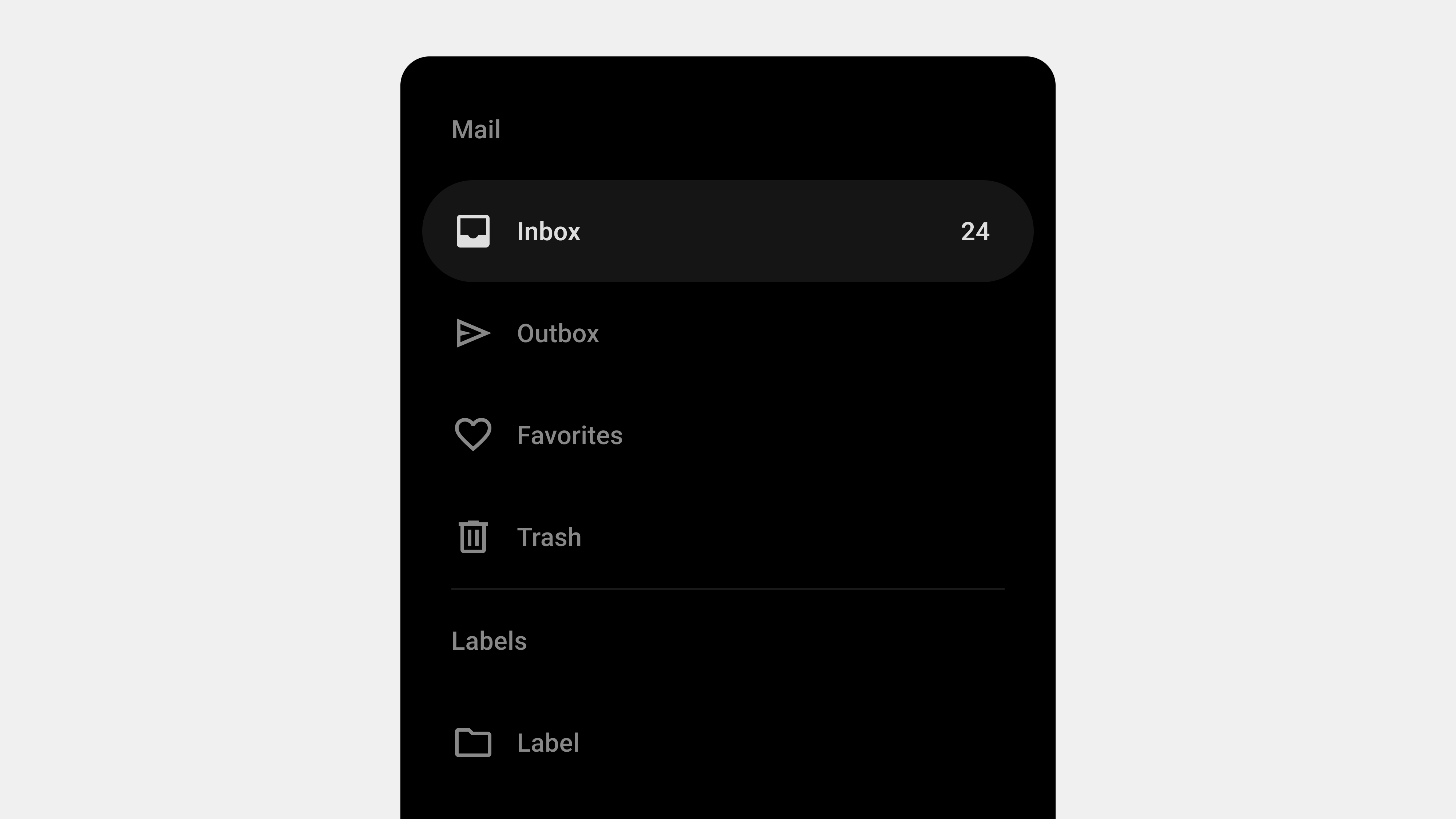
    Designing Bottom Navigation Bars: Meeting User Expectations

    Bottom navigation bars are a critical component of mobile app design, providing users with quick and intuitive access to an app’s key features. Users approach these navigation systems with certain expectations, and service planners must align design and functionality with these expectations to enhance user experience. This article explores what users expect from bottom navigation bars and outlines actionable steps service planners can take to meet these needs effectively.


    1. User Expectations for Bottom Navigation Bars

    Users interact with bottom navigation bars based on their prior experiences with similar apps, forming specific expectations about their functionality and design.

    A. Simplicity and Clarity

    • Expectation: Users expect bottom navigation bars to be straightforward and easy to understand.
    • Details: Tabs should have clear labels and intuitive icons that reflect their purpose.
    • Why It Matters: Overcomplicated or unclear navigation systems can frustrate users and reduce engagement.

    B. Quick Access to Core Features

    • Expectation: Users want to access an app’s primary features quickly and directly.
    • Details: Tabs should provide shortcuts to key sections without requiring additional steps.
    • Why It Matters: Reduces the time users spend navigating, improving overall satisfaction.

    C. Consistency Across Screens

    • Expectation: Users expect the navigation bar to remain consistent throughout their app experience.
    • Details: The bar should maintain the same design and functionality across all screens.
    • Why It Matters: Builds familiarity and trust, making navigation predictable.

    D. Feedback and Contextual Awareness

    • Expectation: Users rely on feedback to understand their current location within the app.
    • Details: Active tabs should be visually distinct, and transitions should be smooth.
    • Why It Matters: Helps users stay oriented and reduces cognitive load.

    E. Accessibility and Ease of Use

    • Expectation: Navigation should be accessible to all users, including those with disabilities.
    • Details: Tabs should be touch-friendly, screen reader-compatible, and visually clear.
    • Why It Matters: Inclusive design ensures that all users can navigate the app effectively.

    2. Responsibilities of Service Planners

    To meet user expectations, service planners must adopt a user-centric approach when designing bottom navigation bars.

    A. Conduct User Research

    • Why It Matters: Understanding user behavior and preferences ensures that the navigation design aligns with their needs.
    • Actions to Take:
      • Conduct surveys or interviews to gather insights into user navigation habits.
      • Analyze competitor apps to identify successful navigation patterns.
      • Use analytics tools to track user interactions with existing navigation systems.

    B. Focus on Simplicity and Prioritization

    • Why It Matters: A cluttered navigation bar can overwhelm users and reduce usability.
    • Actions to Take:
      • Limit the number of tabs to 3-5 to avoid overcrowding.
      • Prioritize core features that users interact with most frequently.
      • Group less important features into an overflow menu.

    C. Design for Accessibility

    • Why It Matters: Inclusive design ensures a positive experience for all users.
    • Actions to Take:
      • Add ARIA labels and roles for screen reader compatibility.
      • Test navigation bars with assistive technologies like VoiceOver or NVDA.
      • Ensure sufficient contrast between text/icons and the background.

    D. Provide Clear Feedback and Visual Cues

    • Why It Matters: Users need clear indicators to understand their current location and navigation progress.
    • Actions to Take:
      • Highlight active tabs using distinct colors, bold text, or underlines.
      • Use subtle animations to provide feedback during transitions.
      • Ensure hover and focus states are visually apparent for desktop and web apps.

    E. Iterate and Test Designs

    • Why It Matters: Iterative testing ensures that the navigation bar meets user needs and adapts to feedback.
    • Actions to Take:
      • Use A/B testing to compare different navigation designs.
      • Gather user feedback through usability testing sessions.
      • Continuously analyze navigation metrics to identify areas for improvement.

    3. Common Challenges and Solutions

    A. Overcrowding Tabs

    Challenge: Adding too many tabs makes navigation overwhelming and confusing.
    Solution: Prioritize the most critical features and use an overflow menu for secondary options.

    B. Misaligned Labels or Icons

    Challenge: Ambiguous labels or icons can confuse users about the purpose of a tab.
    Solution: Use familiar language and universally recognized icons to ensure clarity.

    C. Inconsistent Behavior Across Screens

    Challenge: Tabs behaving differently on different screens disrupts user flow.
    Solution: Maintain consistent functionality and design for the navigation bar throughout the app.


    4. Practical Examples of Effective Bottom Navigation Bars

    A. Social Media App

    • Tabs: Home, Search, Notifications, Profile.
    • Design Elements: Clear labels, consistent placement, and active state indicators.

    B. E-Commerce App

    • Tabs: Shop, Categories, Cart, Orders, Account.
    • Design Elements: Prominent icons, concise labels, and a touch-friendly layout.

    C. Productivity Tool

    • Tabs: Dashboard, Calendar, Tasks, Messages, Settings.
    • Design Elements: Adaptive tabs that highlight active states and offer quick feedback.

    Conclusion

    Designing bottom navigation bars from a user’s perspective requires a deep understanding of their expectations and behaviors. By focusing on simplicity, accessibility, consistency, and feedback, service planners can create navigation systems that meet user needs and enhance overall satisfaction. Regular testing and iteration ensure the design remains effective, adaptable, and user-friendly.


  • Bottom Navigation Bars – 4. Functions

    Bottom Navigation Bars – 4. Functions

    A Detailed Guide to the Key Functions of Bottom Navigation Bars

    Bottom navigation bars are essential elements in mobile UI design, providing users with an intuitive way to navigate an application’s core features. Positioned for easy thumb reach, they enhance usability and simplify navigation. This article explores the key functions of bottom navigation bars, highlighting their role in creating seamless and efficient user experiences.


    1. Organizing Primary Navigation

    Purpose

    Bottom navigation bars are designed to structure an app’s main features, grouping them into easily accessible tabs.

    How It Works

    • Core Sections: Tabs represent major app sections like “Home,” “Search,” “Profile,” or “Cart.”
    • Visibility: The navigation bar remains visible across all app screens, ensuring constant access to key features.

    Why It Matters

    • Reduces user effort by making primary features easily accessible.
    • Simplifies navigation for apps with complex structures.

    Example

    In a banking app, a bottom navigation bar organizes features into “Accounts,” “Transfers,” “Payments,” and “Settings,” reducing the need for extensive menu exploration.


    2. Providing Contextual Awareness

    Purpose

    One of the primary functions of a bottom navigation bar is to help users understand their location within the app.

    How It Works

    • Active State Indicators: The active tab is visually highlighted using colors, bold text, or underlines.
    • Consistent Positioning: Tabs remain static, ensuring users can always see their current context.

    Why It Matters

    • Provides visual feedback, reducing cognitive load.
    • Helps users navigate confidently without feeling lost.

    Example

    In a fitness app, when users are on the “Workouts” screen, the “Workouts” tab in the bottom navigation bar is highlighted, ensuring clear contextual awareness.


    3. Enabling Quick Access to Features

    Purpose

    Bottom navigation bars streamline navigation by offering direct access to the app’s core features.

    How It Works

    • Shortcut to Main Features: Each tab serves as a shortcut to a specific section of the app.
    • Ergonomic Placement: Positioned at the bottom of the screen, it ensures easy thumb reach for one-handed use.

    Why It Matters

    • Reduces the time required to switch between sections.
    • Enhances the overall efficiency of user workflows.

    Example

    In an e-commerce app, users can quickly switch between “Shop,” “Cart,” and “Profile” tabs without navigating through a hierarchy of menus.


    4. Supporting Multitasking and Workflow Efficiency

    Purpose

    Bottom navigation bars allow users to switch between tasks without disrupting their progress.

    How It Works

    • State Retention: Tabs preserve the state of each section, enabling users to resume tasks seamlessly.
    • Task Switching: Users can toggle between tabs to perform multiple actions without restarting workflows.

    Why It Matters

    • Facilitates multitasking by enabling smooth transitions between sections.
    • Improves productivity by retaining progress across tabs.

    Example

    In a project management app, users can switch between “Tasks,” “Calendar,” and “Messages” tabs without losing their place in any section.


    5. Enhancing Visual Consistency

    Purpose

    Bottom navigation bars establish a visually consistent navigation framework, reinforcing app design and usability.

    How It Works

    • Uniform Layout: Tabs maintain the same design, style, and placement across all screens.
    • Predictable Behavior: Users learn the navigation structure quickly due to its uniformity.

    Why It Matters

    • Promotes a cohesive design that enhances brand recognition.
    • Reduces the learning curve for new users.

    Example

    A travel app uses consistent tabs for “Flights,” “Hotels,” and “Car Rentals,” ensuring a uniform experience across all features.


    6. Facilitating Accessibility

    Purpose

    Bottom navigation bars make navigation accessible to all users, including those with disabilities.

    How It Works

    • Screen Reader Support: Tabs are labeled and described for users relying on assistive technologies.
    • Keyboard Navigation: Users can navigate tabs using keyboard shortcuts.
    • Touch-Friendly Targets: Large tap areas make tabs easy to use for users with motor impairments.

    Why It Matters

    • Promotes inclusivity and ensures compliance with accessibility standards.
    • Improves usability for all users, regardless of their abilities.

    Example

    In a news app, each tab is labeled for screen readers with descriptions like “Home tab, selected” or “Topics tab, not selected.”


    7. Adapting to User Behavior

    Purpose

    Modern bottom navigation bars dynamically adapt to user preferences or context, offering a personalized experience.

    How It Works

    • Dynamic Updates: Tabs rearrange or display personalized content based on user behavior.
    • Role-Based Customization: Displays tabs relevant to specific user roles or permissions.

    Why It Matters

    • Enhances user engagement by tailoring the experience.
    • Reduces cognitive load by showing only relevant options.

    Example

    In a corporate app, an administrator may see tabs for “Reports” and “User Management,” while regular users see “Dashboard” and “Tasks.”


    8. Improving Multiplatform Usability

    Purpose

    Bottom navigation bars provide a consistent experience across devices and platforms.

    How It Works

    • Responsive Design: The navigation bar adapts to different screen sizes and orientations.
    • Platform Consistency: Tabs behave similarly across mobile, web, and tablet apps.

    Why It Matters

    • Reduces the learning curve for users switching devices.
    • Reinforces a cohesive app experience.

    Example

    In a streaming app, tabs like “Home,” “Search,” and “Downloads” function identically on mobile and desktop.


    Conclusion

    Bottom navigation bars are indispensable for creating intuitive and efficient user experiences. By organizing primary navigation, providing contextual awareness, enabling quick access to features, supporting multitasking, enhancing visual consistency, and facilitating accessibility, they serve as a cornerstone of modern mobile app design. Continuous testing and iteration ensure that bottom navigation bars remain effective and aligned with user expectations.


  • Bottom Navigation Bars – 3. Types

    Bottom Navigation Bars – 3. Types

    Comprehensive Guide to the Key Types of Bottom Navigation Bars

    Bottom navigation bars are a staple in modern mobile app design, providing users with a simple and intuitive way to access core features. Positioned at the bottom of the screen, these navigation bars are optimized for thumb reach, making them ideal for one-handed use. Depending on the app’s functionality and user needs, bottom navigation bars can be designed in various ways. This article explores the primary types of bottom navigation bars, detailing their features, use cases, and design considerations.


    1. Standard Bottom Navigation Bar

    Definition

    A standard bottom navigation bar features a fixed layout with 3-5 evenly spaced tabs, each representing a primary app section.

    Key Features

    • Static Placement: Remains fixed at the bottom of the screen.
    • Icons and Labels: Combines icons with text labels for clarity.
    • Active State Indicators: Highlights the selected tab using color changes, bold text, or underlines.

    Use Cases

    • Social Media Apps: For tabs like “Home,” “Search,” “Notifications,” and “Profile.”
    • E-Commerce Apps: For sections such as “Shop,” “Cart,” “Orders,” and “Account.”

    Advantages

    • Simple and intuitive design.
    • Ensures consistent navigation across screens.
    • Easy to implement for basic navigation needs.

    Best Practices

    • Limit the number of tabs to avoid overcrowding.
    • Use universally recognizable icons for better usability.
    • Ensure labels are short and descriptive.

    2. Floating Bottom Navigation Bar

    Definition

    A floating bottom navigation bar is slightly elevated from the screen’s bottom edge, giving it a distinct appearance with rounded edges and shadows.

    Key Features

    • Modern Aesthetic: Rounded corners and shadows create a “floating” effect.
    • Compact Design: Uses minimal screen space while remaining functional.
    • Interactive Feedback: Includes smooth animations for transitions and interactions.

    Use Cases

    • Fitness Apps: For navigating “Dashboard,” “Workouts,” and “Profile.”
    • Creative Tools: For sections like “Projects,” “Templates,” and “Settings.”

    Advantages

    • Offers a visually appealing and modern design.
    • Enhances focus by creating a clear separation from other UI elements.

    Best Practices

    • Pair with gesture-based navigation for a seamless experience.
    • Use drop shadows to enhance the floating effect.
    • Ensure the design does not obstruct important content.

    3. Scrollable Bottom Navigation Bar

    Definition

    A scrollable bottom navigation bar allows users to swipe horizontally to access additional tabs, accommodating apps with multiple sections.

    Key Features

    • Horizontal Scrolling: Enables access to more tabs than a standard layout can fit.
    • Dynamic Indicators: Highlights the active tab as users scroll through options.
    • Compact Layout: Maintains a clean design while supporting additional features.

    Use Cases

    • Streaming Platforms: For tabs like “Movies,” “TV Shows,” “Sports,” and “Kids.”
    • Content Management Apps: For navigating “Files,” “Shared,” “Recent,” and “Starred.”

    Advantages

    • Supports a large number of sections without cluttering the interface.
    • Ideal for apps with extensive content categories.

    Best Practices

    • Clearly indicate the current tab to prevent disorientation.
    • Include swipe gestures for effortless navigation.
    • Test the design on various screen sizes to ensure usability.

    4. Contextual Bottom Navigation Bar

    Definition

    A contextual bottom navigation bar adapts its content based on the user’s actions, role, or the current app screen.

    Key Features

    • Dynamic Tabs: Tabs change based on the user’s context or preferences.
    • Role-Based Navigation: Displays tabs relevant to the user’s role (e.g., admin vs. regular user).
    • Context Awareness: Adjusts navigation options based on the screen or user behavior.

    Use Cases

    • Enterprise Apps: For switching between “Dashboard,” “Reports,” and “Team Management.”
    • E-Learning Platforms: For accessing “Courses,” “Assignments,” and “Grades.”

    Advantages

    • Personalizes the navigation experience.
    • Reduces cognitive load by showing only relevant options.

    Best Practices

    • Clearly communicate changes in the navigation bar to avoid confusion.
    • Allow users to customize or reset tabs for greater flexibility.

    5. Minimalist Bottom Navigation Bar

    Definition

    A minimalist bottom navigation bar focuses on simplicity, often featuring icon-only tabs without text labels.

    Key Features

    • Icon-Only Design: Relies solely on icons for navigation.
    • Compact Layout: Takes up minimal screen space.
    • Modern Appearance: Prioritizes aesthetics and simplicity.

    Use Cases

    • Creative Apps: For toggling “Draw,” “Eraser,” and “Layers.”
    • Photography Tools: For navigating “Gallery,” “Camera,” and “Settings.”

    Advantages

    • Saves space, ideal for apps with limited navigation options.
    • Provides a sleek and modern interface.

    Best Practices

    • Use universally recognized icons to minimize confusion.
    • Pair with tooltips or onboarding guides to explain functions.
    • Ensure touch targets are large enough for usability.

    6. Hybrid Bottom Navigation Bar

    Definition

    A hybrid bottom navigation bar combines elements of multiple types to accommodate complex navigation needs.

    Key Features

    • Flexible Design: Integrates features like floating effects, dynamic tabs, or scrollable layouts.
    • Multi-Functionality: Supports diverse user tasks and contexts.
    • Scalable Architecture: Adapts to future app expansions.

    Use Cases

    • Project Management Apps: For navigating “Tasks,” “Calendar,” “Chat,” and “Reports.”
    • Health Apps: For accessing “Dashboard,” “Records,” “Appointments,” and “Settings.”

    Advantages

    • Balances usability and complexity.
    • Provides a customizable navigation experience.

    Best Practices

    • Test the navigation bar with real users to ensure intuitiveness.
    • Clearly differentiate primary tabs from secondary or dynamic ones.
    • Optimize performance for smooth interactions.

    Conclusion

    Bottom navigation bars are versatile tools that adapt to different app requirements and user preferences. From standard designs to dynamic and hybrid layouts, each type offers unique advantages tailored to specific use cases. Understanding these variations helps designers and developers create navigation systems that enhance usability, accessibility, and overall user satisfaction. By prioritizing clarity, responsiveness, and user context, bottom navigation bars remain a cornerstone of effective mobile app design.


  • Bottom Navigation Bars – 2. Definition

    Bottom Navigation Bars – 2. Definition

    Exploring the Definition and Role of Bottom Navigation Bars in UI/UX Design

    Bottom navigation bars are a cornerstone of mobile app design, providing users with intuitive and efficient access to an app’s key features. Positioned at the bottom of the screen, these navigation elements cater to ergonomic principles, making them ideal for one-handed use. This article delves deeper into the definition, purpose, and role of bottom navigation bars, examining their impact on usability and user experience.


    1. What Are Bottom Navigation Bars?

    A bottom navigation bar is a fixed UI element located at the bottom of a mobile app screen, used to navigate between primary app sections or features.

    Key Features

    • Placement: Always positioned at the screen’s bottom for easy reach.
    • Tabs: Typically contains 3-5 options, each representing a primary app section.
    • Visual Feedback: Highlights the active tab using colors, icons, or animations.

    Purpose

    Bottom navigation bars are designed to simplify navigation, ensuring that users can access core features with minimal effort. They enhance user experience by providing a consistent and predictable navigation structure.


    2. The Role of Bottom Navigation Bars

    Bottom navigation bars are not just a navigation tool; they play a crucial role in shaping the overall user experience.

    A. Enhancing Usability

    Bottom navigation bars improve usability by grouping the most important app features into one easily accessible area.

    Why It Matters

    • Reduces the number of steps required to navigate between sections.
    • Simplifies app interaction, especially for new users.

    Example

    In an e-commerce app, tabs like “Home,” “Cart,” and “Profile” allow users to quickly switch between shopping and account management.


    B. Supporting Ergonomics

    Positioned for thumb-reach accessibility, bottom navigation bars cater to natural hand movements, making them particularly effective for one-handed use.

    Why It Matters

    • Enhances comfort and ease of use.
    • Reduces strain by placing key features within easy reach.

    Example

    Social media apps like Instagram use bottom navigation bars to ensure seamless interaction, even on larger screens.


    C. Facilitating Discoverability

    By prominently displaying core features, bottom navigation bars help users discover essential app sections without searching through menus.

    Why It Matters

    • Drives engagement with key app features.
    • Improves user retention by showcasing the app’s value.

    Example

    A streaming app with tabs like “Home,” “Search,” and “Library” ensures users can find content quickly.


    D. Providing Contextual Awareness

    Active state indicators in bottom navigation bars inform users of their current location within the app, reducing confusion.

    Why It Matters

    • Helps users stay oriented.
    • Enhances confidence in navigation.

    Example

    In a travel app, highlighting the “Bookings” tab when viewing reservations provides clear context.


    E. Encouraging Task Efficiency

    Bottom navigation bars enable multitasking by allowing users to switch between tasks without losing progress.

    Why It Matters

    • Streamlines workflows.
    • Reduces frustration by preserving state within tabs.

    Example

    In a project management app, users can toggle between “Tasks” and “Calendar” without losing data.


    3. Benefits of Bottom Navigation Bars

    A. Simplicity and Focus

    • Encourages minimalism by displaying only essential features.
    • Keeps the interface clean and user-friendly.

    B. Consistency

    • Provides a uniform navigation experience across screens.
    • Reinforces a cohesive app identity.

    C. Speed and Efficiency

    • Reduces the time required to find and access features.
    • Improves task completion rates.

    4. Best Practices for Designing Bottom Navigation Bars

    A. Prioritize Core Features

    Include only the most frequently used app sections.

    Example

    For a fitness app: “Dashboard,” “Workouts,” “Progress,” and “Settings.”


    B. Use Intuitive Icons and Labels

    Pair icons with short, descriptive labels to clarify their purpose.

    Example

    A music app can use a play icon labeled “Playlists” and a search icon labeled “Search.”


    C. Optimize for Accessibility

    Ensure navigation bars are inclusive and meet accessibility standards.

    Tips

    • Add ARIA roles for screen reader compatibility.
    • Use high-contrast colors for better visibility.

    D. Provide Visual Feedback

    Use animations or style changes to highlight active tabs and interactions.

    Example

    In a photo-sharing app, a color change for the “Upload” tab after tapping reinforces user action.


    E. Test Across Devices

    Ensure navigation bars function seamlessly across devices and orientations.

    Example

    A responsive design for a video app ensures usability on both phones and tablets.


    5. Challenges in Designing Bottom Navigation Bars

    A. Overcrowding

    Adding too many tabs can overwhelm users.
    Solution: Limit to 3-5 tabs and use overflow menus for secondary features.


    B. Ambiguous Labels or Icons

    Unclear or unfamiliar labels can confuse users.
    Solution: Use universally recognized icons and test labels with real users.


    C. Inconsistent Behavior

    Navigation bars that behave differently across screens disrupt the user experience.
    Solution: Maintain uniform functionality and style.


    6. Examples of Successful Bottom Navigation Bars

    A. Instagram

    • Tabs: Home, Search, Reels, Shop, Profile.
    • Why It Works: Combines minimalism with intuitive design.

    B. YouTube

    • Tabs: Home, Explore, Subscriptions, Library.
    • Why It Works: Clearly separates content discovery from user libraries.

    C. Spotify

    • Tabs: Home, Search, Library.
    • Why It Works: Prioritizes simplicity and quick access to core features.

    7. Future Trends for Bottom Navigation Bars

    A. Gesture-Based Navigation

    Replacing traditional taps with swipes for smoother transitions.


    B. AI-Powered Customization

    Dynamic tabs that adapt to user preferences and behavior.


    C. Integration with AR and VR

    Navigation systems tailored for immersive experiences.


    Conclusion

    Bottom navigation bars are more than just a navigation tool—they are a critical element in delivering a seamless and intuitive user experience. By understanding their definition, role, and best practices, designers and developers can create navigation systems that enhance usability and engagement. As mobile app design continues to evolve, bottom navigation bars will remain an indispensable part of the user experience landscape.


  • Bottom Navigation Bars – 1. Overview

    Bottom Navigation Bars – 1. Overview

    Comprehensive Guide to Bottom Navigation Bars

    Bottom navigation bars are integral components of modern app design, providing a simple and intuitive way for users to navigate between key features. Commonly seen in mobile apps, they are positioned at the bottom of the screen for easy thumb access. This guide explores the purpose, design principles, benefits, and best practices of bottom navigation bars, helping you create effective and user-friendly interfaces.


    1. What Is a Bottom Navigation Bar?

    A bottom navigation bar is a fixed UI element that sits at the bottom of the screen and provides quick access to an app’s core sections. It typically contains three to five items, each representing a primary app feature.

    Key Characteristics

    • Placement: Always visible at the bottom of the screen.
    • Icons and Labels: Combines visual icons with descriptive text for clarity.
    • Active State Indicators: Highlights the currently selected tab with color or style changes.

    Purpose

    • Simplifies navigation by offering direct access to primary features.
    • Enhances usability by keeping navigation within easy reach.
    • Reduces cognitive load by providing a consistent and predictable interface.

    2. Why Use Bottom Navigation Bars?

    Bottom navigation bars are especially effective for mobile apps because they align with natural thumb movement and ergonomic principles.

    Benefits

    • Accessibility: Positioned within thumb reach for one-handed use.
    • Consistency: Offers a uniform navigation structure across screens.
    • Discoverability: Ensures critical features are easy to find.
    • Task Switching: Allows users to switch between tasks without losing context.

    3. Key Components of a Bottom Navigation Bar

    A. Icons

    Icons visually represent each feature or section.

    • Use universally recognized symbols for clarity (e.g., a home icon for the homepage).
    • Ensure icons are visually distinct to avoid confusion.

    B. Labels

    Labels provide textual context for icons.

    • Keep labels concise, ideally one to two words.
    • Use familiar terms aligned with user expectations.

    C. Active State Indicators

    • Highlight the selected tab with bold text, color changes, or underlines.
    • Provide subtle animations for transitions between tabs.

    4. Best Practices for Designing Bottom Navigation Bars

    A. Keep It Simple

    • Limit tabs to three to five items.
    • Avoid overcrowding the navigation bar with too many options.

    B. Prioritize Core Features

    • Include only the most important app sections.
    • Move secondary features to an overflow menu if necessary.

    C. Use Intuitive Icons and Labels

    • Pair icons with descriptive labels for better clarity.
    • Test labels with users to ensure they align with expectations.

    D. Optimize for Accessibility

    • Use ARIA roles and labels for screen reader compatibility.
    • Ensure sufficient contrast between text/icons and the background.

    E. Provide Visual Feedback

    • Highlight the active tab to indicate the user’s current location.
    • Use animations to create smooth transitions between tabs.

    5. Common Types of Bottom Navigation Bars

    A. Standard Bottom Navigation Bar

    • Features fixed tabs for primary app sections.
    • Ideal for apps with up to five core features.

    B. Scrollable Bottom Navigation Bar

    • Allows users to scroll horizontally to access additional tabs.
    • Useful for apps with multiple content categories.

    C. Dynamic Bottom Navigation Bar

    • Adjusts its content based on user roles, preferences, or app states.
    • Enhances personalization and context awareness.

    D. Floating Bottom Navigation Bar

    • Positioned slightly above the bottom edge with rounded corners.
    • Adds a modern aesthetic and reduces visual clutter.

    6. Examples of Effective Bottom Navigation Bars

    A. Instagram

    • Tabs: Home, Search, Reels, Shop, Profile.
    • Why It Works: Combines clear icons, concise labels, and a visually appealing design.

    B. YouTube

    • Tabs: Home, Explore, Subscriptions, Library.
    • Why It Works: Organizes features effectively with clear active state indicators.

    C. Spotify

    • Tabs: Home, Search, Library.
    • Why It Works: Keeps navigation minimal and focused on core features.

    7. Challenges in Designing Bottom Navigation Bars

    A. Overcrowding

    • Including too many tabs can overwhelm users.
    • Solution: Prioritize essential features and group secondary ones into an overflow menu.

    B. Ambiguous Icons or Labels

    • Poorly designed icons or unclear labels can confuse users.
    • Solution: Use familiar icons and test labels with real users.

    C. Poor Accessibility

    • Lack of accessibility features excludes users with disabilities.
    • Solution: Follow WCAG guidelines and test with assistive technologies.

    8. Tools for Designing and Developing Bottom Navigation Bars

    Design Tools

    • Figma: For prototyping and designing interactive navigation bars.
    • Adobe XD: For creating and testing animations and transitions.

    Development Tools

    • React Native: For cross-platform implementation.
    • Flutter: For creating dynamic, responsive navigation bars.

    Testing Tools

    • BrowserStack: For cross-device and cross-browser compatibility testing.
    • Axe Accessibility Checker: For accessibility audits.

    Conclusion

    Bottom navigation bars are essential for creating intuitive and efficient navigation in mobile apps. By focusing on simplicity, accessibility, and user-centered design, you can ensure your navigation bar enhances usability and meets user expectations. Whether it’s a standard navigation bar or a dynamic, personalized one, a well-designed bottom navigation bar is a cornerstone of successful app design.


  • Navigation Drawers – 11. Final

    Navigation Drawers – 11. Final

    The Complete Guide to Navigation Drawers: Wrap-Up

    Navigation drawers are a critical component of modern digital interfaces, offering a clean and efficient way to organize menus and navigation elements. Over the course of our exploration, we have delved into various aspects of navigation drawers, including their definition, roles, key types, UX writing best practices, design considerations, development essentials, and QA testing. This comprehensive guide summarizes all the important points to create a cohesive understanding of navigation drawers, their design, implementation, and testing.


    1. What Is a Navigation Drawer?

    Navigation drawers are collapsible side panels used in digital interfaces to organize and provide access to navigation elements. They are particularly popular in mobile and web applications due to their ability to save space while maintaining functionality.

    Key Features

    • Expandable and Collapsible: Hidden by default and activated via gestures or buttons.
    • Space Efficient: Keeps the interface clean by storing secondary options.
    • Scalable: Handles large or hierarchical navigation structures effectively.

    Primary Role

    Navigation drawers serve as a tool for organizing content, enabling users to navigate complex interfaces with ease.


    2. Designing Navigation Drawers: User-Centered Best Practices

    Creating an effective navigation drawer begins with a focus on the user. The design must prioritize simplicity, accessibility, and responsiveness.

    Key Considerations

    1. Clarity and Simplicity: Use clear, concise labels and group related items logically.
    2. Accessibility: Ensure compatibility with screen readers, keyboard navigation, and focus management.
    3. Responsive Design: Adapt layouts for mobile, tablet, and desktop devices.
    4. Feedback and Cues: Highlight active states, provide visual feedback, and use smooth animations.
    5. Scalability: Design for future growth, accommodating new features seamlessly.

    UX Writing for Navigation Drawers

    Labels play a vital role in user experience. Clear and action-oriented labels such as “Profile” or “Track Order” align with user expectations, improving navigation efficiency.


    3. Types of Navigation Drawers

    Navigation drawers come in various forms, each tailored to specific use cases.

    Primary Types

    1. Standard (Temporary): Hidden by default and overlays the main content. Ideal for mobile apps.
    2. Persistent: Always visible alongside the content, suitable for larger screens.
    3. Mini Variant: Collapsible design showing only icons when closed.
    4. Bottom Drawer: Slides up from the bottom, optimized for mobile ergonomics.
    5. Modal Drawer: Focused interaction with a dimmed background for emphasis.

    Each type addresses different user needs, balancing space efficiency and usability.


    4. Developing and Publishing Navigation Drawers

    Key Development Considerations

    1. Performance Optimization: Use lazy loading, CSS transitions, and minimize JavaScript dependencies.
    2. Dynamic Content Handling: Fetch content dynamically and handle errors gracefully.
    3. Responsiveness: Implement layouts that adapt seamlessly to various screen sizes and devices.
    4. Cross-Platform Compatibility: Test the drawer on all major browsers and devices to ensure consistent performance.
    5. Accessibility Compliance: Incorporate ARIA roles, focus management, and keyboard navigation.

    Tips for Developers

    • Use semantic HTML for better screen reader support.
    • Test gestures and interactions on both mobile and desktop devices.

    5. QA Testing for Navigation Drawers

    Quality assurance ensures that navigation drawers function reliably across all scenarios.

    Focus Areas

    1. Functional Testing: Validate all links, buttons, and dropdowns.
    2. Performance Testing: Measure response times for opening, closing, and loading dynamic content.
    3. Accessibility Testing: Ensure compatibility with assistive technologies like screen readers.
    4. Error Handling: Test fallback behaviors for broken links or failed API requests.
    5. Cross-Browser and Device Testing: Verify consistency across devices, orientations, and browsers.

    Tools for QA

    • Lighthouse: For performance and accessibility audits.
    • BrowserStack: For cross-browser and device testing.
    • Axe Accessibility Checker: For in-depth accessibility testing.

    6. Combining Design, Development, and QA

    The success of a navigation drawer relies on the collaboration between designers, developers, and QA teams. Each role contributes to the process:

    • Designers focus on creating intuitive layouts and labels.
    • Developers implement responsive, scalable, and accessible code.
    • QA Teams ensure functionality, usability, and reliability through rigorous testing.

    By aligning efforts across these teams, you can create navigation drawers that not only meet user expectations but also drive engagement and satisfaction.


    Conclusion

    Navigation drawers are more than just a functional component—they are a strategic tool for organizing content and enhancing user experiences. From their design and development to rigorous QA testing, each step in the process requires attention to detail and user-centric thinking. By following the principles and best practices outlined in this guide, you can create navigation drawers that are intuitive, accessible, and scalable, ensuring long-term success for your applications.


  • Navigation Drawers – 9. QA

    Navigation Drawers – 9. QA

    5 Key Considerations for QA Testing Navigation Drawers

    Navigation drawers are critical components of modern user interfaces, helping users navigate seamlessly through content and features. Given their importance, rigorous quality assurance (QA) testing is essential to ensure functionality, usability, and accessibility. This article outlines the five most important areas to focus on during QA for navigation drawers, providing practical insights and actionable tips for QA teams.


    1. Functional Testing

    Why It Matters

    The primary purpose of a navigation drawer is to enable users to access content and features efficiently. Broken links, unresponsive buttons, or improper animations can lead to user frustration and abandonment.

    Key Considerations

    • Link Validation: Ensure all links navigate to the correct destinations.
    • Interactive Elements: Verify that buttons, icons, and touch gestures work as expected.
    • Dropdowns and Submenus: Test nested menus for smooth opening and closing.

    Testing Checklist

    • Open and close the drawer using gestures, buttons, and keyboard shortcuts.
    • Verify that all menu items are clickable and functional.
    • Test dynamic elements like dropdowns or expandable sections.

    Example

    In a food delivery app, ensure that tapping “My Orders” navigates to the order history page, and submenus like “Past Orders” expand correctly.

    Tools

    • Selenium or Cypress for automated testing.
    • Browser DevTools for manual interaction testing.

    2. Cross-Platform and Cross-Browser Compatibility

    Why It Matters

    Users access navigation drawers on a variety of devices and browsers. Ensuring compatibility across platforms is crucial for a consistent experience.

    Key Considerations

    • Browser Testing: Verify functionality in major browsers like Chrome, Firefox, Safari, and Edge.
    • Device Testing: Test responsiveness on different devices, including mobile, tablet, and desktop.
    • Orientation Changes: Ensure the drawer behaves properly when switching between portrait and landscape modes.

    Testing Checklist

    • Check for consistent rendering across browsers and devices.
    • Test swipe gestures on mobile and click functionality on desktop.
    • Verify that the drawer adapts to screen orientation changes.

    Example

    In a streaming app, ensure the drawer is fully functional when accessed on Chrome (desktop), Safari (iPhone), and Firefox (Android).

    Tools

    • BrowserStack or Sauce Labs for cross-browser testing.
    • Real-device testing for accurate results.

    3. Accessibility Testing

    Why It Matters

    Navigation drawers must be accessible to all users, including those with disabilities. Ignoring accessibility can lead to usability issues and potential legal implications.

    Key Considerations

    • Keyboard Navigation: Test if users can open, close, and navigate the drawer using only a keyboard.
    • Screen Reader Compatibility: Ensure all elements are readable and labeled correctly for screen readers.
    • Focus Management: Verify that focus shifts to the drawer when it opens and returns to the toggle button when it closes.

    Testing Checklist

    • Navigate through the drawer using the Tab and Shift+Tab keys.
    • Test with screen readers like NVDA, VoiceOver, or JAWS.
    • Check focus indicators for visibility and functionality.

    Example

    In a banking app, confirm that pressing Tab moves through each menu item in the correct order and announces labels like “Accounts” and “Transfers.”

    Tools

    • Axe Accessibility Checker.
    • Lighthouse Accessibility Audit.

    4. Performance Testing

    Why It Matters

    Navigation drawers are often used on every page, making their performance critical to the overall user experience. Slow loading or laggy animations can frustrate users and lead to disengagement.

    Key Considerations

    • Load Speed: Measure how quickly the drawer opens and closes.
    • Dynamic Content: Test the performance of dynamically loaded sections.
    • Heavy Traffic: Simulate multiple users interacting with the drawer simultaneously.

    Testing Checklist

    • Measure response times for interactions like opening, closing, and navigating.
    • Test the drawer under slow network conditions.
    • Analyze performance during high traffic or peak usage scenarios.

    Example

    In a retail app, ensure the drawer loads personalized recommendations within 2 seconds, even on slow networks.

    Tools

    • Apache JMeter for load testing.
    • Lighthouse Performance Audit.

    5. Error Handling and Edge Case Testing

    Why It Matters

    Navigation drawers must handle unexpected inputs, errors, or failures gracefully to ensure a robust user experience.

    Key Considerations

    • Broken Links: Verify that the drawer responds appropriately to missing or incorrect links.
    • Dynamic Content Errors: Test how the drawer handles failures when fetching dynamic content.
    • Offline Mode: Ensure the drawer remains functional with offline or limited connectivity.

    Testing Checklist

    • Simulate 404 errors for missing pages linked in the drawer.
    • Test how the drawer behaves when API calls for dynamic content fail.
    • Check for proper error messages or fallback options in offline scenarios.

    Example

    In a project management app, ensure the drawer shows a clear error message if “Project Files” fails to load due to a server issue.

    Tools

    • Postman for API testing.
    • Chrome DevTools for offline simulation.

    Conclusion

    Quality assurance for navigation drawers is a multi-faceted process that involves testing functionality, compatibility, accessibility, performance, and error handling. By addressing these five critical areas, QA teams can ensure that navigation drawers are reliable, user-friendly, and inclusive. A well-tested navigation drawer enhances the overall user experience, building trust and satisfaction among users.


  • Navigation Drawers – 8. UX Writing

    Navigation Drawers – 8. UX Writing

    UX Writing for Navigation Drawers: Crafting Clear and User-Friendly Labels

    Navigation drawers are a versatile tool in modern UI design, offering a clean way to organize complex menus while optimizing space. However, the success of a navigation drawer depends not only on its structure but also on the clarity and intuitiveness of its labels. UX writing plays a crucial role in ensuring users can easily understand and navigate the drawer’s options. This article focuses on how to craft clear, concise, and user-centric labels for navigation drawers, providing practical examples and best practices.


    1. The Role of UX Writing in Navigation Drawers

    UX writing is about creating text that guides users through an interface effortlessly. For navigation drawers, it ensures that users can quickly locate features and understand their purpose without confusion or guesswork.

    Why It Matters

    • Efficiency: Clear labels reduce the time users spend searching for features.
    • Usability: Intuitive text enhances the overall experience.
    • Consistency: Uniform language builds trust and familiarity.

    Example

    Instead of using vague terms like “Options” or “Things to Do,” opt for descriptive labels like “Settings” or “Task Manager.”


    2. Principles of Effective UX Writing for Navigation Drawers

    A. Clarity Over Creativity

    Users value clarity more than creative or quirky language. Avoid jargon, idioms, or ambiguous terms that could confuse users.

    Good Examples:

    • Use “Profile” instead of “My Corner.”
    • Use “Cart” instead of “Bag of Goods.”

    Why It Works:

    Clear, familiar terms help users understand options at a glance.


    B. Use Action-Oriented Labels

    Action-oriented labels help users understand what they can do within a section.

    Good Examples:

    • Use “Start Order” instead of “Ordering.”
    • Use “Track Shipment” instead of “Shipping Info.”

    Why It Works:

    Action-oriented labels align with user intent, guiding them toward their goals.


    C. Prioritize the User’s Mental Model

    Align labels with how users think about tasks and features. Conduct user research to understand their expectations and terminology.

    Good Examples:

    • “Watchlist” for saved media in a streaming app.
    • “Favorites” for saved items in an e-commerce app.

    Why It Works:

    Matching users’ mental models makes navigation intuitive.


    D. Keep It Short and Scannable

    Navigation drawer labels should be concise and scannable. Long phrases increase cognitive load and make navigation slower.

    Good Examples:

    • “Home” instead of “Return to Home Page.”
    • “Orders” instead of “Order History and Details.”

    Why It Works:

    Short labels are easier to read, especially on mobile devices.


    E. Consistency Across the Interface

    Use consistent terminology throughout the app or platform to avoid confusion.

    Good Examples:

    • If the main navigation says “Cart,” don’t call it “Basket” elsewhere.
    • If you use “Notifications” in one place, avoid “Alerts” or “Updates” elsewhere.

    Why It Works:

    Consistency reinforces user understanding and trust.


    3. Common Navigation Drawer Categories and Their Optimal Labels

    A. Home and General Navigation

    • Optimal Labels: Home, Dashboard, Explore.
    • Why It Works: These terms are widely recognized and intuitive.

    B. User Actions and Profiles

    • Optimal Labels: Profile, Settings, Log Out.
    • Why It Works: They clearly indicate user-specific functions.

    C. E-Commerce

    • Optimal Labels: Shop, Cart, Wishlist, Orders.
    • Why It Works: These terms directly reflect typical e-commerce actions.

    D. Content Platforms

    • Optimal Labels: Library, Favorites, Categories, Recommendations.
    • Why It Works: These terms align with how users organize and discover content.

    4. Testing and Refining Navigation Drawer Labels

    UX writing is an iterative process. Testing ensures that your labels resonate with users and align with their expectations.

    A. Conduct Usability Testing

    • Use A/B testing to evaluate different label options.
    • Ask users to locate specific features and observe their behavior.

    B. Analyze Metrics

    • Monitor click-through rates and time spent navigating.
    • Identify labels that cause confusion or low engagement.

    C. Gather Feedback

    • Collect user feedback through surveys or interviews.
    • Incorporate their suggestions into your next iteration.

    5. Examples of Excellent UX Writing for Navigation Drawers

    A. Google Drive

    • Labels: My Drive, Shared with Me, Recent, Trash.
    • Why It Works: Combines simplicity with functionality, using terms users easily understand.

    B. Netflix

    • Labels: Home, New & Popular, My List, Settings.
    • Why It Works: Prioritizes commonly used actions and personalized options.

    C. Shopify

    • Labels: Dashboard, Orders, Products, Marketing, Analytics.
    • Why It Works: Uses direct, action-oriented language suited for business owners.

    6. Common Pitfalls to Avoid

    A. Ambiguous Labels

    • Issue: Users can’t predict what the label means.
    • Fix: Use descriptive terms, e.g., replace “Stuff” with “Documents.”

    B. Overloading with Options

    • Issue: Too many items overwhelm users.
    • Fix: Group items into categories or collapsible menus.

    C. Ignoring Localization

    • Issue: Terms don’t translate well for international users.
    • Fix: Use universally understood terms or localize effectively.

    Conclusion

    Crafting clear and user-friendly labels for navigation drawers is a critical part of UX writing. By focusing on clarity, action-oriented language, and user mental models, you can create a navigation system that enhances usability and meets user expectations. Consistent testing and iteration ensure that your labels remain relevant and effective over time. A well-written navigation drawer not only improves navigation but also strengthens the overall user experience.


  • Navigation Drawer – 7. Design

    Navigation Drawer – 7. Design

    5 Key Considerations for User-Centric Navigation Drawer Design

    Navigation drawers are integral to modern UI/UX design, providing users with an intuitive way to navigate complex applications. To create an effective navigation drawer, designers must adopt a user-centered approach, prioritizing usability, accessibility, and responsiveness. This article highlights the five most critical factors to consider when designing navigation drawers to ensure a seamless and satisfying user experience.


    1. Simplicity and Clarity in Navigation

    Why It Matters

    Users interact with navigation drawers to find specific features or content quickly. A cluttered or overly complicated design can confuse users and increase navigation time.

    Key Strategies

    • Prioritize Core Features: Display the most important items prominently, placing them at the top of the menu.
    • Logical Grouping: Organize related items into clear categories or sections.
    • Use Clear Labels: Avoid ambiguous or technical terms—use language that aligns with user expectations.

    Best Practices

    • Limit the number of menu items to avoid overwhelming users.
    • Use dividers or headings to visually separate sections.
    • Ensure labels are concise and self-explanatory.

    Example

    In a productivity app:

    • Top items: “Tasks,” “Calendar,” “Notifications.”
    • Group secondary items under categories like “Settings” or “Help.”

    2. Accessibility for All Users

    Why It Matters

    Inclusive design ensures that all users, including those with disabilities, can access and interact with the navigation drawer. Accessibility is not just a legal requirement but also a critical aspect of user-centered design.

    Key Strategies

    • Keyboard Navigation: Ensure the drawer can be opened, closed, and navigated using only a keyboard.
    • Screen Reader Support: Use ARIA roles and semantic HTML to describe drawer elements.
    • High Contrast: Ensure text and background colors meet WCAG contrast guidelines.

    Best Practices

    • Highlight focus states for interactive elements.
    • Provide clear visual cues for actions, such as opening or closing the drawer.
    • Test the design with assistive technologies like screen readers.

    Example

    A banking app’s drawer should:

    • Allow users to tab through menu items.
    • Announce each item with its description (e.g., “Accounts, link”).

    3. Responsiveness and Adaptability

    Why It Matters

    With users accessing applications on various devices, a navigation drawer must adapt seamlessly to different screen sizes and input methods. A responsive design ensures consistency and usability across platforms.

    Key Strategies

    • Design for Multiple Breakpoints: Create layouts for mobile, tablet, and desktop devices.
    • Optimize for Touch Devices: Ensure buttons and menu items are large enough for touch interactions.
    • Use Gestures Effectively: Allow swipe gestures to open or close the drawer on mobile devices.

    Best Practices

    • Create a persistent sidebar for desktop interfaces and a temporary drawer for mobile.
    • Test interactions like swiping and tapping for responsiveness.
    • Ensure the drawer does not block critical content on smaller screens.

    Example

    A social media app might:

    • Use a hamburger menu on mobile to open a full-screen drawer.
    • Display a persistent sidebar on desktop for quick access to “Feed” and “Messages.”

    4. Feedback and Visual Cues

    Why It Matters

    Users rely on visual and interactive feedback to understand the state and functionality of the navigation drawer. Without proper feedback, interactions can feel unresponsive or unclear.

    Key Strategies

    • Highlight Active States: Indicate the current page or section with a visual cue (e.g., bold text, a highlighted background).
    • Provide Clear Feedback: Use animations or transitions when the drawer opens or closes.
    • Error Handling: Display appropriate messages for scenarios like missing content or connectivity issues.

    Best Practices

    • Use smooth, non-disruptive animations for transitions.
    • Ensure hover effects or focus indicators are consistent.
    • Provide fallback options for dynamic content (e.g., a retry button for failed loads).

    Example

    An e-commerce app could:

    • Highlight “Cart” when the user is reviewing their items.
    • Show a spinner or error message if categories fail to load.

    5. Scalability and Future-Proofing

    Why It Matters

    Applications often grow over time, adding new features or content. A navigation drawer must be designed to accommodate such changes without becoming cluttered or confusing.

    Key Strategies

    • Modular Structure: Use a flexible design that can expand or adapt as new items are added.
    • Dynamic Content Loading: Include placeholders or expandable sections for future features.
    • Role-Based Customization: Tailor the drawer’s content based on user roles or permissions.

    Best Practices

    • Design for scalability with collapsible menus and submenus.
    • Regularly audit the drawer to remove outdated or unused items.
    • Use analytics to monitor how users interact with the navigation and adjust accordingly.

    Example

    In an enterprise tool:

    • Admin users see options like “User Management” and “Reports.”
    • Regular users see streamlined menus with “Dashboard” and “Profile.”

    Conclusion

    Designing a navigation drawer that prioritizes user experience requires balancing simplicity, accessibility, responsiveness, and scalability. By focusing on these five key areas, designers can create drawers that not only meet user expectations but also adapt to evolving needs and technologies. A user-centered navigation drawer is more than a functional element—it’s a critical component of a seamless digital experience.


  • Navigation Drawers – Product Owner 1

    Navigation Drawers – Product Owner 1

    Designing Navigation Drawers: User Expectations and Service Planner’s Responsibilities

    Navigation drawers have become a staple in modern UI/UX design, offering a compact and efficient way for users to navigate applications. However, creating an effective navigation drawer requires understanding user expectations and aligning design and functionality to meet those needs. This article explores user expectations for navigation drawers and outlines the key responsibilities of service planners to ensure these expectations are met.


    1. User Expectations for Navigation Drawers

    Users approach navigation drawers with specific expectations about functionality, usability, and accessibility. Meeting these expectations is crucial for creating a positive user experience.

    A. Simplicity and Clarity

    Users expect navigation drawers to provide clear, concise, and well-organized options.

    • What Users Want:
      • Clear labels for menu items.
      • Logical grouping of related items.
      • A clutter-free interface.
    • Why It Matters:
      Overly complex or ambiguous menus confuse users, leading to frustration and disengagement.

    B. Quick Access to Important Features

    Users rely on navigation drawers to quickly locate and access key features.

    • What Users Want:
      • Frequently used items at the top of the menu.
      • Shortcuts to essential actions.
      • Search functionality for deep navigation.
    • Why It Matters:
      Efficiency is a key factor in retaining user attention, especially in task-oriented applications.

    C. Consistency Across Screens and Platforms

    Navigation drawers should behave predictably and maintain a consistent layout throughout the app.

    • What Users Want:
      • Familiar placement of the toggle button (e.g., top left).
      • Consistent menu structure across devices.
      • Seamless transitions between pages.
    • Why It Matters:
      Consistency reduces cognitive load and helps users build familiarity with the interface.

    D. Accessibility and Usability

    Users expect navigation drawers to be accessible and easy to use, regardless of their abilities or devices.

    • What Users Want:
      • Keyboard and screen reader support.
      • Touch-friendly design for mobile users.
      • High contrast and readable text.
    • Why It Matters:
      Accessibility ensures inclusivity and compliance with global usability standards.

    E. Personalization and Context Awareness

    Modern users value navigation systems that adapt to their needs and preferences.

    • What Users Want:
      • Personalized content or shortcuts based on usage history.
      • Context-aware options tailored to the current screen or task.
      • Clear feedback and visual cues.
    • Why It Matters:
      Personalization enhances user satisfaction and encourages deeper engagement.

    2. Responsibilities of Service Planners

    Service planners play a critical role in bridging user expectations with functional design. By prioritizing user needs and aligning them with business goals, planners can ensure the navigation drawer enhances the overall experience.

    A. Conduct User Research

    Understanding the target audience’s preferences, behaviors, and pain points is essential for designing effective navigation drawers.

    • Actions to Take:
      • Conduct surveys and interviews to identify user priorities.
      • Analyze user flows to determine frequently accessed features.
      • Use heatmaps to observe navigation patterns.
    • Outcome:
      A data-driven understanding of what users need from the navigation drawer.

    B. Create a Logical Information Hierarchy

    Organizing menu items in a logical and intuitive structure is key to meeting user expectations.

    • Actions to Take:
      • Categorize features into primary, secondary, and tertiary levels.
      • Use card sorting techniques to group related items.
      • Prioritize essential actions based on user goals.
    • Outcome:
      A navigation drawer that aligns with user mental models and reduces cognitive load.

    C. Prioritize Accessibility and Inclusivity

    Ensuring that the navigation drawer is accessible to all users is both an ethical and practical responsibility.

    • Actions to Take:
      • Implement ARIA roles and semantic HTML for screen readers.
      • Test keyboard navigation for ease of use.
      • Provide visual focus indicators for better accessibility.
    • Outcome:
      A navigation drawer that is inclusive and compliant with global accessibility standards.

    D. Optimize for Cross-Platform Consistency

    Service planners must ensure that the navigation drawer provides a consistent experience across devices and screen sizes.

    • Actions to Take:
      • Use responsive design principles to adapt the layout for mobile, tablet, and desktop.
      • Maintain consistent menu structures and interactions across platforms.
      • Test performance on different devices to ensure smooth functionality.
    • Outcome:
      A navigation drawer that feels intuitive and reliable, regardless of the device used.

    E. Incorporate Feedback and Iteration

    Continuous improvement is critical for maintaining the effectiveness of navigation drawers over time.

    • Actions to Take:
      • Gather user feedback through surveys and usability testing.
      • Analyze metrics like time to navigate and menu engagement rates.
      • Iterate on the design based on insights and evolving user needs.
    • Outcome:
      A navigation drawer that evolves to meet changing user expectations and business goals.

    Conclusion

    Designing a navigation drawer that meets user expectations requires a deep understanding of their needs and a commitment to delivering intuitive, accessible, and efficient solutions. Service planners must take a user-centered approach, focusing on clarity, consistency, and personalization while ensuring inclusivity and responsiveness. By aligning these principles with actionable strategies, navigation drawers can become a powerful tool for enhancing the user experience.