[태그:] UX Design

  • Navigation Bars – Pro

    Navigation Bars – Pro

    Understanding the Definition and Role of Navigation Bars in UX/UI

    Navigation bars are the fundamental building blocks of digital interfaces, guiding users through applications and websites. Despite their simplicity in appearance, their design and implementation carry a profound impact on usability, accessibility, and overall user experience. This article dives deep into the definition and role of navigation bars, offering insights into their significance in modern UI/UX design.

    What Is a Navigation Bar?

    A navigation bar, often abbreviated as a “nav bar,” is a UI component that organizes and presents the main options or destinations within a digital product. It serves as a roadmap, enabling users to traverse an application or website efficiently.

    From the simplest website with a few links to a complex enterprise system with multiple layers of content, the navigation bar is the interface’s backbone. Its structure directly affects how users interact with the platform and how intuitively they can accomplish their tasks.

    Characteristics of a Navigation Bar

    • Hierarchy Representation: Organizes content into logical categories.
    • Persistent Accessibility: Ensures users can always find their way back to key sections.
    • Visual Indicator: Communicates the current location within the system.
    • Consistency: Provides a unified experience across different pages or screens.

    The Role of Navigation Bars in Digital Design

    1. Structuring Content

    The primary role of a navigation bar is to structure content into a digestible and logical format. This structure enables users to find what they need without confusion, minimizing cognitive load. For instance, e-commerce websites use categories like “Home,” “Shop,” “Cart,” and “Profile” to segment user tasks effectively.

    2. Enhancing Usability

    Usability is a core tenet of UX design, and navigation bars play a pivotal role in achieving it. By following established conventions such as placing a top nav on desktop websites or a bottom nav on mobile apps, designers ensure a predictable and seamless user journey.

    3. Increasing Accessibility

    Navigation bars serve as an entry point for all users, including those with disabilities. Accessible nav bars, when designed correctly, enable everyone to interact with content. Screen readers, focusable elements, and keyboard navigation are essential considerations for achieving inclusivity.

    4. Encouraging User Engagement

    Navigation bars can guide users toward desired actions or content, influencing behavior. For example, a streaming platform’s nav bar may prioritize “Trending” or “Recommendations” to drive content discovery and engagement.

    5. Establishing Brand Identity

    The navigation bar is often the first touchpoint for users. Its design, typography, color scheme, and interaction style can communicate the brand’s identity. A sleek, minimalist nav bar aligns with a high-tech brand, while a playful, colorful one may suit a children’s product.

    Layers of Complexity in Navigation Bars

    While the concept of a navigation bar is simple, its implementation can be highly complex, especially in multi-layered systems like enterprise software or global e-commerce platforms.

    1. Single-Level Navigation

    Used for websites or apps with limited content, single-level navigation includes direct links to all primary sections.

    2. Multi-Level Navigation

    Larger platforms often require subcategories and nested menus. This complexity requires careful attention to hierarchy and discoverability. Dropdown menus, mega menus, and side panels are common solutions.

    3. Contextual Navigation

    Some applications use dynamic or contextual nav bars that adapt based on user actions. For instance, design software may display different options when editing text versus an image.

    4. Adaptive Navigation

    Adaptive nav bars respond to user behavior, such as frequently accessed sections or personalized recommendations. They leverage data and machine learning to create tailored experiences.

    Psychological and Cognitive Impact

    Navigation bars significantly affect how users perceive and interact with digital interfaces.

    1. Reducing Cognitive Load

    A well-structured nav bar reduces the mental effort required to locate information. By grouping related items and using clear labels, users can quickly understand the interface without unnecessary thought.

    2. Fostering Confidence

    Knowing that a navigation bar is consistently available reassures users. This sense of control is essential for user retention and satisfaction.

    3. Building Trust

    A clear and transparent navigation bar builds trust, as users feel the interface is reliable and easy to use. Misleading or poorly structured nav bars can frustrate users, leading to abandonment.

    4. Encouraging Exploration

    Nav bars designed with enticing visuals or intuitive flows encourage users to explore more sections of the app or website, increasing engagement and time spent on the platform.

    Practical Applications Across Platforms

    1. Mobile Navigation

    Mobile devices have limited screen space, so navigation bars need to prioritize essential functions. Common practices include bottom nav bars and hamburger menus for secondary options.

    2. Desktop Navigation

    With more screen real estate, desktop nav bars often feature horizontal layouts, dropdowns, and mega menus for greater content visibility.

    3. Wearables and IoT Devices

    On smaller screens, like smartwatches, navigation relies heavily on gestures or voice commands. The navigation bar is often minimal or context-specific.

    4. TV Interfaces

    For smart TVs, remote controls dictate navigation design. Horizontal scrolling or carousel-style navigation is common.

    Challenges in Navigation Design

    Designing an effective navigation bar requires addressing several challenges:

    • Overcrowding: Including too many options can overwhelm users.
    • Ambiguous Labels: Poorly chosen menu labels confuse users.
    • Inconsistency: Variations in navigation design across platforms create friction.
    • Accessibility: Ignoring accessibility features limits usability for diverse users.

    Future Trends in Navigation Bars

    1. Gesture-Based Navigation

    With the rise of touch interfaces, gestures are becoming a natural way to navigate.

    2. Voice Navigation

    As voice assistants grow in popularity, voice-based navigation will supplement traditional nav bars.

    3. AI-Driven Personalization

    Artificial intelligence can dynamically tailor nav bar options based on user behavior and preferences.

    4. Minimalist and Invisible Navigation

    Simplified designs that fade into the background, such as context-sensitive menus, are gaining traction.

    Conclusion

    Navigation bars are more than just functional elements—they are a cornerstone of user experience and brand interaction. By understanding their definition, role, and impact, designers can create intuitive, accessible, and engaging navigation systems that meet the needs of diverse users. As technology evolves, so will navigation design, making it an ever-exciting field for UX/UI professionals.
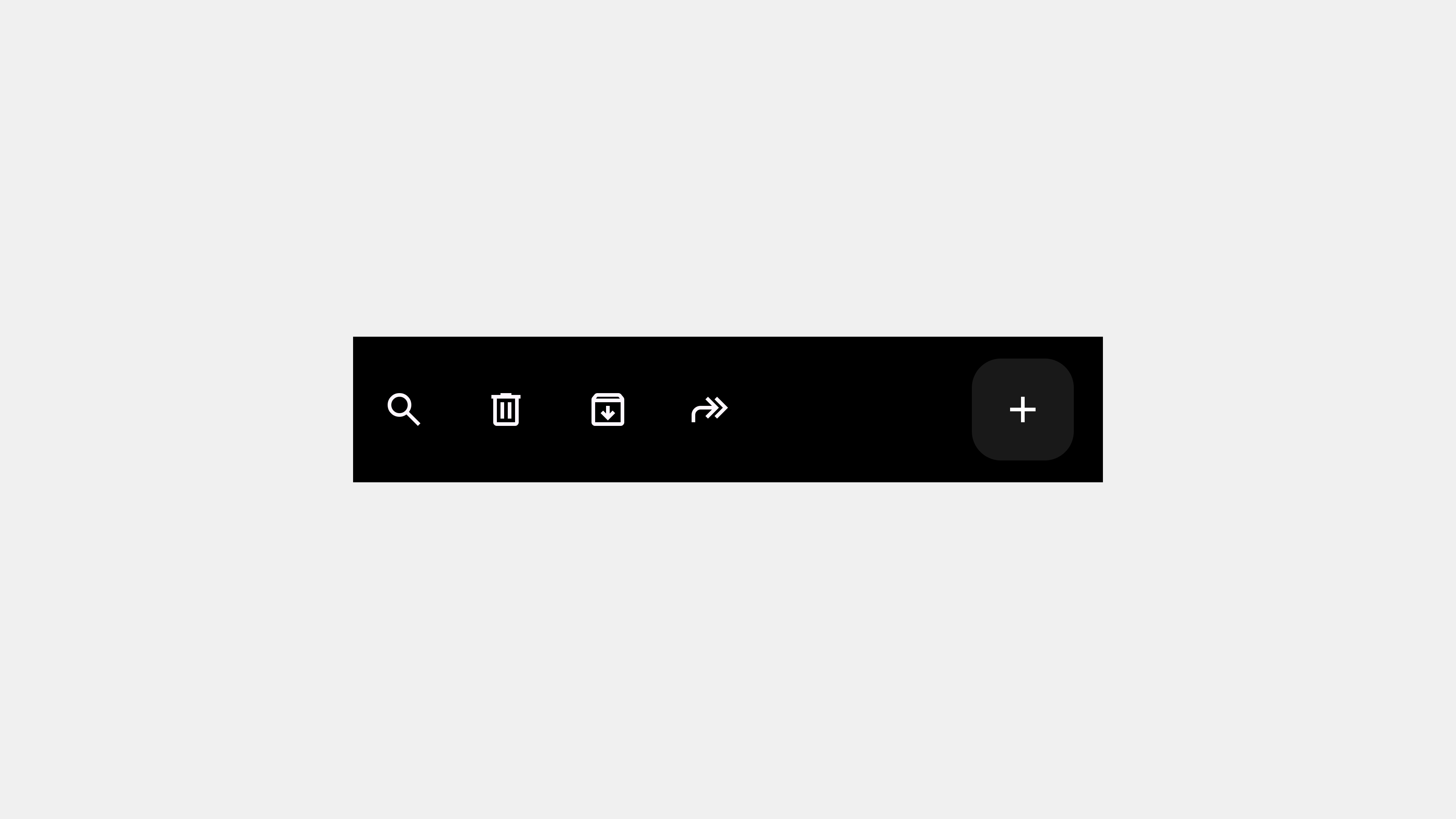

  • Navigation Bars – Overview

    Navigation Bars – Overview

    Mastering Navigation Bars: A Comprehensive Guide for UX/UI Experts

    Navigation bars are the backbone of any digital interface. They act as a guide, helping users navigate through content seamlessly and achieve their goals efficiently. This article will explore the design principles, best practices, and use cases of navigation bars across platforms such as mobile, PC, and beyond, ensuring your designs meet Silicon Valley standards.

    Understanding Navigation Bars

    What Is a Navigation Bar?

    A navigation bar (nav bar) is a UI component that allows users to move between different sections of an application or website. It provides a structured layout for menu options, ensuring a logical flow and accessibility of content.

    Why Navigation Bars Are Crucial

    Navigation bars directly impact user experience, retention, and task completion rates. Poorly designed navigation can frustrate users, causing them to abandon the app or website. A well-optimized navigation bar ensures intuitive interaction and fosters user satisfaction.

    Key Design Principles

    1. Clarity and Simplicity

    • Use clear labels for menu items.
    • Avoid overcrowding; focus on primary options.
    • Ensure the design is intuitive and visually digestible.

    2. Consistency

    • Maintain uniform design patterns across the platform.
    • Keep navigation consistent between desktop, mobile, and other platforms.

    3. Accessibility

    • Ensure the nav bar is accessible via screen readers.
    • Use proper color contrast and focus states for interactive elements.

    4. Feedback and State Indicators

    • Highlight the current section (active state).
    • Use hover and click feedback to signal interactivity.

    Types of Navigation Bars

    1. Top Navigation

    • Commonly used in websites and desktop applications.
    • Best for horizontal screen layouts with ample space.

    2. Bottom Navigation

    • Popular for mobile apps due to easy thumb reach.
    • Use for up to 5 primary destinations.

    3. Side Navigation (Drawer)

    • Useful for complex systems with numerous menu items.
    • Often used for secondary or less-frequent actions.

    4. Tab Navigation

    • Great for categorizing content into multiple tabs.
    • Enhances discoverability and segmentation.

    5. Fixed vs. Dynamic Navigation

    • Fixed: Always visible on the screen (sticky navigation).
    • Dynamic: Hides during scrolling and reappears when needed.

    Platform-Specific Navigation Considerations

    1. Mobile Navigation

    • Design for touch: Ensure tap targets are large enough.
    • Prioritize key actions due to limited space.
    • Use icons with labels for clarity.

    2. Desktop Navigation

    • Utilize hover states for interaction cues.
    • Leverage dropdown menus for hierarchical structures.
    • Ensure responsiveness for varying screen sizes.

    3. Multi-Device Consistency

    • Align navigation experiences across mobile, tablet, desktop, and even wearables.
    • Keep transitions smooth between devices.

    Best Practices for Navigation Bars

    1. Prioritize Key Features

    • Focus on user priorities to determine menu structure.
    • Minimize cognitive load by showing only essential options.

    2. Test and Iterate

    • Conduct usability testing to identify pain points.
    • Use A/B testing to evaluate alternative designs.

    3. Incorporate Personalization

    • Offer adaptive navigation based on user behavior.
    • Leverage AI to highlight frequently used sections.

    4. Embrace Visual Hierarchy

    • Use font sizes, colors, and spacing to emphasize important elements.
    • Group related items for better organization.

    5. Optimize for Speed

    • Reduce latency in navigation interactions.
    • Use preloading techniques for faster content delivery.

    Case Studies and Examples

    1. Apple

    • Consistent navigation across devices: Top nav on desktop, bottom nav on iOS apps.
    • Clear icons and concise labels ensure usability.

    2. Google Material Design

    • Focus on simplicity and accessibility.
    • Dynamic navigation patterns adapt to various platforms.

    3. Pinterest Gestalt Principles

    • Emphasizes visual grouping for related actions.
    • Minimalist design aids in content discovery.

    Common Mistakes to Avoid

    1. Overloading the Navigation Bar

    Too many options can overwhelm users. Stick to core features.

    2. Ignoring Responsiveness

    Navigation must adapt seamlessly to different screen sizes.

    3. Lack of Feedback

    Interactive elements without hover or click feedback lead to confusion.

    4. Complex Terminology

    Use language that is straightforward and easy to understand.

    5. Overlooking Accessibility

    Failing to design for accessibility limits user inclusivity and engagement.

    Emerging Trends in Navigation Design

    1. Voice-Activated Navigation

    As voice assistants grow, navigation is shifting towards voice commands.

    2. Micro-Interactions

    Subtle animations provide cues and enhance the user experience.

    3. AI-Powered Navigation

    AI can predict user needs and adapt the navigation structure accordingly.

    Conclusion

    Designing navigation bars requires a balance of functionality, aesthetics, and user-centric thinking. By following these principles and best practices, you can create navigation systems that enhance usability, delight users, and drive engagement. Remember to continuously iterate and adapt based on user feedback and evolving technologies.


  • Buttons – Product owner 2

    Buttons – Product owner 2

    Crafting Effective Button Wireframes: 5 Key Considerations for Designers, Publishers, and Developers

    Buttons are at the heart of digital interfaces, serving as the primary elements of interaction. When creating wireframes or storyboards for buttons, ensuring clarity and alignment among designers, publishers, and developers is crucial. A well-documented button wireframe not only streamlines the implementation process but also reduces miscommunication and errors. In this post, we’ll outline the five most critical considerations when creating button wireframes.


    1. Define the Button’s Purpose and Hierarchy

    Why It Matters:

    The purpose of a button directly impacts its design, placement, and functionality. Establishing a clear hierarchy ensures that users can easily distinguish between primary, secondary, and tertiary actions, guiding their attention and interaction.

    Key Considerations:

    • Primary Buttons: Highlight the most critical actions, such as “Submit” or “Buy Now.” Use bold colors and prominent placement.
    • Secondary Buttons: Support additional actions, such as “Cancel” or “Back.” Use subtler styling like outlines or muted colors.
    • Tertiary Buttons: For minor or contextual actions, such as “Learn More.” Often styled as text links.

    Documentation Tips:

    • Clearly label buttons in the wireframe based on their hierarchy (e.g., Primary, Secondary).
    • Include annotations explaining the button’s purpose and its role in the user flow.

    2. Specify Button States and Interactions

    Why It Matters:

    Buttons must provide visual feedback to inform users about their status and interactivity. Defining these states in the wireframe ensures consistency across the design and development stages.

    Common Button States:

    1. Default: The resting state when no interaction occurs.
    2. Hover: Changes when the cursor is over the button (web).
    3. Pressed/Active: Indicates the button has been clicked or tapped.
    4. Disabled: Grayed out when the button is inactive or unavailable.
    5. Loading: Shows progress for actions that take time.

    Documentation Tips:

    • Illustrate all button states in the wireframe, with visual examples or mockups.
    • Annotate interactions such as hover effects, animations, or transitions.
    • For mobile, specify tactile feedback like vibrations for taps.

    3. Ensure Accessibility Standards

    Why It Matters:

    Accessible buttons cater to all users, including those with disabilities. Ensuring accessibility in the wireframe phase prevents costly revisions during development.

    Key Considerations:

    • Size: Buttons should have a minimum touch target size of 48x48dp for mobile interfaces.
    • Contrast: Meet WCAG guidelines with sufficient contrast between text and background.
    • Keyboard Navigation: Buttons should be operable with a keyboard and include clear focus states.
    • Screen Reader Support: Include ARIA labels or text equivalents for non-text buttons.

    Documentation Tips:

    • Include specific accessibility requirements in the wireframe annotations.
    • Provide examples of how focus and hover states will appear for keyboard users.
    • Annotate ARIA roles and labels for screen readers.

    4. Document Placement and Alignment

    Why It Matters:

    Button placement significantly affects usability. Proper alignment and spacing contribute to a visually cohesive design and prevent user confusion.

    Key Considerations:

    • Align buttons consistently across the interface (e.g., primary actions on the bottom-right).
    • Maintain sufficient spacing between buttons to avoid accidental clicks or taps.
    • Follow platform-specific guidelines for button placement (e.g., floating action buttons on mobile).

    Documentation Tips:

    • Use grid systems in the wireframe to illustrate button alignment and spacing.
    • Include annotations specifying alignment rules, such as “Center align this button within its container.”
    • Highlight platform-specific adjustments (e.g., mobile vs. desktop layouts).

    5. Detail Functional Requirements and Edge Cases

    Why It Matters:

    Buttons often interact with complex system logic, such as disabling states or triggering backend processes. Documenting these functional requirements ensures developers implement the button behavior correctly.

    Key Considerations:

    • Functional Logic: Define when a button is enabled, disabled, or in a loading state.
    • Error Handling: Specify what happens when an action fails (e.g., error messages).
    • Edge Cases: Include scenarios like network interruptions or invalid inputs.
    • Performance Feedback: Explain how users will know an action is processing (e.g., spinners, loaders).

    Documentation Tips:

    • Use flowcharts or diagrams in the wireframe to detail button behavior across user journeys.
    • Annotate specific conditions for enabling or disabling buttons.
    • Include examples of success and error messages that appear after button actions.

    Additional Best Practices for Button Wireframes

    1. Use Consistent Naming Conventions: Label buttons clearly in the wireframe (e.g., “Primary_Button_Submit”).
    2. Provide Visual and Text Annotations: Combine visual examples with text annotations to avoid ambiguity.
    3. Collaborate Early: Involve designers, publishers, and developers early in the wireframe process to address potential challenges.
    4. Test with Prototypes: Before finalizing wireframes, create clickable prototypes to validate button behavior with stakeholders and users.

    Conclusion

    Creating effective button wireframes requires careful attention to purpose, states, accessibility, placement, and functional logic. As a Product Owner, your role is to ensure these details are clearly documented to streamline collaboration and implementation. By addressing these five considerations, you can minimize miscommunication and deliver buttons that meet both user and business goals.


  • Buttons – Functions

    Buttons – Functions

    The Core Functions of Buttons: A Detailed Guide for UX/UI Professionals

    Buttons play a critical role in user interfaces, acting as the primary mechanism for interaction. Their importance lies in their ability to provide users with clear, actionable paths, guiding workflows and enabling seamless navigation. In this article, we will explore the major functions of buttons, dissecting their roles and impact on usability and user experience.


    What Are the Core Functions of Buttons?

    At their essence, buttons bridge the gap between user intention and system response. Their design and functionality aim to minimize user effort while maximizing clarity and efficiency. Here are the key functions of buttons:


    1. Triggering Actions

    Buttons are action-oriented elements that enable users to initiate specific tasks or processes. This is their most fundamental function and includes tasks such as:

    • Form Submission: Buttons like “Submit” or “Sign Up” complete user input processes.
    • Data Processing: Trigger backend operations like saving or uploading.
    • System Control: Start, pause, or stop actions, such as a video playback button.

    Example:

    In an e-commerce platform:

    • The “Add to Cart” button initiates the process of adding an item to the user’s shopping cart.

    Key Design Considerations:

    • Ensure buttons clearly indicate the action they trigger.
    • Use labels that are short, descriptive, and action-oriented, such as “Save Changes” or “Download File.”

    2. Facilitating Navigation

    Buttons are integral to navigation, guiding users through workflows and interface hierarchies. They make it possible for users to:

    • Move between pages (e.g., “Next” or “Previous”).
    • Open new interfaces, such as modals or pop-ups.
    • Access external resources or links.

    Example:

    • A “Learn More” button might navigate users to a detailed product description page.
    • Pagination buttons (e.g., “1, 2, 3”) help users browse multi-page content.

    Key Design Considerations:

    • Place navigation buttons in intuitive locations (e.g., at the bottom of forms or content).
    • Provide visual feedback, such as hover effects, to guide user expectations.

    3. Indicating Status

    Buttons are effective tools for communicating the current status of a system or user interaction. They can:

    • Show a process is in progress (e.g., with a spinner or “Loading” state).
    • Indicate completion (e.g., “Done” or “Success”).
    • Highlight system availability (e.g., “Offline” or “Try Again”).

    Example:

    • A “Submit” button might change to “Submitting…” while data is being processed.
    • After successful completion, it can display “Submitted!”

    Key Design Considerations:

    • Use clear state changes (e.g., color or label changes) to reflect the button’s status.
    • Ensure transitions are smooth and provide feedback for each interaction phase.

    4. Providing Feedback

    Feedback is an essential aspect of usability. Buttons visually and functionally communicate their interactivity, reassuring users that their actions have been acknowledged.

    Types of Feedback:

    • Hover Effects: Highlighting a button when a cursor hovers over it.
    • Active State: Changing the appearance when clicked or tapped.
    • Disabled State: Graying out non-functional buttons to clarify their inactivity.

    Example:

    • A “Confirm Purchase” button may turn green briefly after being clicked to confirm the action has been received.

    Key Design Considerations:

    • Design clear visual cues for each state (default, hover, active, disabled).
    • Combine visual feedback with auditory or haptic responses for accessibility.

    5. Promoting User Decisions

    Buttons act as decision points, enabling users to make choices and commit to actions. These decisions might involve:

    • Confirming or canceling operations.
    • Choosing between multiple options (e.g., “Yes” or “No”).
    • Providing alternatives (e.g., “Retry” or “Cancel”).

    Example:

    • In a dialog box, a “Delete” button prompts users to confirm deletion, often accompanied by a “Cancel” button.

    Key Design Considerations:

    • Design buttons with distinct visual hierarchies to highlight primary choices.
    • Avoid overloading users with too many options in a single view.

    6. Enhancing Accessibility

    Accessibility is a critical function of buttons, enabling users with varying abilities to interact with digital interfaces. Buttons should:

    • Be operable via multiple input methods (mouse, keyboard, touchscreen, assistive devices).
    • Provide clear, descriptive labels for screen readers.
    • Meet minimum size requirements for touch interactions.

    Example:

    • A button labeled “Play Video” should have an ARIA label that a screen reader can interpret.

    Key Design Considerations:

    • Use ARIA attributes to describe the button’s function.
    • Ensure buttons meet WCAG contrast ratio guidelines for readability.

    7. Driving Conversions

    In marketing and e-commerce, buttons play a key role in driving user engagement and conversions. These buttons often encourage users to take desired actions, such as:

    • Purchasing products (e.g., “Buy Now”).
    • Signing up for services (e.g., “Get Started”).
    • Downloading resources (e.g., “Download Free Guide”).

    Example:

    • A “Subscribe Now” button on a landing page may lead to increased newsletter signups.

    Key Design Considerations:

    • Use persuasive language that creates urgency (e.g., “Limited Offer – Sign Up Now”).
    • Position conversion buttons prominently and use vibrant colors to grab attention.

    8. Controlling System Functions

    Buttons often serve as direct controls for system functionality, especially in interactive or multimedia environments. These controls may include:

    • Play/Pause buttons for media.
    • Start/Stop buttons for processes like file transfers.
    • Toggle switches for enabling or disabling features.

    Example:

    • A “Dark Mode” toggle button allows users to switch between light and dark themes.

    Key Design Considerations:

    • Provide clear visual indicators of the current state.
    • Ensure buttons are responsive and do not lag during transitions.

    9. Improving Workflow Efficiency

    Buttons simplify workflows by consolidating multiple steps into a single action. For example:

    • A “Pay Now” button can bundle payment details, order confirmation, and checkout processes.
    • A “Save and Continue” button helps users maintain progress in multi-step forms.

    Example:

    • In a project management app, a “Mark Complete” button streamlines task tracking.

    Key Design Considerations:

    • Use progressive disclosure to hide complexity, revealing additional options only when needed.
    • Design buttons to reflect the user’s mental model of their task flow.

    Conclusion

    Buttons are not merely decorative elements; they are vital components that enable interaction, navigation, and decision-making in digital interfaces. By understanding their core functions and designing them with intention, you can create buttons that enhance usability, improve accessibility, and drive meaningful user engagement.


  • Button – types

    Button – types

    Understanding Button Types: A Detailed Guide for UX/UI Professionals

    Buttons are a cornerstone of interaction in user interfaces, with different types serving various roles depending on the context and the action required. In this article, we’ll dive deep into the major types of buttons, their use cases, design considerations, and how they contribute to a seamless user experience.

    Why Classify Buttons by Type?

    Different actions and contexts demand buttons with unique characteristics. Categorizing buttons helps ensure clarity, consistency, and usability in design systems. The primary factors that differentiate button types include:

    • Priority: Level of importance relative to other actions.
    • Functionality: Specific purpose within a workflow.
    • Design Style: Visual elements and interaction states.

    Key Button Types

    1. Primary Buttons

    Definition:

    Primary buttons represent the most important action on a screen. They are designed to draw attention and encourage user interaction with the main task.

    Use Cases:

    • Completing forms (e.g., “Submit”)
    • Confirming critical actions (e.g., “Save Changes”)
    • Driving user conversions (e.g., “Buy Now”)

    Design Considerations:

    • Visual Emphasis: Use bold colors, larger size, or unique shapes to stand out.
    • One Per Screen: Avoid multiple primary buttons to reduce confusion.
    • Action-Oriented Labels: Ensure clear, concise wording that reflects the action, e.g., “Start Free Trial.”

    2. Secondary Buttons

    Definition:

    Secondary buttons support the primary action by offering alternative or less critical options. They are visually less prominent but remain easily accessible.

    Use Cases:

    • Optional actions alongside primary tasks (e.g., “Learn More”)
    • Supporting navigation (e.g., “Back”)
    • Providing less urgent actions (e.g., “Preview”)

    Design Considerations:

    • Styling: Use outlines, muted colors, or less visual weight compared to primary buttons.
    • Placement: Position near the primary button without competing for attention.
    • Accessibility: Ensure secondary buttons are still easily clickable or tappable.

    3. Tertiary Buttons

    Definition:

    Tertiary buttons are used for minor or supplementary actions. They are typically text-only or minimally styled to avoid drawing too much attention.

    Use Cases:

    • Navigational links (e.g., “Forgot Password?”)
    • Canceling actions (e.g., “Cancel”)
    • Opening additional options or menus (e.g., “More Details”)

    Design Considerations:

    • Minimal Styling: Use text links or very subtle buttons.
    • Contextual Placement: Place where users can intuitively find them without cluttering the interface.

    4. Icon Buttons

    Definition:

    Icon buttons are compact, using icons instead of text to represent an action. They save space while maintaining functionality.

    Use Cases:

    • Common actions with recognizable icons (e.g., “Search,” “Close,” “Delete”)
    • Toolbars and action bars (e.g., “Edit” pencil icon)
    • Mobile interfaces where space is limited

    Design Considerations:

    • Clarity: Ensure icons are universally recognizable or provide tooltips/labels for context.
    • Touch Targets: Maintain adequate size (minimum 48x48dp for mobile).
    • Consistency: Use a consistent style and iconography across the interface.

    5. Floating Action Buttons (FABs)

    Definition:

    A Floating Action Button is a circular button that promotes a primary or standout action, often floating above the content.

    Use Cases:

    • Mobile interfaces requiring a dominant action (e.g., “Add” in Google Drive)
    • Emphasizing a single action in apps with minimal navigation

    Design Considerations:

    • Positioning: Place in an unobtrusive yet accessible area (typically bottom-right for mobile).
    • Use Sparingly: FABs should not compete with other primary buttons on the same screen.
    • Animations: Use subtle animations for hover or press feedback.

    6. Toggle Buttons

    Definition:

    Toggle buttons allow users to switch between two states, such as “on” and “off” or “enabled” and “disabled.”

    Use Cases:

    • Turning features or settings on/off (e.g., “Dark Mode”)
    • Selecting preferences (e.g., “Like” or “Dislike”)
    • Activating filters in search interfaces

    Design Considerations:

    • State Indicators: Clearly show the active/inactive state through color changes or icons.
    • Accessibility: Ensure screen readers can describe the toggle’s current state.
    • Avoid Overuse: Use toggle buttons only when two distinct states are required.

    7. Grouped Buttons

    Definition:

    Grouped buttons are multiple buttons displayed together to provide closely related options.

    Use Cases:

    • Pagination controls (e.g., “Previous” and “Next”)
    • Toolbar options (e.g., “Bold,” “Italic,” “Underline”)
    • Multi-choice actions (e.g., “Yes,” “No,” “Maybe”)

    Design Considerations:

    • Spacing: Maintain sufficient spacing to prevent accidental taps.
    • Consistency: Use the same visual style for all buttons in the group.
    • Hover States: Ensure hover or active states are distinguishable.

    8. Split Buttons

    Definition:

    Split buttons combine a primary action with a dropdown for additional options.

    Use Cases:

    • Offering a default action while providing other choices (e.g., “Save” with a dropdown for “Save As…”)
    • Contextual actions in complex workflows

    Design Considerations:

    • Clear Hierarchy: Ensure the primary action is obvious, with secondary actions hidden in the dropdown.
    • Ease of Use: Use clear separators between the button and dropdown.
    • Visual Cues: Provide arrow icons to indicate the presence of a dropdown.

    9. CTA (Call-to-Action) Buttons

    Definition:

    CTA buttons are designed to drive user engagement and conversions, often used in marketing or e-commerce.

    Use Cases:

    • Signing up for a service (e.g., “Get Started”)
    • Completing purchases (e.g., “Buy Now”)
    • Generating leads (e.g., “Download Free E-Book”)

    Design Considerations:

    • Bold Styling: Use vibrant colors and strong contrast to grab attention.
    • Strategic Placement: Position where users are most likely to take action.
    • Urgency: Use words that create a sense of urgency, like “Limited Offer.”

    10. Ghost Buttons

    Definition:

    Ghost buttons are outlined buttons with no solid fill, designed for minimal emphasis.

    Use Cases:

    • Secondary actions on visually heavy screens
    • Subtle CTAs (e.g., “Learn More” on a landing page)
    • Actions where distraction is a concern

    Design Considerations:

    • Contrast: Ensure outlines are visible against the background.
    • Hierarchy: Use ghost buttons only when a primary button is present to avoid confusion.

    11. Dropdown Buttons

    Definition:

    Dropdown buttons display a menu of options when clicked, offering users multiple choices within a single element.

    Use Cases:

    • Navigating through categories
    • Selecting preferences (e.g., “Sort By”)
    • Reducing clutter by hiding less-used options

    Design Considerations:

    • Menu Design: Ensure dropdown options are easily scannable and categorized.
    • Default Action: If possible, include a default action or state.

    12. Loading Buttons

    Definition:

    Loading buttons visually indicate ongoing processes, like submitting data or loading content.

    Use Cases:

    • Displaying progress after form submission
    • Showing a process is in progress (e.g., file upload)

    Design Considerations:

    • Feedback: Use spinners or progress bars to indicate activity.
    • Disable During Load: Prevent users from triggering duplicate actions.

    Choosing the Right Button Type

    When designing buttons, context is king. Consider the user’s goals, the importance of the action, and the surrounding UI elements. By carefully selecting the right button type, you can guide users effectively and enhance the overall experience.


  • 실수는 사람 탓이 아니다: 인간이 아닌 시스템 오류를 이해하라

    실수는 사람 탓이 아니다: 인간이 아닌 시스템 오류를 이해하라

    우리 주변에서 흔히 볼 수 있는 제품과 시스템들은 종종 ‘인간의 실수’ 때문에 문제를 일으킨다고 생각되곤 합니다. 도널드 노먼은 그의 책 The Design of Everyday Things에서 이와 같은 사고방식을 비판하며, 많은 경우 이러한 오류는 ‘사람’이 아닌 ‘디자인’ 문제에서 기인한다고 주장합니다. 이 글에서는 시스템 오류와 인간의 실수를 분리하는 방법을 탐구하며, 일상 속에서 이런 오류가 어떻게 발생하는지 살펴보겠습니다.

    인간 오류인가 시스템 오류인가?

    노먼은 “산업 사고의 약 75-95%가 인간의 실수로 발생한다는 통계는 오해를 불러일으킬 수 있다”고 주장합니다. 오류가 주로 인간 때문이라면, 그것은 오히려 시스템 설계 자체가 불완전하다는 반증일 수 있습니다. 그가 강조하는 점은, 이러한 오류가 발생하지 않도록 시스템 자체가 예방책을 마련하는 것이 중요하다는 것입니다. 시스템 오류의 예로 그는 조작 방식이 직관적이지 않거나 실수 가능성을 고려하지 않은 설계를 들고 있습니다.

    실수의 유형: 실수와 오류의 차이

    노먼은 실수를 두 가지 범주로 나누어 설명합니다. 첫 번째는 ‘슬립’으로, 올바른 목표를 설정했지만 실수로 다른 행동을 수행하는 경우를 말합니다. 예를 들어, 스마트폰을 놓치지 않으려는 행동에서 손가락을 잘못 움직여 다른 앱이 열리는 상황이 이에 해당합니다. 두 번째는 ‘실수’로, 잘못된 목표를 설정하고 이에 따라 행동한 경우입니다. 이는 목표 설정 자체가 오류를 포함하고 있을 때 발생합니다.

    일상생활 속 시스템 오류의 사례

    노먼이 제시한 개념을 이해하기 위해 몇 가지 일상적인 예를 살펴볼 수 있습니다.

    1. 주차 시스템
      많은 사람들은 주차장에서 잘못된 버튼을 눌러 주차 시간이나 결제를 재설정하게 되는 경험을 하곤 합니다. 이러한 경우, 사용자에게 명확한 피드백이나 안내가 제공되지 않아 실수가 발생합니다. 이는 사용자가 실수하지 않도록 시스템 설계에 개선이 필요함을 보여주는 예시입니다.
    2. 호텔 카드 키 시스템
      호텔에서 카드 키를 통해 객실 문을 여는 경우, 방문객이 종종 잘못된 방향으로 카드를 삽입하거나 제시간 내에 카드를 빼지 않아 문이 열리지 않는 상황이 발생합니다. 시스템 자체가 이러한 방향성을 명확히 표시하지 않기 때문에 생기는 실수입니다.
    3. 자동차 내비게이션
      내비게이션 시스템은 대부분의 운전자를 도와주는 중요한 도구지만, 불명확한 안내나 복잡한 인터페이스는 종종 사고를 유발할 수 있습니다. 예를 들어, 운전 중 갑작스러운 경로 재설정이나 불명확한 음성 안내는 운전자가 오판을 하게 만드는 원인이 될 수 있습니다.

    해결책: 디자인을 통한 오류 방지

    노먼은 오류를 방지하기 위해 시스템 설계가 사용자의 행동을 예측하고, 그들의 실수를 최소화할 수 있도록 해야 한다고 주장합니다. 이를 위해 그는 다음과 같은 디자인 가이드라인을 제안합니다.

    • 직관적인 피드백 제공: 사용자가 수행한 작업에 대한 즉각적인 피드백을 제공하여 자신의 행동이 시스템에 어떤 영향을 미치는지 알 수 있게 해야 합니다.
    • 재설정 및 취소 기능: 실수로 잘못된 작업을 수행했을 때 이를 취소할 수 있는 옵션을 제공하여, 사용자가 오류를 되돌릴 수 있도록 해야 합니다.
    • 안전 장치와 중첩 방지: 중요한 작업을 수행할 때 중복 확인을 요구하는 방법이나, 잘못된 동작을 수행할 가능성을 줄이는 물리적 장치를 도입할 수 있습니다.

    결론

    도널드 노먼의 주장은 사용자 오류가 실제로 시스템 디자인 문제에서 기인할 수 있음을 보여줍니다. 이러한 오류를 방지하기 위해서는 시스템이 사용자의 행동을 이해하고, 사용자가 자연스럽게 올바른 결정을 내릴 수 있도록 설계되어야 합니다. 인간 중심 디자인의 원칙은 사용자에게 더욱 안전하고 직관적인 경험을 제공하며, 이러한 철학이 더 널리 적용될 때, 일상에서의 불필요한 오류는 점차 줄어들 것입니다.

  • 왜 컴퓨터는 복잡할까? PC의 문제와 미래의 정보가전

    왜 컴퓨터는 복잡할까? PC의 문제와 미래의 정보가전

    컴퓨터를 사용할 때 불편하거나 어려움을 느낀 적이 있다면, 그것은 단지 사용자 문제가 아닐 수 있습니다. 도널드 노먼은 The Invisible Computer에서 개인용 컴퓨터(PC)가 지나치게 복잡하다고 지적하며, 그 원인과 해결책을 탐구했습니다. 그는 PC의 복잡성이 본질적이며, 궁극적으로 정보가전이라는 새로운 개념이 이를 대체할 수 있다고 주장합니다. 이 글에서는 PC의 복잡성 문제를 다루고, 이를 일상 생활의 예를 통해 살펴보겠습니다.

    PC의 복잡성: 본질적 문제

    노먼에 따르면, 현재 PC의 복잡성은 “하나의 장치로 모든 것을 수행하도록 설계”되어 있기 때문입니다. 이 다기능적인 접근법은 하나의 기기가 다양한 용도를 만족시키려다 보니, 개별 작업에 최적화되지 못한 결과를 초래합니다. 또한, PC는 전 세계 수백만 명의 다양한 문화와 요구를 충족해야 하므로 많은 기능을 포함하게 됩니다. 이러한 접근 방식은 오히려 사용자에게 불필요한 복잡성을 제공하며, 사용자는 필요한 일부 기능만 사용하는 경우가 많습니다.

    비가시성의 중요성

    노먼은 사용자가 PC를 통해 복잡성을 경험하지 않도록 기술이 ‘비가시성’을 가져야 한다고 주장합니다. 사용자는 특정 작업을 수행할 때 기술의 존재를 느끼지 않고도 편리하게 사용할 수 있어야 합니다. 그는 “기술은 사용자의 필요에 맞추어 보이지 않게 배치되어야 한다”고 강조하며, 이를 통해 사용자 경험이 크게 개선될 수 있음을 설명합니다.

    일상 속의 비가시적 기술 사례

    노먼의 비가시적 기술 개념은 이미 일상 속에서 볼 수 있습니다. 다음은 그 몇 가지 사례입니다:

    1. 자동차 연료 잔량 표시기: 대부분의 자동차는 연료 잔량을 보여주지만, 사용자 입장에서는 얼마나 더 운행할 수 있는지가 중요합니다. 몇몇 자동차는 남은 주행 가능 거리를 표시하여 사용자가 직관적으로 이해할 수 있게 합니다. 이는 연료 잔량이라는 복잡한 계산을 통해 도출된 정보를 사용자에게 간단하게 제공하는 예시입니다.
    2. 스마트 가전: 스마트 냉장고는 사용자가 식재료를 쉽게 확인하고, 유통기한을 관리할 수 있도록 지원합니다. 이를 통해 사용자는 복잡한 설정 없이 필요한 정보를 간편하게 얻을 수 있습니다.
    3. 음성 인식 스피커: 음성 명령으로 작동하는 스마트 스피커는 사용자에게 직관적인 경험을 제공합니다. 음악을 재생하거나, 날씨를 확인하는 등의 작업을 음성만으로 수행할 수 있어, 기술이 배경에 존재하는 비가시적 요소로 작동합니다.

    정보가전: PC의 대안

    노먼은 PC가 아닌 정보가전이 이러한 복잡성을 해결할 수 있는 해법이 될 수 있다고 보았습니다. 정보가전은 특정 작업에 최적화된 장치로, 사용자가 필요로 하는 기능만을 제공하여 사용성을 극대화합니다. 예를 들어, 전자책 리더기는 오로지 독서 경험에 초점을 맞추어 설계되어 있으며, 다른 복잡한 기능을 제거하여 사용자가 독서에만 집중할 수 있게 합니다. 이러한 정보가전은 간단하고 직관적인 인터페이스를 통해 사용자의 삶을 더 편리하게 만들어 줍니다.

    결론

    도널드 노먼의 The Invisible Computer는 PC의 복잡성이 본질적으로 문제임을 지적하며, 비가시적 기술과 정보가전이 그 대안이 될 수 있음을 보여줍니다. 기술이 보이지 않게 작동하면서 사용자에게 필요한 정보만을 제공한다면, 사람들은 더욱 편리하게 기술을 활용할 수 있을 것입니다. 앞으로 정보가전이 어떻게 더 발전할 수 있을지 기대됩니다.

  • PC보다 정보가전? 사람을 위한 기술이란 무엇인가?

    PC보다 정보가전? 사람을 위한 기술이란 무엇인가?

    기술이 발전하면서, 우리는 점점 더 복잡한 기기를 접하게 됩니다. 그러나 복잡성이 반드시 사용자에게 좋은 경험을 제공하는 것은 아닙니다. 도널드 노먼의 ‘정보가전’ 개념은 기존의 개인용 컴퓨터(PC)가 가진 복잡성과 사용성 문제를 해결하기 위한 대안으로 떠오르고 있습니다. 정보가전은 단순하고, 특정 목적을 수행하는 데 최적화된 기기로, 사람들이 쉽게 사용하고 편리함을 느끼게 해 줍니다. 이 글에서는 노먼이 제시하는 정보가전 개념을 통해 복잡성을 줄이는 방안을 살펴보고, 일상생활에서의 예시를 통해 그 효과를 알아보겠습니다.

    정보가전이란 무엇인가?

    노먼은 정보가전이란 특정 목적을 수행하기 위해 설계된 간단한 장치를 의미한다고 설명합니다. 기존 PC는 다양한 기능을 제공하지만, 그 복잡성 때문에 사용자가 원하는 작업을 수행하는 데 어려움을 느끼게 됩니다. 정보가전은 이러한 복잡성을 배제하고, 기기 자체가 사용자가 원하는 특정 작업을 자연스럽게 수행하도록 설계됩니다. 이는 기술이 ‘보이지 않는’ 상태로, 사용자 경험을 중심으로 디자인된 것입니다. 노먼은 이를 “컴퓨터를 보이지 않게 만들기”라고 표현하며, 정보가전이 사용자의 필요에 맞추어 기술의 역할을 최소화해야 한다고 주장합니다.

    복잡성의 문제와 사용자 경험

    전통적인 PC는 기술의 복잡성을 감안하여 다양한 기능과 옵션을 제공하지만, 이로 인해 사용자가 필요한 기능을 직관적으로 찾기 어렵습니다. 예를 들어, 스마트폰과 달리 PC는 특정 작업을 위해 여러 소프트웨어와 기능을 동시에 사용할 수 있지만, 그 과정이 복잡하여 일상적인 사용이 불편할 수 있습니다. 노먼은 이러한 복잡성을 피하기 위해 정보가전을 사용하는 것이 사용자 경험을 크게 개선할 수 있다고 강조합니다. 정보가전은 단순한 인터페이스와 직관적인 사용법을 통해 사용자에게 즐거운 경험을 제공합니다.

    정보가전의 일상적인 예

    노먼의 정보가전 개념은 이미 일상생활에서 많이 볼 수 있습니다. 몇 가지 구체적인 사례를 통해 그 개념을 알아보겠습니다.

    • 스마트 스피커: 스마트 스피커는 음악을 듣거나 날씨를 조회하는 등 특정 작업에 최적화된 장치로, 음성 인식을 통해 사용자가 간단히 명령을 내릴 수 있습니다. 이처럼 특정 작업에 최적화된 정보가전은 사용자가 복잡한 설정을 필요로 하지 않으며, 바로 원하는 결과를 얻을 수 있게 합니다.
    • 전자책 리더기: 전자책 리더기는 책을 읽는 목적에 맞춰 디자인되었습니다. 전자책 리더기는 디스플레이 기술을 통해 장시간 읽기에 적합한 화면을 제공하고, 불필요한 기능을 배제하여 사용자가 편안하게 독서에 집중할 수 있도록 합니다.
    • 온도 조절기: 기존의 복잡한 HVAC 시스템과 달리, 스마트 온도 조절기는 간단한 인터페이스와 자동화된 온도 제어 기능을 제공합니다. 예를 들어, 특정 온도에 맞추어 자동으로 조절되거나, 외출 시 에너지를 절약하는 방식으로 사용자의 편의를 제공합니다. 이처럼 특정한 필요에 맞춰 단순화된 기능을 제공함으로써 사용자가 더 나은 경험을 할 수 있습니다.

    정보가전의 장점과 한계

    정보가전의 가장 큰 장점은 사용이 간단하고 직관적이라는 점입니다. 노먼에 따르면, 정보가전은 사용자 경험을 개선할 수 있는 중요한 방안으로, 기술의 복잡성을 줄이면서도 필요한 기능만을 제공하여 사용자 친화적입니다. 또한, 직관적인 디자인은 사용자가 학습 곡선을 줄이고 쉽게 적응할 수 있도록 도와줍니다.

    하지만 정보가전에는 한계도 존재합니다. 다기능을 요구하는 상황에서는 정보가전이 충분한 기능을 제공하지 못할 수 있으며, 특정 용도에 맞춰 설계되었기 때문에 범용적으로 사용할 수 없는 경우가 많습니다. 따라서 정보가전과 범용 기기 간의 균형을 맞추는 것이 중요합니다.

    결론

    도널드 노먼의 정보가전 개념은 기술이 복잡성을 배제하고, 사용자가 원하는 목적을 쉽게 달성할 수 있도록 설계되어야 한다는 것을 강조합니다. 일상에서 이미 접할 수 있는 다양한 정보가전 제품들은 사용자 경험을 중시하는 설계가 기술의 가치를 더욱 높일 수 있음을 보여줍니다. 앞으로의 기술 발전에서도 사람 중심의 설계 철학이 중요한 역할을 할 것입니다.

  • 기술 중심에서 사람 중심으로: 사용자 경험 혁명은 어떻게 시작되었는가?

    기술 중심에서 사람 중심으로: 사용자 경험 혁명은 어떻게 시작되었는가?

    우리가 사용하는 많은 제품과 서비스는 사람보다 기술에 중점을 두고 설계되어 왔습니다. 하지만 도널드 노먼의 사용자 중심 디자인 개념은 이러한 기술 중심적 사고방식을 혁신했습니다. 그는 디자인의 중심을 기술이 아닌 사람에게 맞추어야 한다고 강조하며, 이를 통해 진정한 의미의 사용자 경험(UX)을 창출할 수 있다고 주장했습니다. 이 글에서는 사용자 중심 디자인의 중요성과 일상에서 이를 실현하는 실제 사례를 살펴보겠습니다.

    기술 중심에서 사람 중심으로의 전환

    노먼은 디자인에서 “사람이 기술을 따라가야 하는 상황”을 비판하며, 기술이 사람의 요구와 한계를 이해해야 한다고 말합니다. 과거에는 제품을 설계할 때 기술적인 성과와 산업적 효율성만을 고려했습니다. 이는 사용자가 기계에 맞추어 행동하도록 강요하는 디자인 방식을 초래했죠. 예를 들어, 과거의 컴퓨터는 사용자가 복잡한 코드를 이해하고 직접 입력해야 했던 시절이 있었지만, 오늘날의 컴퓨터는 직관적이며 사용자가 쉽게 다룰 수 있는 방식으로 발전해왔습니다.

    노먼은 인간 중심적 사고방식을 통한 디자인 개선이 사용자 경험을 높이는 데 얼마나 중요한지 보여주었고, 이는 오늘날 UX 및 UI 설계의 기초가 되었습니다.

    사용자 중심 디자인의 실제 적용 사례

    사용자 중심 디자인의 철학은 우리가 일상에서 사용하는 많은 제품에 이미 스며들어 있습니다. 몇 가지 예를 통해 이 철학이 어떻게 구체화되는지 살펴보겠습니다.

    • 스마트폰 인터페이스
      과거의 휴대폰은 제한적인 물리적 버튼과 복잡한 메뉴로 구성되어 있었습니다. 그러나 스마트폰은 터치스크린, 시각적 피드백, 직관적인 아이콘을 통해 누구나 쉽게 사용할 수 있는 인터페이스를 제공하죠. 이처럼 직관적인 설계는 사용자가 자연스럽게 원하는 작업을 수행할 수 있도록 돕습니다. 특히, 터치 기능은 클릭과 드래그 같은 물리적 피드백을 제공하여 사용자의 이해도를 높입니다.
    • 자동차의 운전 인터페이스
      운전대의 조작 방식을 통해 자연스러운 매핑의 예를 들 수 있습니다. 운전대는 사용자가 직관적으로 방향을 조정할 수 있도록 설계되어 있으며, 이것은 사람이 일상생활에서 ‘방향을 잡는다’는 개념을 그대로 차용한 것입니다. 이 외에도 현재의 자동차에는 사용자 경험을 강화하기 위해 다양한 피드백 요소들이 추가되고 있습니다. 예를 들어, 자동 주차나 후진 카메라는 사용자의 조작을 지원하는 피드백 시스템으로 사용자 편의성을 크게 향상시킵니다.
    • 정보 가전 제품
      노먼은 컴퓨터와 같은 복잡한 장치를 단순한 용도로 사용하기 위한 정보 가전의 개념을 소개했습니다. 이는 특정 작업을 수행하는 데 필요한 단순화된 기능을 제공하는 기기로, 예를 들어 스마트 스피커가 음성 인식을 통해 사용자가 손쉽게 음악을 틀거나 날씨 정보를 얻을 수 있도록 해줍니다. 이와 같은 제품은 복잡한 조작을 최소화하여 사용자 친화적인 경험을 제공합니다.

    사람 중심 설계의 중요성

    사람 중심 설계는 단순히 사용자가 제품을 편리하게 사용할 수 있게 하는 것뿐만 아니라, 기술이 사용자의 삶을 보다 풍요롭게 할 수 있다는 점에서 중요한 의미를 가집니다. 기술 중심의 디자인이 사용자에게 불편함을 초래하고, 오류를 유발할 가능성을 높인다면, 사용자 중심 디자인은 이를 완화하며, 사용자가 제품을 자연스럽게 사용할 수 있도록 지원합니다.

    노먼은 사용자가 제품을 직관적으로 사용할 수 있도록 디자인하는 것이 중요하며, 이로 인해 제품과 사용자 간의 감정적 연결이 강화된다고 주장합니다. 특히, 피드백과 가시성, 매핑, 제약 조건 같은 디자인 요소들은 사용자 경험을 풍부하게 만드는데 중요한 역할을 합니다.

    결론

    도널드 노먼의 사용자 중심 디자인 철학은 제품 설계의 패러다임을 바꾸었습니다. 기술 중심에서 사람 중심으로의 전환은 단순히 사용자 편의성을 높이는 것을 넘어, 인간과 기술의 상호작용을 근본적으로 혁신하는 과정입니다. 이 접근은 일상에서 더 나은 사용자 경험을 제공하며, 궁극적으로 기술이 인간의 삶을 지원하고, 더욱 풍요롭게 할 수 있음을 시사합니다. 오늘날 UX와 UI 설계의 기초가 된 노먼의 철학은 앞으로도 다양한 기술과 제품 개발에 큰 영향을 미칠 것입니다.

  • 왜 에디슨의 발명은 실패했는가? 사용자 중심 디자인의 숨겨진 비밀

    왜 에디슨의 발명은 실패했는가? 사용자 중심 디자인의 숨겨진 비밀

    기술 혁신은 언제나 한발 앞서나가며 세상을 변화시킵니다. 하지만 기술의 진보가 항상 사용자에게 가치 있는 경험을 제공하는 것은 아닙니다. 도널드 노먼의 책 The Design of Everyday Things에서 소개된 에디슨의 사례는 사용자 중심 디자인(user-centered design)의 중요성을 설명하는 대표적인 예시입니다. 이 글에서는 에디슨의 발명 실패를 통해 기술과 사용자 중심 디자인의 관계를 탐구해 보고, 일상 속 사례를 통해 사용자 경험이 디자인 성공에 미치는 영향을 살펴보겠습니다.

    에디슨의 축음기 실패: 기술과 사용자의 괴리

    에디슨은 위대한 발명가였지만, 축음기를 통해 보여준 것처럼 사용자의 니즈를 충분히 이해하지 못했습니다. 에디슨은 그의 축음기를 훌륭한 기술적 성과로 여겼지만, 시장에서 성공하지 못했죠. 이유는 간단했습니다. 그의 발명품은 복잡하고 불편했으며, 실제 사용자들이 원하는 것과 거리가 있었습니다. 노먼은 이 예시를 통해 디자인이 사용자의 기대와 일치하지 않을 경우, 어떤 기술적 우수성도 무의미해질 수 있음을 강조했습니다. 이는 단지 기계적 성능뿐만 아니라 사용 편의성, 직관적인 인터페이스 등 ‘사용자 경험’을 디자인의 필수 요소로 포함해야 함을 시사합니다.

    사용자 중심 디자인의 핵심 개념

    도널드 노먼은 사용자 중심 디자인을 설계할 때 몇 가지 중요한 요소들을 제시했습니다.

    1. 피드백
      사용자가 자신의 행동이 기기나 시스템에 어떤 영향을 미쳤는지를 즉각적으로 알 수 있어야 합니다. 예를 들어, 누르는 순간 소리가 나거나 불빛이 켜지는 것은 사용자에게 적절한 피드백을 제공합니다. 반면에 피드백이 없을 경우 사용자는 작동이 제대로 이루어졌는지 판단하기 어렵습니다.
    2. 가시성
      사용자가 필요한 조작을 쉽게 인식할 수 있도록 해야 합니다. 에디슨의 축음기는 복잡한 사용법으로 인해 사용자들이 쉽게 접근하지 못했지만, 오늘날의 리모컨이나 스마트폰의 간단한 인터페이스는 ‘가시성’의 원칙을 성공적으로 구현한 사례입니다.
    3. 자연스러운 매핑
      조작과 결과 사이의 관계를 사용자가 쉽게 이해할 수 있게 해야 합니다. 이는 조작 부위가 실생활에서 익숙한 패턴을 따르는 것을 의미합니다. 예를 들어, 오디오 볼륨을 높일 때는 다이얼을 돌리거나 버튼을 눌러 직관적으로 조정할 수 있어야 합니다.
    4. 제약 조건
      사용자가 조작할 수 있는 범위를 설정하여 혼란을 줄입니다. 물리적 제약을 통해 특정한 방식으로만 조작이 가능하게 하면 사용자의 오류를 방지할 수 있습니다.

    일상 속에서의 사용자 중심 디자인 사례

    사용자 중심 디자인 원칙은 여러 분야에서 적용되고 있습니다. 다음은 일상에서 볼 수 있는 사용자 중심 디자인의 예입니다.

    • 자동차 운전대
      자동차 운전대는 자연스러운 매핑의 대표적인 예입니다. 오른쪽으로 돌리면 자동차는 오른쪽으로 이동하고, 왼쪽으로 돌리면 왼쪽으로 이동합니다. 이는 간단하지만 매우 직관적입니다.
    • 스마트폰의 간단한 사용자 인터페이스
      대부분의 스마트폰에는 한두 번의 터치로 기본적인 기능을 사용할 수 있는 간단한 인터페이스가 제공됩니다. 홈 버튼이나 스와이프 기능은 사용자 중심 디자인의 원칙인 ‘가시성’과 ‘피드백’을 잘 구현한 예입니다.
    • 전자제품의 리모컨
      많은 리모컨들은 직관적인 아이콘과 버튼 배치를 통해 사용자가 쉽게 조작할 수 있게 디자인됩니다. 예를 들어, 텔레비전 리모컨의 전원 버튼은 상단 중앙에 위치해 있으며, 아이콘과 색상으로 명확히 표시되어 있습니다.

    왜 사용자 중심 디자인이 중요한가?

    사용자 중심 디자인은 단순히 제품을 사용자에게 맞추는 것 이상입니다. 이는 사용자가 제품을 어떻게 인식하고, 사용하면서 겪는 모든 경험을 최적화하는 과정입니다. 잘못 설계된 제품은 사용자에게 혼란과 불편을 초래하고, 제품에 대한 부정적인 이미지를 형성할 수 있습니다. 노먼은 사용자 중심 디자인이 감정적인 연결을 형성할 때 장기적인 성공으로 이어질 수 있다고 주장했습니다. 이는 사용자가 제품을 반복해서 사용하게 하고, 긍정적인 경험을 통해 브랜드에 대한 충성도를 높이는 데 중요한 역할을 합니다.

    결론

    에디슨의 축음기 사례는 기술의 우수성만으로는 사용자에게 가치 있는 경험을 제공할 수 없음을 보여줍니다. 도널드 노먼이 강조한 사용자 중심 디자인 원칙은 일상 속 다양한 제품에 적용되며, 사용자의 요구와 기대를 충족시키는 디자인의 중요성을 입증합니다. 디자인은 단순히 기능을 제공하는 것을 넘어 사용자와의 감정적 연결을 형성하고, 지속적으로 긍정적인 경험을 제공하는 방향으로 발전해야 합니다.