UX Writing for Menus: Crafting Clear and Intuitive Labels
Menus are pivotal in guiding users through an interface, and their usability heavily depends on the clarity of their labels. UX writing for menus involves crafting intuitive, concise, and user-focused terms that align with expectations and minimize cognitive load. This article explores best practices, examples, and strategies for creating menu labels that are easy to understand and improve navigation efficiency.
1. The Role of UX Writing in Menu Design
Why It Matters
Menu labels act as signposts, helping users understand where to go and what actions they can perform. Poorly written labels can confuse users and lead to frustration.
Key Objectives
- Clarity: Ensure users immediately understand the purpose of each menu item.
- Conciseness: Avoid lengthy terms that clutter the interface.
- Consistency: Maintain uniform terminology throughout the system.
2. Best Practices for Crafting Menu Labels
A. Use Action-Oriented Language
Labels should indicate what users can do within a section, focusing on actionable terms.
Examples
- Instead of “Library,” use “View Library.”
- Replace “Profile” with “Manage Profile.”
Why It Works
Action-oriented language reduces ambiguity and helps users understand the purpose of each menu item.
B. Keep Labels Short and Direct
Long labels can overwhelm users and disrupt visual hierarchy.
Examples
- Use “Settings” instead of “Application Settings and Preferences.”
- Opt for “Search” rather than “Search for Items.”
Why It Works
Short labels are easier to scan and fit well on small screens, especially in mobile interfaces.
C. Align Labels with User Mental Models
Menu terms should reflect users’ expectations and commonly used terminology.
Examples
- Use “Home” for the main page, a universally recognized term.
- Choose “Cart” over “Shopping Basket” for e-commerce apps.
Why It Works
Familiar terms reduce the learning curve and align with user expectations.
D. Prioritize Clarity Over Creativity
While creative labels may stand out, they can confuse users if the meaning is unclear.
Examples
- Avoid using “Hub” for a dashboard and opt for “Dashboard” instead.
- Replace “Explore” with “Browse” if the section primarily involves searching.
Why It Works
Clarity ensures that users can navigate confidently without second-guessing their choices.
E. Test Labels with Real Users
User testing helps validate whether menu labels are intuitive and effective.
Methods
- Card Sorting: Ask users to group items under proposed labels.
- Usability Testing: Observe how users interpret and interact with menu items.
Why It Works
Testing uncovers ambiguities or misunderstandings, enabling improvements before deployment.
3. Common Pitfalls in UX Writing for Menus
A. Using Vague or Ambiguous Terms
Unclear labels can leave users guessing about their purpose.
Examples to Avoid
- “Stuff” instead of “Documents.”
- “More” without specifying the additional content.
B. Overloading Menus with Technical Jargon
Terms unfamiliar to users can create confusion and hinder navigation.
Examples
- Replace “API Settings” with “Developer Options” for general users.
- Use “Support” instead of “Customer Service Contact Options.”
C. Inconsistent Terminology
Using different terms for the same feature across menus disrupts the user experience.
Example
- If “Profile” is used in the top menu, avoid labeling it as “Account” elsewhere.
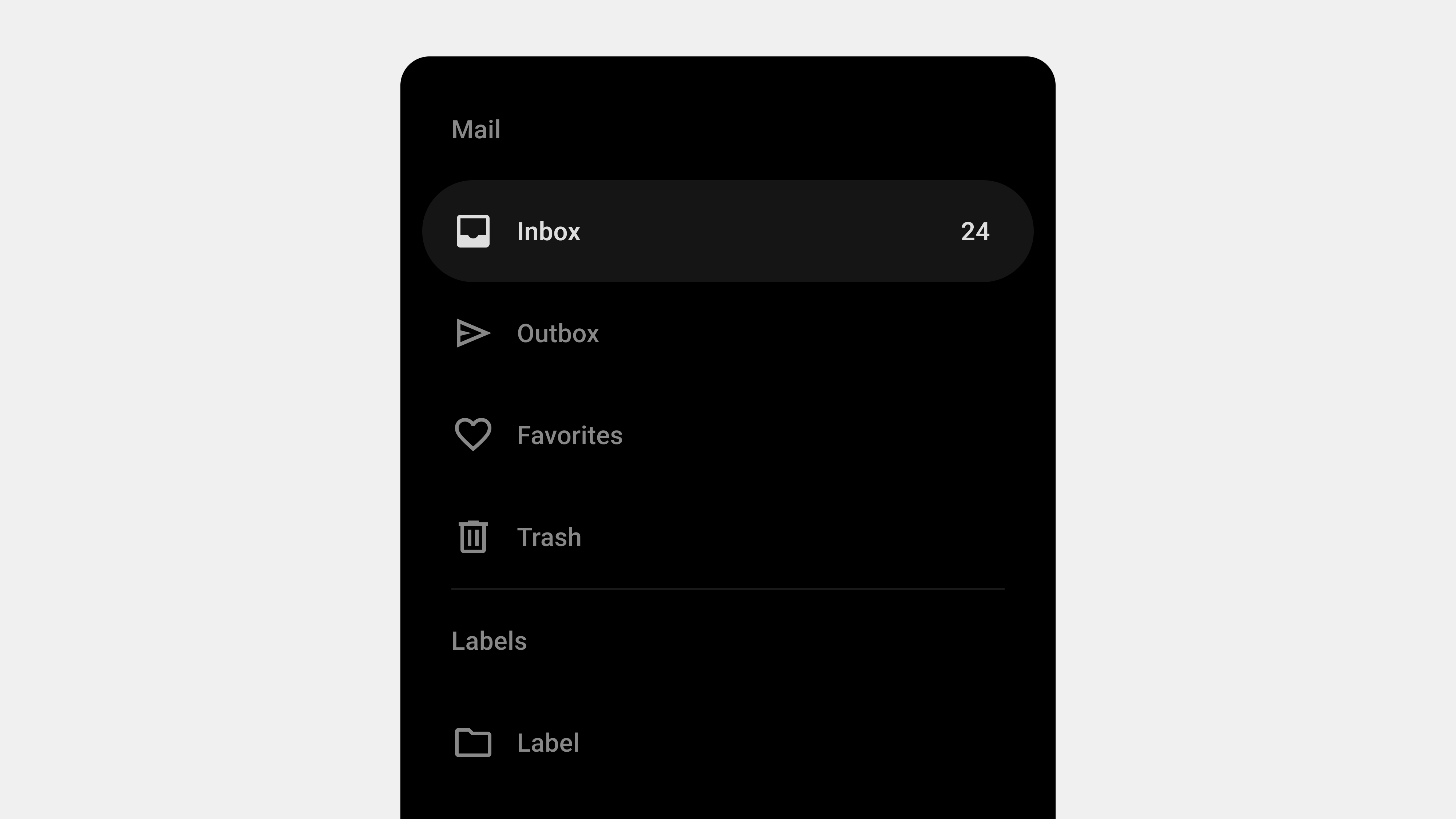
4. Examples of Effective Menu Labels
A. Instagram
- Tabs: Home, Search, Reels, Shop, Profile.
- Why It Works: Labels are short, clear, and align with user expectations.
B. Spotify
- Tabs: Home, Search, Library.
- Why It Works: Uses universally understood terms to describe primary actions.
C. Google Drive
- Menu Items: My Drive, Shared with Me, Recent, Trash.
- Why It Works: Labels reflect the content users will find in each section.
5. Adapting Menu Labels for Mobile and Web Interfaces
A. Mobile Interfaces
- Use compact labels to fit within small screens.
- Avoid truncation by testing labels with varying device sizes.
B. Web Interfaces
- Take advantage of additional space to include slightly more descriptive labels.
- Ensure consistency between mobile and desktop versions.
6. Incorporating Accessibility in UX Writing
Why It Matters
Clear labels improve accessibility for all users, including those using assistive technologies.
Key Considerations
- Screen Reader Support: Use ARIA labels for additional context.
- Keyboard Navigation: Ensure focus indicators clearly highlight menu items.
Example
For a button labeled “Add,” use an ARIA label like “Add New Item” to provide context for screen reader users.
7. Tools for Testing and Refining Menu Labels
A. Design Tools
- Figma: Prototype and test menu interactions with different labels.
- Sketch: Create and refine menu layouts and labels.
B. Testing Tools
- Optimal Workshop: For card sorting and tree testing.
- UsabilityHub: To gather feedback on label clarity and effectiveness.
Conclusion
Crafting effective menu labels is a critical component of UX writing. By focusing on clarity, brevity, and alignment with user expectations, designers can create intuitive menus that enhance navigation and usability. Regular testing and iteration ensure that menu labels evolve alongside user needs, resulting in a seamless and satisfying user experience.